
Places mean a lot to us.
My bespoke artworks are inspired by a sense of place, creating something that is unique to the people that use the space. A sense of place helps to connect people to their area, to give them a sense of belonging that helps improve wellbeing, making people feel at home and safe in their environment.
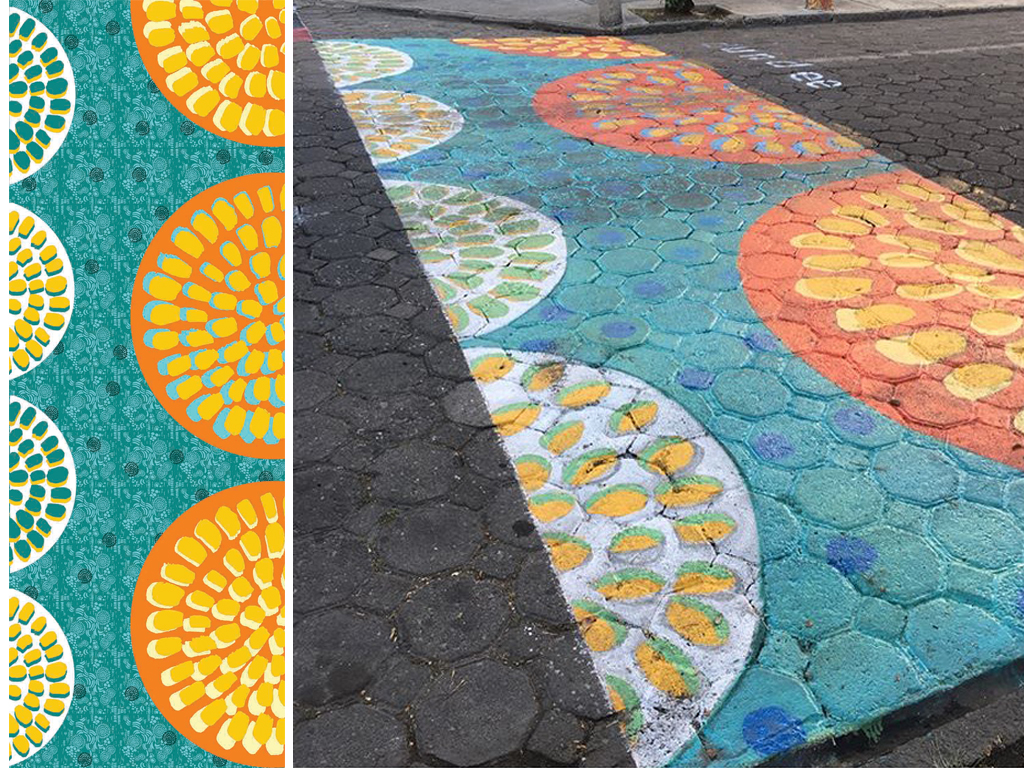
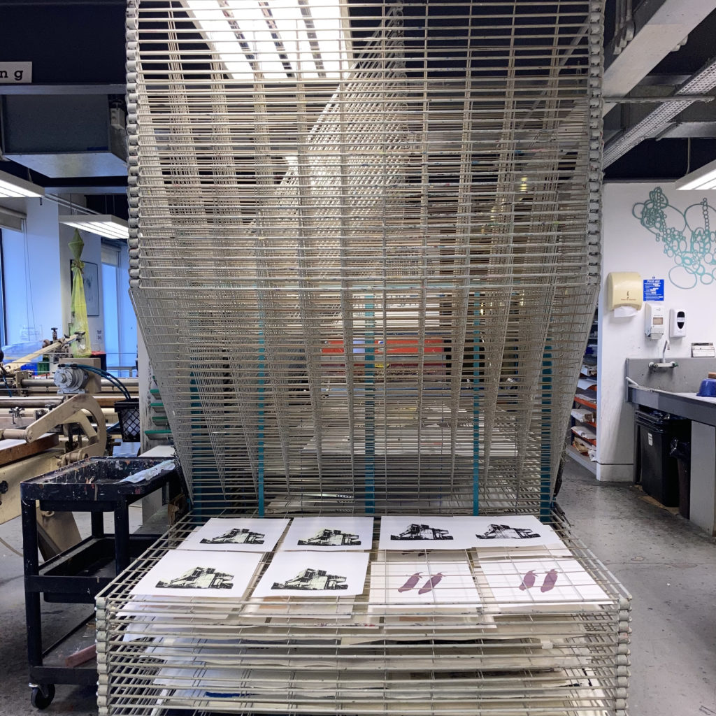
During consultation I find out what is meaningful and unique about the area or organisation gathering what makes somewhere unique.
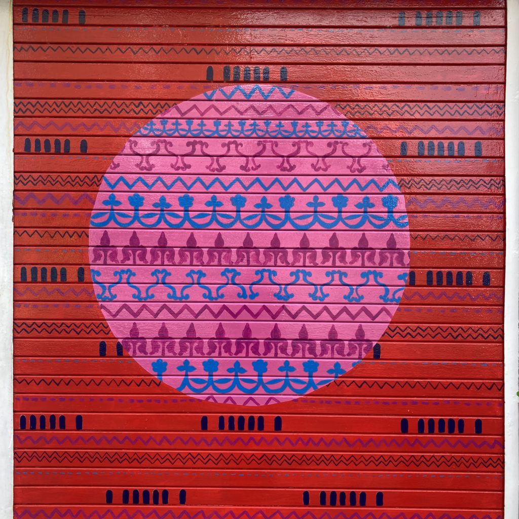
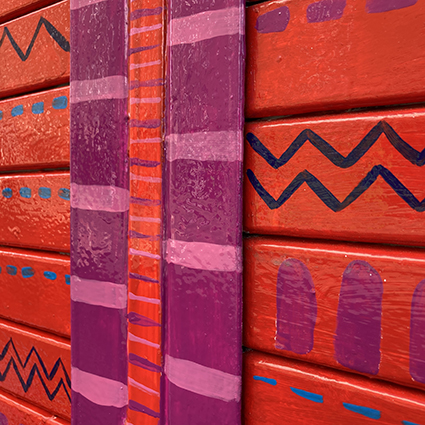
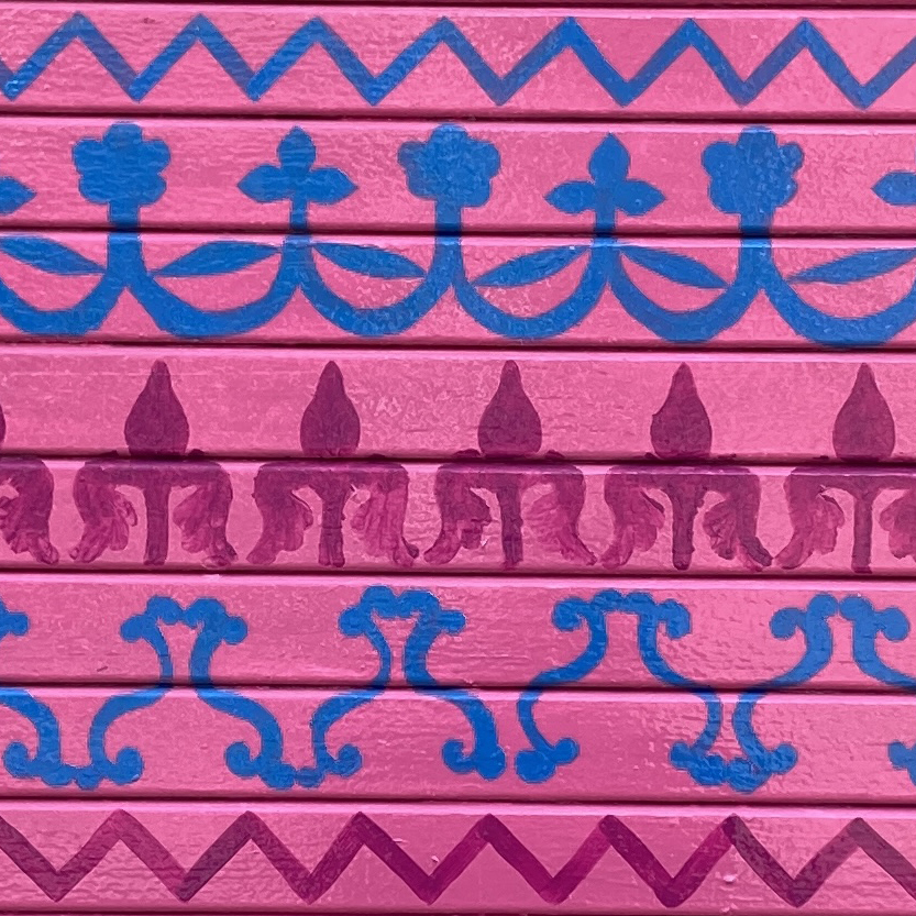
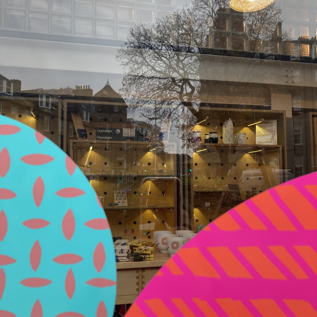
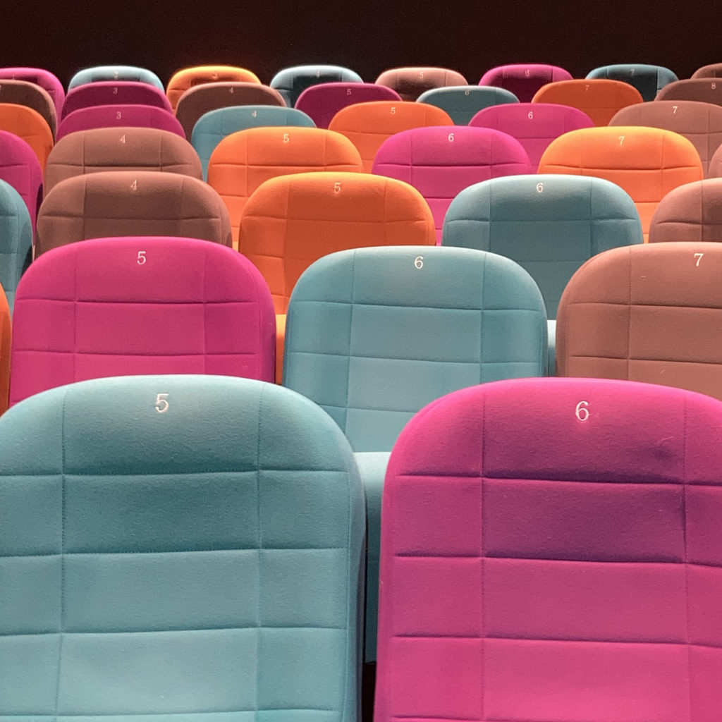
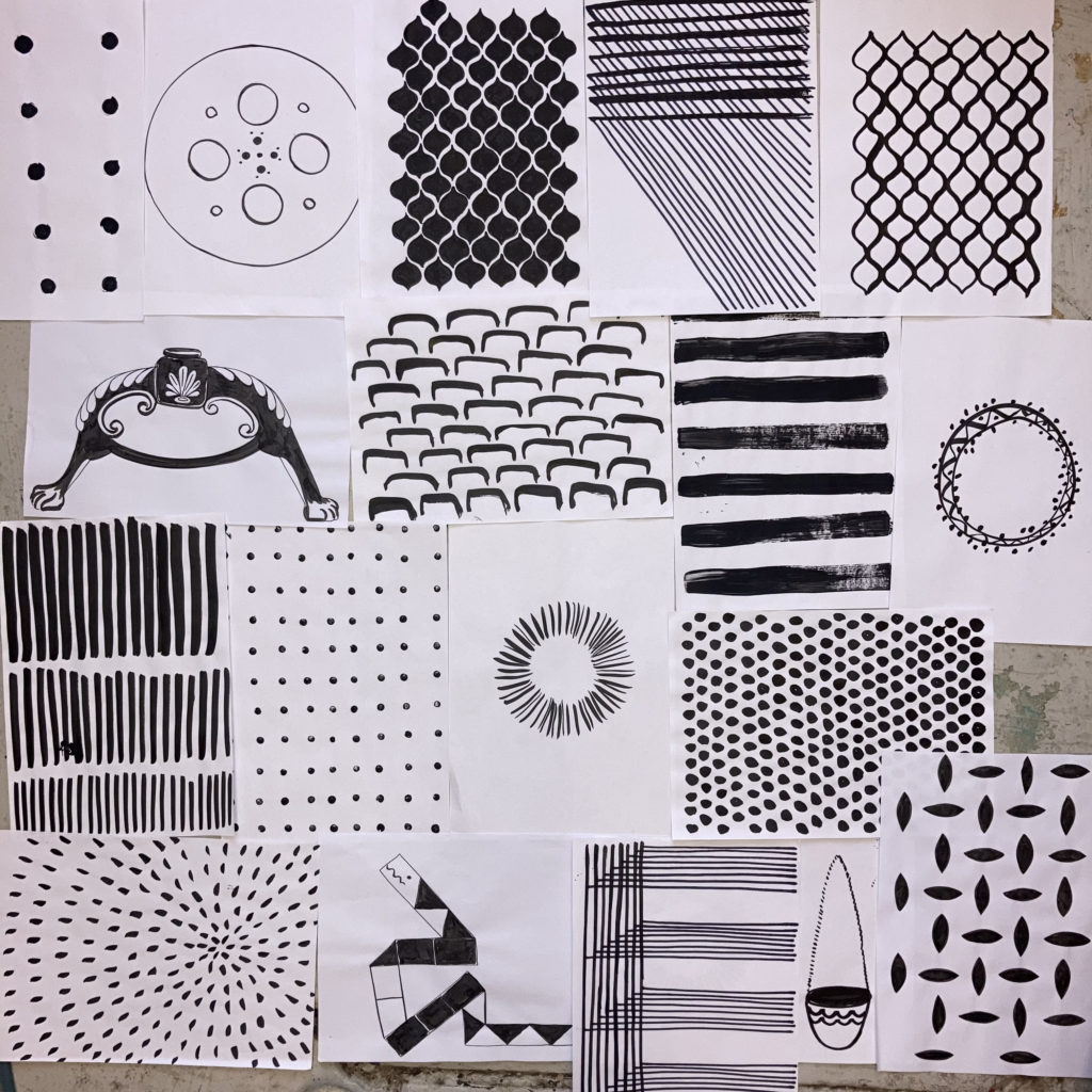
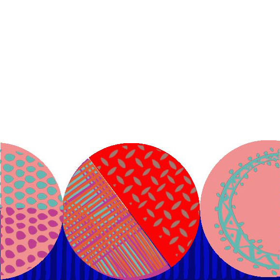
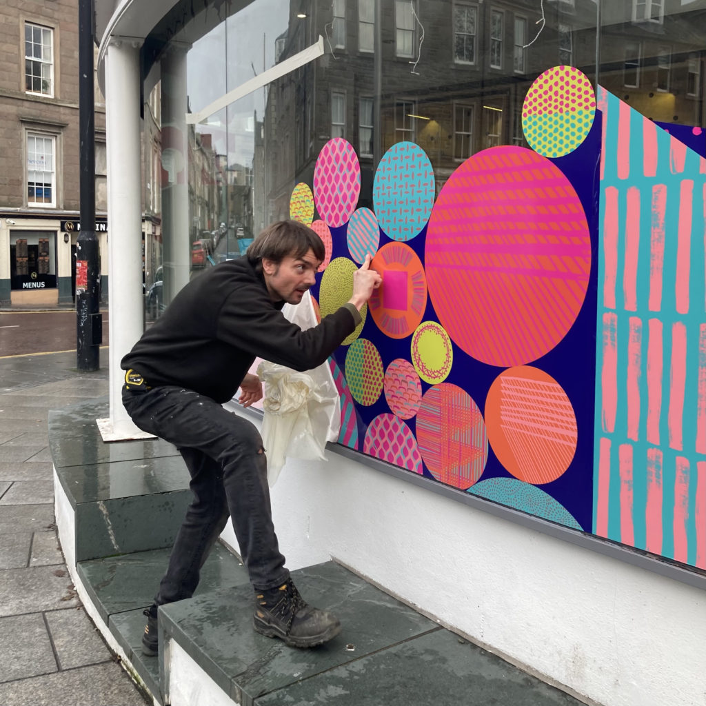
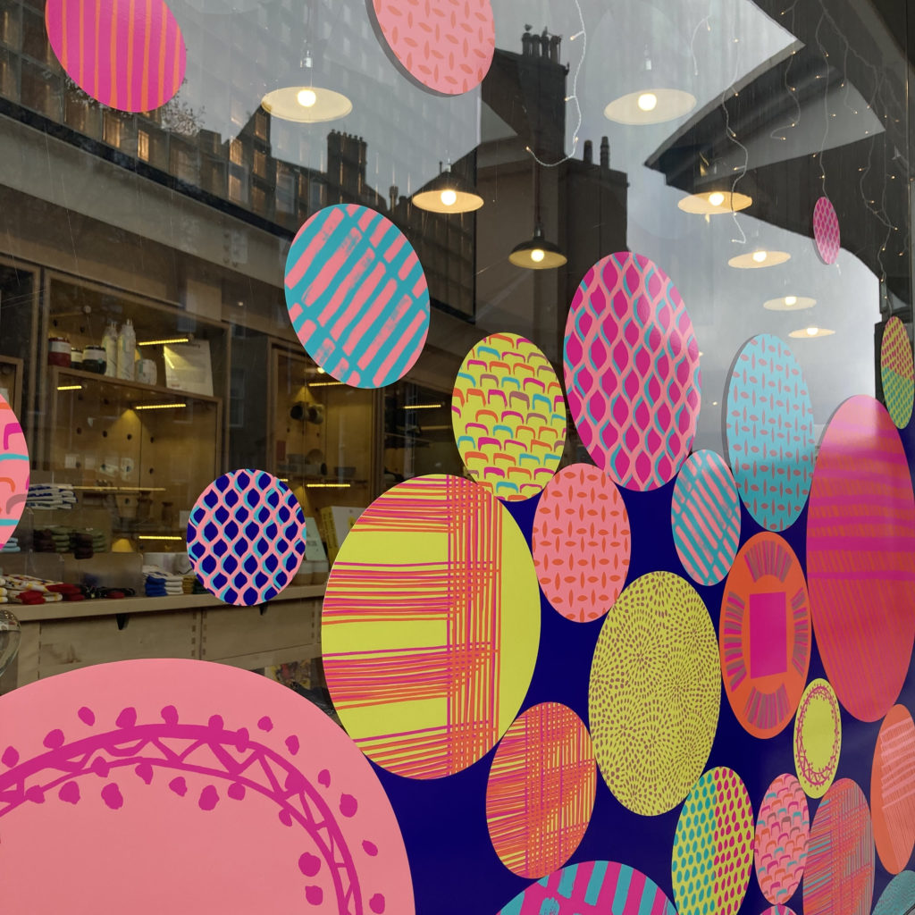
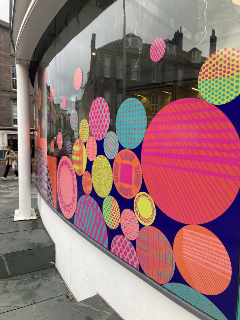
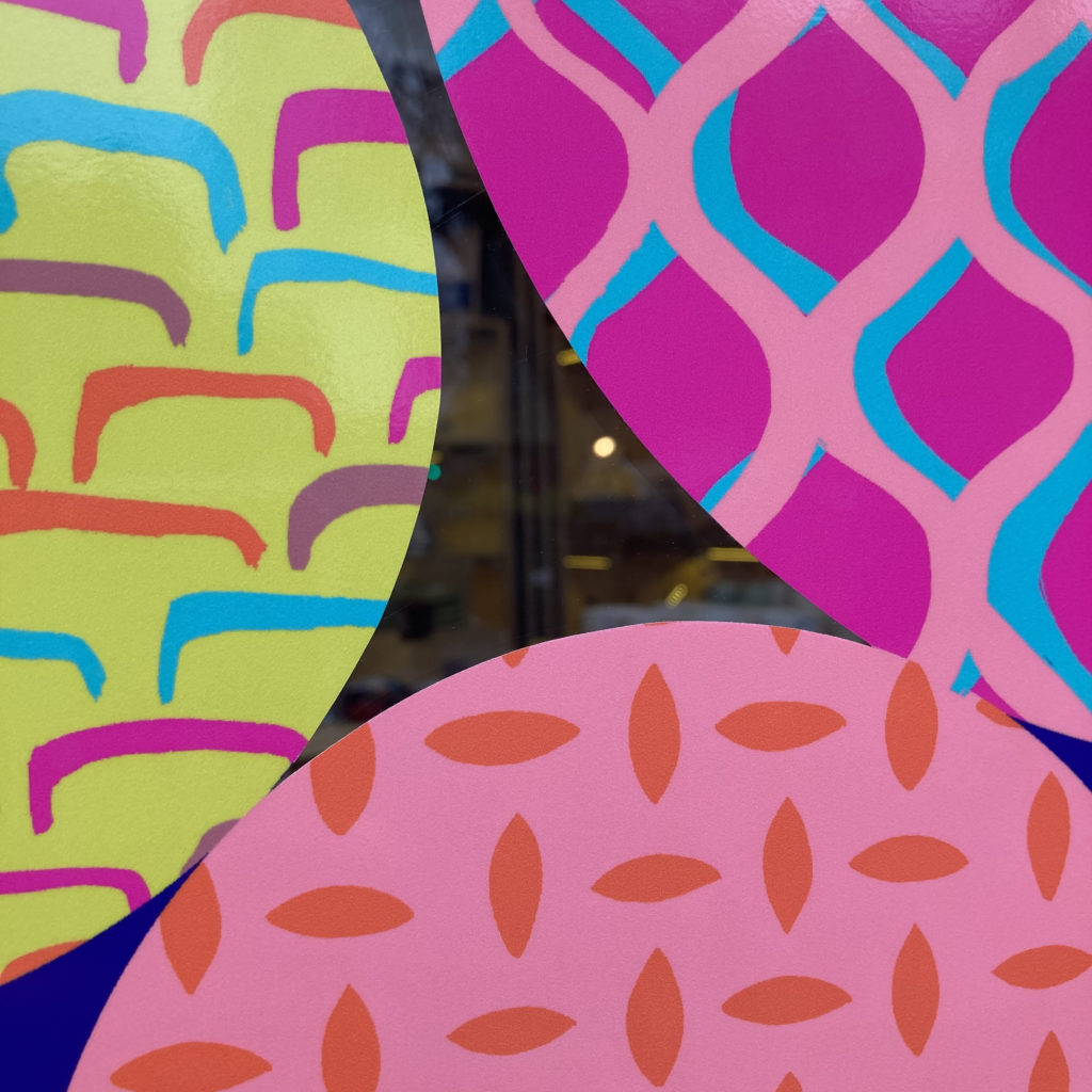
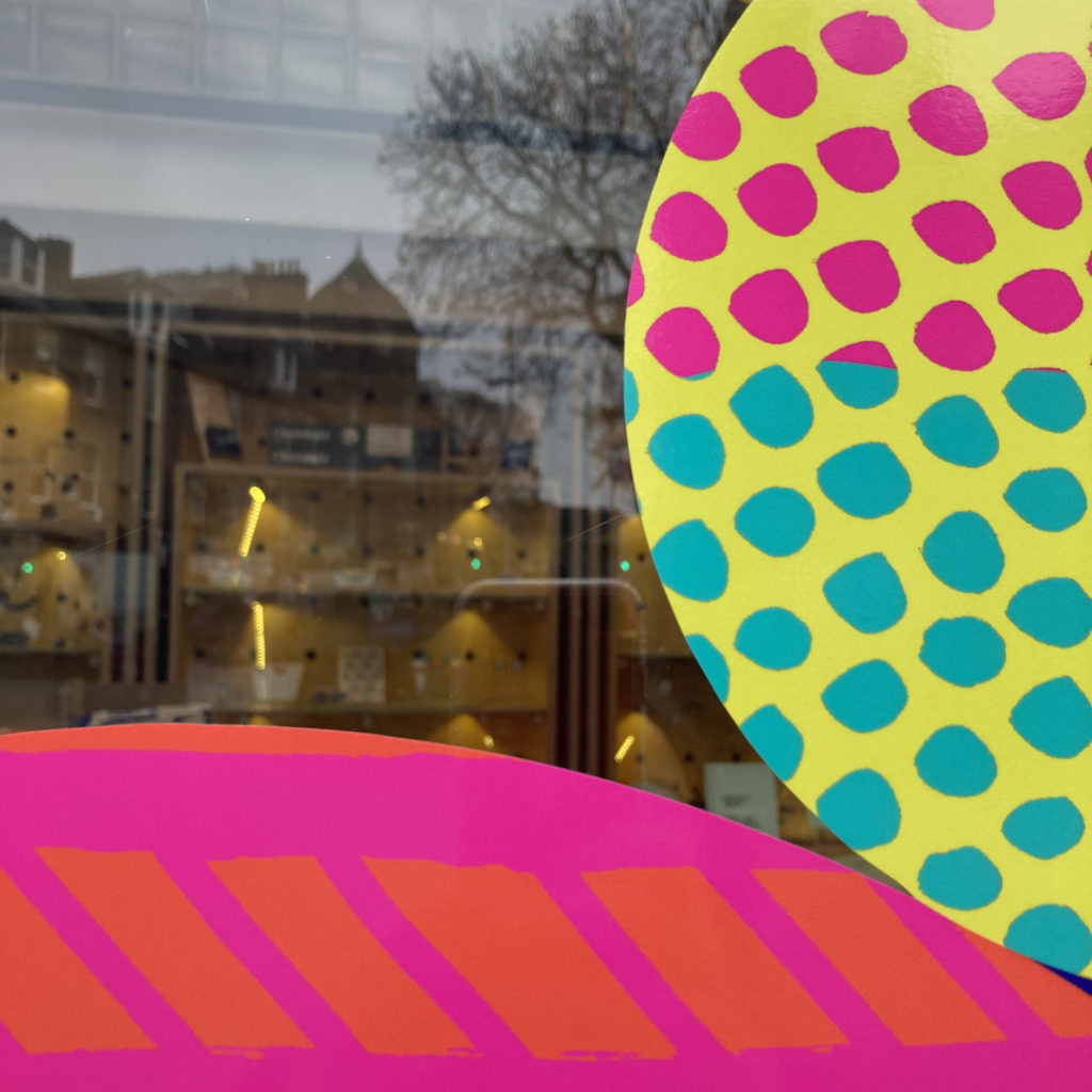
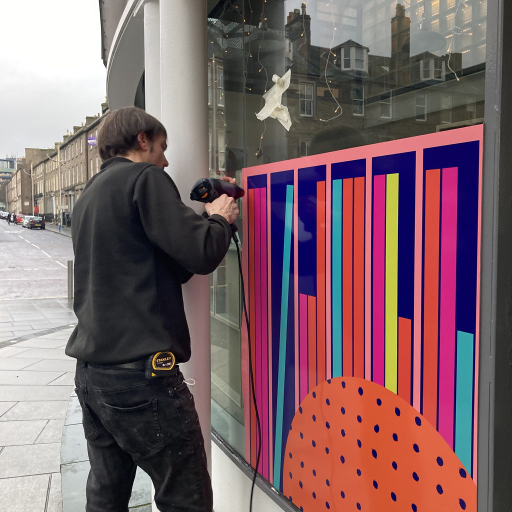
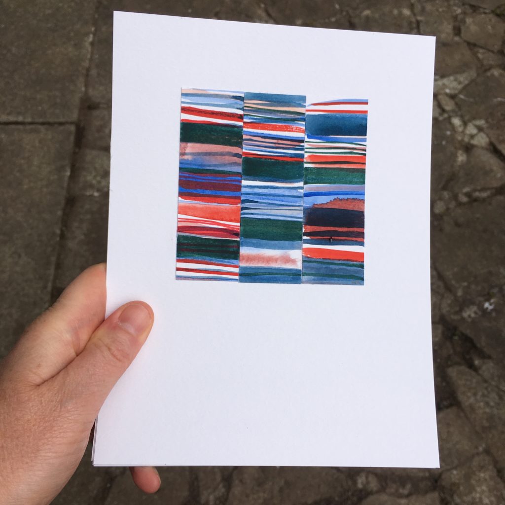
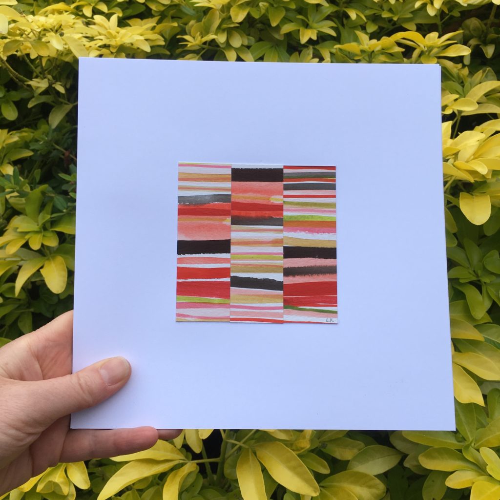
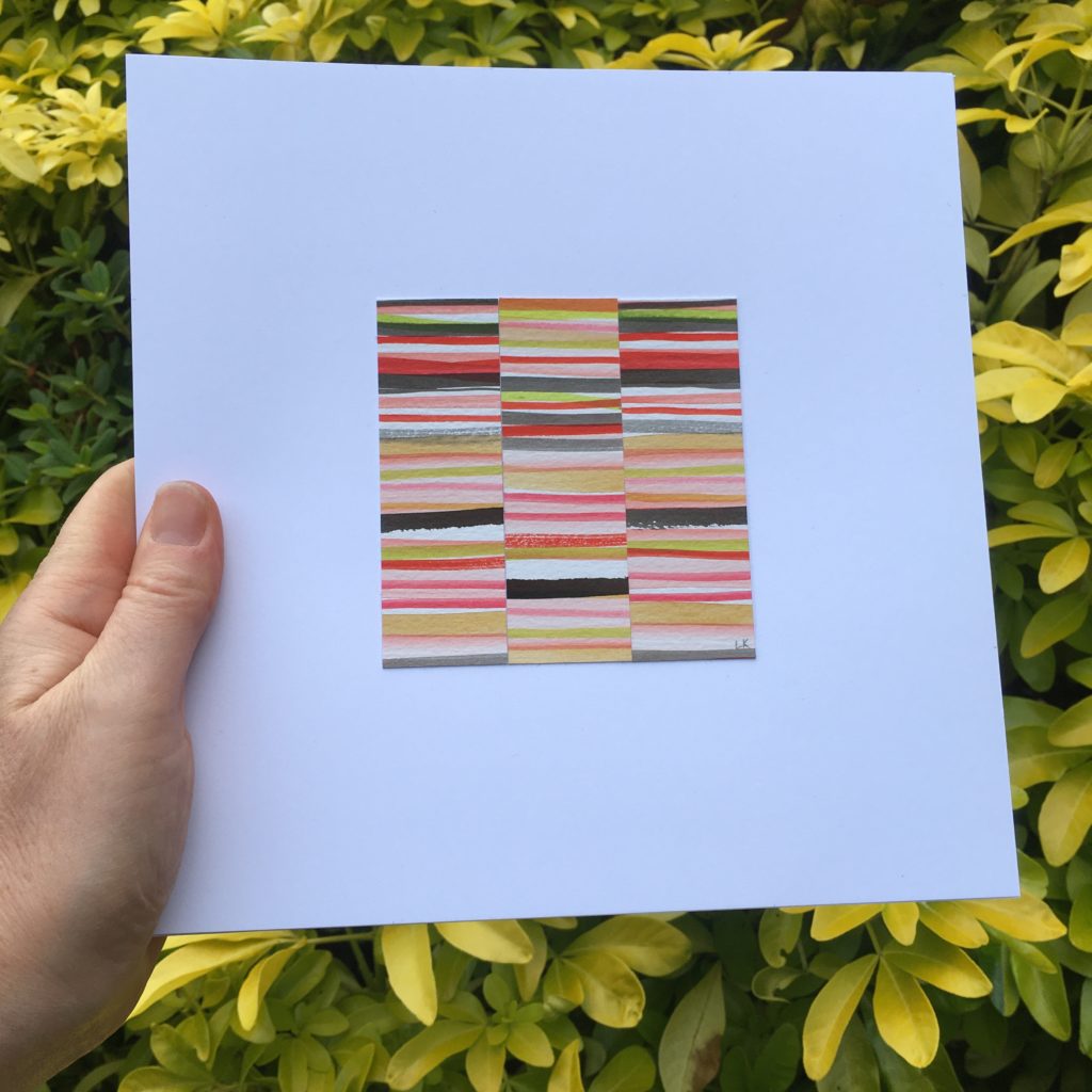
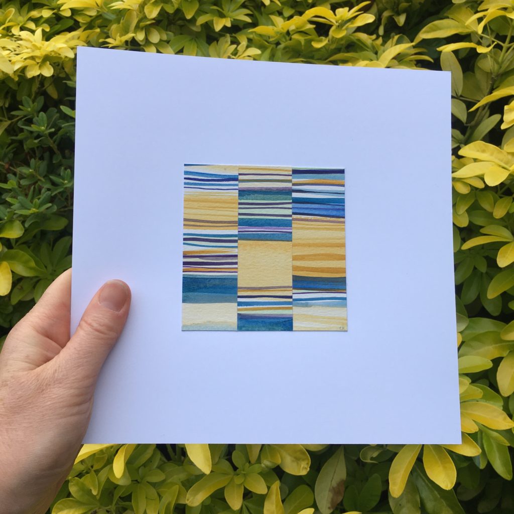
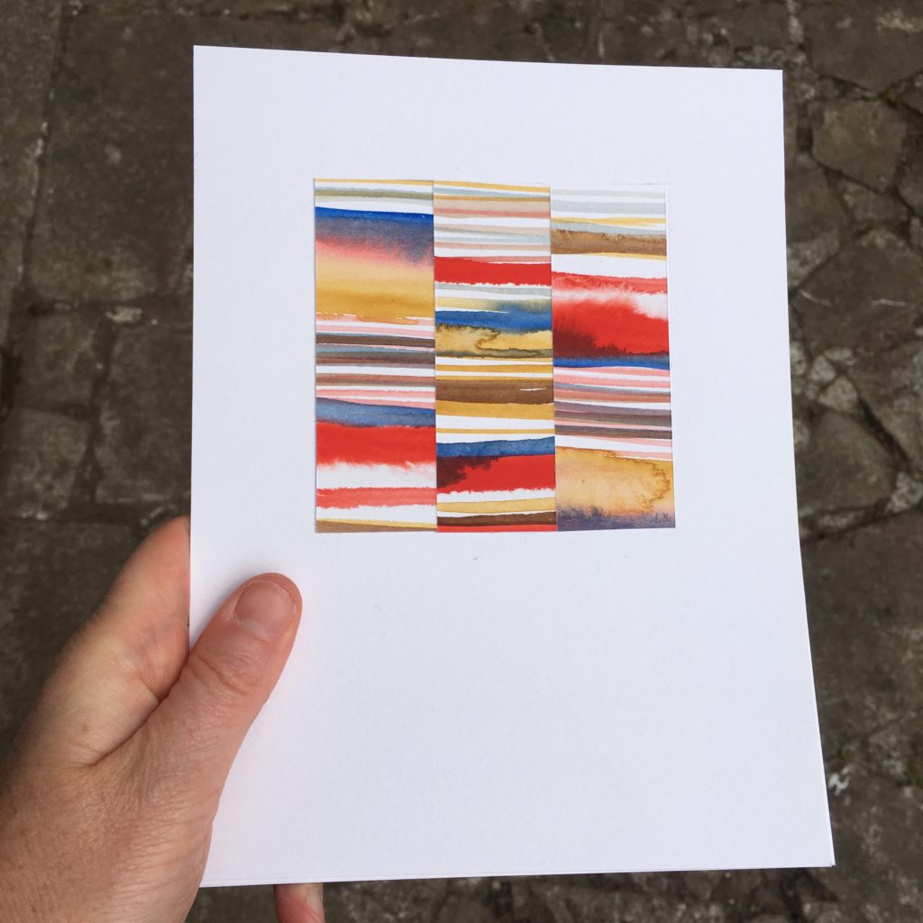
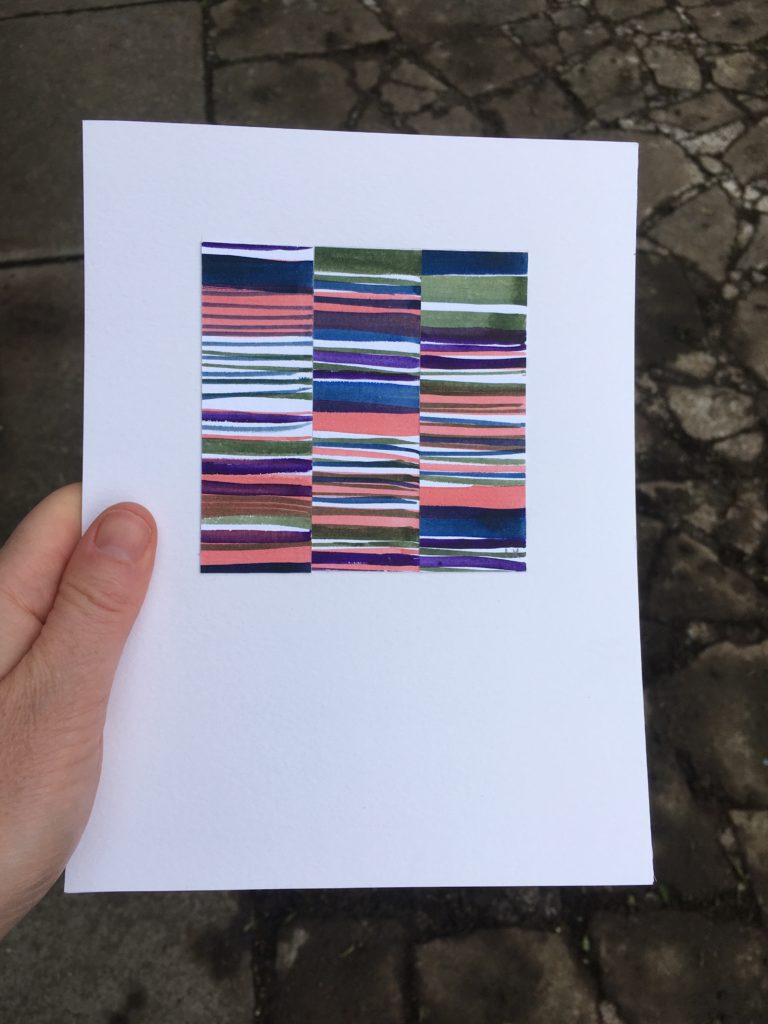
Calm colours to bold and exciting!
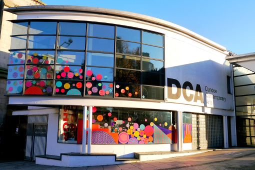
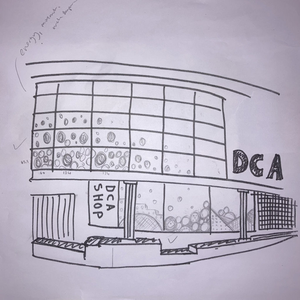
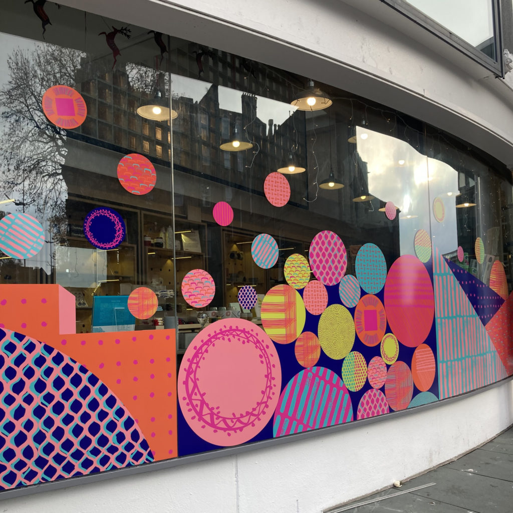
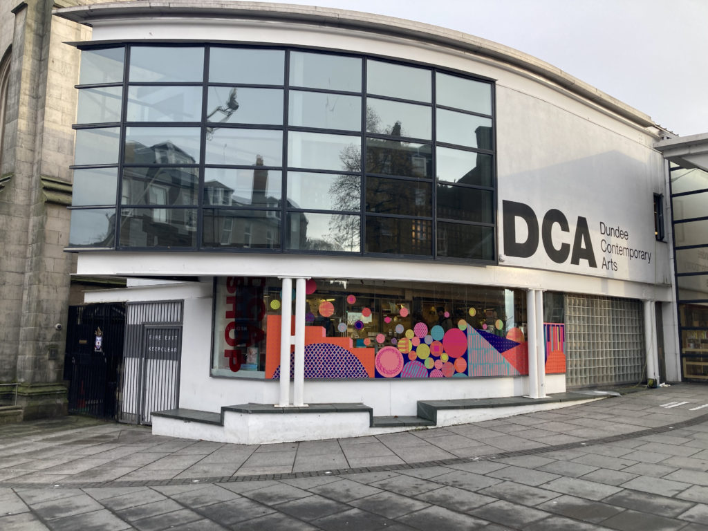
My designs can feel quite different on each project I work on as I respond to the people, place and purpose of a space. From a calm artwork in a hospital corridor to help reduce stress and anxiety for visitors and patients to a bright vibrant cultural space to inspire people to come and to capture the essence of the building activity.
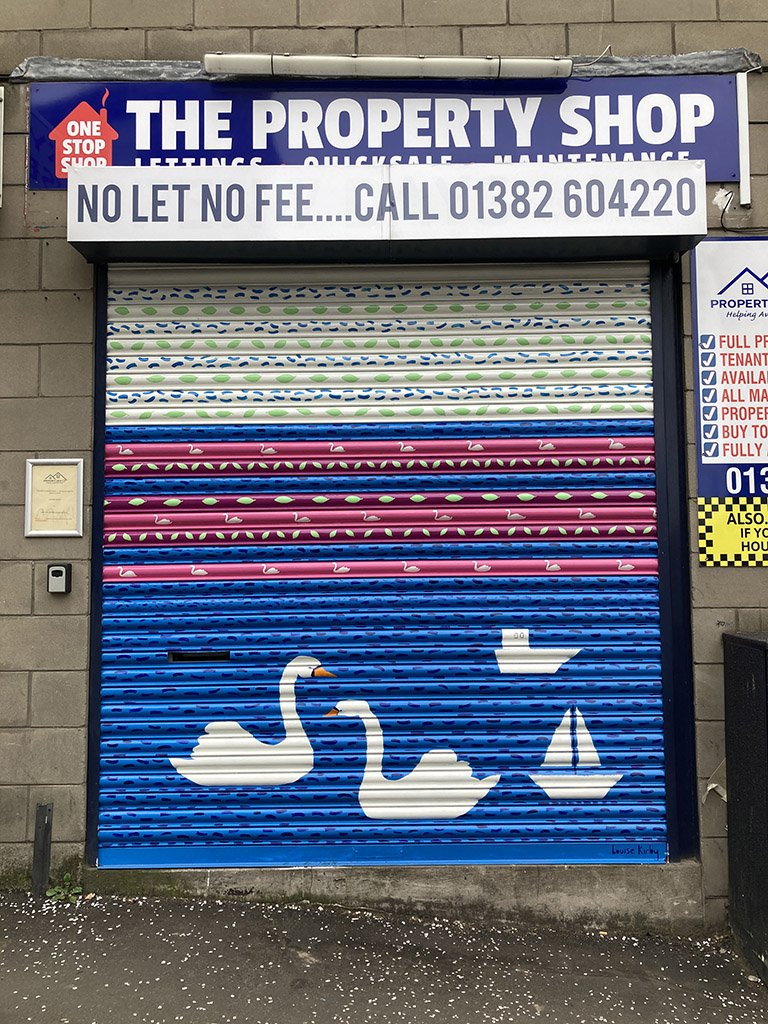
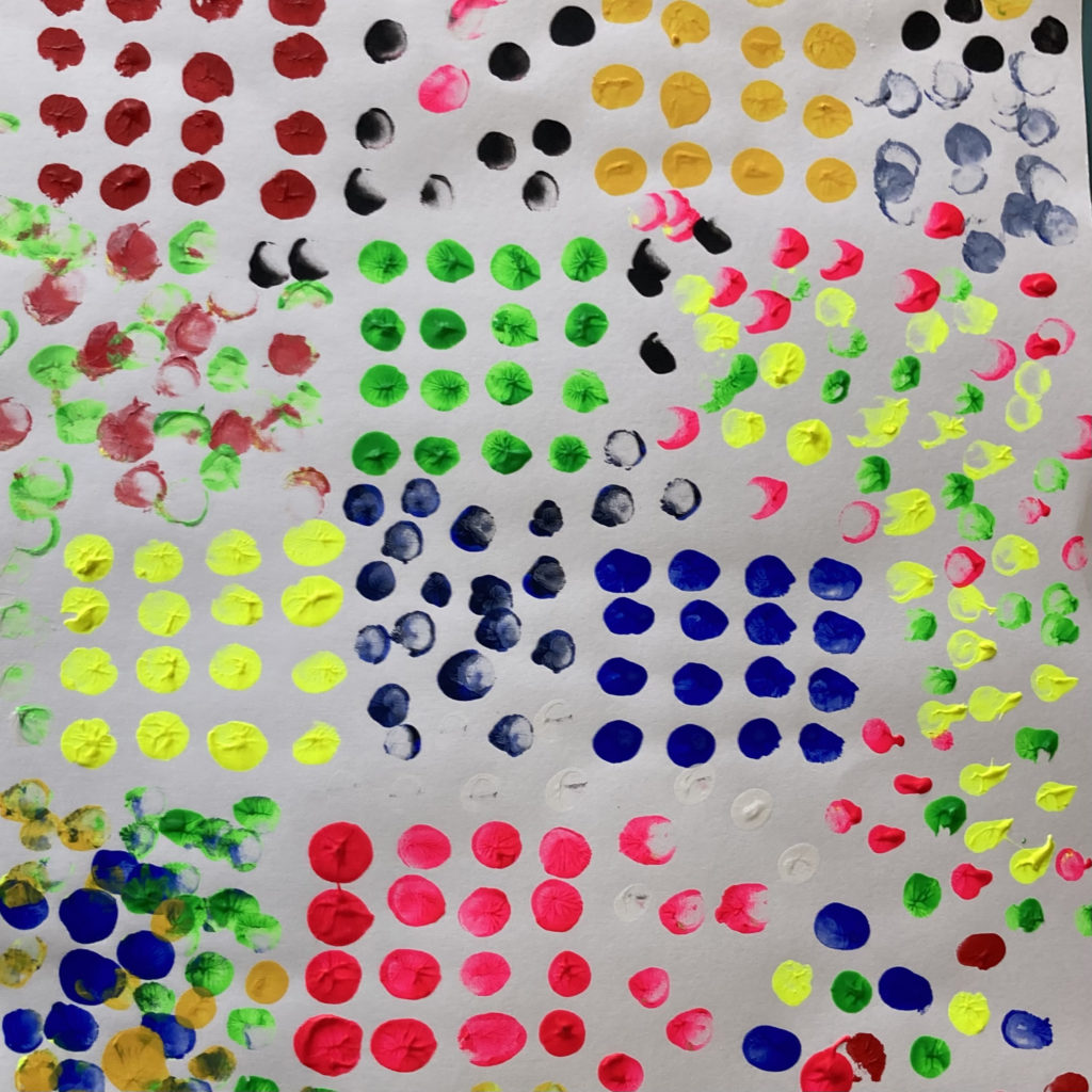
Locals to an area or service users of an organisation need to feel welcomed and connected to a space so they feel comfortable. Buildings, streets and spaces can be daunting, uninspiring and scary. With the use of imagery, colour and good design in consultation with people that use the space designs can have a positive impact.
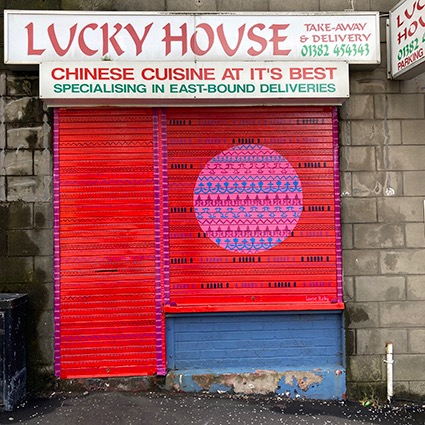
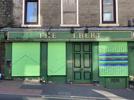

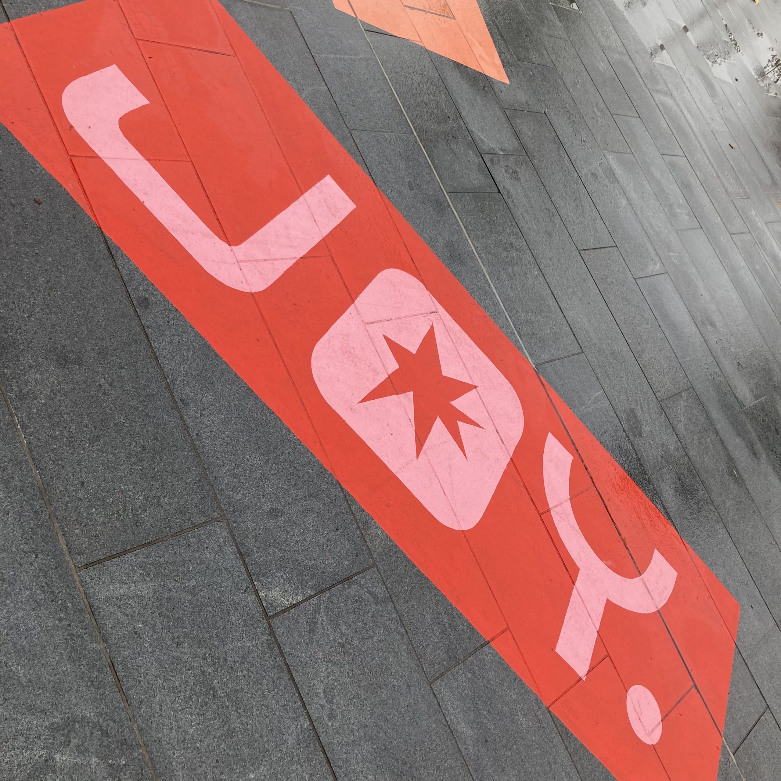
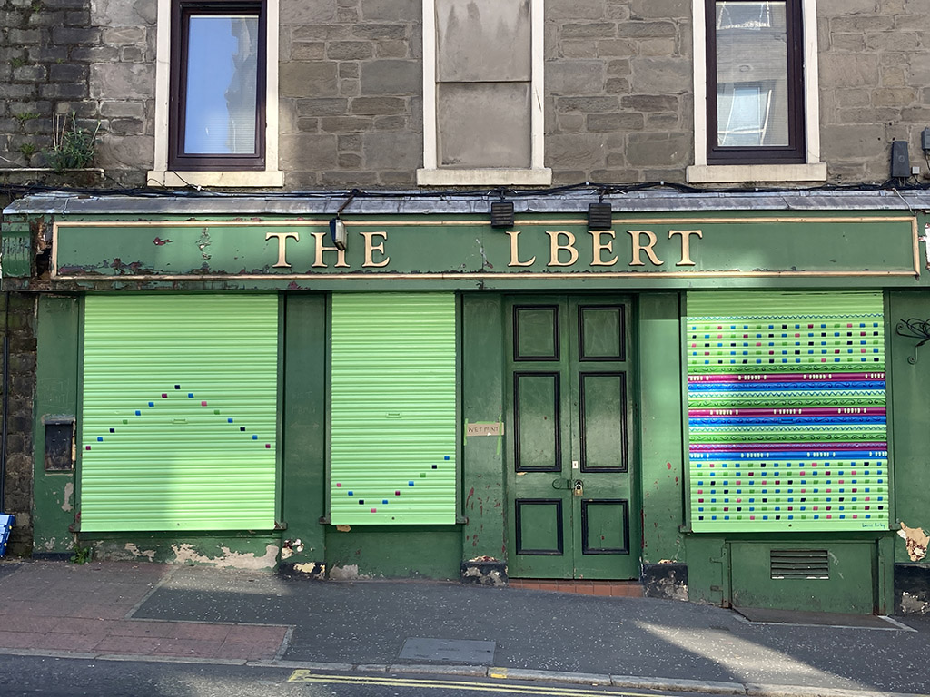
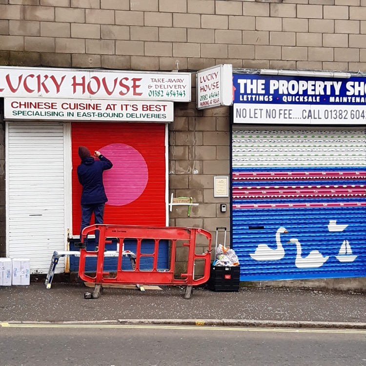
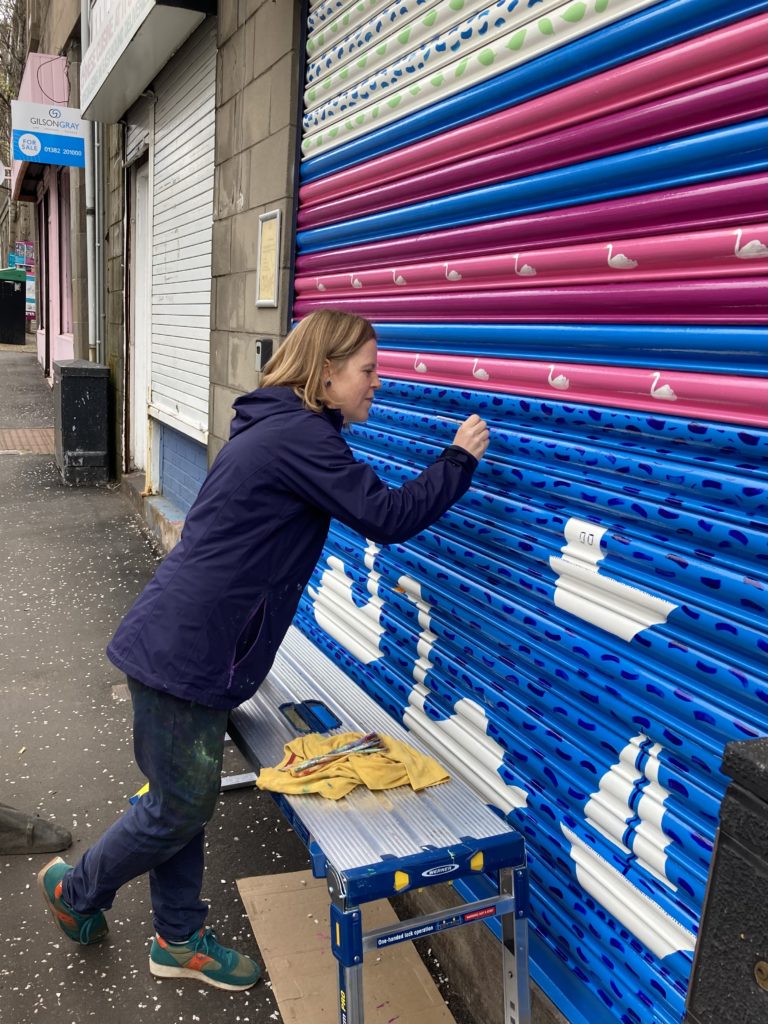
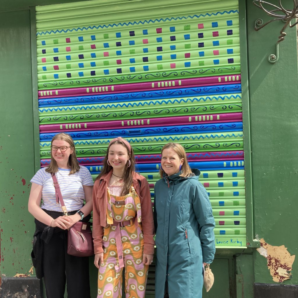
“Sustrans commissioned Louise to spruce up Albert Street with her beautiful artwork as part of the Stobswell Pocket Places project and it’s been a pleasure working with her. Her designs were carefully considered and every detail was inspired by the local area, helping to create a sense of place and an identity for Albert Street. Louise eagerly engaged with business owners to get them involved in the project and ensure they were happy with the designs before she painted them. Her warmth, authenticity and personal approach put the business owners at ease and encouraged them to participate in the project. She was in regular communication with the project team, remained flexible under changing circumstances, and even helped to raise the profile of the project through her social media and other channels. I would not hesitate to work with Louise again – 10/10 would recommend!” – Tremaine Bilham, Project Lead, Sustrans Scotland
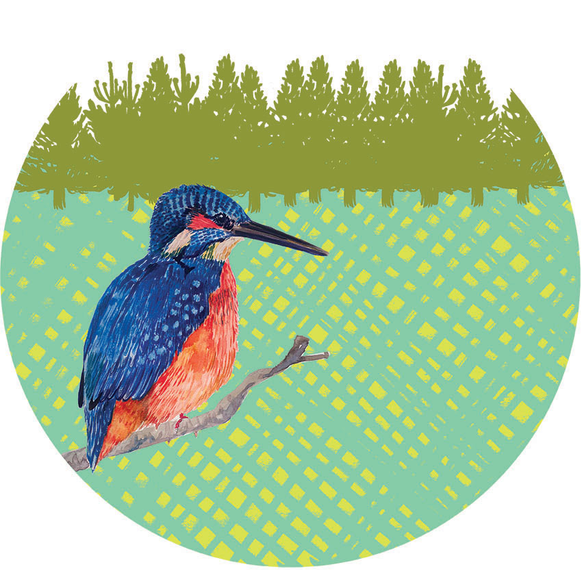
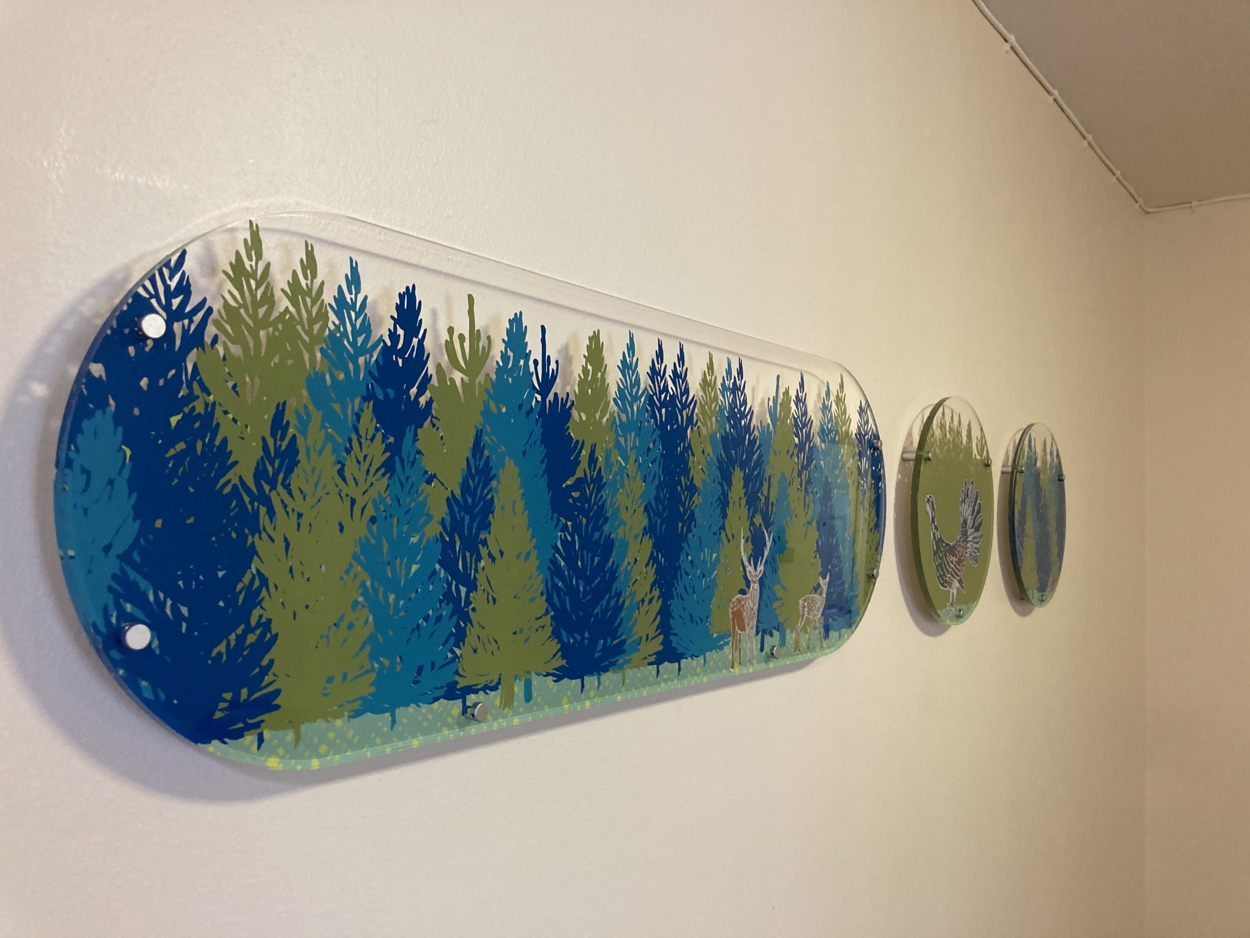
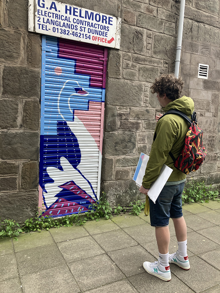
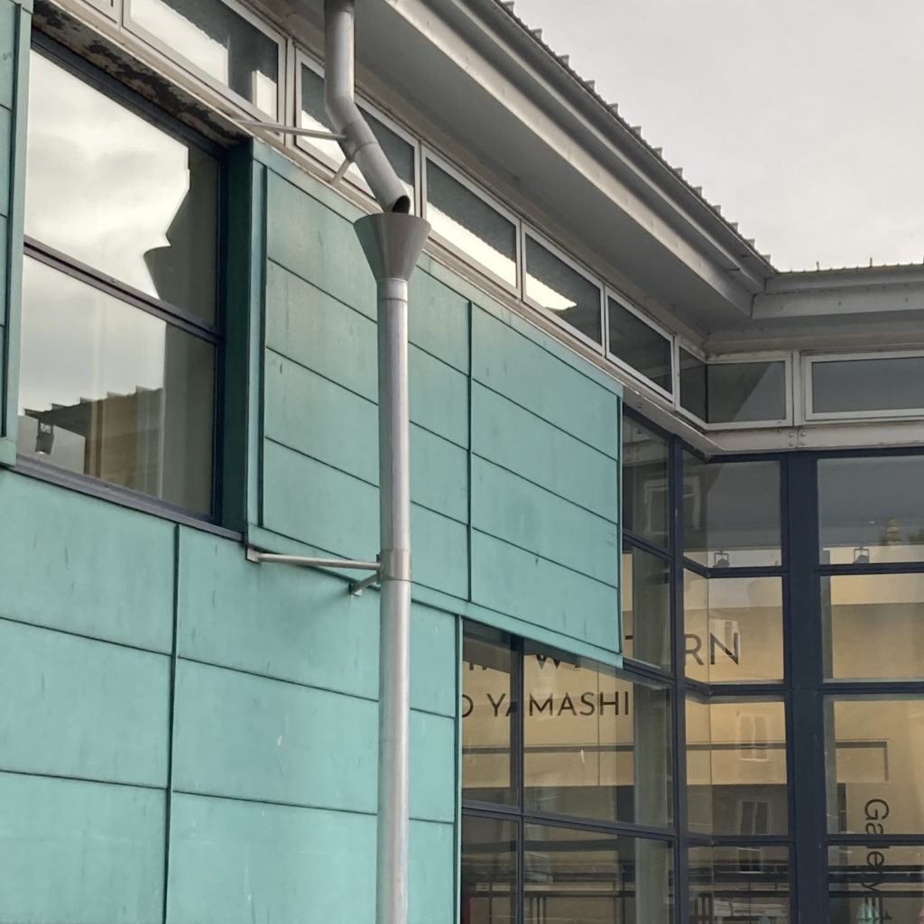
For Pitlochry Sheltered Housing Unit corridor enhancements inspiration came from the local trees and wildlife to bring in a bit of the outdoors inside as talked about during the staff and tenants consultations.

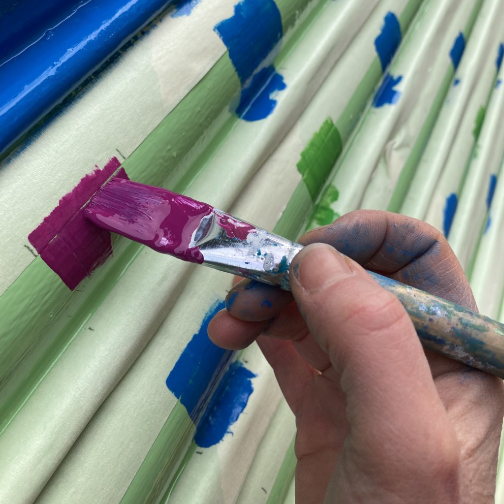
I have a vision of the world full of colourful creative interventions to bring more joy to the spaces we play, live, work and travel through. My aim is to uplift and connect people and highlight the positives by creating artworks that capture a sense of place which creates a sense of belonging. I love to do this with my use of playfully applying colour and pattern.
I am ready to take on new design challenges and if you have a project, collaboration or commission in mind please get in touch hello@louisekirby.com or you can check some samples on my website to give you a flavour of previous projects.


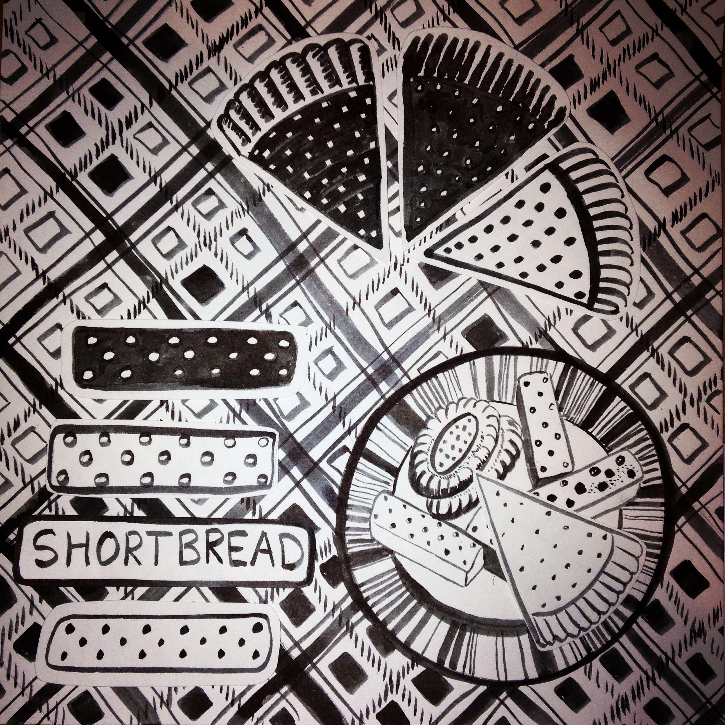
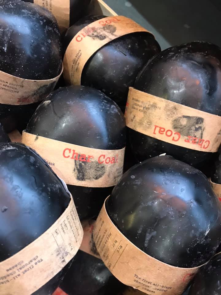
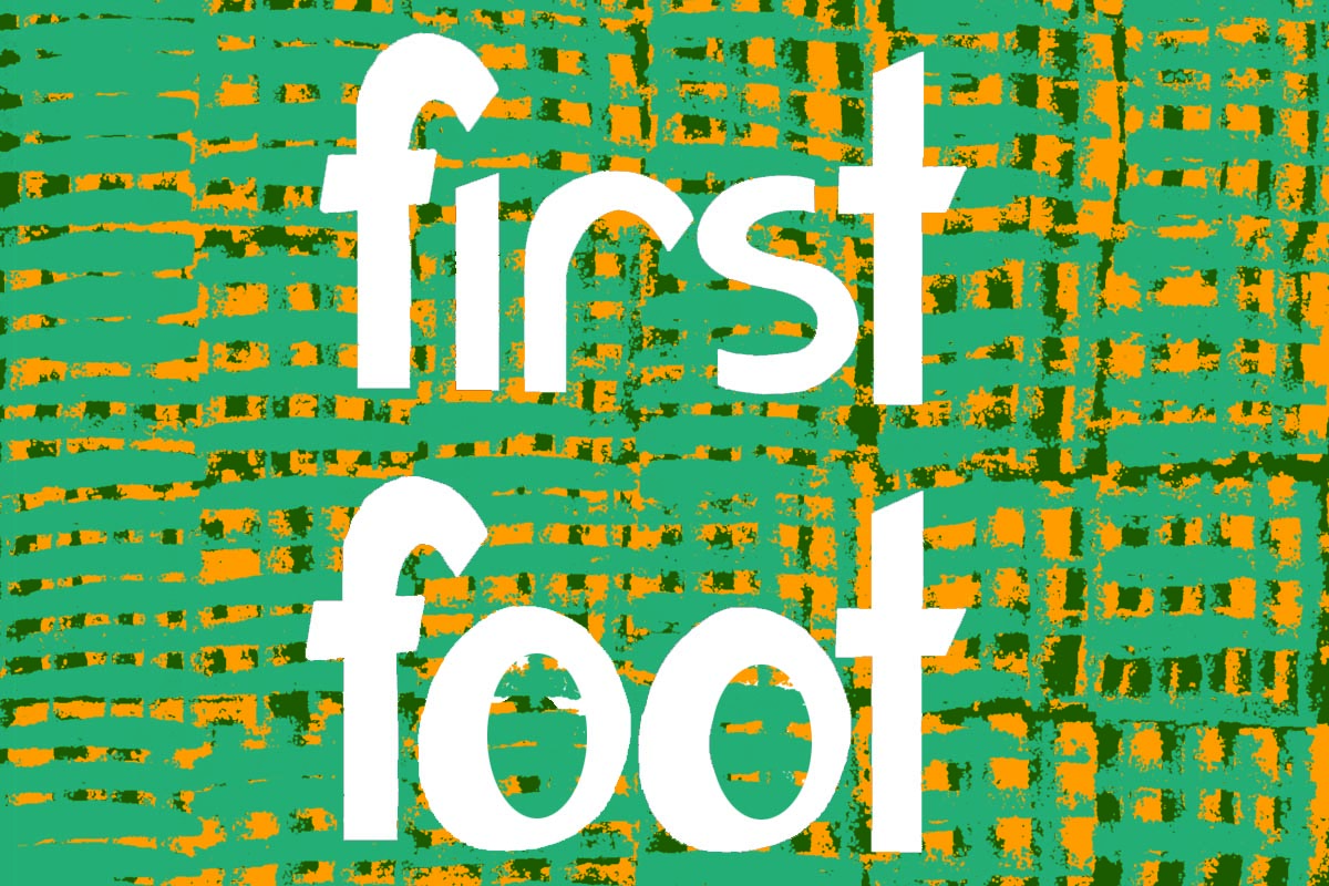 Here in Scotland its tradition on Hogmanay (New Years Eve) to give a first foot gift after midnight. Traditionally gifts would be whisky to represent financial prosperity and good cheer, a lump of coal to represent warmth and to keep the fire burning, or a black bun or shortbread to symbolise that the receiving family would not go hungry during the forthcoming year.