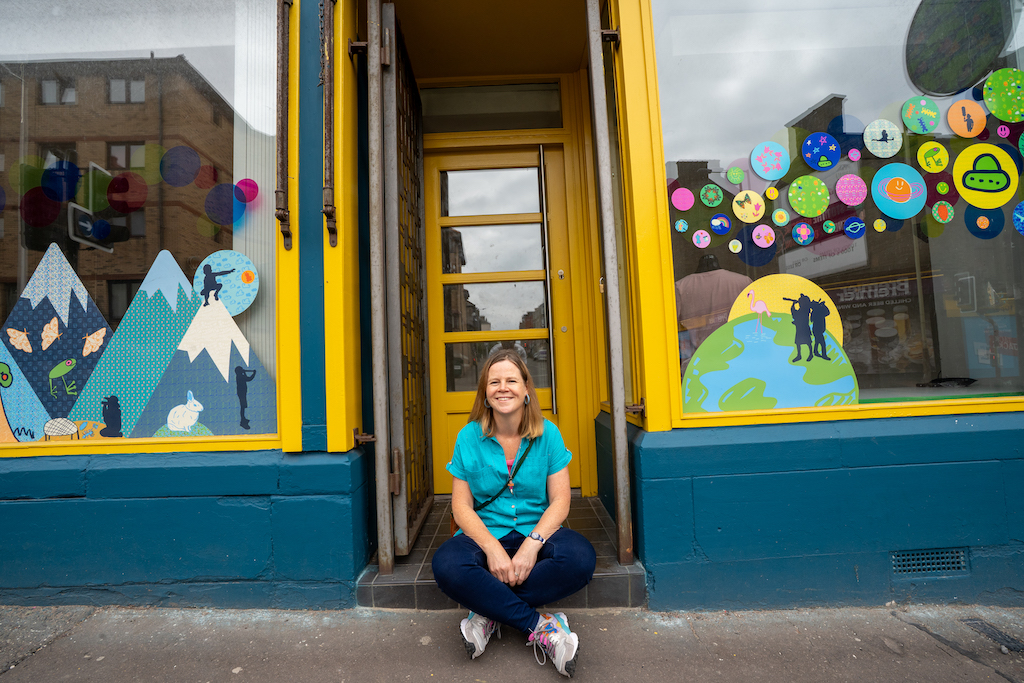
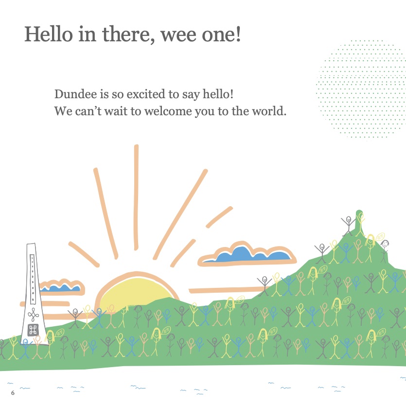
I was asked to help Front Lounge a Hilltown based charity to transform the facade of their three units by using artwork. I created a coherent look that capture their ethos and makes a positive mark on the Hilltown.
I did this by transformation the window with colour and artwork with their young people, redecorated the building facade and added six new artwork using the existing street furniture.
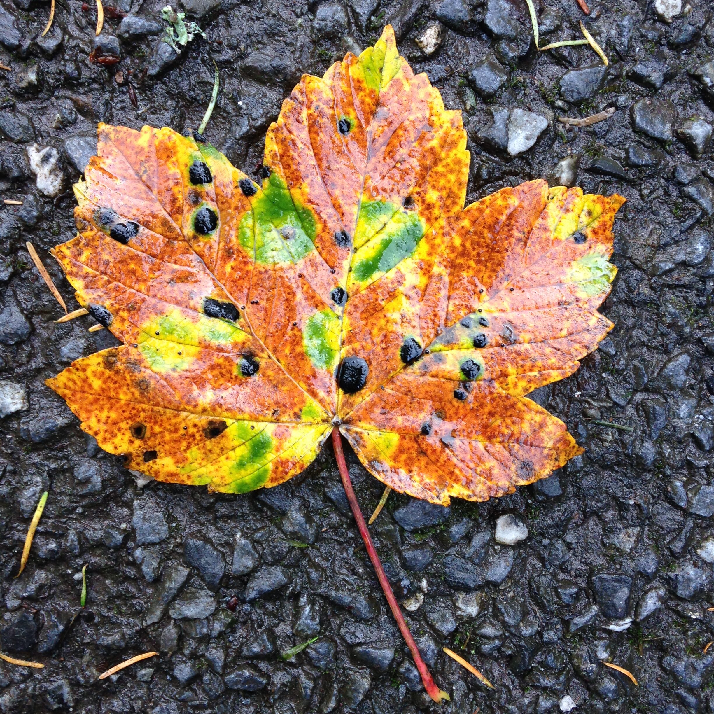
Before and After
(Top photo by Grant at PPG Photography)
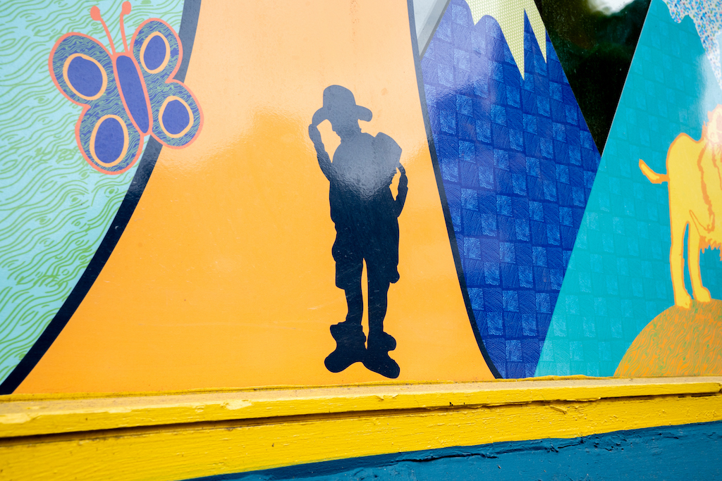
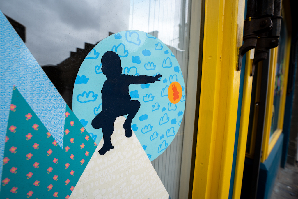
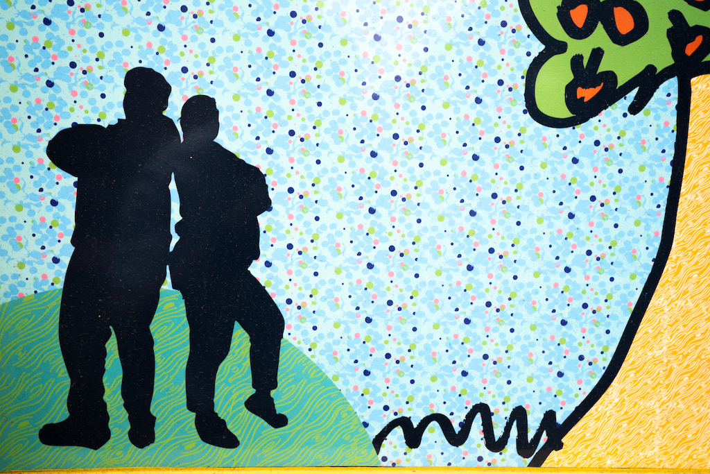
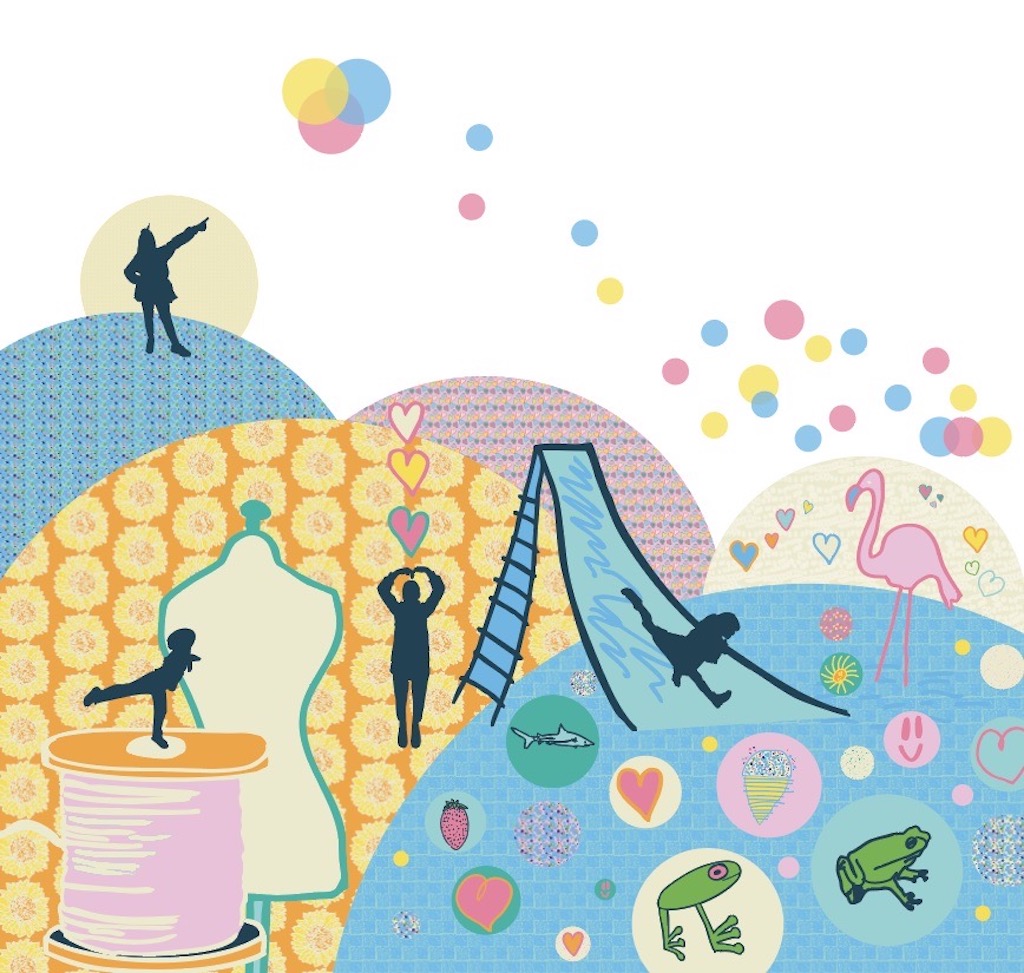
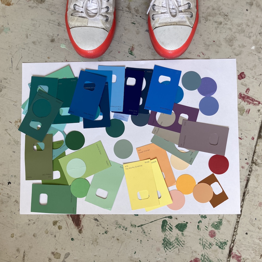
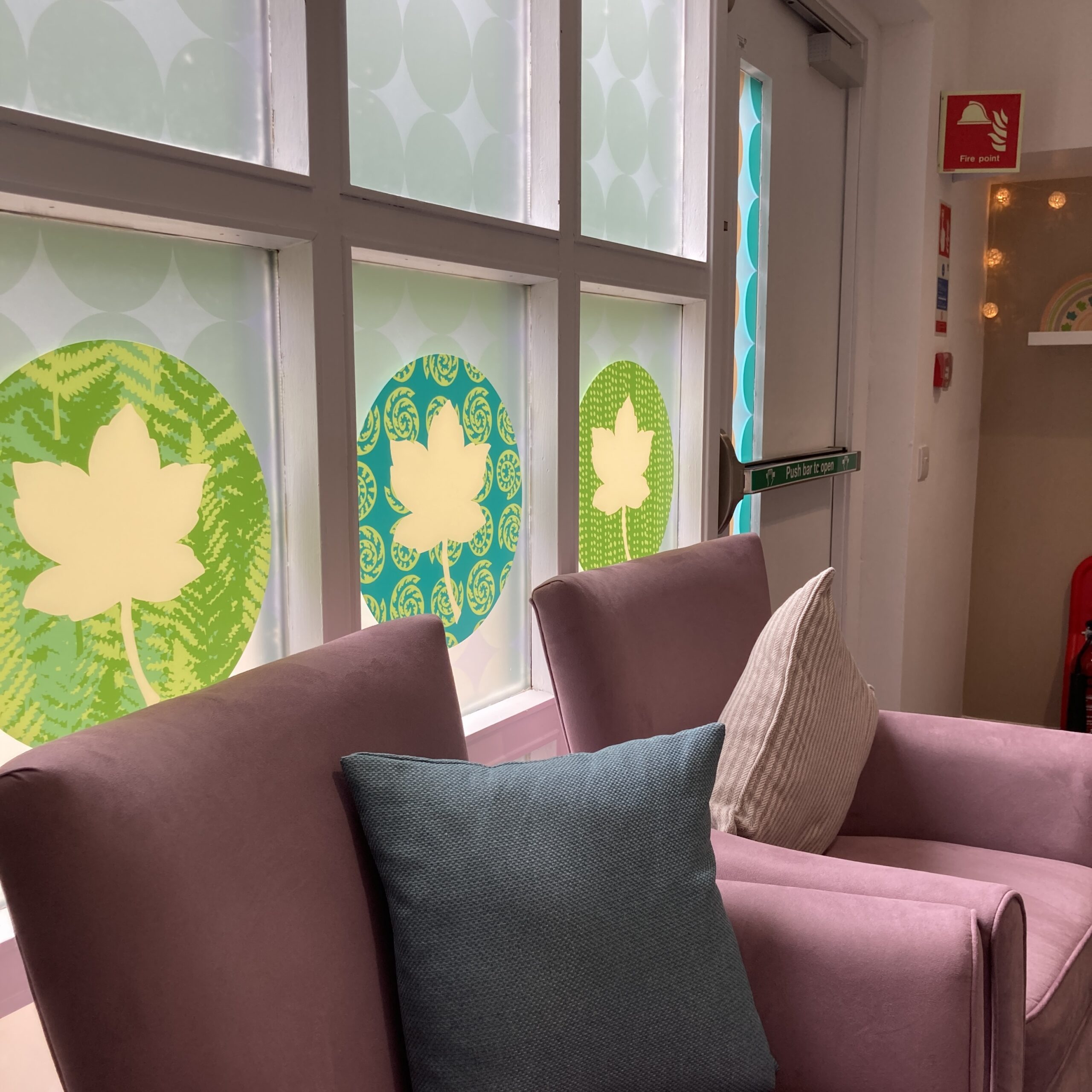
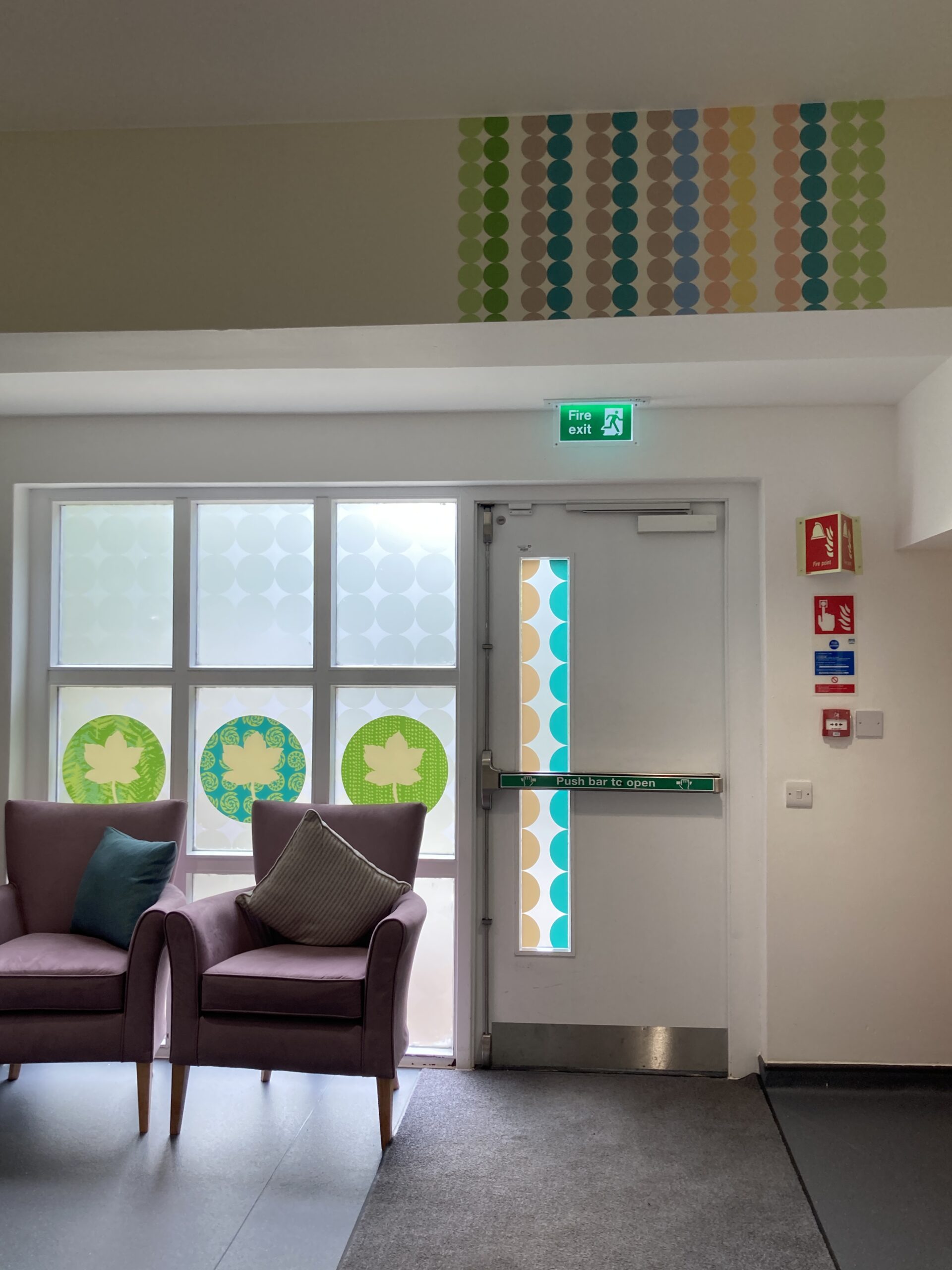
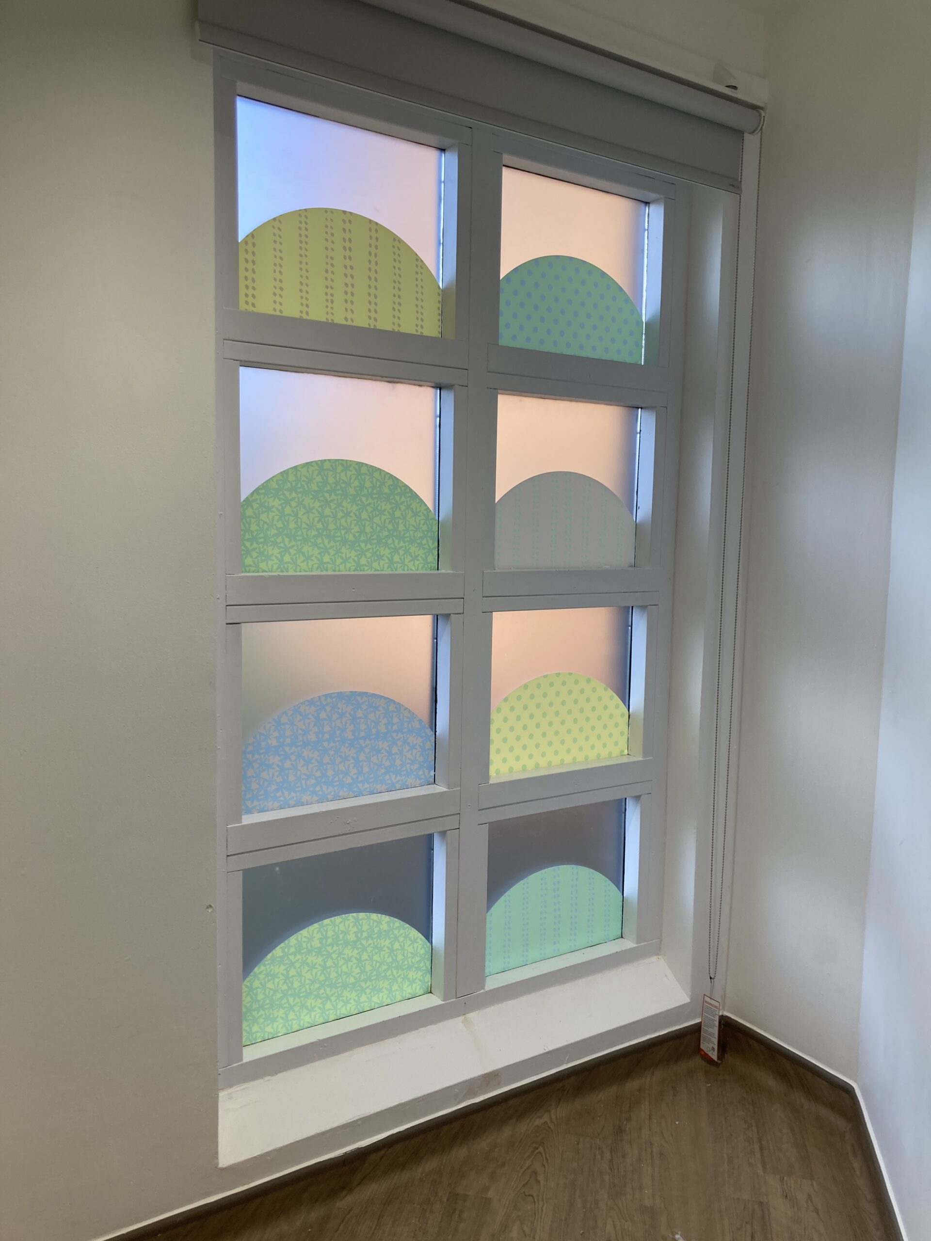
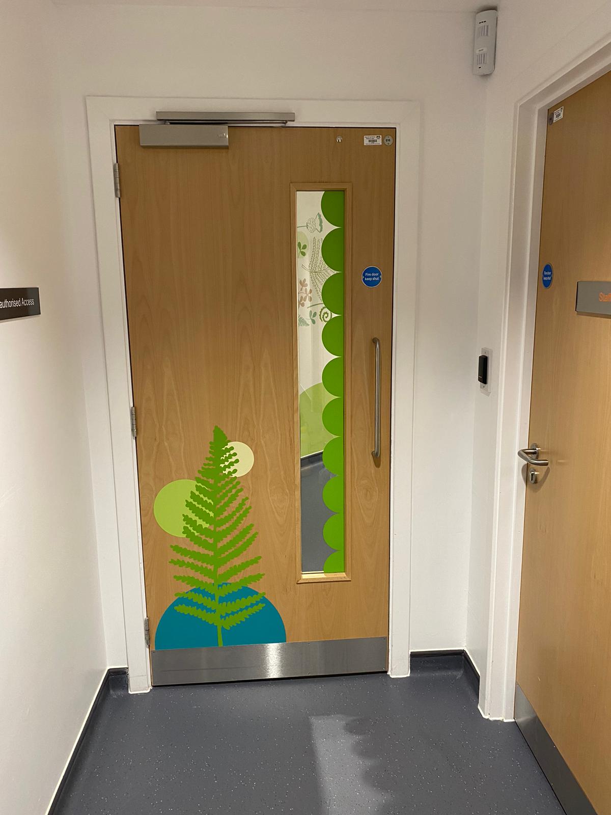
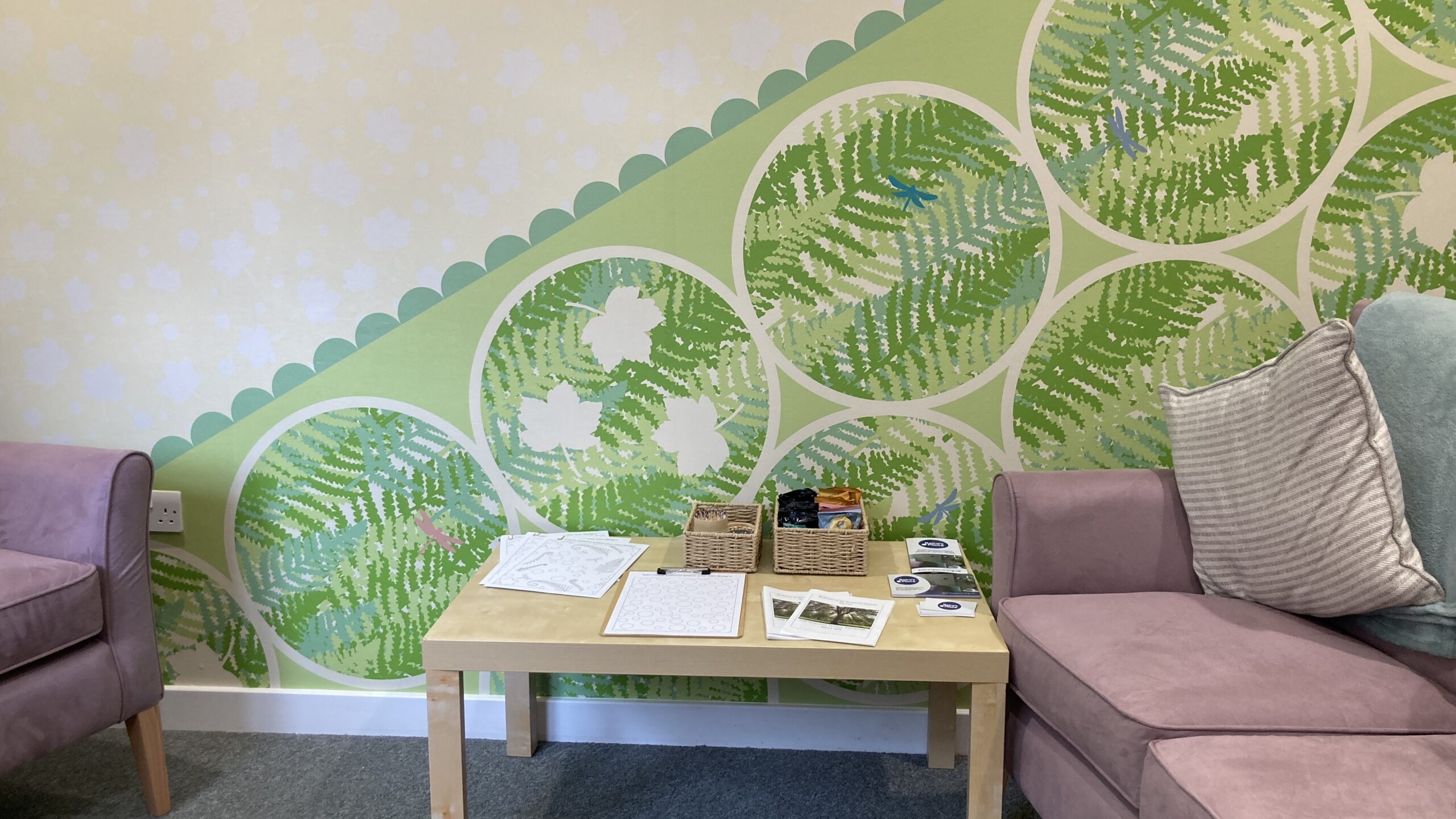
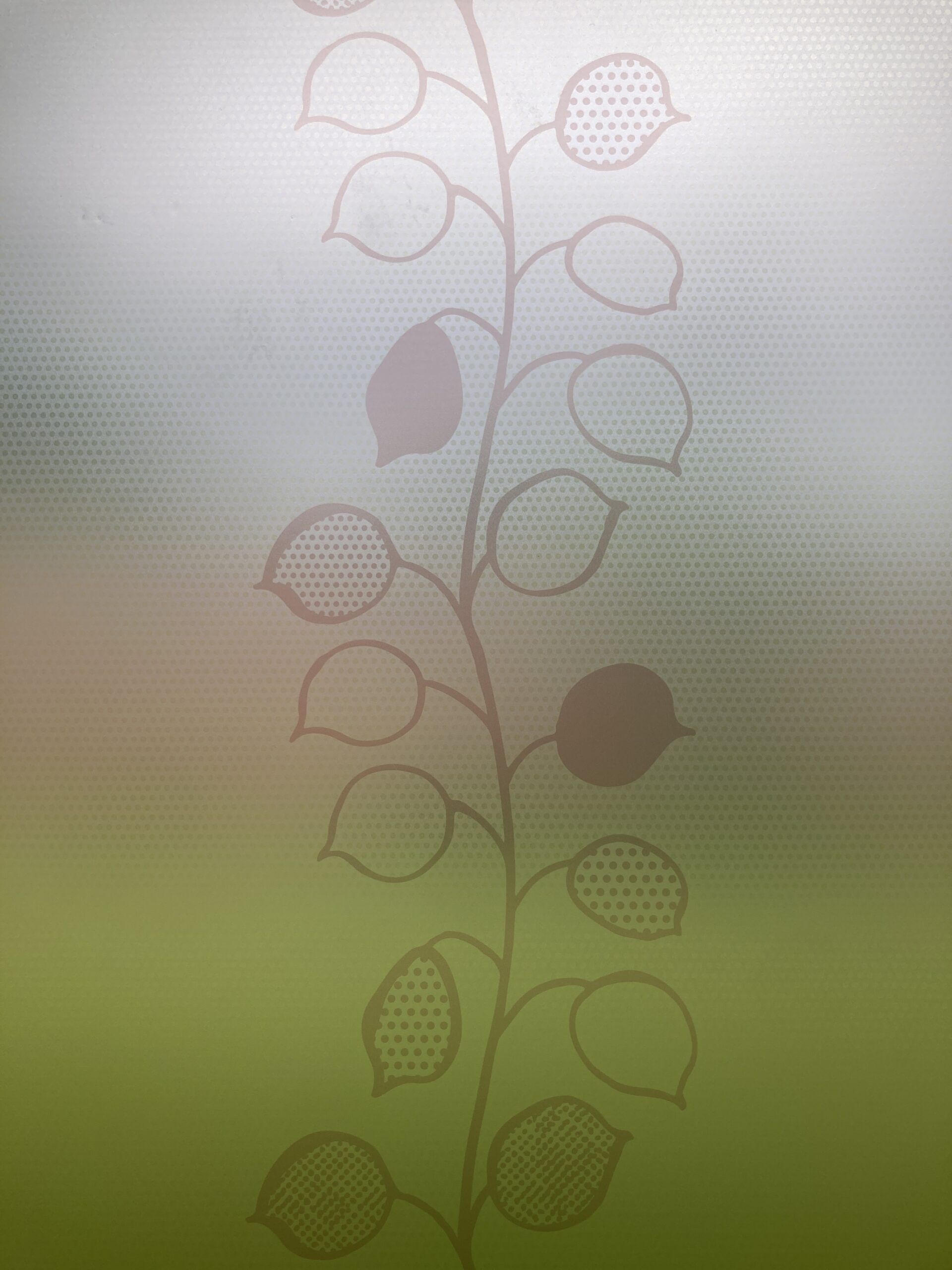
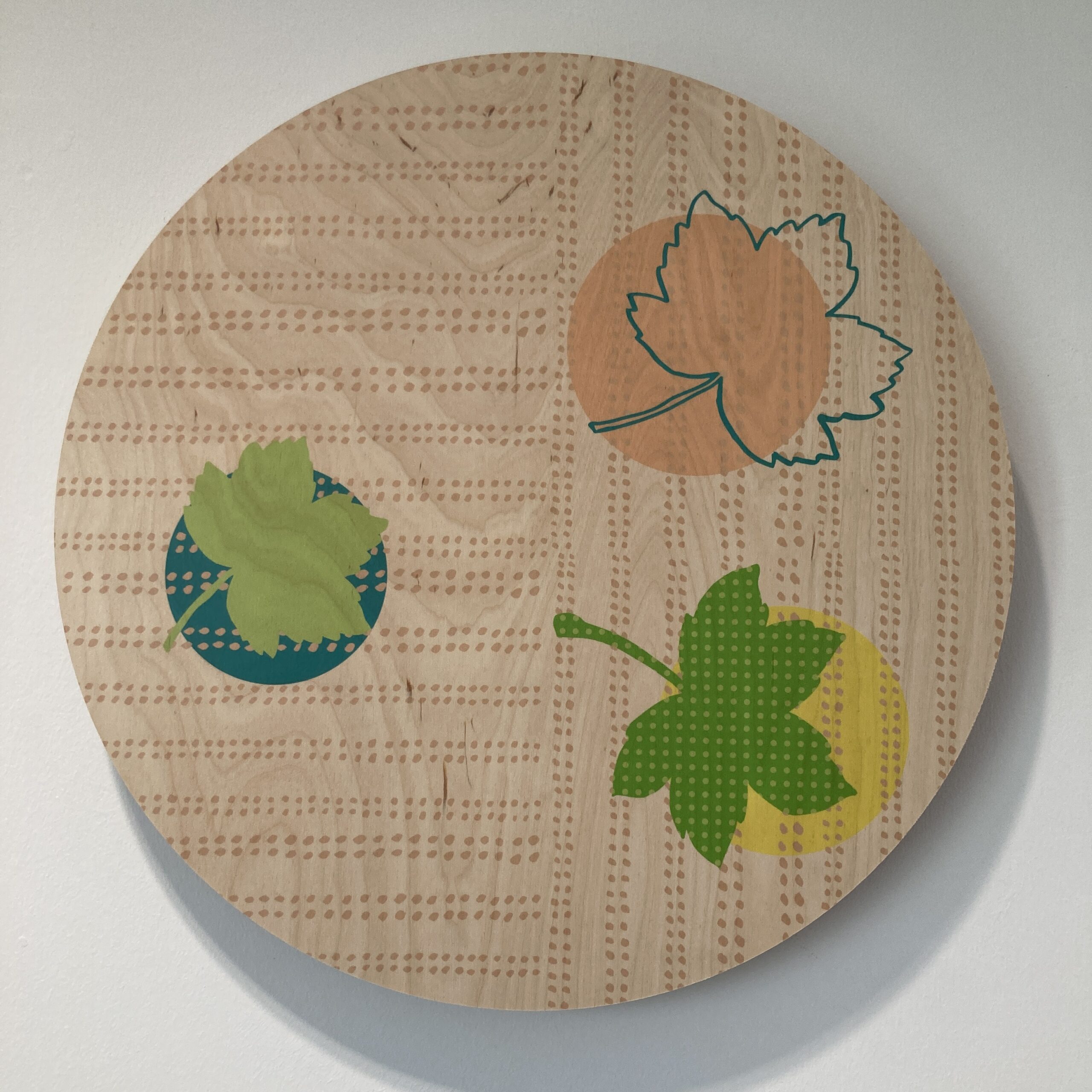
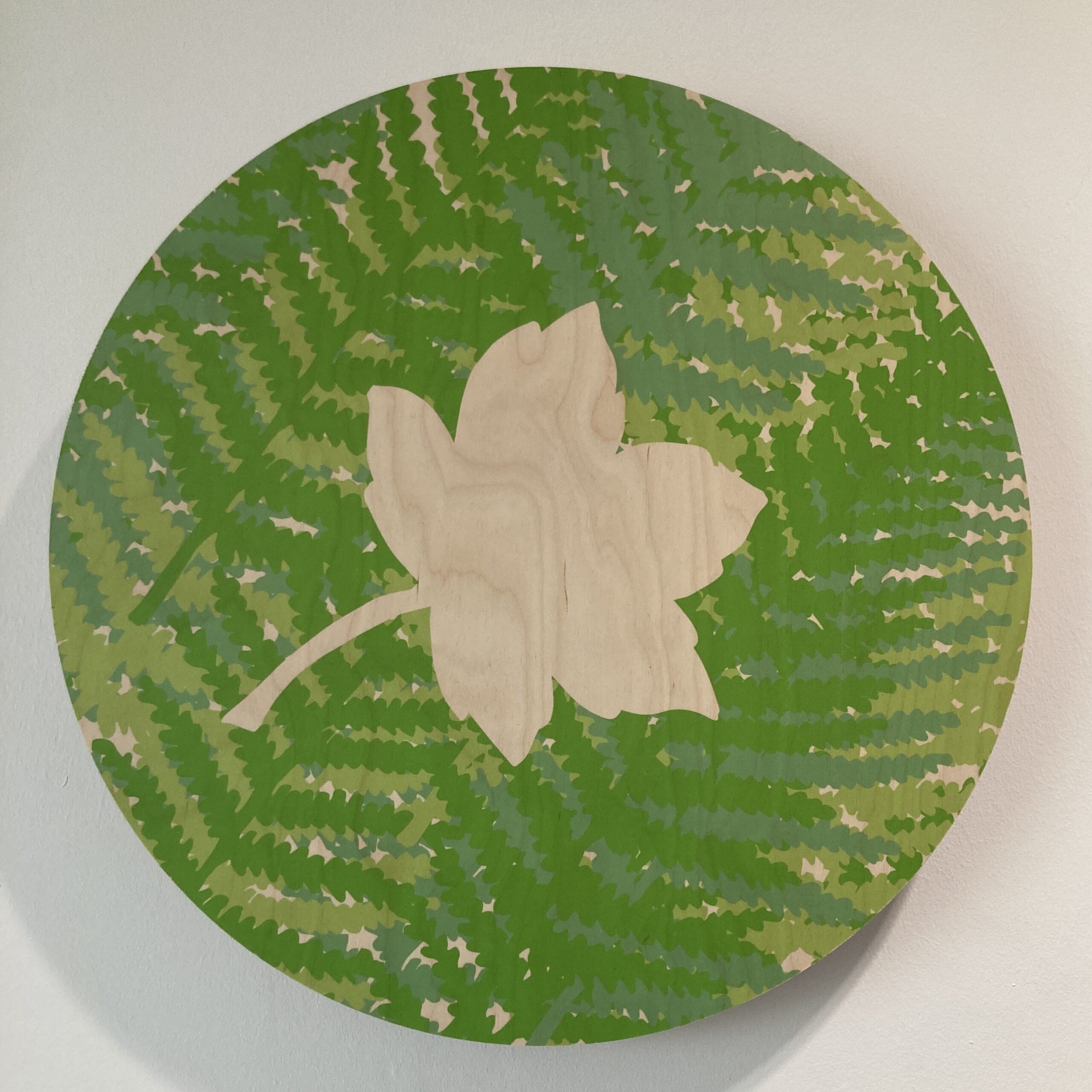
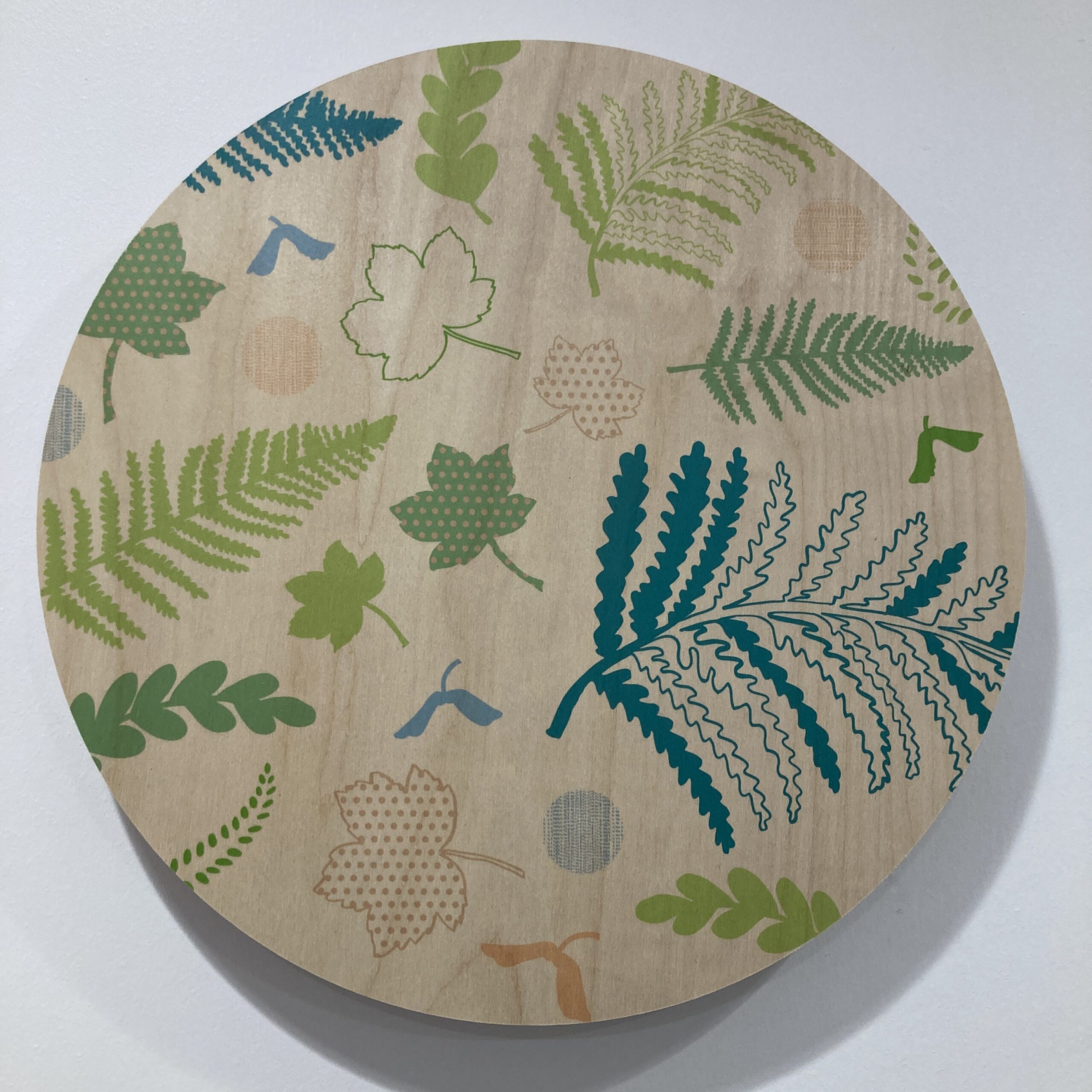
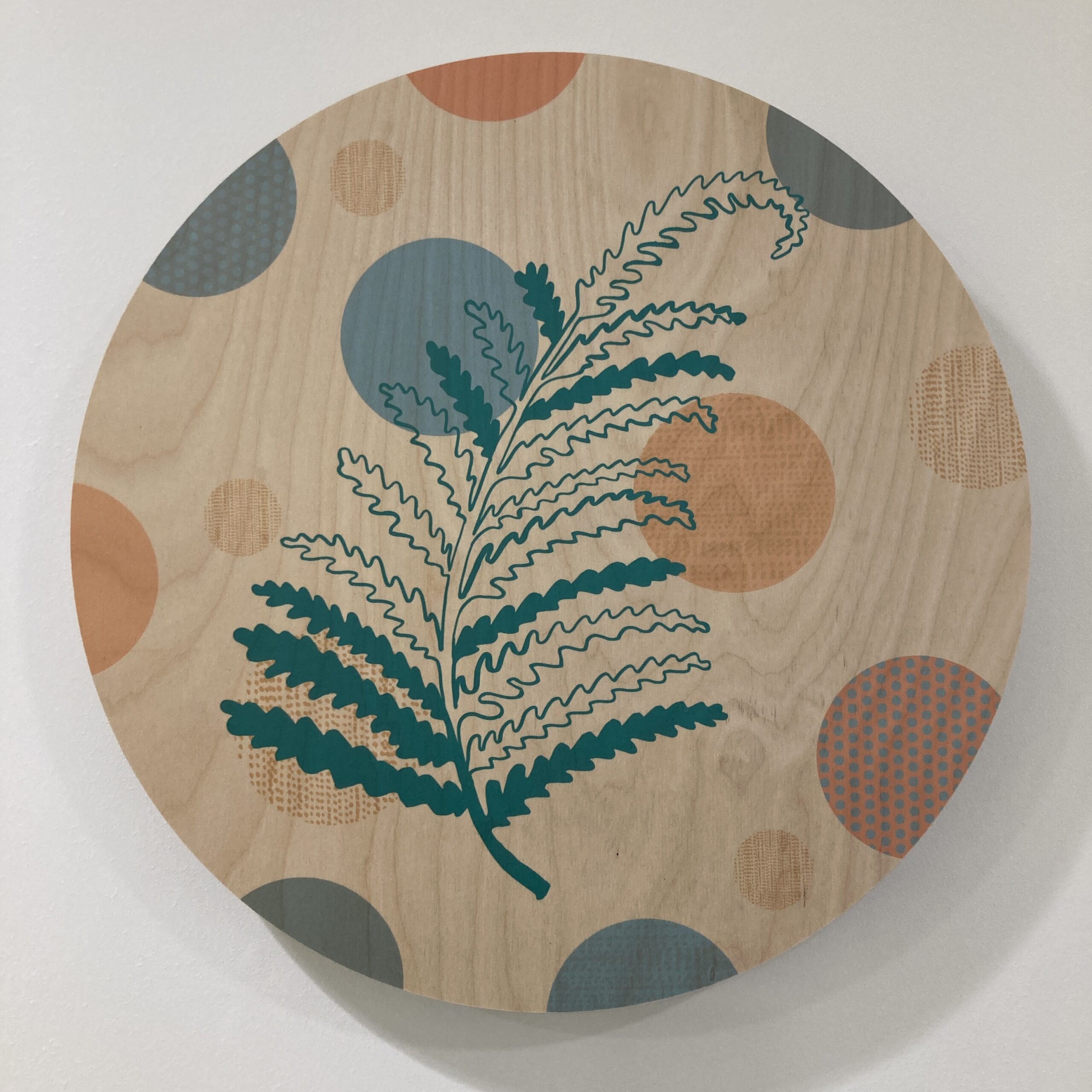
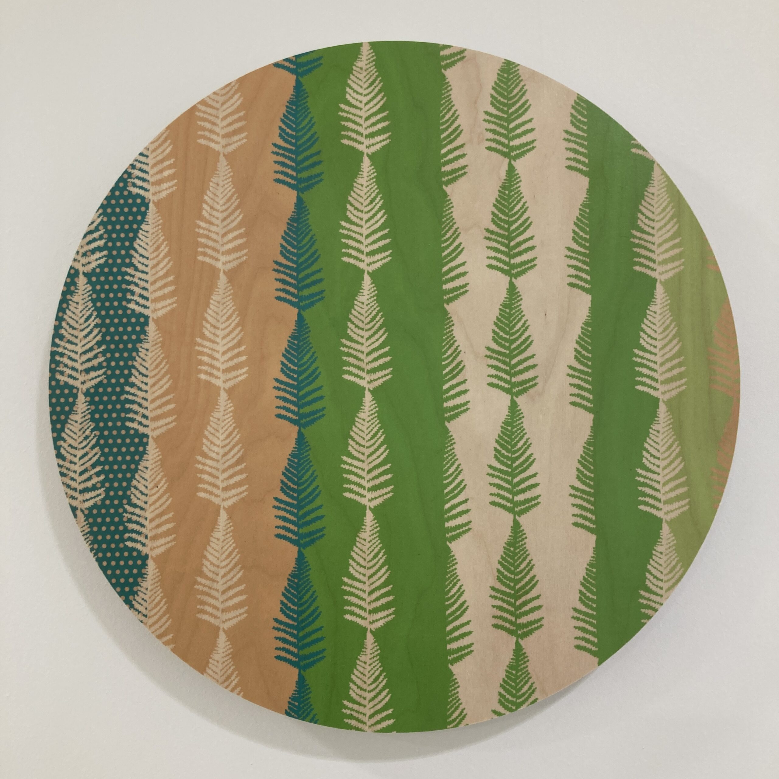
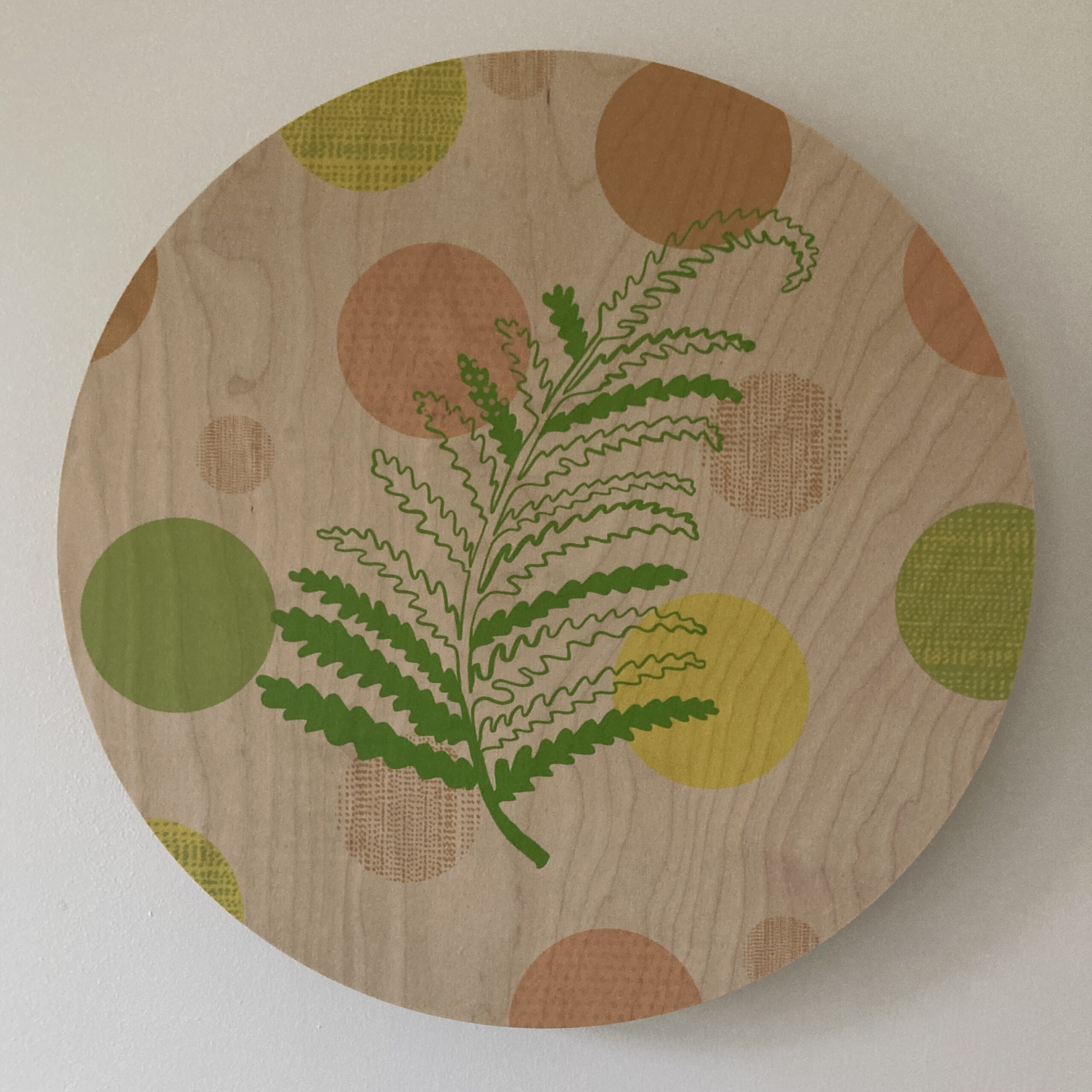
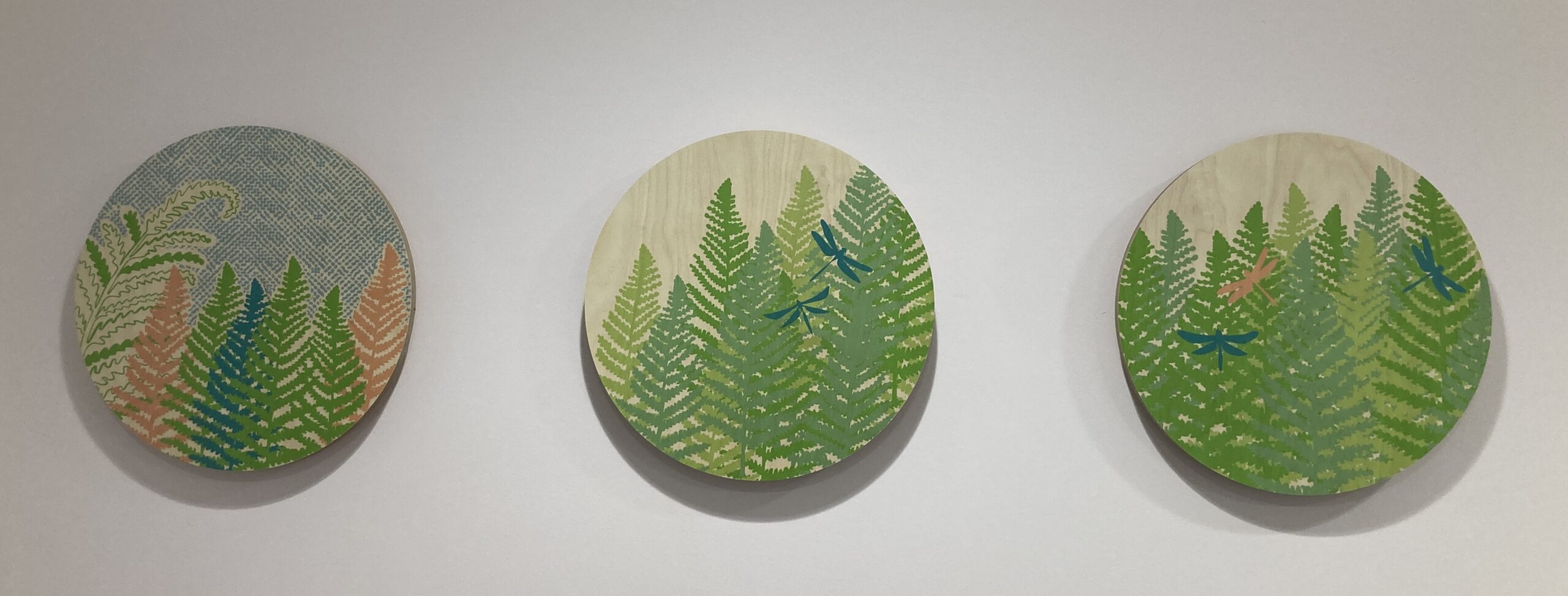
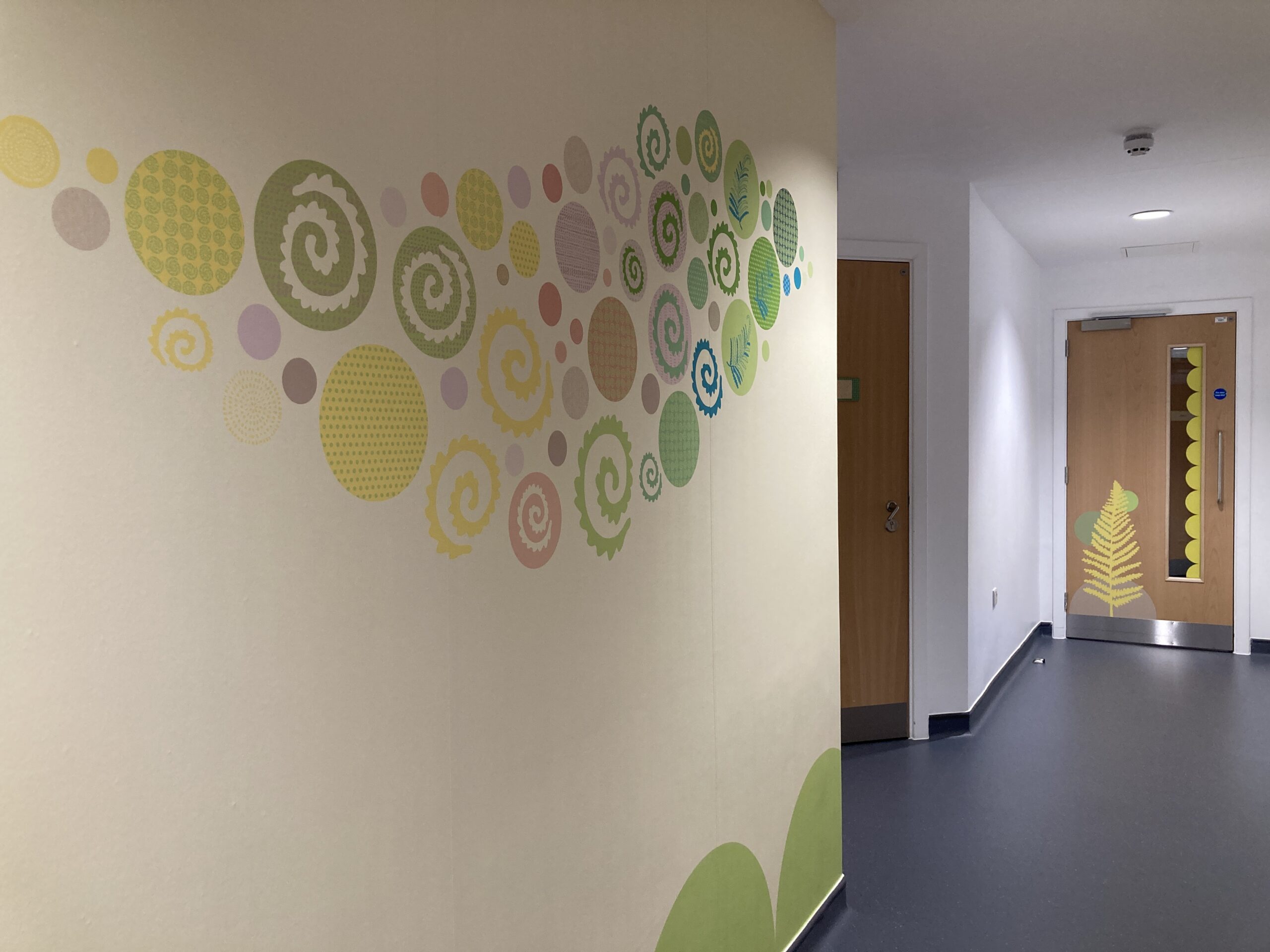
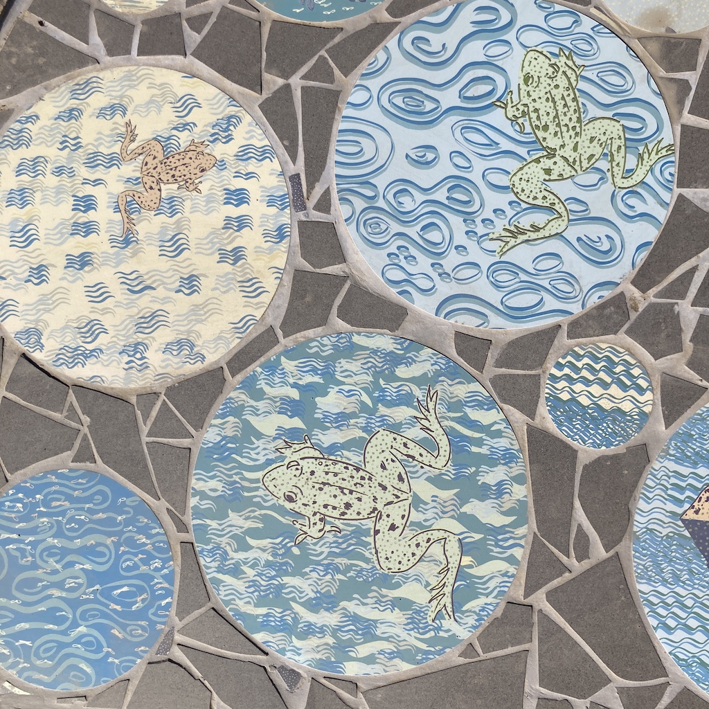
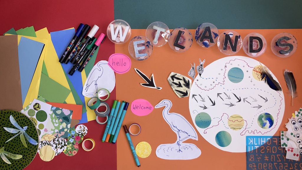
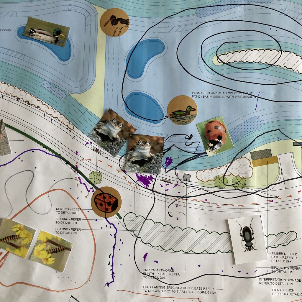
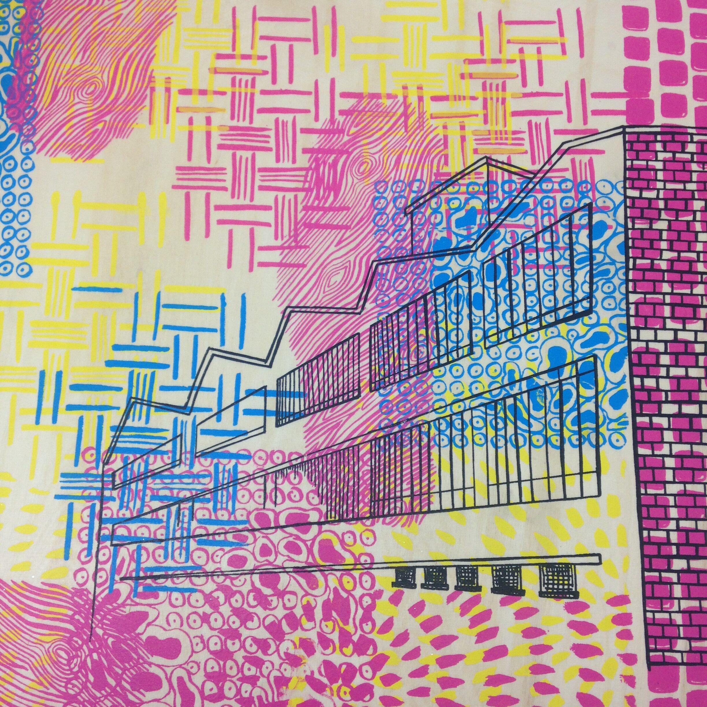
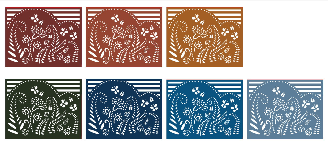
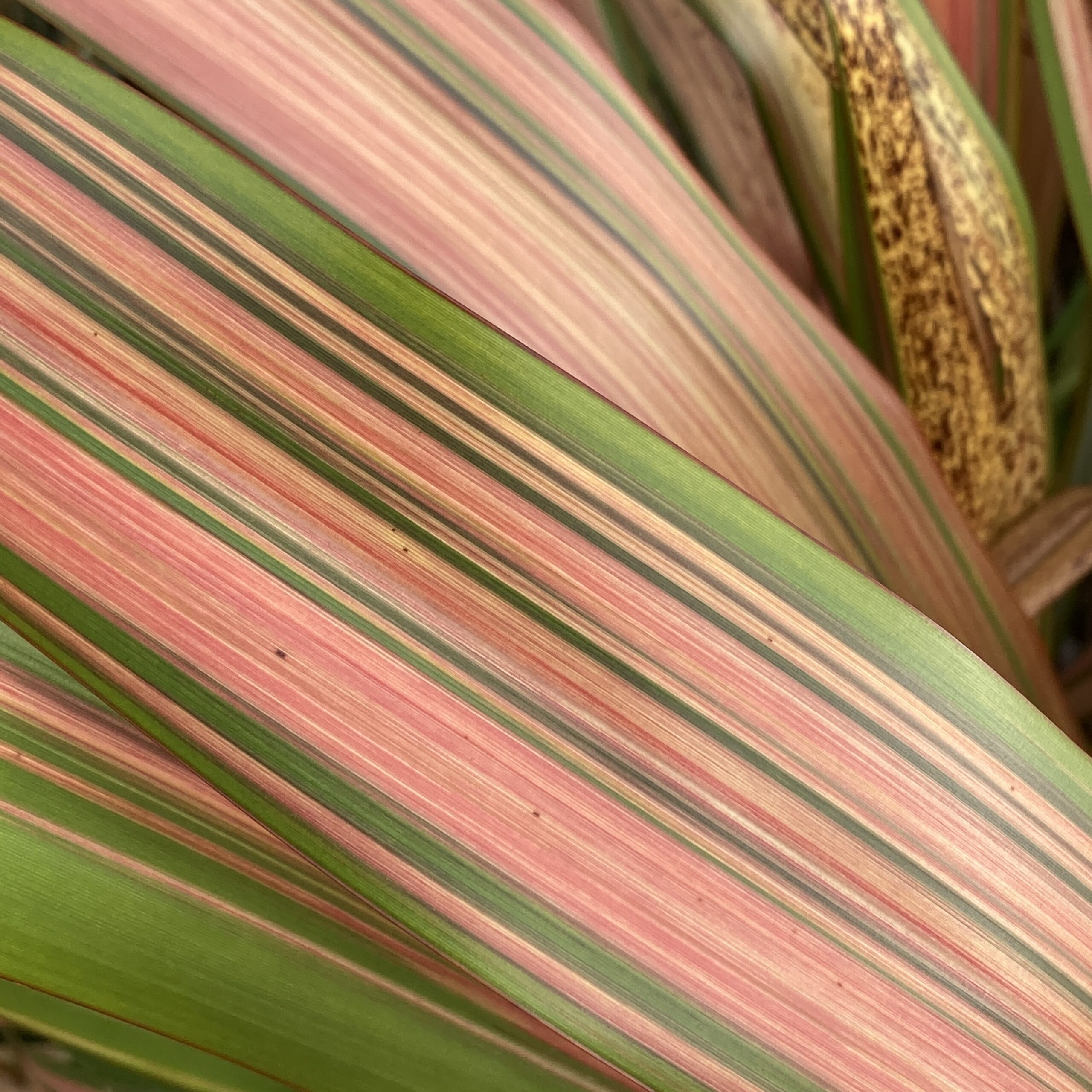
Window Design
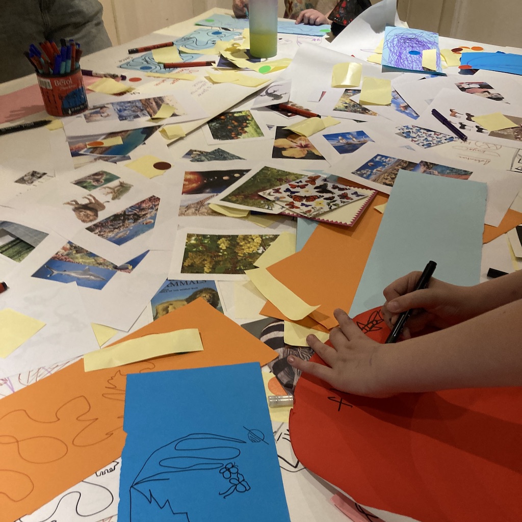
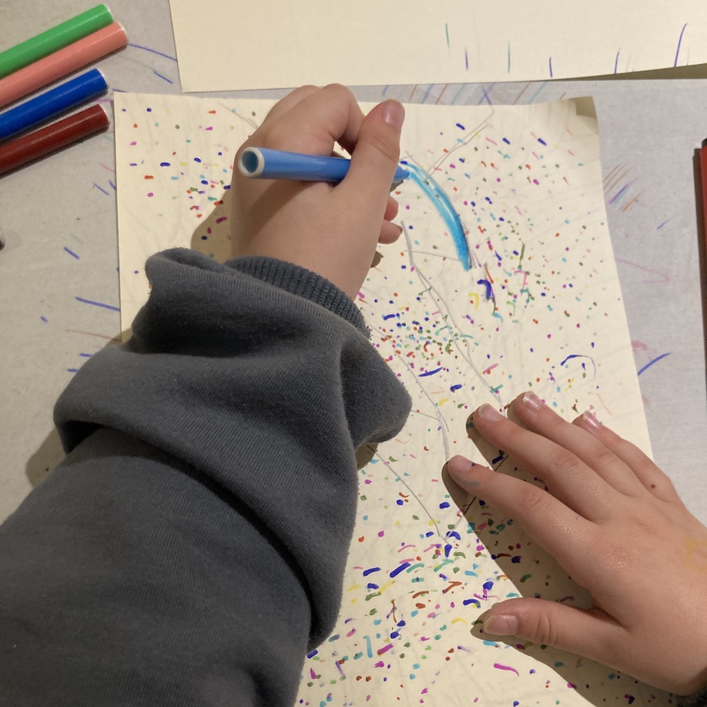
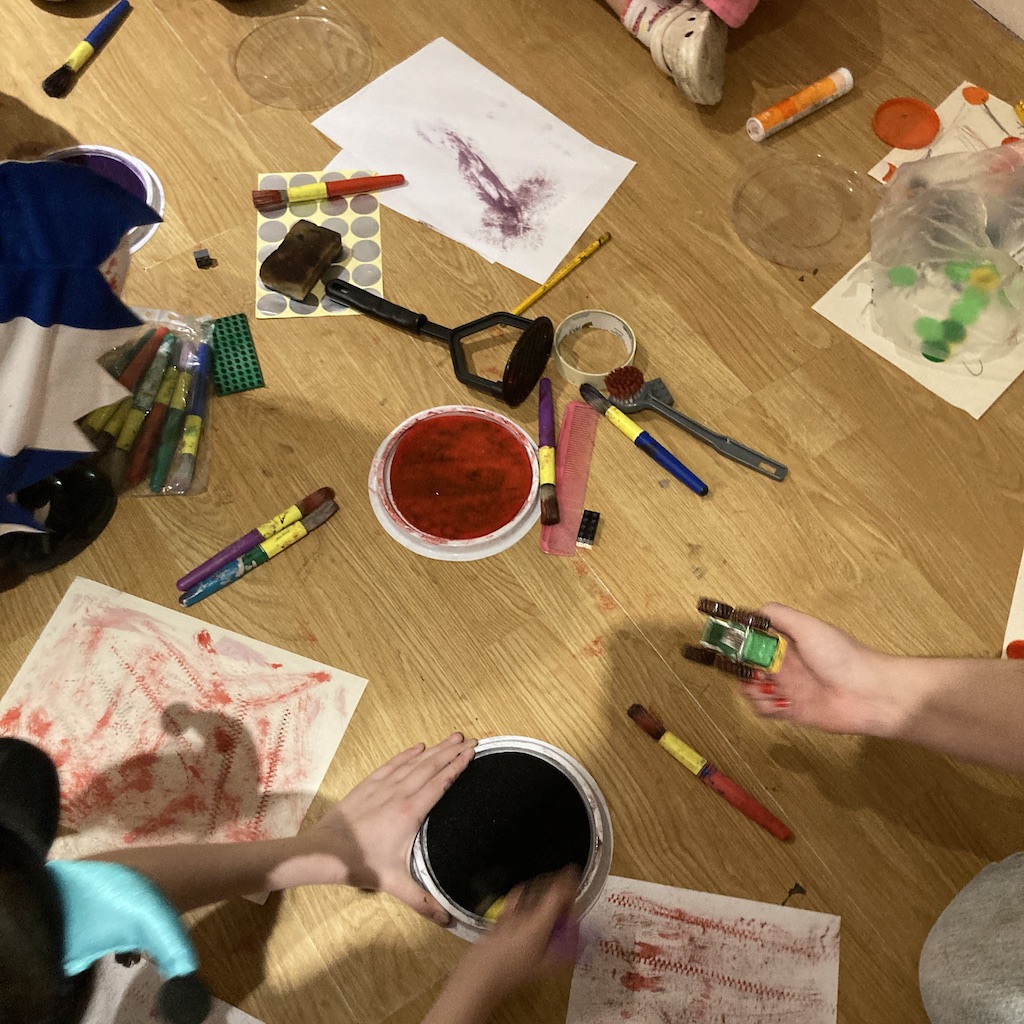
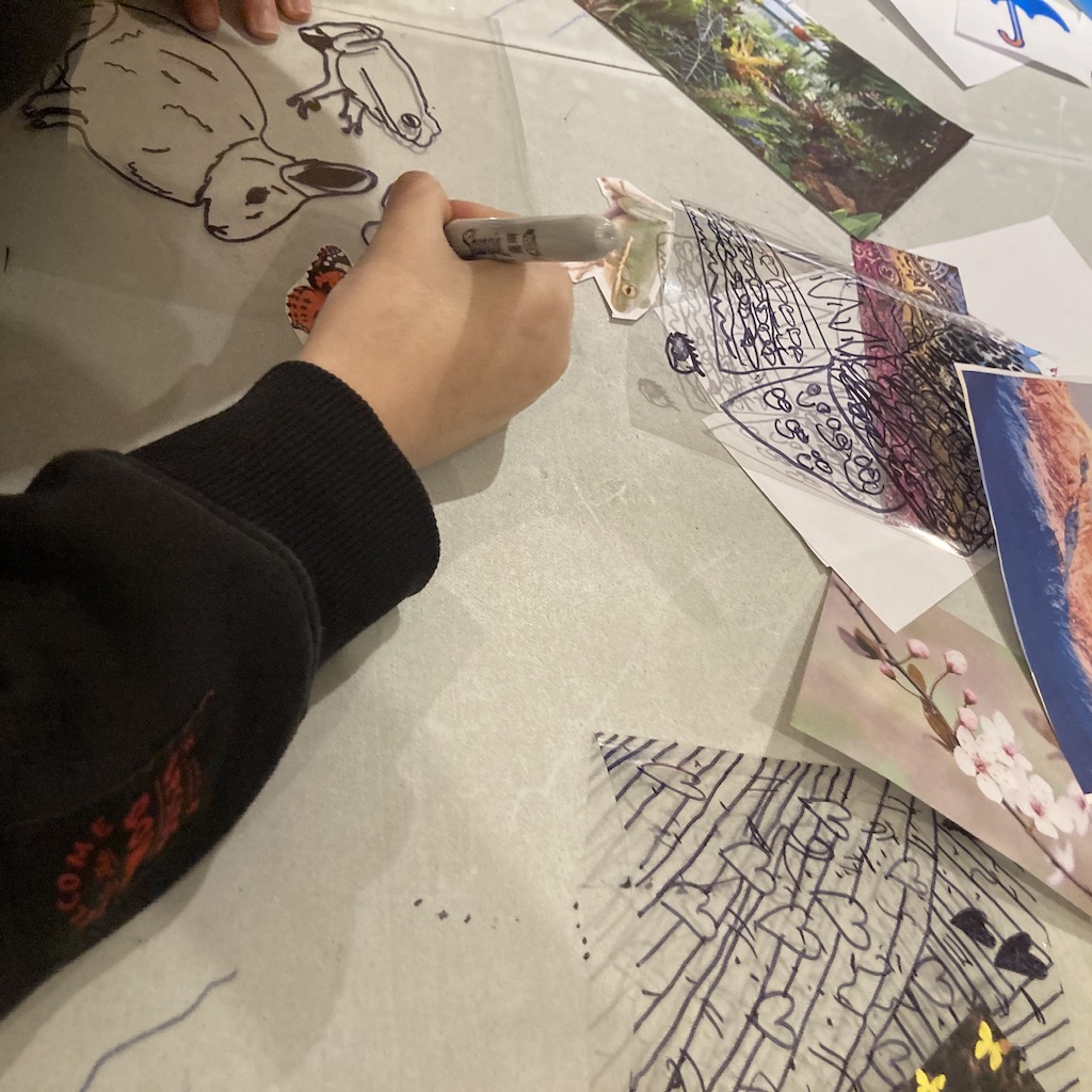
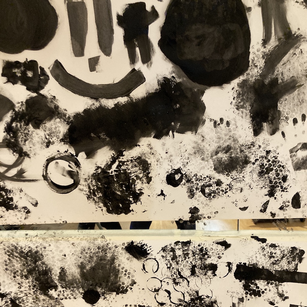
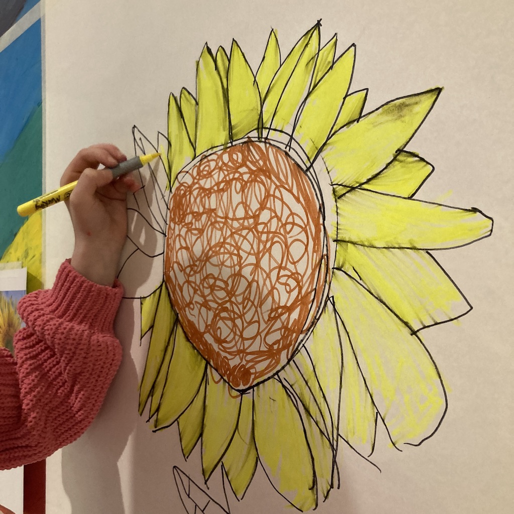
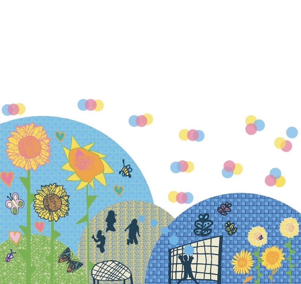
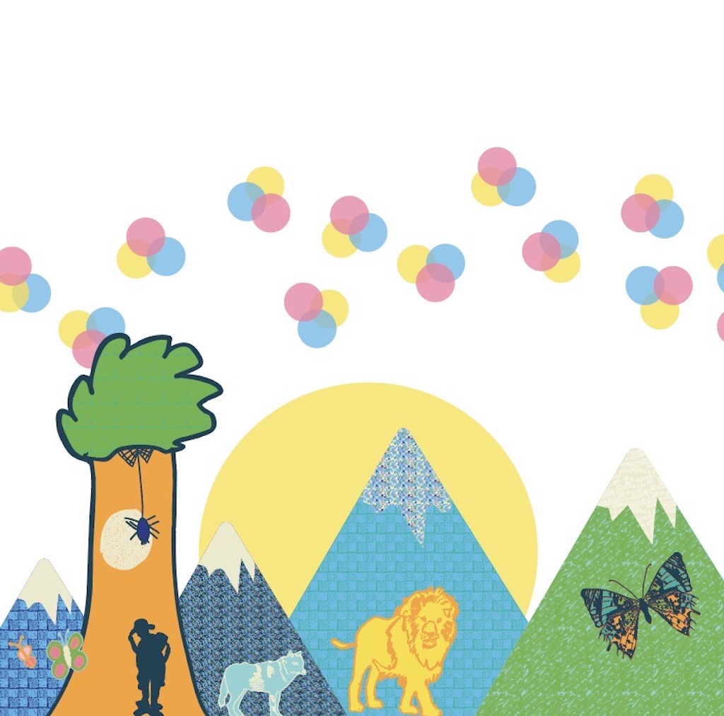
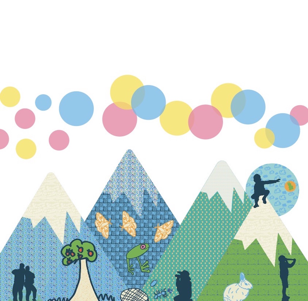
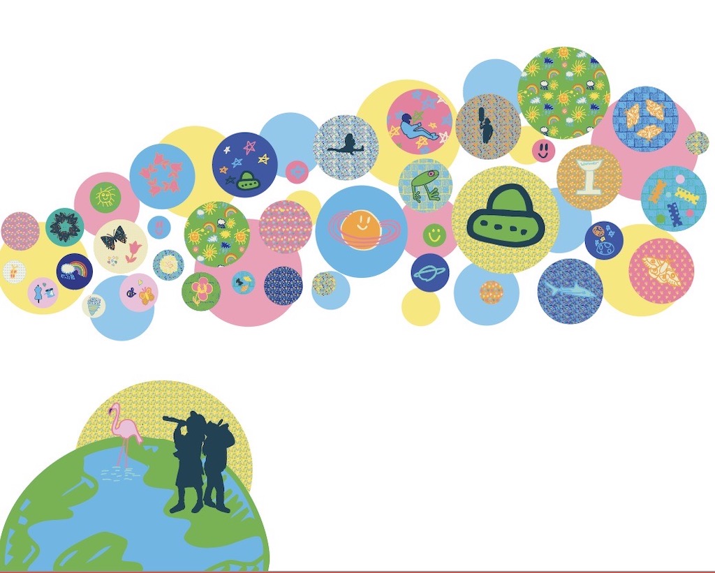
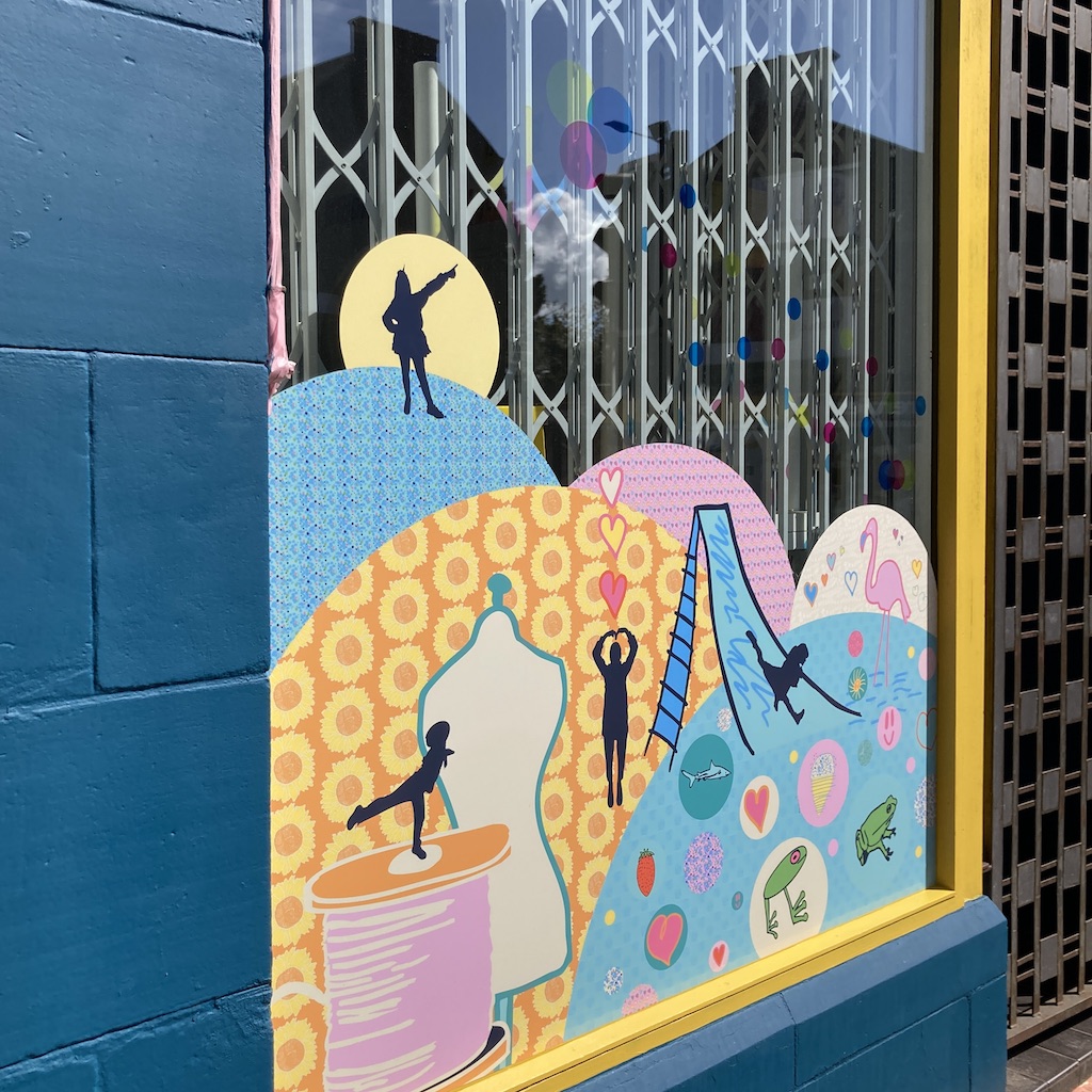
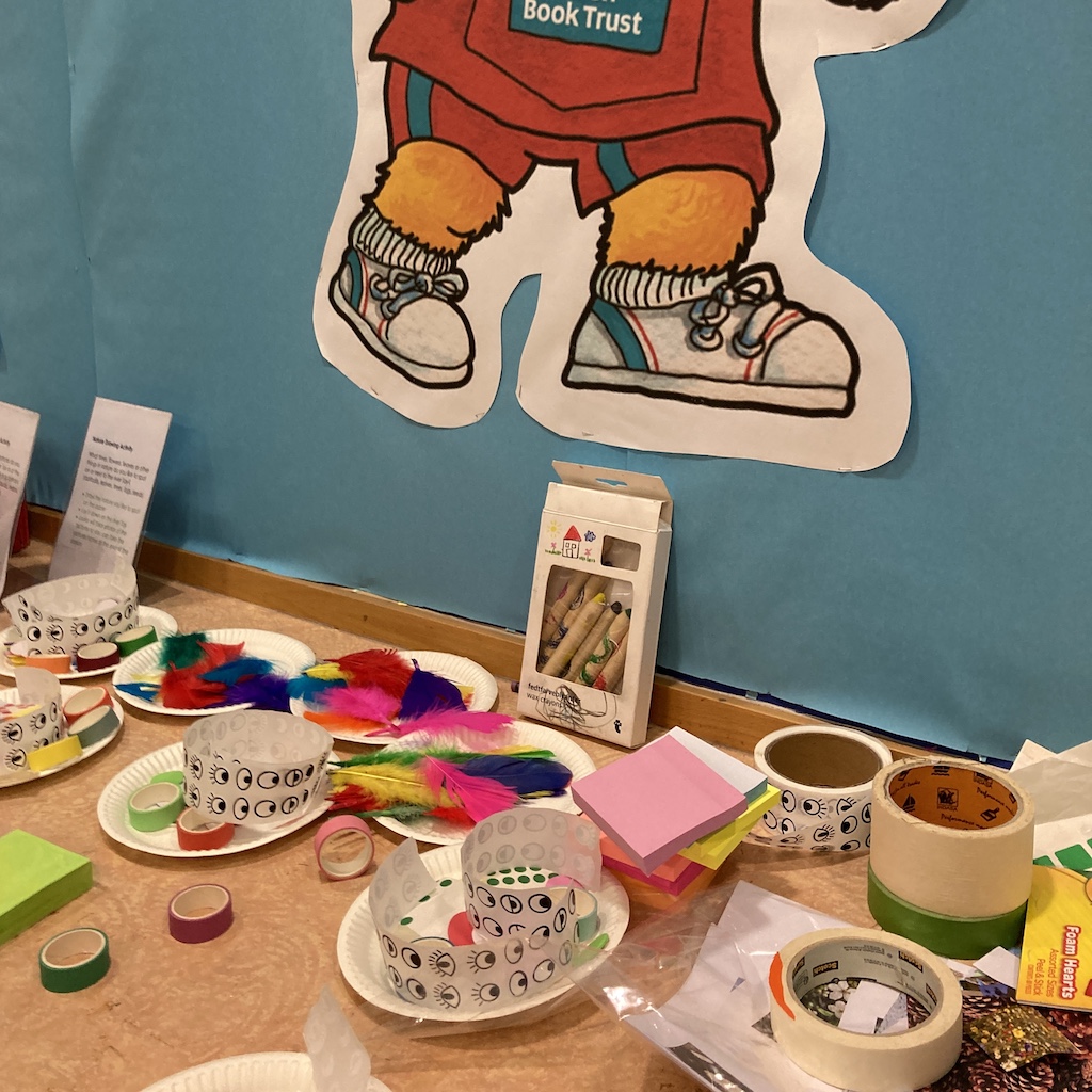
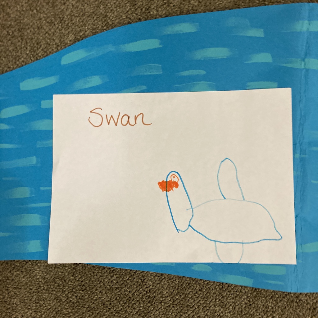
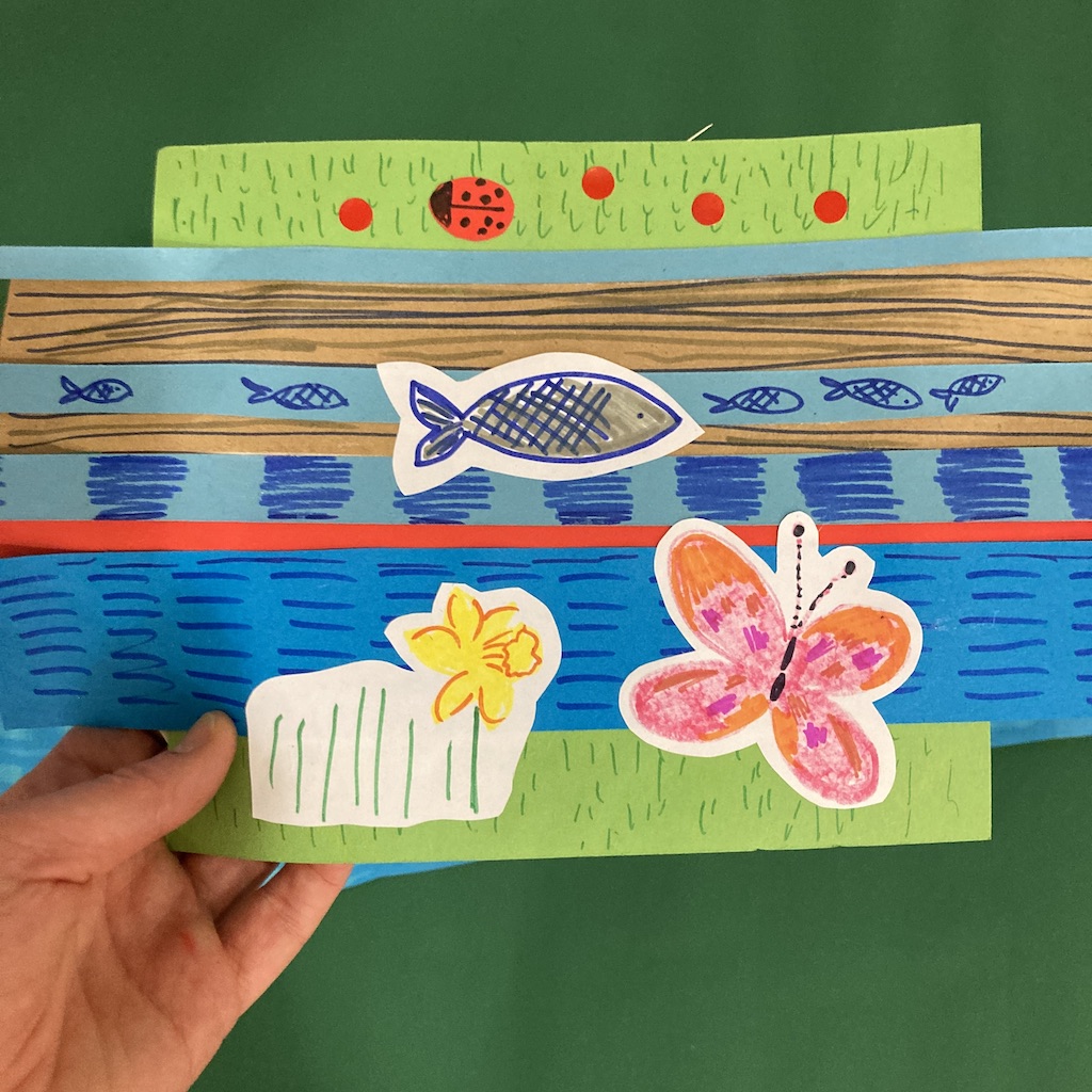
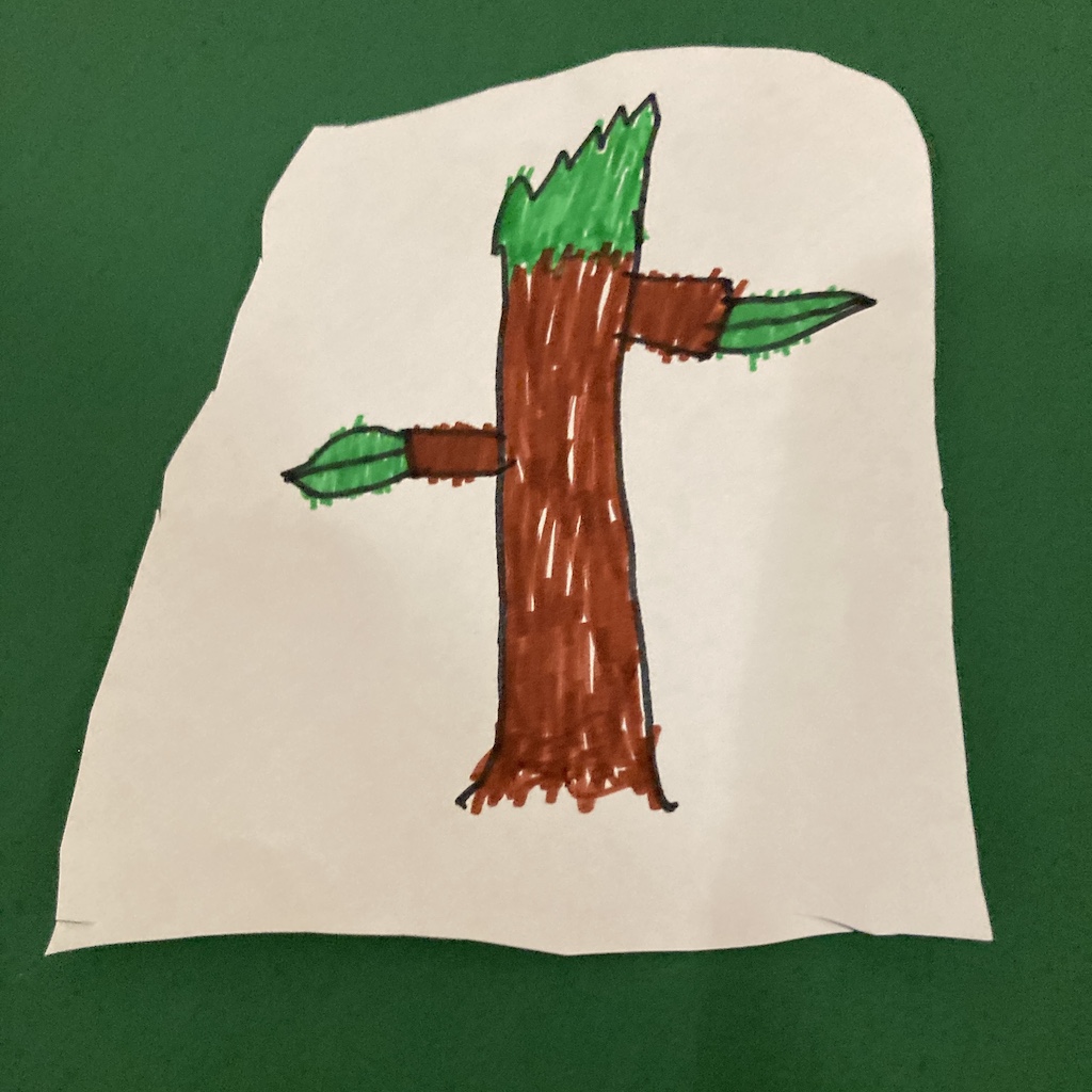
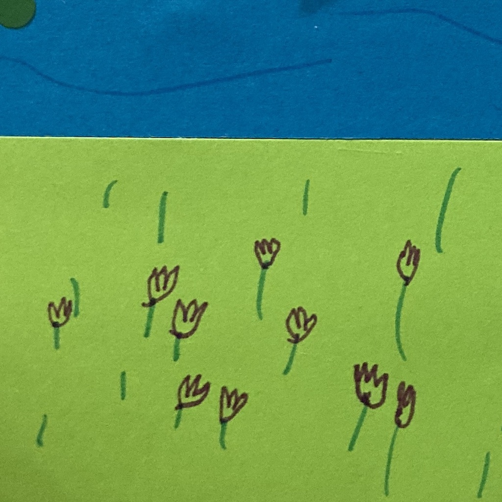
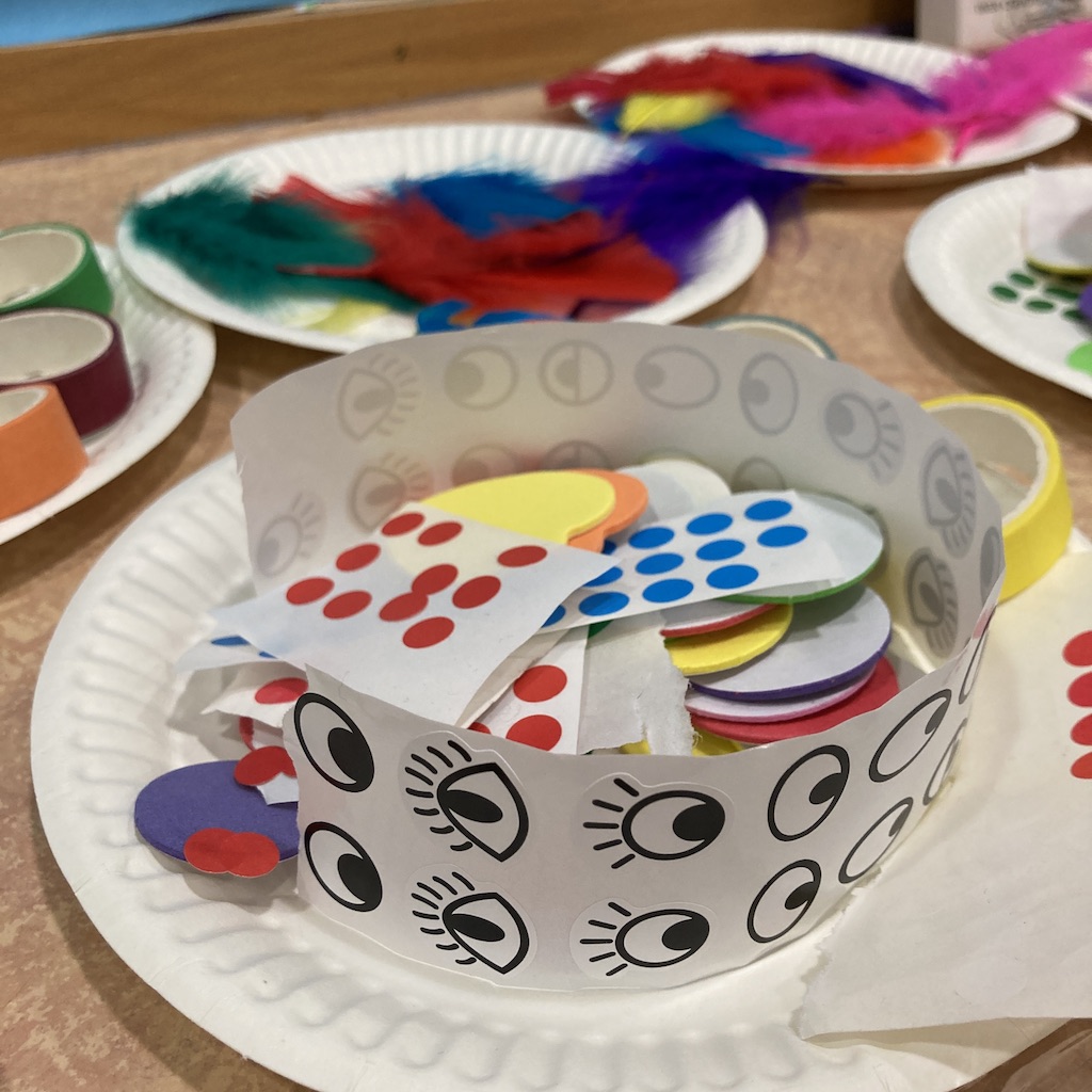
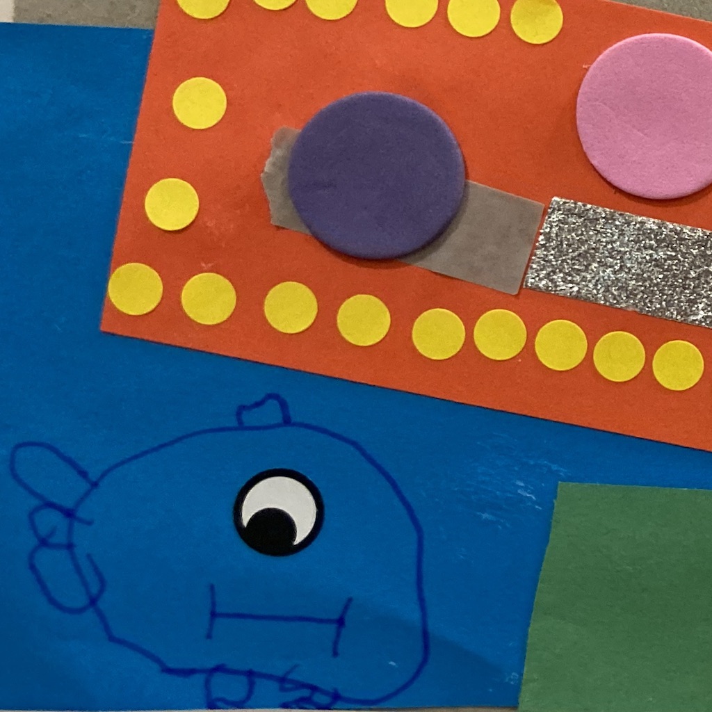
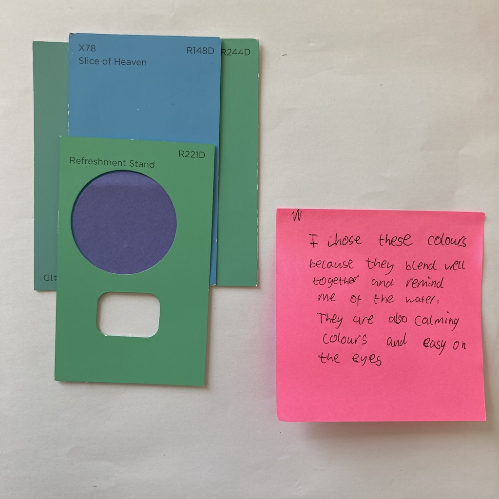
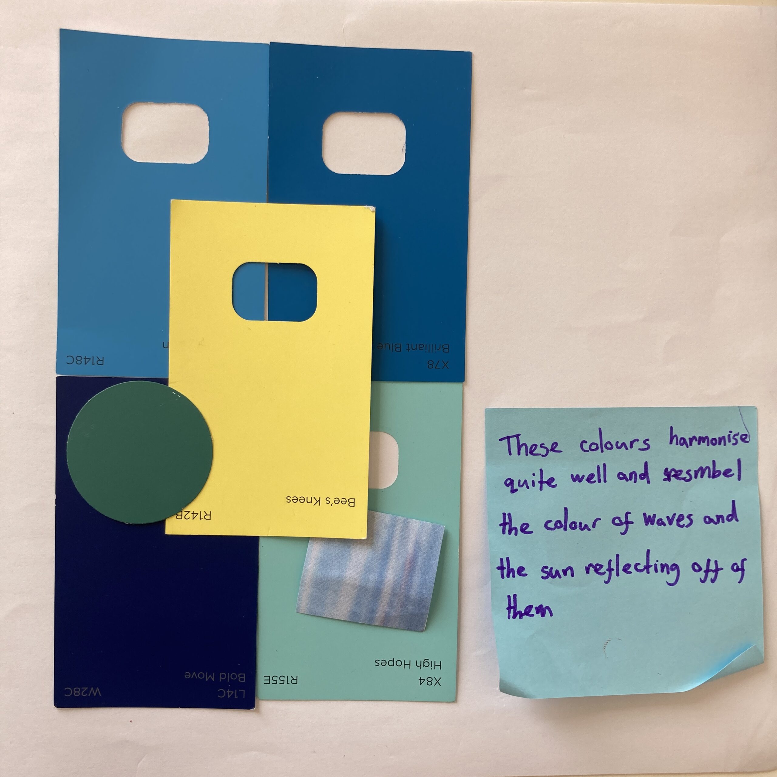
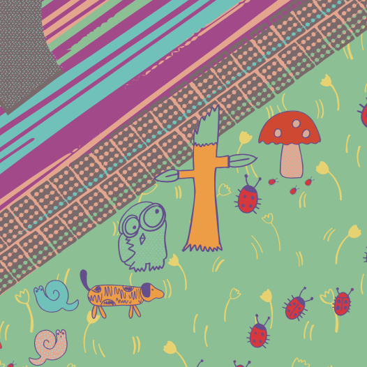
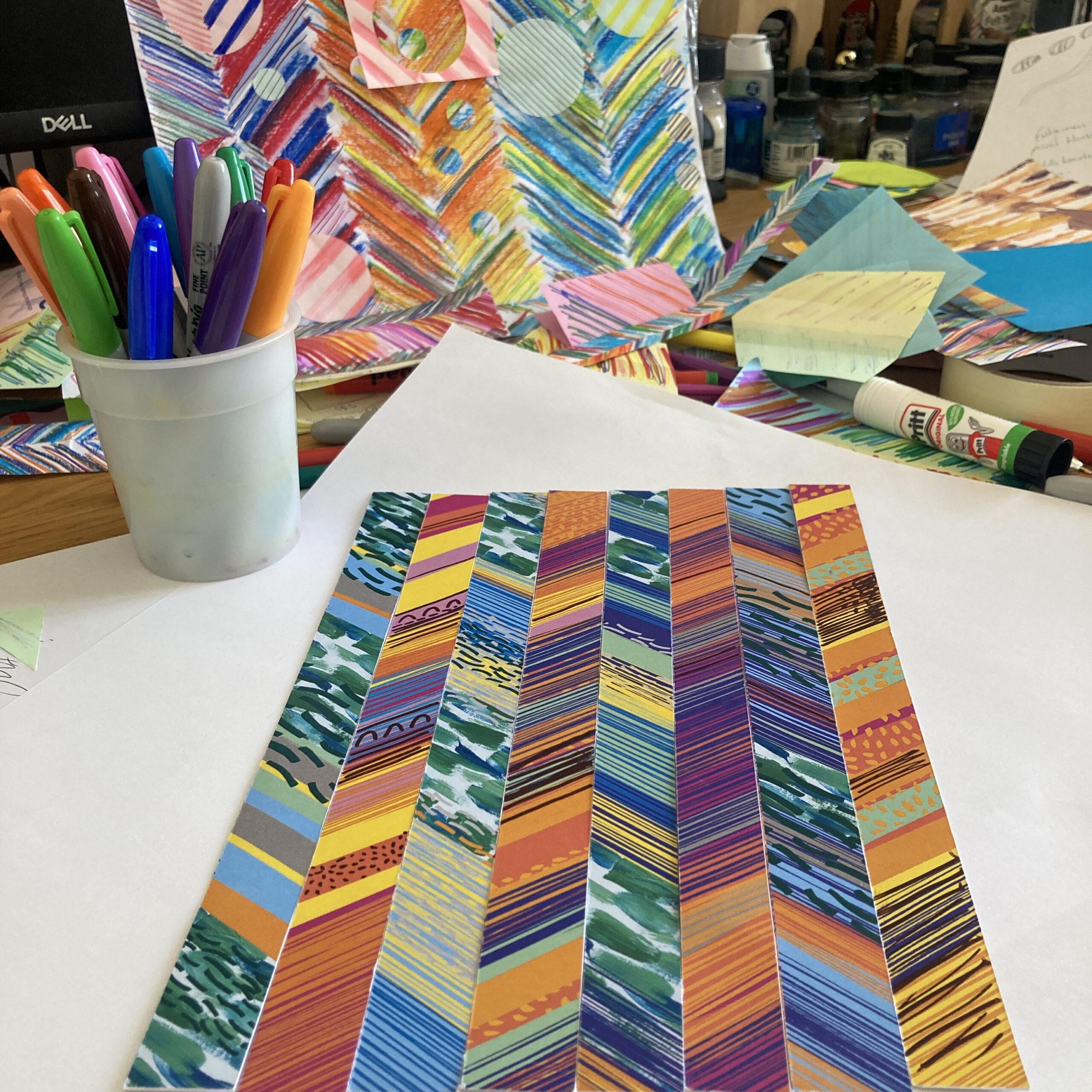
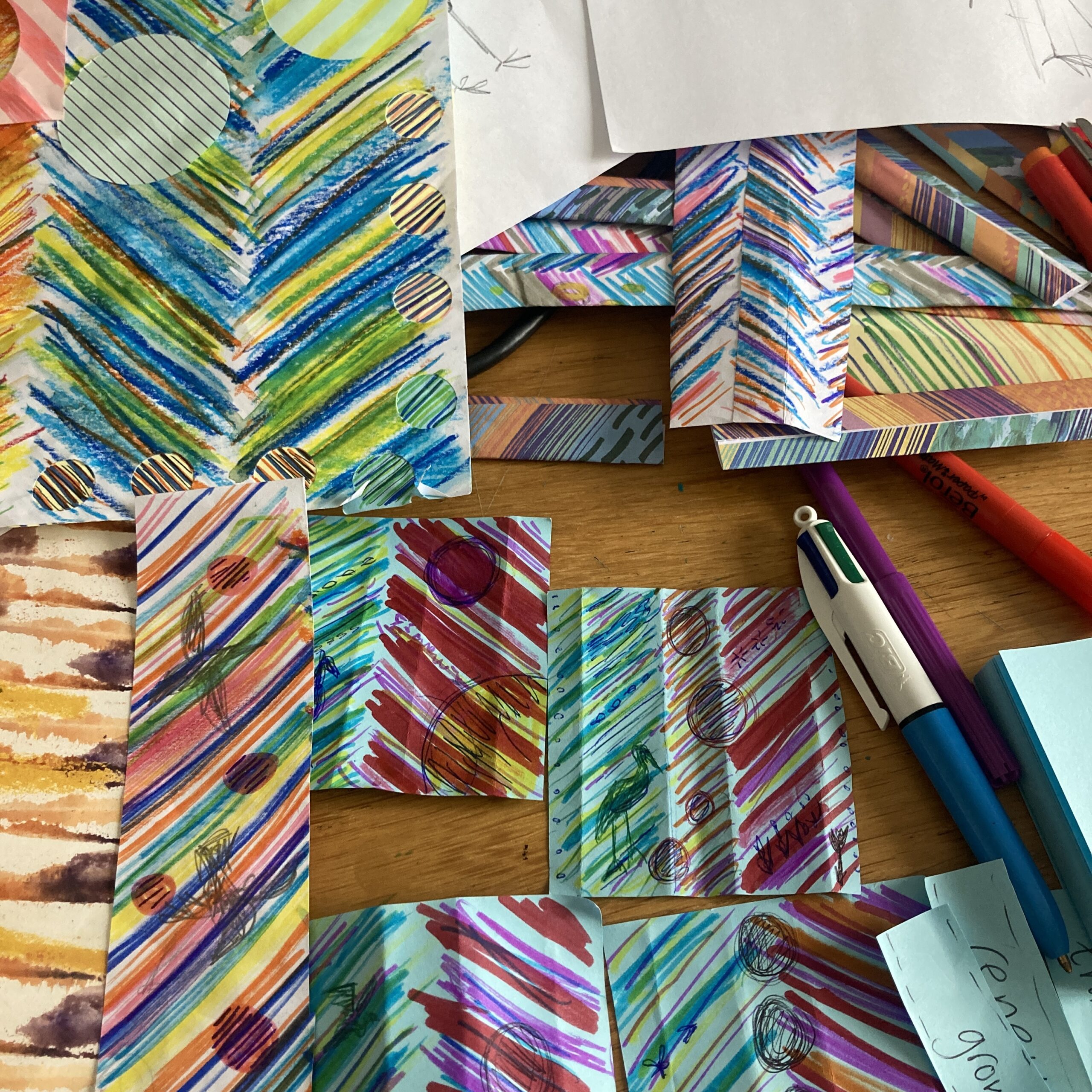
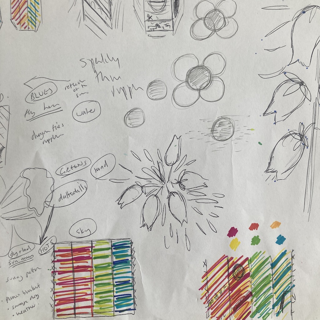
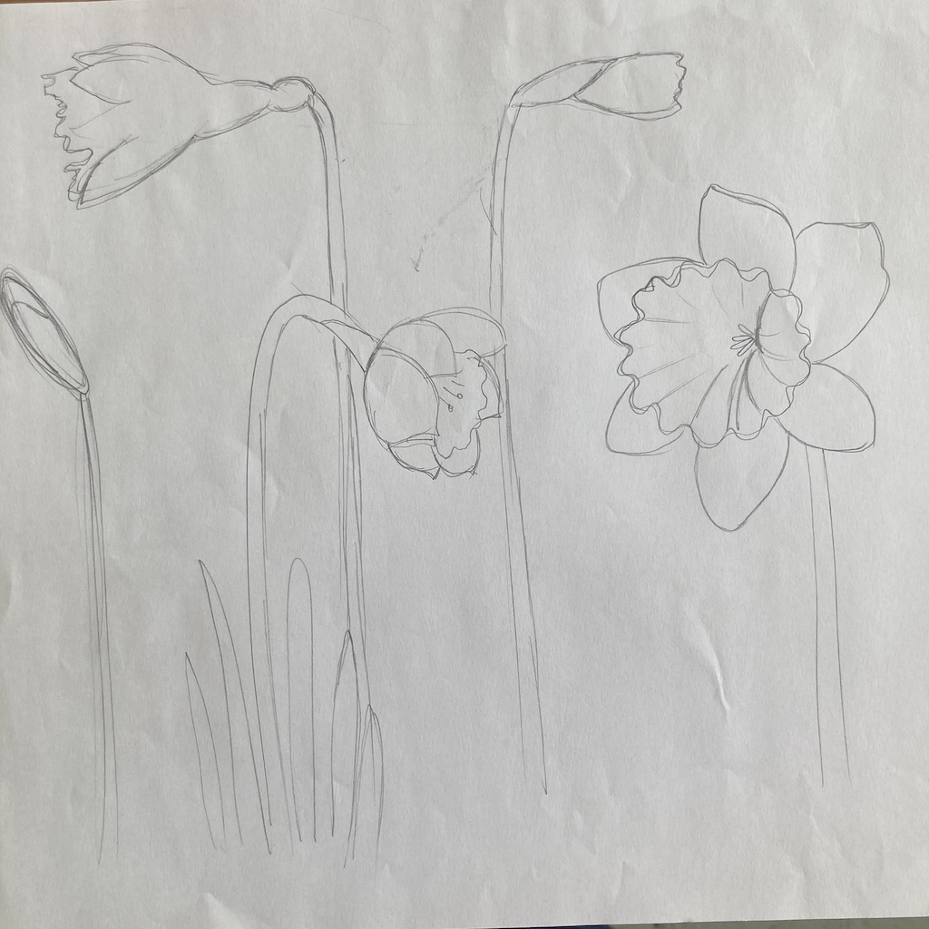
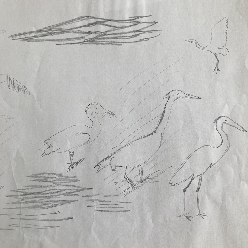
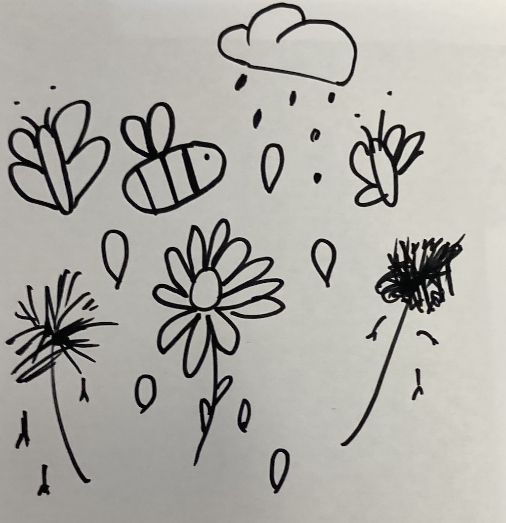
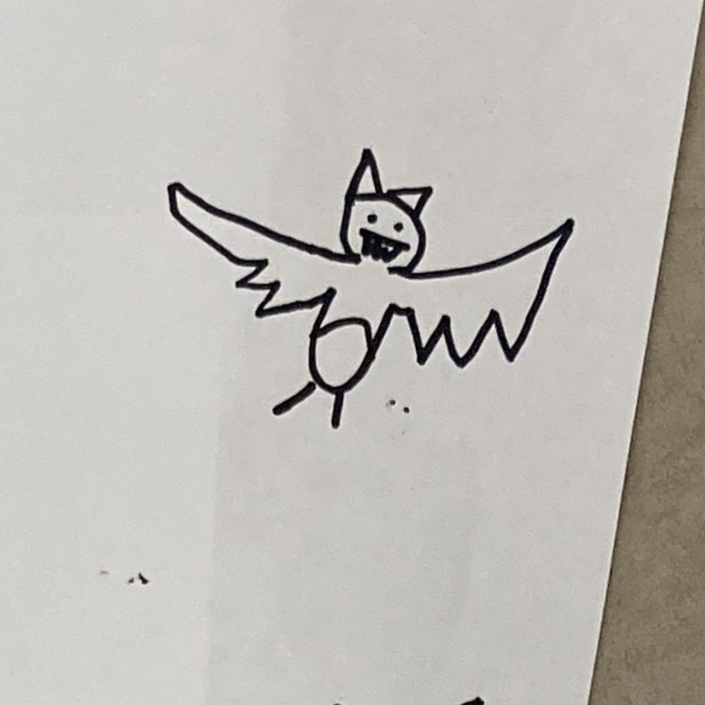
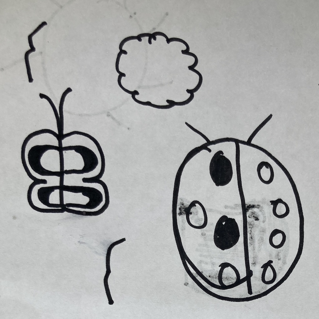
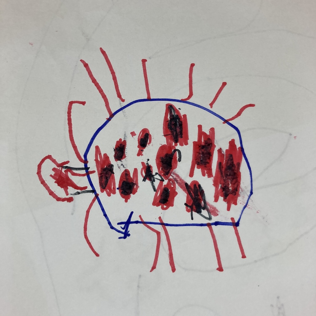
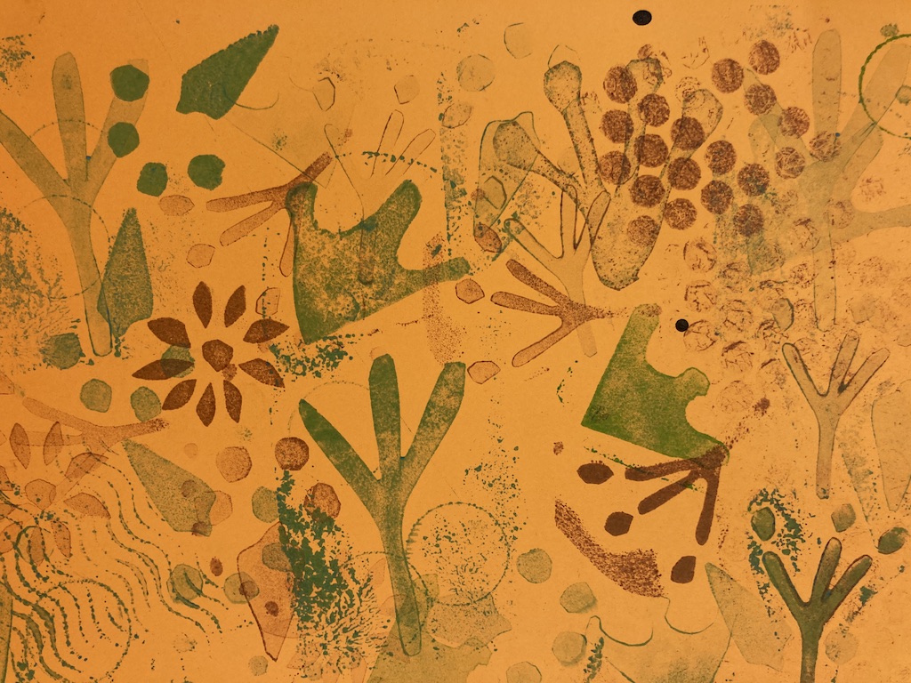
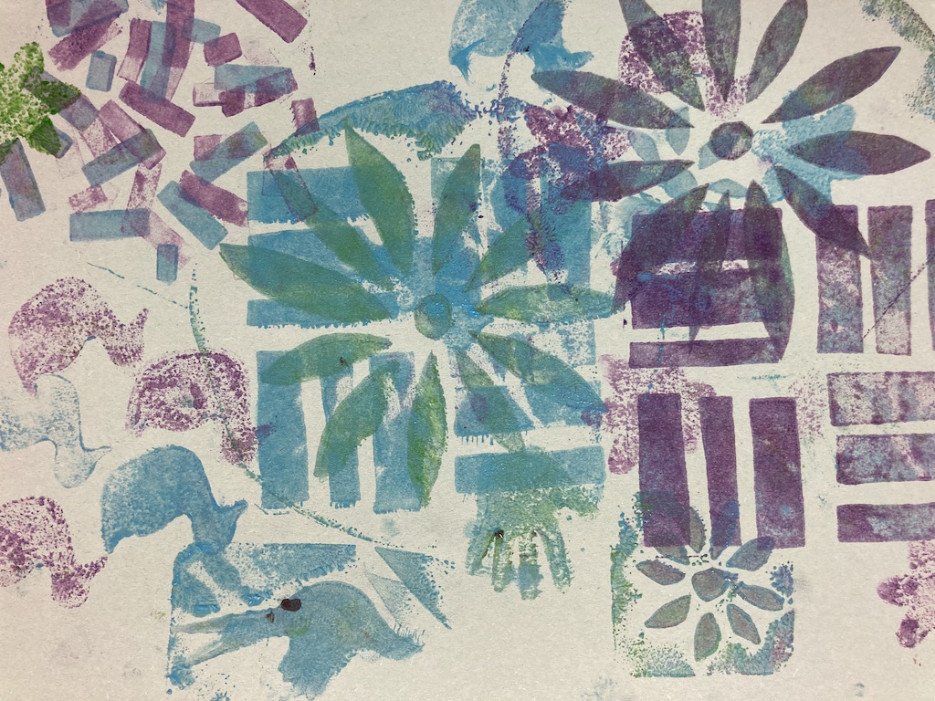
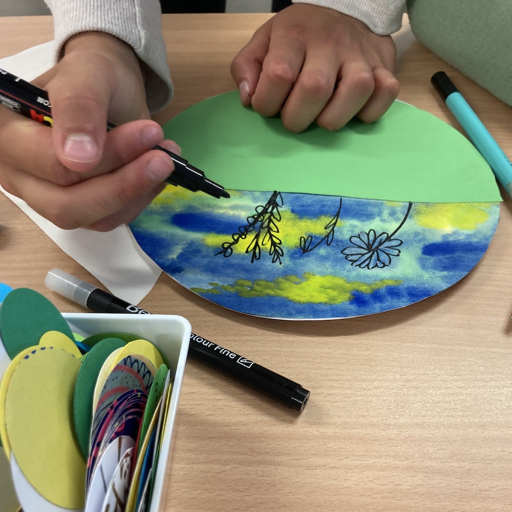
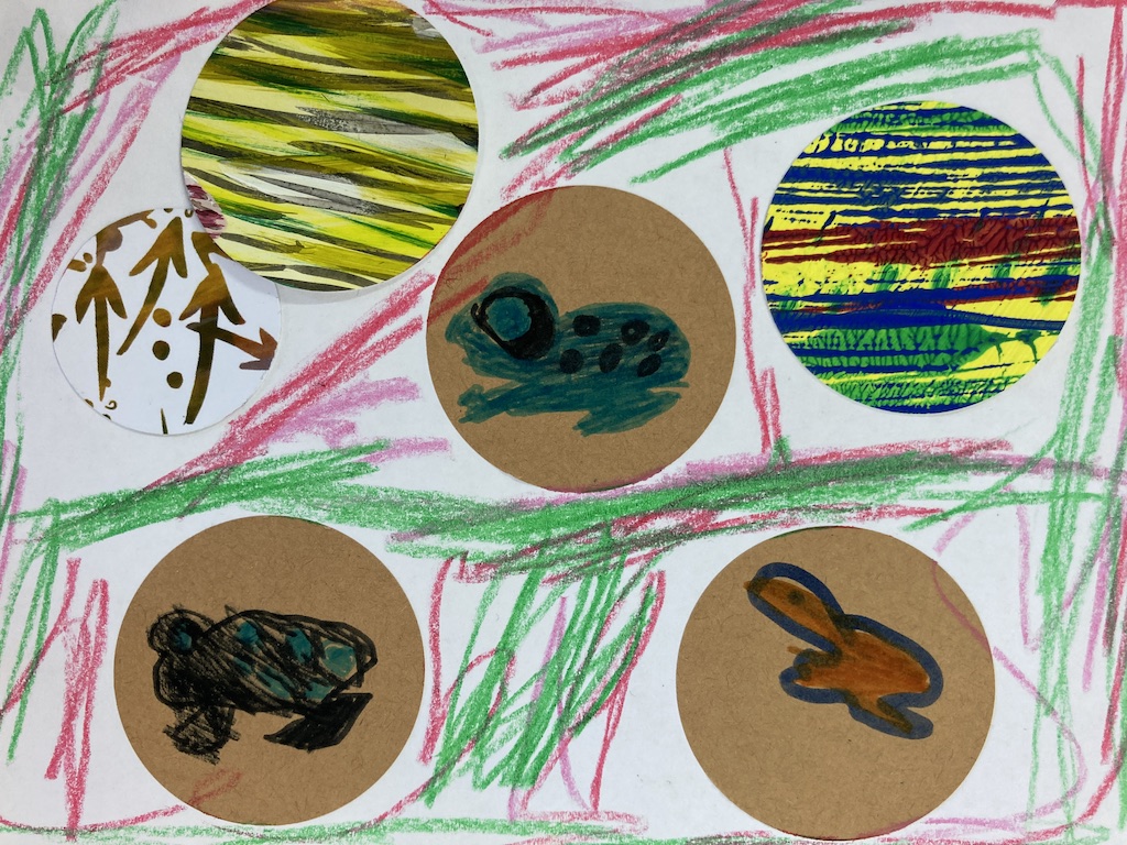
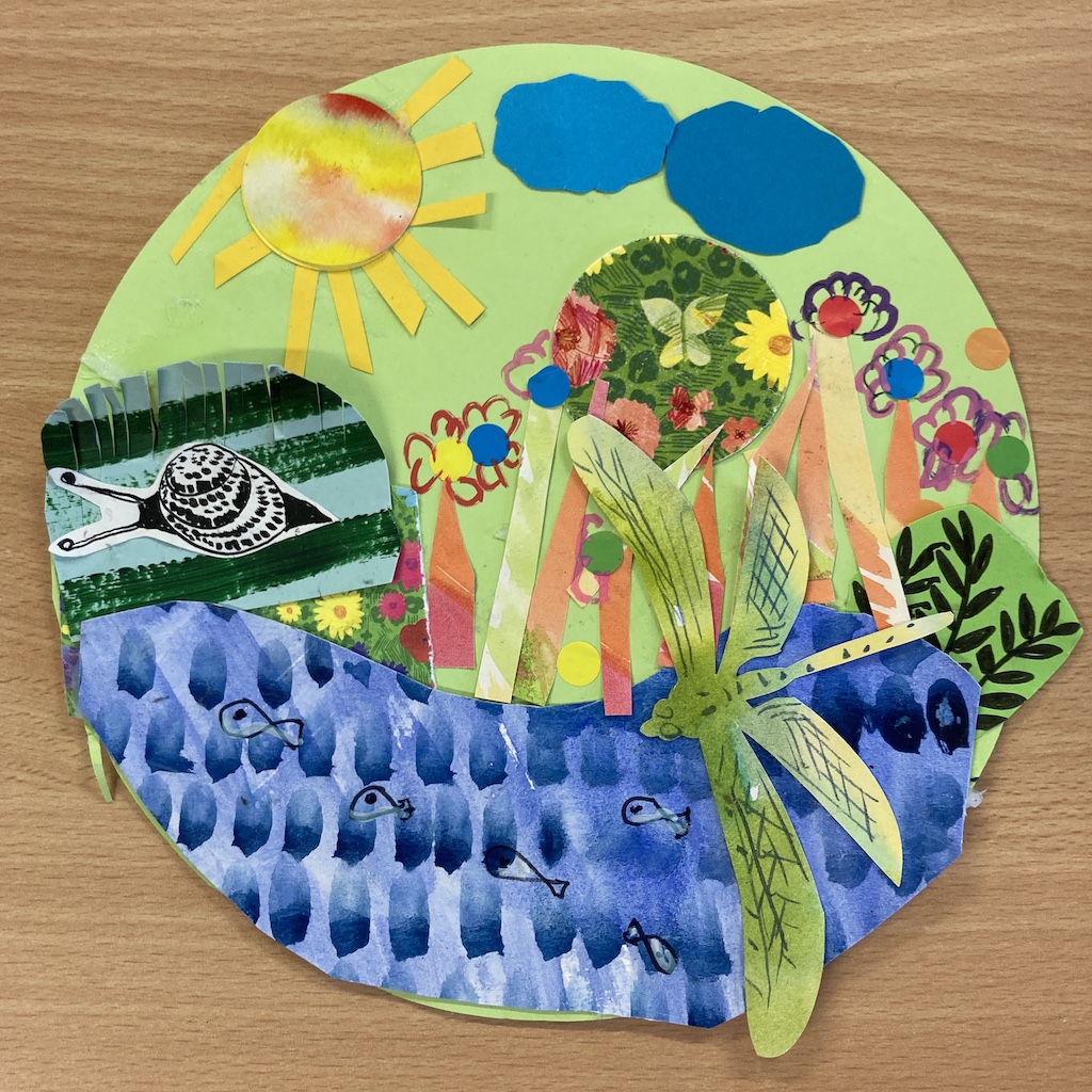
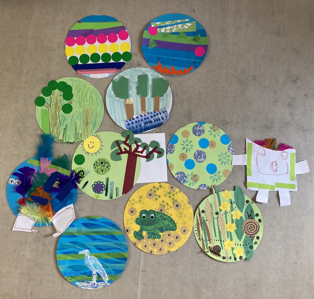
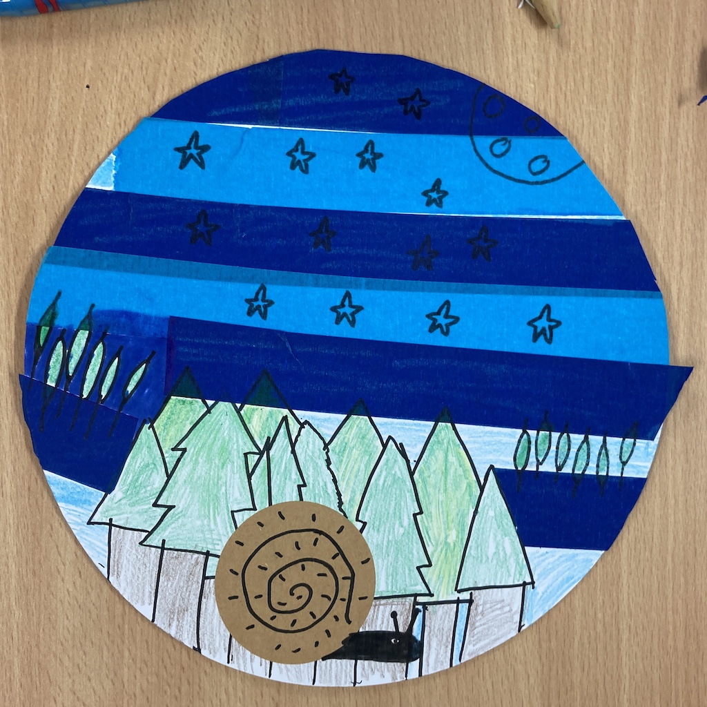
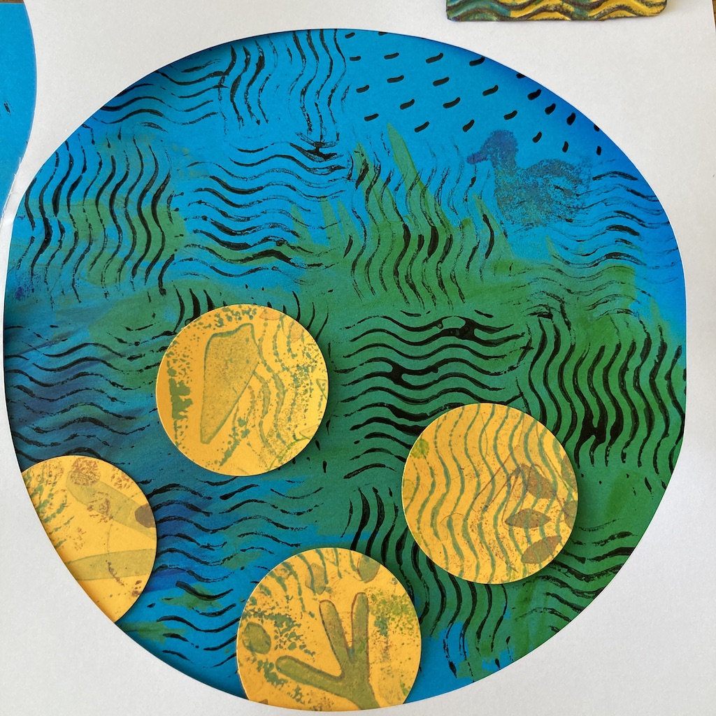
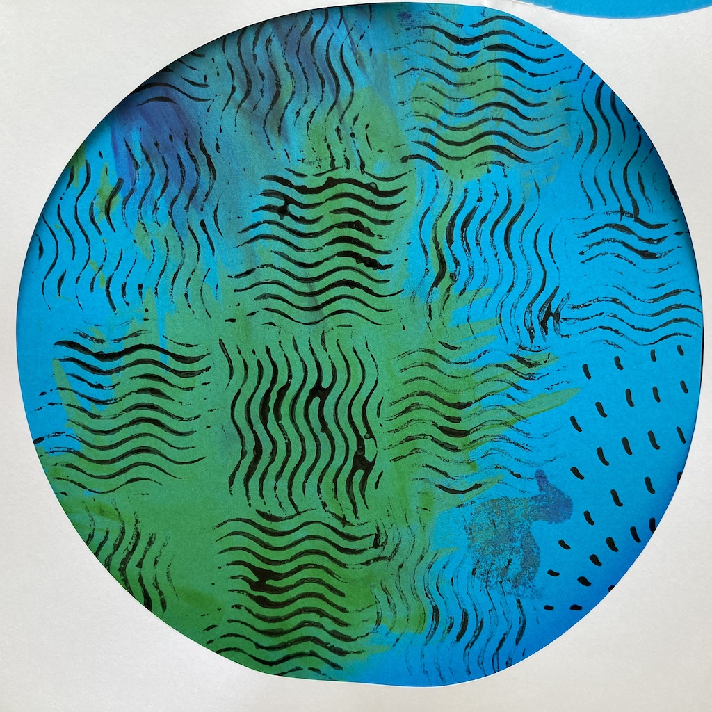
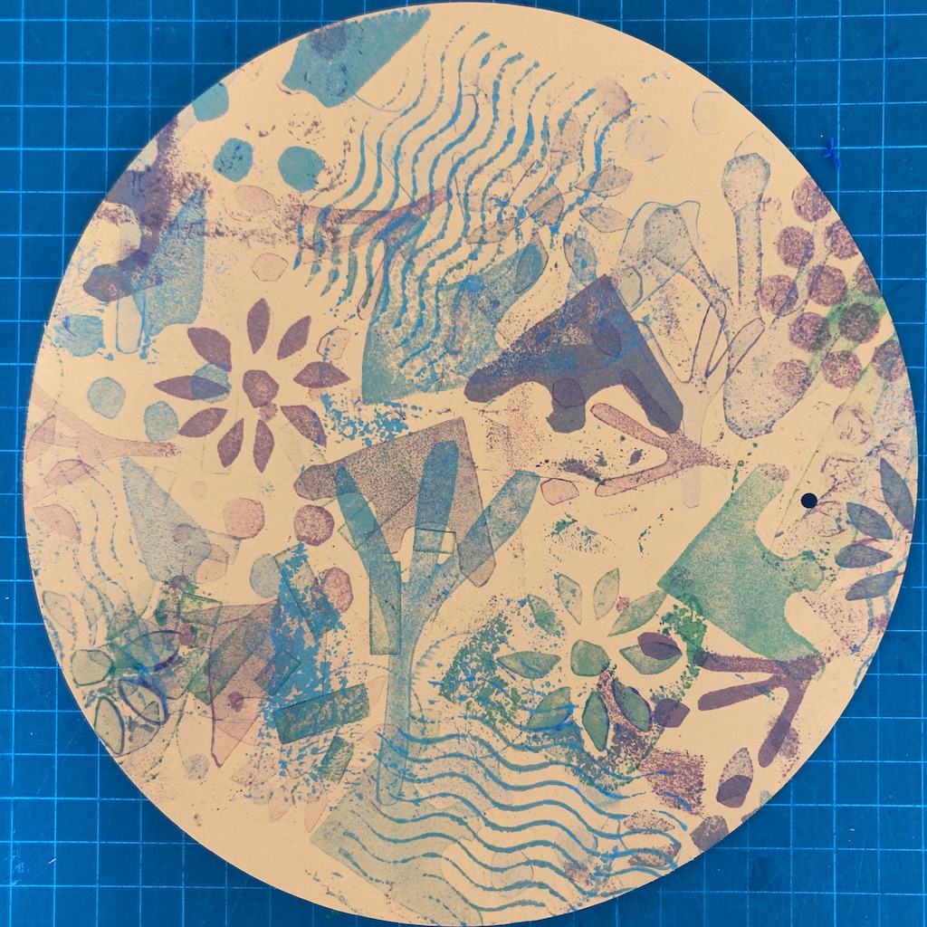
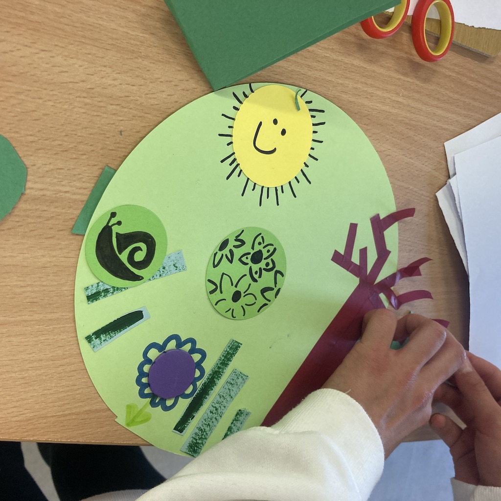
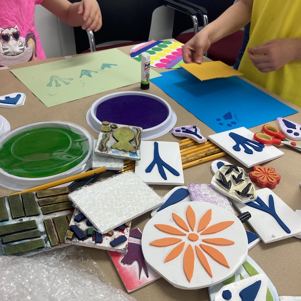
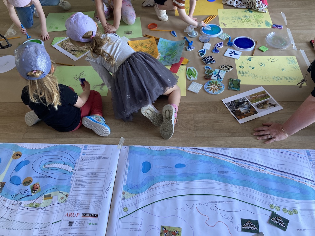
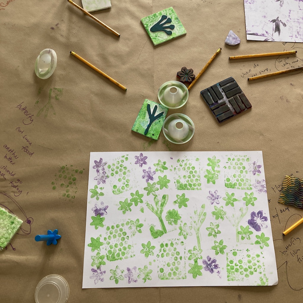
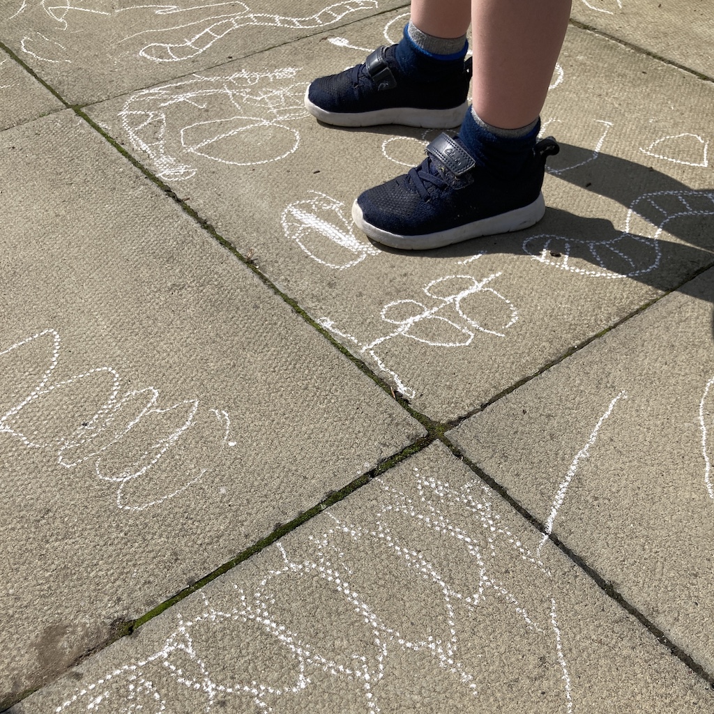
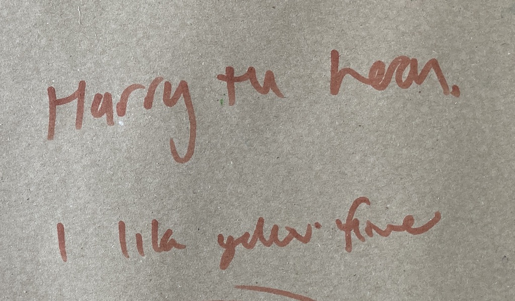
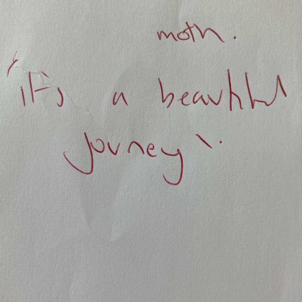
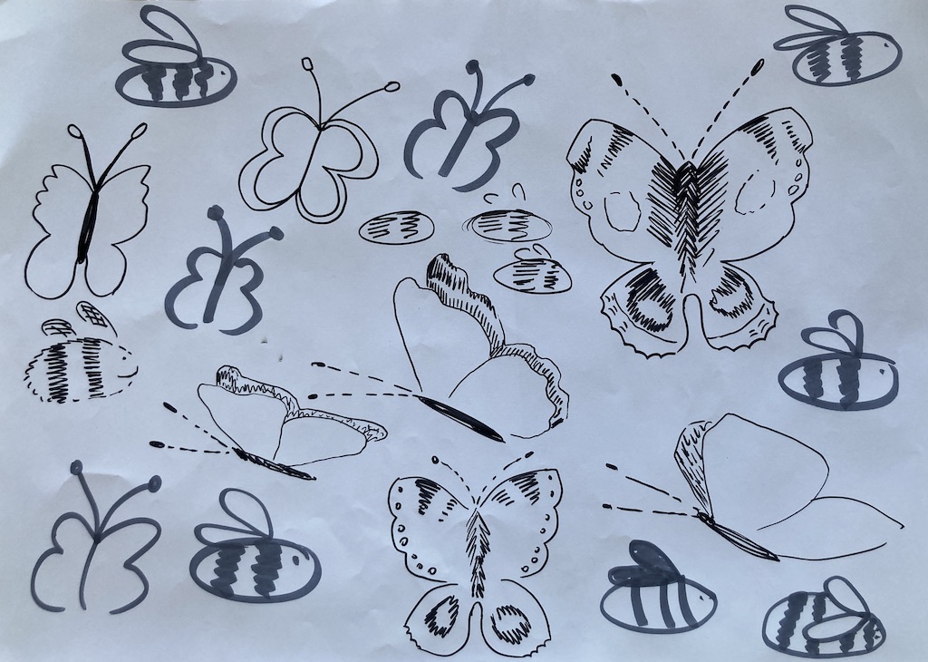
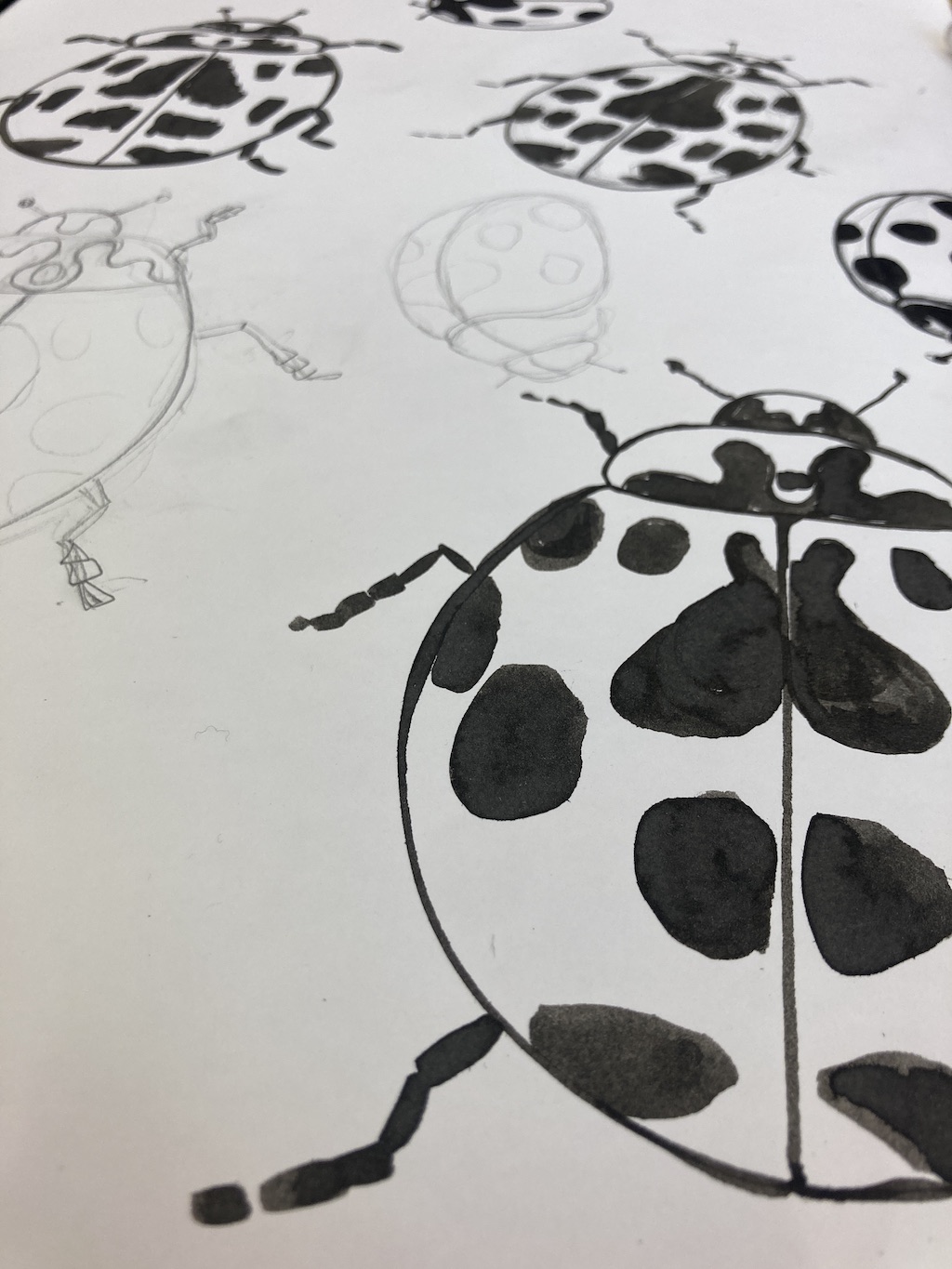
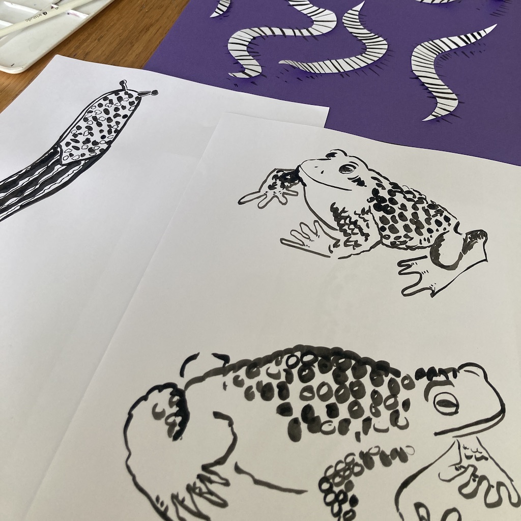
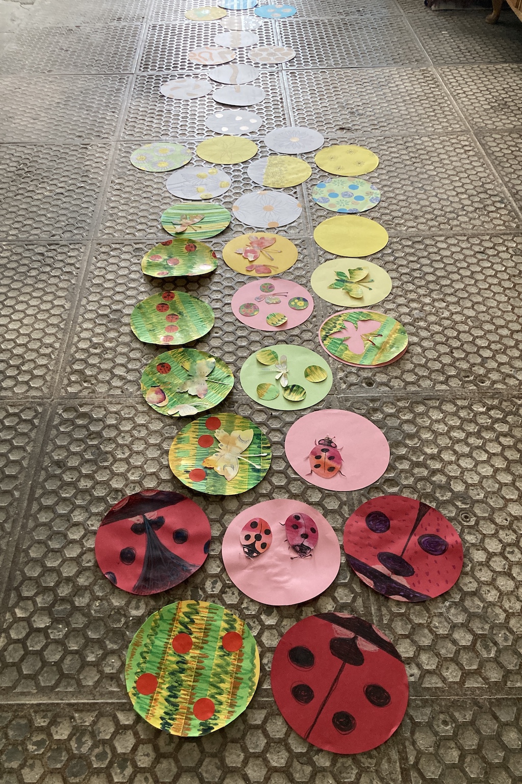
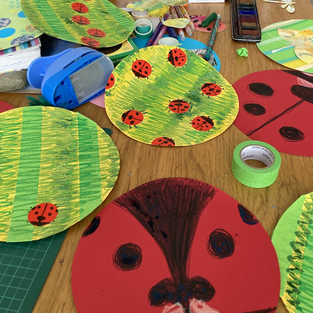
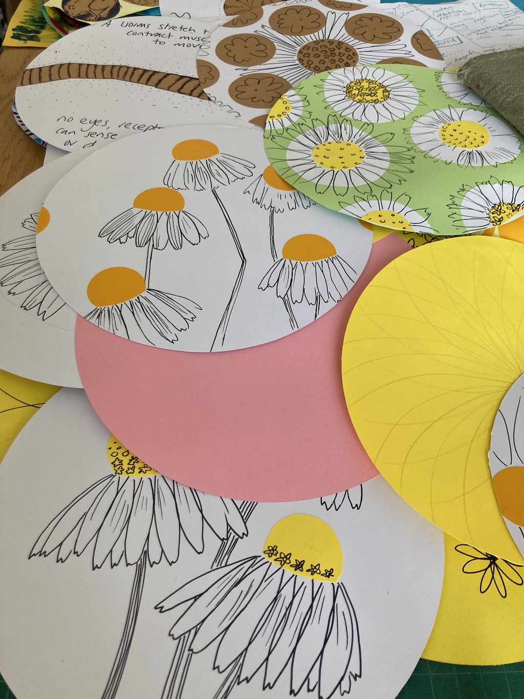
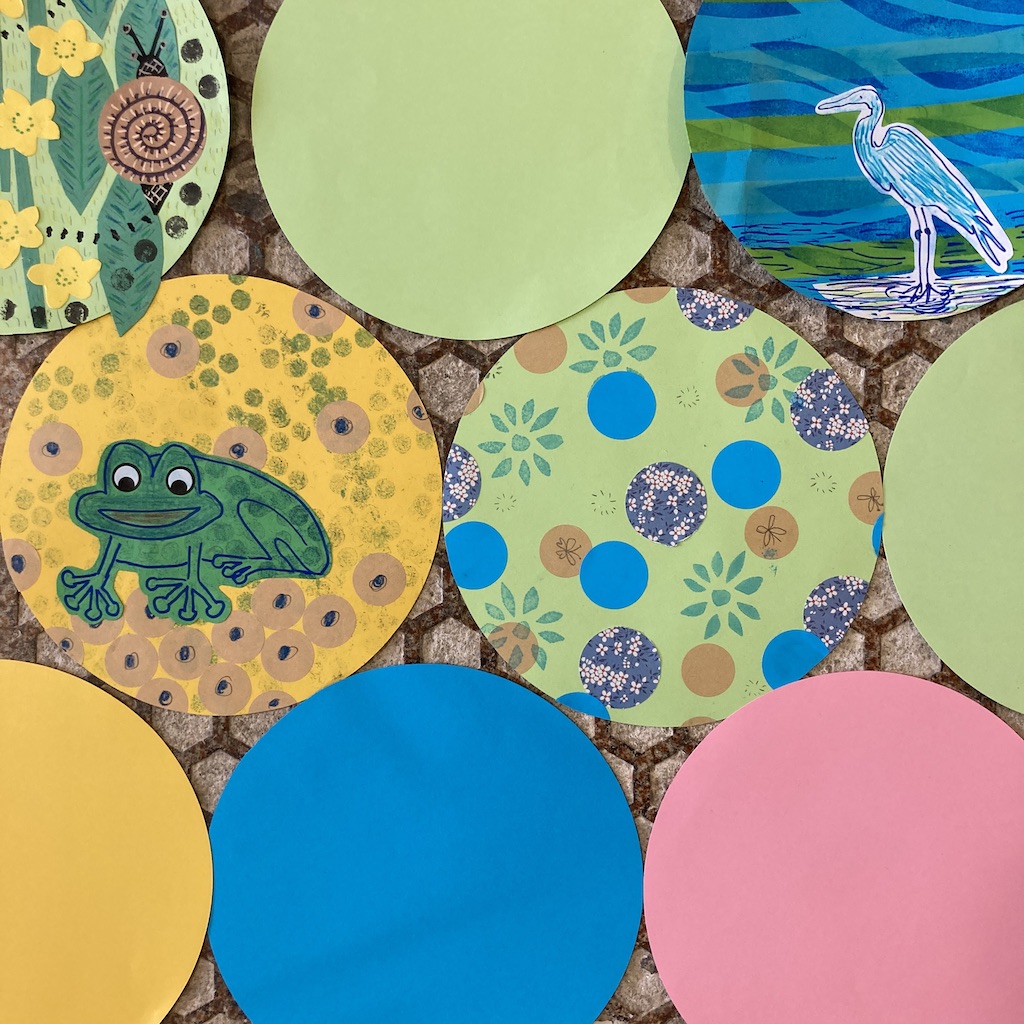
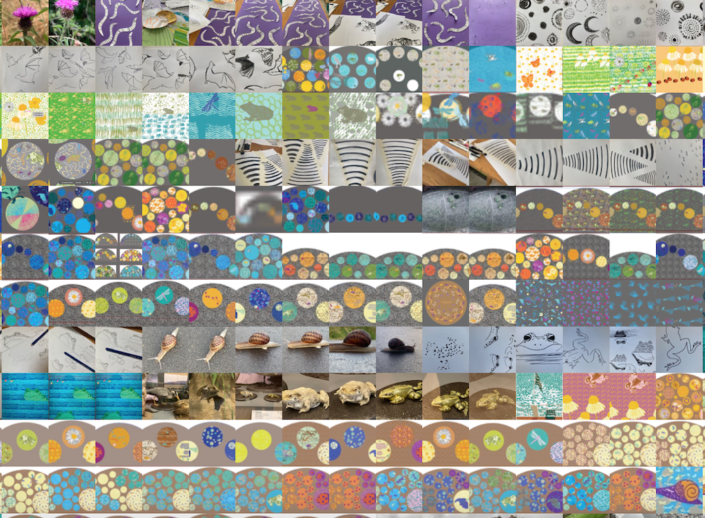
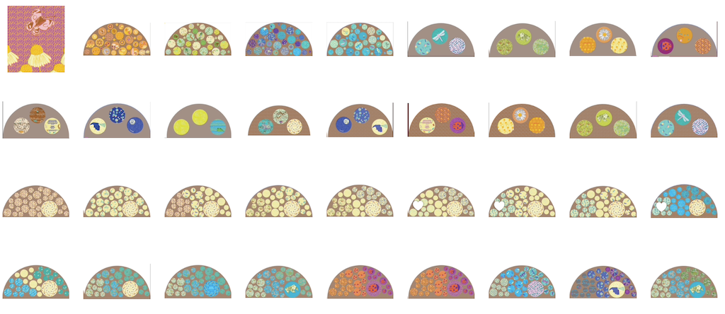
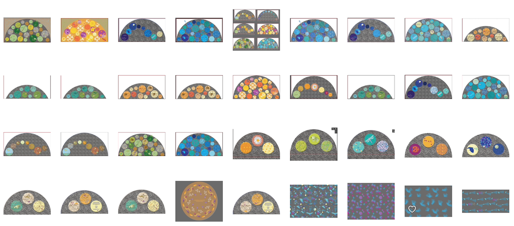
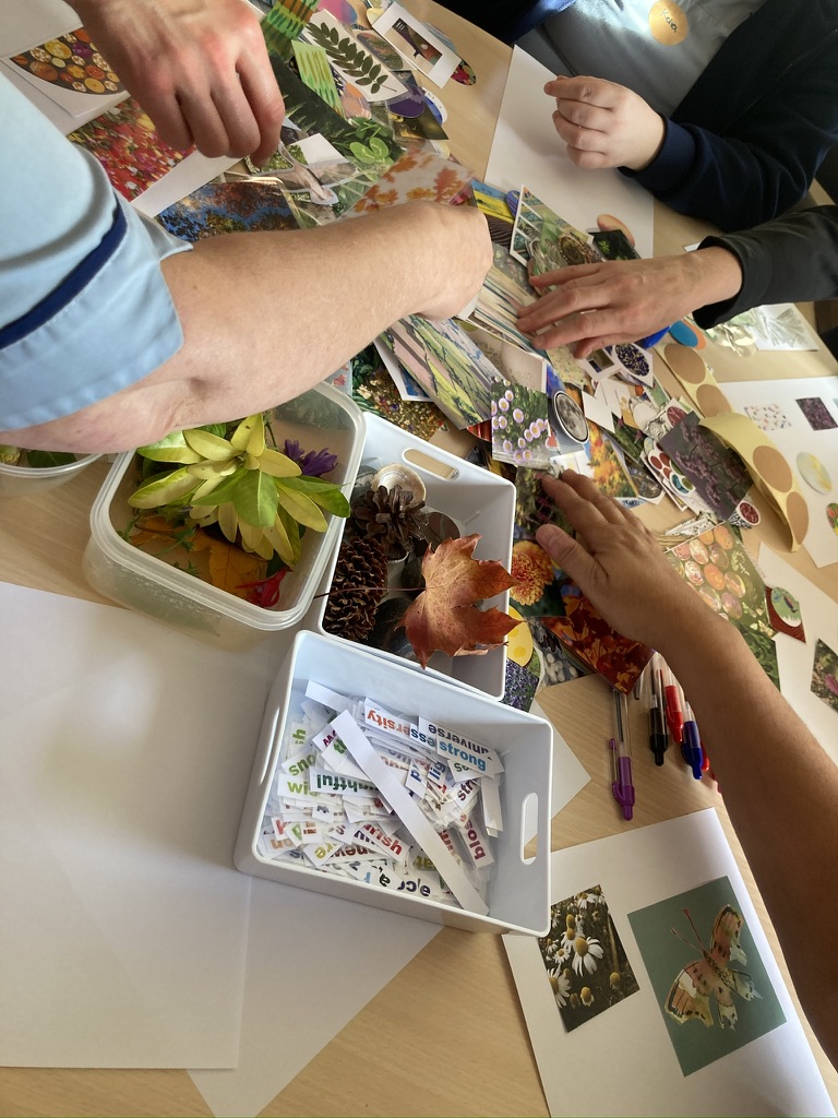
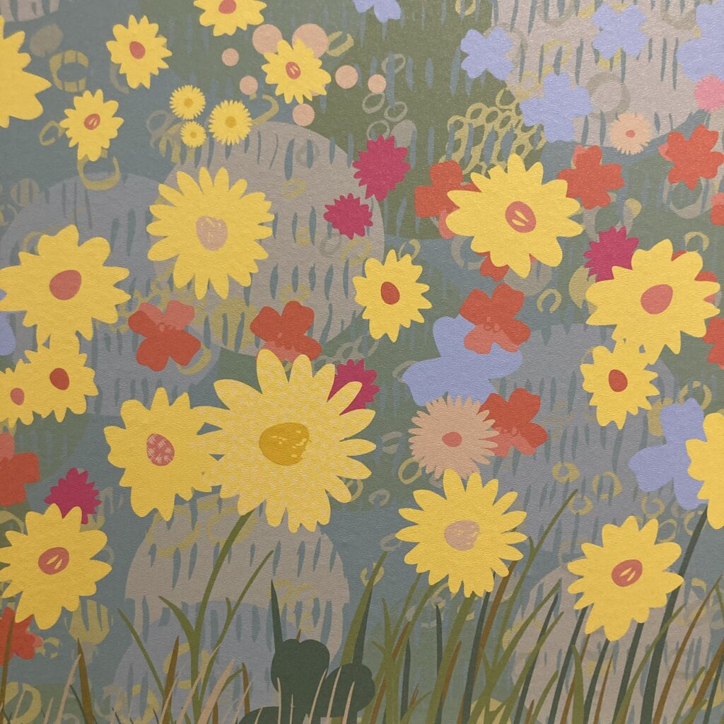
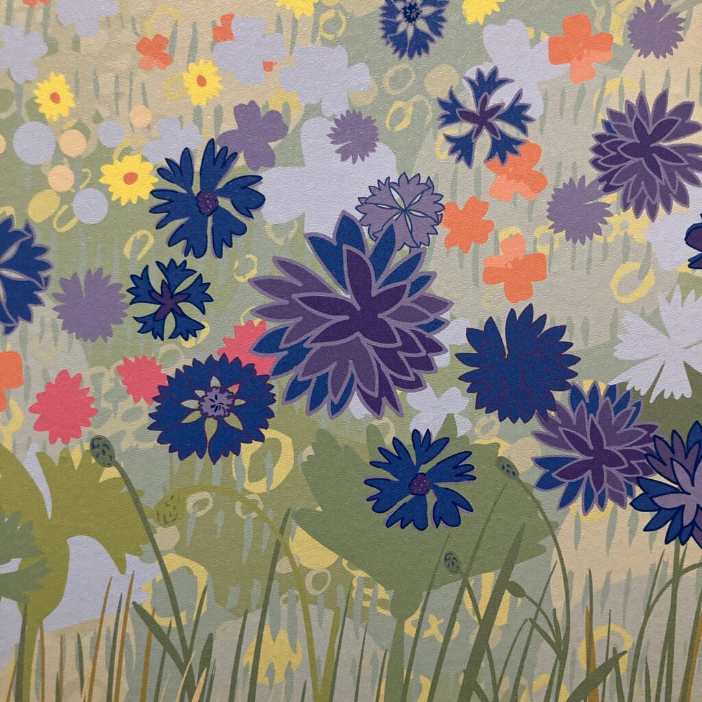
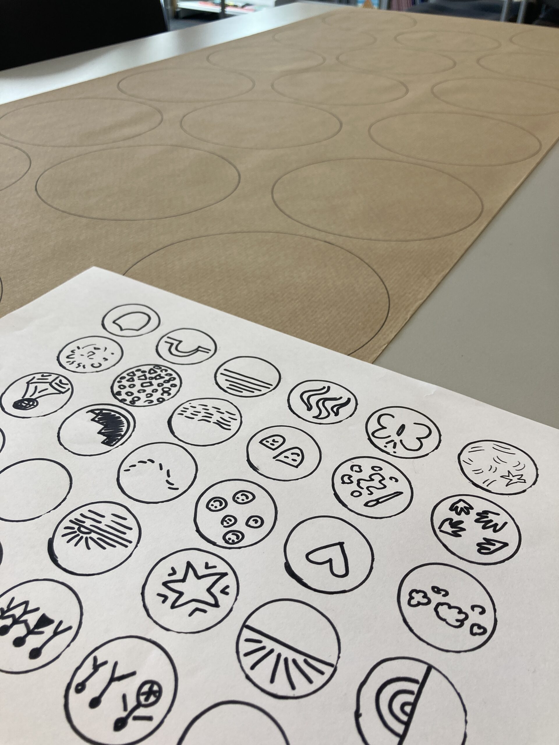
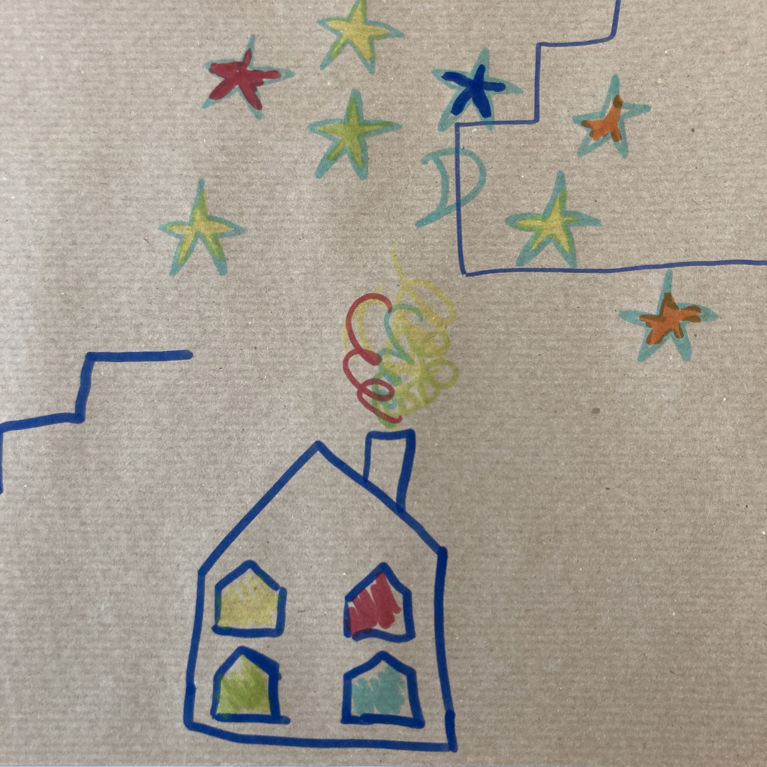
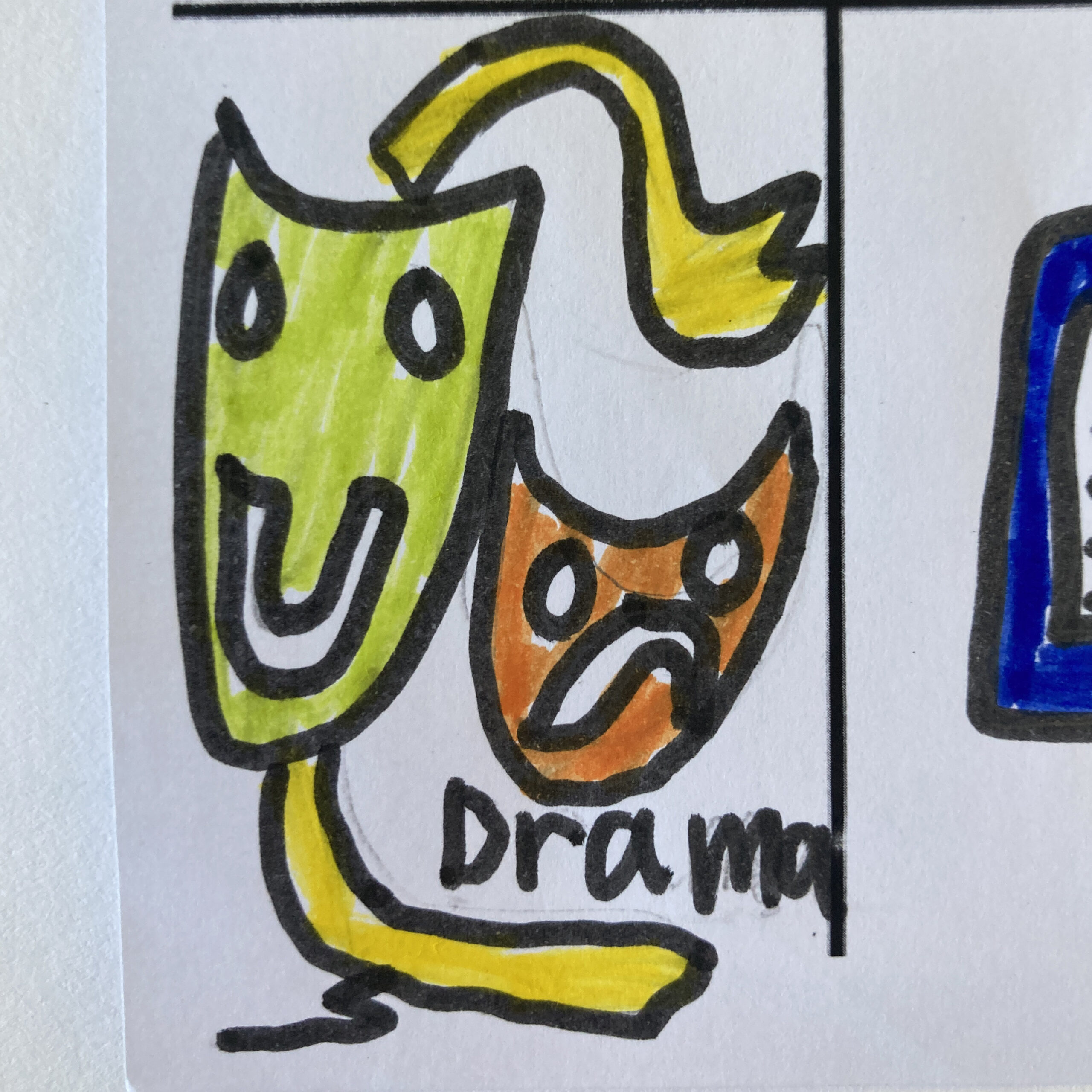
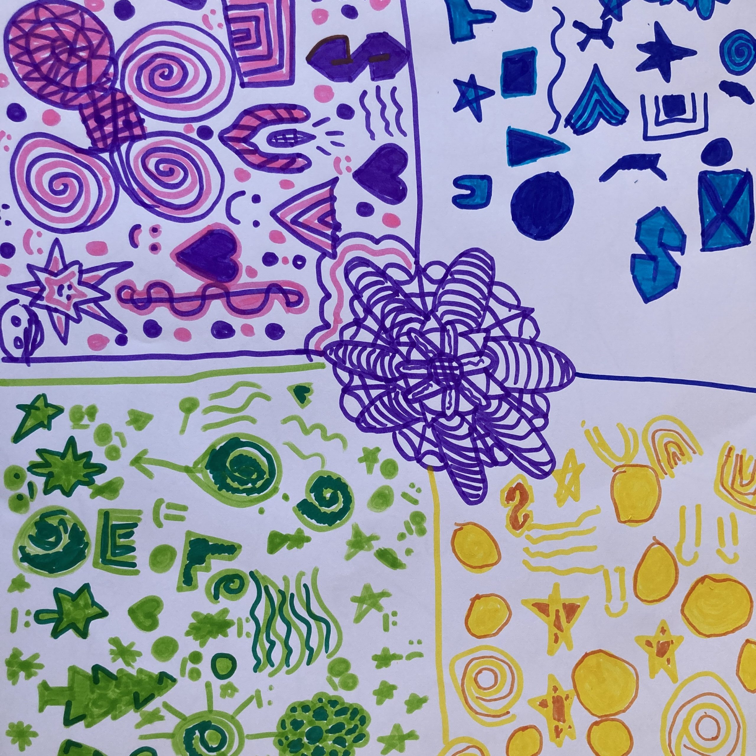
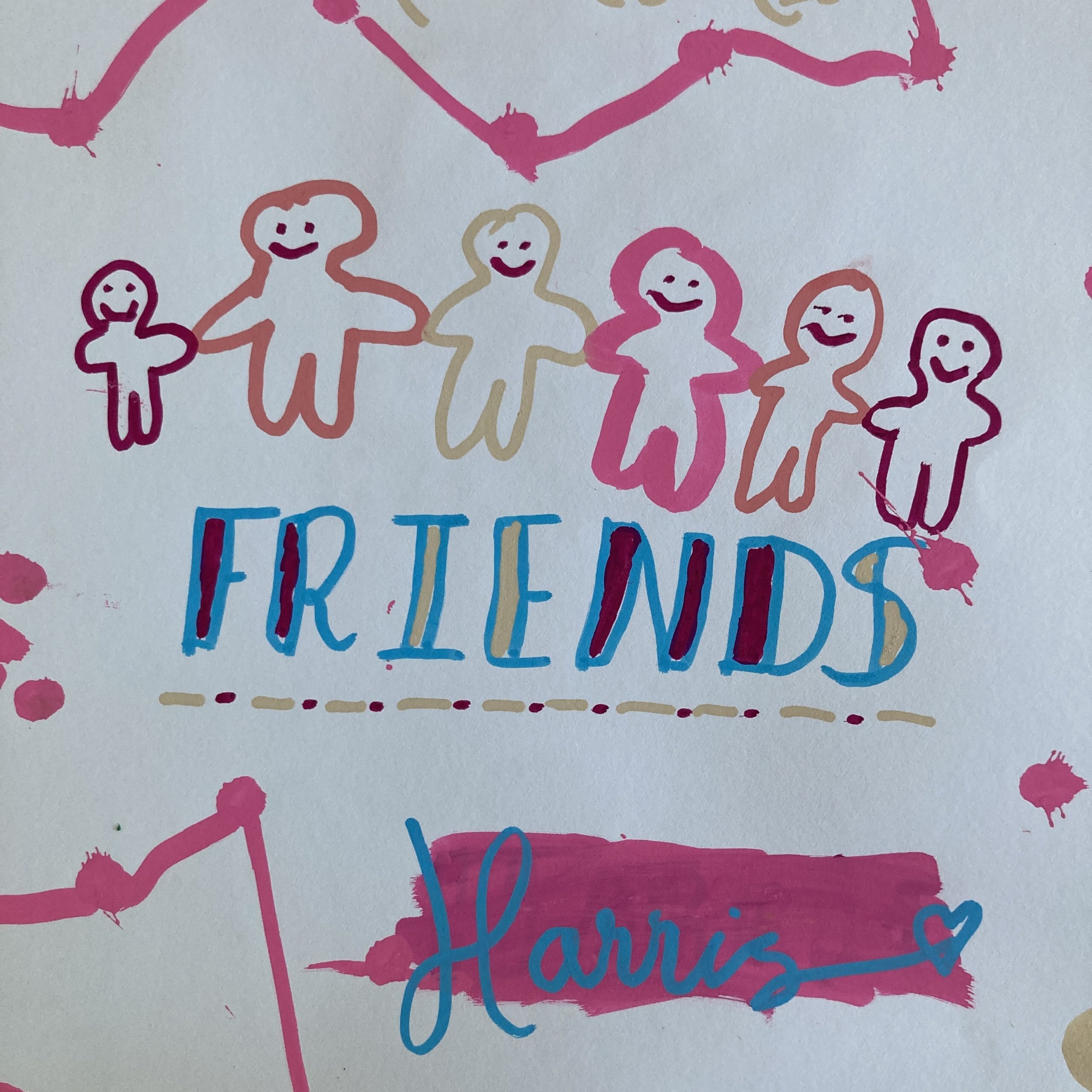
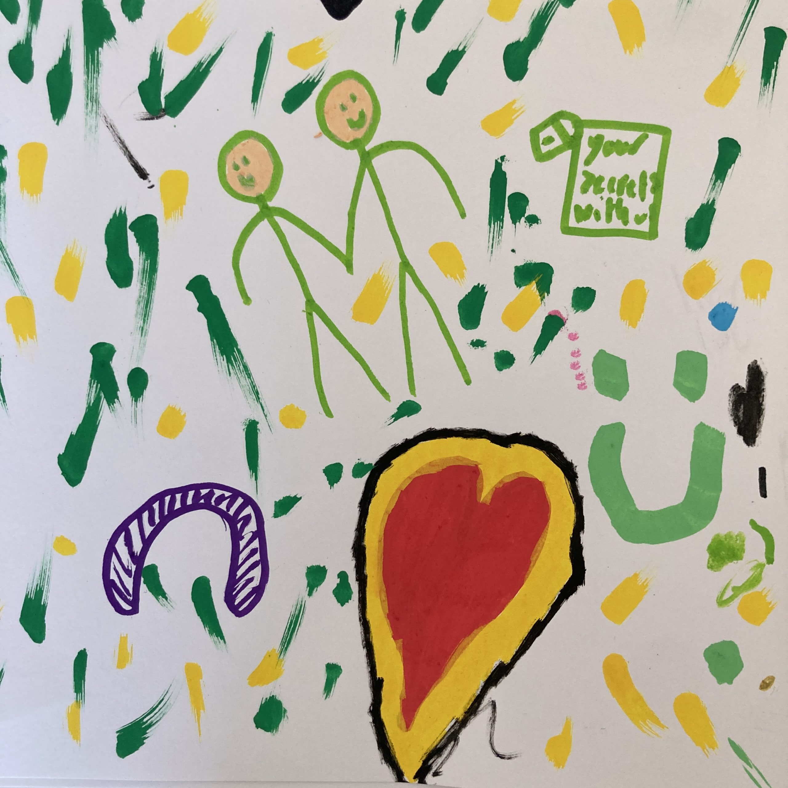
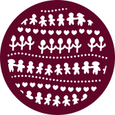
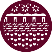
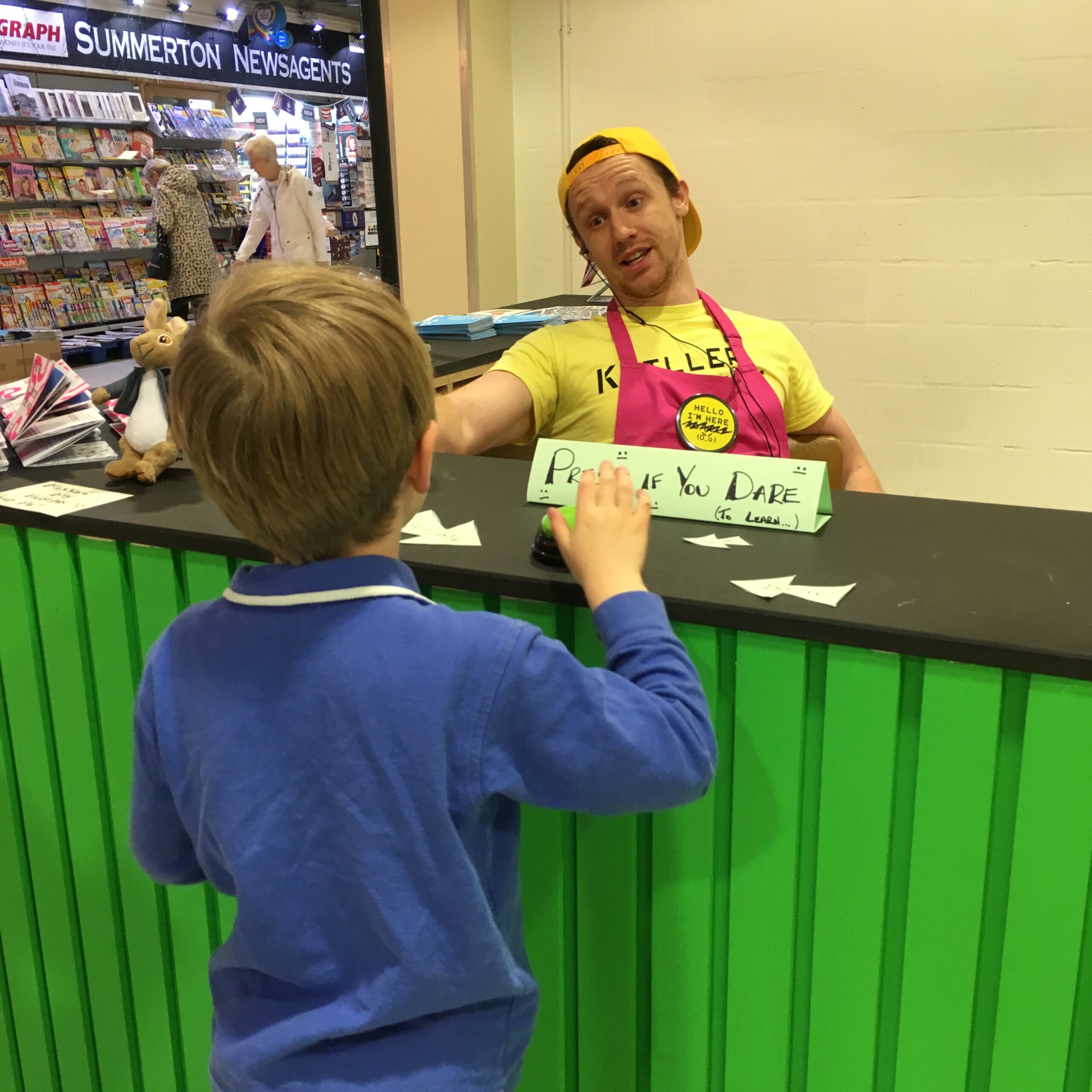
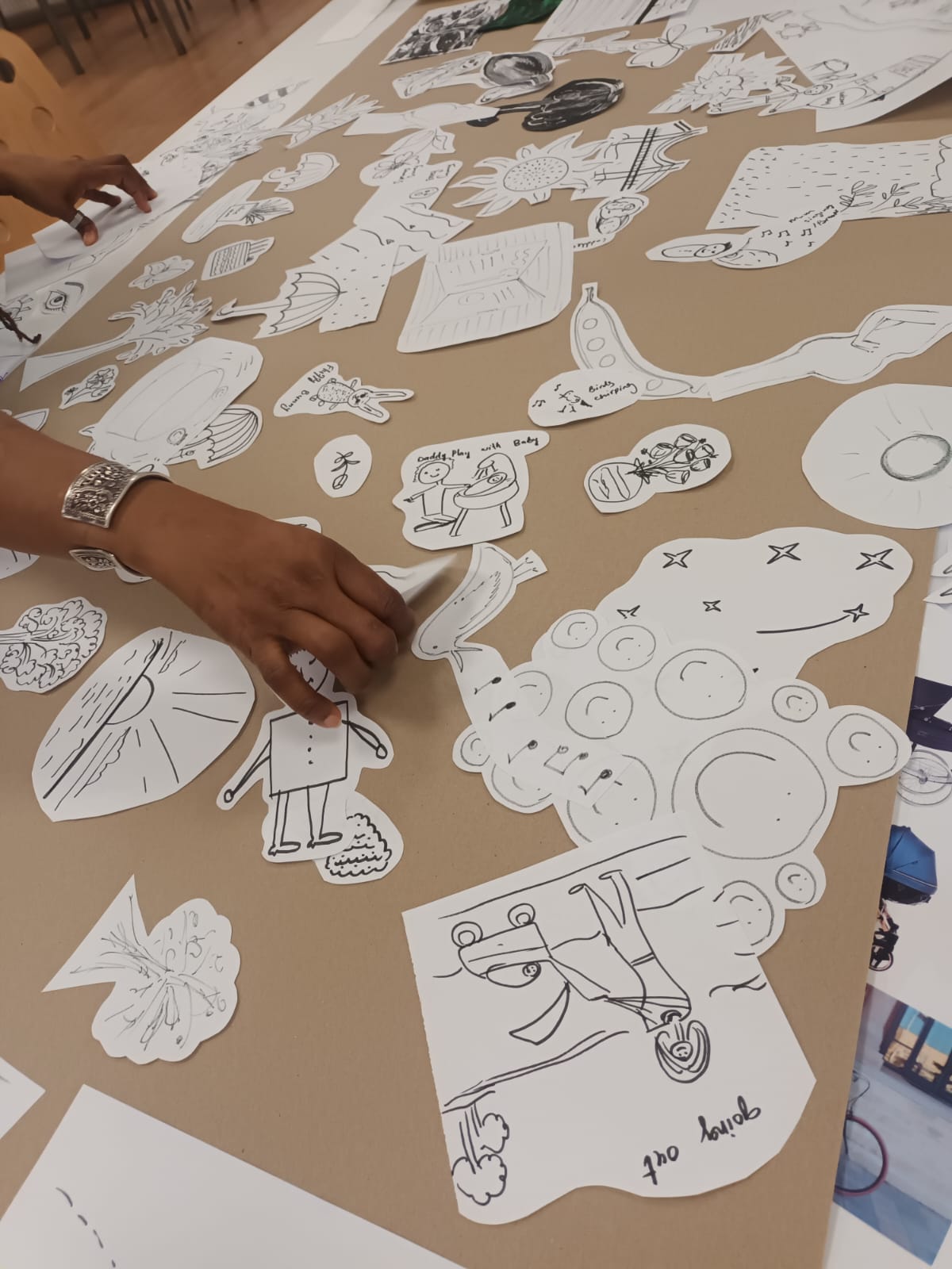
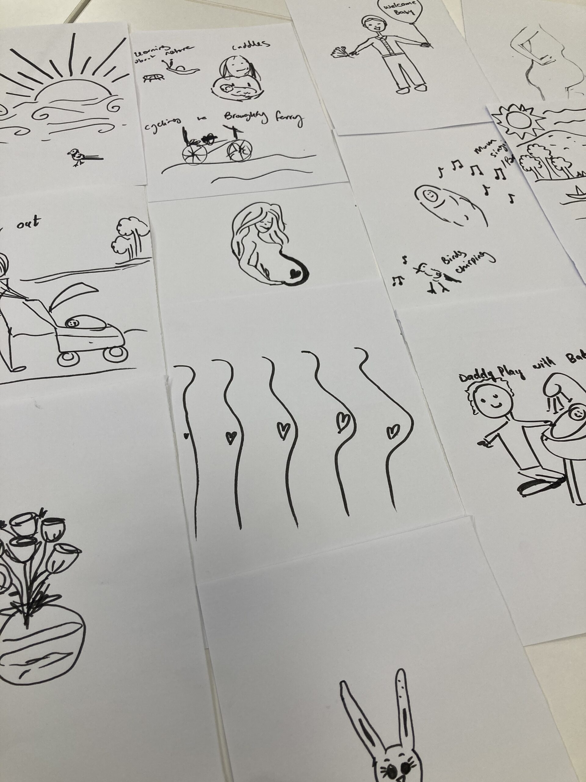
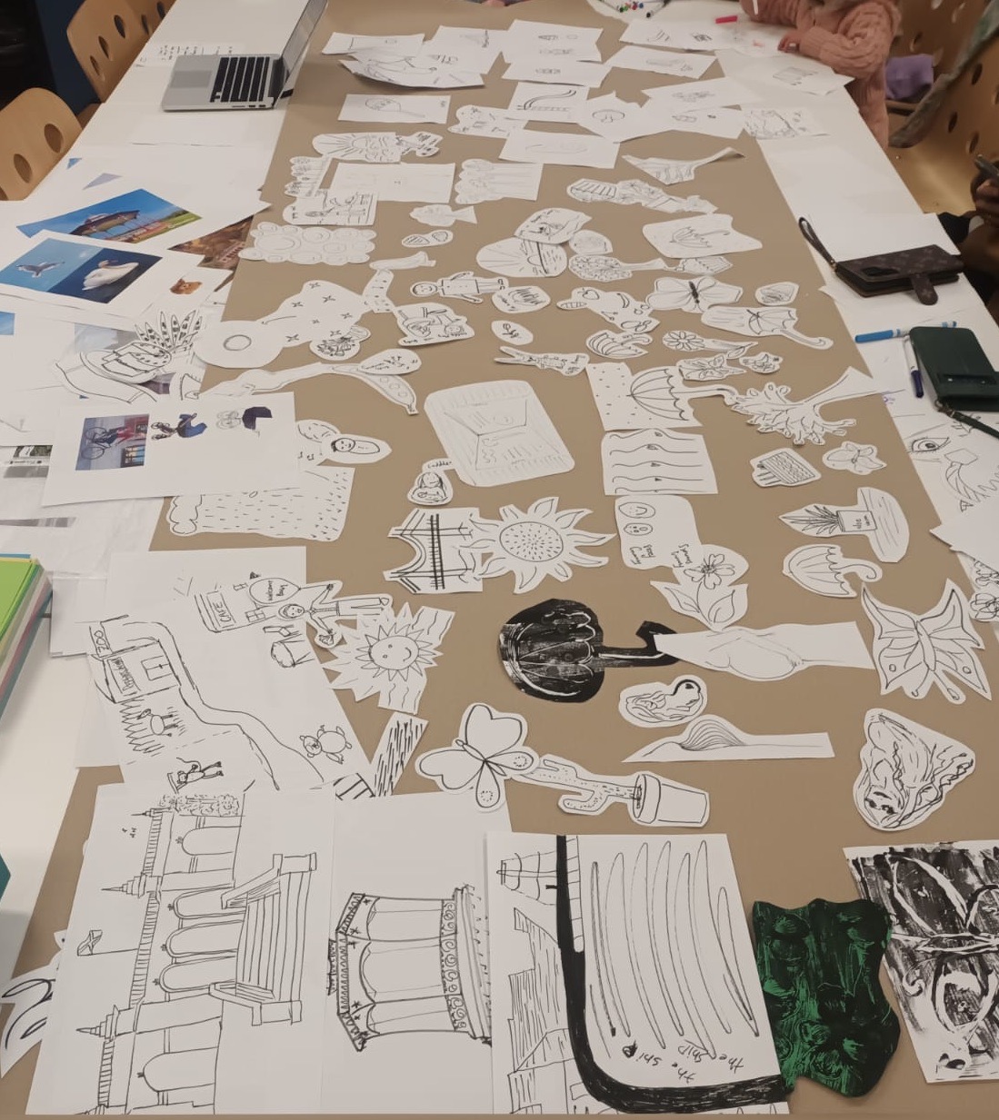
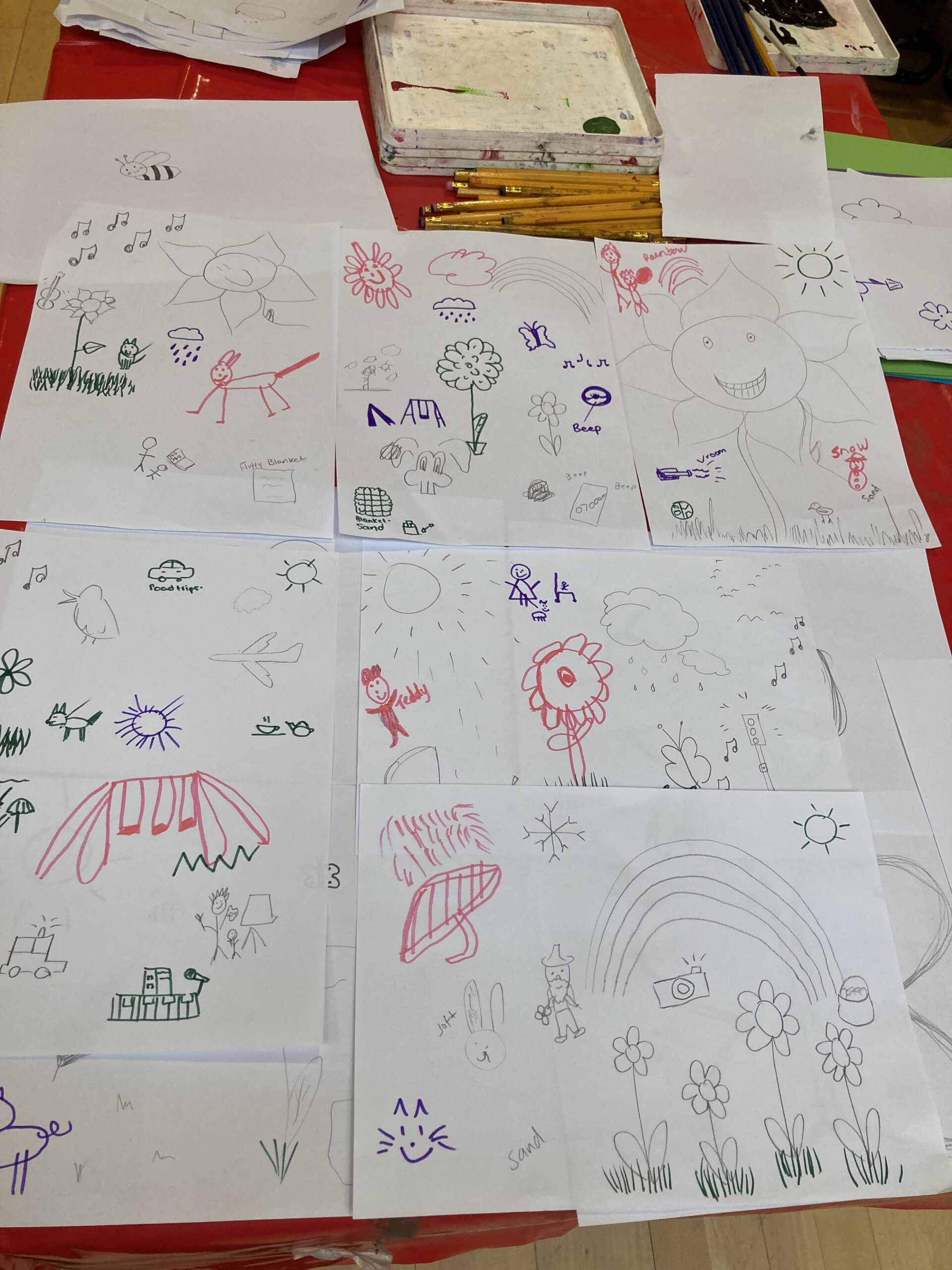
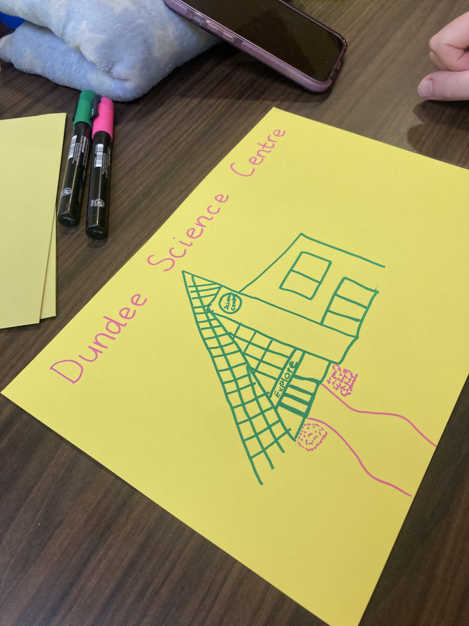
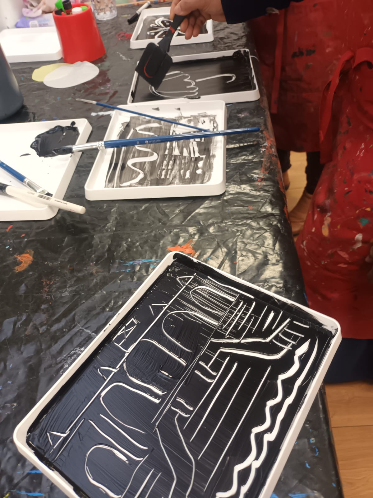
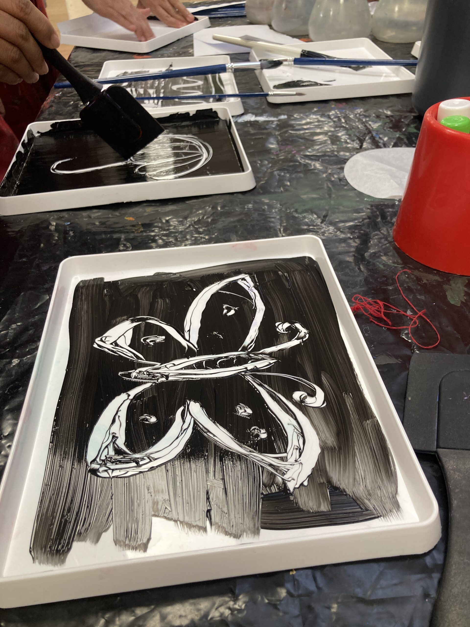
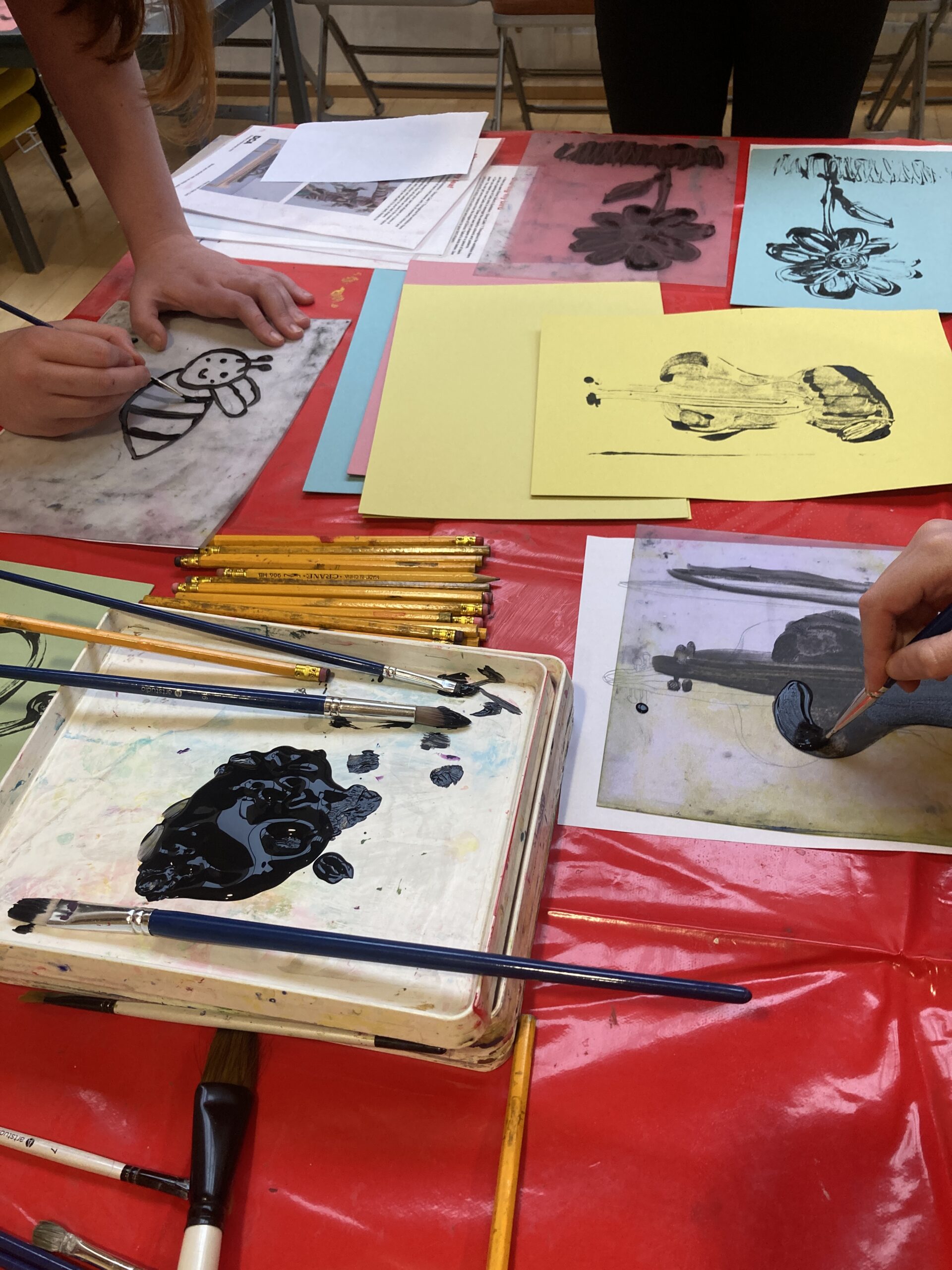
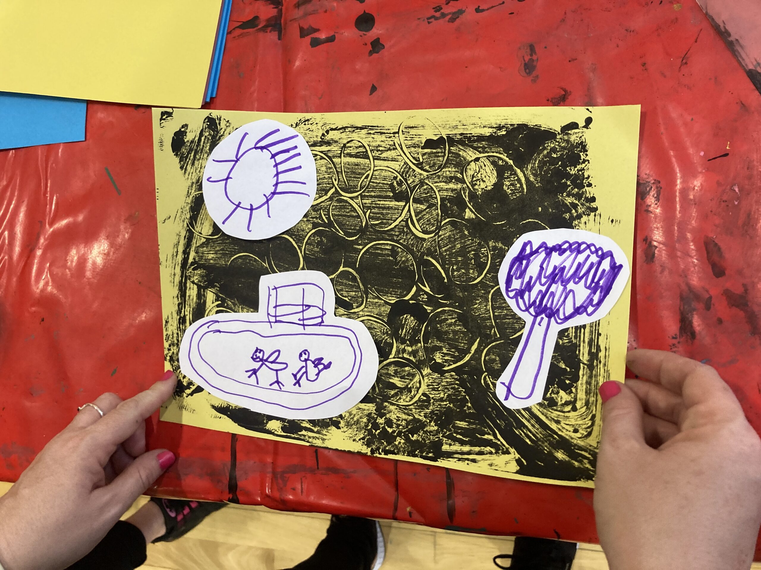
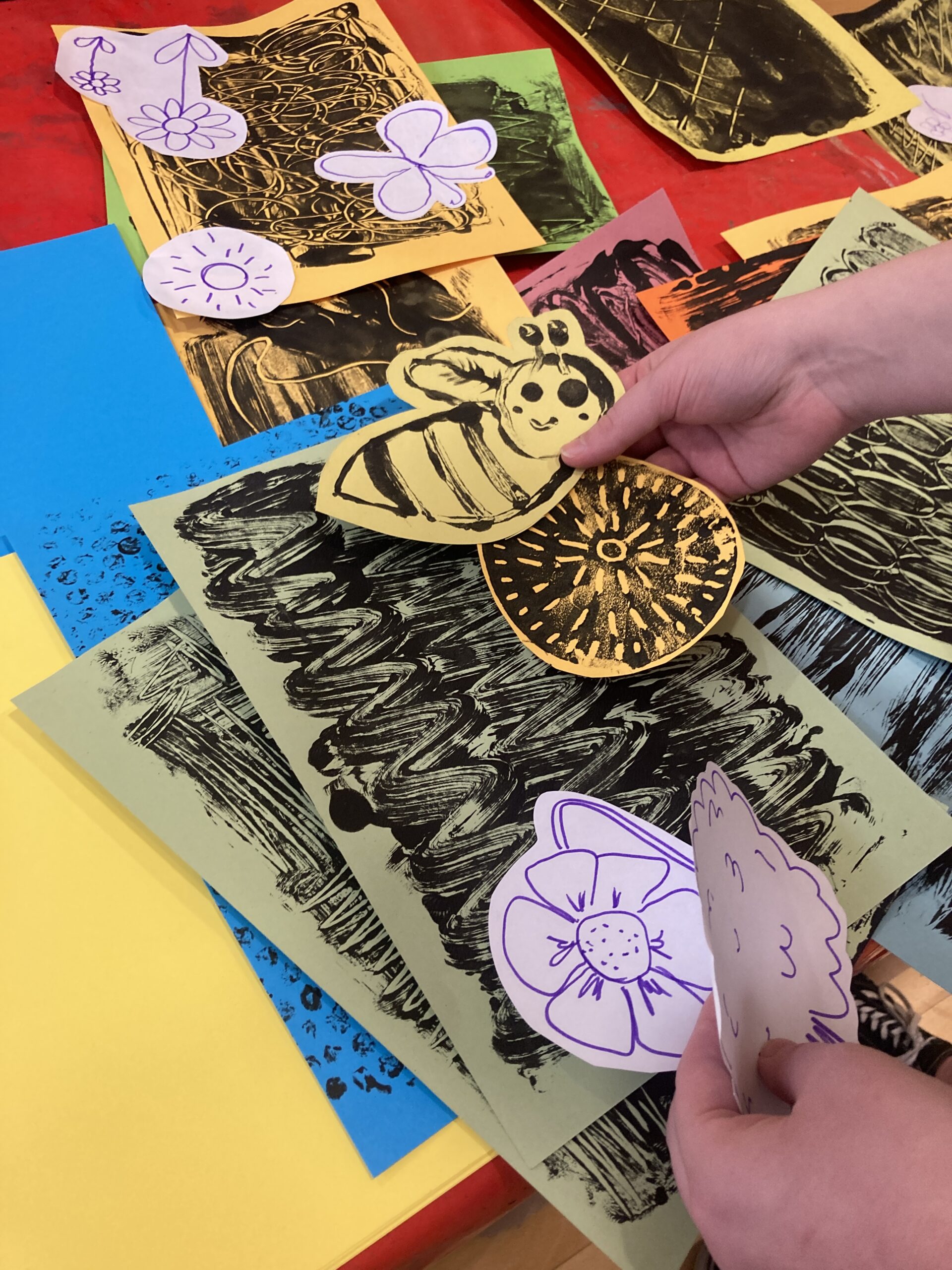
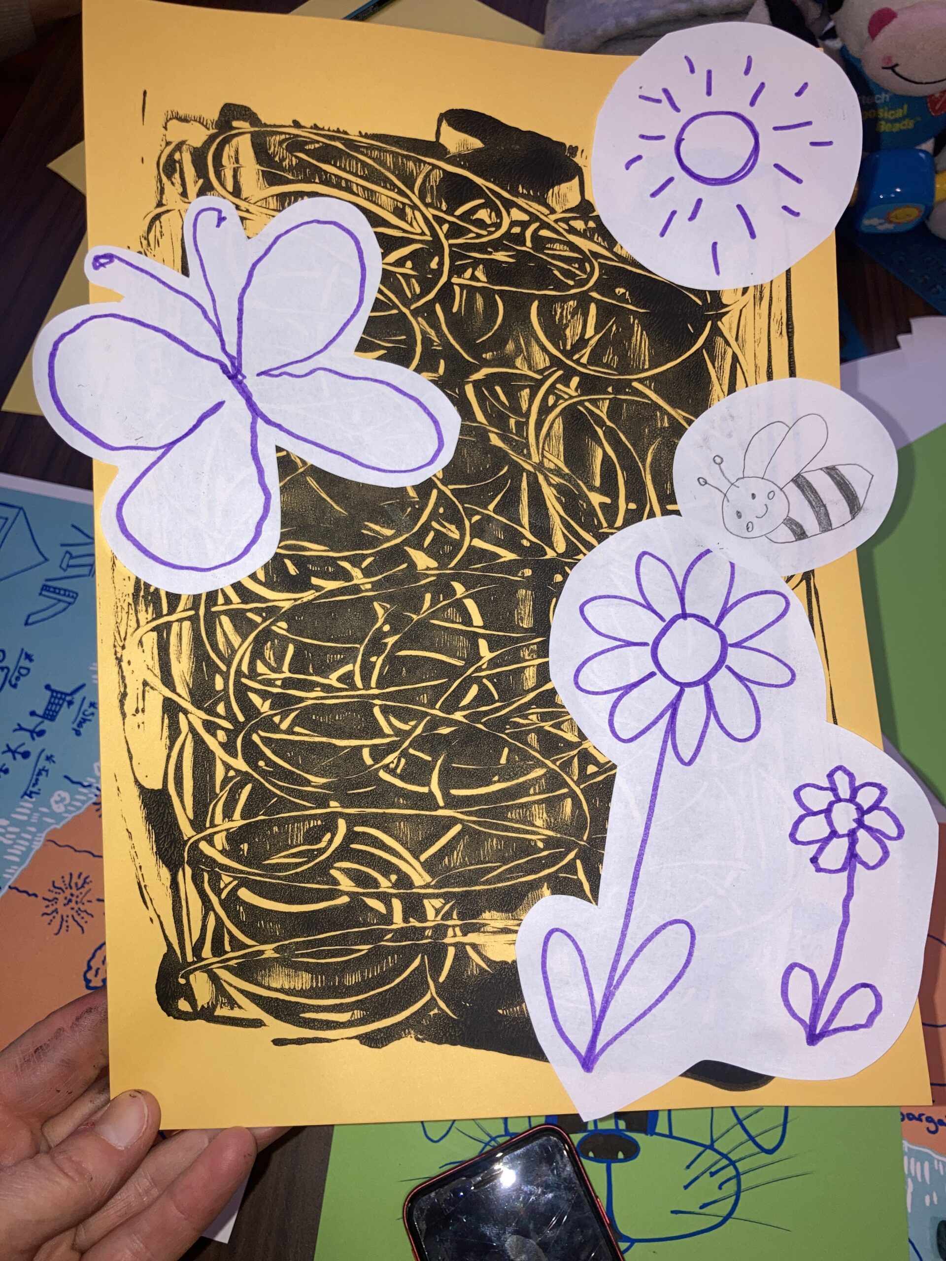
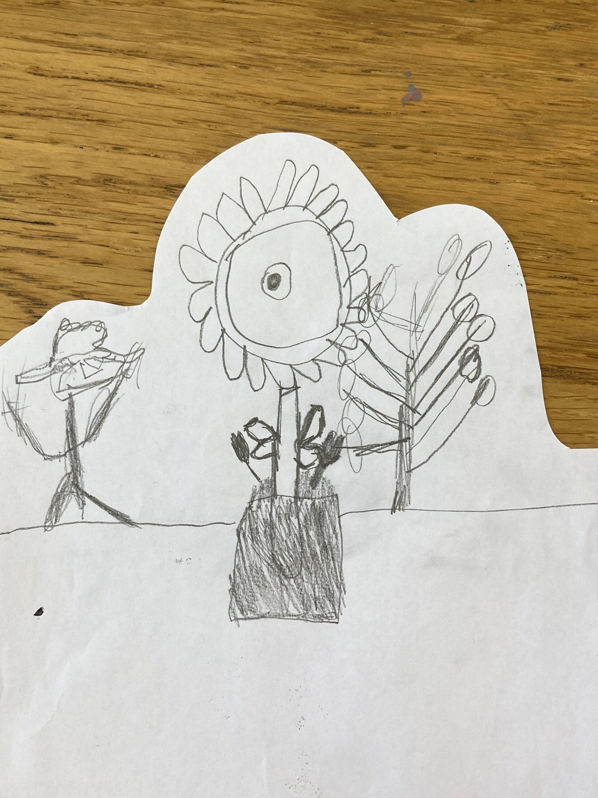
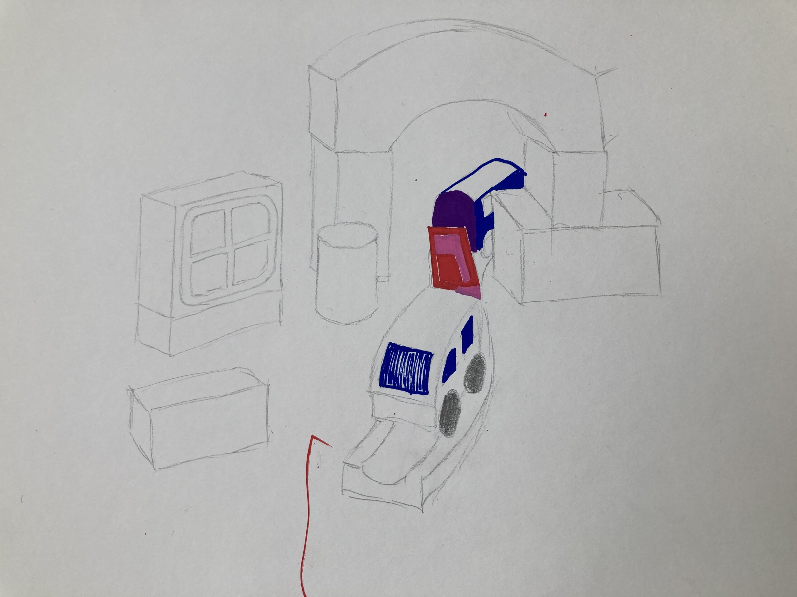
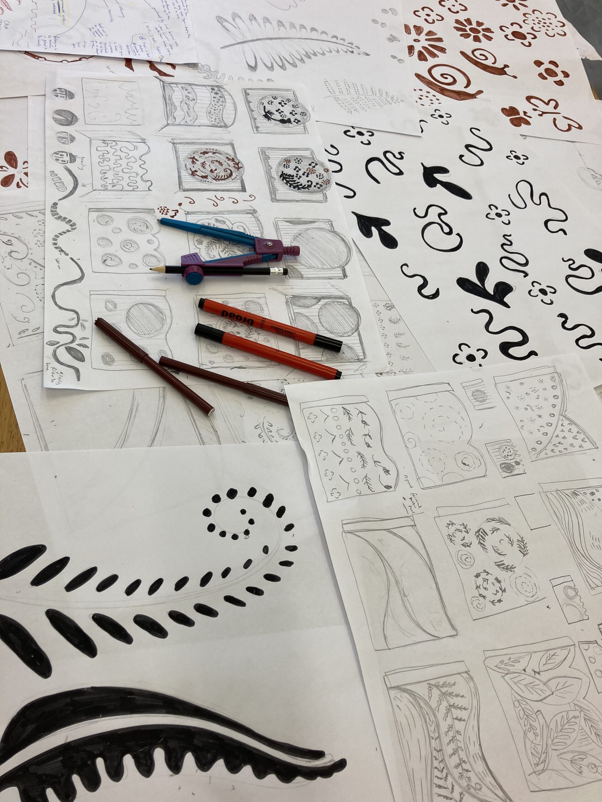
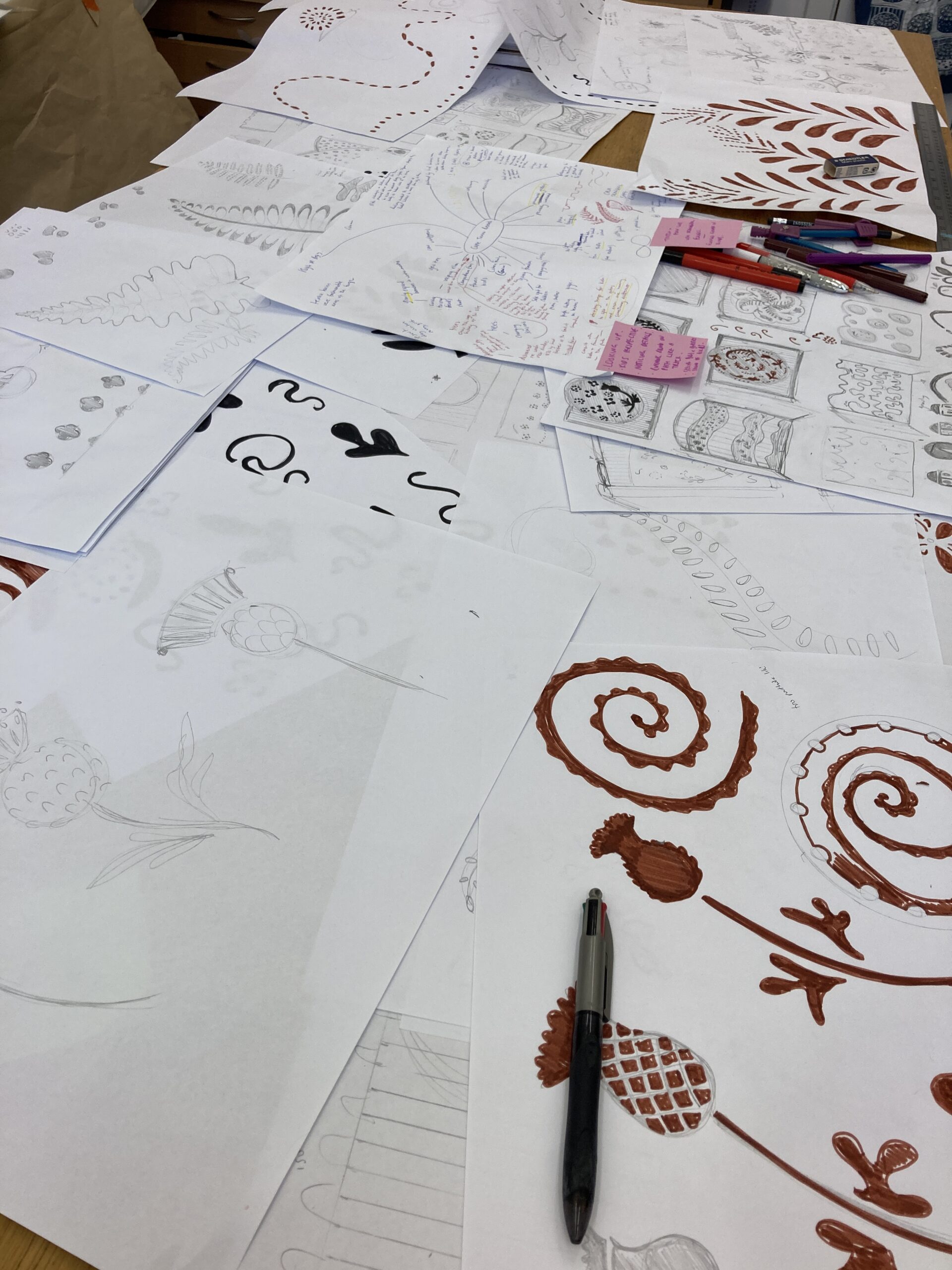
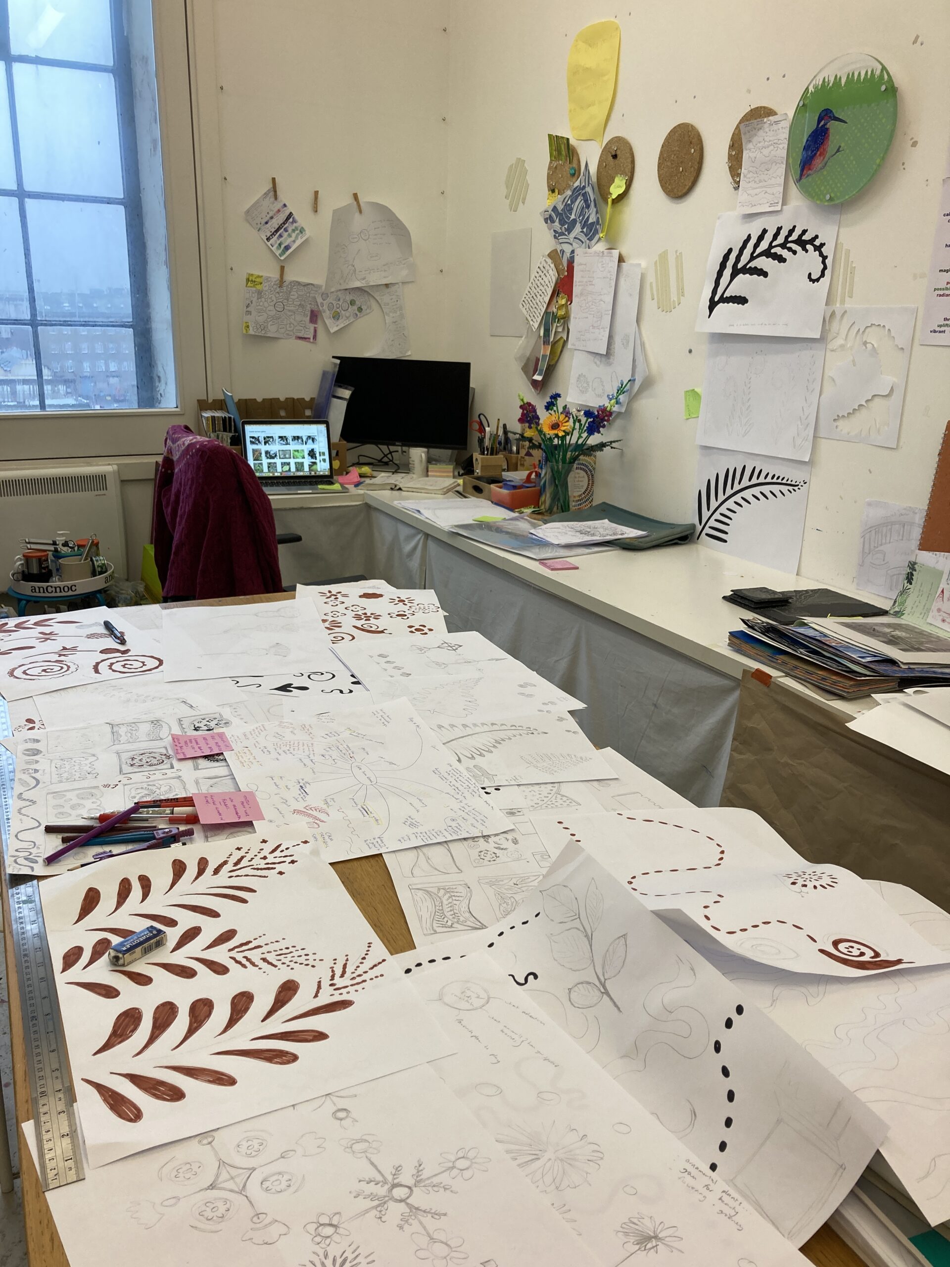
I developed seven bespoke workshops to help the The Adventures of the Little People Group (aged 5 – 12) to create ideas for the five windows, tailoring each session from the young people’s interests, encouraged collaboration and imagination. Workshops themed around looking at what adventures the young people wanted to go on, what they’d like to do when they’re older and places around the world they’d like to visit.
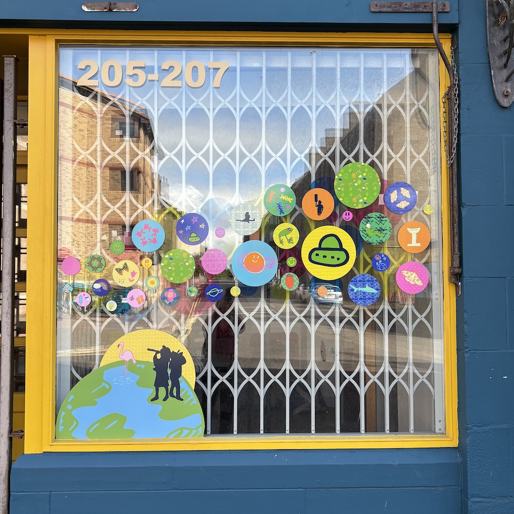
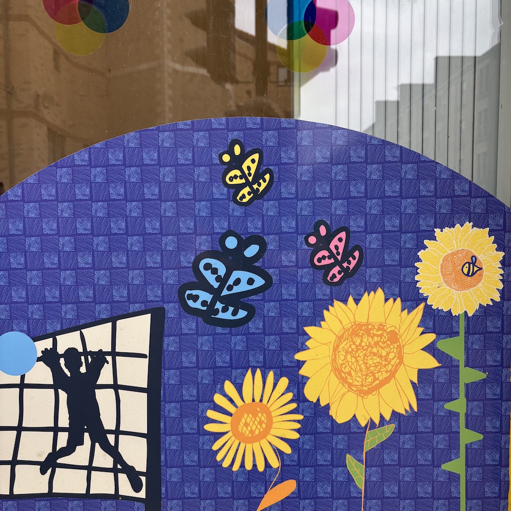
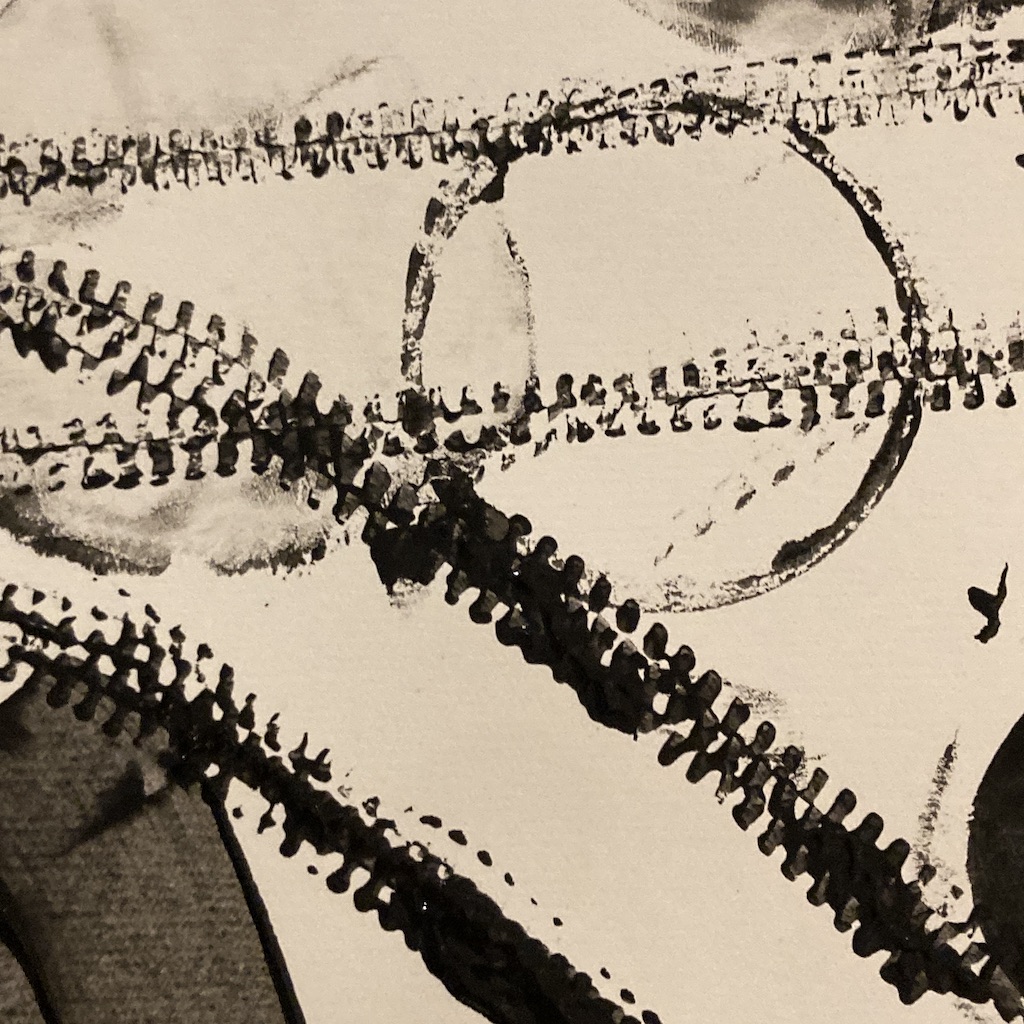
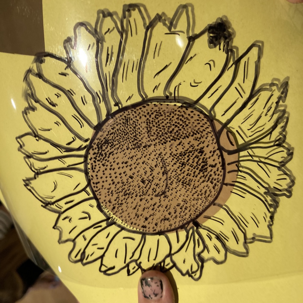
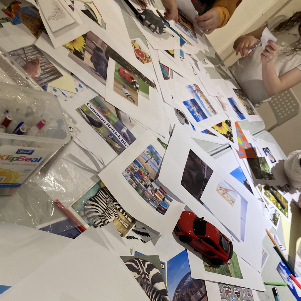
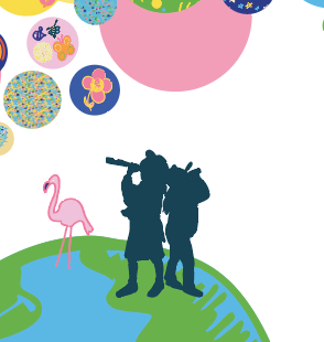
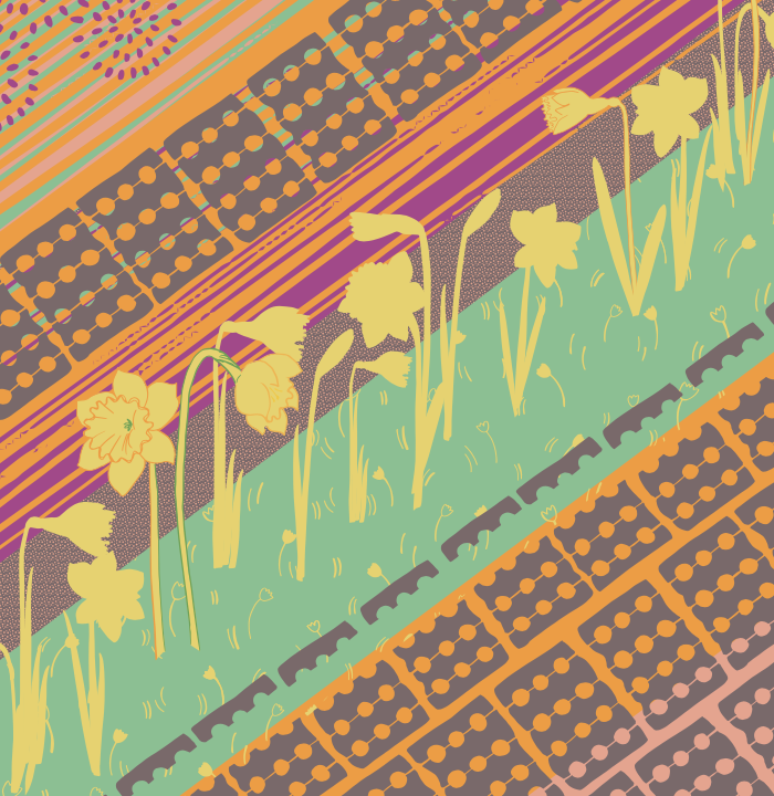
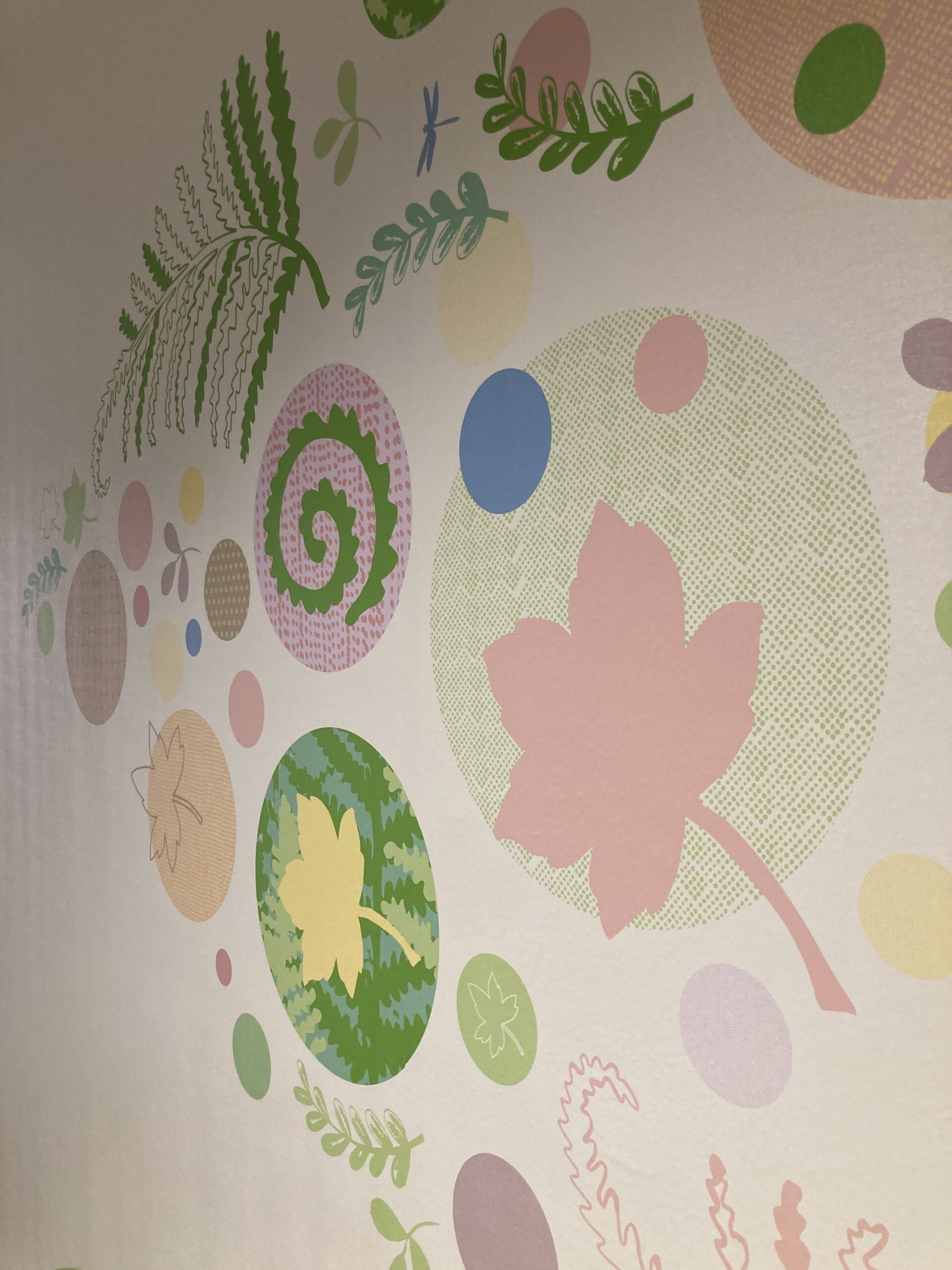
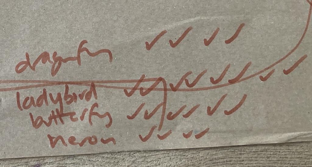
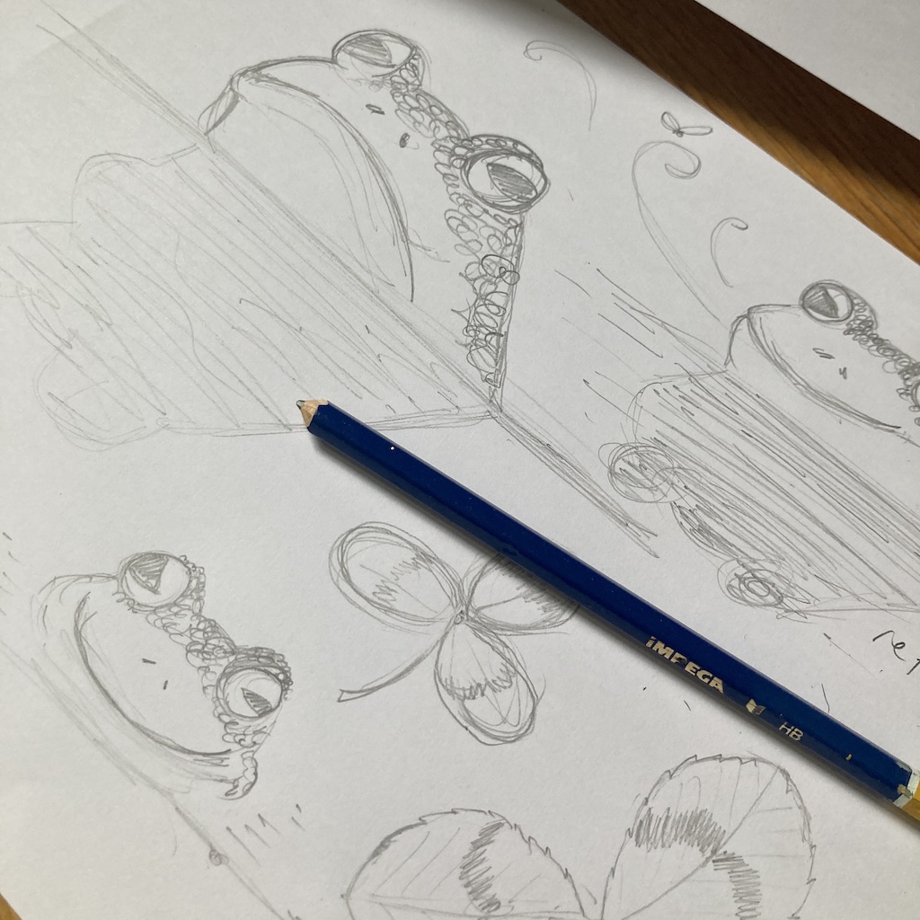
I used different techniques to engage them: painting, drawing, mark-making, mood boards and collage. Their imagination and creativity went from space, sunflowers, moths, racing cars to lions! It was amazing to see their imaginations come to life! For those who couldn’t attend in person, I created a template and prompt questions to get them involved.
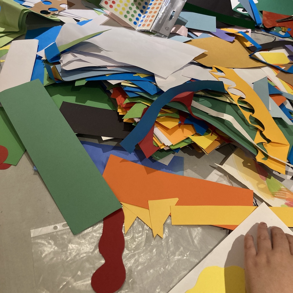
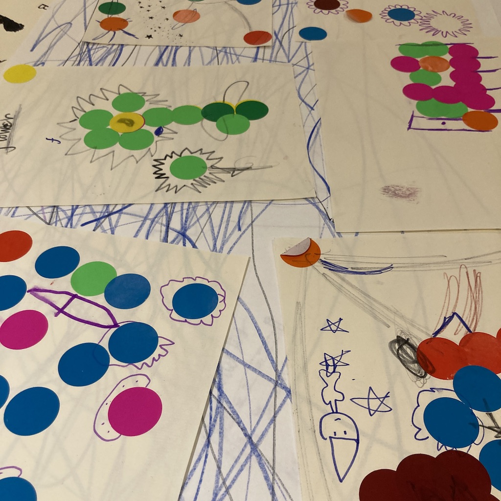
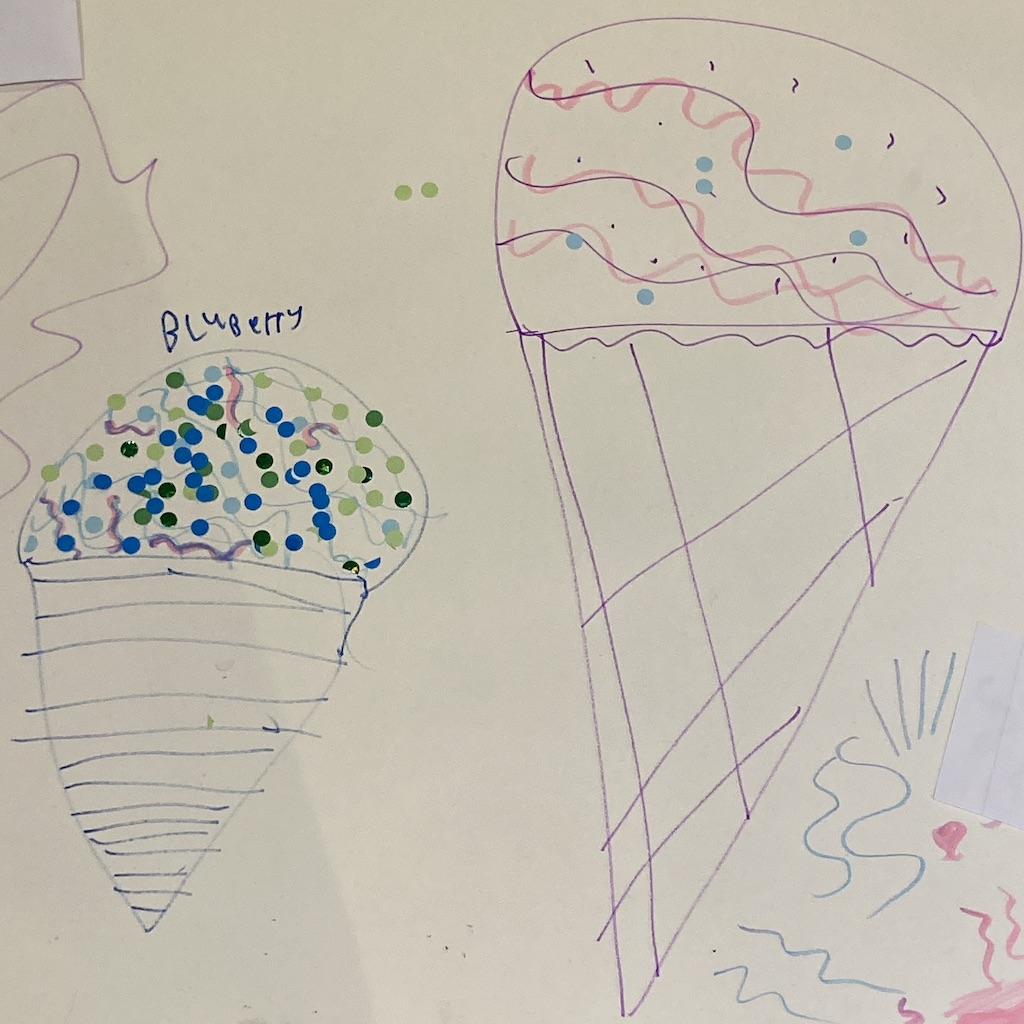
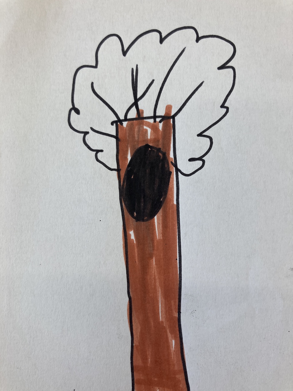
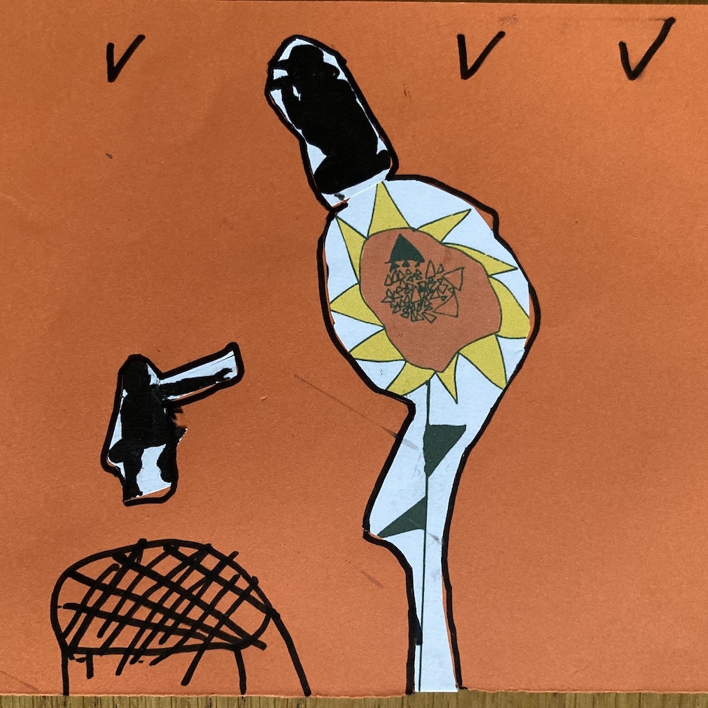
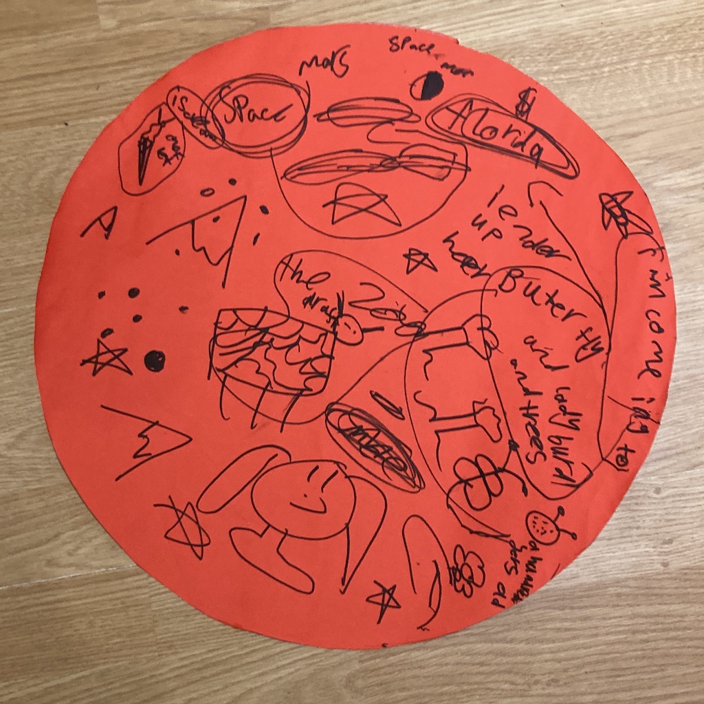
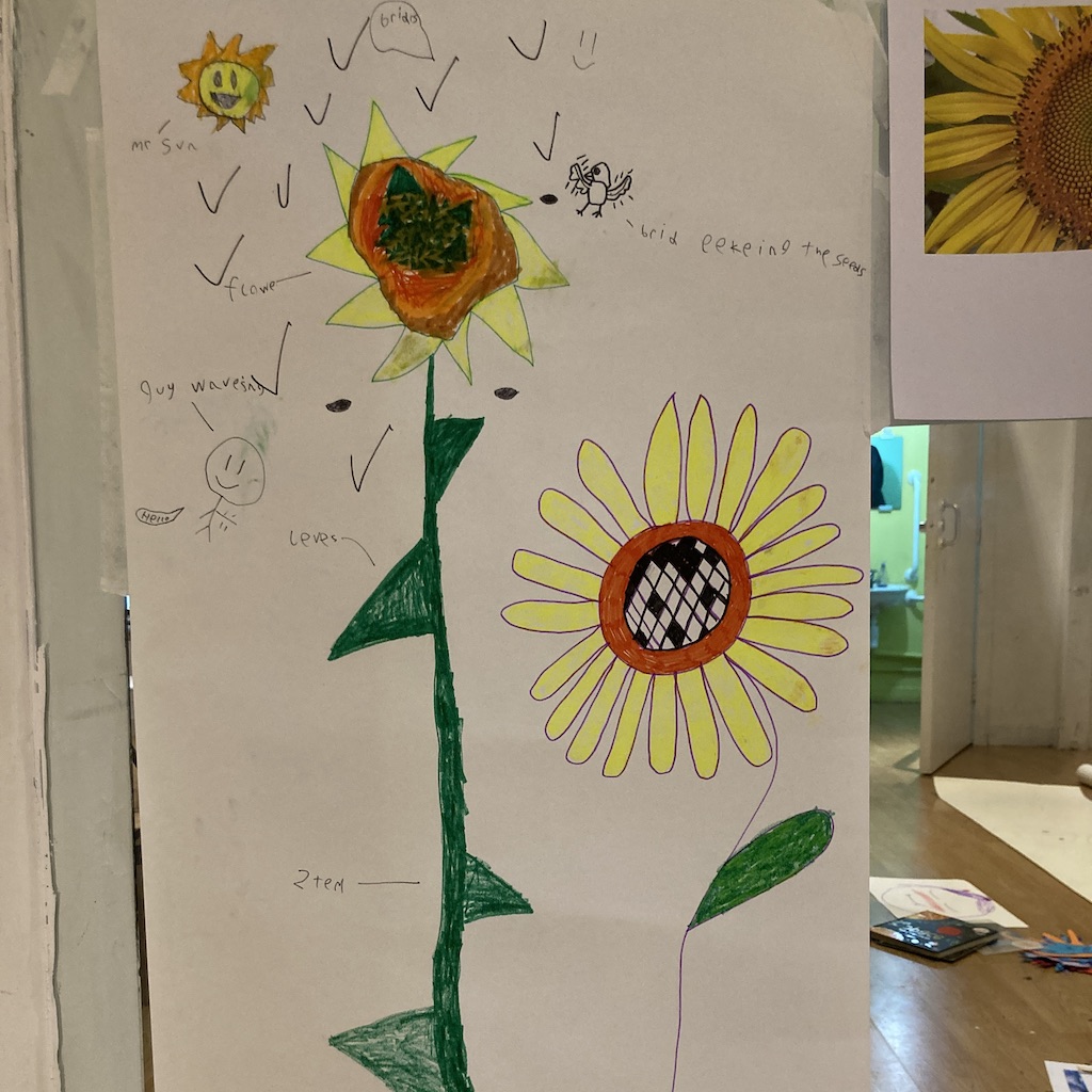
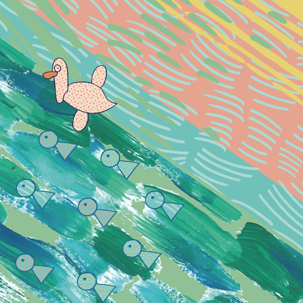
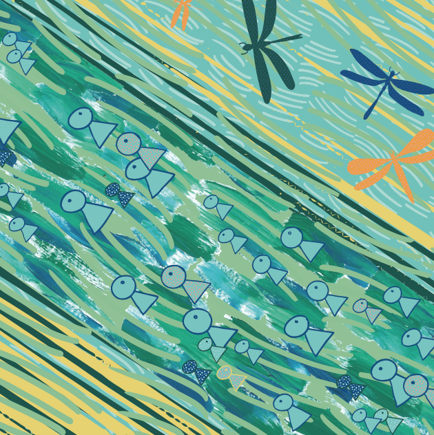
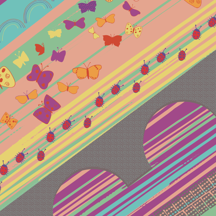
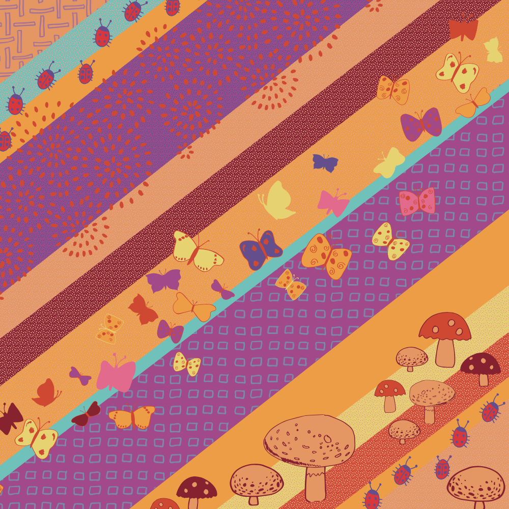
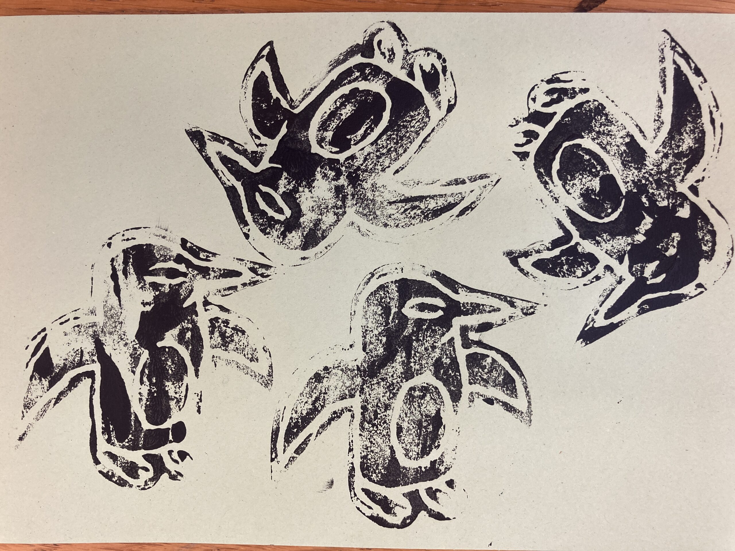
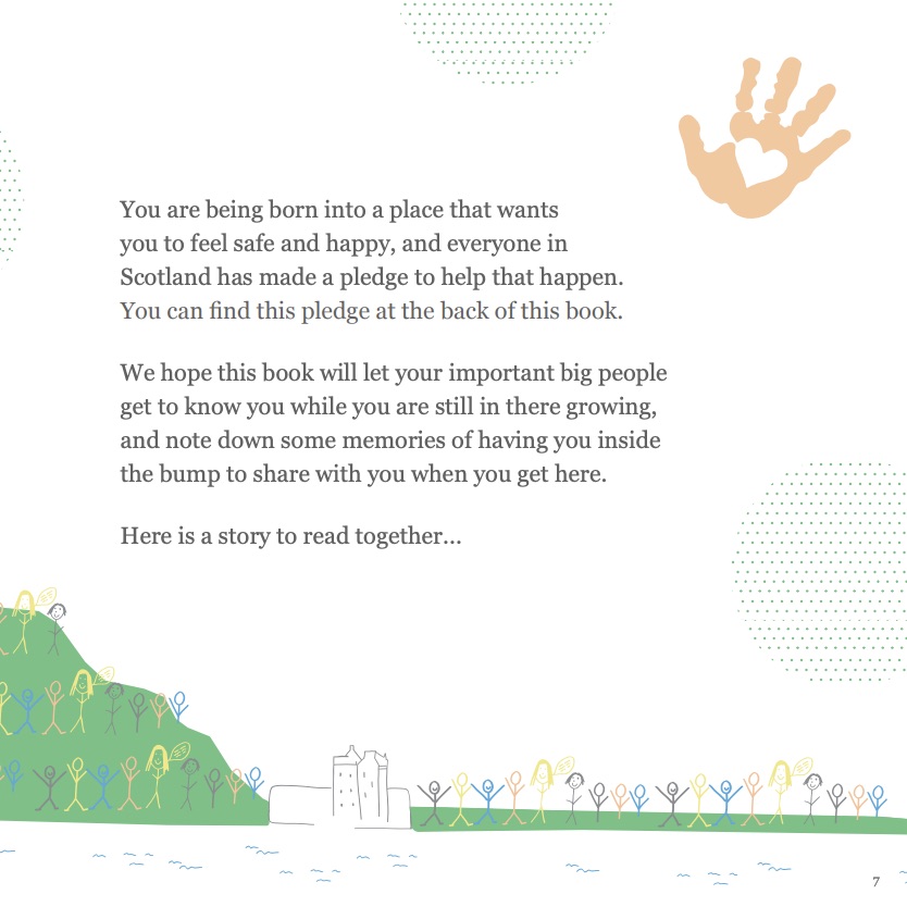
Windows feature a medley of imagery and patterns from the children artworks and some mini silhouettes of some of the people bouncing, spinning, looking and discovering as they go on adventures amongst the artwork. Huge thanks to Grant from PPG Photography for the photo session with the young people and workers capturing all their energy!
(Photos above by Grant at PPG Photography)
“Having local children support the transformation with vibrant colour has been significant, instilling a deep sense of pride in everyone who uses the space. It now mirrors the energy and spirit of Front Lounge, and marks a bold step forward as we evolve into a dedicated learning centre. Most importantly, this transformation has changed how the wider community sees and engages with the building, helping to make Hilltown a more vibrant place to live, work, and connect.” Chika Inatimi, Project Leader, Front Lounge.
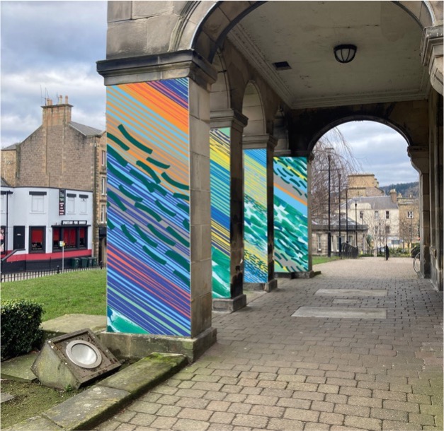
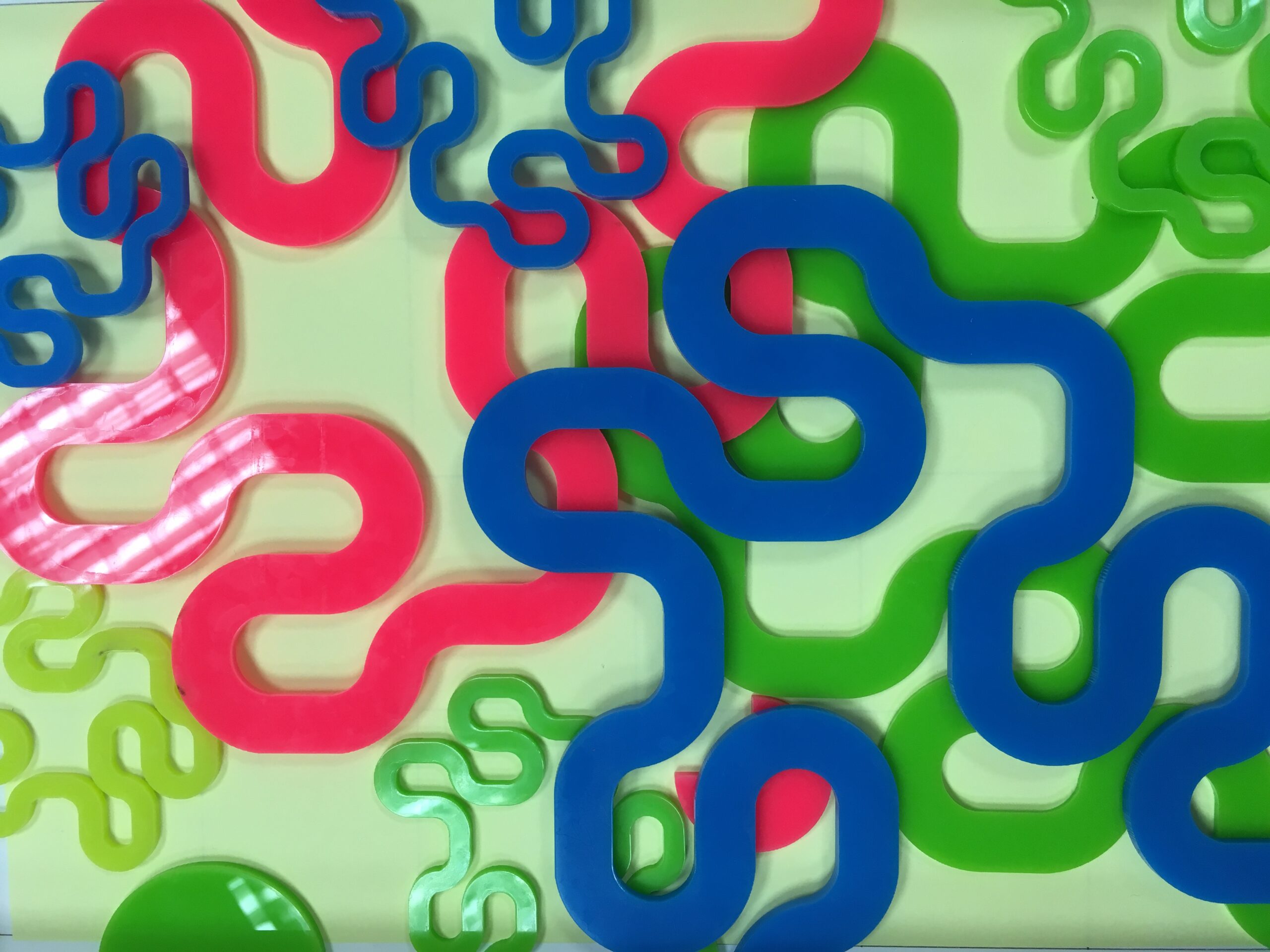
Paintwork
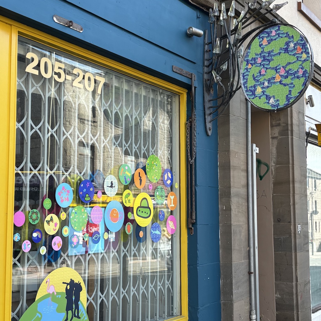
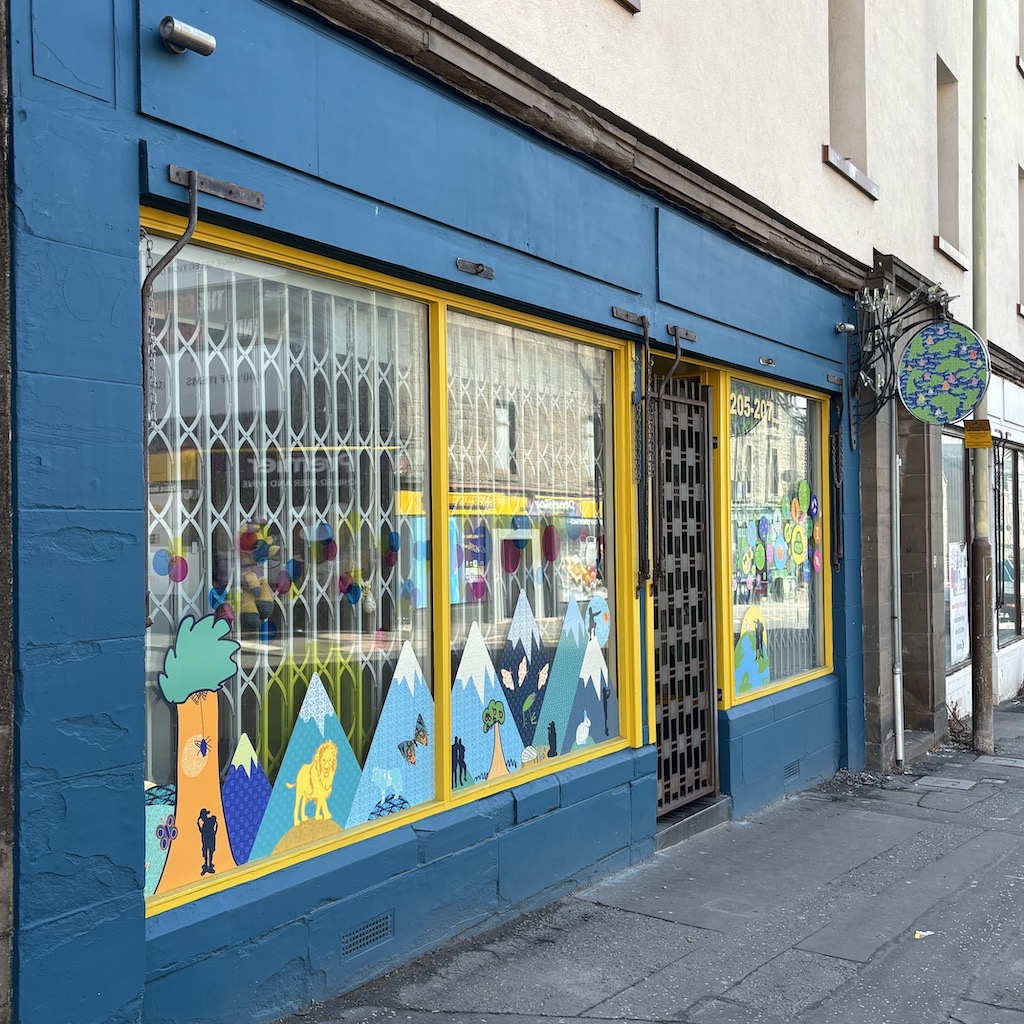
The exteriors was quite dilapidated, revealing the layers of history through the flaky paintwork. With each shop being a different colour. I tested different concepts that would allow the window artwork to pop and bring the units together as one.
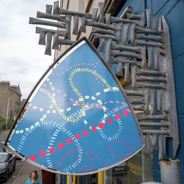
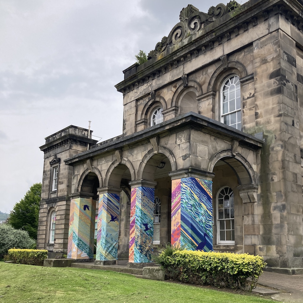
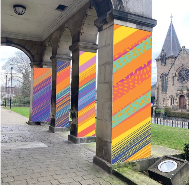
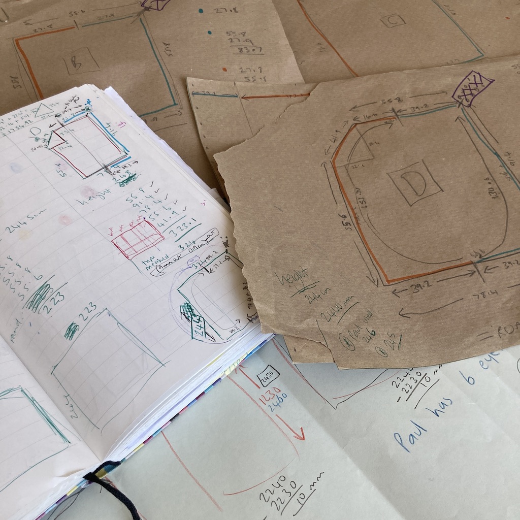
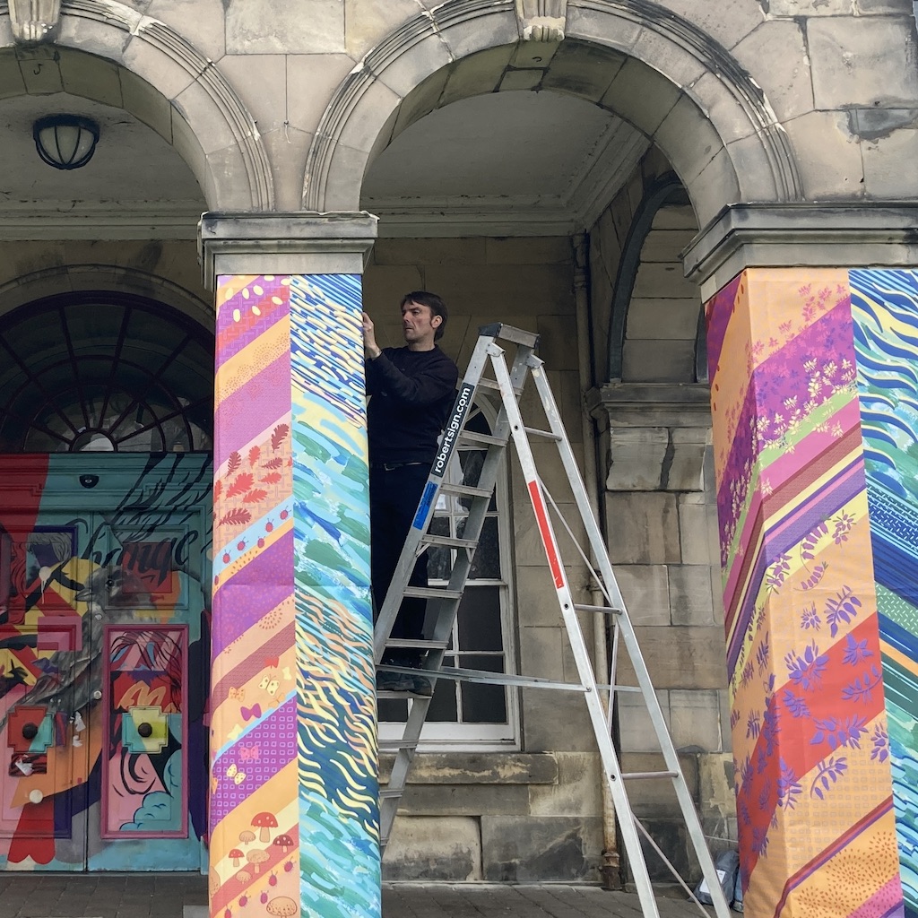
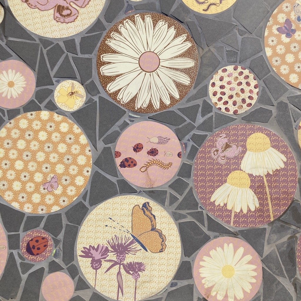
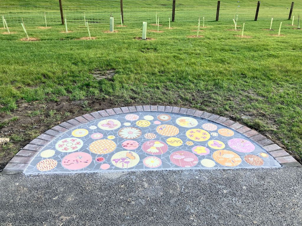
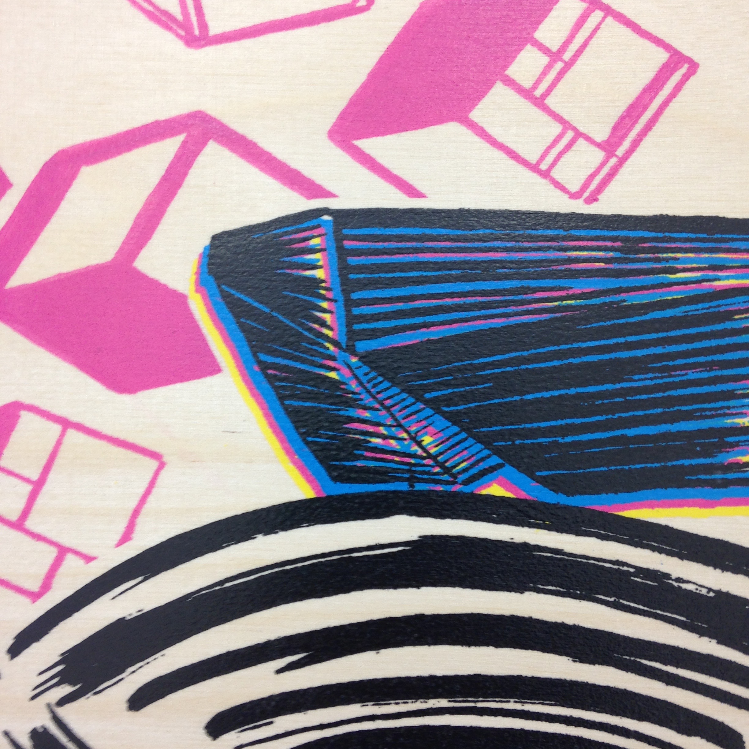
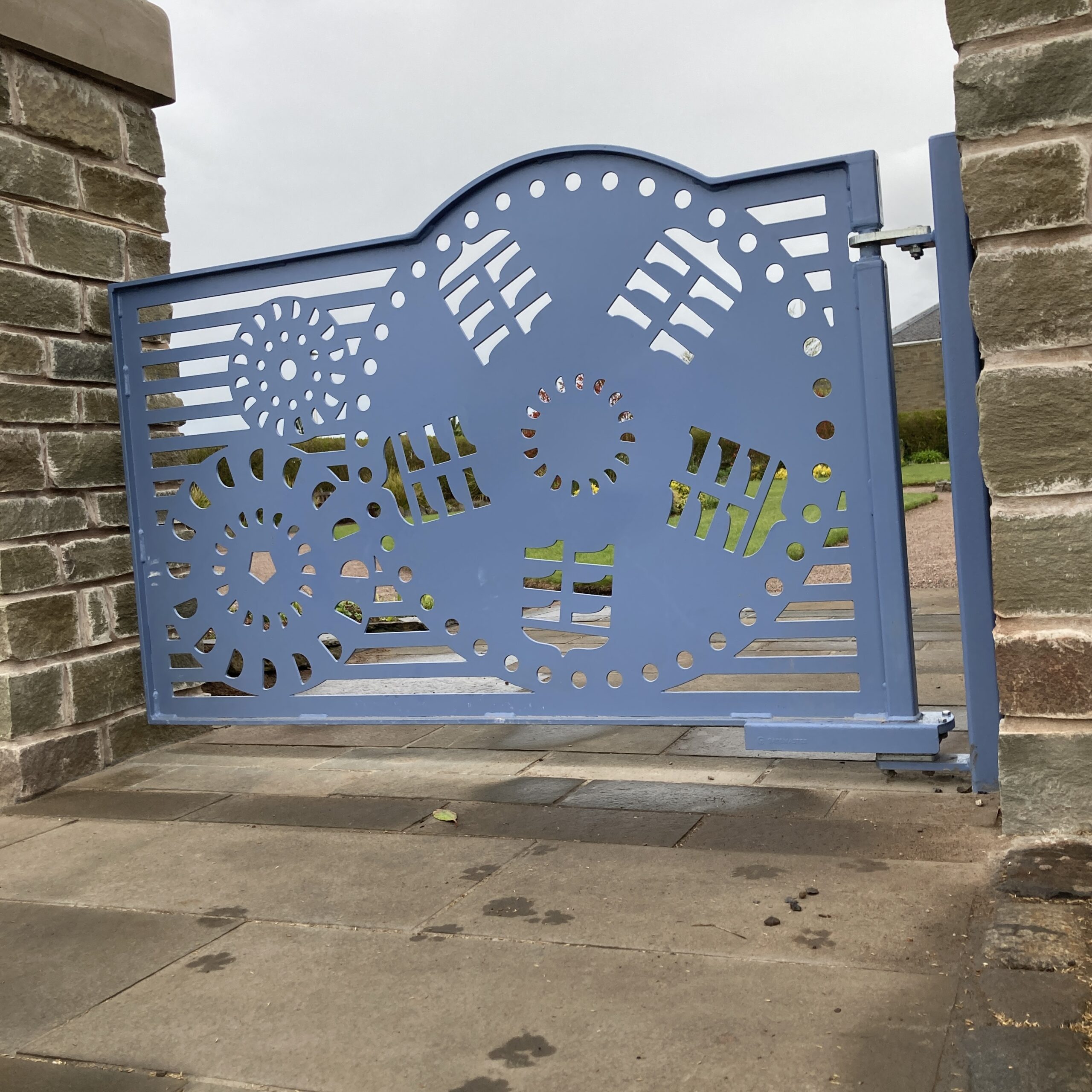
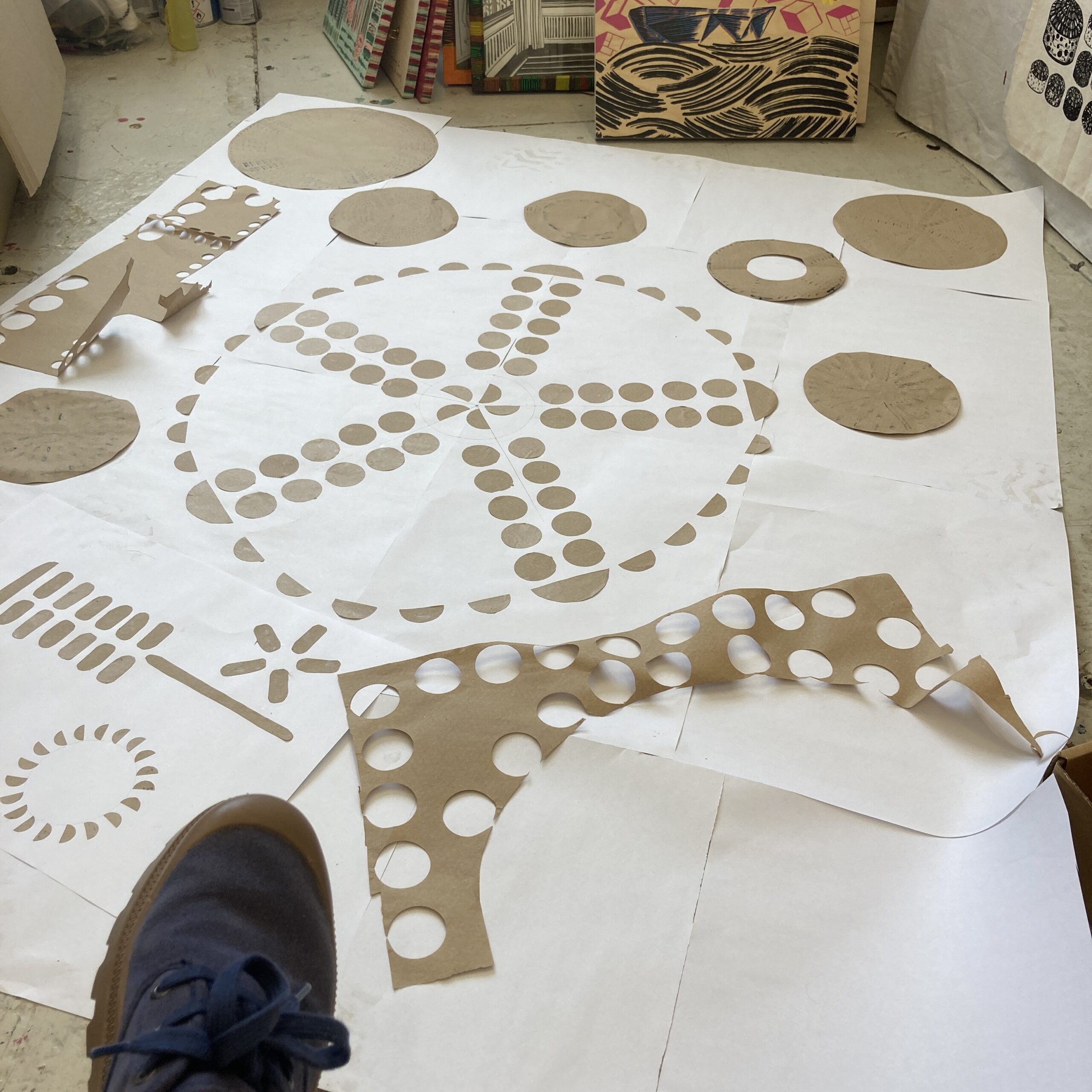
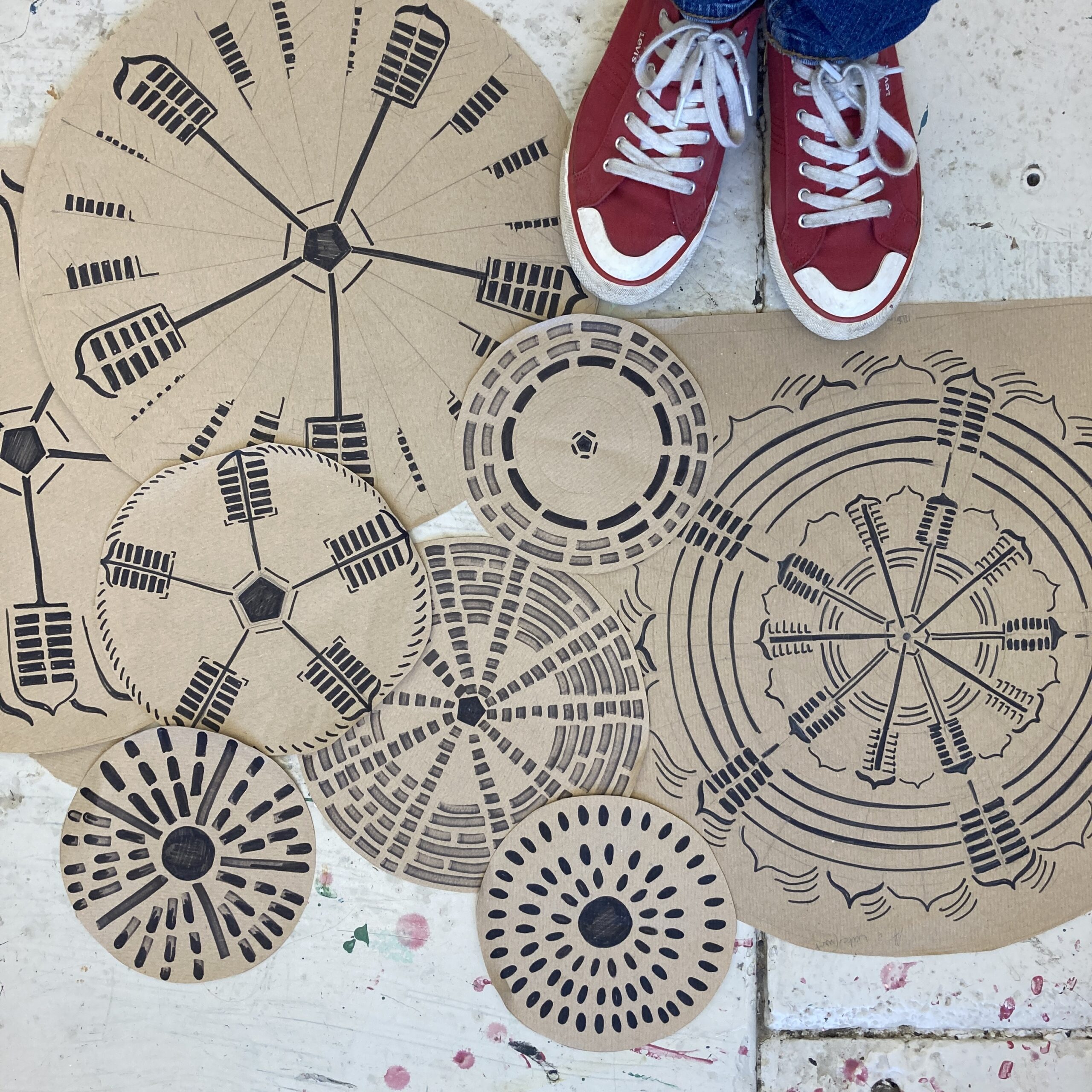
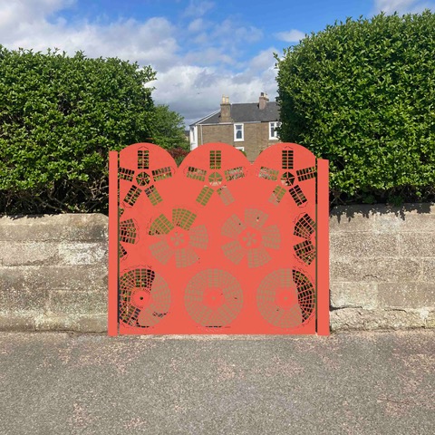
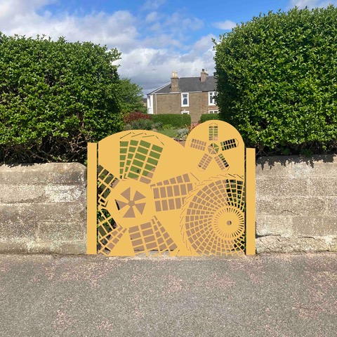
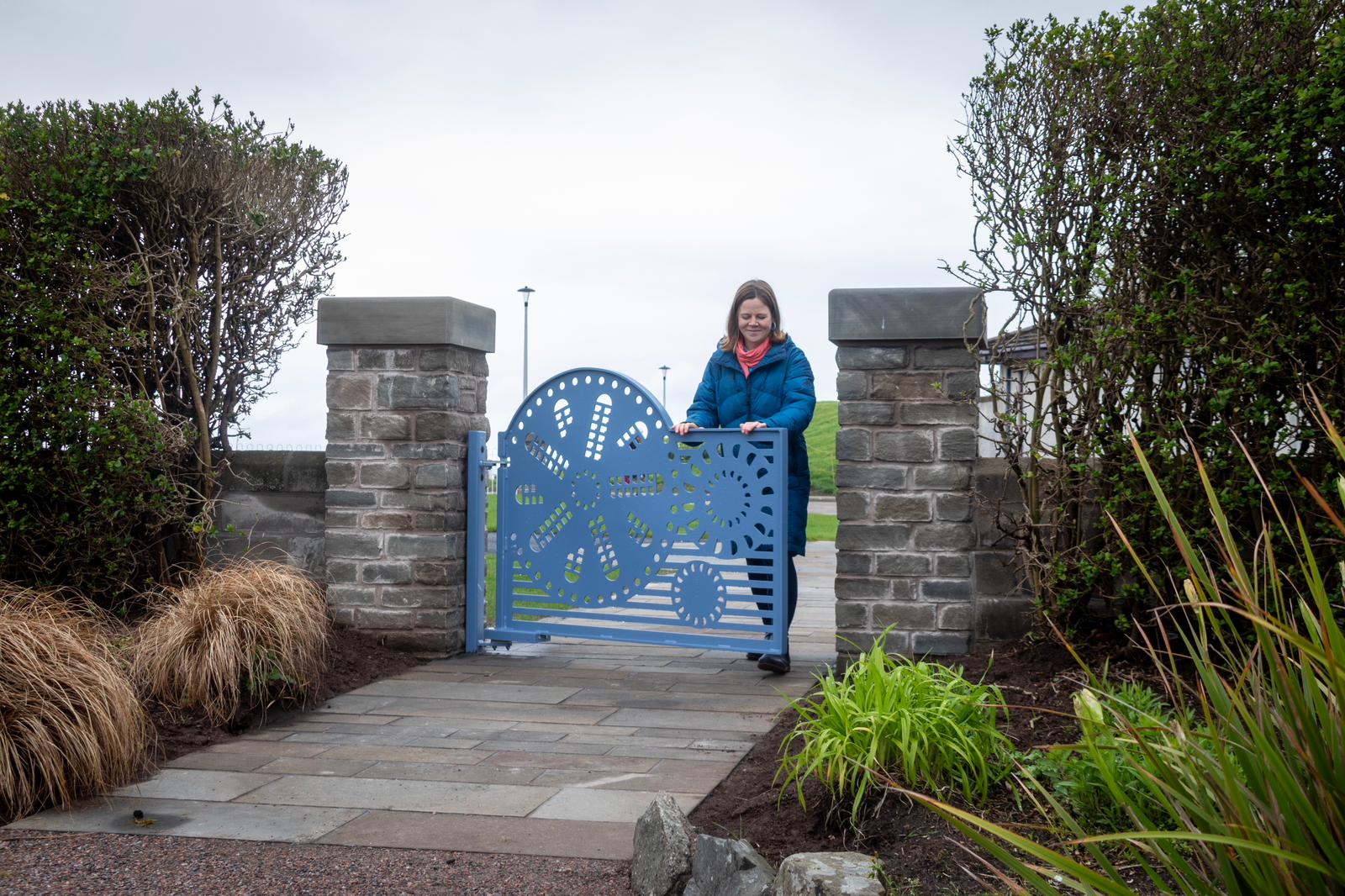
Hanging Signage
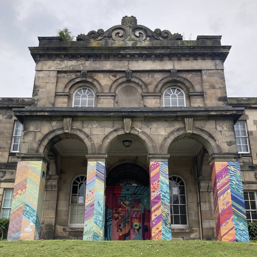
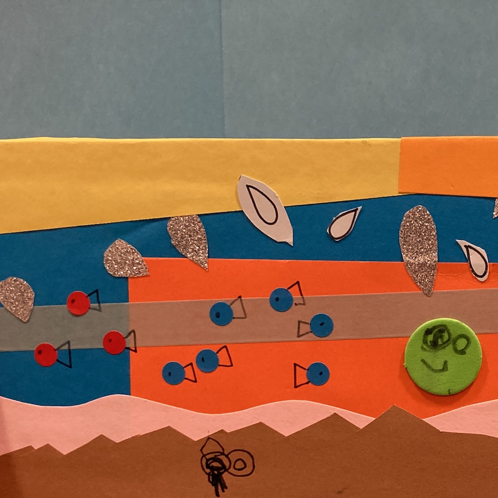
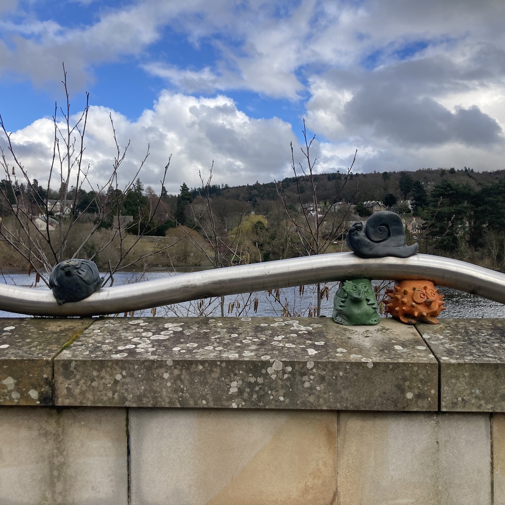
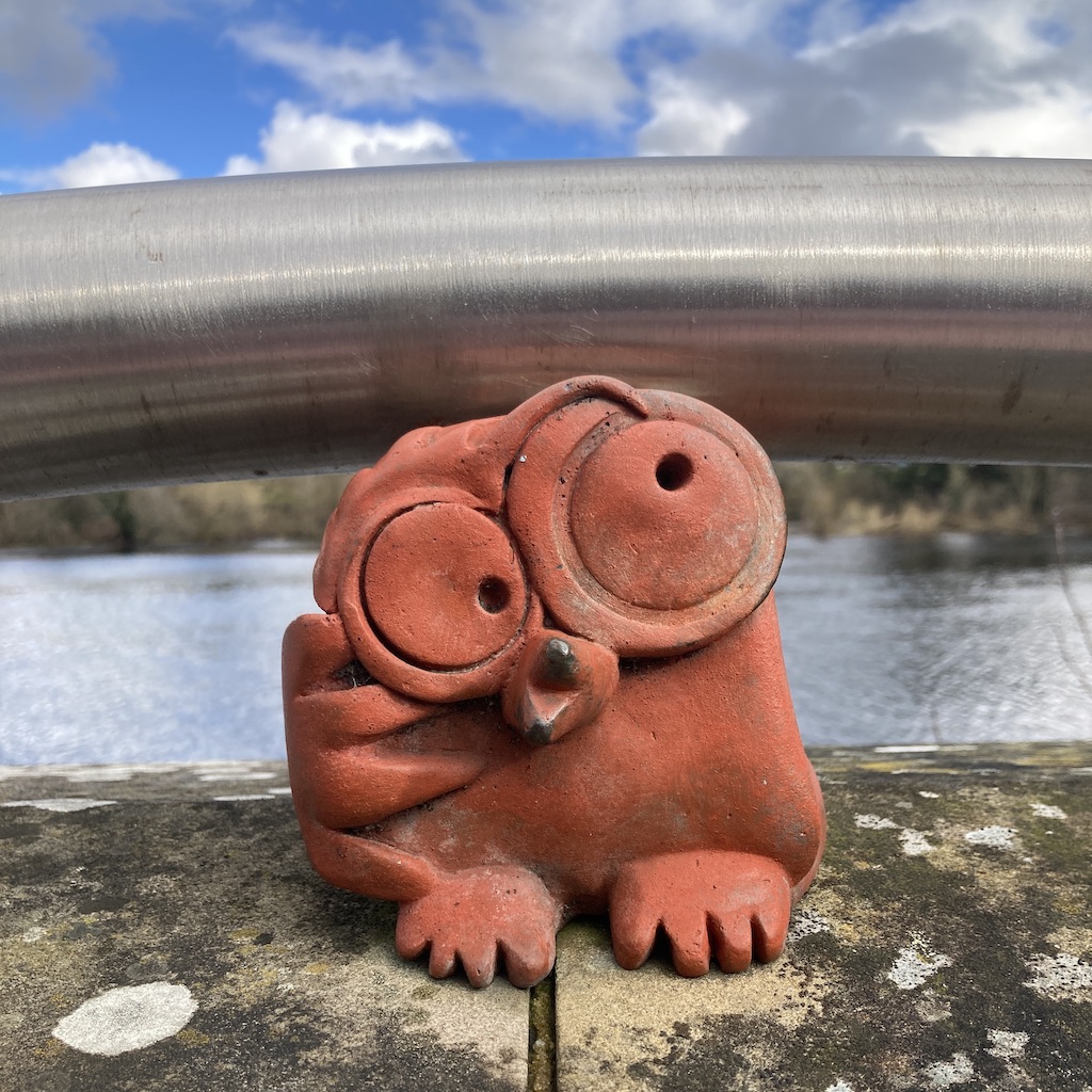
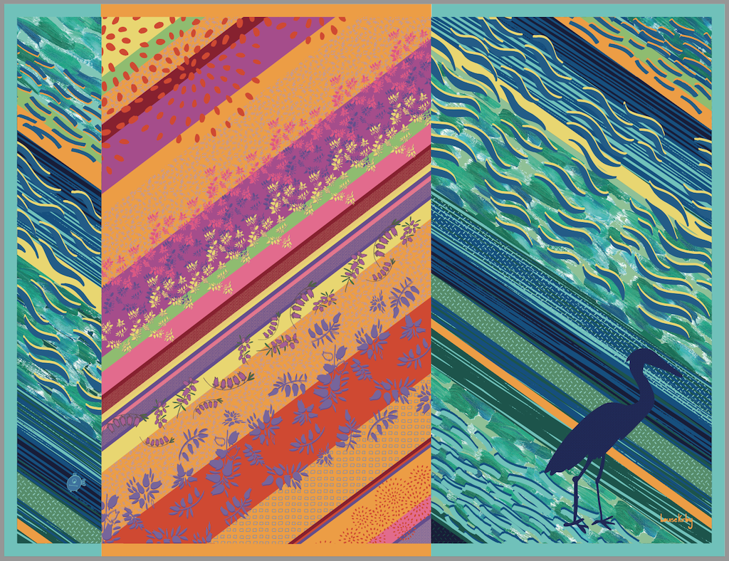
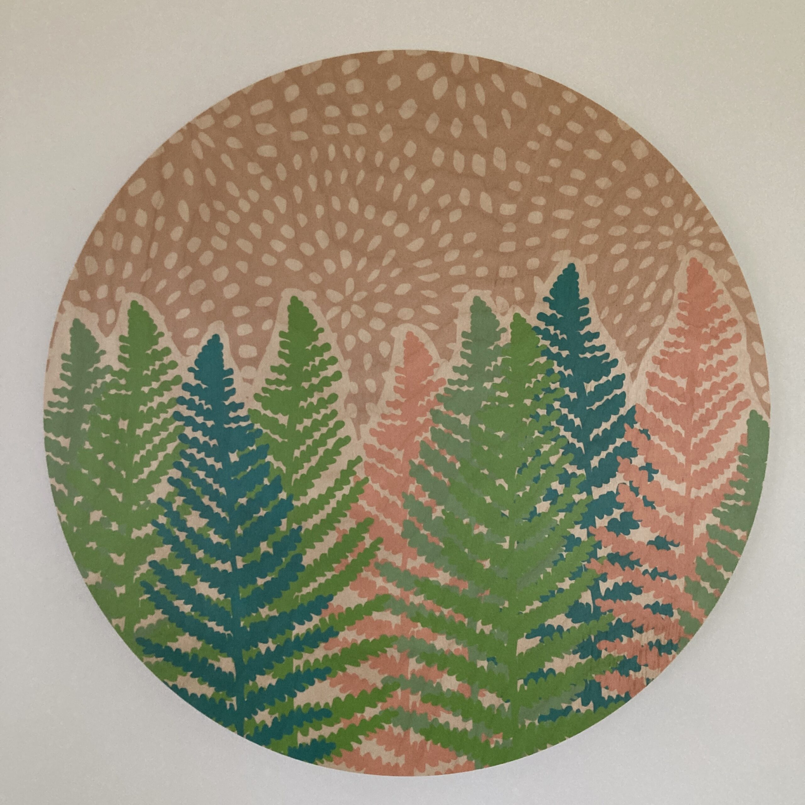
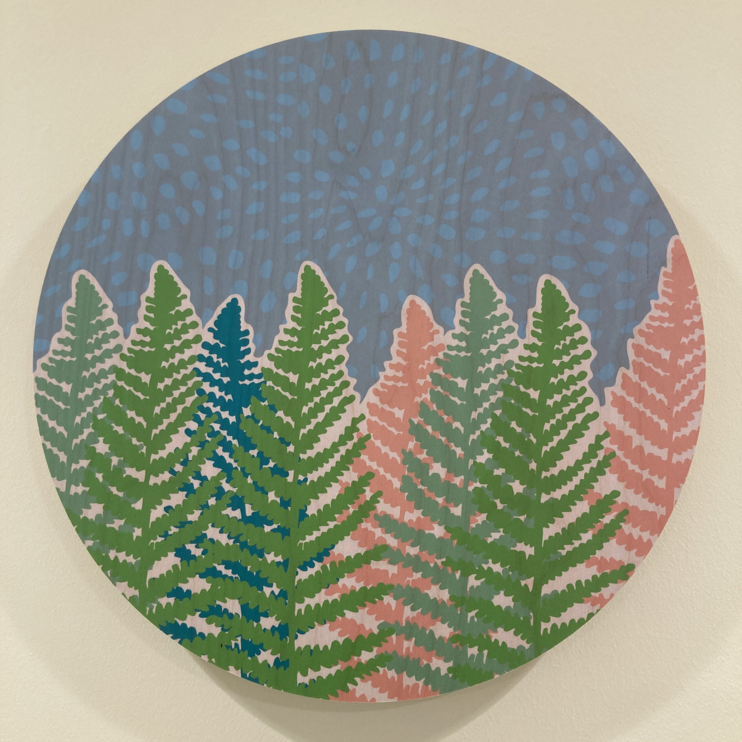
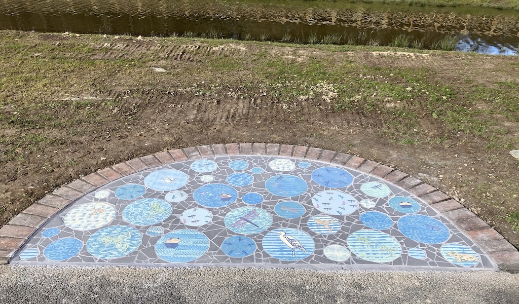
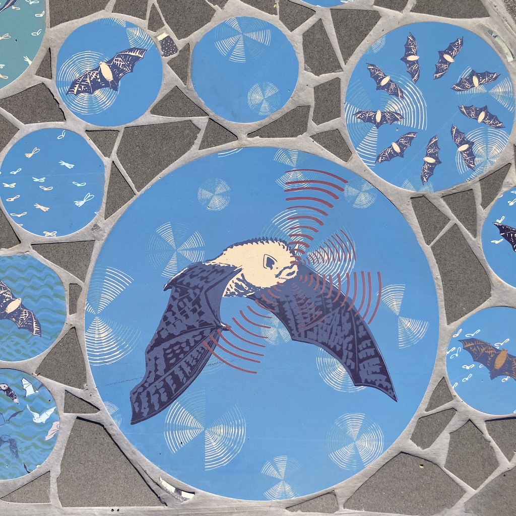
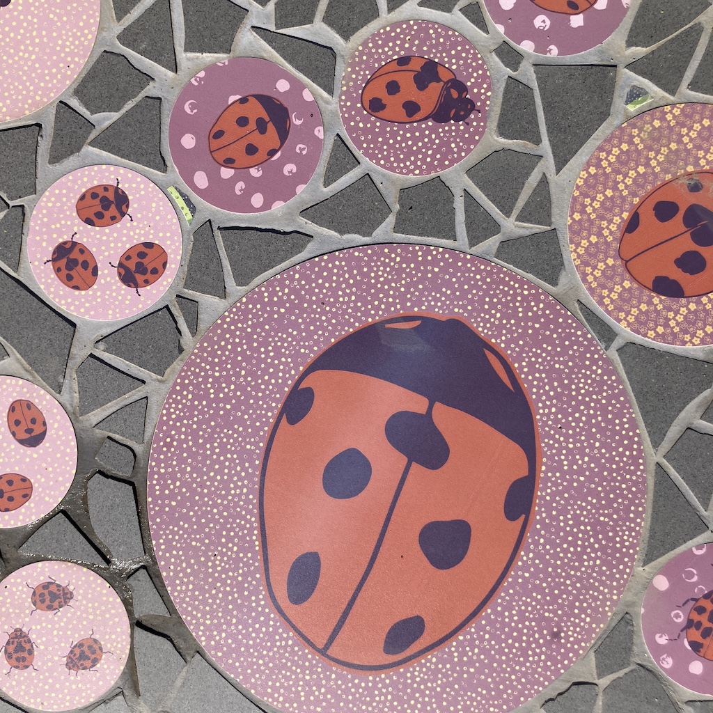
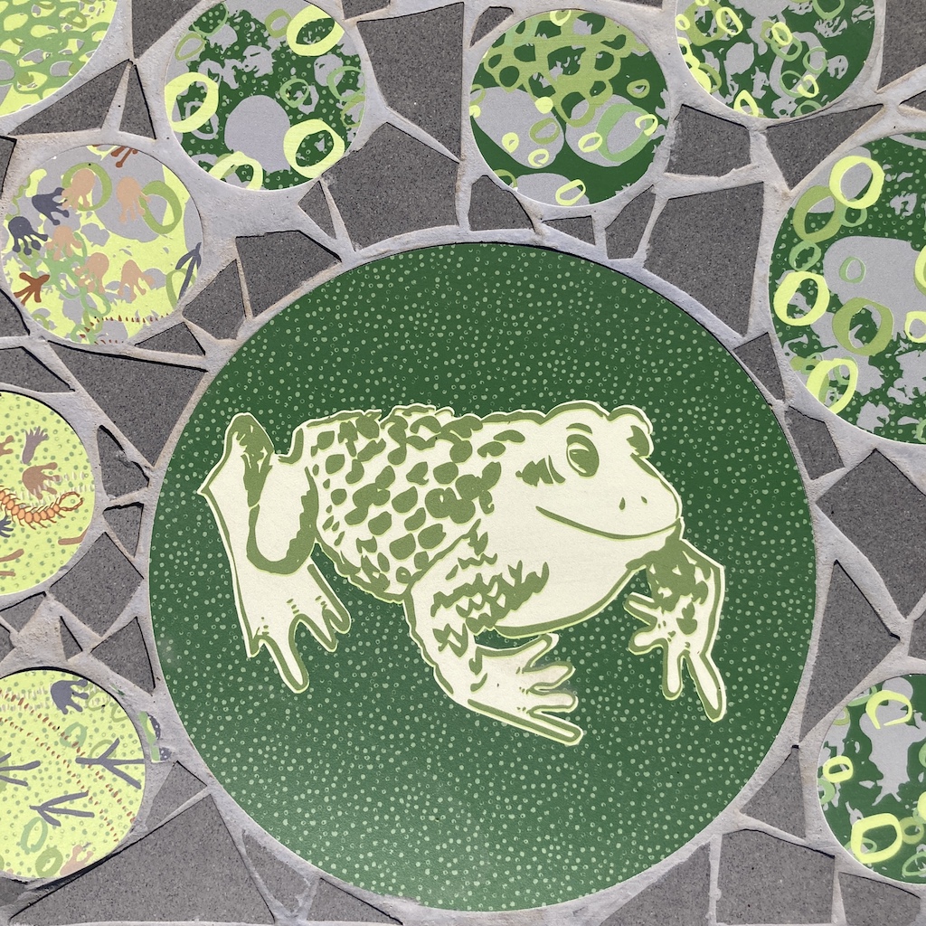
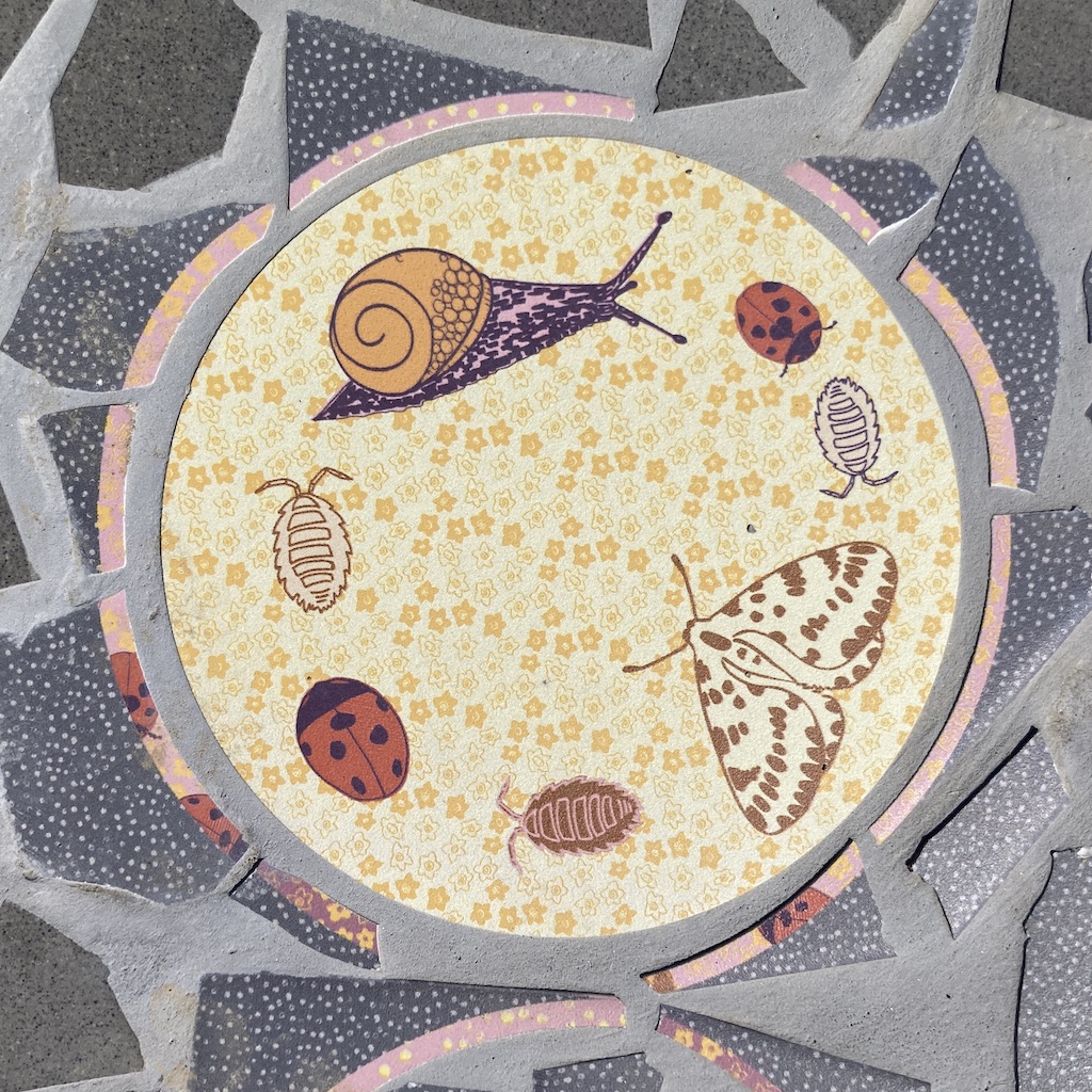
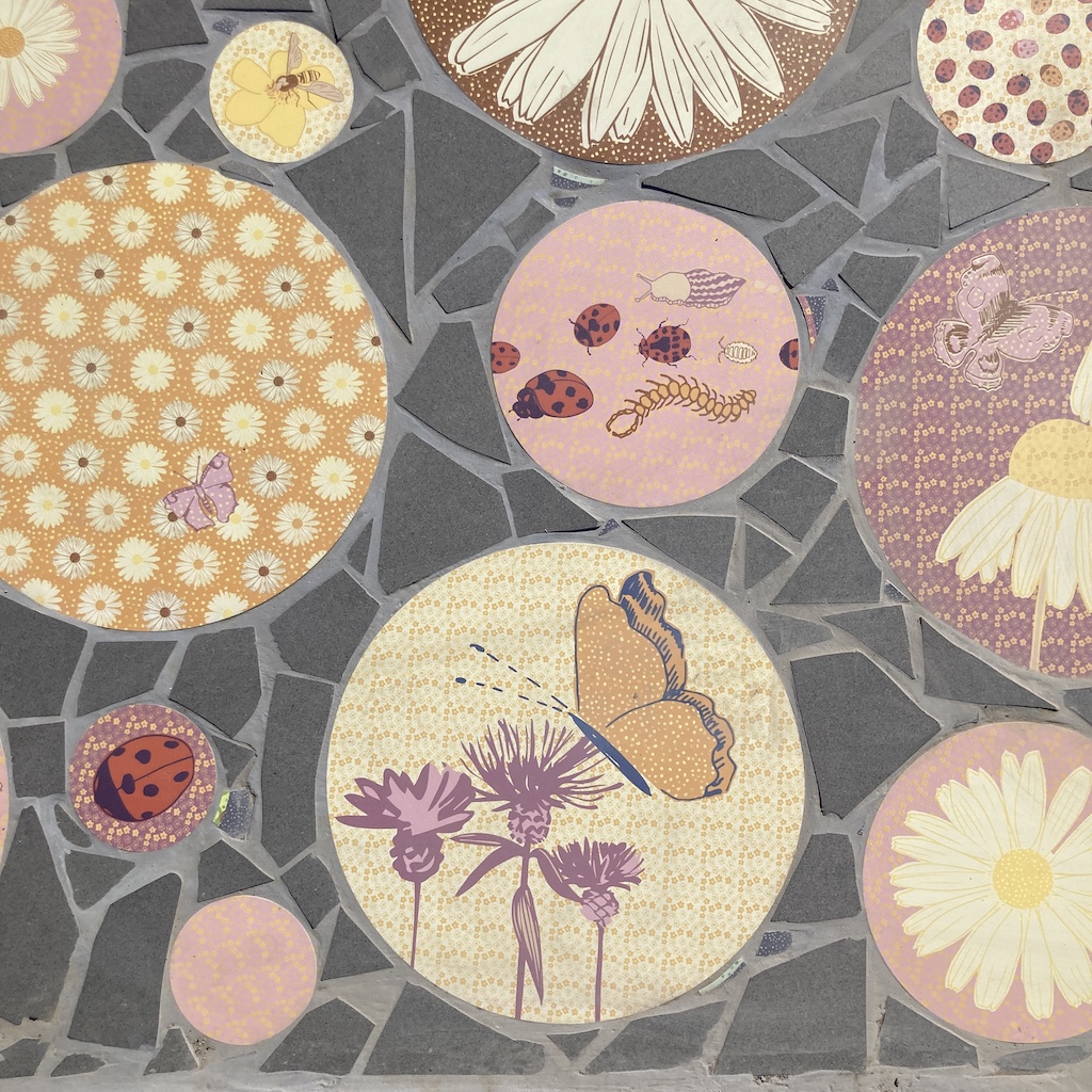
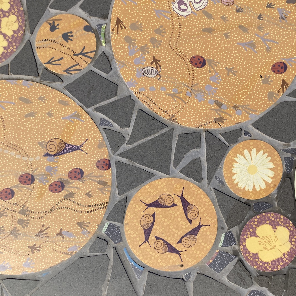
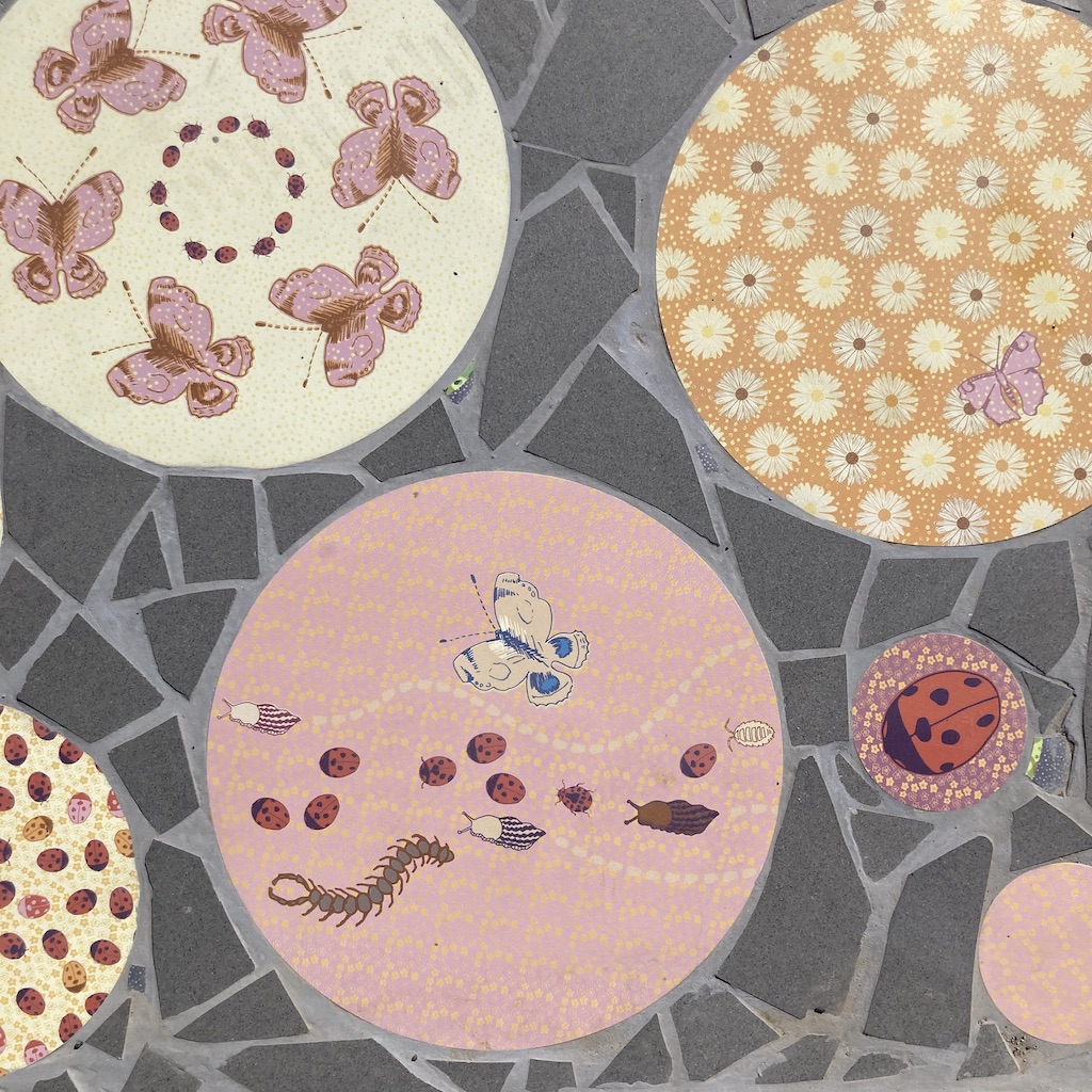
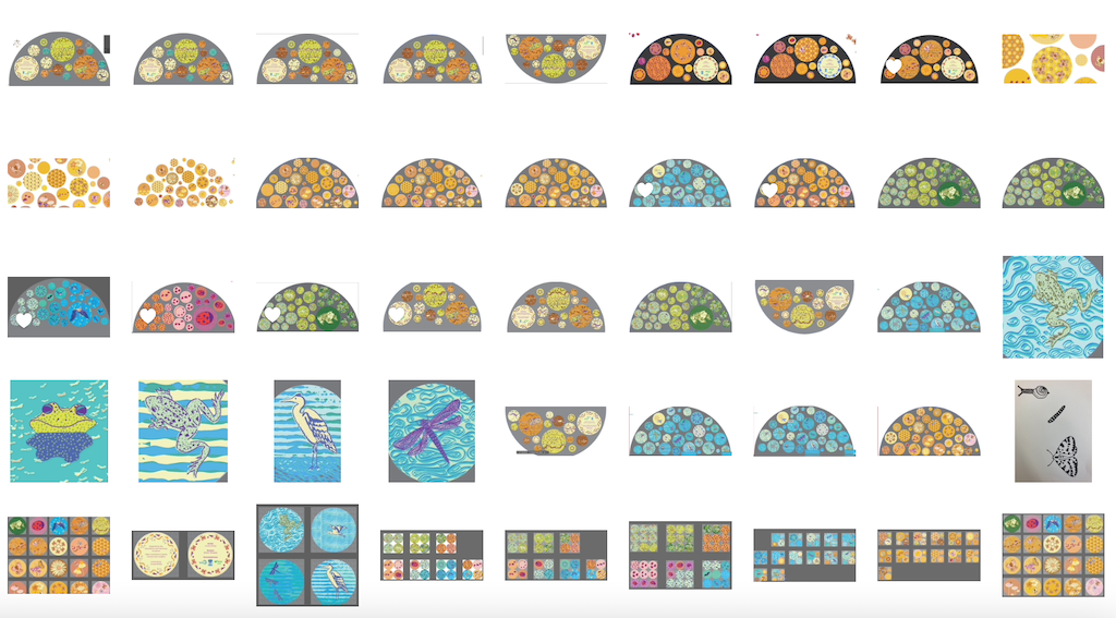
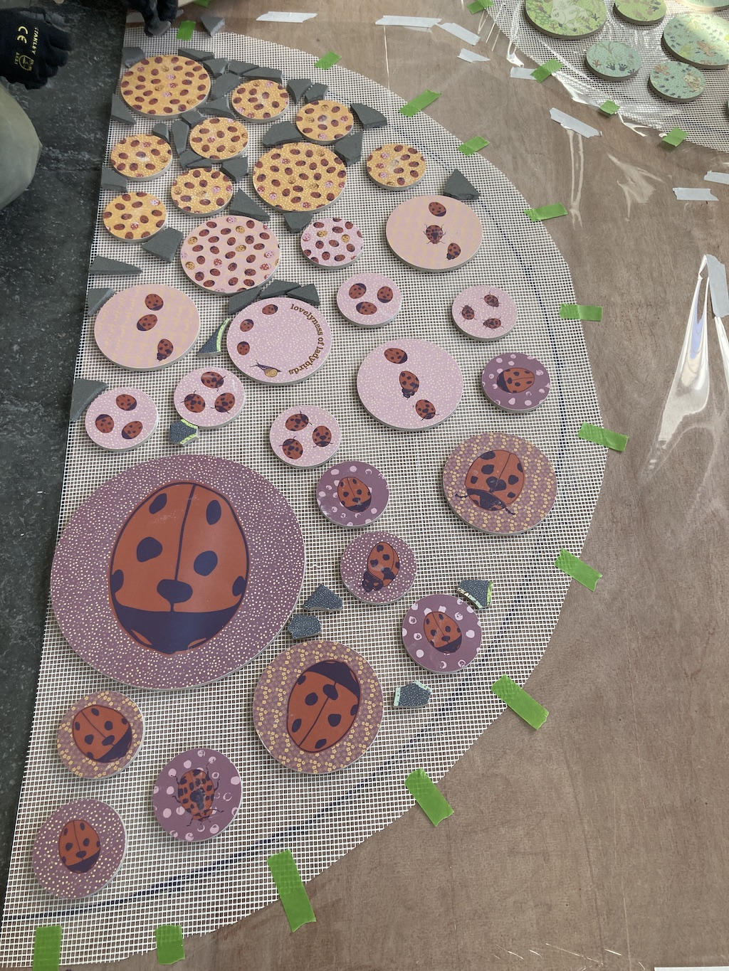
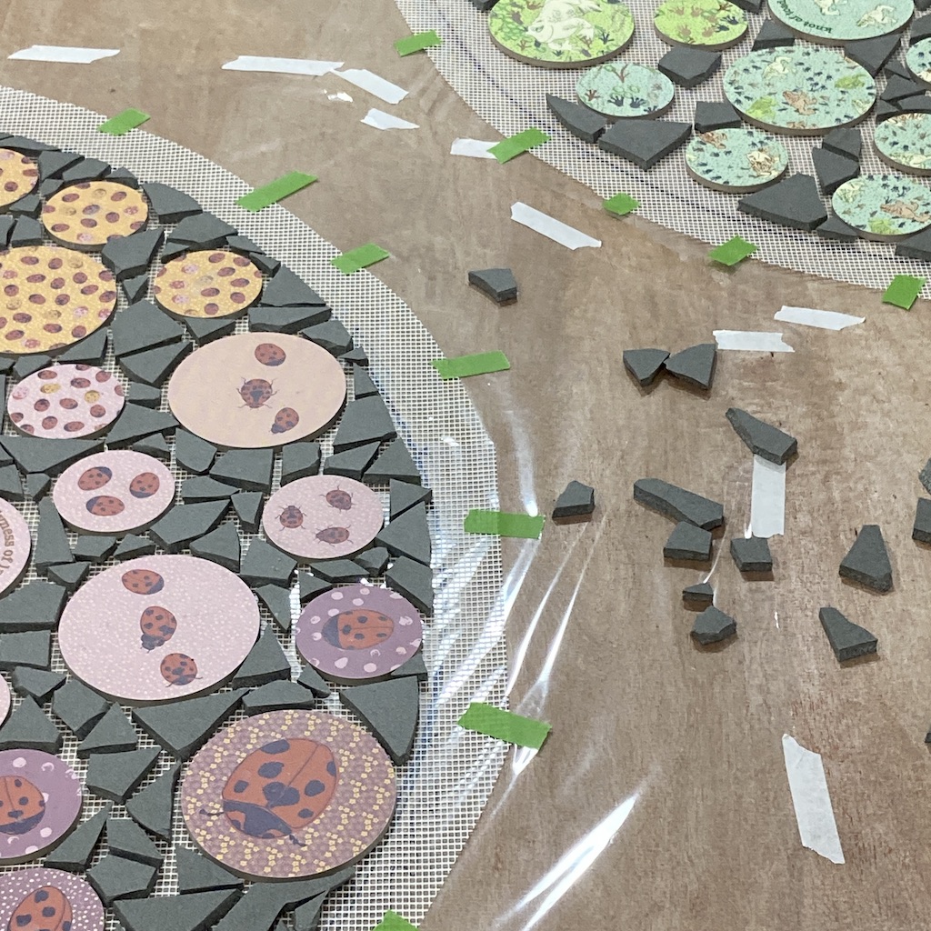
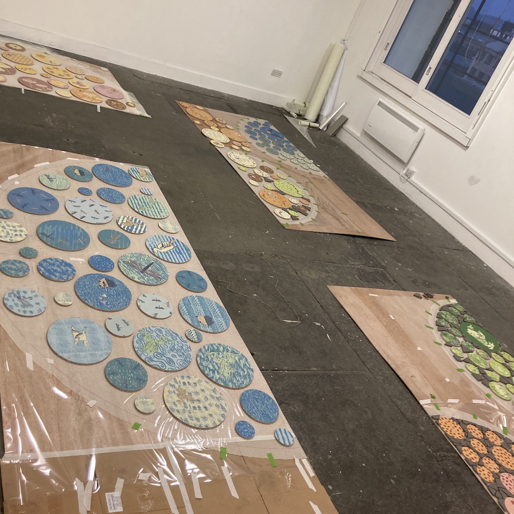
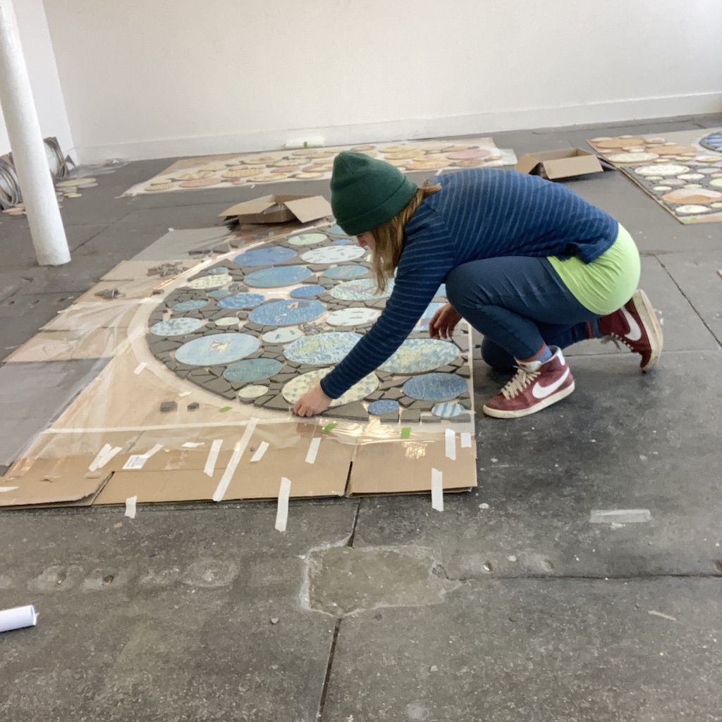
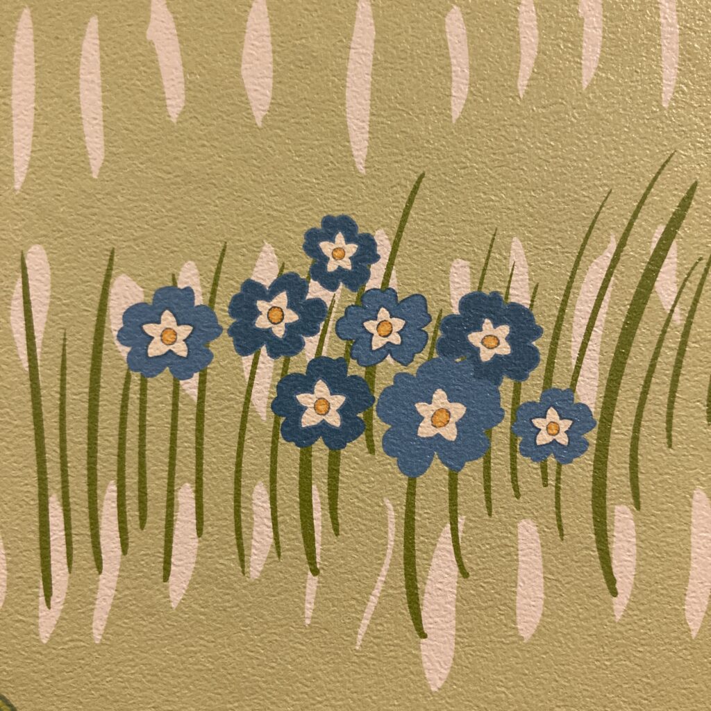
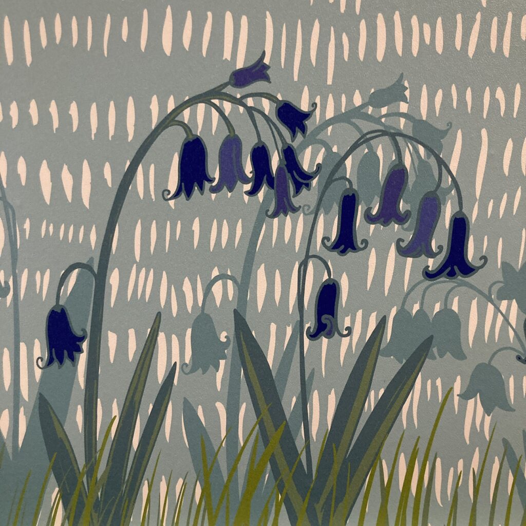
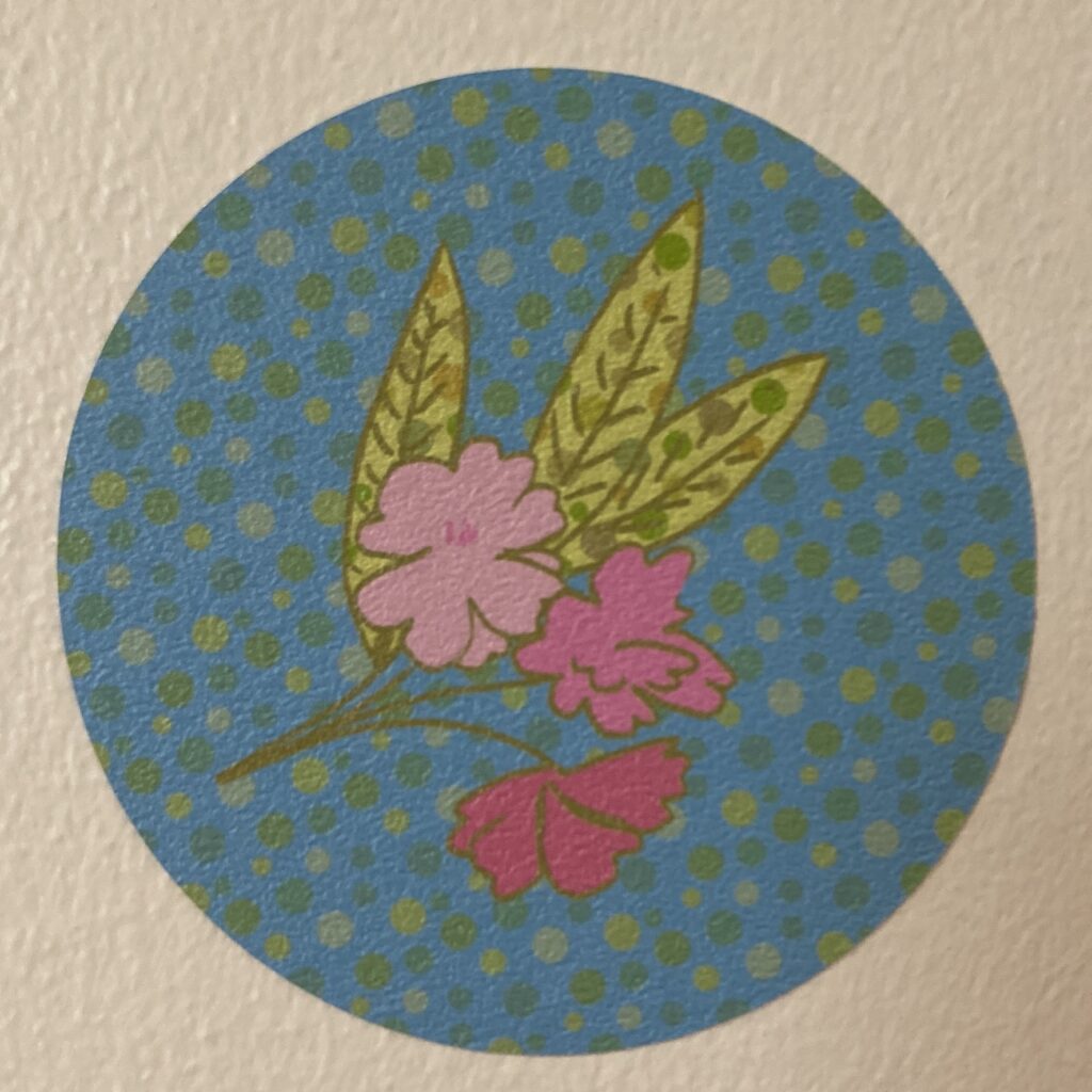
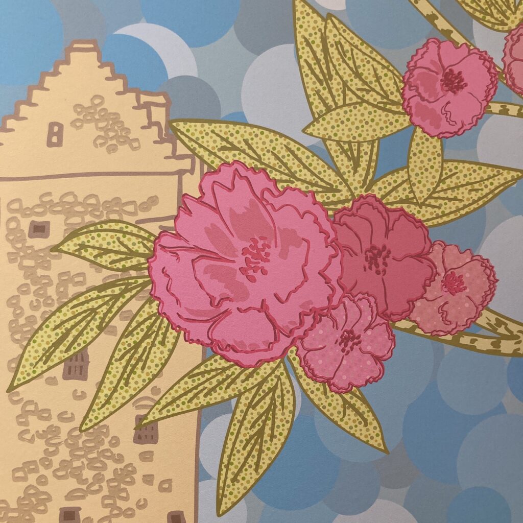
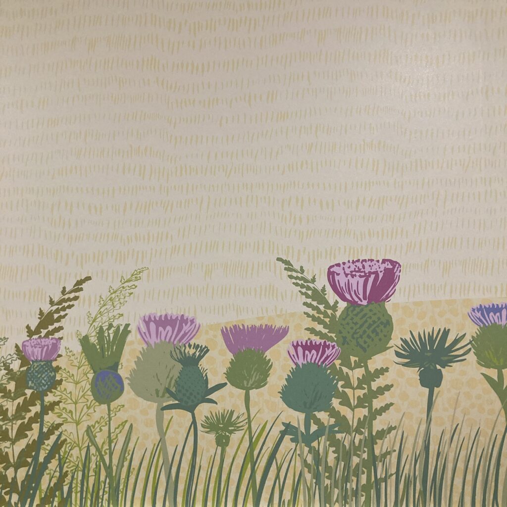
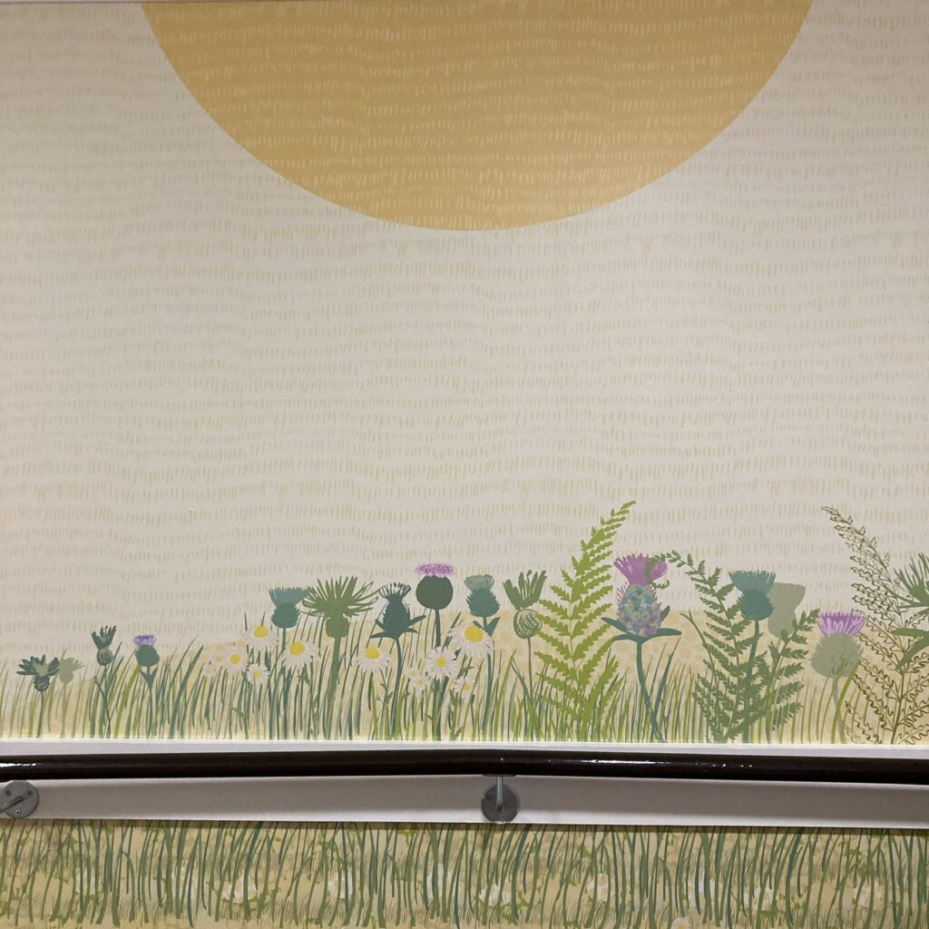
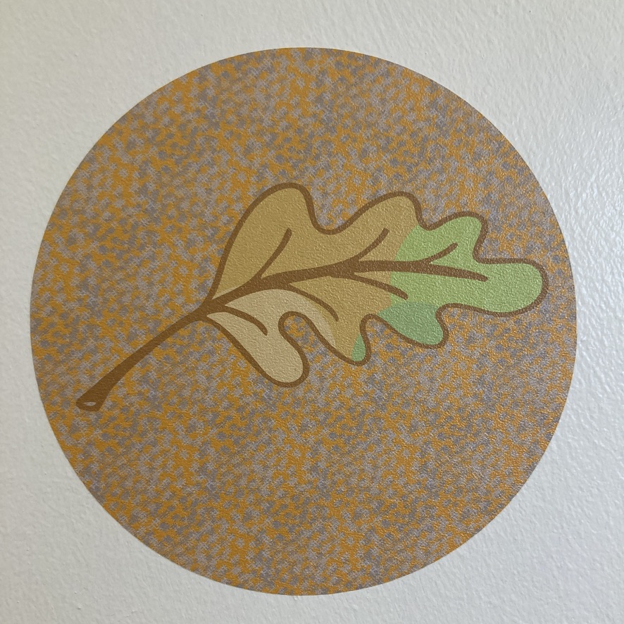
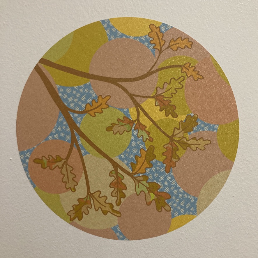
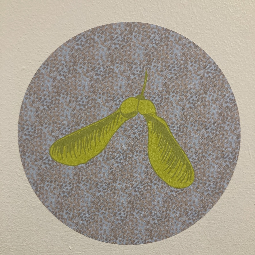
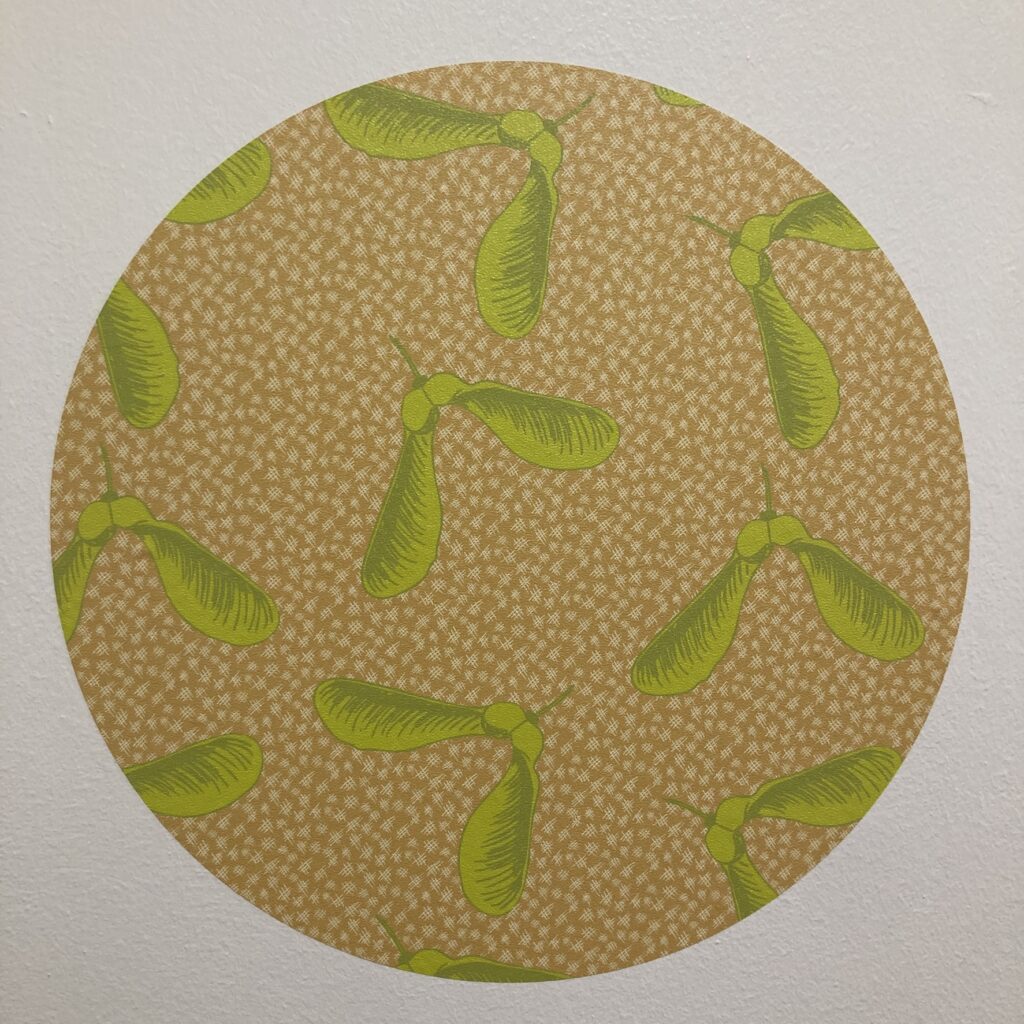
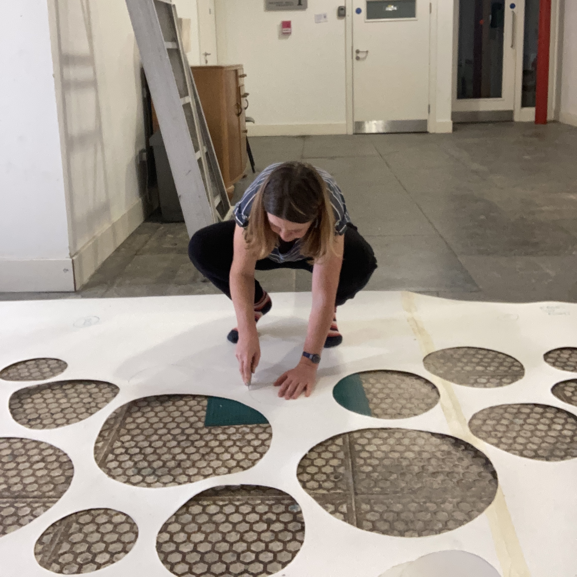
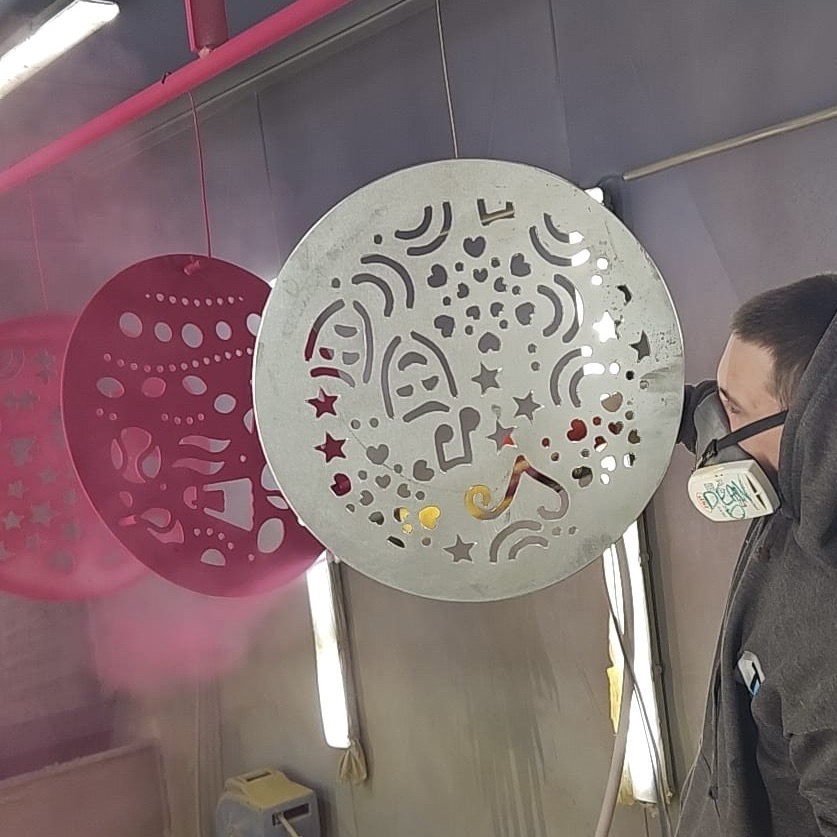
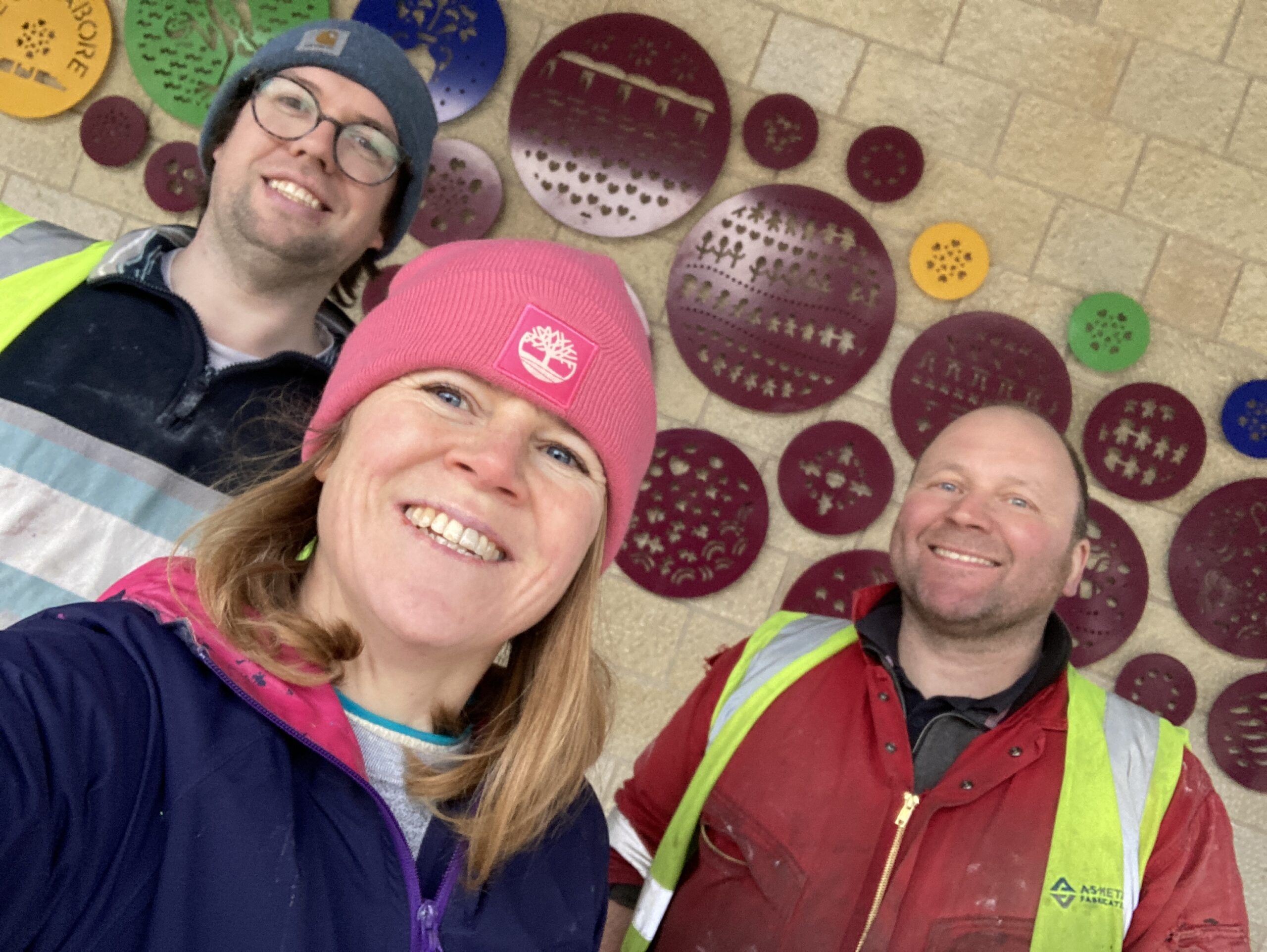
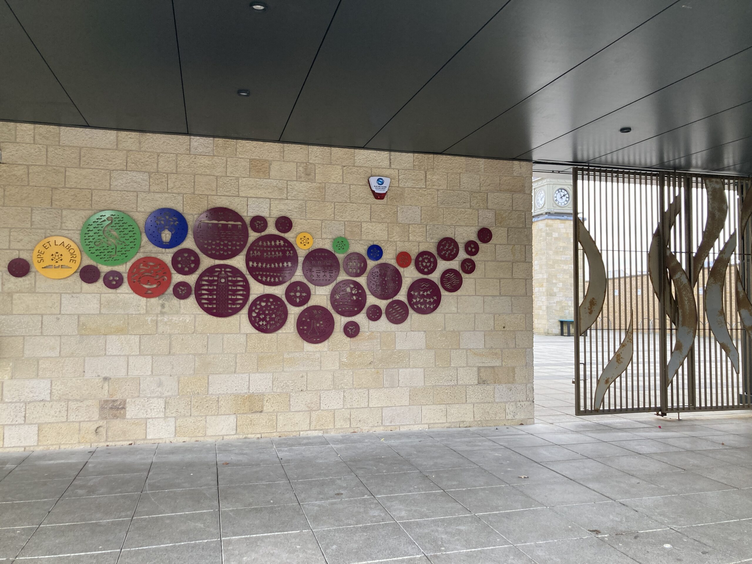
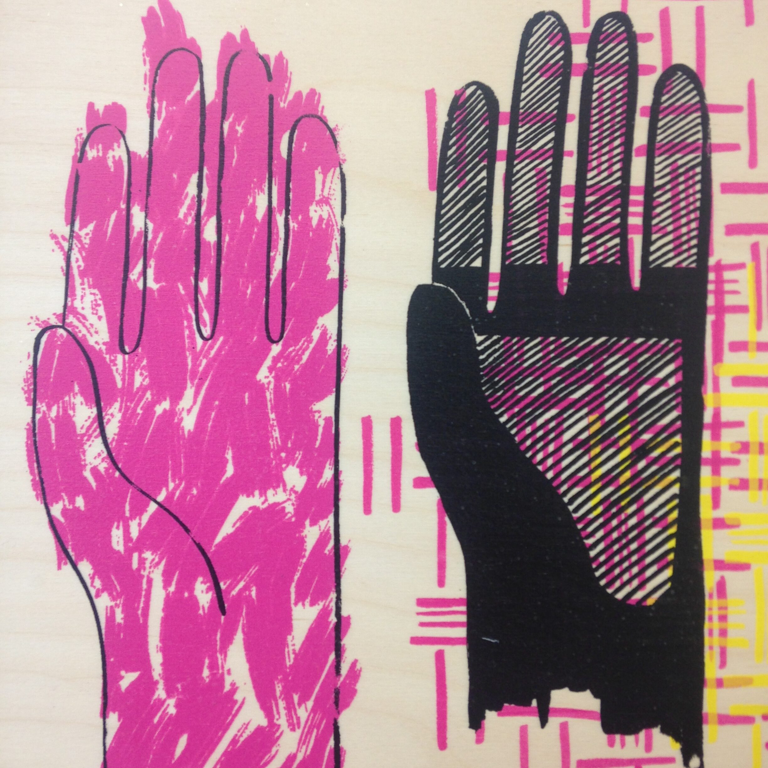
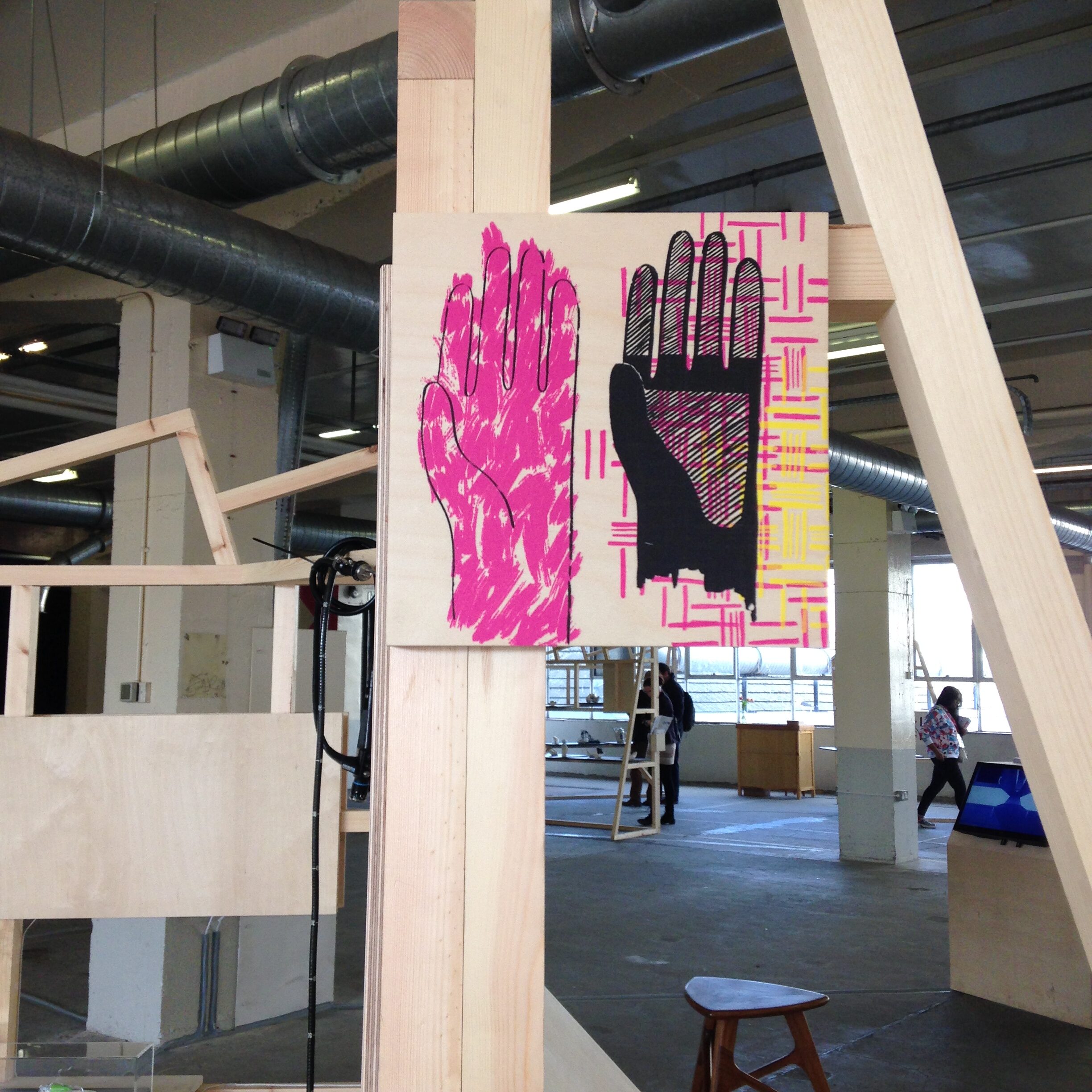
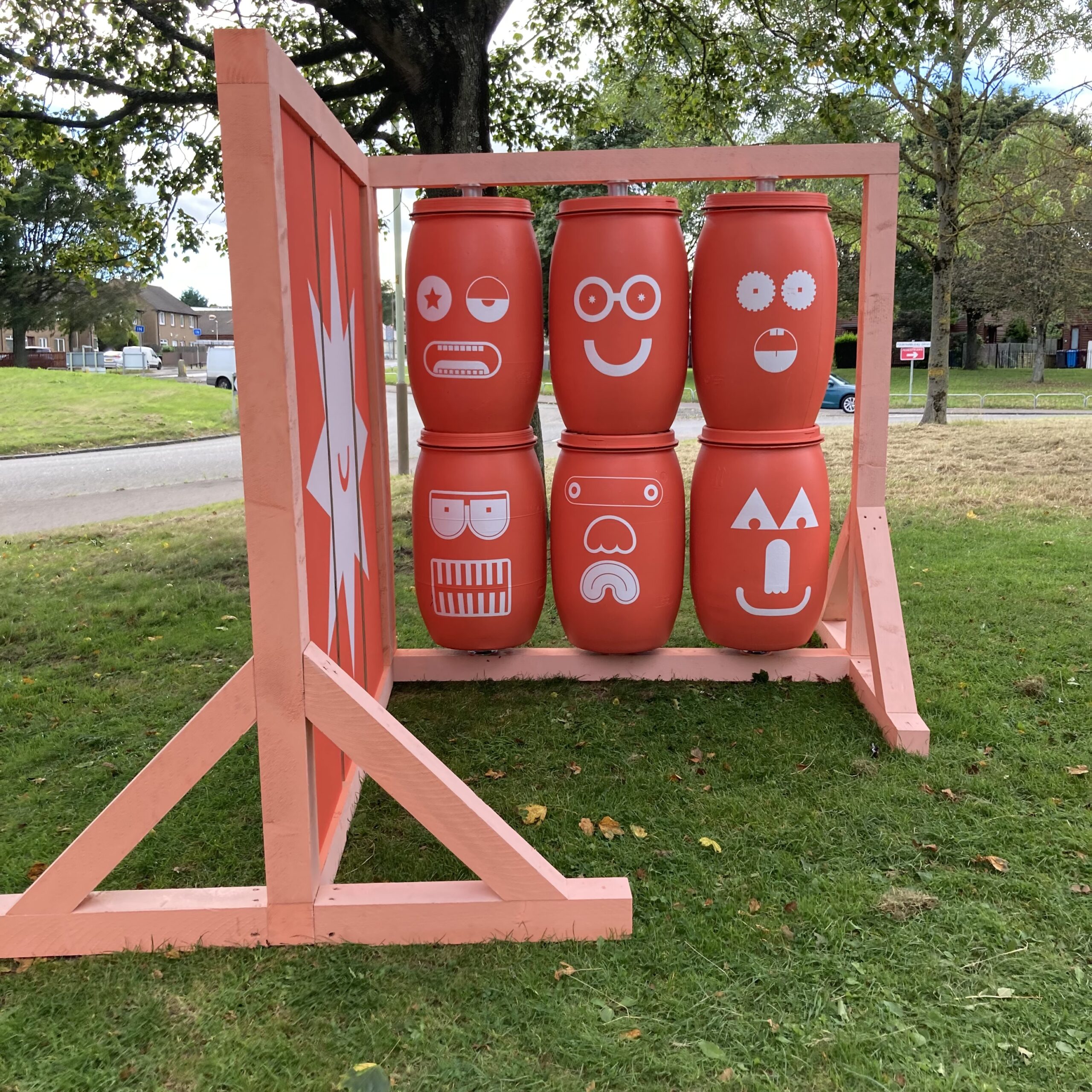
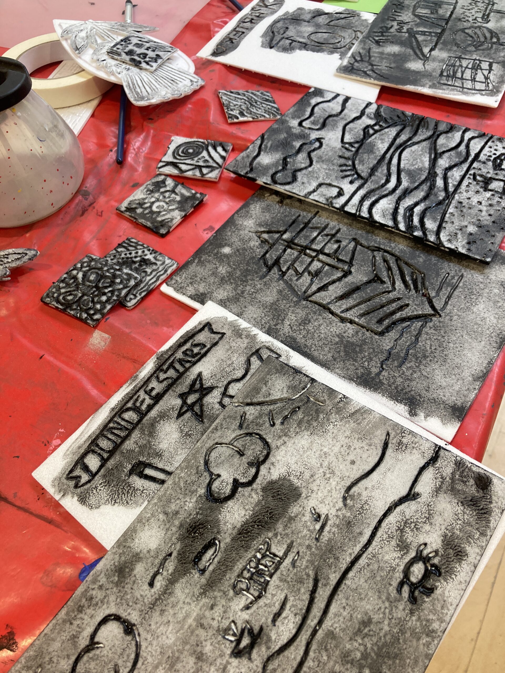
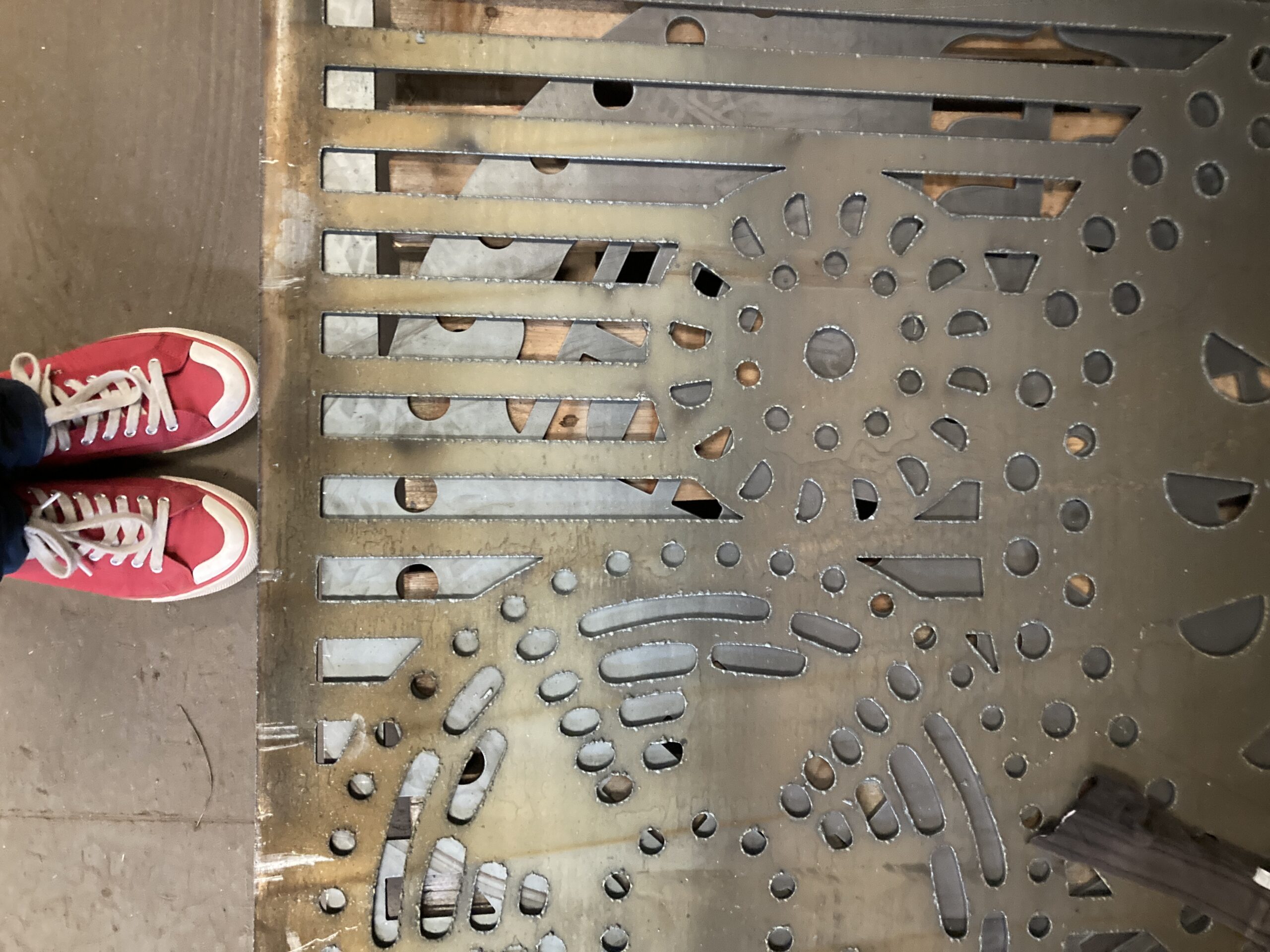
Part of my vision was to have artwork in the public art hanging signs originally created in 2010 by David Wilson, you can see more about the original work here
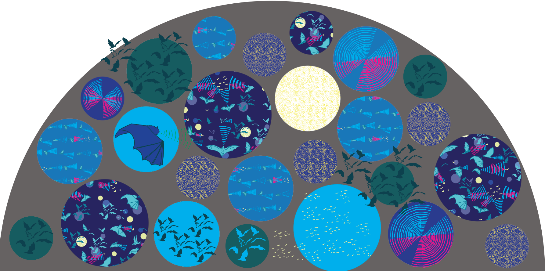
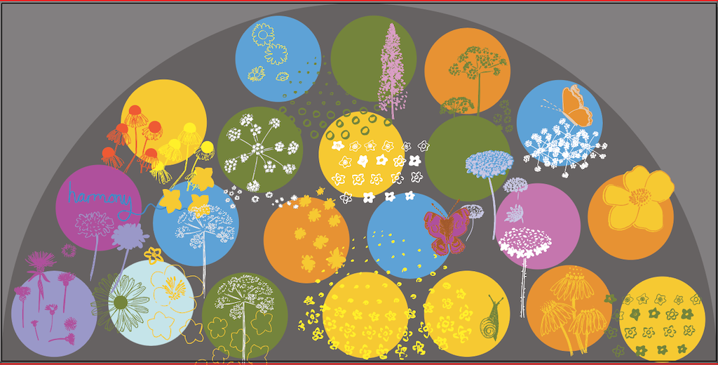
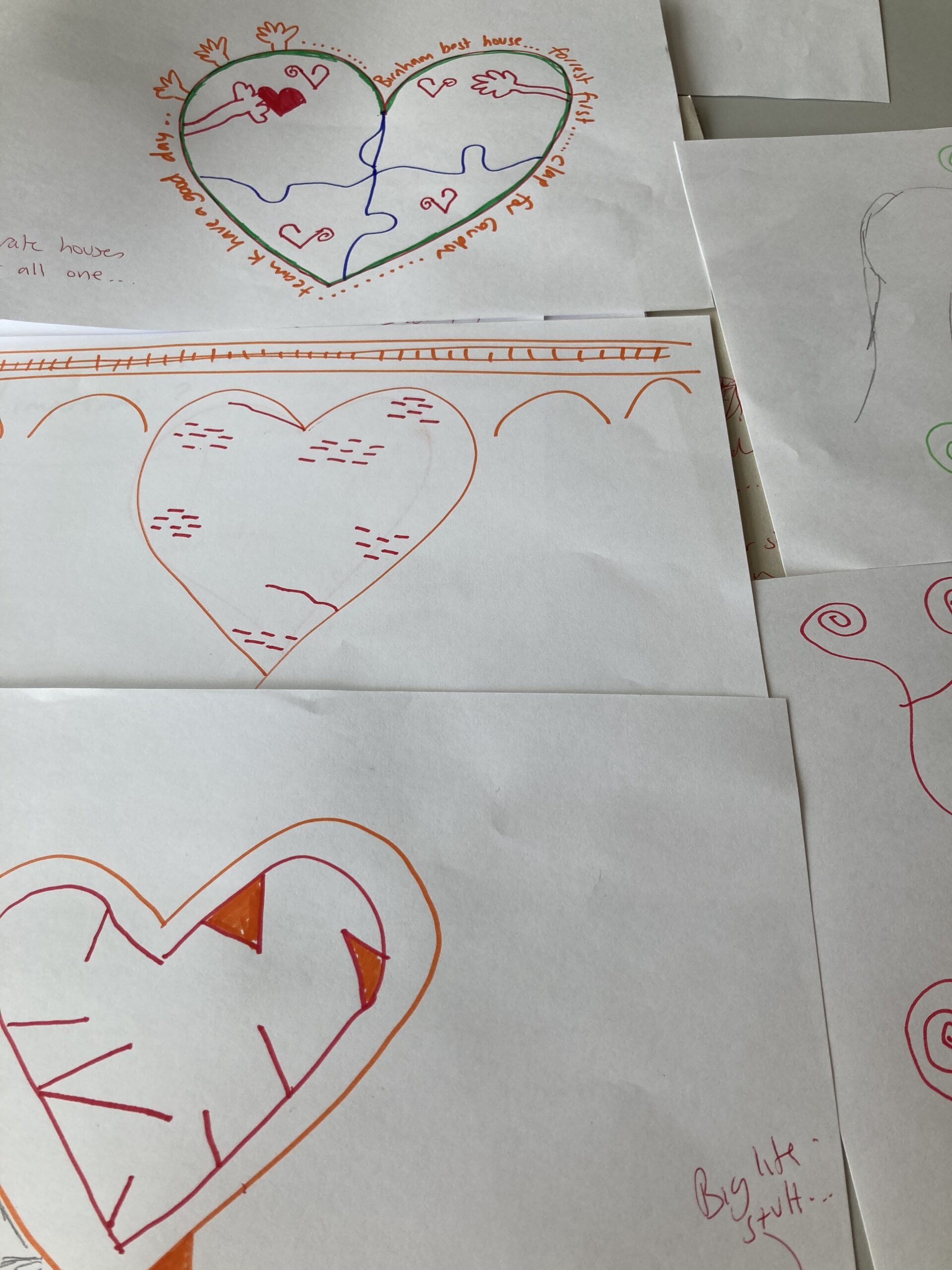
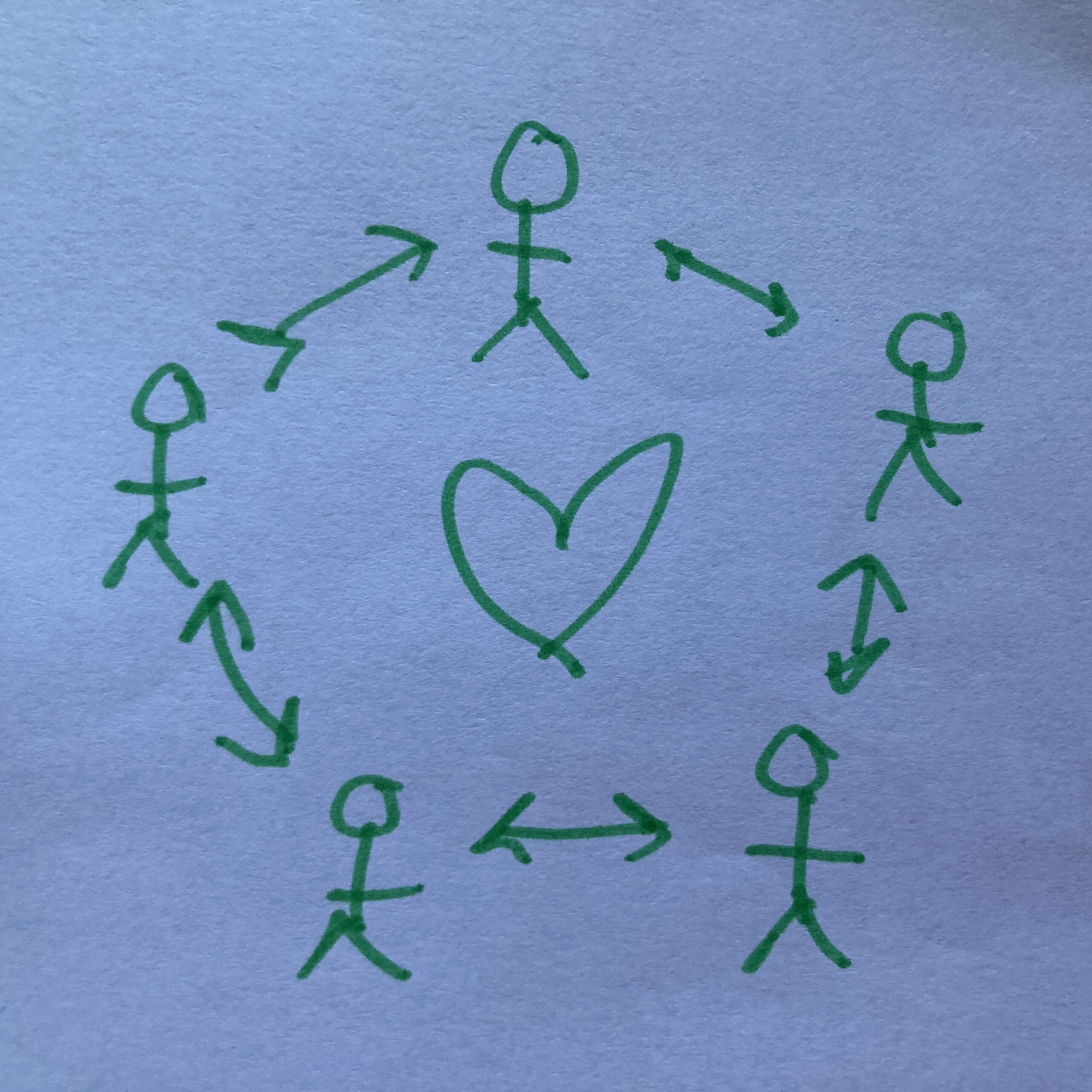
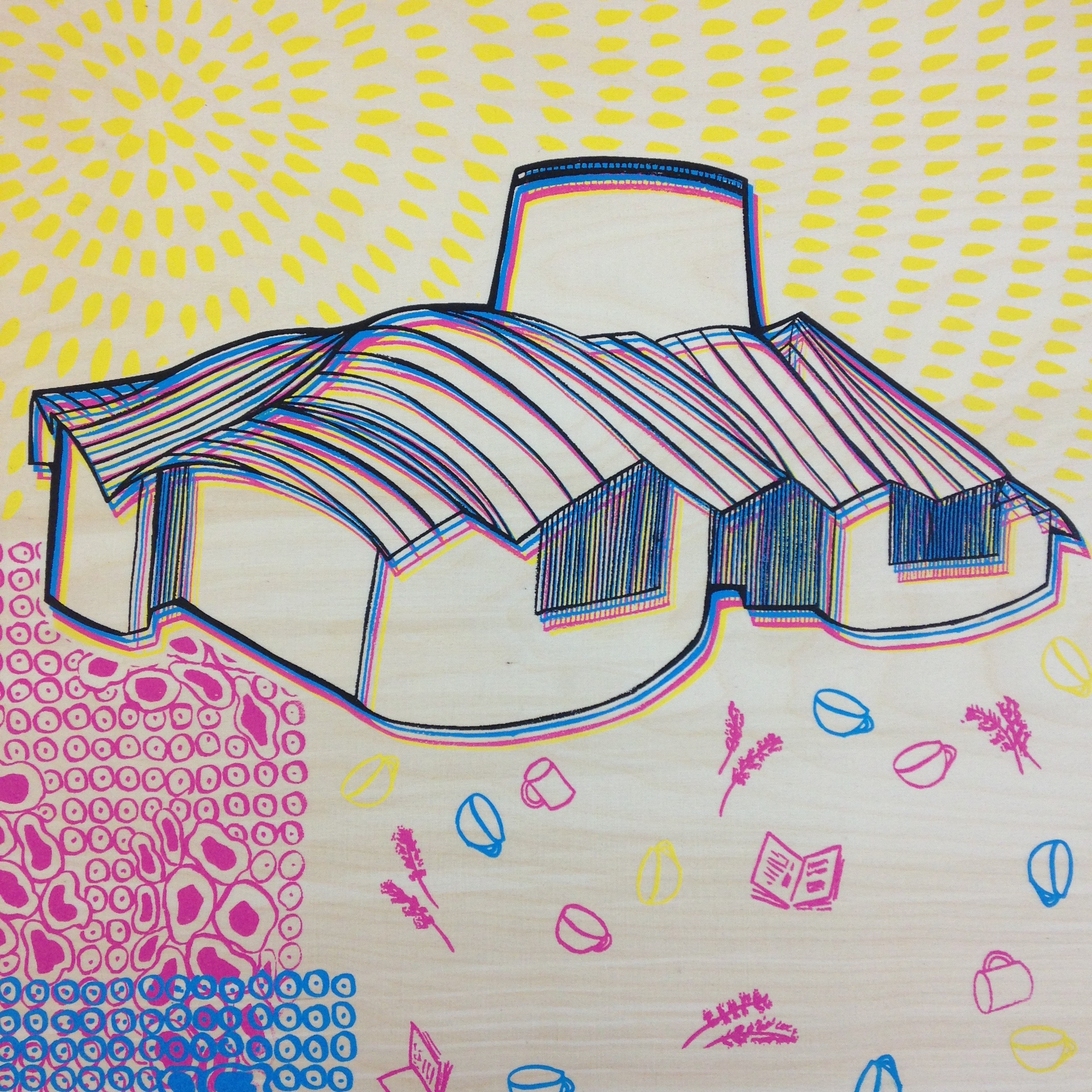
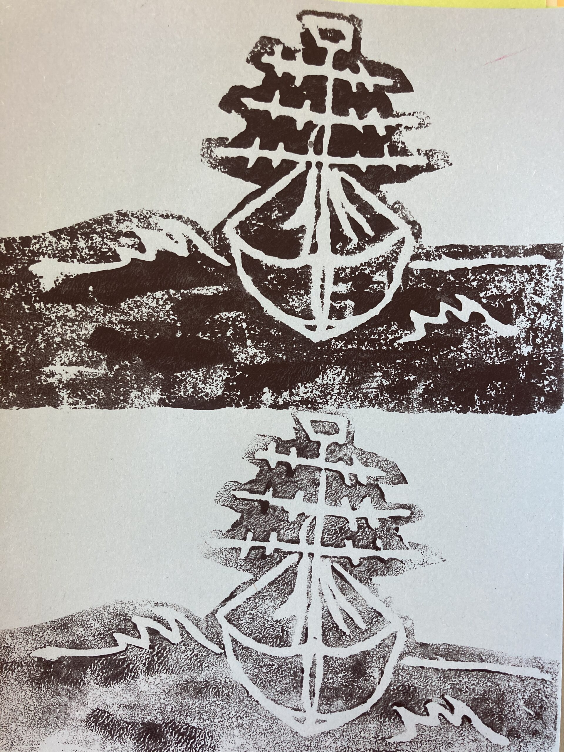
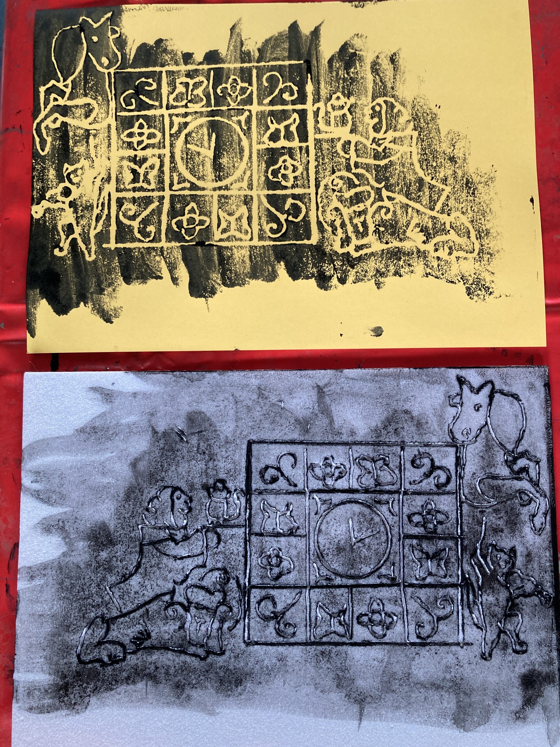
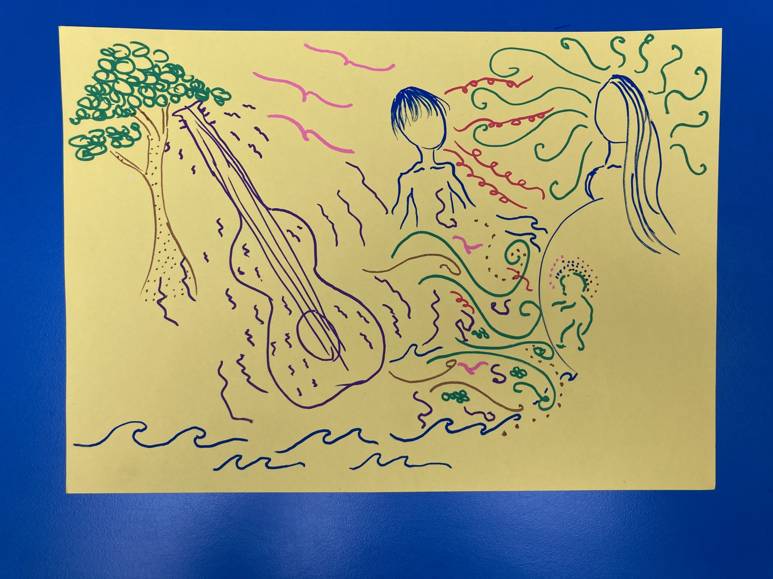
I developed a concept for viewing as you go UP the hill and DOWN the hill. I wanted to capture their vision as an organisation very much rooted here with big ambition to help people thrive.
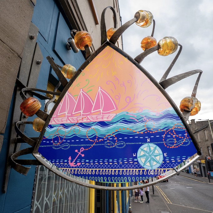
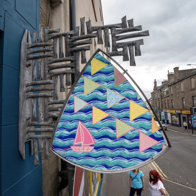
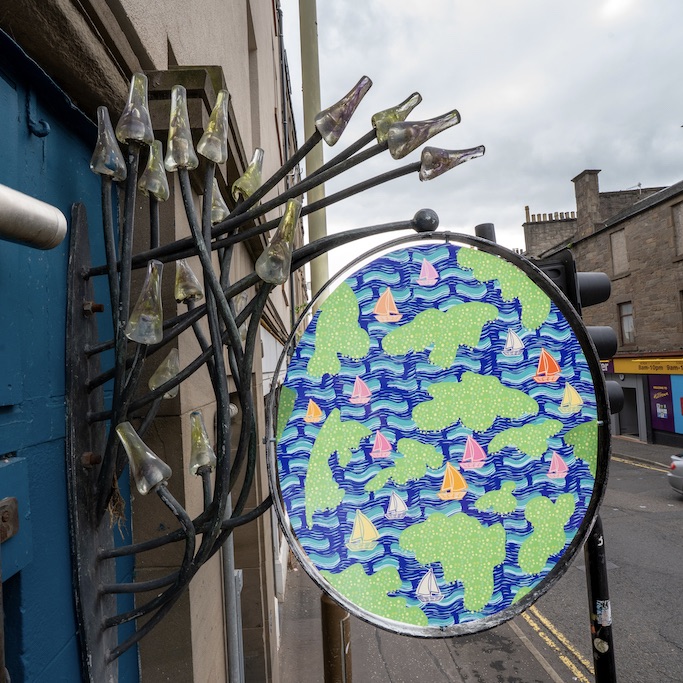
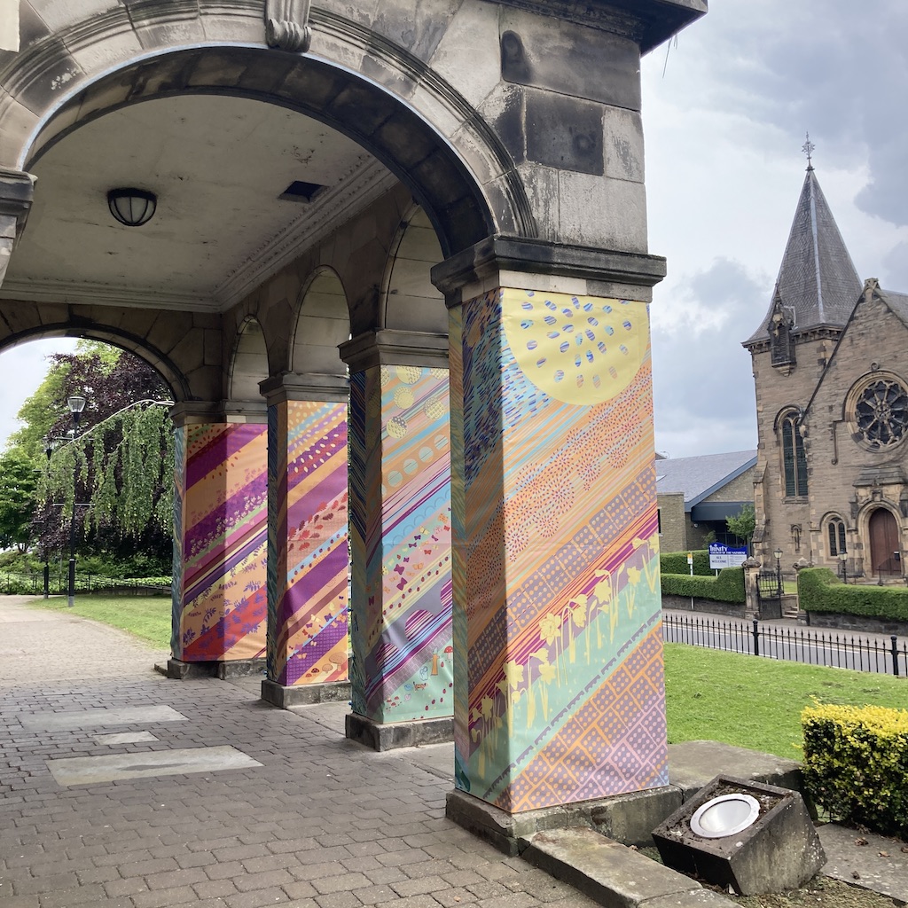
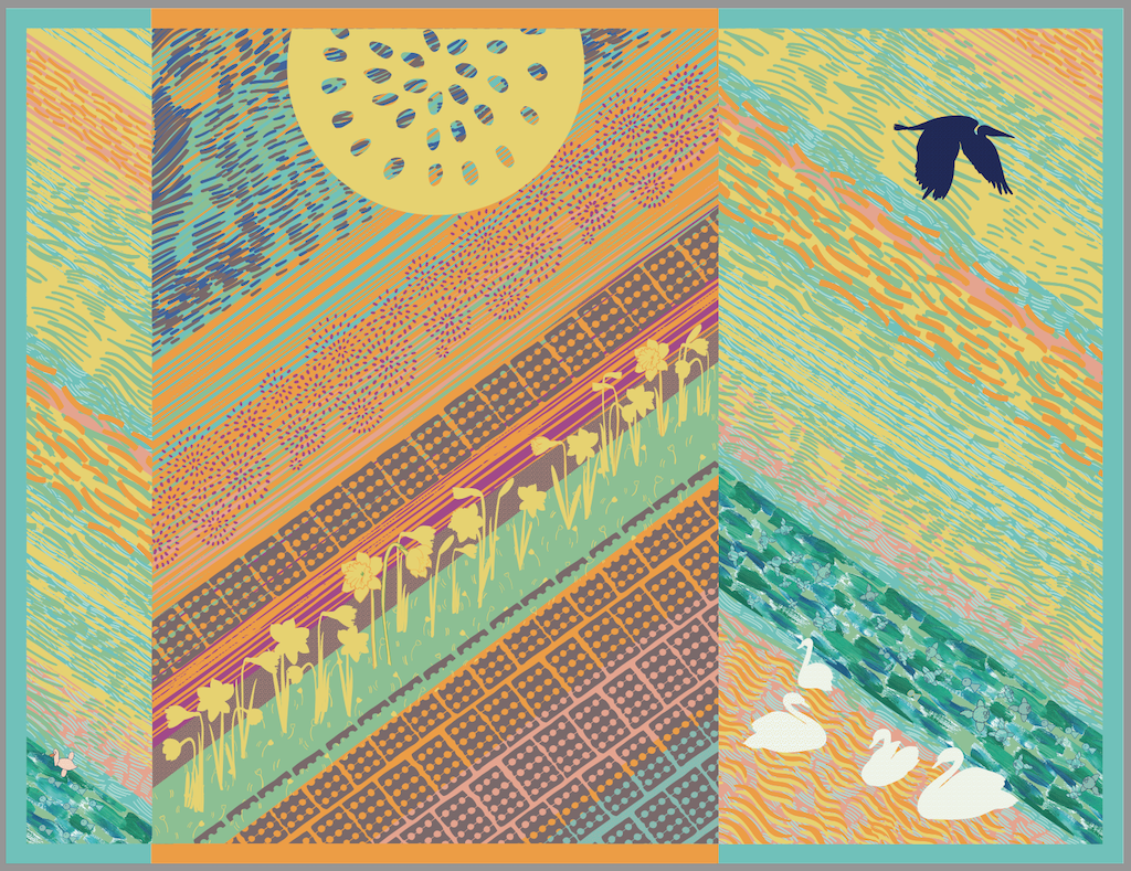
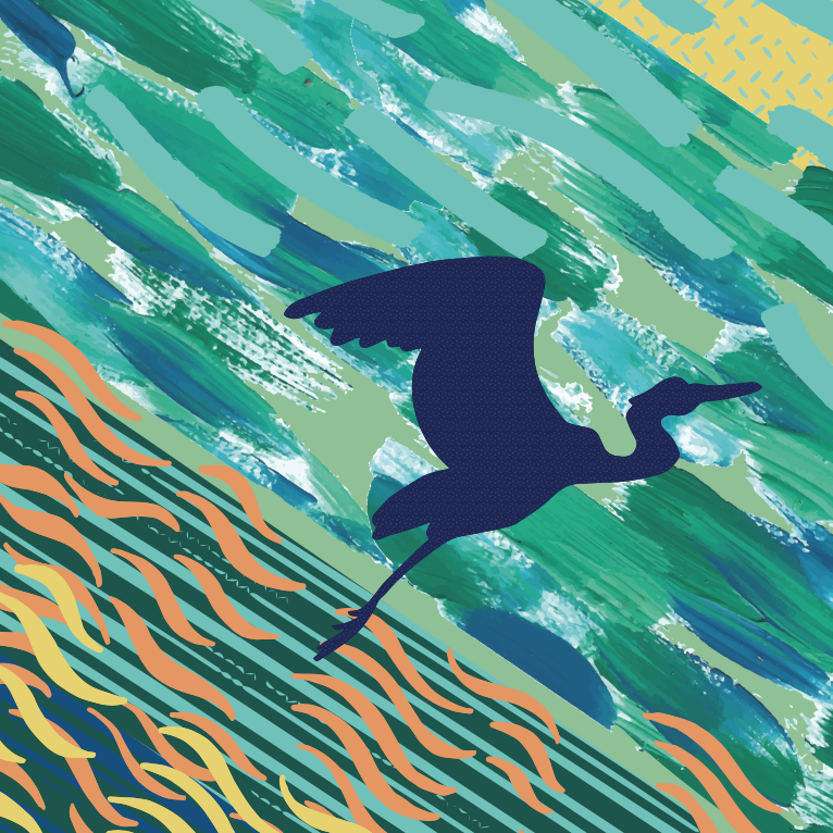
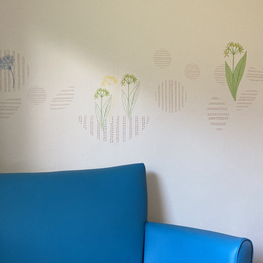
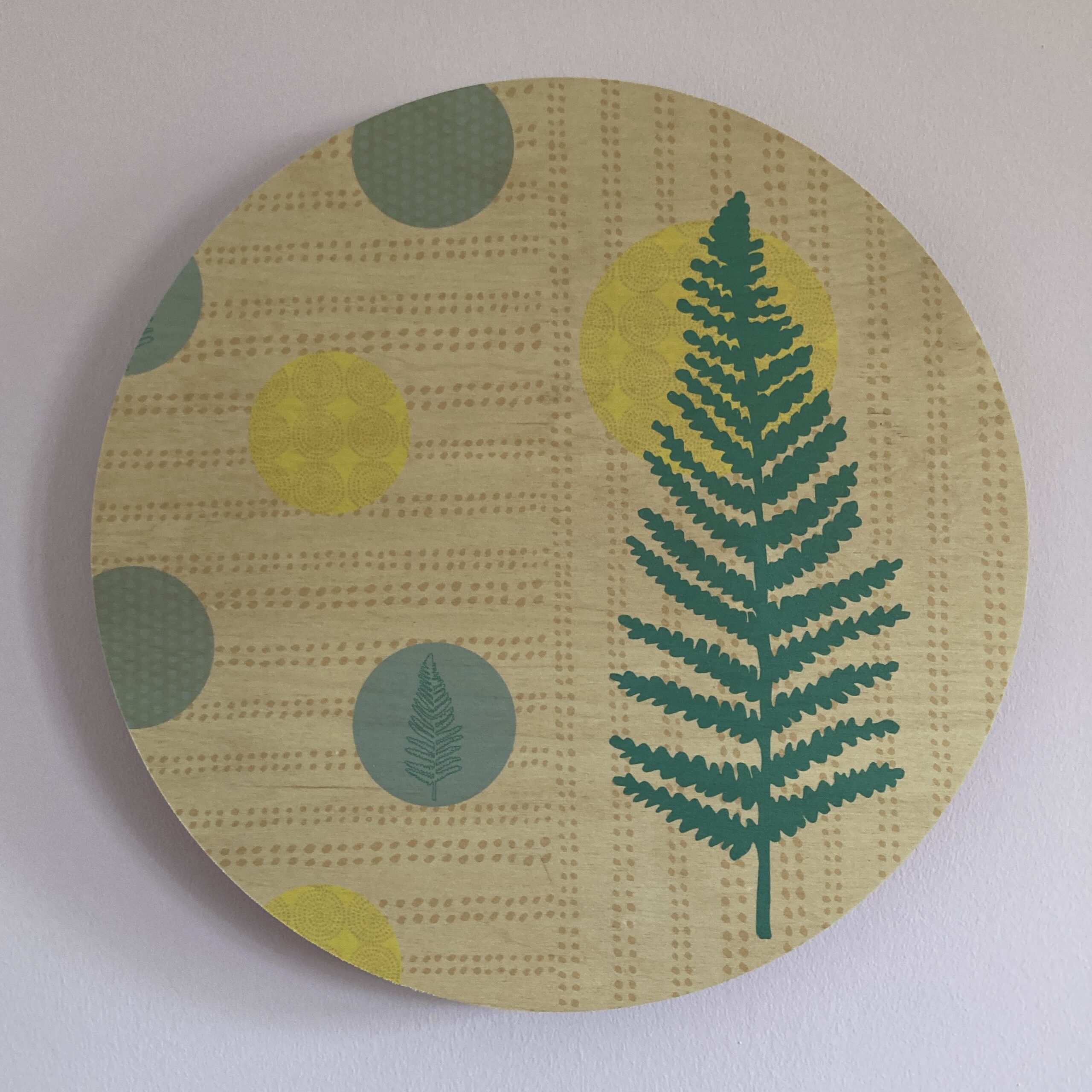
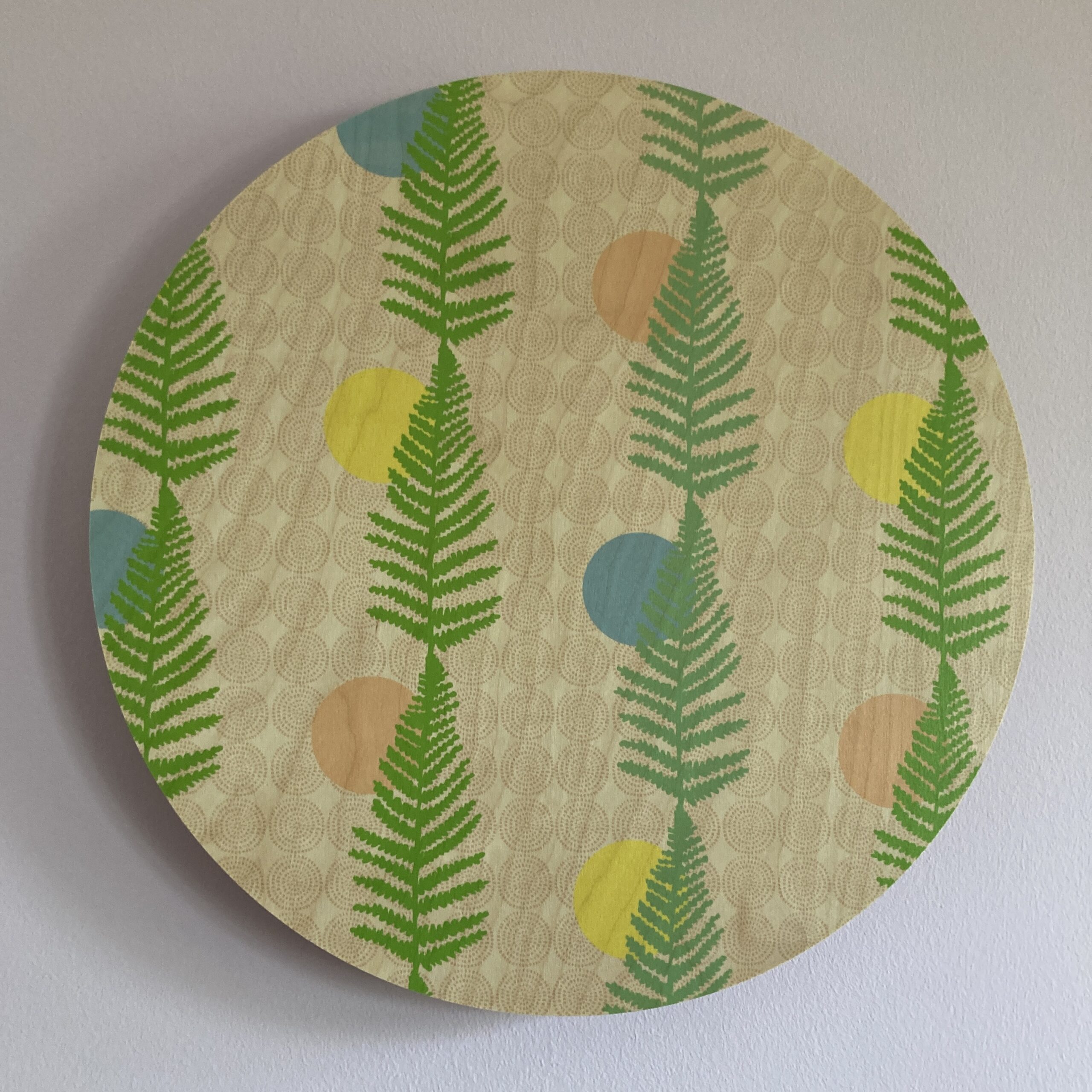
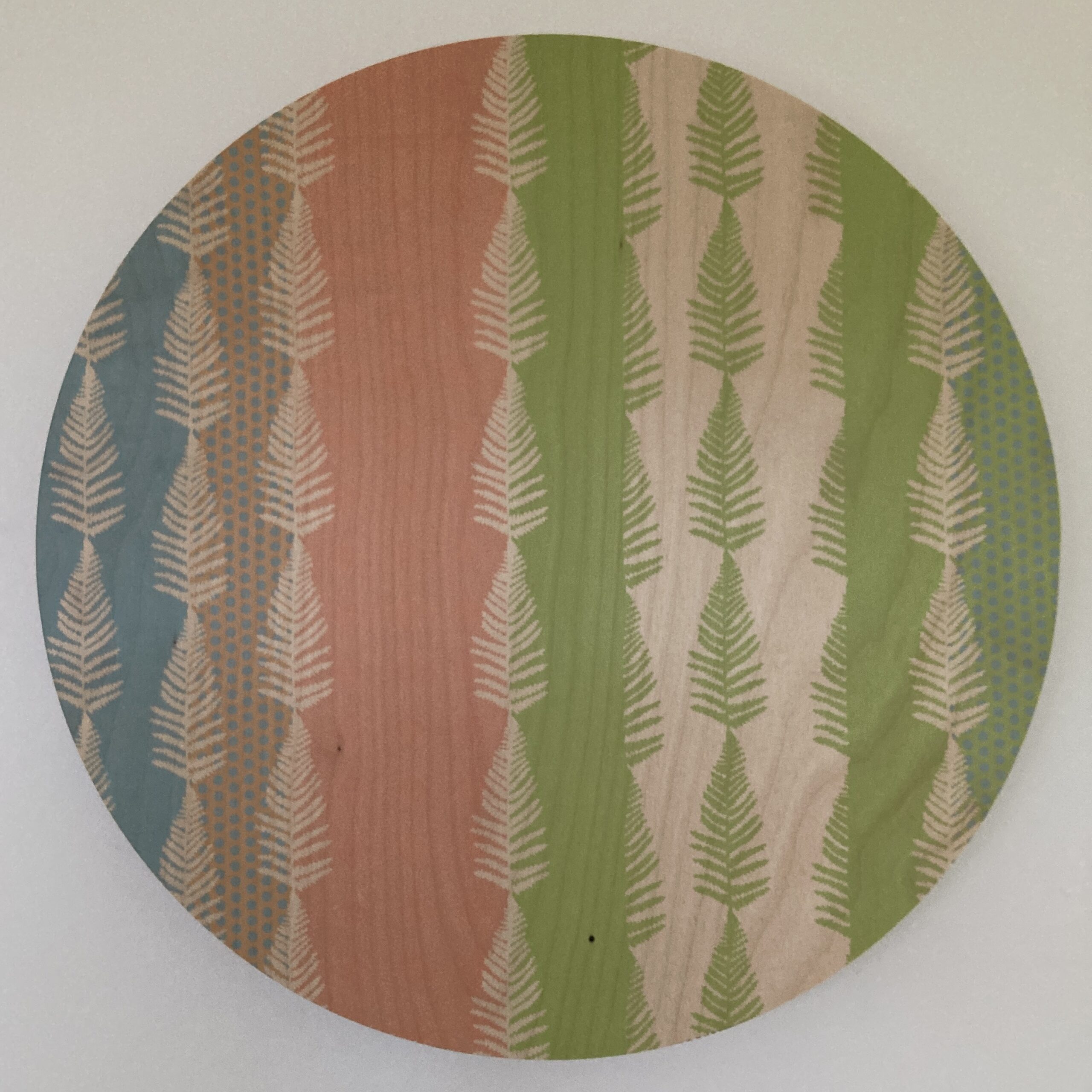
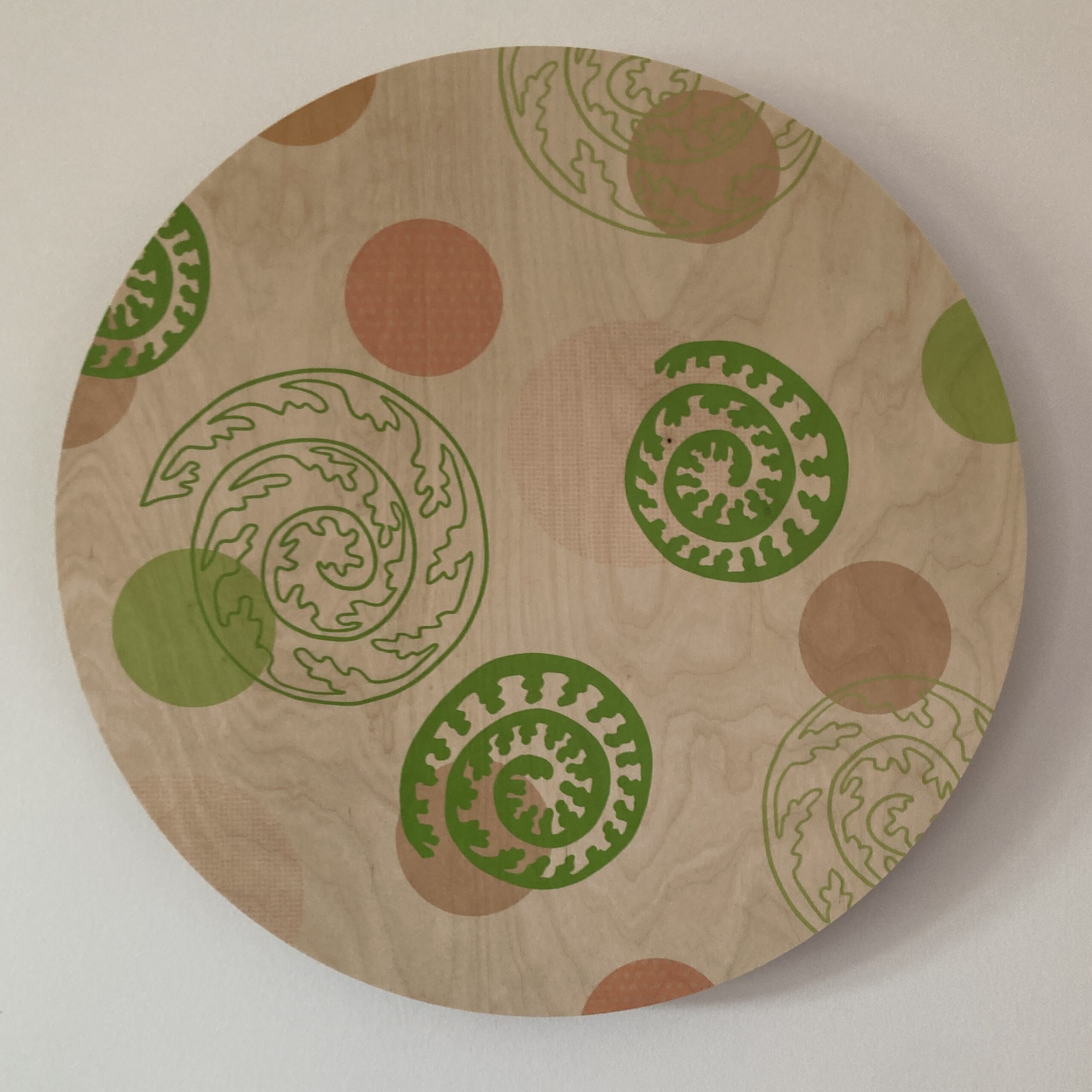
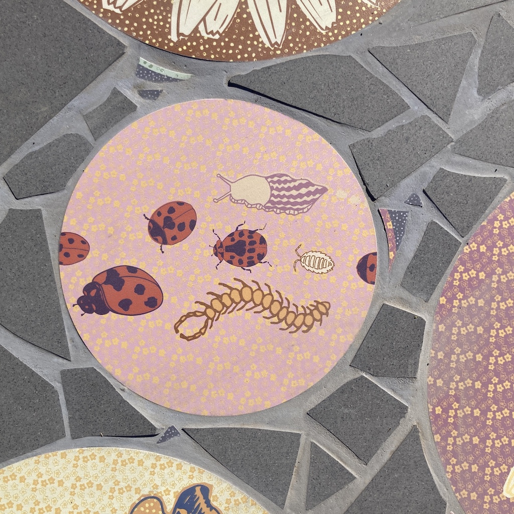
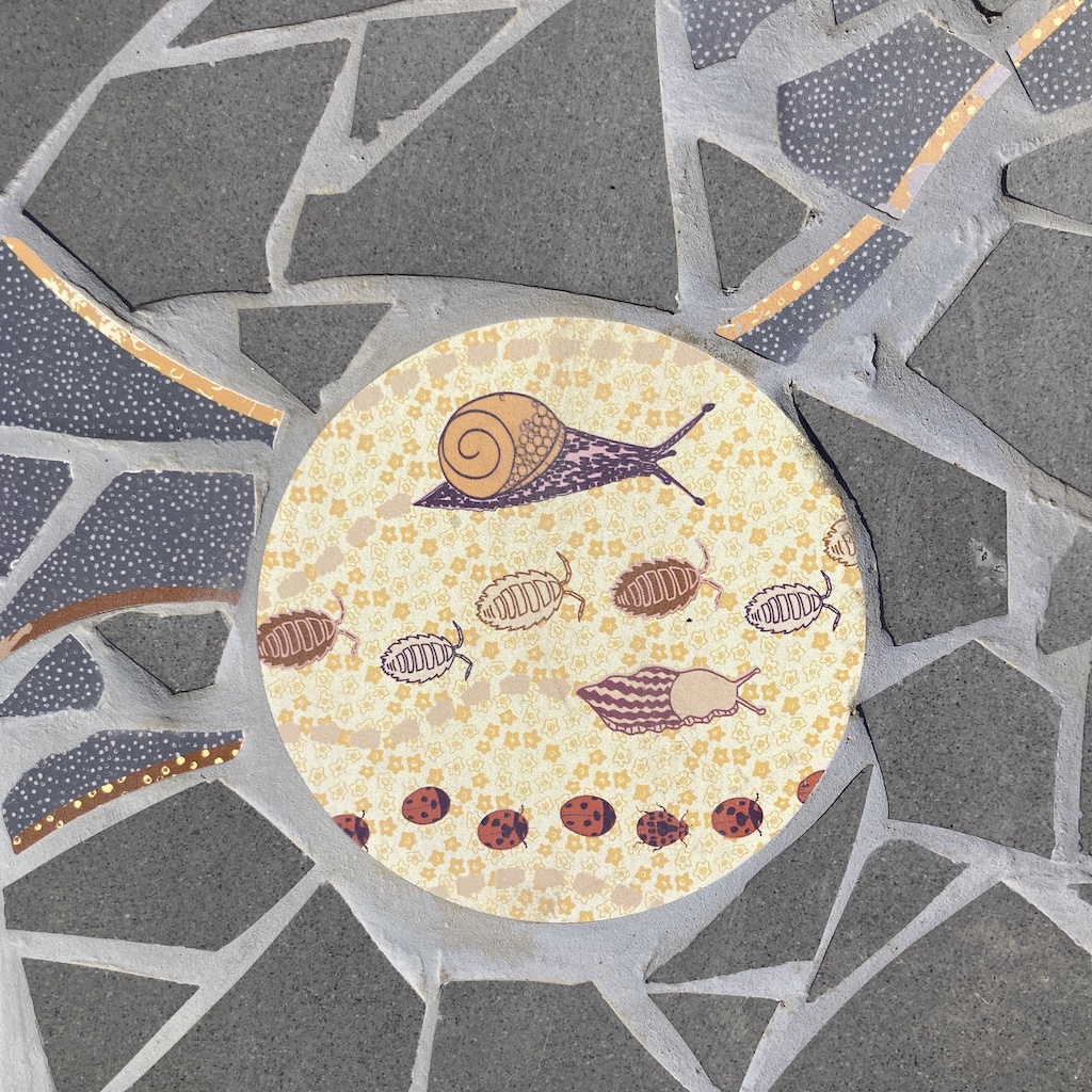
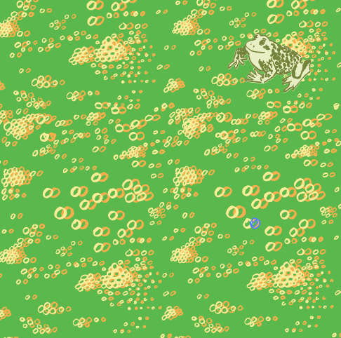
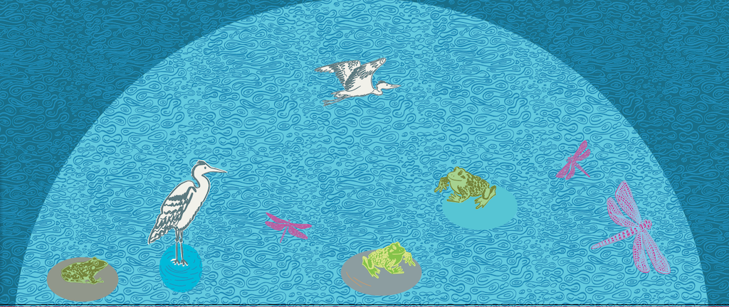
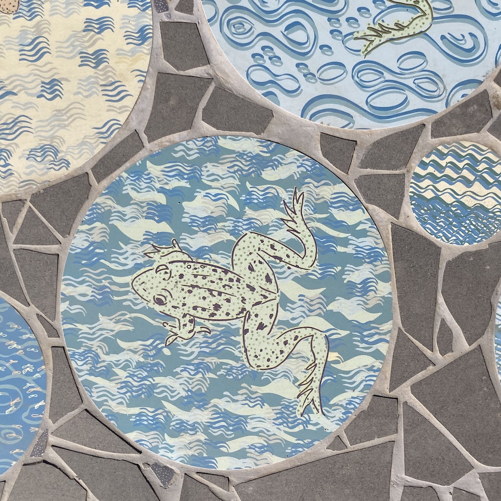
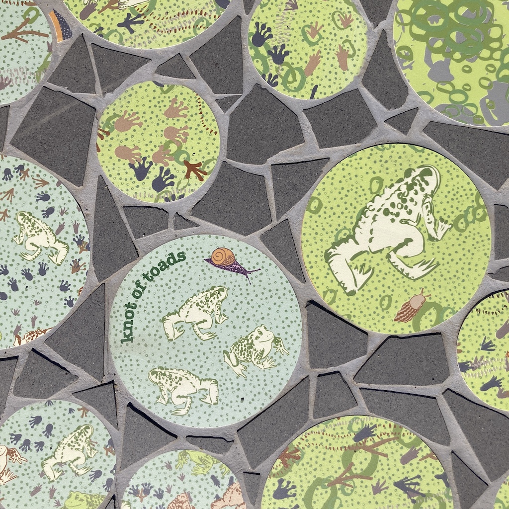
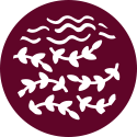
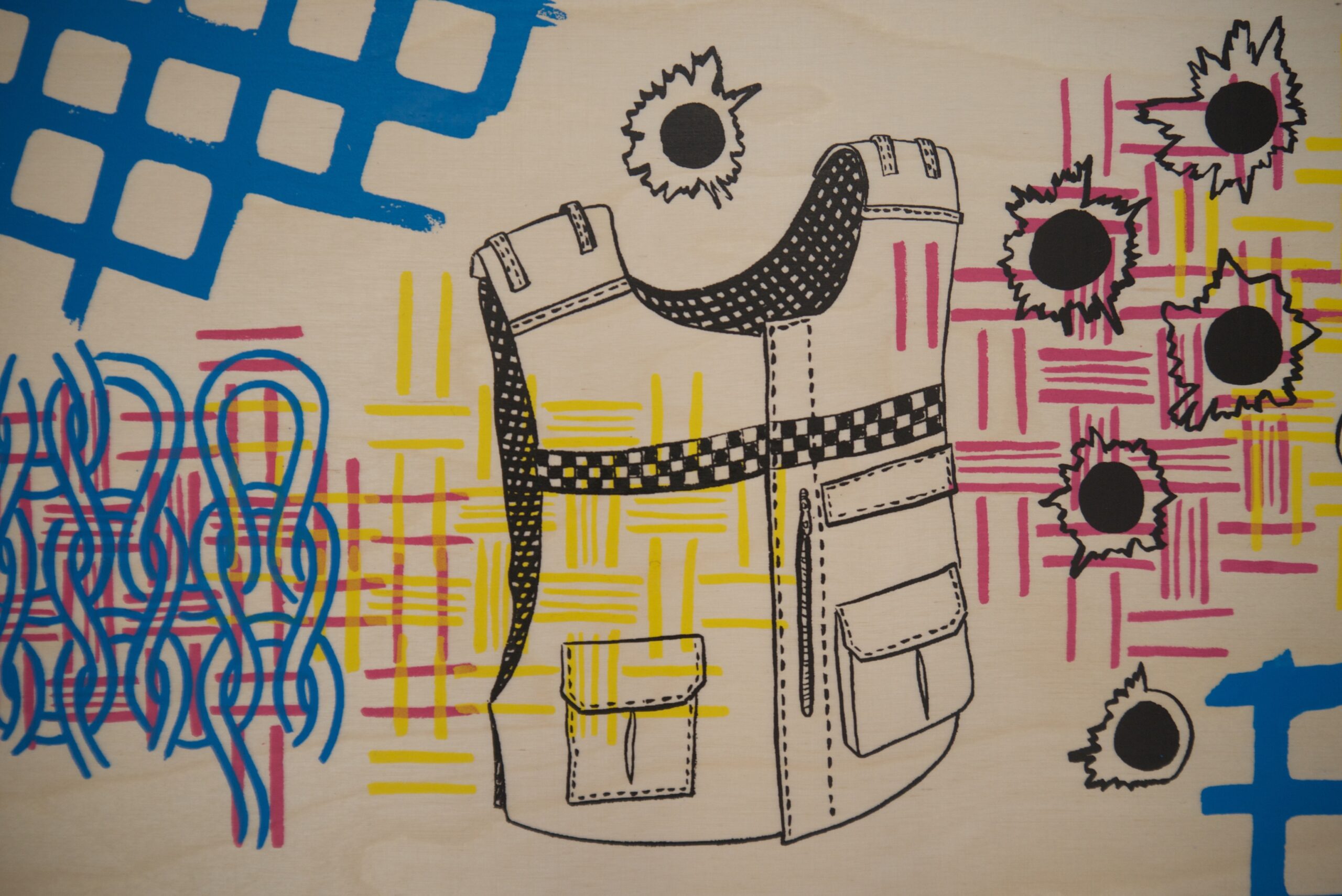
Down the Hill: You can see the river Tay as you go down the hill and wanted to create a concept linked with sailing and journeys. Linking to your own journey of learning and development of practical skills of fishermen knots and mixing of decorative stitches linking to the fashion and textile elements of Front Lounge. Handmade bunting linking to the textile roots and importance of celebration. Rooted here in Dundee with the river Tay with all the rivers leading to the seas and oceans all over the world echoing the charities motto “Life is Big: Be All You Can Be” (photos by Grant at PPG Photography)
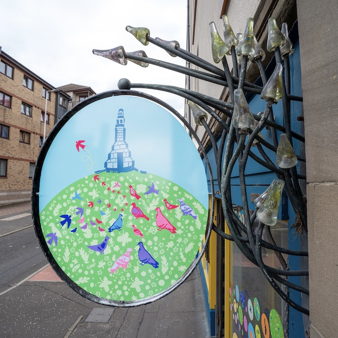
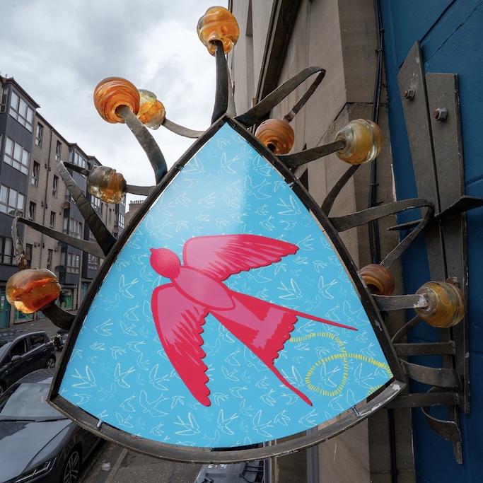
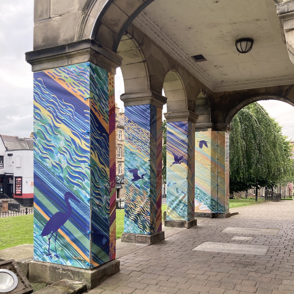
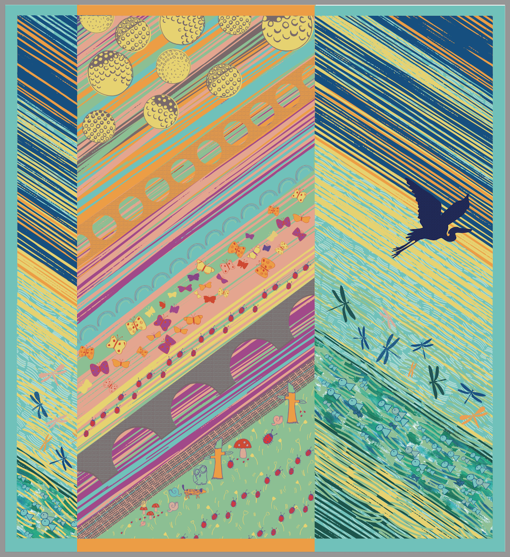
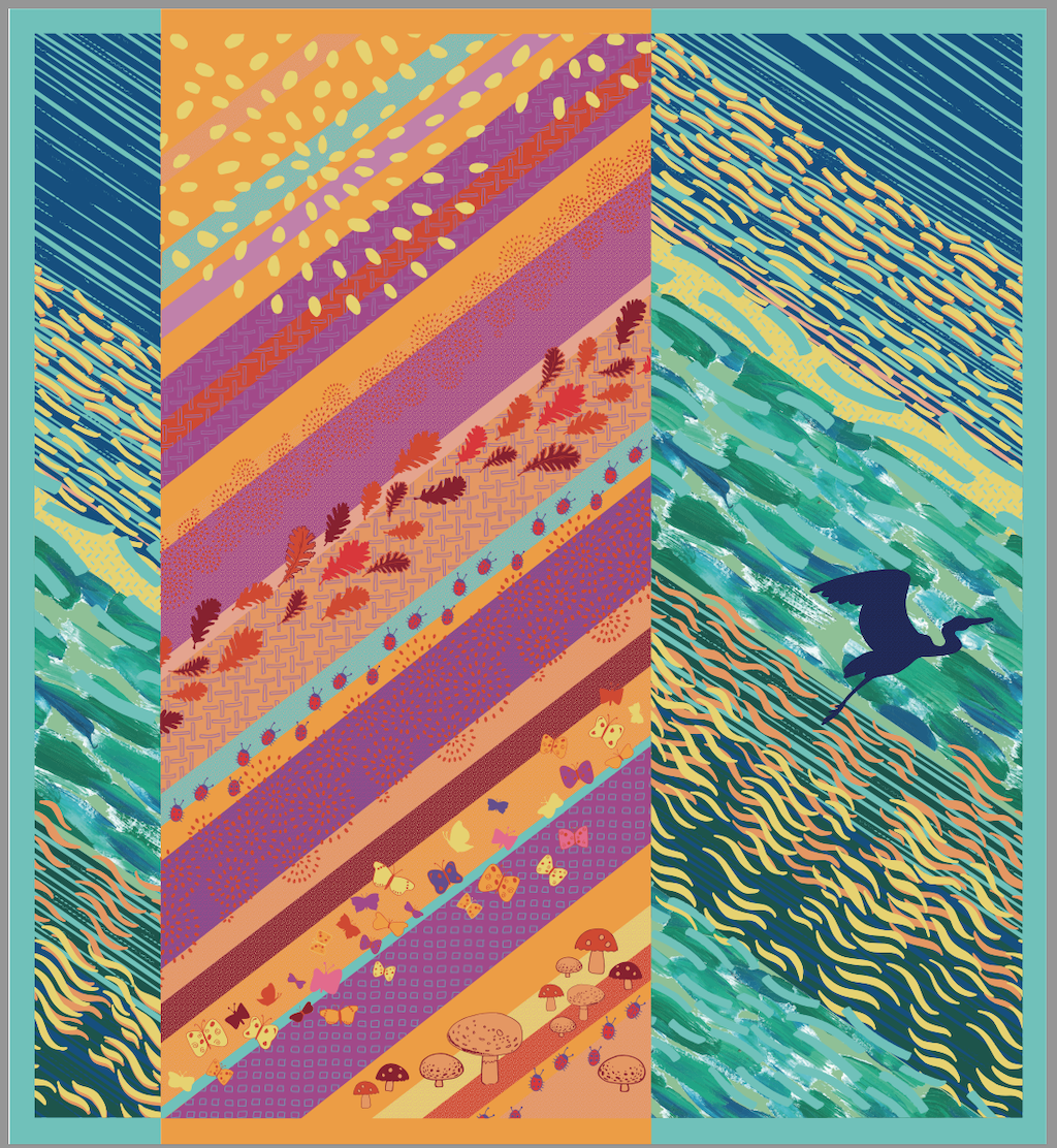
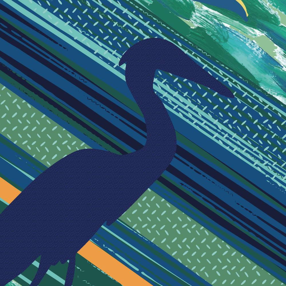
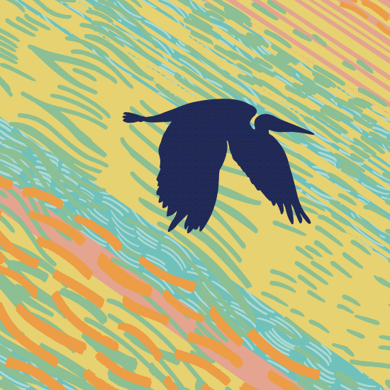
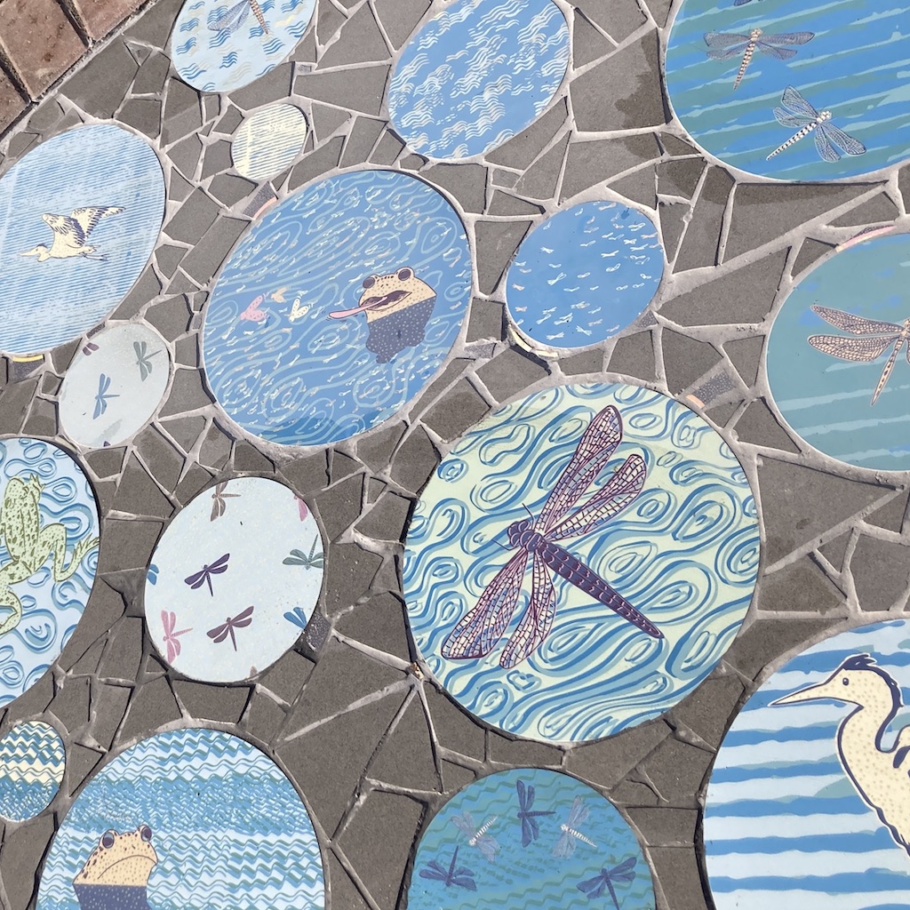
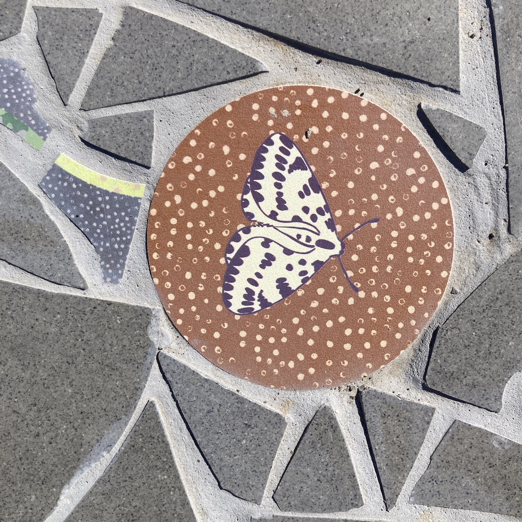
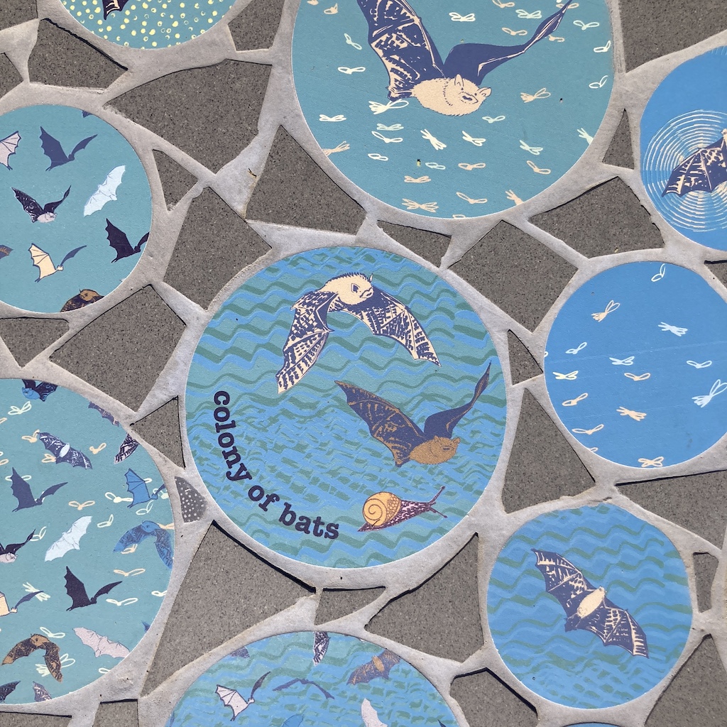
Up the Hill: As HQ is on the Hilltown the Law is an iconic sight, so as you walk up the hill it’s rooted here in Dundee with lots of birds, starting to fly, all the routes and journeys then soaring up high in the sky. Linking with the support, learning, practicing to reach your potential. (photos by Grant at PPG Photography)
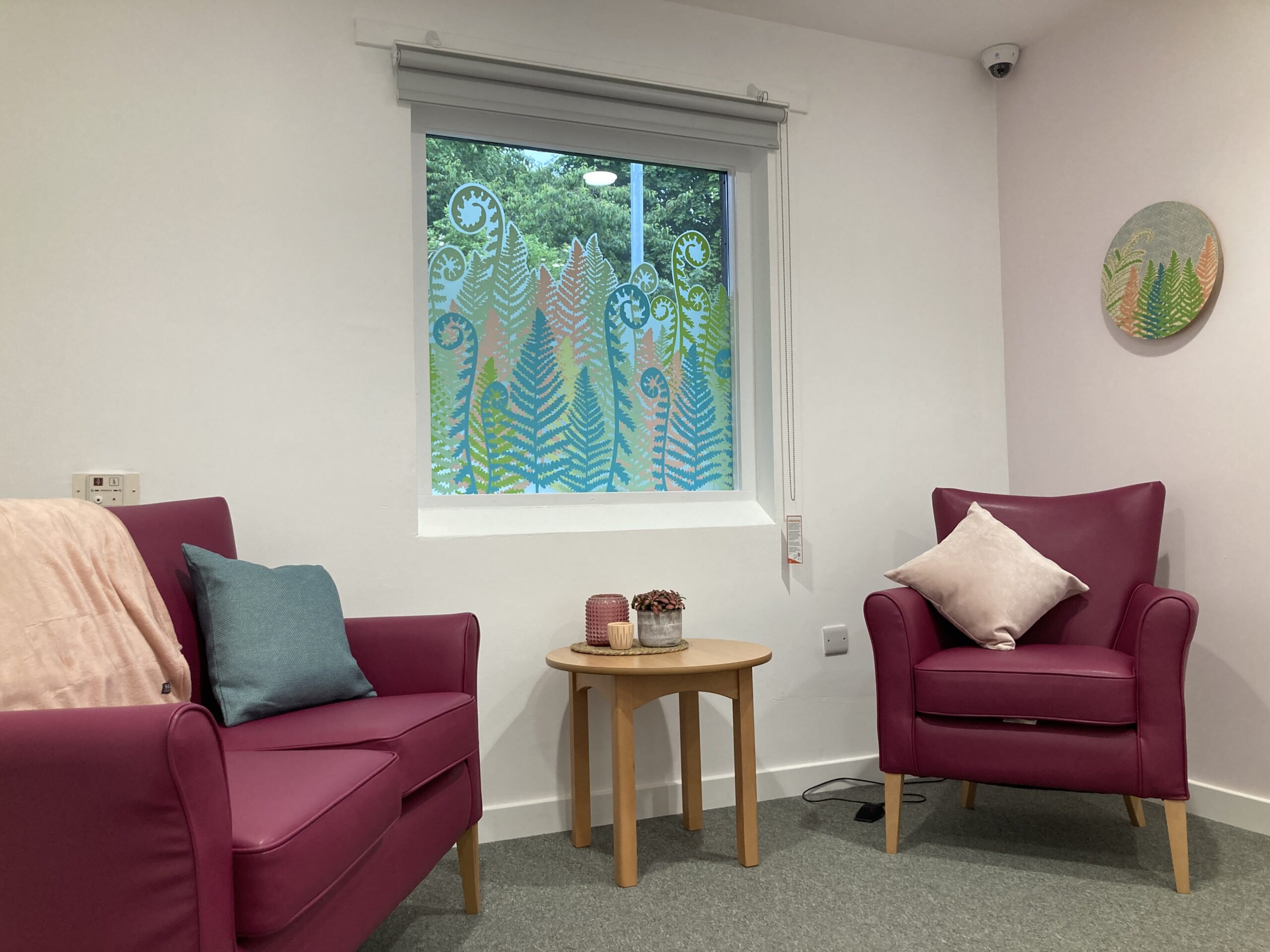
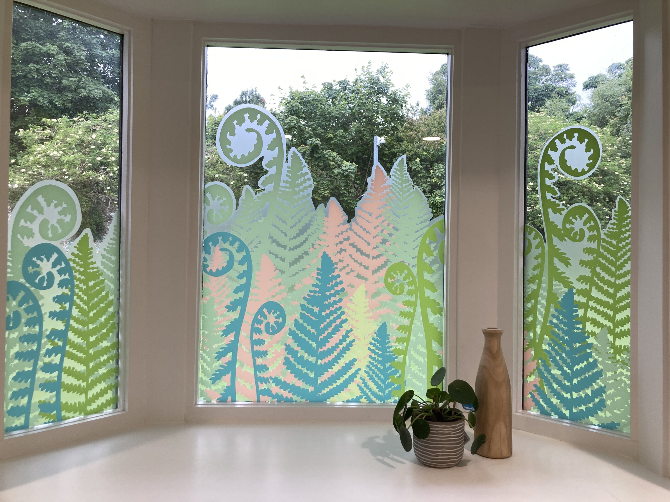
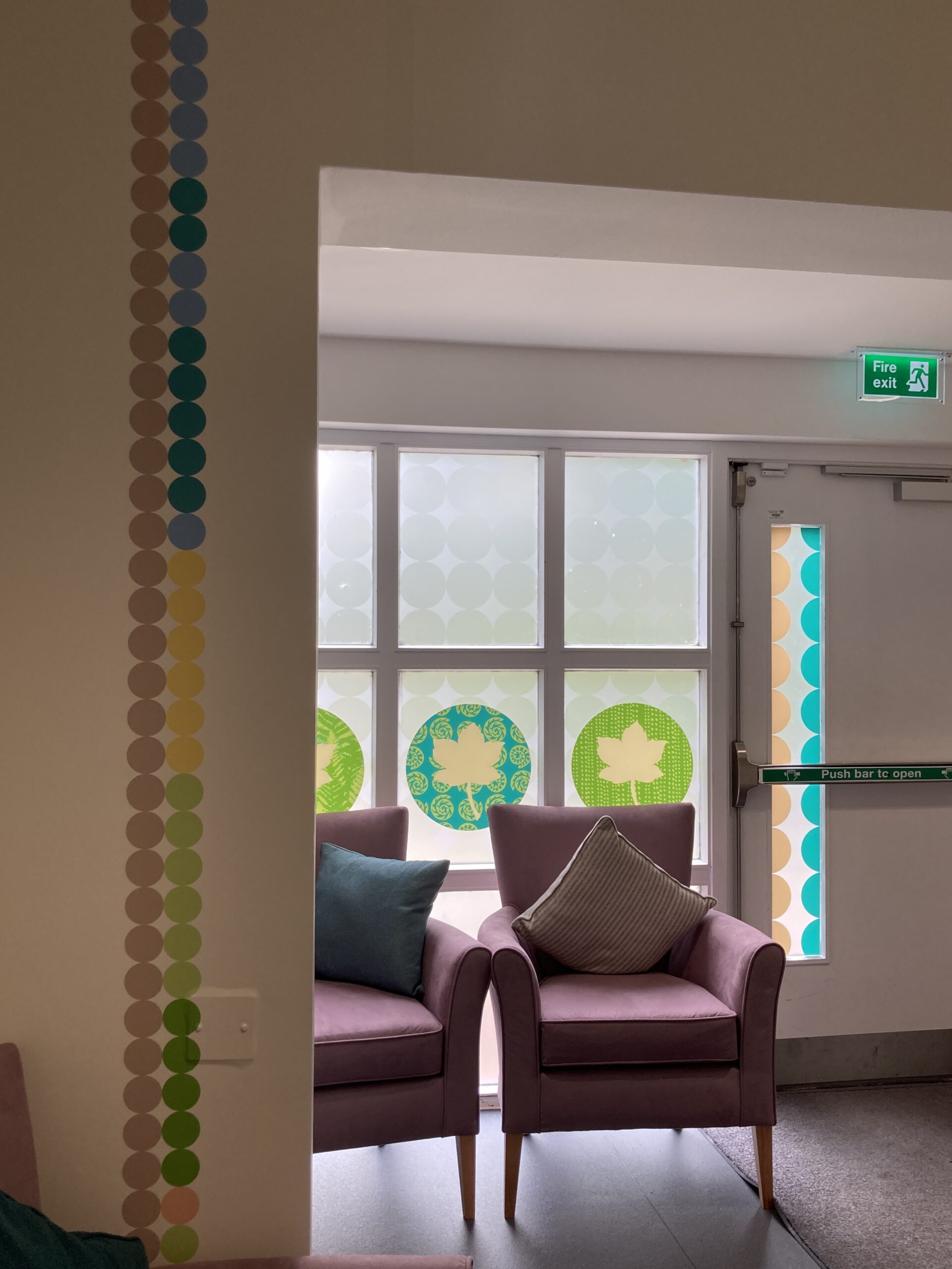
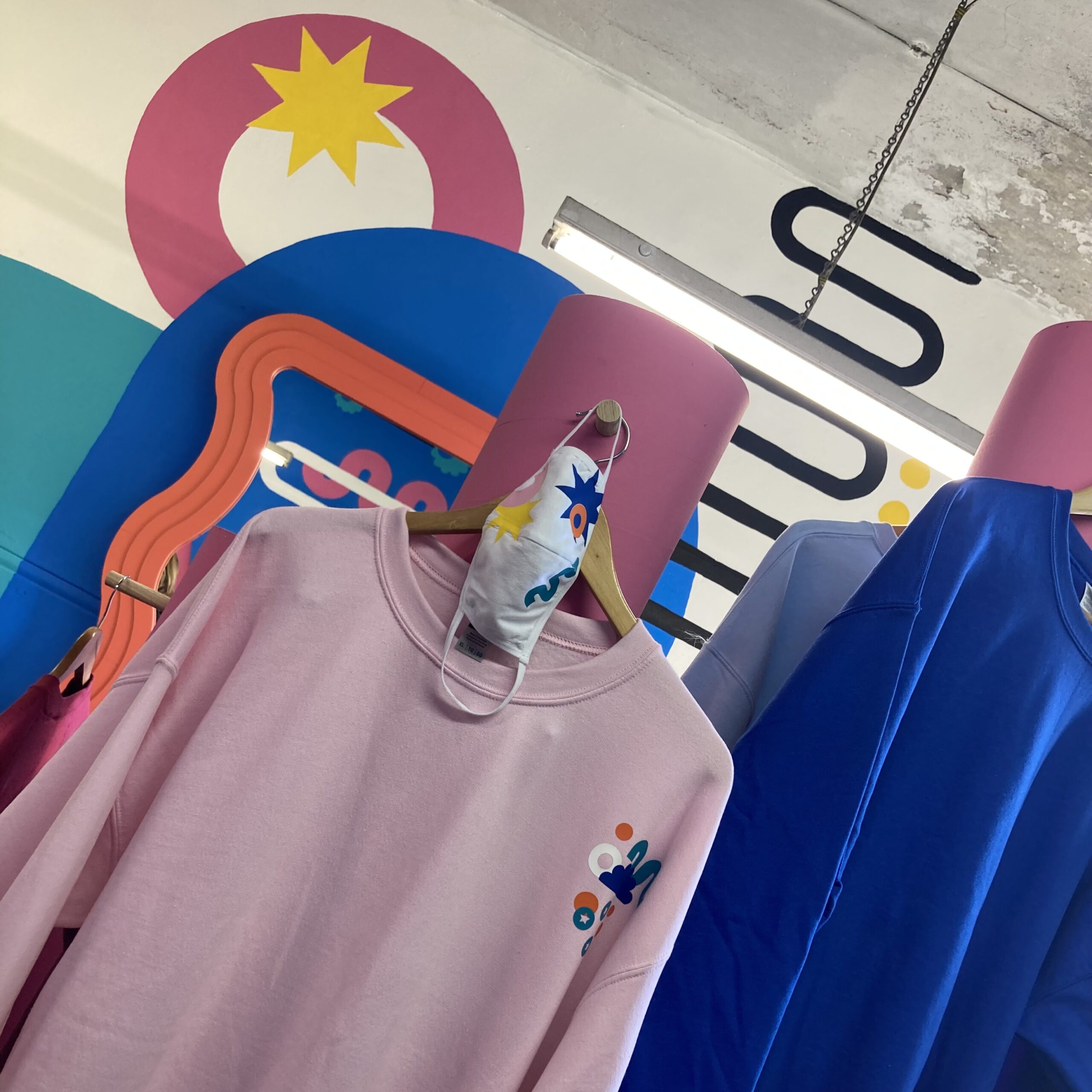
Interior
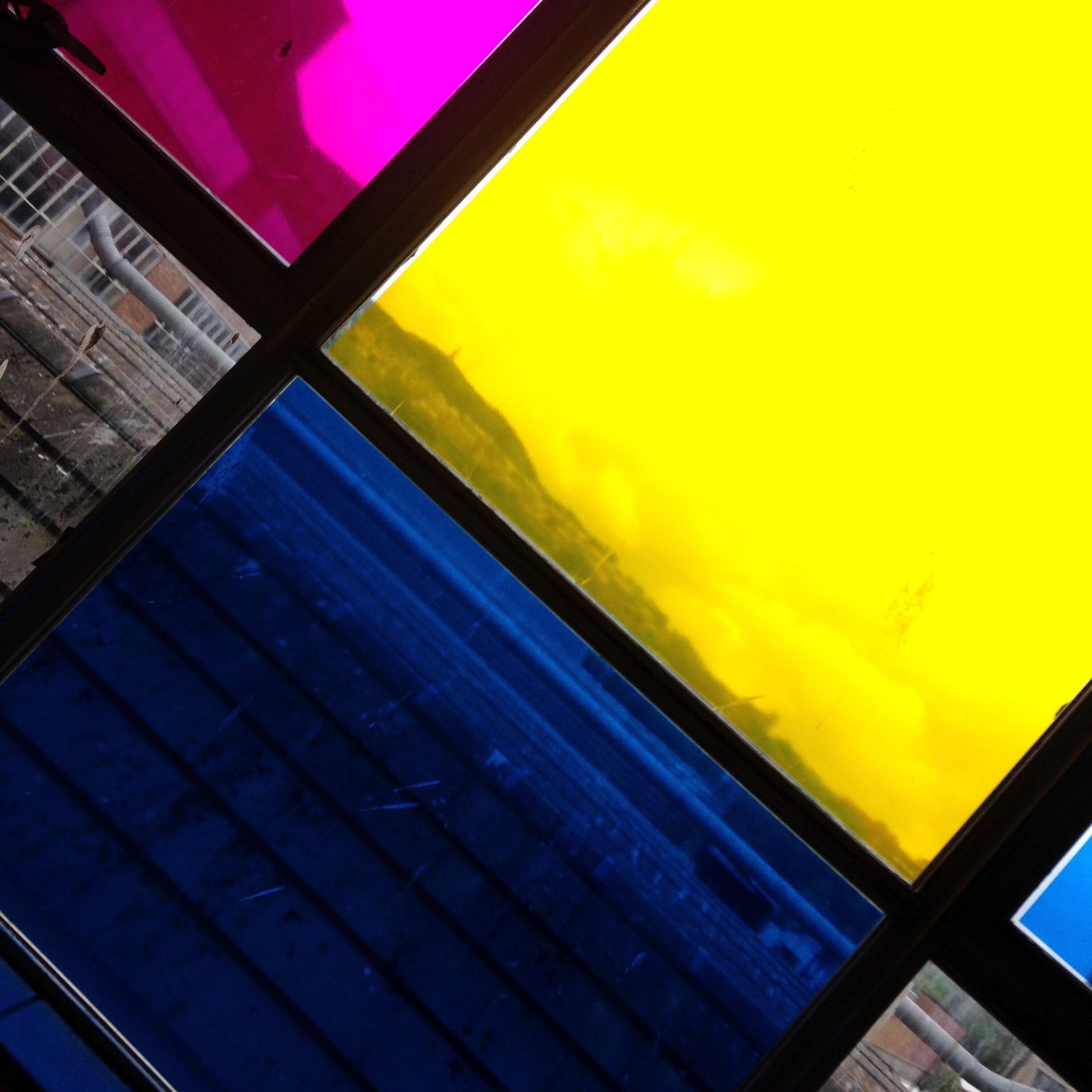
Fox maximum impact I was keen to bring use colour and light that transform the inside as the light moves during the day and included this in the window design concept.
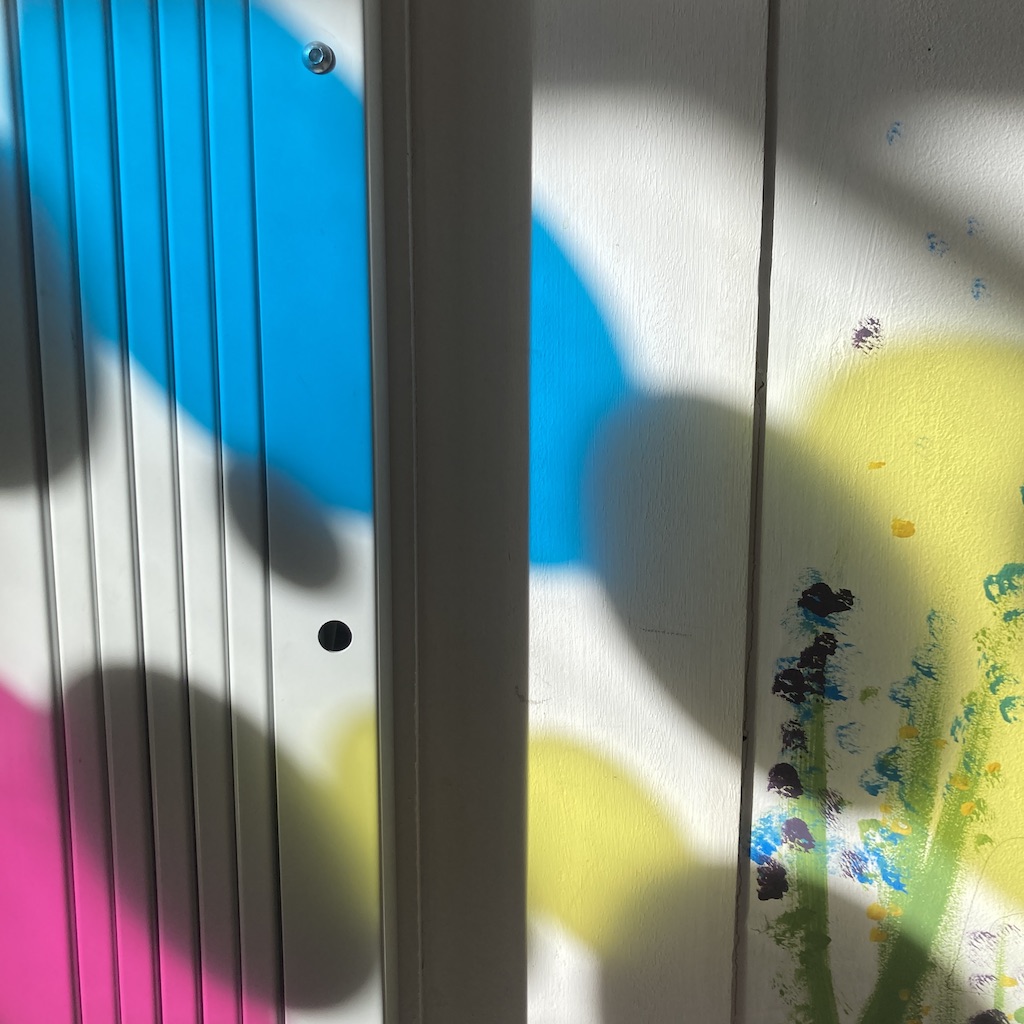
“By using the translucent vinyl on the windows, we affecting how the space looks like inside with the sun leave a rainbow off colours inside. This changes through the day and adds a bit of magic!” Chika Inatimi, Project Leader, Front Lounge.
Impact
This project has wider benefits to the people and organisation involved, it has transformed a dilated building and added a breath of fresh air to the area.
“The workshop is about half way up the hill. Folk regularly stop there to take a breather when hiking up the hill. So by transforming the physical building we are transforming how people will interact with the physical landscape. Transforming the built environment, and positively impact the lives of those who interact with the building/s both inside and out. Front Lounge like to turn creativity into a power to change lives and build confidence. One of charity’s motto is Life is Big: Be All You Can Be, and that thinking has come through loud and clear on our new windows! In the process I think we have transformed a small area of the Hilltown for the wider community to enjoy. “ Chika Inatimi, Project Leader, Front Lounge.
Thanks
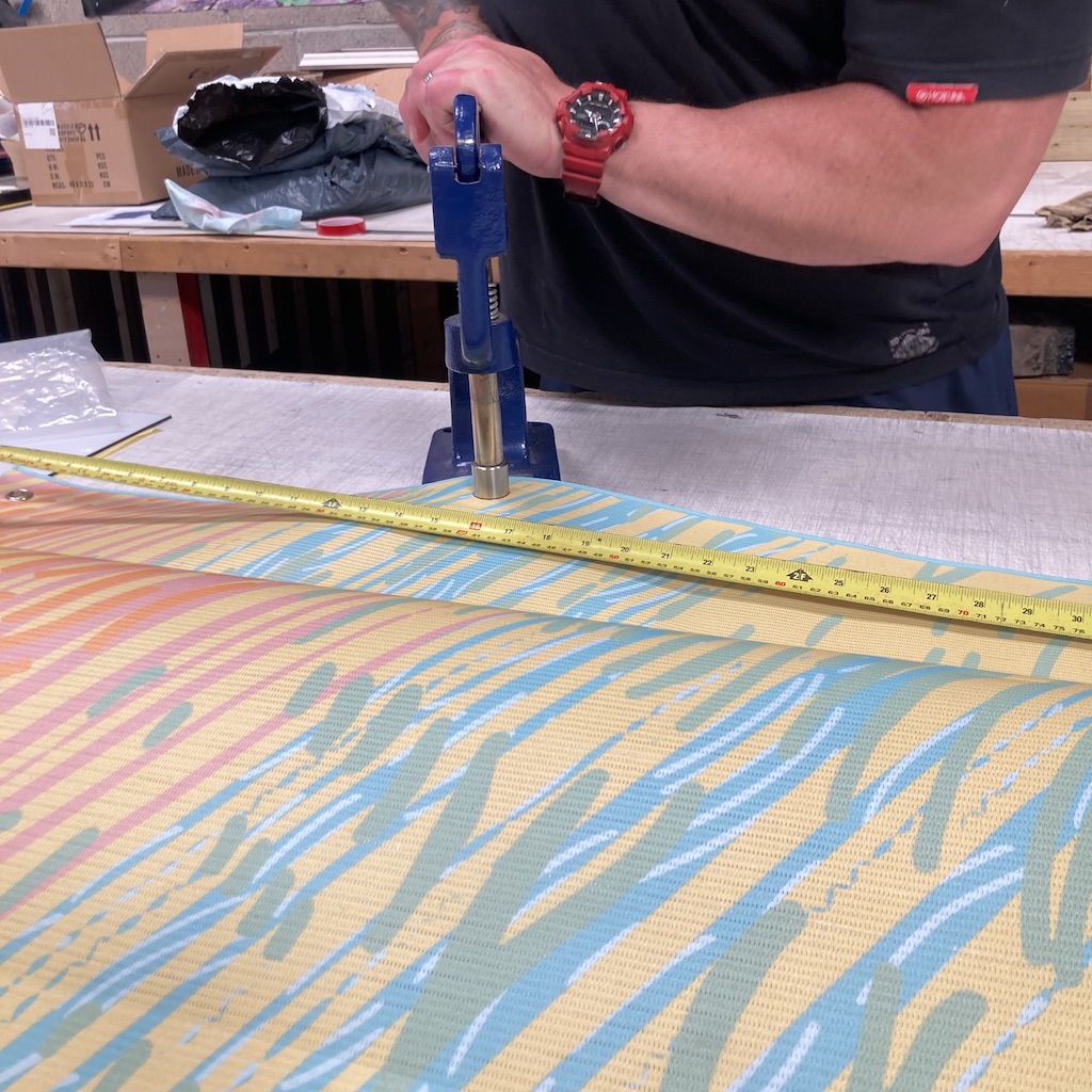
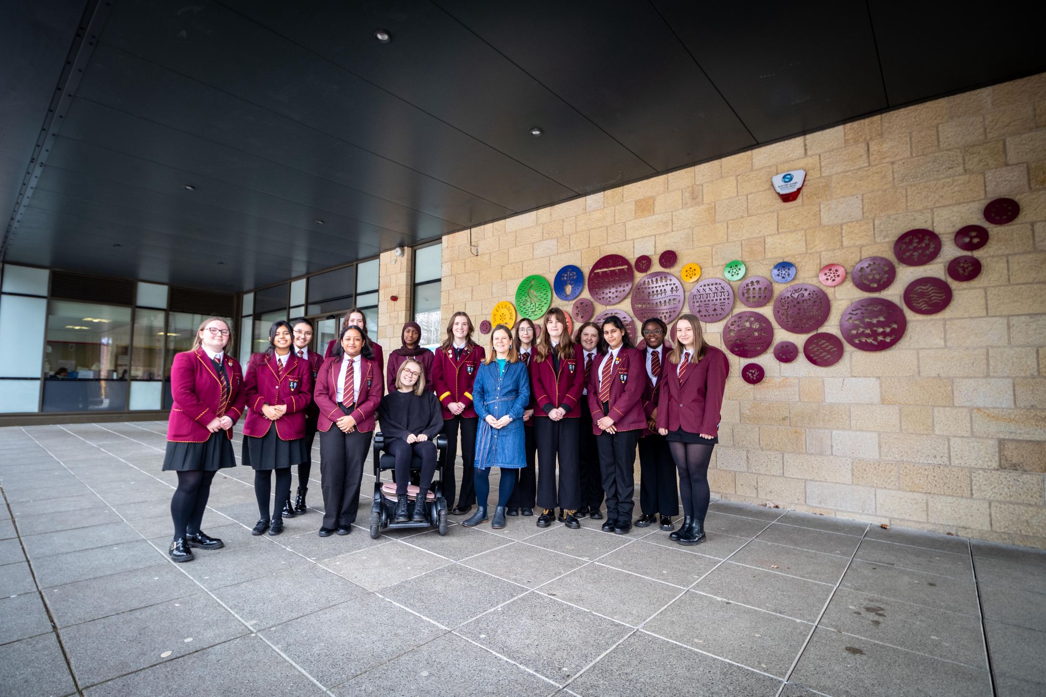
Thanks to Chika, Amy and Kerry-Lee for supporting this project. Thanks to the young people for all their enthusiasm and creativity! Thanks to local business Boyle Decorators completing the paintwork and Robertson Sign on the window vinyl and fabrication and installation of the artwork in the hanging signs.
“This project certainly makes me smile from the colour, the imagery a whole medley of imagination and inspiration, a joy to be part of, I loved going on a journey with the young people! It’s been a lovely project to be part of and seeing the supportive and caring organisation with big ambitions, that felt so aligned in the work I’m doing. ” Louise Kirby
Front Lounge
Front Lounge are an amazing charity doing great things, find more out here.
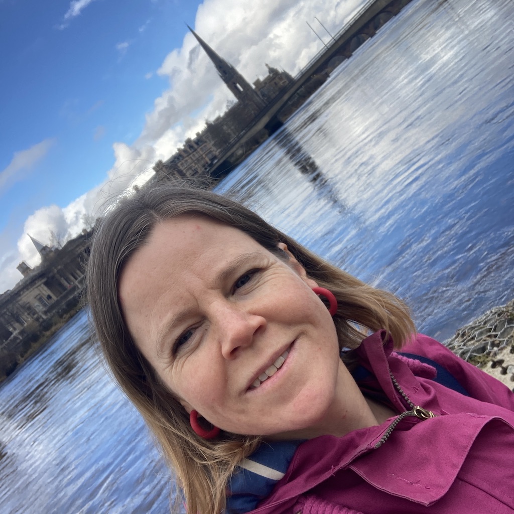
Louise Kirby Creative Practice
I love transforming spaces public spaces through art and design and this one brought my creative facilitation, collaboration, design, project management into play.
I am visual artist and designer that enhances experiences and placemaking that support positive wellbeing. My work is about connection and seeing the positives, I want people to thrive and positively experience this amazing world.
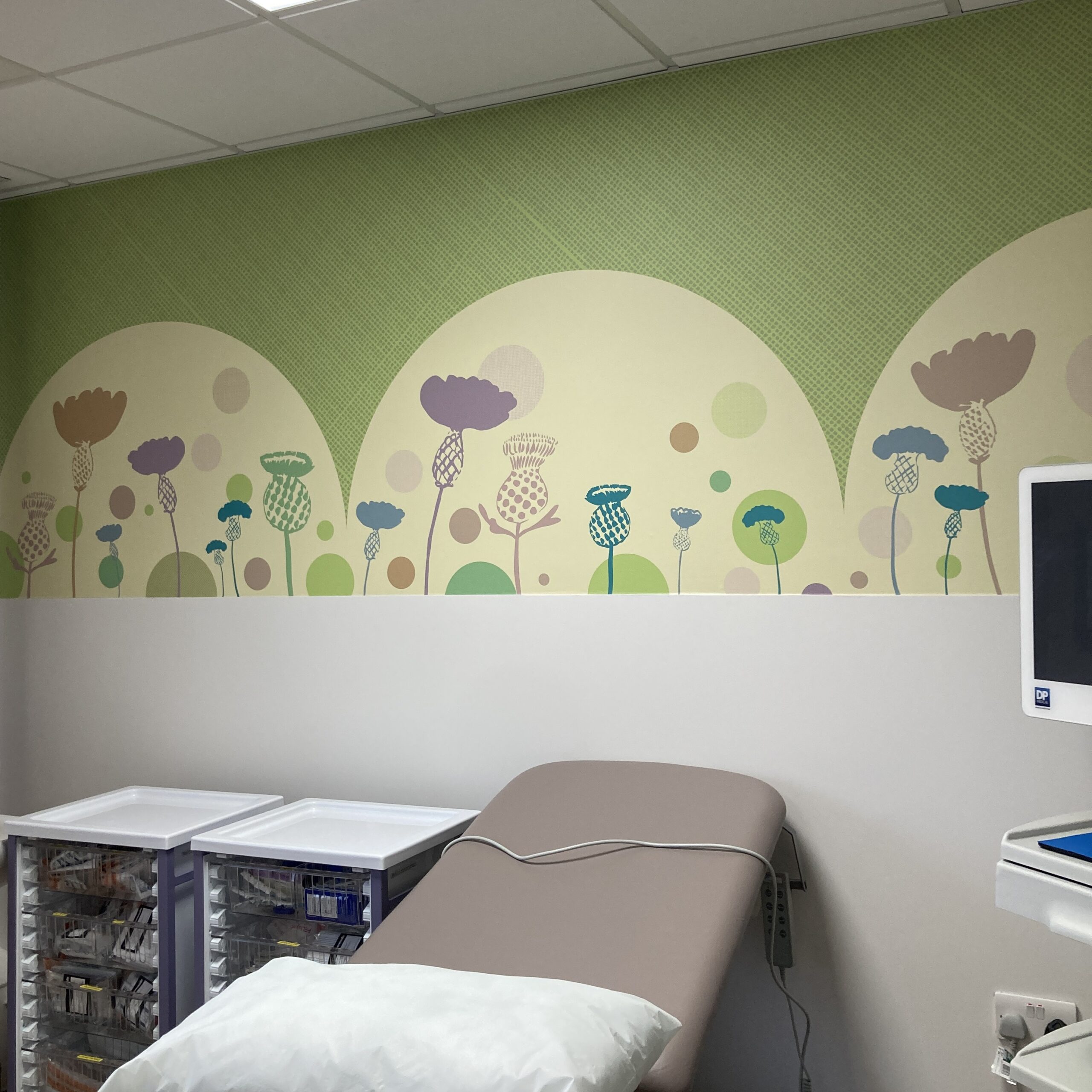
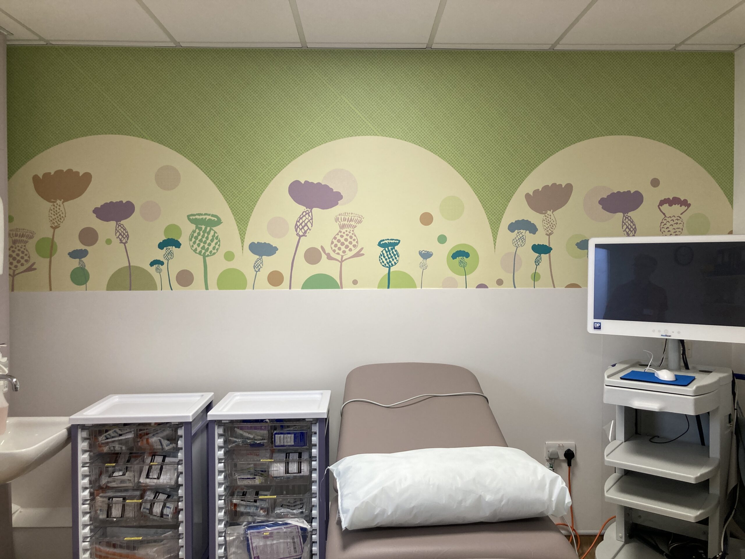
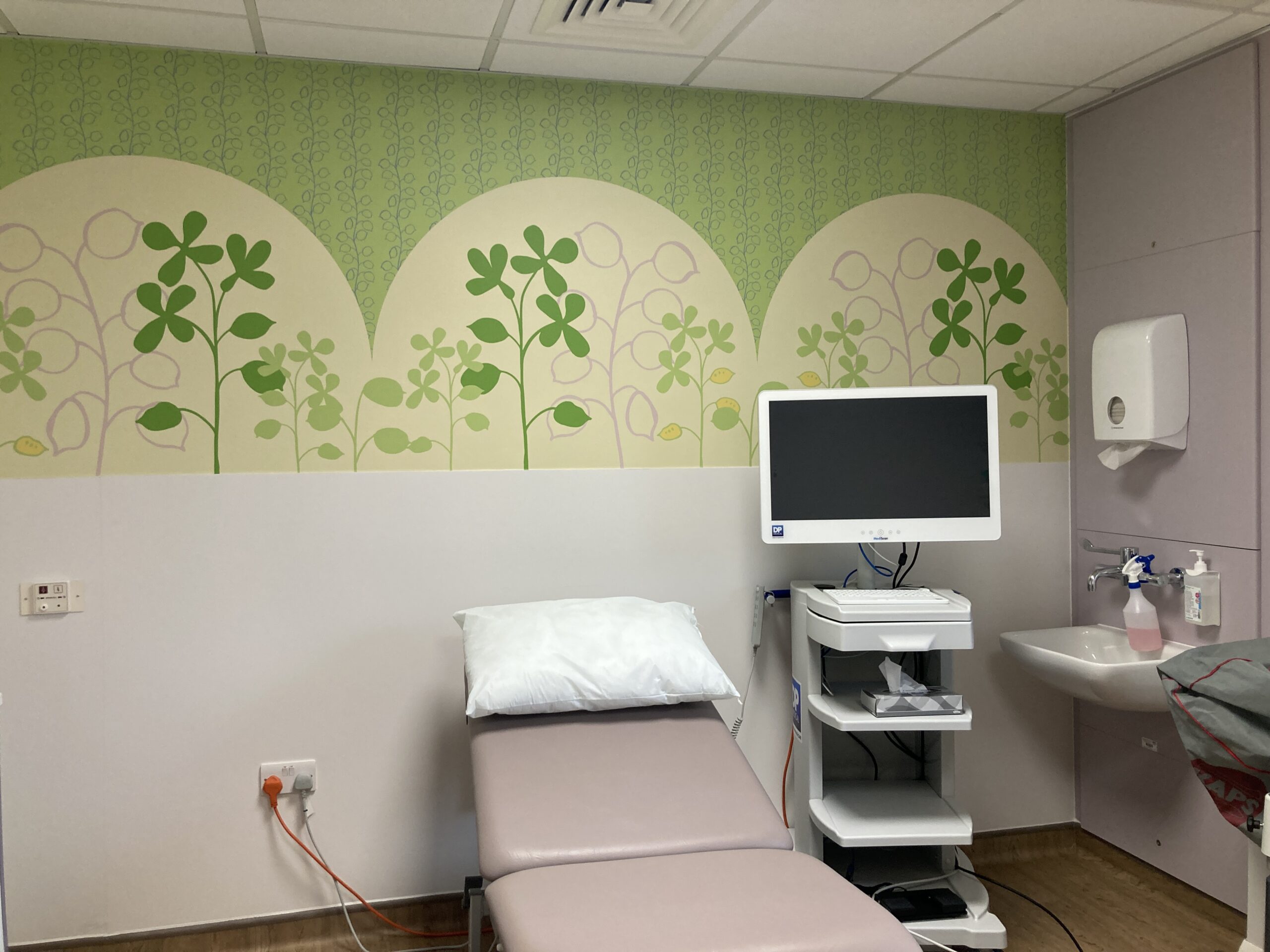
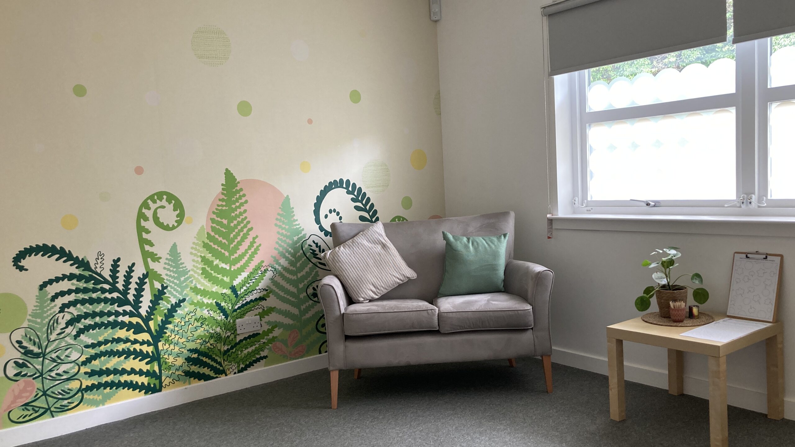
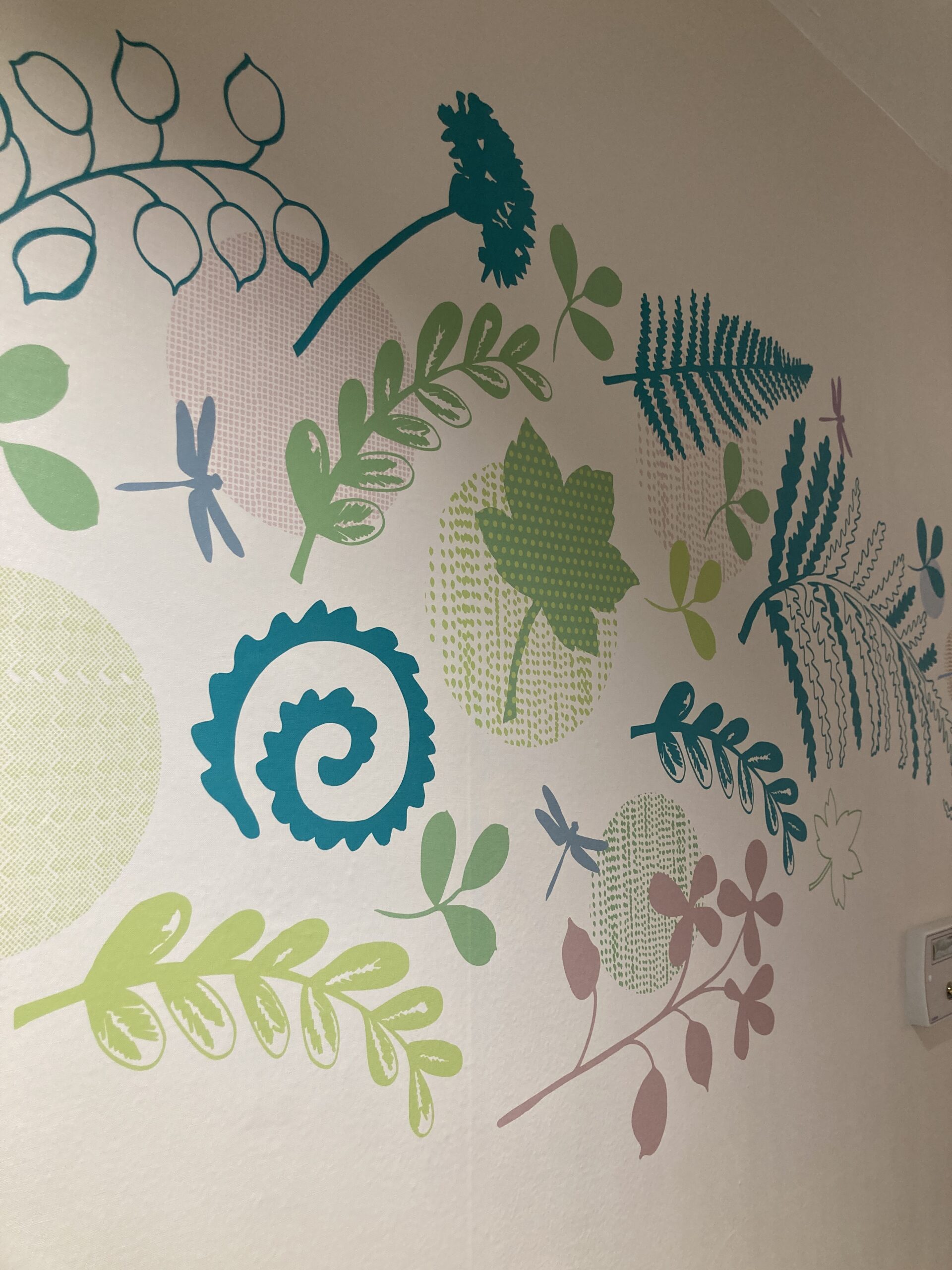
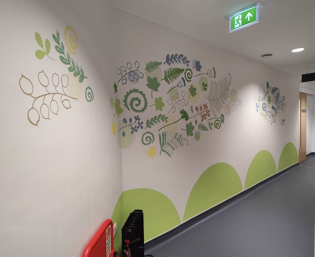
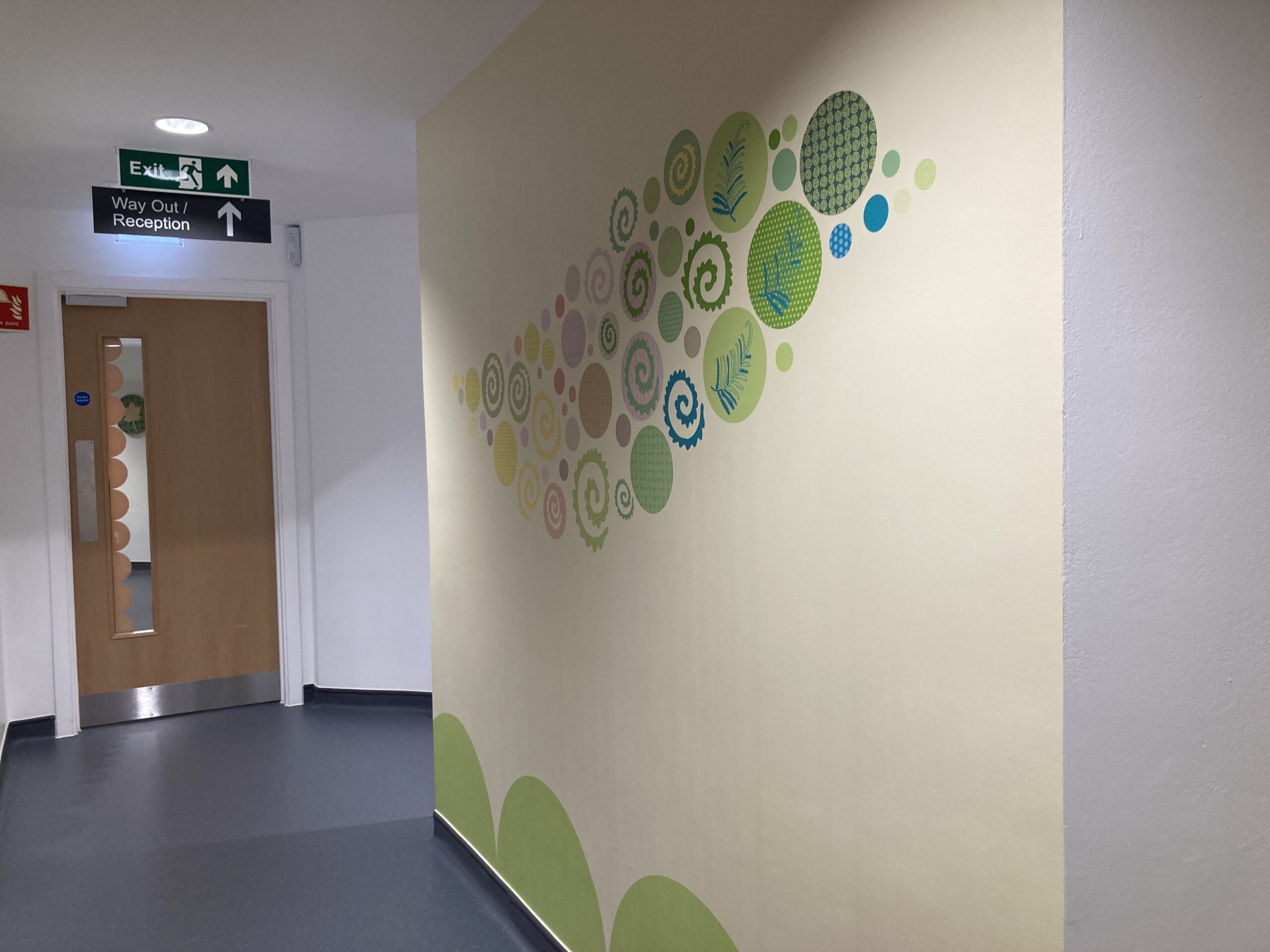
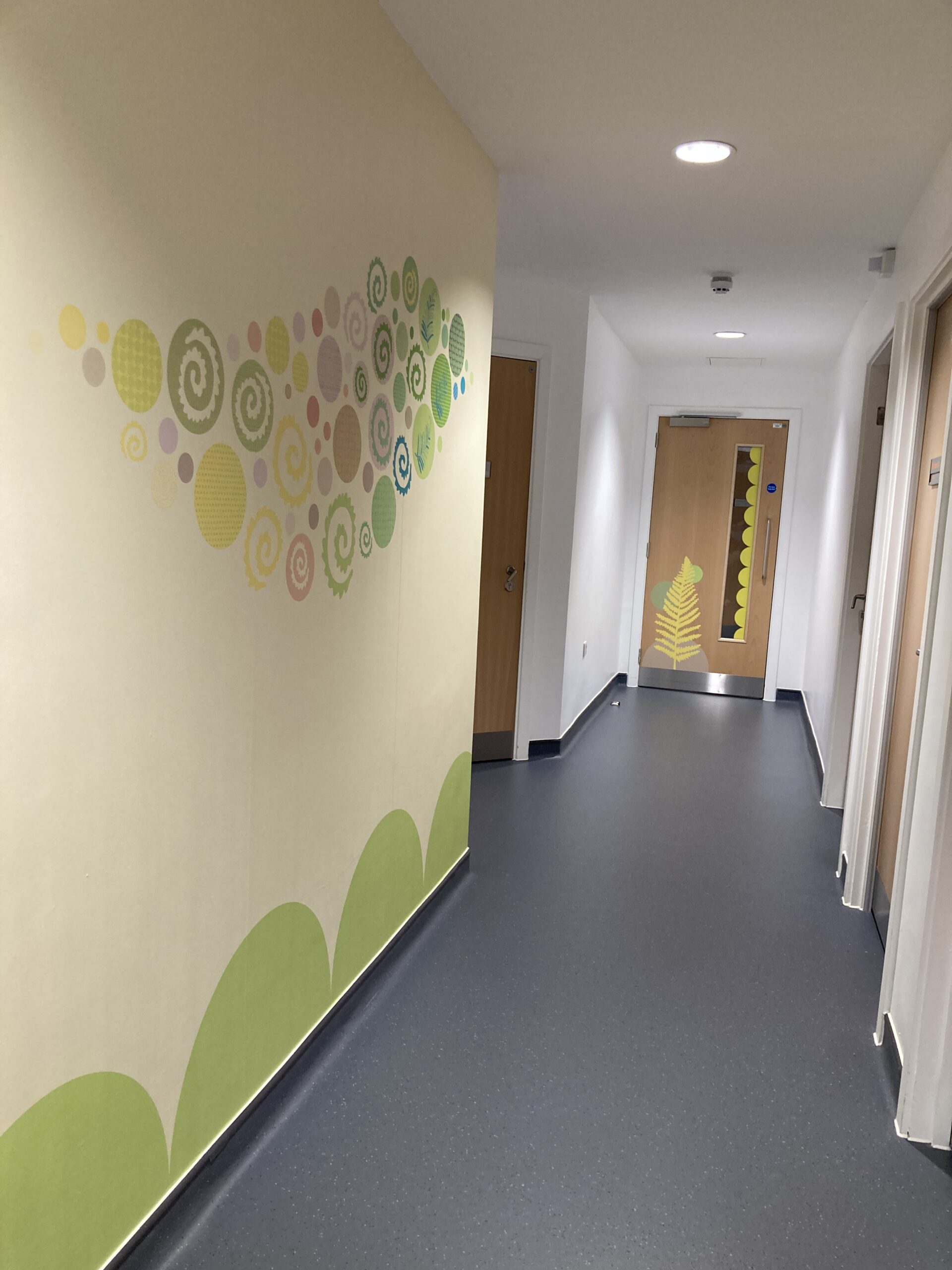
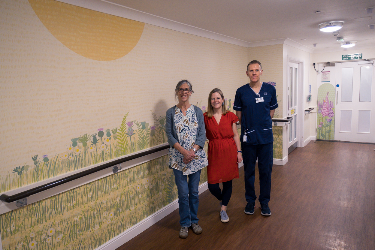
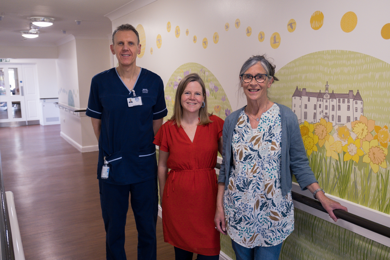
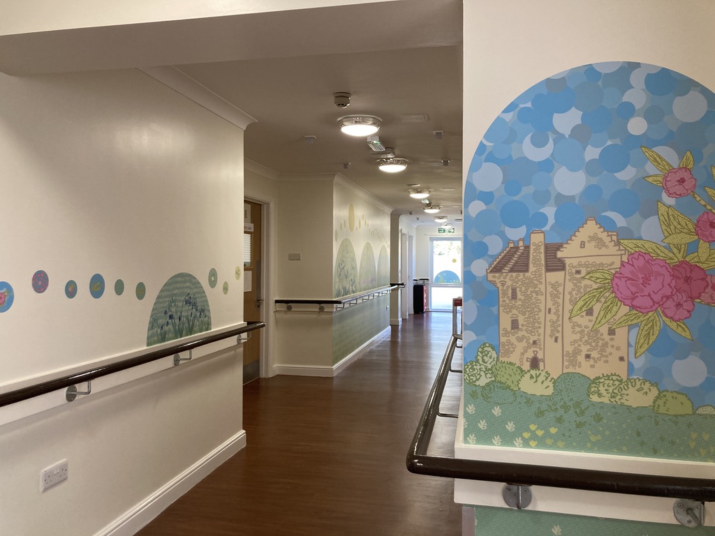
My designs have a range of applications from applied artwork to colourful pocket parks, corridor artwork for healthcare settings, colourful crossings and ground graphics in the streets, decorative steel gates in parks, interior and exterior environmental graphics and murals. I hope my artwork brings joy to site specific places within the public realm and concept to the people and spark something within them. You can see more of my projects on my website


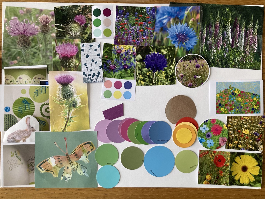
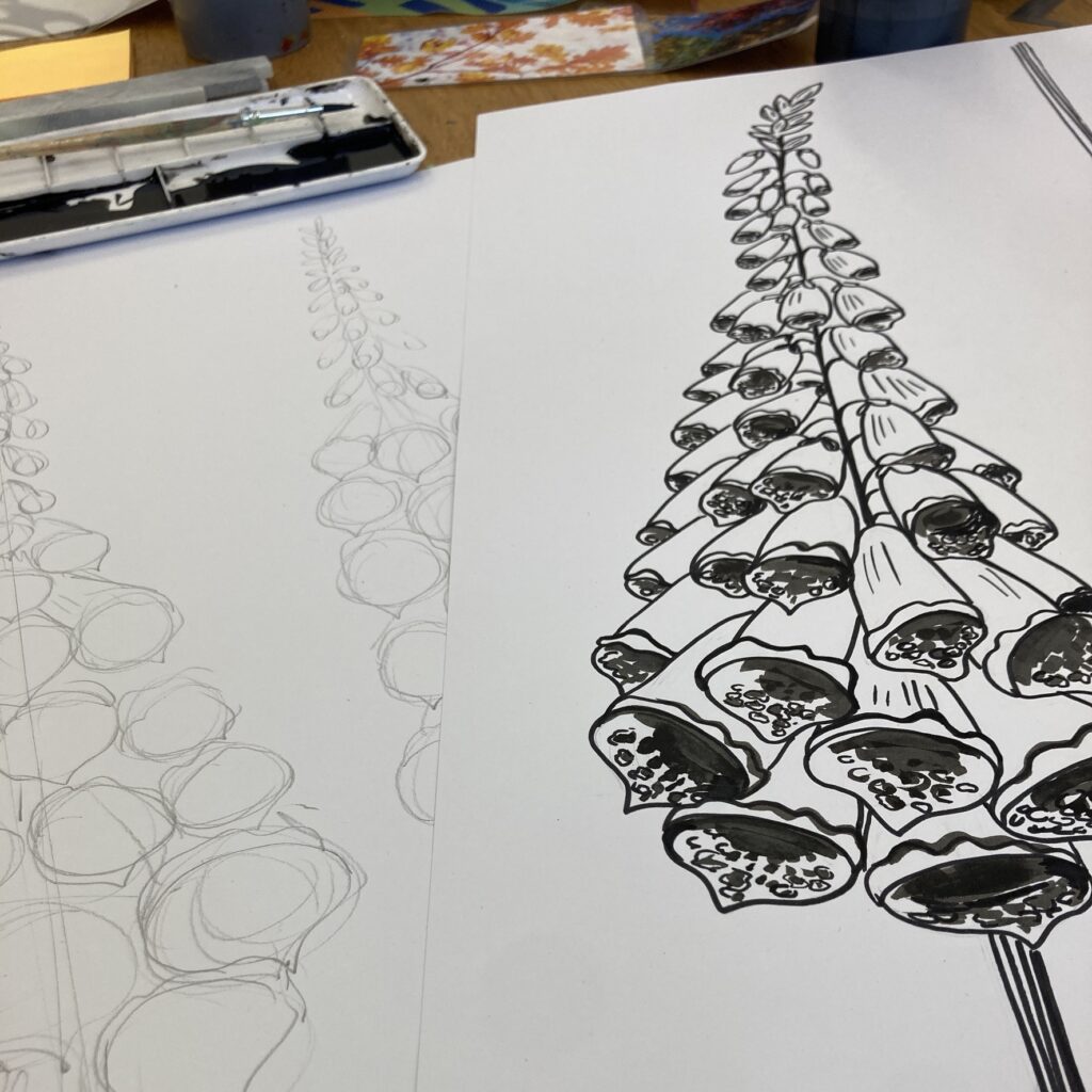
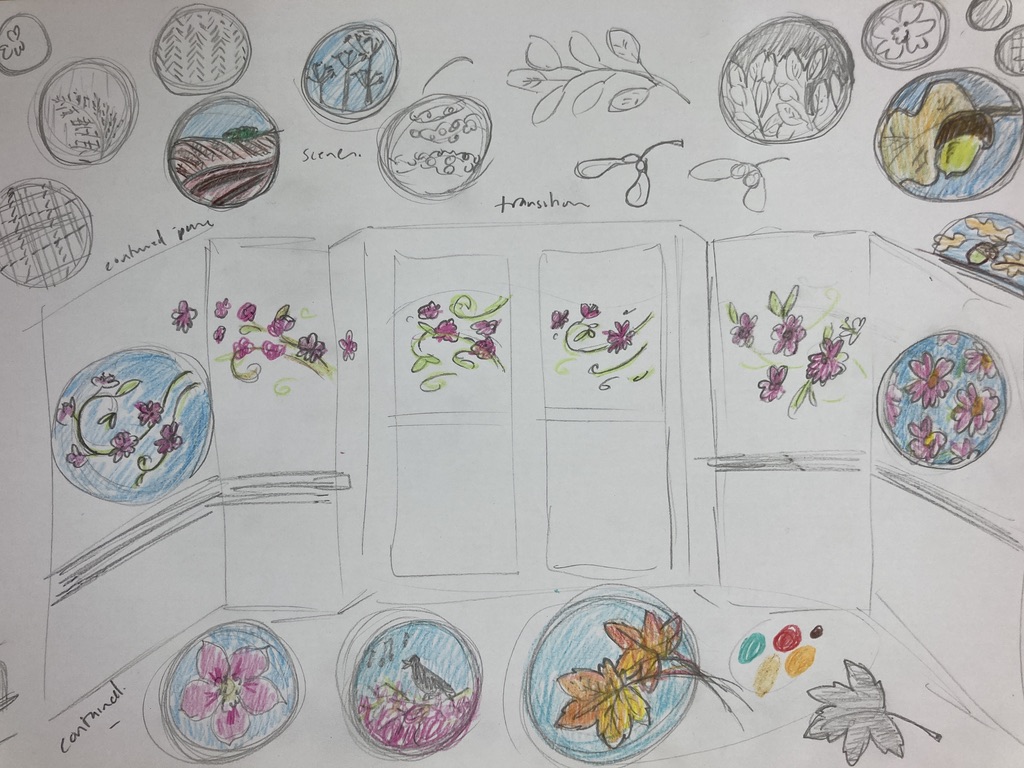


Inspirational
Thanks Christine