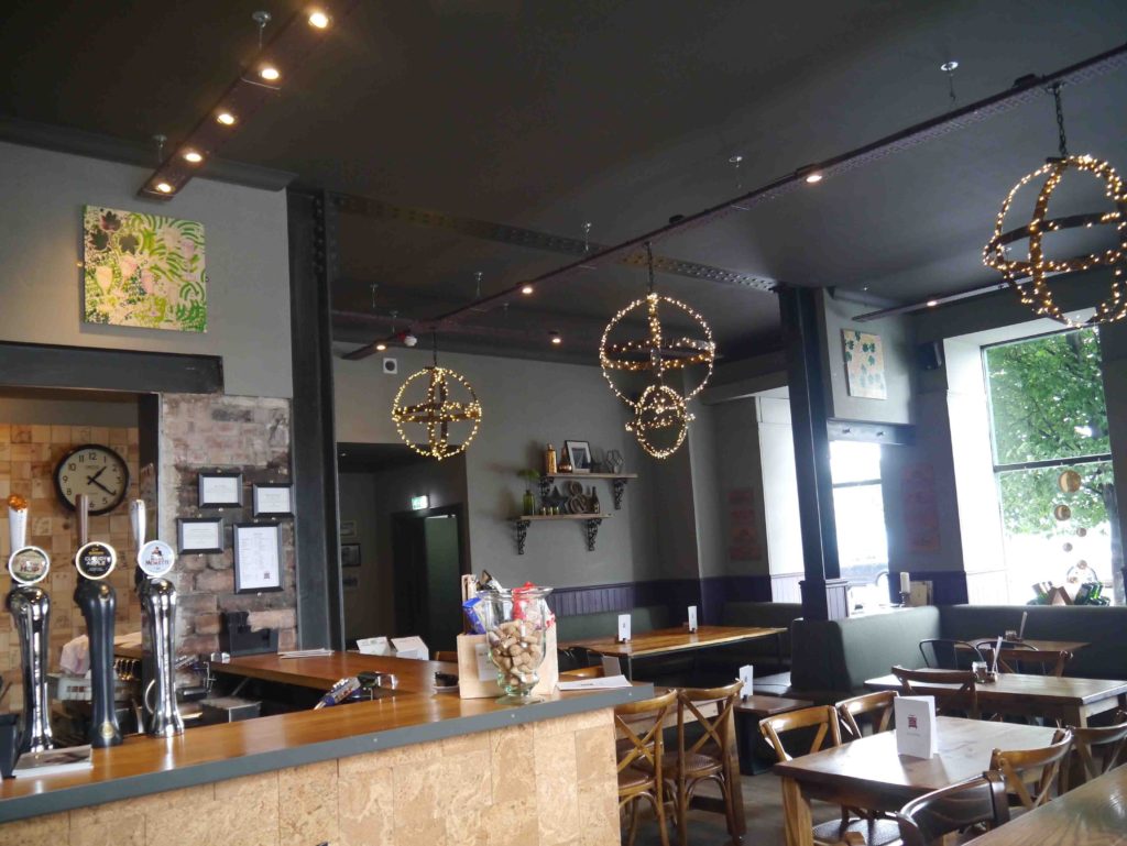
The Wine Press commissioned me to create artwork for their wine bar in Dundee. I was delighted to create not one but four bespoke pieces for their interior space that would lead the eye round and add as an accent colour, imagery and joy.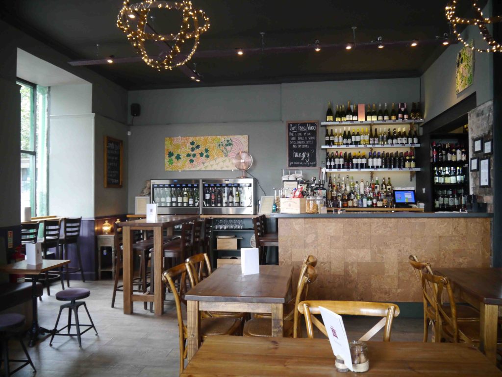
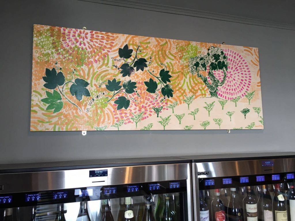
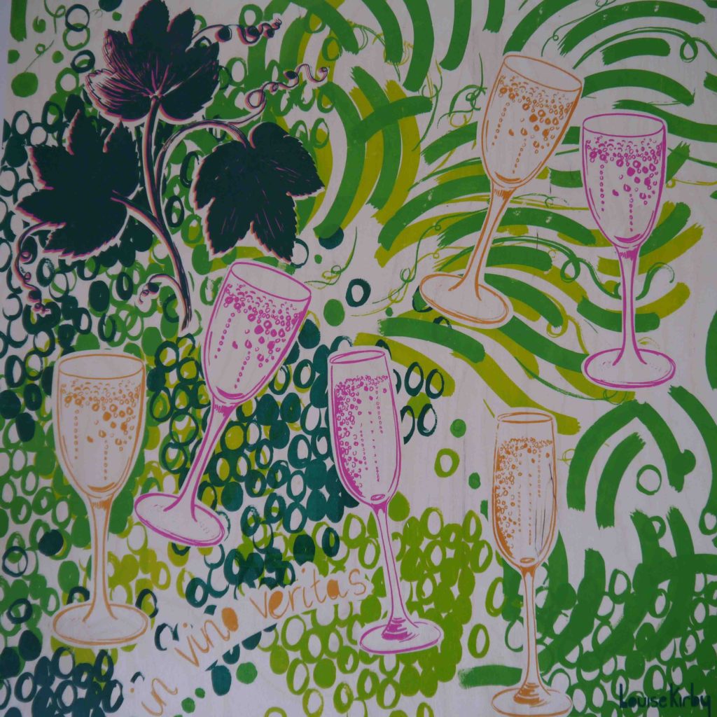
The process involved an informal meeting with owner Patrick Rhode to discuss the brief. This helped me to drill down exactly what he wanted. The brief was to have a celebratory feel, be colourful, to include the colour gold and to have the latin phrase ‘in vino veritas’ which mean in wine their is truth. We talked about where wine came from and his love for gnarly grape vines. He send me some photos of vineyards from his business trips which I included some of the imagery in the final images.
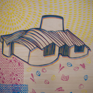
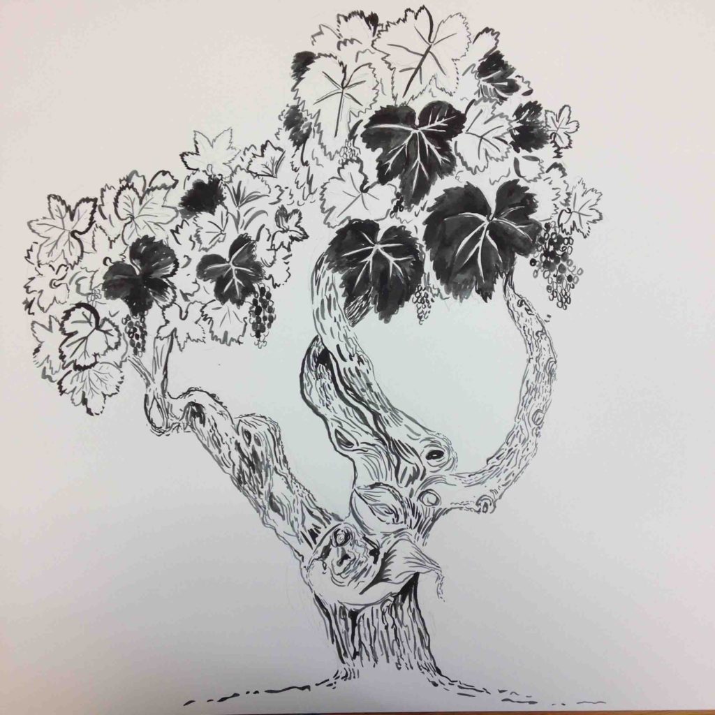 From our meeting I did lots of sketches of different compositions and imagery ideas. I love drawing, markmaking and patterns so I created some interesting relevant images and marks and movement that would compliment the design. Then I exposed the images onto screen. I did colour tests, then started hand screen printing onto the wood panels.
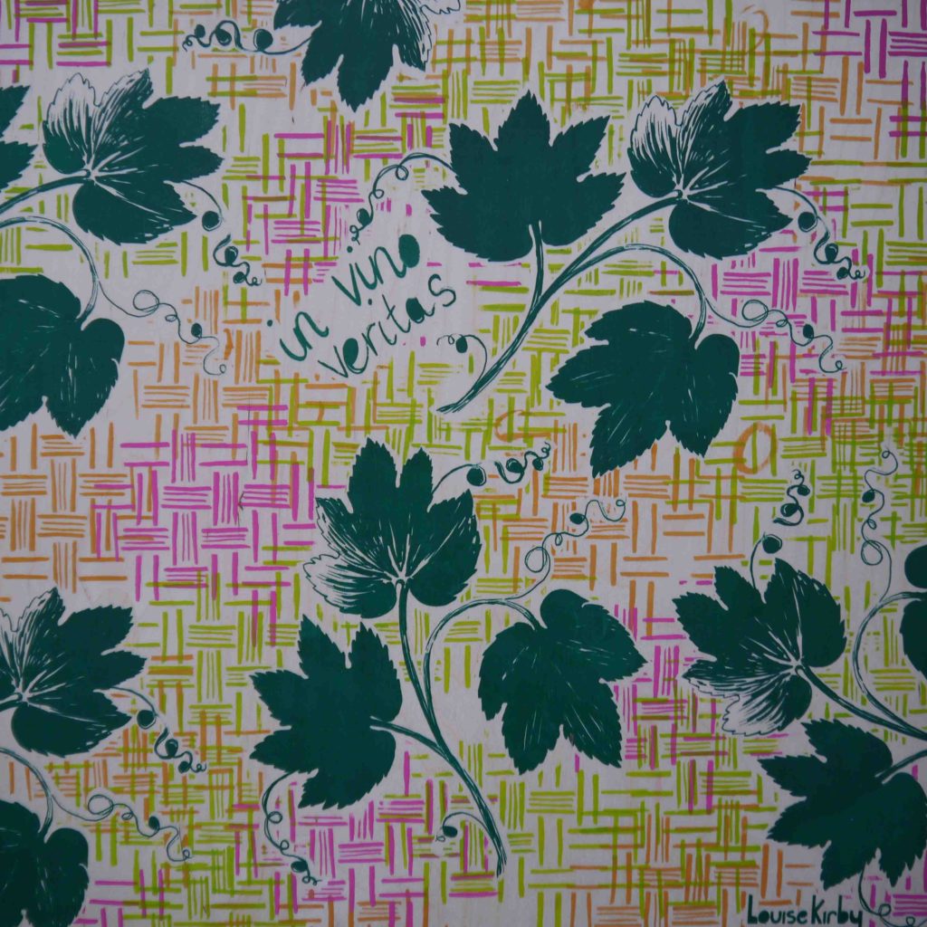
I chose to hand screen print as I love the flatness of the colour and clear lines and textures it has without loosing the quality of the drawing. I am very experimental and playful with the way that I screen print using lots of stencils and overprints. I do love getting my hands dirty in the studio!
 I work well to a deadlines and it was tight as I had to have it completed so it could be installed before their 1st Birthday celebrations. And I did it !
Patrick knew of my work so trusted me to come up with something. And he was delighted when I dropped it off – phew!
Patrick Rhode says ” Louise did a fantastic job and more than delivered on her remit. Her work is beautiful and has brightened up the bar which is exactly what I’d expected and hoped it would do. Oh, and she delivered on time!!! Very professional.”
I think The Wine Press is a lovely space for an afternoon coffee, or a glass of wine or bubbly with friends and the platters are delicious!
Thanks for reading, let me know what you think when you see them. You can follow me on Facebook or Twitter