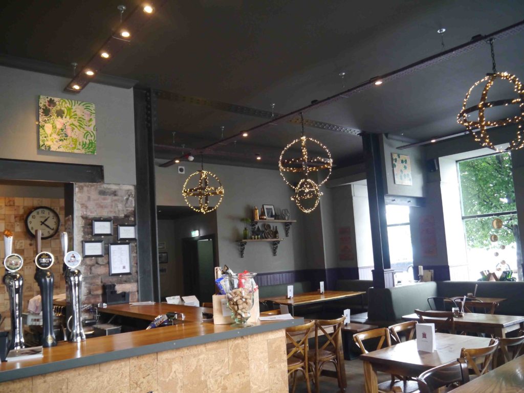
 I’ve loved Dundee Design Festival 2017 it’s provided me with inspiration, professional development, place to work, networking and nourishment for me and my practice – just what I needed!

Here are some highlights
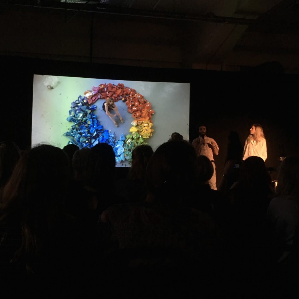
Pecha Kucha, with a line up of 13 interesting speakers, my favourites were Leanne Fischler and views on consumerism and the mesmerising sound of Panda Su.
 Creative Dundee created a WRKSHP space for designers to work during the festival. I used for for a couple of days which was great to be part of the whole event as well as tap into things happening. With Make/Share round the table, I particularly liked the passion and perseverance of Steph Liddle with ceramics. Great to hear Brian and Mark from McGinaly Bell architects on the start of the journey imaging what the West Ward Works could be in the future and Biome Collective and the creative, interactive and varied work the gaming collective get up to.

My Make/Share was about the process of creating the 12 hand printed patterned illustration wooden panels for last years Dundee Design Festival chatted about the initial conversation with Sion, mind maps, sketches, screen printing, tests, decisions I had to make including the happy accidents and many late nights to pull it off!
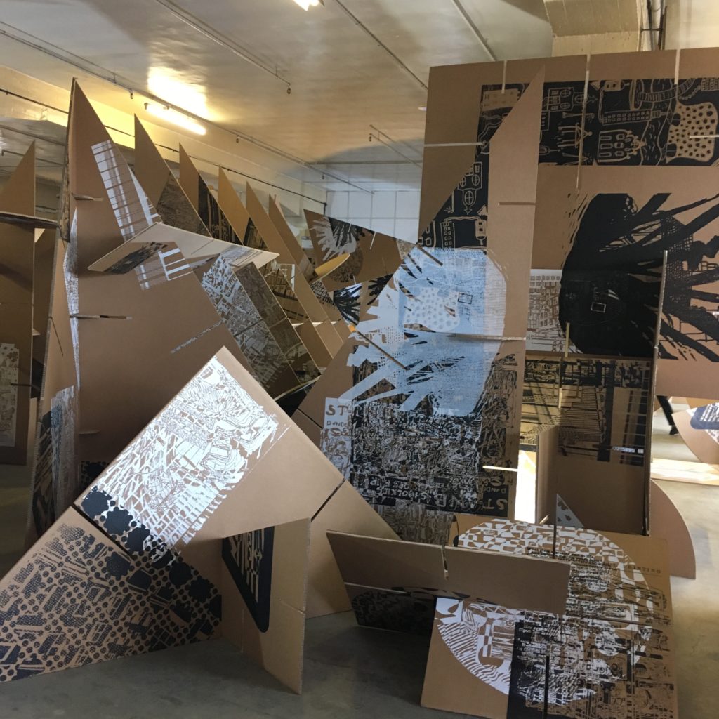 There was lots of things take part in, dicsuss and hear about. Print City was amazing, I love screen printing and the giant 3d shapes really created a interesting space to walk around and loved that the community had a part to play in the creating the visuals.
 I chose a blue triangle for Silent Monitors, where the colours and positions were decided by people opinions of how you felt on how your data was being used.
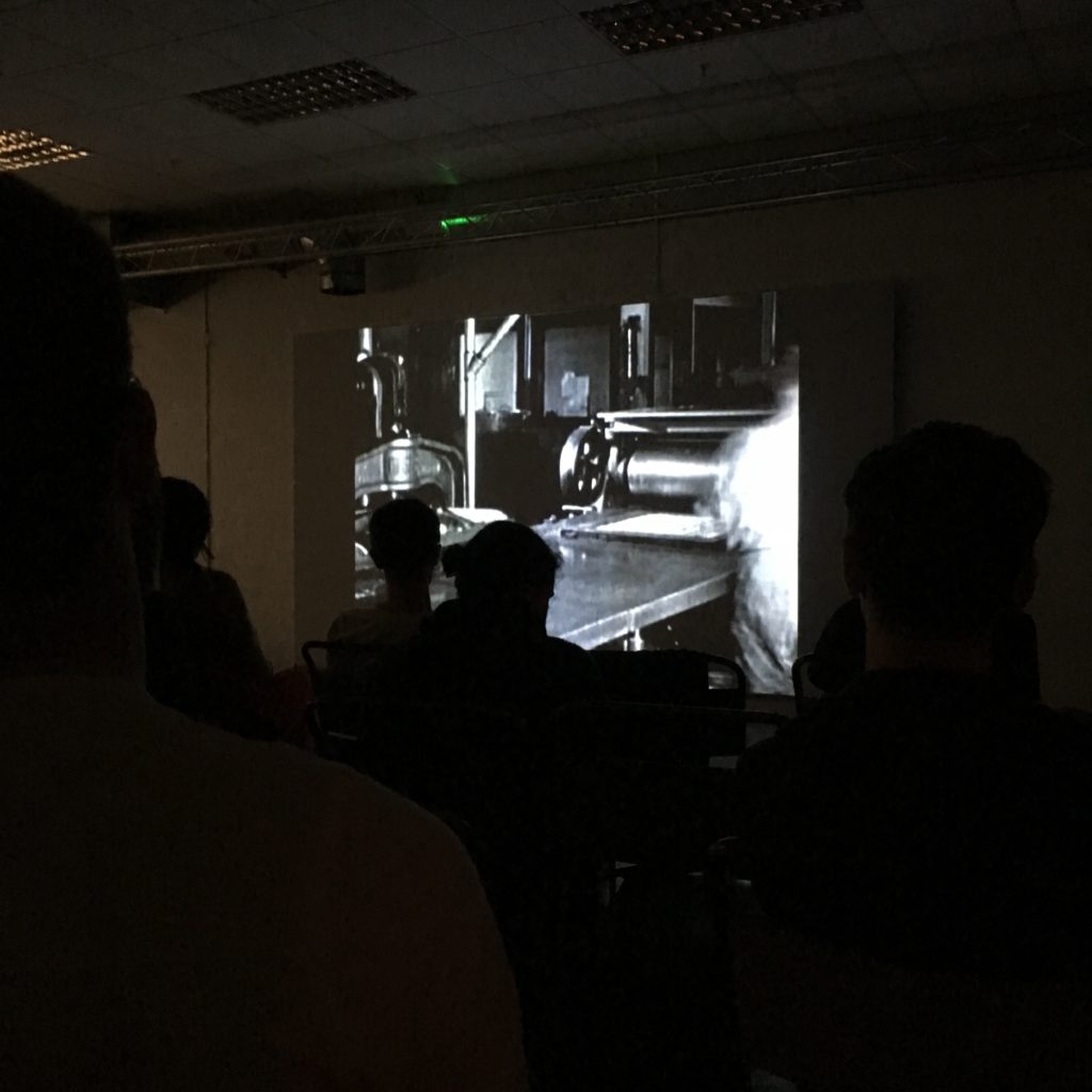 I ate popcorn and drumstick lollipops while watching Graphic Means film brought to the festival by D:Screening. The documentary was on the history of graphic design production, I didn’t realise how technical it used to be, I bet folk are happy with their apple macs now, even through I’m more of a cut and paste type of person!

Discussion of Why Should we make more with the cool brand Trakke, historic and very profitable Johnstons of Elgin, Clare Cooper and designing aides for the elderly and the inspiring Fi from Make Works. It highlighted my feeling that we are consuming too much and really should by things that you love with a quality to last or be repaired.
 The building is such a great space with the real industrial feel with the exposed pipes and extractors, faded painted lines that separate area and the lovely sunshine shining streaming through the coloured windows.
 This worked well with the simplicity of the bright tables legs created by Old School Fabrications showcasing the Factory Floor exhibition bringing together a collection of makers, materials and machines from Orkney to Detroit. Great to see the links with music and design as well as technical advances of the Ninewells x DJCAD radiotherapy mask and familiar faces of Hilary Grant and her beautiful knit patterns.

There was so much more to see from family workshops, talks, demonstrations, DCA shop with exclusives from Tom Pigeon and Whimsical Lush, tours in the building and factories in the area, Mak Lab workshop, Factory Floor Exhibition, live recording of Creative Chit Chats with a range of questions – looking forward to hearing them! Not to mention the cool opening night with delicious cocktails on the opening night! Loved the colour combination of the new branding by Sooper DD and Fleet Collective.
Well done to Sion Parkinson and the team that brought it all together! For more info on the Dundee Design Festival 2017 follow the link.
 If you want to feel inspired come along to Wasps Open Studios in Dundee on the 26th & 27th October, home of the artists and designer of Dundee. It’s a sneak peek into the studios were you will see a real variety of creative practices.

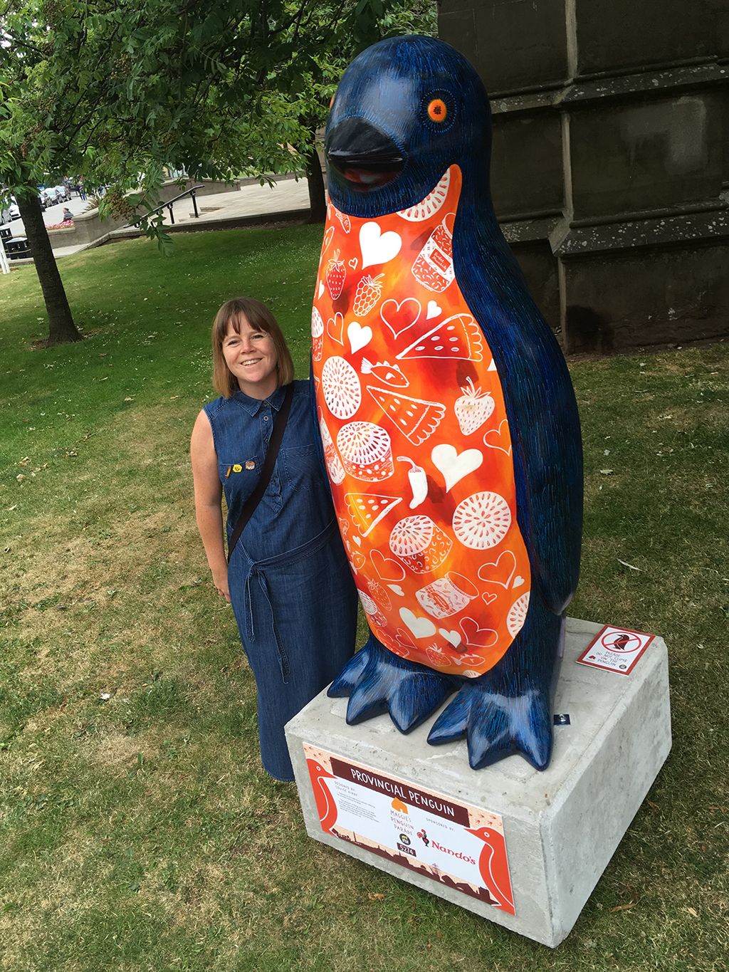 I’m delighted to have painted a penguin on the Maggie’s Penguin Parade. Number 64 on the trail map, next to the 5 penguin sculptures. It’s great to be part of the trail of 80 penguins to find in Dundee and surrounding areas and the money raised is for Maggie’s Dundee. You can find out more about it
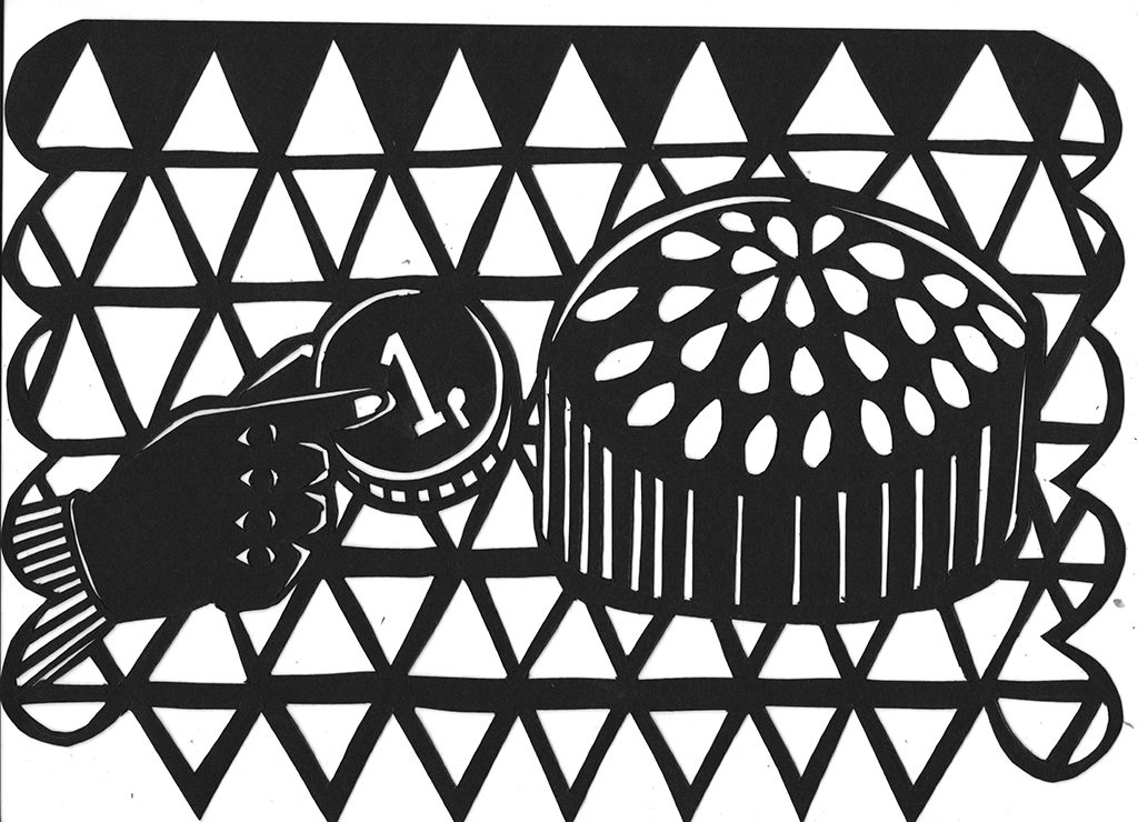
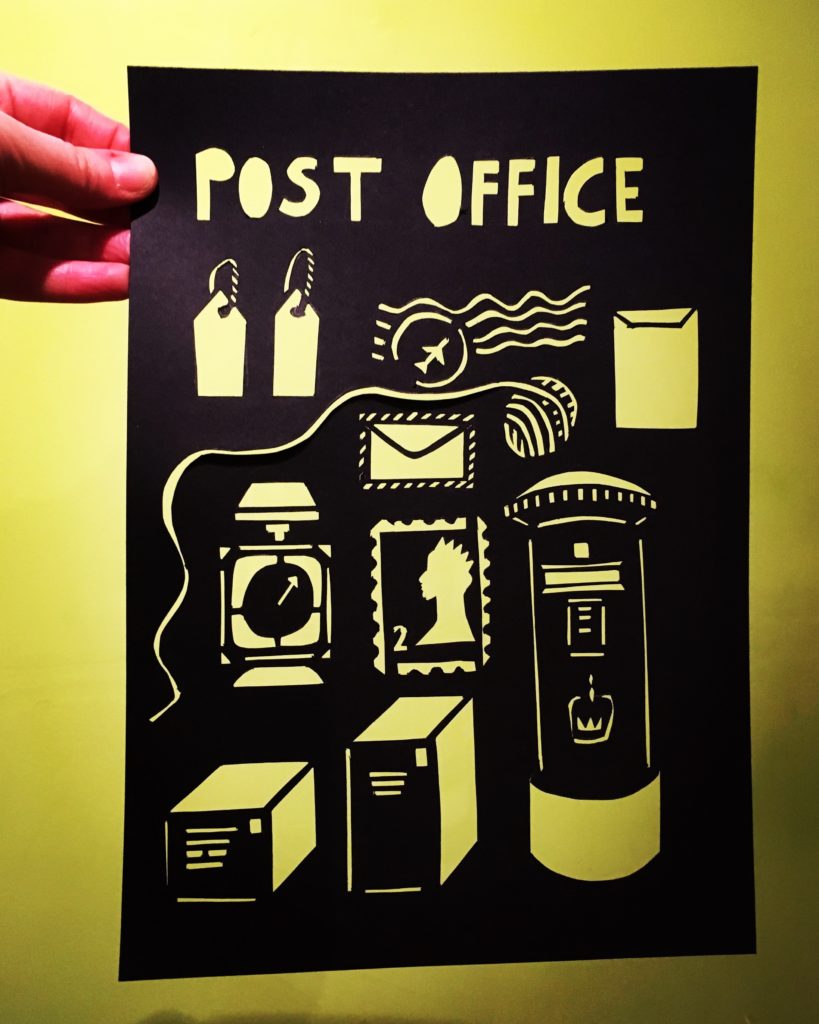
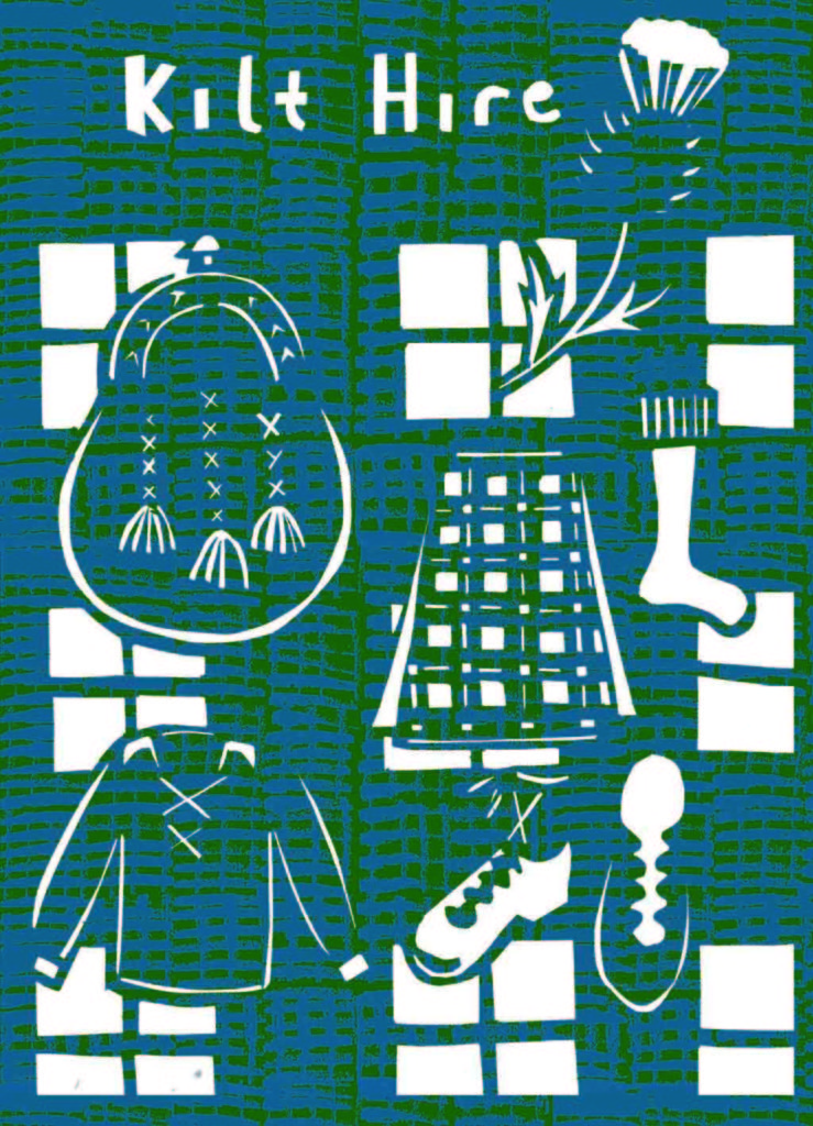
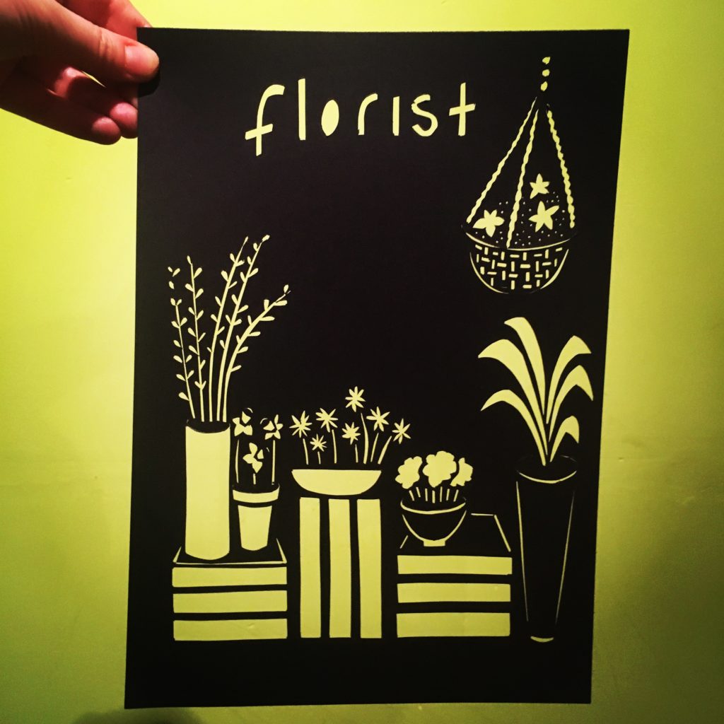 During the month of January I took part in Fun A Day, where you do something fun every day. I wanted to explore and play with an idea with no defined outcome to see where it takes me. Adapting the ‘Five Currant Buns’ nursery rhyme as a starting point. I went on a journey and did some sketches of bakers shops, ink drawings, illustrations, patterns and then focused on creating a range of paper cuts of local shop fronts and all cool things they sell. I love local independent shops on the high street.
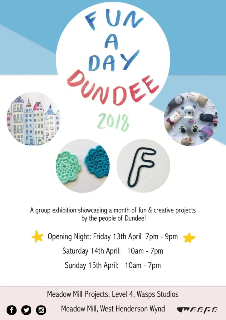
 The exhibition opens on Friday 13th April at 7pm, and is on over the Saturday and Sunday from 10am – 7pm at Gallery space, 4th floor, WASPS Studios, Meadow Mill, Dundee, DD1 5BY. The exhibition will have an eclectic mix of projects that happened in January.
 A few of the things I created during Fun A Day will be developed in the future, I can imagine a range of illustrations to a 5 Dundee Cakes in the bakers shop counting book. Doing the paper cuts allowed me to think about the positive and negative space and keep designs quite simple. I’ve been playing with these by adding colour and texture since January. Here are some test pieces

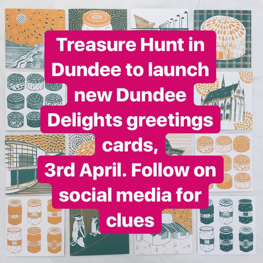


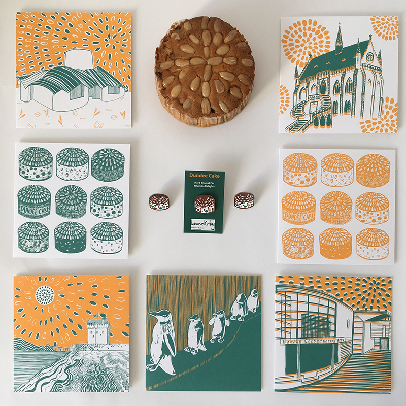
 Patterned sand looking over to Broughty Ferry castle with a happy sun shiny Dundee cake sky, evoking memories of days at the beach.
 The characterful 5 bronze penguins by sculptor Angela Hunter that make people smile as they walk past and sometimes they have been known to adorn clothes and hats.
 Local delicacy of the Dundee Cake, with the lovely pattern of the almonds on top.
 Maggies Centre designed by world renowned architect Frank Gehry here in the city which I believe is evidence of how good design changes peoples’ lives providing a place of calm, support, nurture and tranquility created within a purposeful space. Externally, I enjoy the shape and movement of the roof which I feel echoes the local landscape.
 Creative and cultural hub in Dundee with the curved face of different surfaces which is invites you in to the space which houses 2 cinemas, print studio, galleries and a bar and a restaurant.
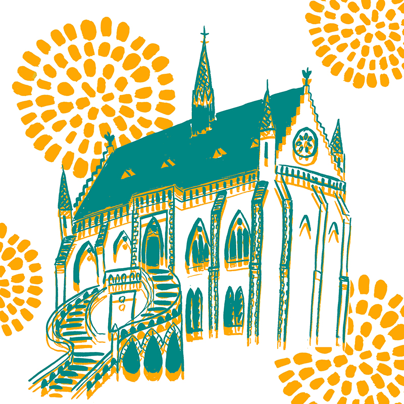 Dundee’s art gallery and museum in the fantastic gothic revival architecture, I love dramatic staircase and the detail in the architecture. So many stories lye within this building I particularly love the ceramics, Dundee and the World exhibitions and the Tay whale.
 I’ve loved Dundee Design Festival 2017 it’s provided me with inspiration, professional development, place to work, networking and nourishment for me and my practice – just what I needed!


 There was lots of things take part in, dicsuss and hear about.
  I chose a blue triangle for Silent Monitors, where the colours and positions were decided by people opinions of how you felt on how your data was being used.
 I ate popcorn and drumstick lollipops while watching Graphic Means film brought to the festival by
 The building is such a great space with the real industrial feel with the exposed pipes and extractors, faded painted lines that separate area and the lovely sunshine shining streaming through the coloured windows.
 This worked well with the simplicity of the bright tables legs created by
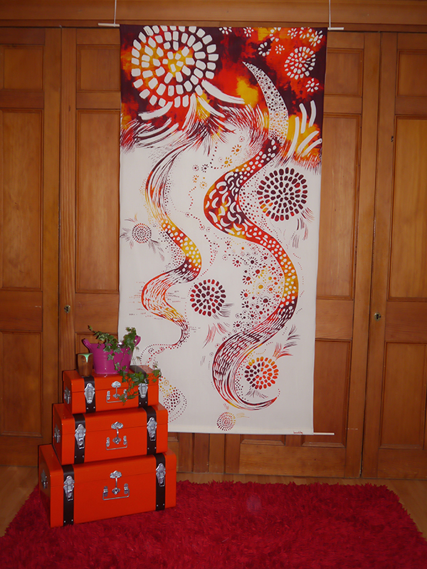 I wanted to share a bespoke wall hanging I did a while ago that I forgot to share.
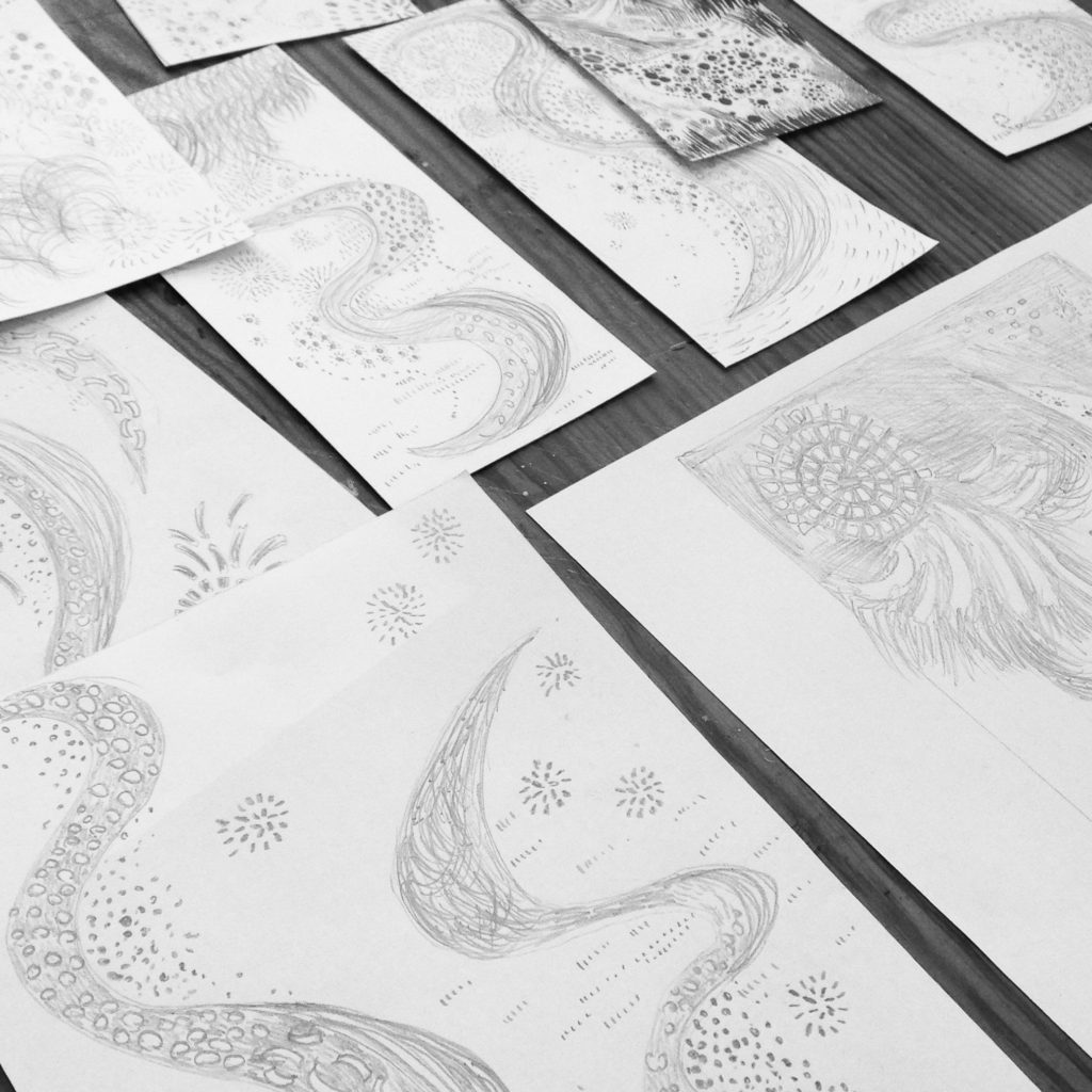
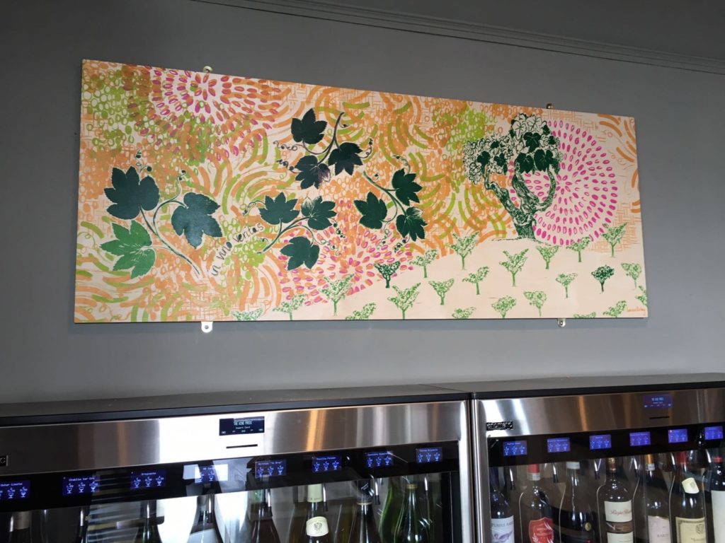
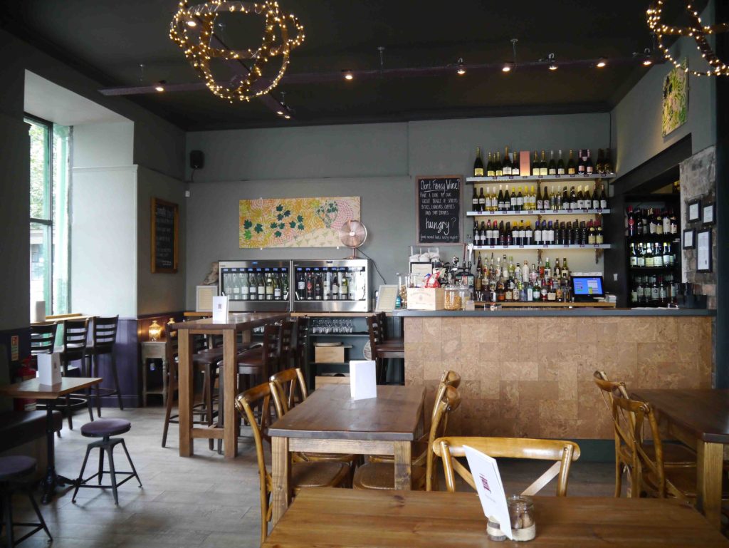
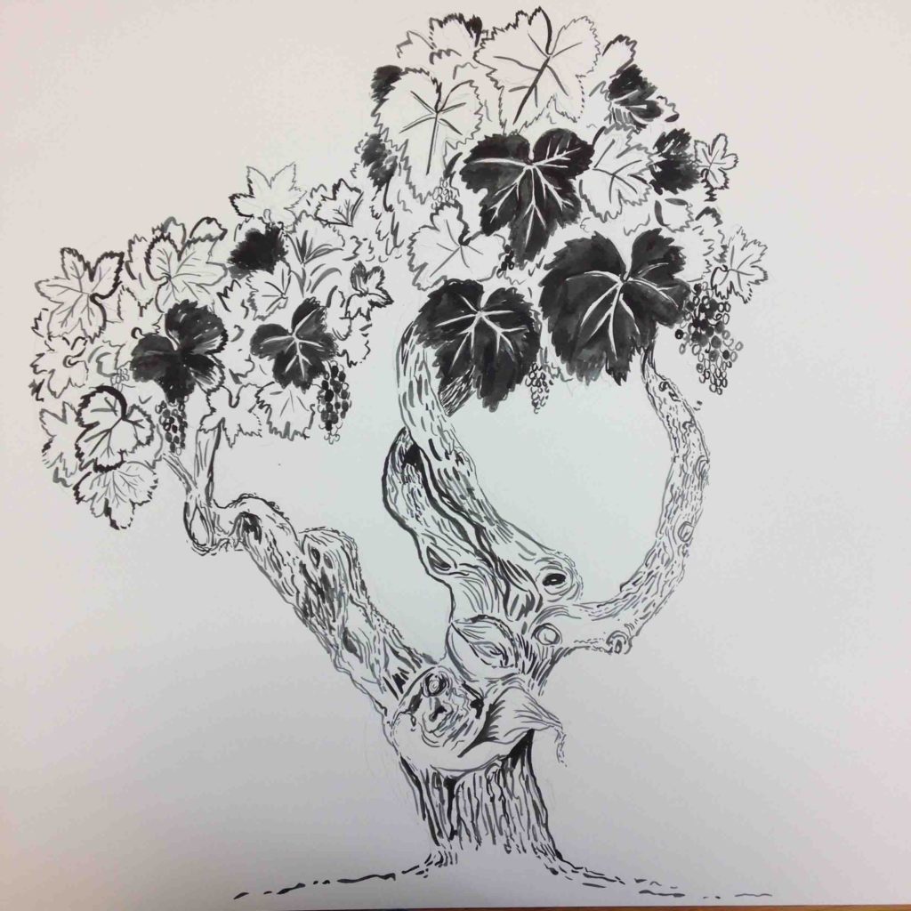 From our meeting I did lots of sketches of different compositions and imagery ideas. I love drawing, markmaking and patterns so I created some interesting relevant images and marks and movement that would compliment the design. Then I exposed the images onto screen. I did colour tests, then started hand screen printing onto the wood panels.
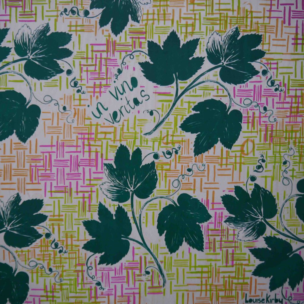
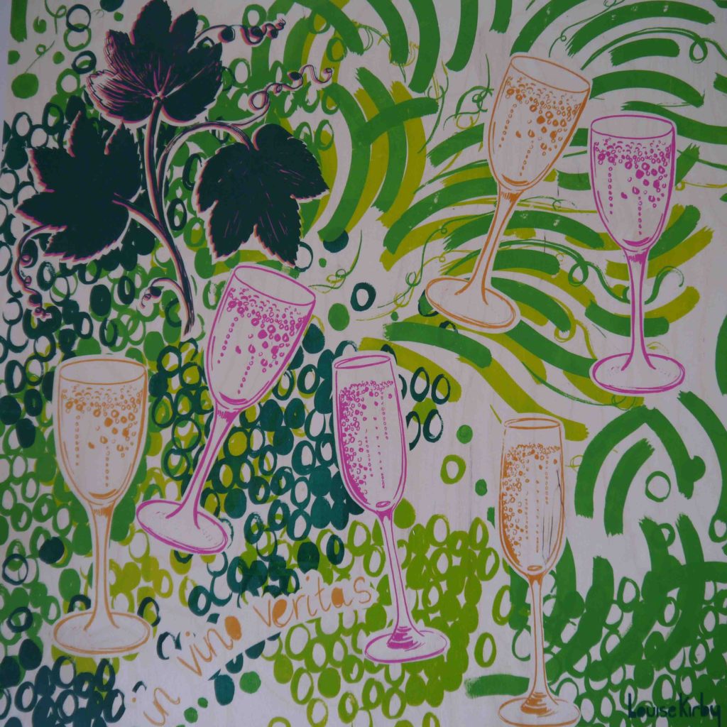 I work well to a deadlines and it was tight as I had to have it completed so it could be installed before their 1st Birthday celebrations. And I did it !
