Perth Pillars: Thriving Tay

I am delighted to be commissioned by Culture Perth & Kinross to create artwork for the pillar wraps for the entrance of AK Bell Library.   The brief was to capture their vision for ‘reinvention and renewal’.  I took my inspiration from the River Tay with water being a symbol for renewal, vitality and life, layering meaningful local imagery with colours and surface patterns to capture a sense of place.

Design experience

These site specific artworks are designed to be seen from different angles.  Entering from either side or walking, wheeling or driving past so that they have an impact from a distance as well as close up.    

Viewpoints

View 1 – Capturing moments in time with the heron standing patiently camouflaged in its surrounding then gradually flying off.  Progression of the colour palette and variation of ripple and movement of the water catching the light.  

View 2 – Uplifting warm colours with positive imagery playfully combined highlighting local features on The Tay – daffodils along the bank, butterflies flying, mushrooms, ladybirds, golf, heather, bridges, flowers, swans.

View 3 – The chevron striped artworks are seen from a distance bringing attention to the building.  The contrast of colour and patterns flow from one pillar to the next, from a more contrasting combination to a harmonious one, echoing gradual transformation.

View 4 – As leaving the building or walking past you can see the chevron stripe with details of the pattern, imagery and texture closer up.  

Consultation

Artwork was informed by the consultation with: staff, a family workshop for 2-5 year olds and their adults, LGBTQ+ group and the knitting group that are held in the library.  

During the consultation I found out what made the area meaningful and unique to the participants, finding out favourite places, things people liked to spot such as herons, golf, ripples, daffodils in the spring, sun on the water, swans, butterflies, dragonflies, heather, leaves, mushrooms, bridges, sunsets, current on the Tay. We explored colour combinations to bring joy. You can see these references in the final designs.

Site Visit Research

I enjoyed walking along the Tay capturing colour, texture and imagery – lovely rhythm and movement of the water, reflections of the bridges and buildings, the variety of public art sculptures in Rodney Gardens, the colours of the heather, the activity of the ducks and swans.

Moncreiffe island is quite unique with having a golf course in the design you can see a sunny pattern of golf balls and blooming daffodils and patterned paving. I loved seeing  ‘Soutar’s Menagerie’ by Rhonda Bayley on Tay Street – you’ll find a wee nod to this in the artwork.

Development and Installation

I drew, played with different elements and mocked up concepts, lots of more technical elements linked to measuring, sampling and installation, then created the final artworks ready for production.

Culture Perth & Kinross Vision

The brief was to animate the familiar space in a new way.  To contribute to the recognition of Perth as a creative place to live, work and visit and be a new visual marker as a destination.

The aim of my artwork is to capture the positive progress and shifting of perspective in the city of Perth with my striking artworks that uplift and bring joy and a sense of place creating confident, uplifting, joyful designs capturing the shifting perspectives of the city.  I hope you enjoy seeing them, they are up for up to 6 months.

Thanks

Thanks to librarian Louise for reading ‘love your earth’ by Jane Cabrera and ‘A home on the river’ by Peter Bentley and Charles Fuge as a great start to the crafty consultation workshop with families. Thanks to Kirsty for being my contact at AK Bell, thanks to Paul for initial chats on previous pillar wraps used. Thanks to the families, LGBTQ+ group and knitting group for your help. Thanks to Circle Signs for fabrication and Barry for installation.

My Creative Practice

With my artwork I like to create work that captures a sense of place and is meaningful and unique to space and the people who use it.  You can find out more about my projects and  commissions on my website where there are examples of a range of projects from outdoor active travel public artworks, healthcare corridor artworks, illustrations for books and much more.

Harmonious Artwork for The Sycamore Centre in Edinburgh – Rhythms of Nature

Delighted to share my latest commission for The Sycamore Centre in Edinburgh.  I was commissioned to create a welcoming, comfortable and calming environment to reduce the clinical and institutional feel.  I did with a mindful approach through my choice of imagery, colour, materials and consideration of the user experience.

The Sycamore centre is the Equally Safe Multi Agency centre (ESMAC) is based in Edinburgh and is a dedicated facility, which provides a wraparound person-centred trauma informed service for adults 16 and over who have encountered gender-based violence, rape, and sexual assault, who live in Edinburgh and the Lothian areas.

This is my largest project to date where I created artwork for 12 rooms (including forensic suites, police interview rooms, welcome rooms), corridor with 3 feature murals, signage, visual wayfinding, activity sheets, reception area and entrance feature windows and window manifestations. 

Many site visits, meetings and feedback from stakeholders and lived experience really helped me to create designs suitable for the space and to help support the experience of using the service.  

Inspiration

The final designs are inspired by a Scottish woodland walk bringing in nature elements.  Adding in nature into the interior environment helps to reducing stress and making it less clinical, linking into biophilic design.

Visual clues

I created a concept for the whole building with visual clues with colour and imagery to help you gently transition through spaces.  My colour palette changes as you go through the corridors in both the door artworks and feature murals. Metal clinical signs were removed with warm wooden friendly ones that coordinate with the rooms and whole experience.  

Conscientious Colour

I conscientious used colour to create a warm, safe and welcoming feel that helped to reduce the clinical feel of the while plain walls and the colour worked through the building and helped with wayfinding.  Applying colour really helped to get away from the clinical feel.

It’s not all art

I chose materials suitable for each room that linked to health and safety, produced installation guidelines to ensure smooth running installation, choose suitable plants and soft furnishings for each space and extra details to make the experience better. Thanks to Eastern Display Graphics for laser precision installation!

Impact

Quote from Head of Service ” The design and artwork now in place at Sycamore is transformative, it has made the difference between a functional and fit for purpose clinical facility, into a SARC. The colours, images and visual texture are welcoming, warm and peaceful, and at the same time, not memorable, thus not triggering. It gives a vibe, a feeling rather than an impression not to be forgotten. People will always remember, above everything, how you made them feel and I think the trauma informed design reflects and melds with our purpose to provide recovery in a psychologically safe space.”

Louise Kirby Creative Practice

I am a Dundee based visual artist and designer enhancing experiences and placemaking that support positive wellbeing.  I creates site specific artworks and designs that transforms the experience. Each project or commision is distinct to the organisation or space with a flavour of my signature style of  playful pattern, conscientious colour and meaningful references that captures a sense of place. 

You can find out more about my projects and  commissions on my website

You can read the NHS Lothian Charity blog about it here

Painted Elephant Trail

Photo by Derek Gerrard Photography

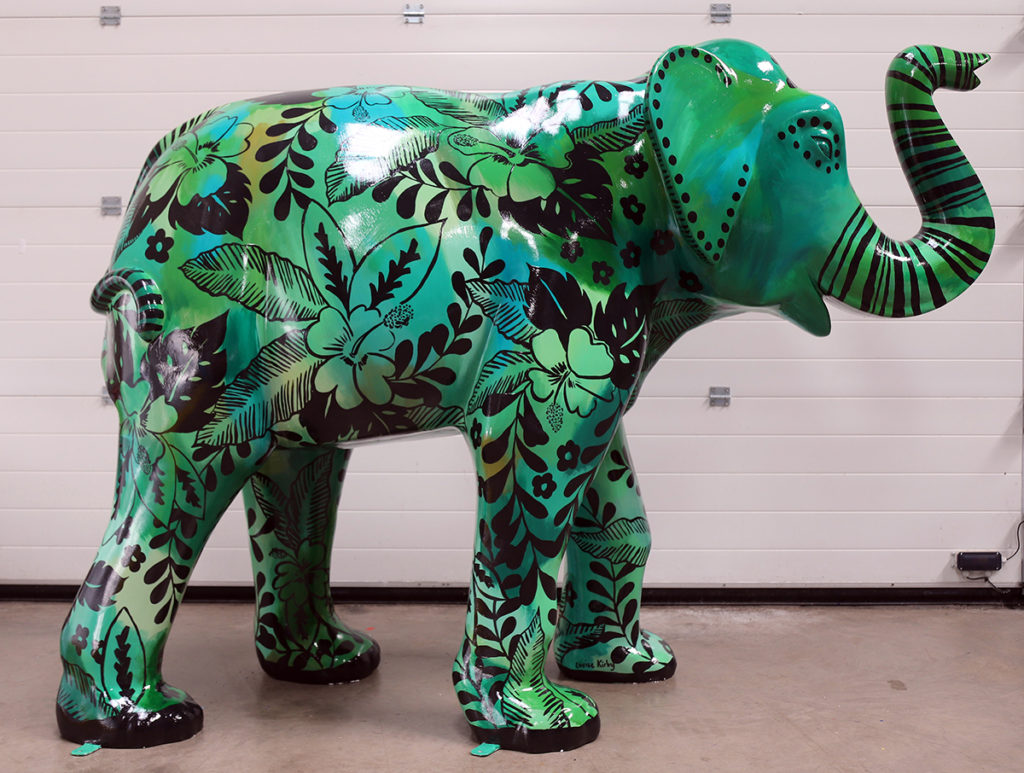
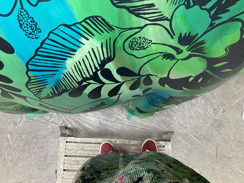
I loved painting this lush and leafy design onto a plain elephant, it was a great shape to paint on. I built up layers of greens, turquoise and olives to create depth and the feeling of a tropical rainforest. I then added hibiscus and ditzy flowers with tropical leaves in an allover pattern. And of course a striped trunk and tail! I named it Lush + Leafy, I was inspired by elephants of the tropical jungle of Borneo, camouflaged in the luscious tropical patterns.

Work in progress video

Work in progress video

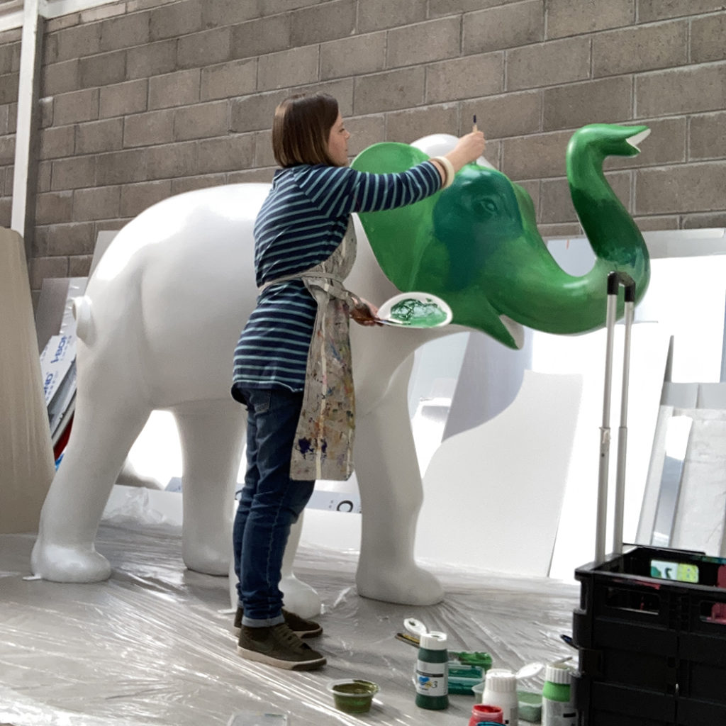
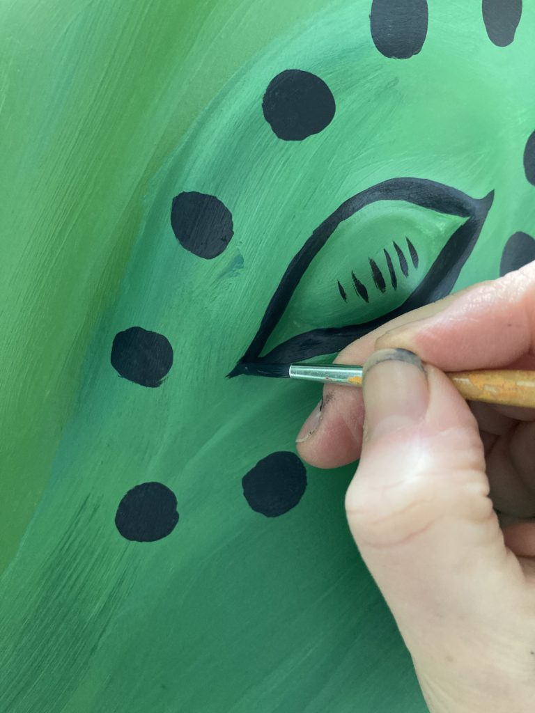
My elephant is part of The Big Trunk Trail in Luton raising money for Keech Hospice Care. Big thanks to the sponsor HBD Places. If you are in Luton you will spot Lush + Leafy in The Moor Park, please tag me in on social media or send me a photo! hello@louisekirby.com Here are some work in progress photos

The elephant sculpture was massive and wasn’t going to fit into my studio on the 4th floor at Wasps studios. I’m super grateful for the kindness of Derek from Circle Signs offering me space in his workshop to paint!

Thanks to the Sandra Webster for escorting my elephant to Luton with her colourful elephant also on the trail.

Finished painted elephant – Lush + Leafy

I love taking part in the Wild In Art trails as they allow me to use my skills of applying colour and pattern to objects and surfaces. They raise money for charities and the trails themselves are great at encouraging people to get out and about and explore the area.

Next one to look out for is my Lighthouse, part of the Light The North Trail. You can see my other Wild In Art painted sculptures on my website

Thanks for reading!