What has no corners or beginning or end?

Circles keep popping up in my life! I’ve been reflecting on my design practice through the years (24 years ago since I started professionally in the creative industries from leaving DJCAD. I’ve gone down a bit of a rabbit warren and found a whole series of designs and artwork from the last 24. years through my time as a textile designer into more recently where I create bespoke artwork for the public realm. It’s funny how different themes stay at my core.

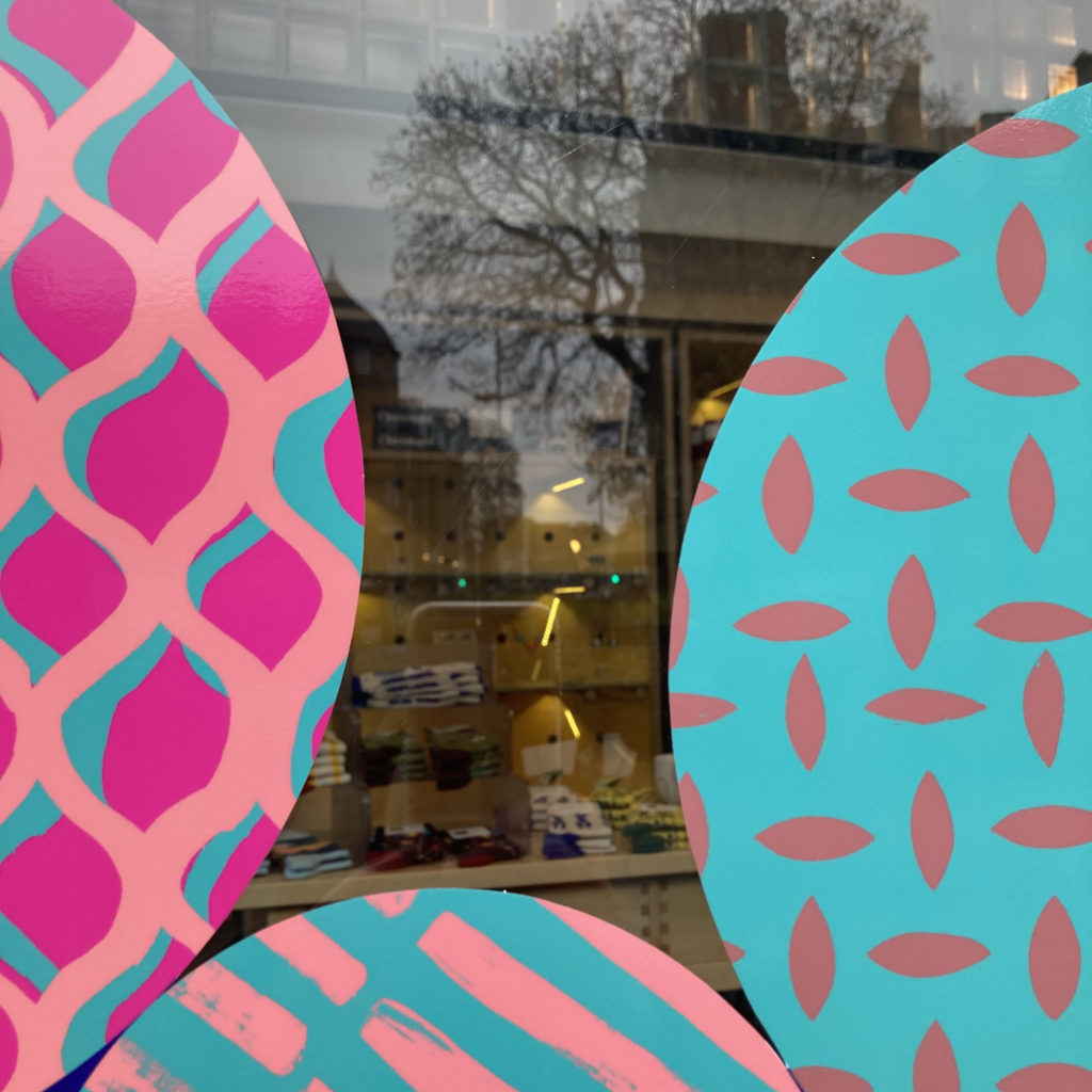
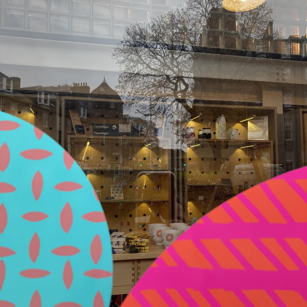
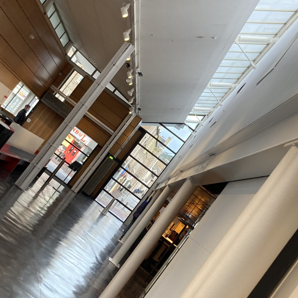
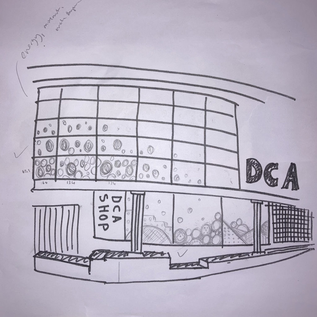
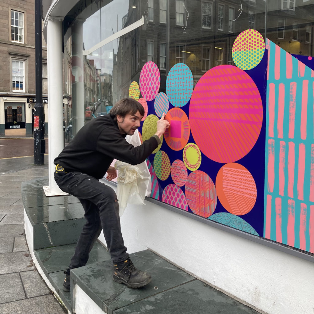
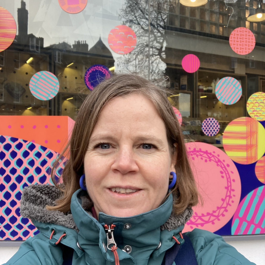
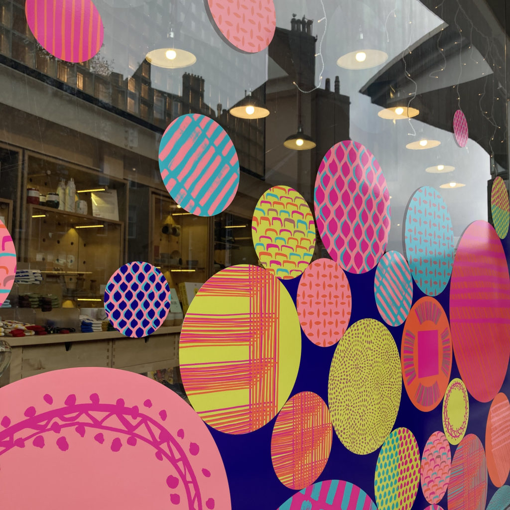
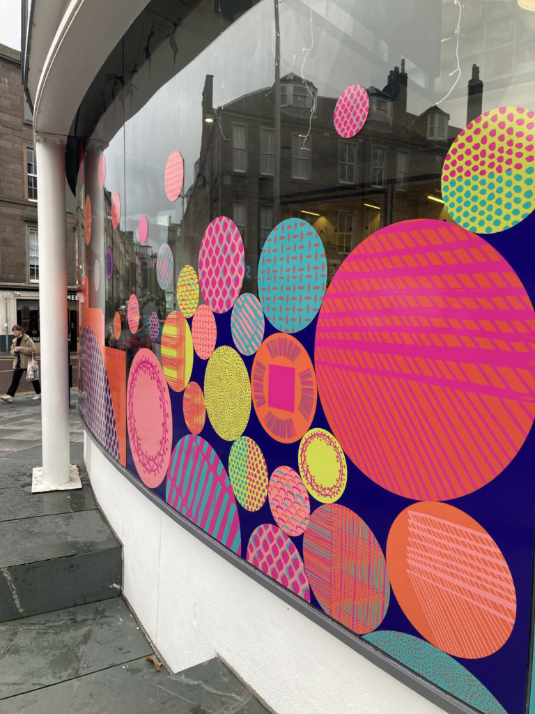
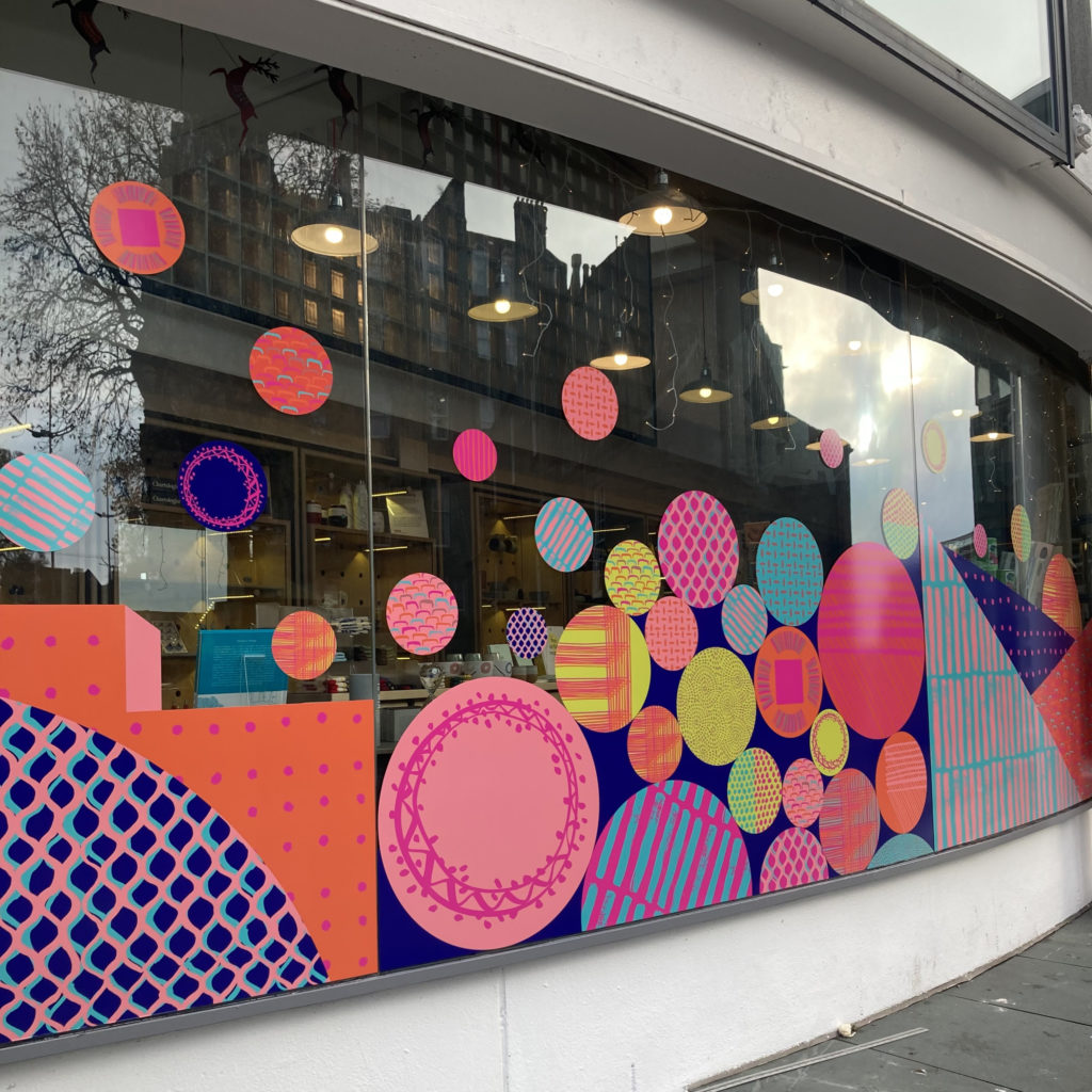
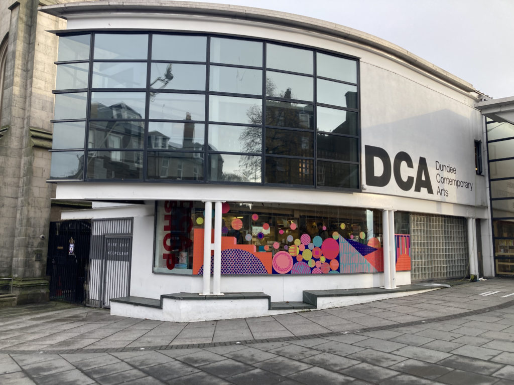
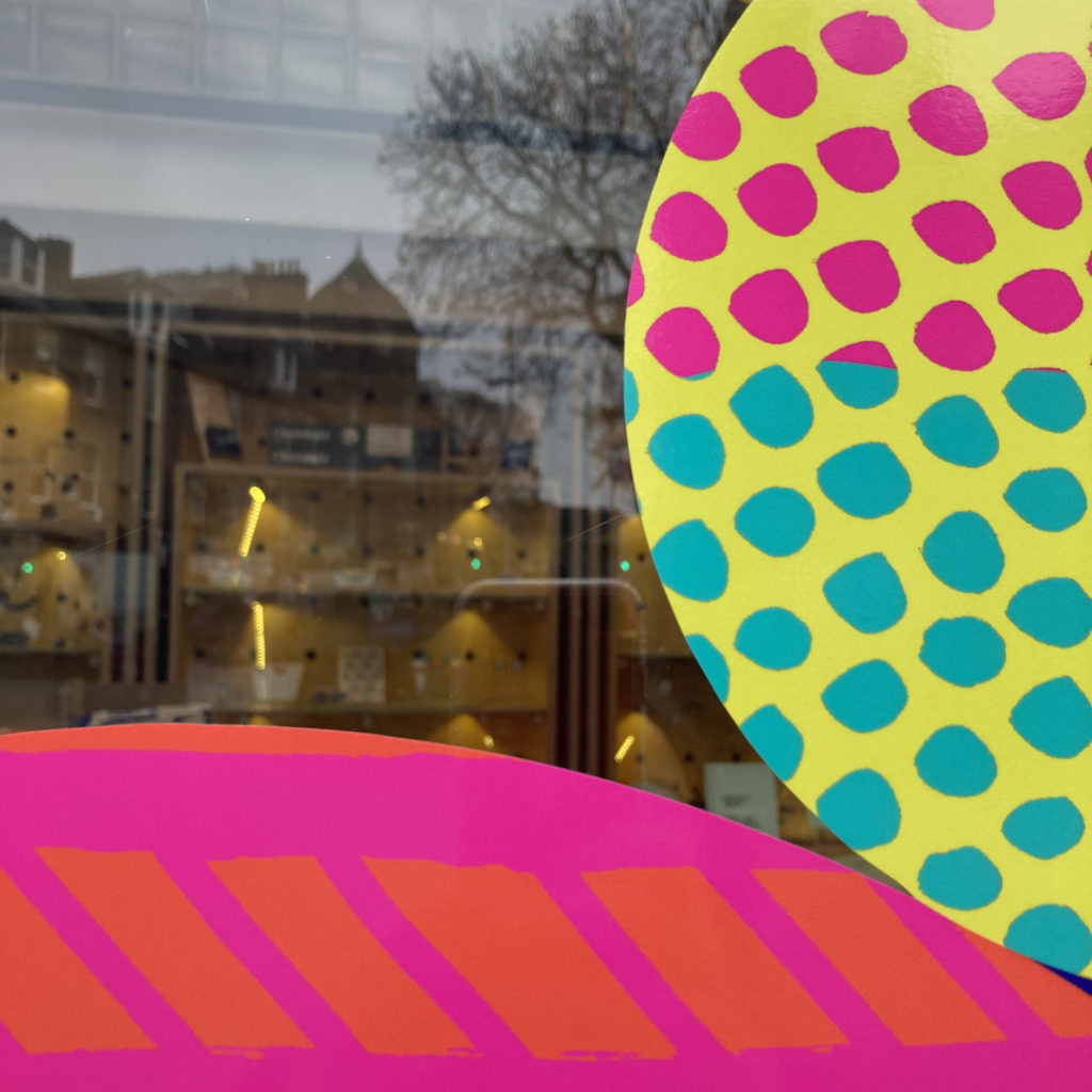
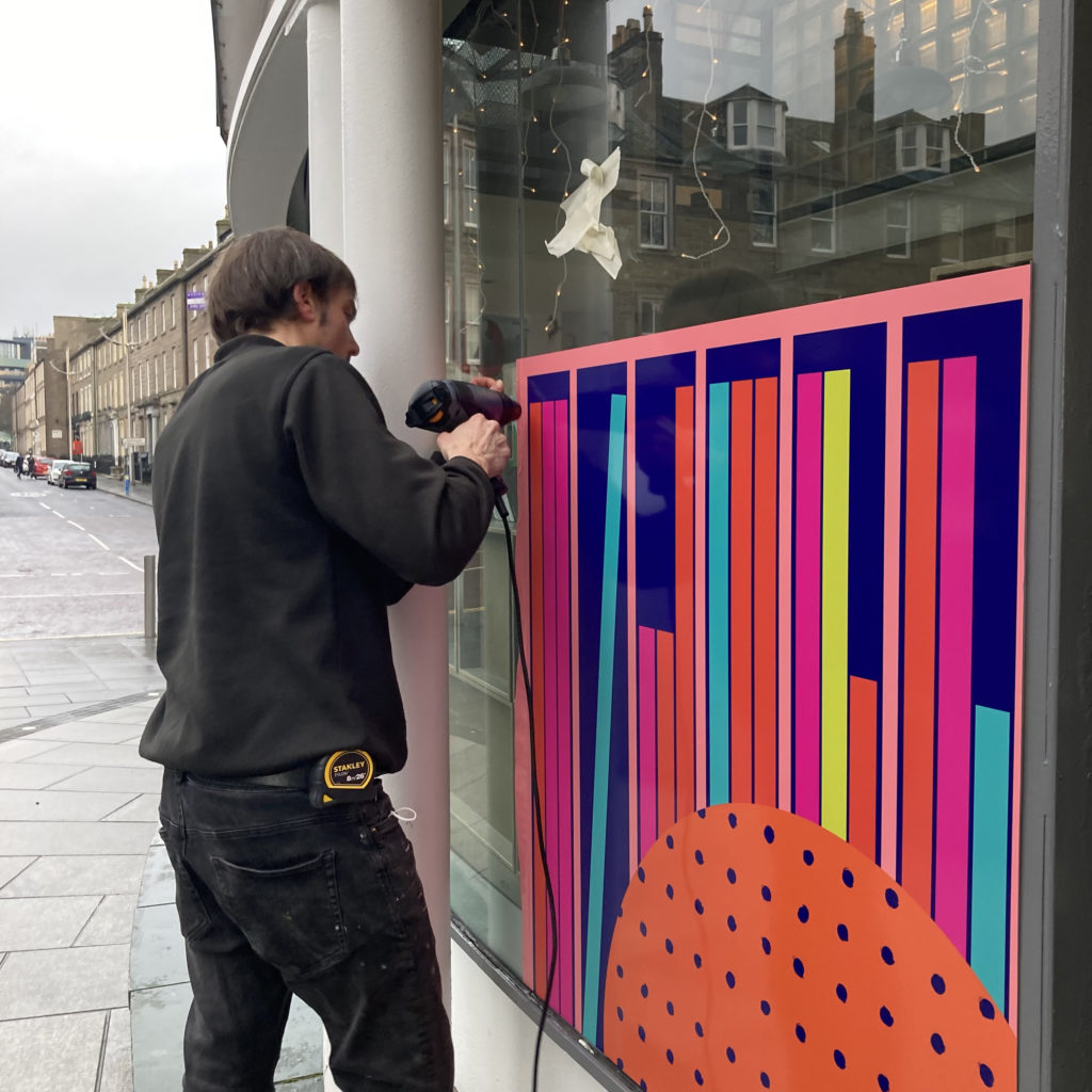
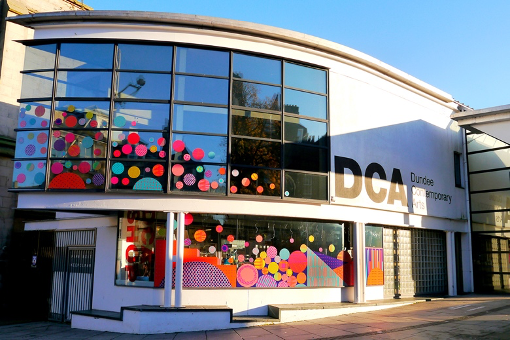
More recently I found lots of circles in my research of all the departments within Dundee Contemporary Art building for their site-specific window design commission.

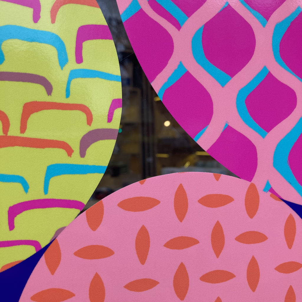
The various patterns inside the circles captures the range of activity that goes on inside the building and I loved playing the layout of the of them bouncing/floating as if they were moving and falling into place.  Giving an energetic feel!  I adored this commission, from the research, problem solving, developing the concept and the trust of the DCA to create my creative response to the building. If you want to read more about the process of this you can here

With each design commission I am responding to the place, the people who use the space and the purpose of adding designs so that I can give the best results possible with the biggest impact. 

These circle designs have a more homely feel as they were for the communal corridor in a sheltered housing unit and tenants wanted to have a less clinical and corporate feel.  The circle shape allowed me to group together common themes that came from the tenant consultation and the arrangement of the circles in colour groups to aid wayfinding. If you would like to read more about my sheltered housing work you can here

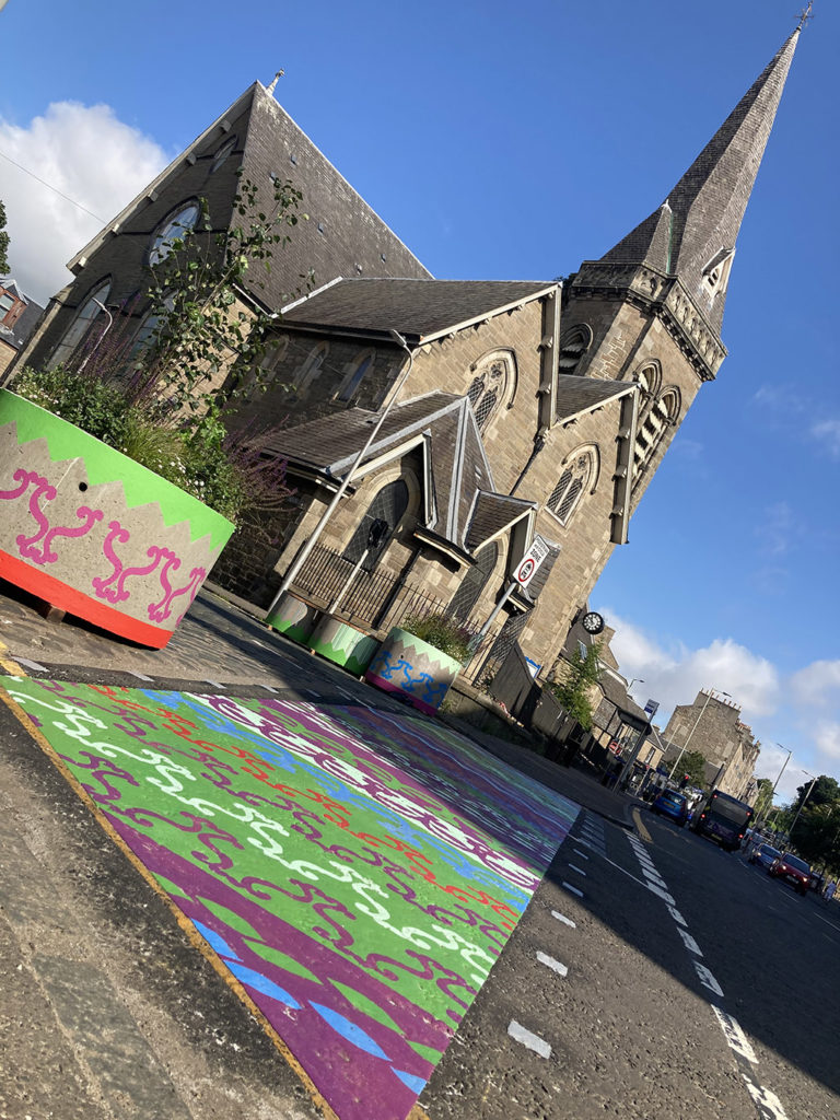
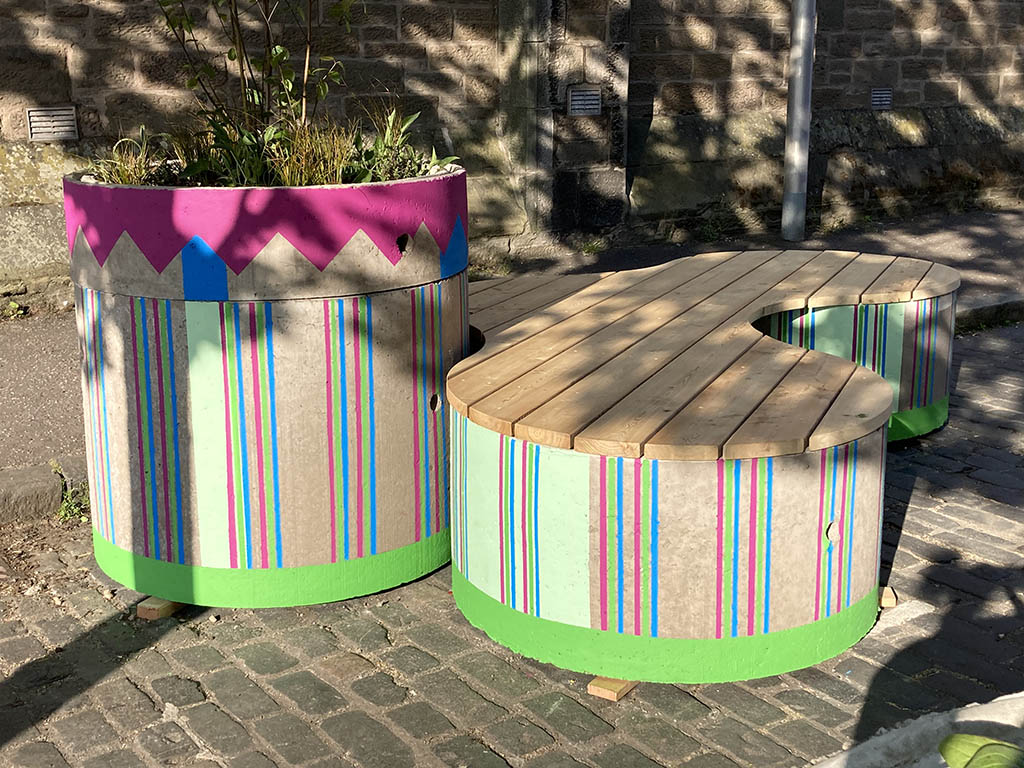
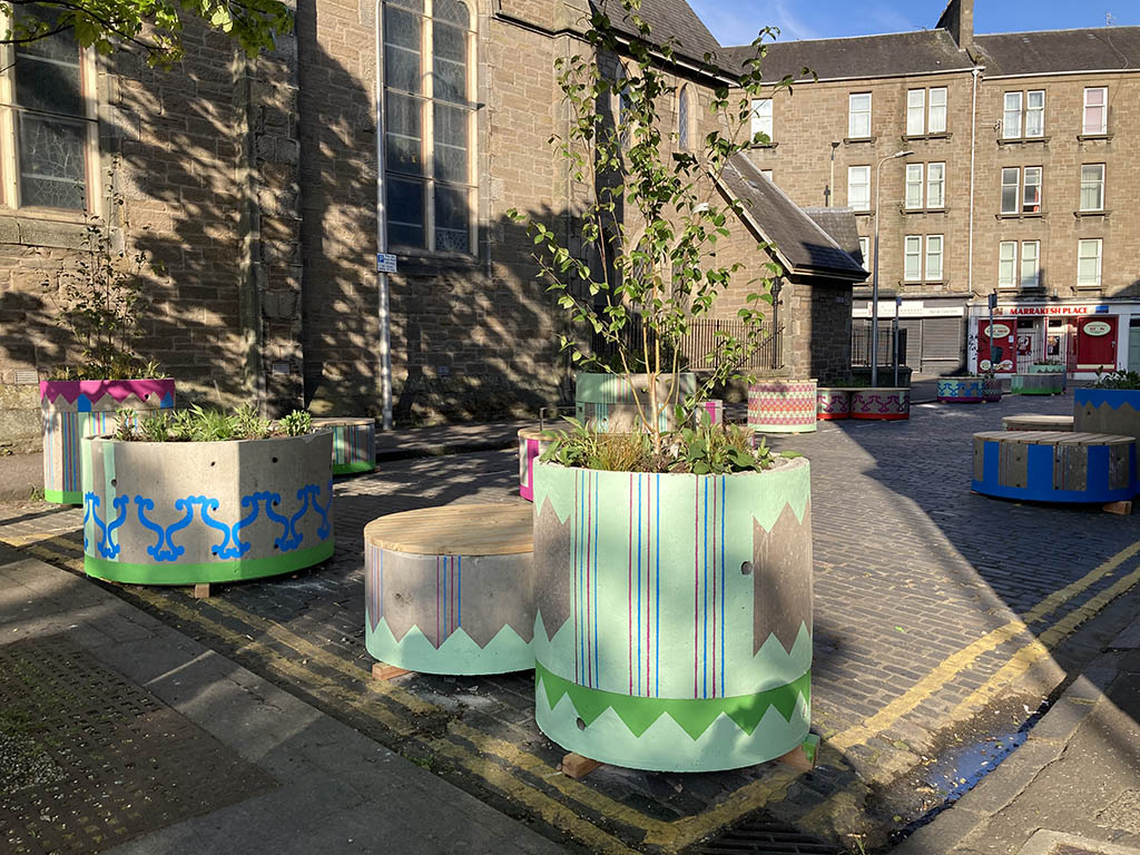
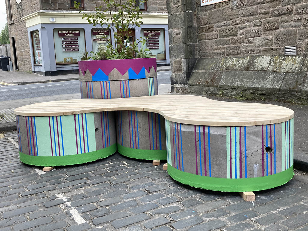
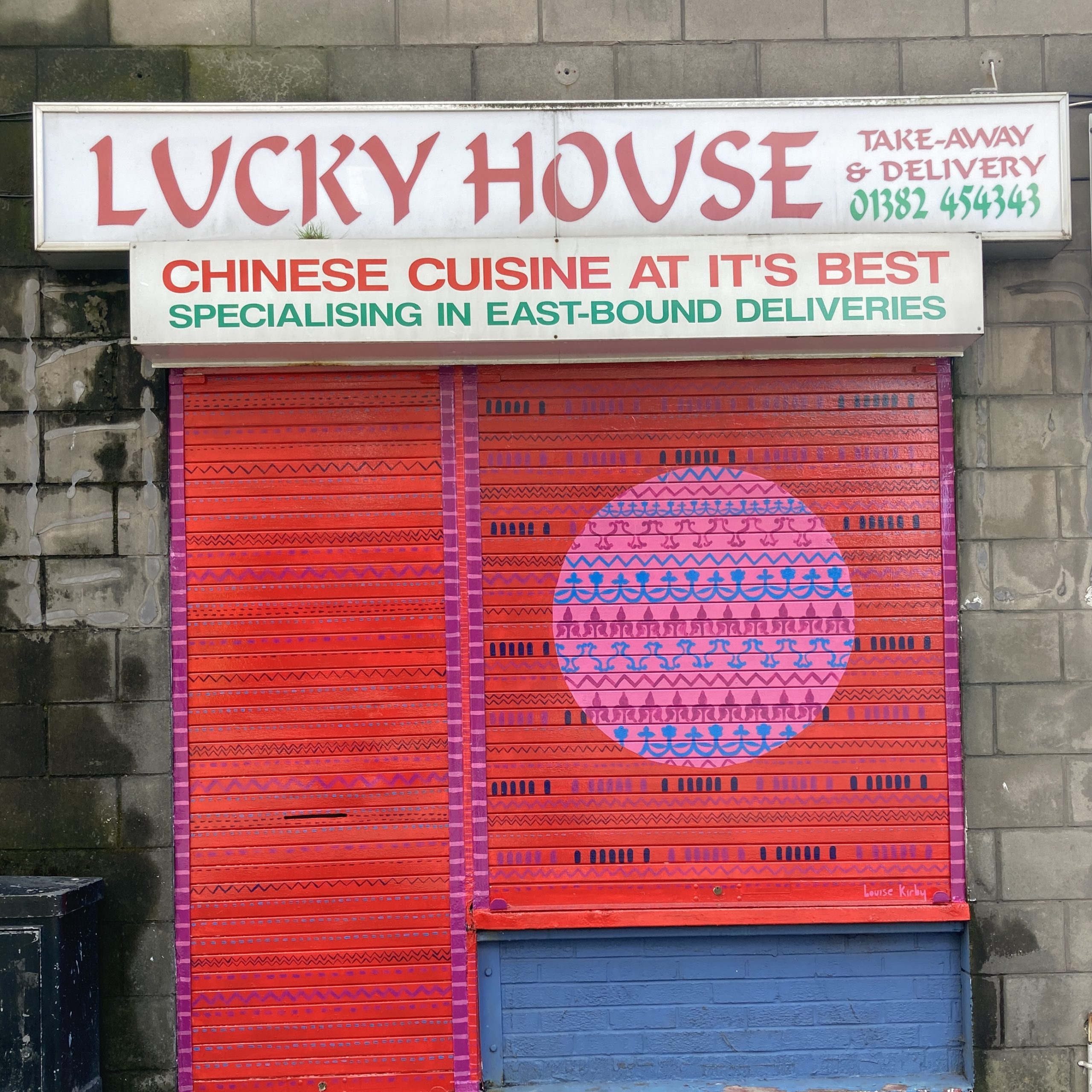
Then popping up more recently is the circle shutter art part of a parade of artwork for Stobswell in Dundee, for the the local Chinese takeaway.  I love the clashing of colour and impact from a distance but when you get closer you can see the meaningful decoration inspired by the local area. This giant circle was made using a makeshift compass with a bit of string and chalk – old school methods at their best! If you want to read more you can here

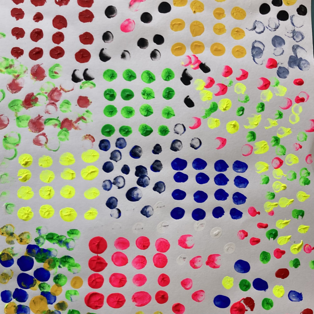
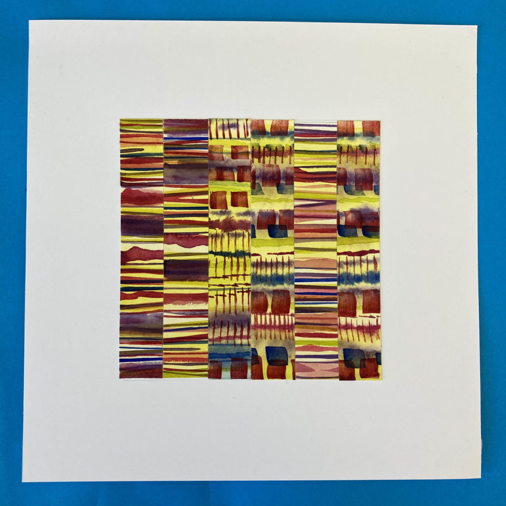
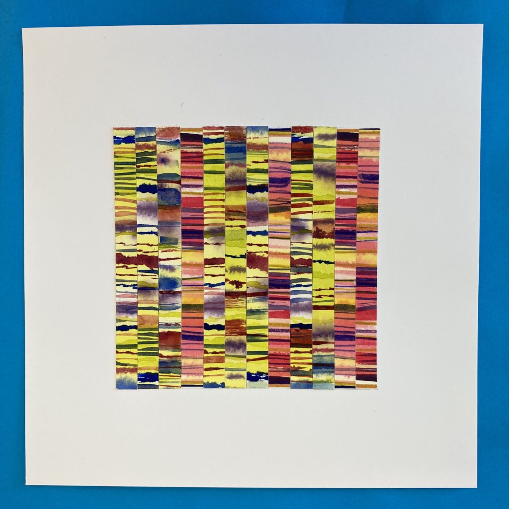
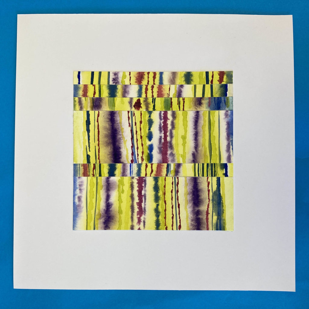
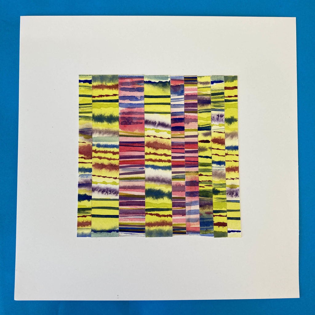
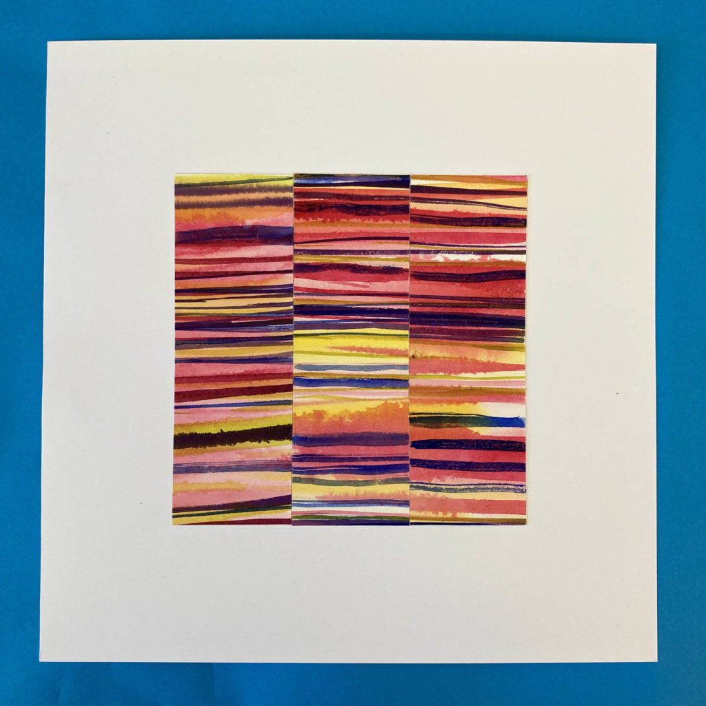
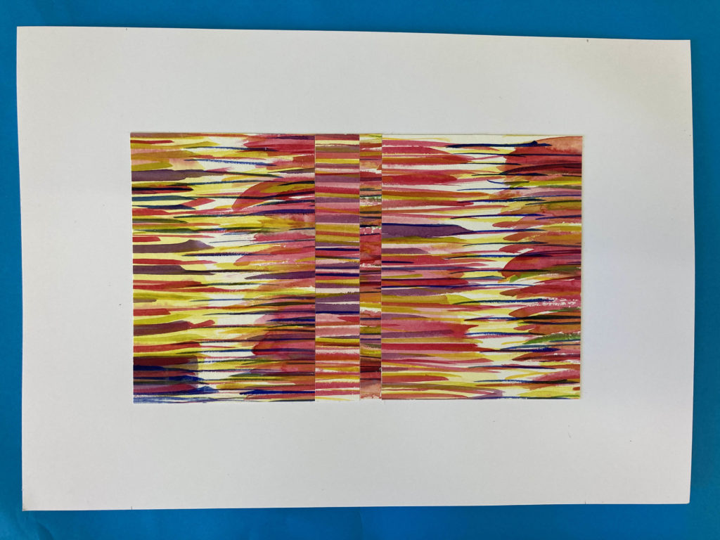
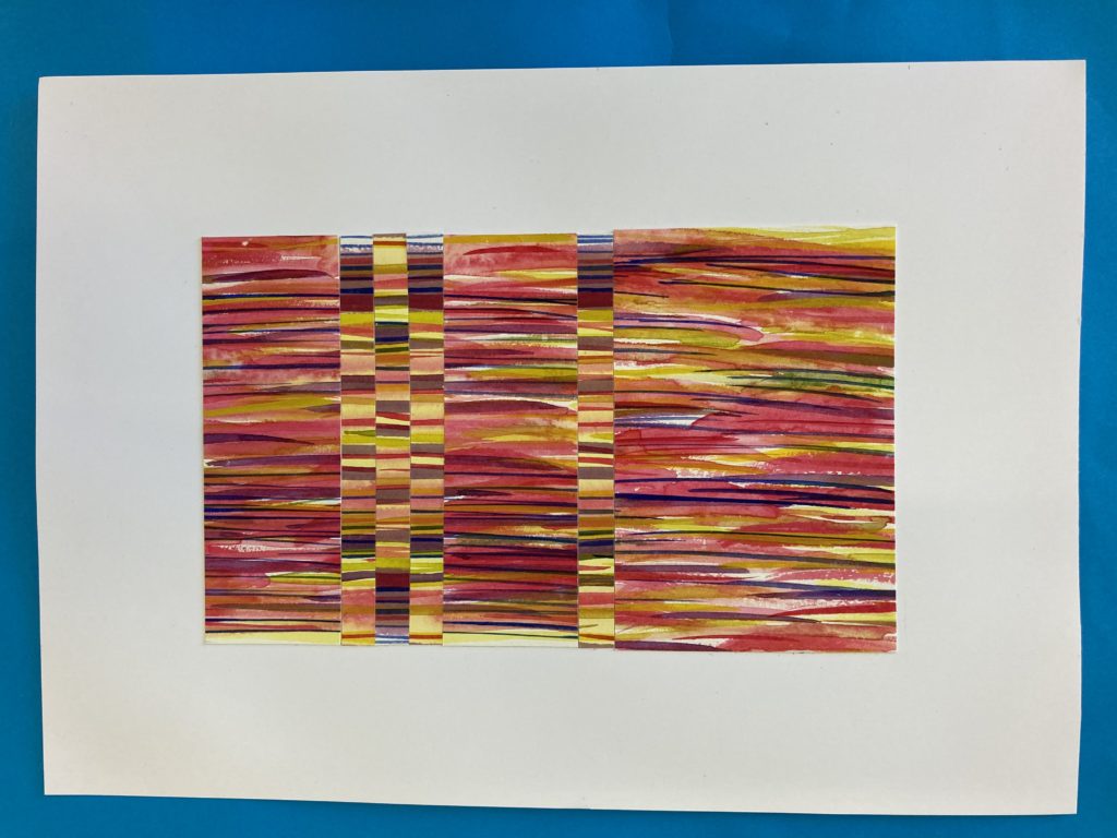
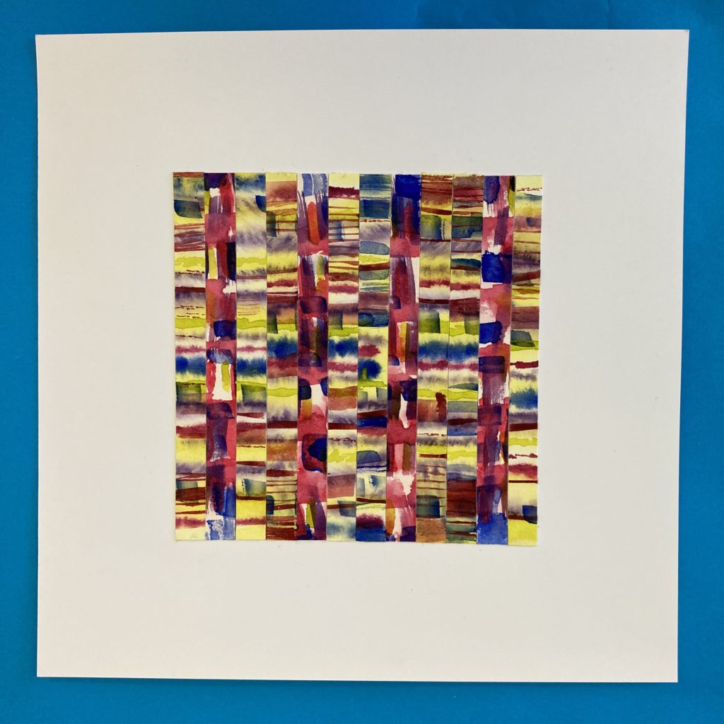
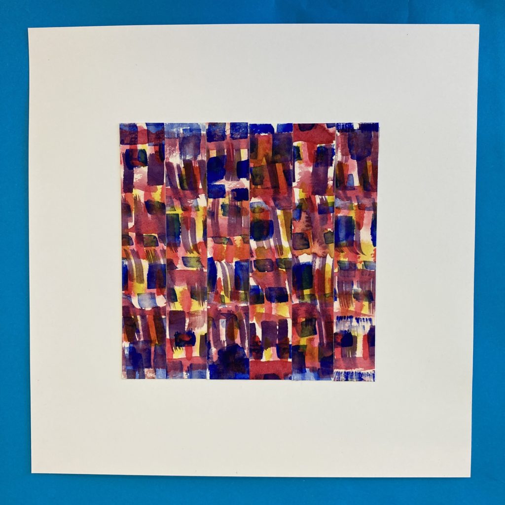
For the Riso Soup Misprint publication and exhibition of exploring the concept of misprints and serendipitous errors I chose to explore exciting combinations of how colour and pattern sit together, playing with layout and movement to create this composition as if elements are misprinted.

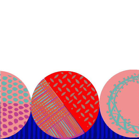
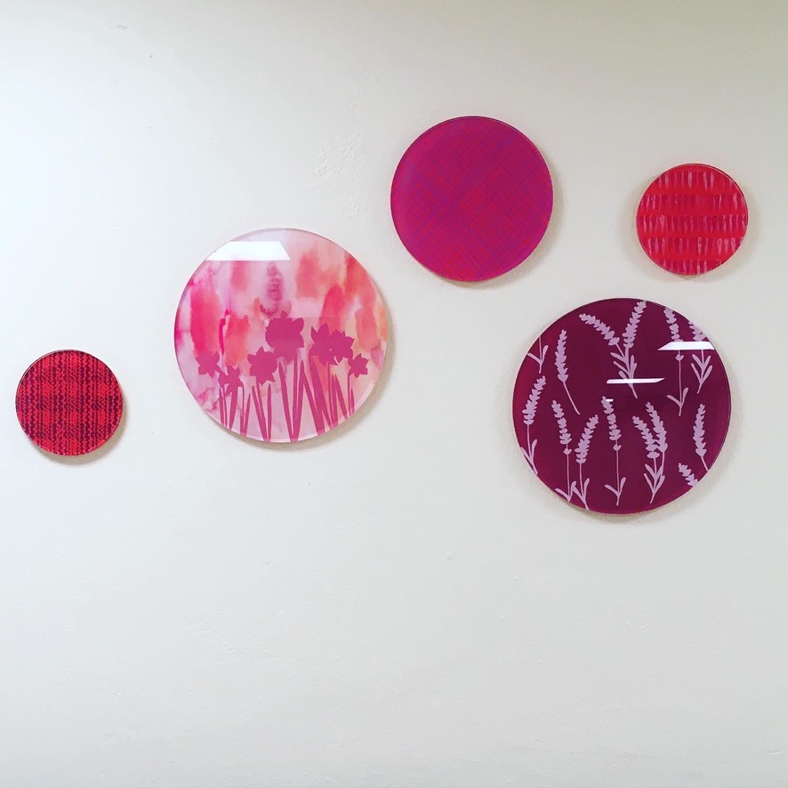
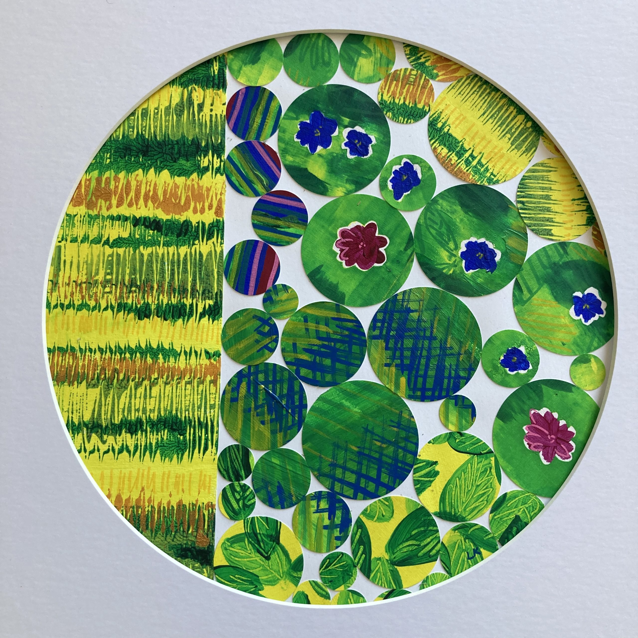
Most recently circles are for my creative response to ‘Outside In’ which is inspired by noticing the positives in nature and the feeling of gratitude that creates an inner positive wellbeing. I loved playing with the composition of the different textures, images and surfaces to create these circles of circles.

Circles are such satisfying shapes to play with….. I’m sure you’ll see more in my future work! And check out the lovely stacked circles in in this lovely eco house at Guardswell Farm that I saw last week.

I have a vision of the world full of colourful creative interventions to bring more joy to the spaces we play, live, work and travel through.  My aim is to uplift and connect people and highlight the positives by creating artworks that capture a sense of place which creates a sense of belonging.  I love to do this with my use of playfully applying colour and pattern.

I am ready to take on new design challenges and if you have a project, collaboration or commission in mind please get in touch hello@louisekirby.com or you can check some samples on my website to give you a flavour of previous projects.

Explore. Play. Create.

DCA Windows Inspiration and Process

I was delighted to be commissioned by the DCA to create an exciting, vibrant window design that celebrates all the activity, energy and sense of community found across all the programme areas of DCA.  Bringing the inside activity and energy to the outside of the building in the window areas.

The process involved research, development, prototyping and good communication with the DCA team and fabricator to creating the final designs on display.

Research

I got a feel for the building by visiting all the different departments, taking lots of photos that I could refer to in the studio.

I found lots of geometric shapes within the building from the angular windows, step shaped walls, winged gallery roof plus so many circles, from the vintage projectors, printing press wheels, pegboard, retail display units, circular fairy lights fittings in Jute Café Bar to products in the shop.

I am naturally drawn to seeing pattern and texture and loved the overlaid wire racks in the print studio that created modern checks and the negative space of the screen-printing racks full of irregular stripes.

I found colour references from the bright cinema seats, pots of ink in the print studio, participant artwork on display in the creative learning store, bright colours of the Riso print samples to the more subtle cladding of the building. 

Development

To process ideas, I created sketches in pencil and ink then found visual connections.  I created rough thumbnail sketches of designs in situ and mocked them up digitally to test various colour combinations and played with different juxtaposition of textures within shapes.  I played with rotation and scale of the spots to capture the energy from the activity from inside of the building.  I referred to the brief, discussed technical details with the local fabricator RobertSign and worked within design constraints so that the design would work practically.  I selected and rejected elements to create coherent concepts for presenting to the DCA team.

The final designs are inspired from the bold geometric shapes with a playful feel using my signature style that retain the hand drawn feel of my linework and confidently uses a vibrant colour palette with clashing and contrasting of patterns bringing together all the activity of the building. I wanted the circles in the top windows to have a lot of movement the capture the energy of the building and connect to the shop windows below. 

With my design work I like to capture a sense of place by creating bespoke designs that are meaningful and unique to the space and I hope these designs help people to connect to the DCA and remind past visitors to come inside and entice new visitors to see the variety of things it has to offer, from a trip to the cinema to taking part in a workshop to grabbing a bite to eat with friends or seeing the latest contemporary art exhibition.

You can find out more about my work here

Spaces for People in Stobswell, Dundee.

Bringing joy to the streets of Stobswell in Dundee!

I worked with the UNESCO City of Design Dundee on the Spaces For People project to help realise the community’s idea of reclaiming two small sections of road at Eliza Street and Craigie Street to create people focused, friendly spaces full of colour and greenery as a temporary intervention funded by Sustrans Scotland.

Co-Design Process

I loved being part of the process from start to completion. Beginning with workshops run by the Service Design Academy using a co-design process, which gave a real insight into what the people who use and live in the area want and need, plus their issues and aspirations. The co-design process gave everyone a level playing field and participants were encouraged to gather user research to bring back a wider voice, they be imaginative on developing ideas. These ideas formed the design brief I worked on.

Research + Development

My role was to create a visual identity inspired by the feedback from the Service Design workshops to combat the greyness of the area, by brightening it up with more colour.

Stobswell is an area I know well from living there and attending Morgan Academy. I wanted to take a fresh look and went on a research mission with my camera to find shapes, colours and imagery linking into the initial conversations in the workshops about the jewels of Stobswell. I had interesting conversation with Friends of Baxter Park finding out about the plants and wildflowers and was shown the Cotoneaster tree which is the largest of its kind. Stobswell has many interesting pieces of public art so I watched Matthew Jarron’s video tours which gave me a good insight.

I found lots of circles and this later features in the seating and planter design.

From there I created print and pattern ideas in sketches, collage and digital art. I looked at many ways of applying colour to the area from trails, signage, gable ends, shop windows, shelters, awnings, seating/planters and through ground art. Not all ideas could go forward. (some pictures of things that didn’t go forward)

Concepts were shared for feedback. Ideas were refined and adapted to suit users. I defined colour palettes and did lots of maths to work out scale and repeat patterns.

I created 3D prototypes to help plan how the artwork would look in situ and placed designs in street plans to help visualise how the ground graphics would look.

Jewels of Stobswell

I think it’s important to capture a sense of place to find out what’s meaningful and unique about the area. It was identified Stobswell has a real mix of jewels – from historic details, green spaces, public art and tree lined streets. (I have a big long list of specific places that people love). I wanted to have a strong visual identity that worked in the Stobswell area using the same colour palette but felt there needed to be distinction between the 2 pocket parks of each individual site.

Eliza Street – Grand and Ornamental

The Eliza Street is an eclectic mix of imagery inspired by the jewels of Stobswell: details of the decorative ironwork on Morgan Academy rooftop, Baxter park railings, zig zags from the public art down on Princess Street, some leaves from Baxter Park and I managed to slip in a stripe or two!

The entrance from Albert Street was marked with a colourful crossing. To give it a homely feel I coordinated and clashed patterns on the seating and planters which complimented the range of surfaces of the birch, concrete and planting.

Craigie Street – Geometric and Playful

Craigie Street’s visual references came from the decorative brickwork gable end on the street, mixed with circular berries inspired from the Cotoneaster tree in Baxter Park. Colour and pattern were added to the seating and planters plus the circular ground graphics. Designs were initially developed to give a visual clue to physical distancing due to the Covid-19 pandemic.

By adding the ground graphics it gave an opportunity to have more colour and pattern into the space, plus is gave it a more playful feel.

Teamwork is dreamwork

I was only one part of this project. I loved being part of a core team with architectural designer Fíona Canavan who was a whizz on the technical side of maps, plans and research. UNESCO City of Design Dundee team, Annie Marrs and Poppy Jarrett who lead on the project and trusted my ability. Old School Fabrications who created the modular seating and planters and did all the logistics and practical element of the install.

So many people helped make this happen, from Angie who used her magic to convert files to be print ready, plus the team of local painters who brought the vision of colour and pattern to life.

Working with Tayside Contracts to add the colourful crossing and circle graphics along with Jamie from Geveko Marking. So many conversations were had to make this work from accessibility groups, Stobswell Form, Dundee City Council Transport and Planning team, Boomerang Project, Fire Brigade to name a few.

I met with local artist Gordy Craw who was working on painting shopfronts in Stobswell. We decided to use the same colour palette to give a stronger identity to the area. I added window decals with zig zags on The Stobbie Chipper and cotoneaster leaves and berries to the Boomerang Cafe. I love how Gordy’s artwork and my designs clash and bring a richer Stobswell pattern.

Future

There were lots of ideas and not everything could be taken forward in this project as it is temporary. There is still work to be done in the area and Sustrans are working with the community to create permanent interventions. You can find out more about what they are doing here.

What’s it all about for me

For me this project encompases what I love doing: bringing joy through colour and pattern, creating meaningful artwork that captures a sense of place, connecting people to places and improving the world we live in.

It’s been great to see people using the space from stopping for a chat, sitting stroking the friendly cats, enjoying sunshine and eating lunch from the local takeaways.

Photographed by David P Scott. All rights reserved. www.davidpscott.com

Thanks for reading, you can find out more about projects I’ve worked on here.

Painted Elephant Trail

Photo by Derek Gerrard Photography

I loved painting this lush and leafy design onto a plain elephant, it was a great shape to paint on. I built up layers of greens, turquoise and olives to create depth and the feeling of a tropical rainforest. I then added hibiscus and ditzy flowers with tropical leaves in an allover pattern. And of course a striped trunk and tail! I named it Lush + Leafy, I was inspired by elephants of the tropical jungle of Borneo, camouflaged in the luscious tropical patterns.

Work in progress video

Work in progress video

My elephant is part of The Big Trunk Trail in Luton raising money for Keech Hospice Care. Big thanks to the sponsor HBD Places. If you are in Luton you will spot Lush + Leafy in The Moor Park, please tag me in on social media or send me a photo! hello@louisekirby.com Here are some work in progress photos

The elephant sculpture was massive and wasn’t going to fit into my studio on the 4th floor at Wasps studios. I’m super grateful for the kindness of Derek from Circle Signs offering me space in his workshop to paint!

Thanks to the Sandra Webster for escorting my elephant to Luton with her colourful elephant also on the trail.

Finished painted elephant – Lush + Leafy

I love taking part in the Wild In Art trails as they allow me to use my skills of applying colour and pattern to objects and surfaces. They raise money for charities and the trails themselves are great at encouraging people to get out and about and explore the area.

Next one to look out for is my Lighthouse, part of the Light The North Trail. You can see my other Wild In Art painted sculptures on my website

Thanks for reading!

LOUISE KIRBY X JERRY RANDALLS Music and Art Collaboration

I was asked by composer Jerry Randalls to collaborate with him to create some visual to go with his new Laxmi composition.

I created a series of abstract compositions called Counterpoint in response to repeatedly listening to the Laxmi composition. I used gestural marks and movement with the brushes to create colourful textural marks in watercolour.  The individual pieces were sliced and re-composed to create new compositions of juxtaposing colour and pattern.  Colours were inspired by the Laxmi Hindu goddess.

Counterpoint 1
White mount size 21cm x 29.7cm
£45
Counterpoint 2
White mount size 21cm x 29.7cm
£45 – SOLD
Counterpoint 3
White mount size 21cm x 29.7cm
£45
Counterpoint 4
White mount size 21cm x 21cm
£35
Counterpoint 5
White mount size 21cm x 21cm
£40
Counterpoint 6
White mount size 21cm x 21cm
£45 – SOLD
Counterpoint 7
White mount size 21cm x 21cm
£40
Counterpoint 8
White mount size 21cm x 21cm
£40
Counterpoint 9
White mount size 21cm x 21cm
£30 – SOLD
Counterpoint 10
White mount size 21cm x 29.7cm
£45
Counterpoint 11
White mount size 21cm x 29.7cm
£40
Counterpoint 12
White mount size 21cm x 21cm
£35
Counterpoint 13
White mount size 21cm x 21cm
£35

If you are interested in any of the pieces for your home or office, please email hello@louisekirby.com They are all one off watercolour collages ranging from £30 – £45.

To listen to the collaboration click here

Jerry writes “Laxmi (also known as Lakshmi) – for Flute trio, jazz trio and cello

I have fused a jazzy arpeggiated melodic pattern with a 17th century harmonic progression which suggests more than a nod to J S Bach, but is also, as it happens, a staple of the jazz world. The piece concludes with a brief blues break which merges into a classic Baroque final cadence.

Louise has a striking and wholly individual style which resonates with the renaissance of her home town of Dundee as a leading citadel of contemporary creative arts. Her work is always confident, fresh and dynamic – and echoes techniques and principles which also guide my composition technique: line, patterns and sequences, energetic rhythms, tone colour, momentum and structure. I love how she has taken the idea of counterpoint – melody against melody – and applies it to visual art. I couldn’t have imagined a more spectacular exhibition to accompany my music. “