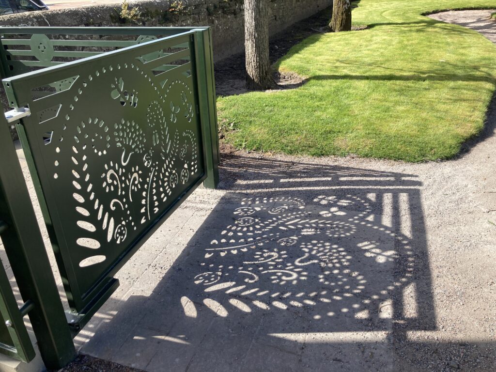
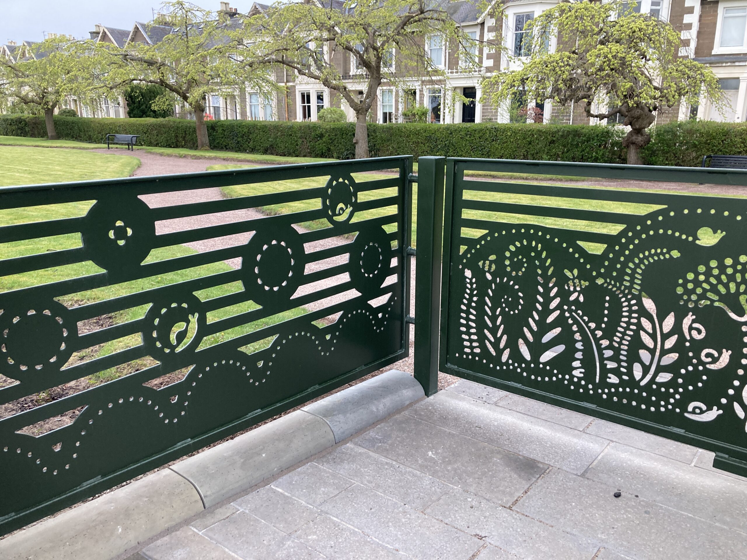
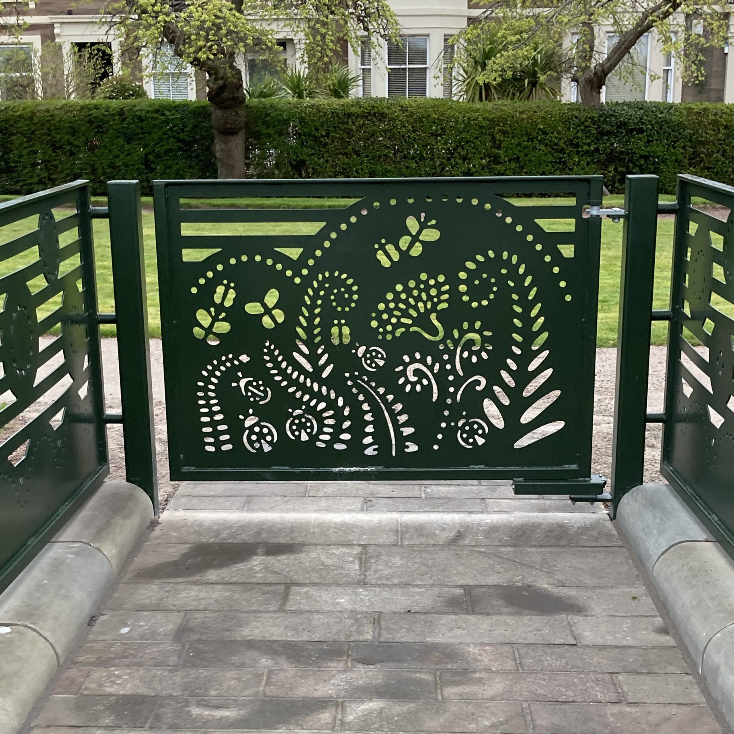
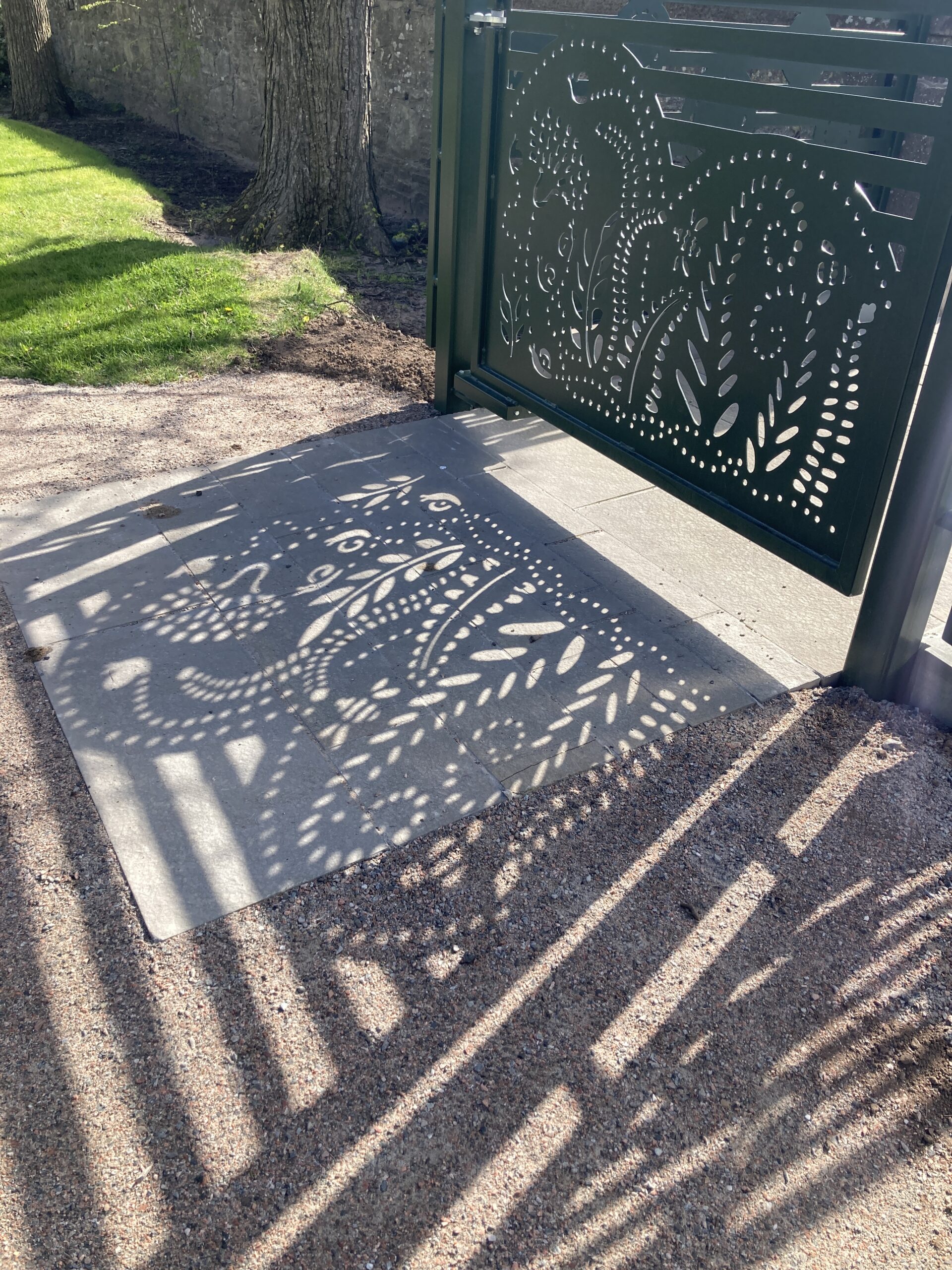
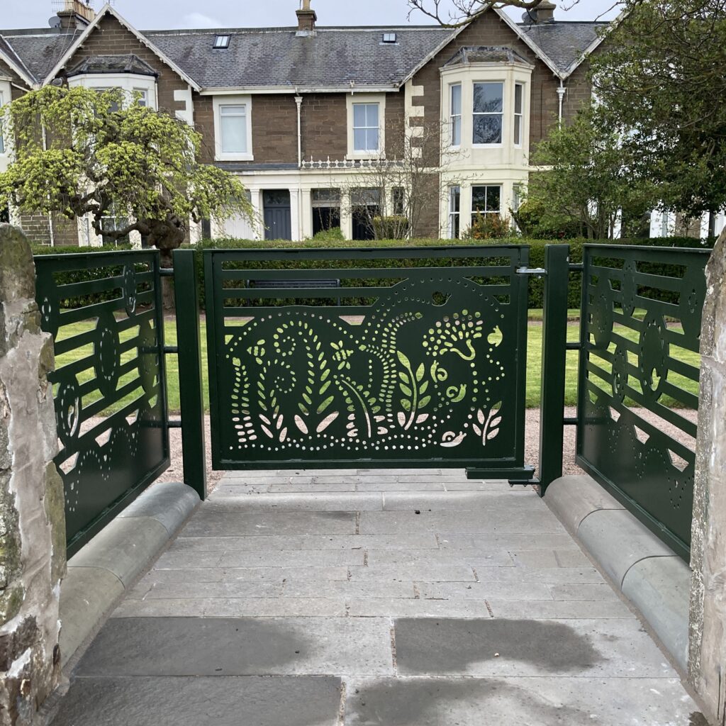
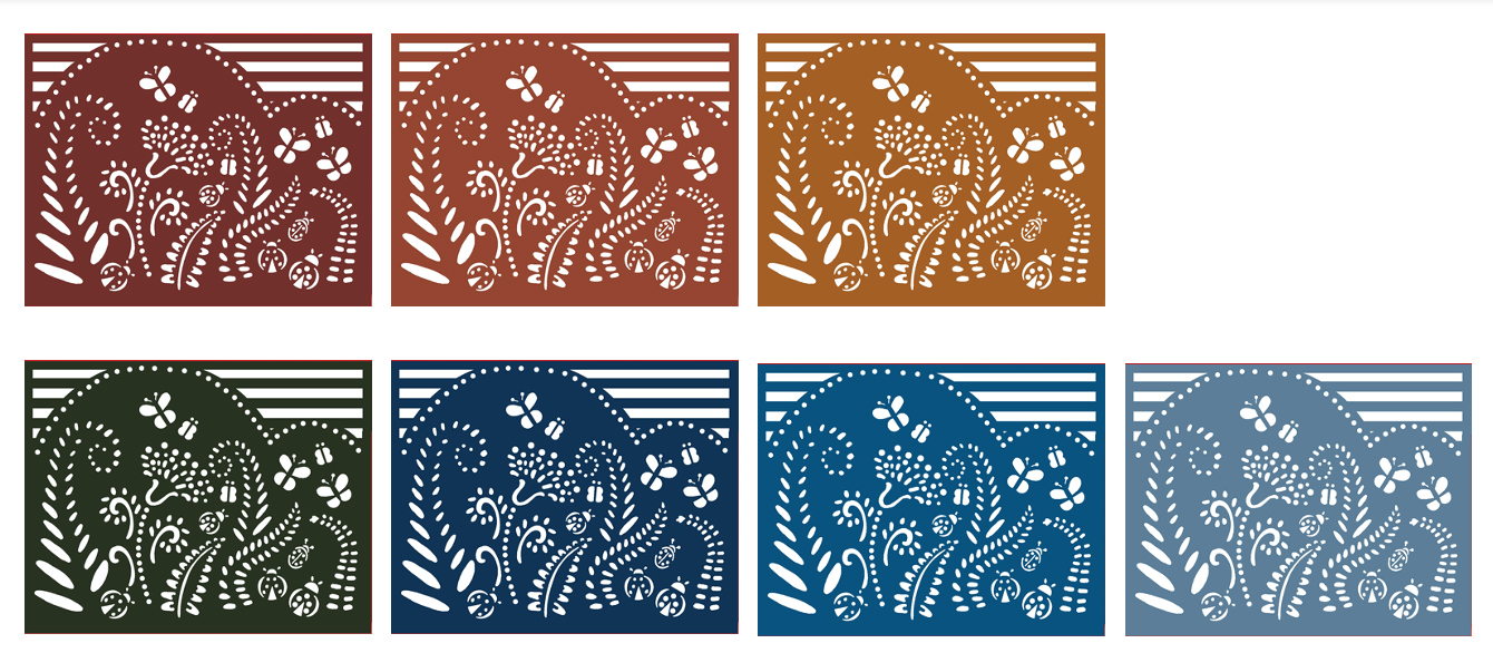
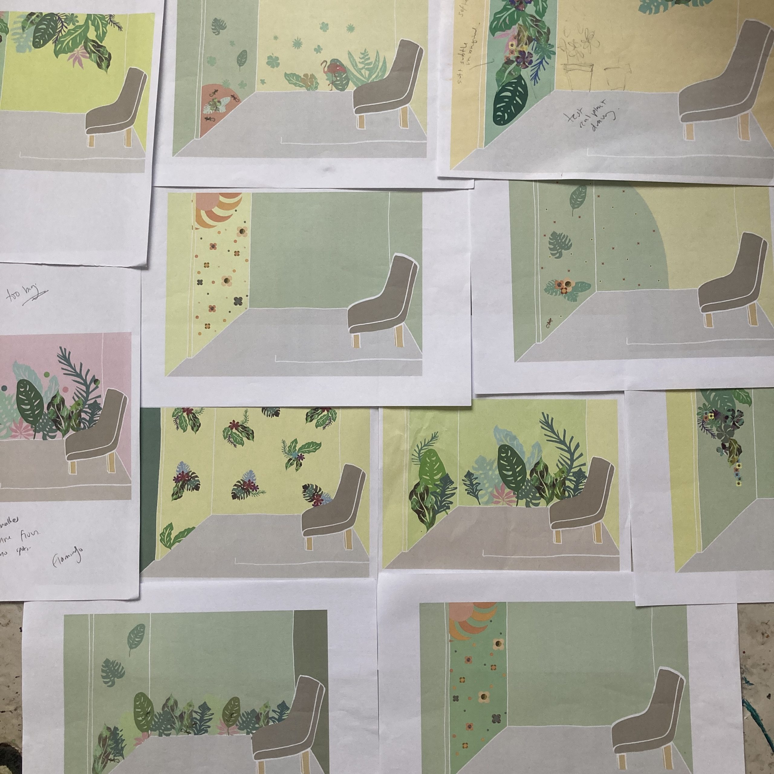
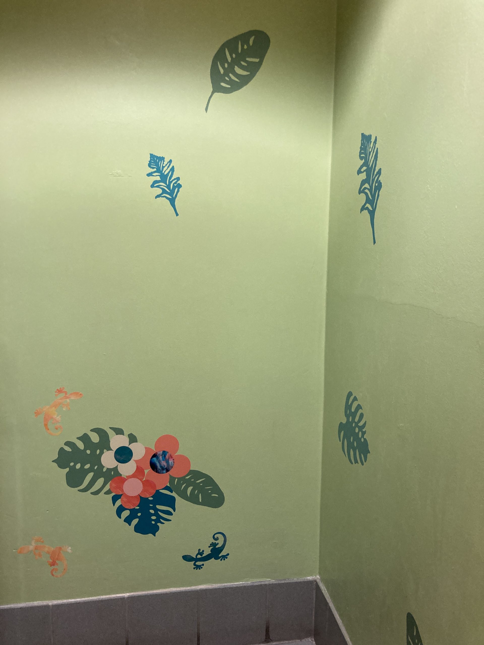
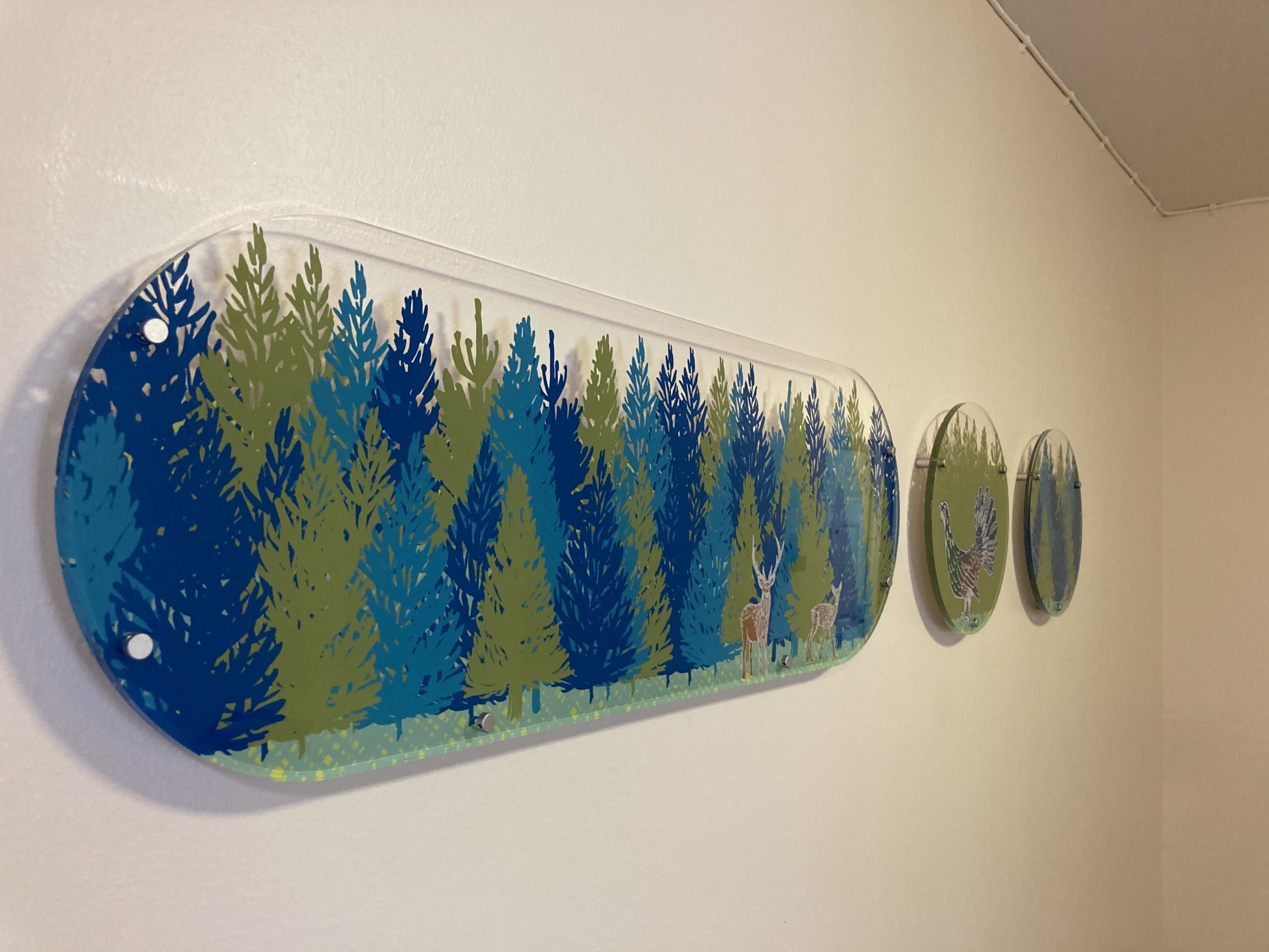
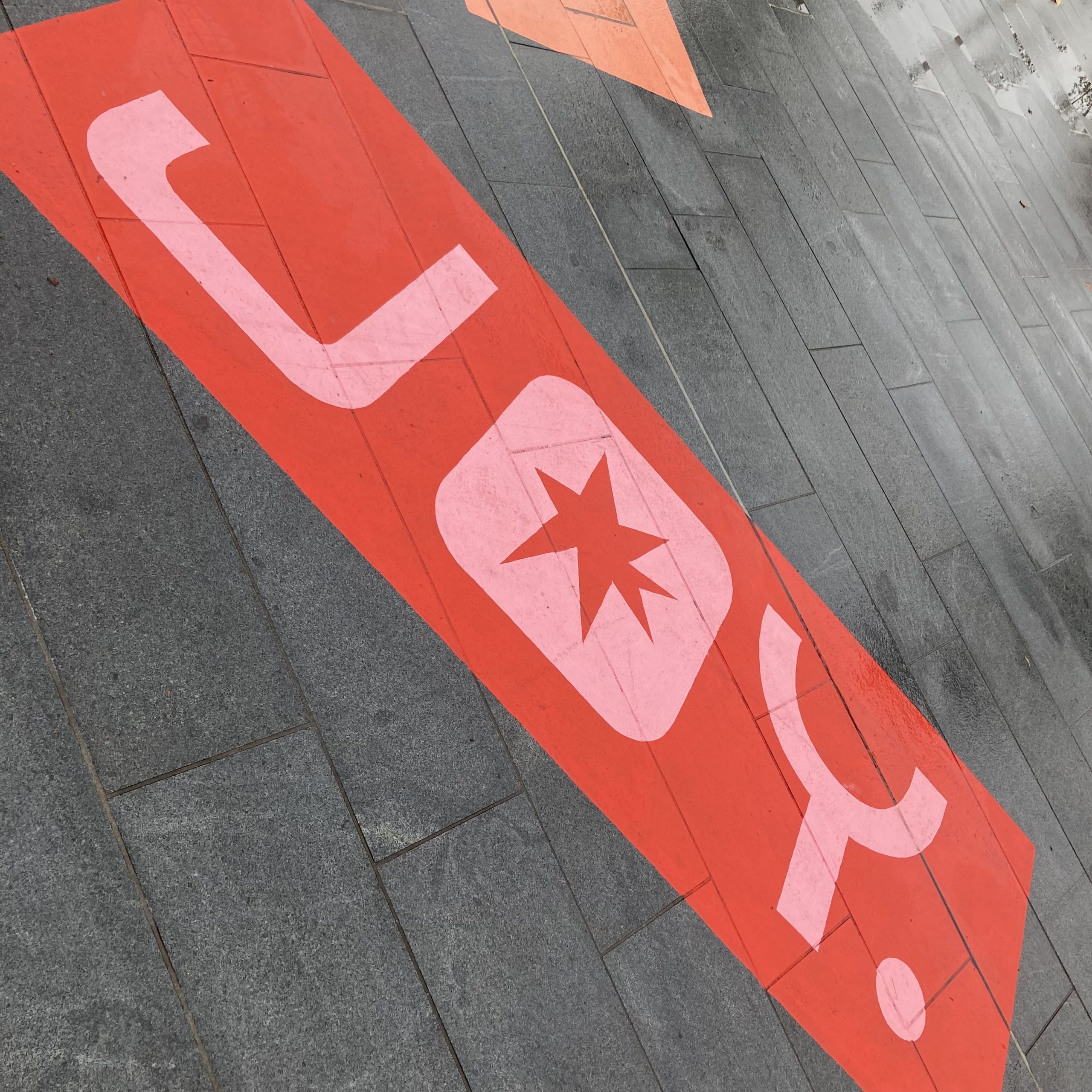
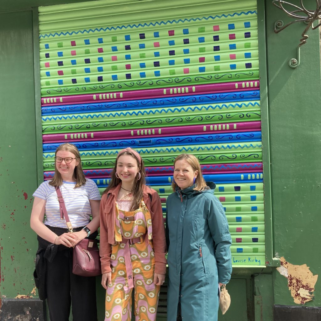
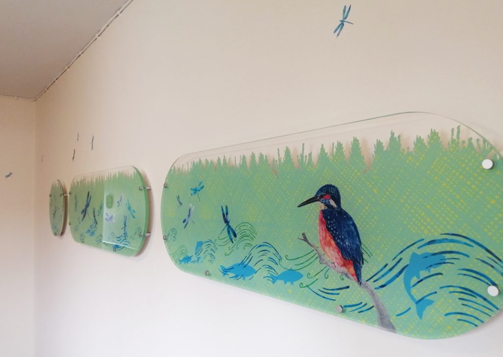
I designed decorative gates and panels for the two entrances at Castle Terrace Gardens, part of the Broughty Ferry active travel enhancements. I responded to the site specific space by hearing the history of the gardens from residents and their desire to reflect a tranquil and relaxing space.


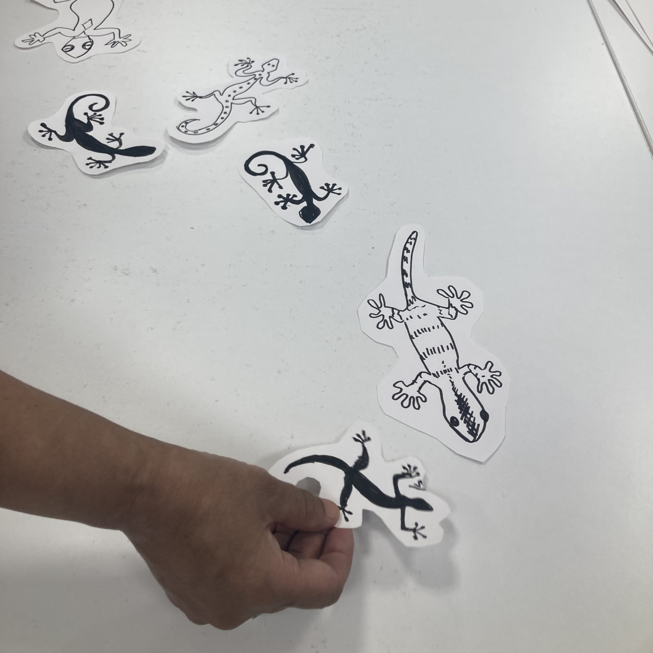
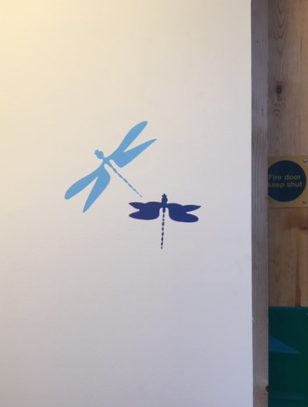
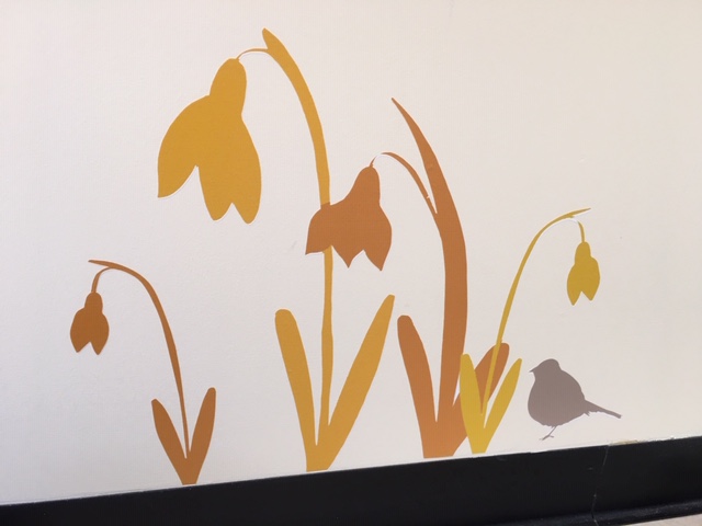
The final designs have a mix of flora, fauna and creatures with a nod to the fern and thistle that link past resident Mr Gilray who represented both Scotland and New Zealand at rugby.
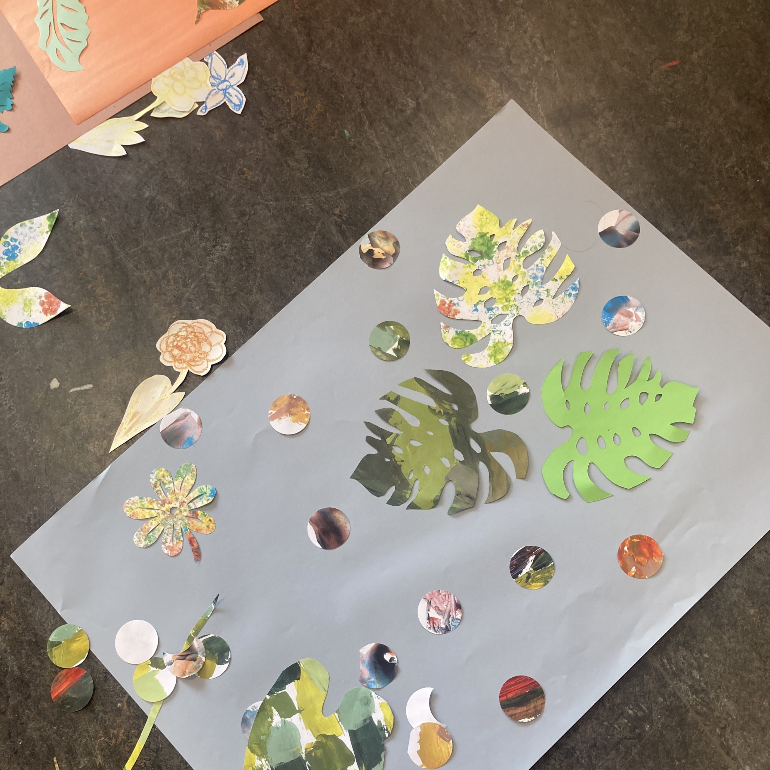
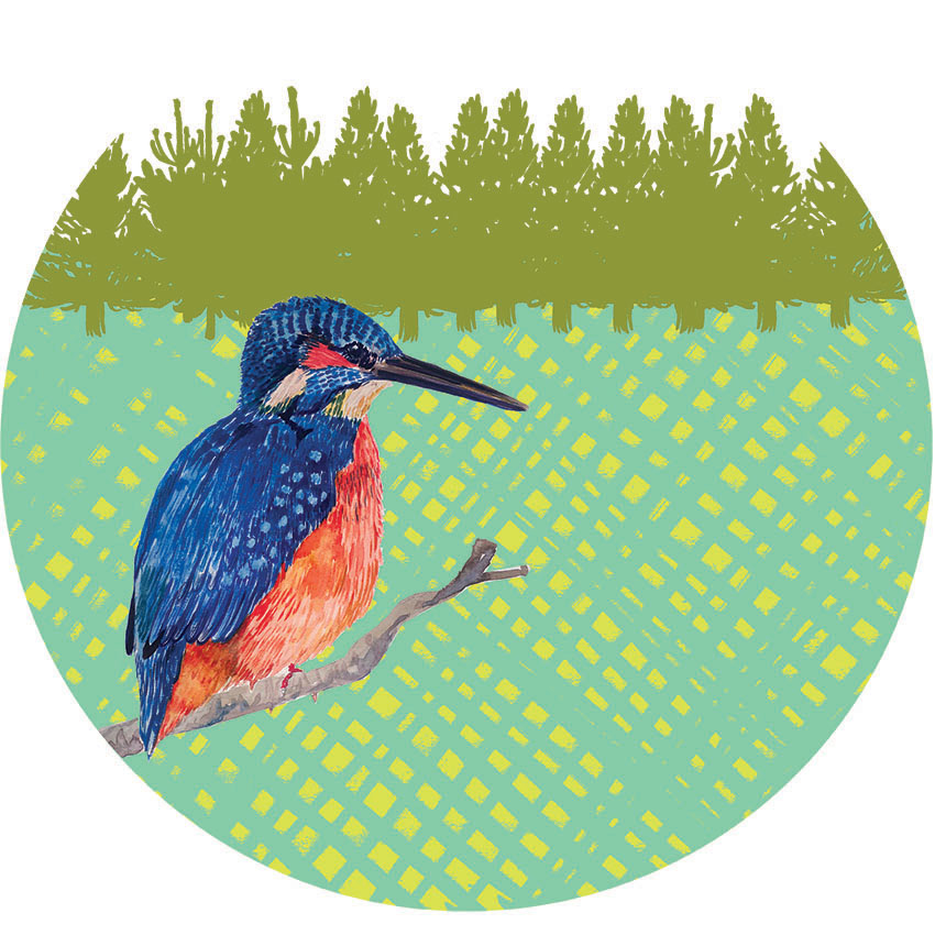
To appeal to families with young children I highlighted some snails trails, ladybirds and butterflies that might be spotted in the gardens. I hope the gates encourage children to look closer and discover the magic that is around us. There are 2 entrances, each entrance is unique with a similar feel.
Design Process
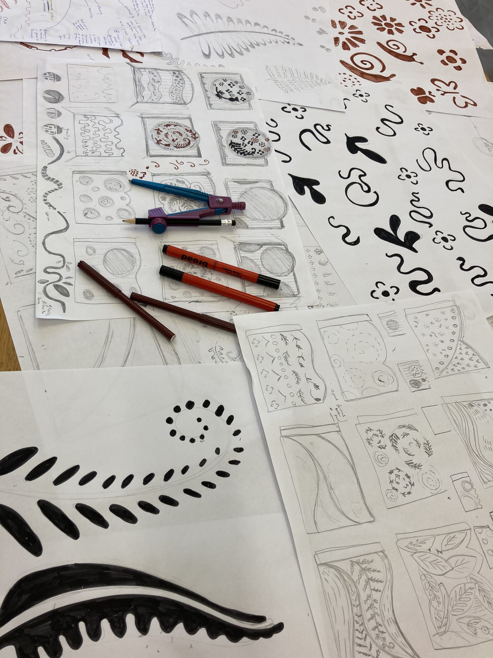
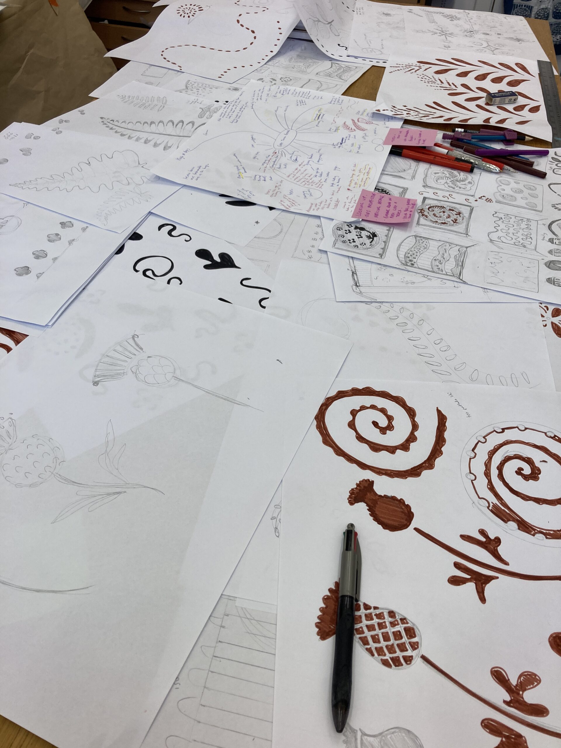
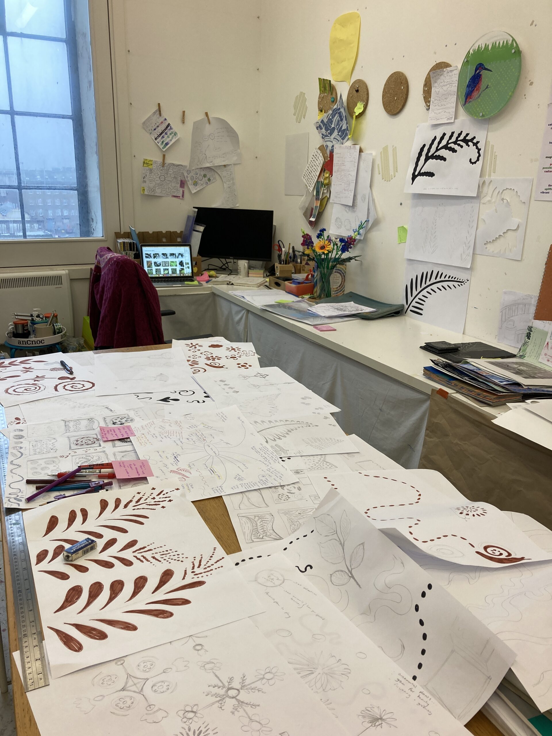
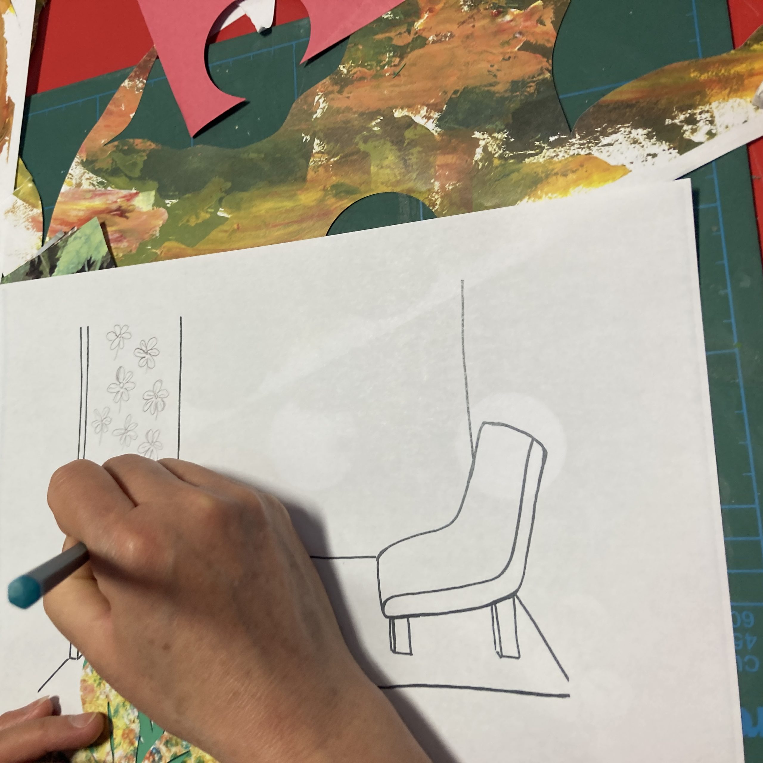
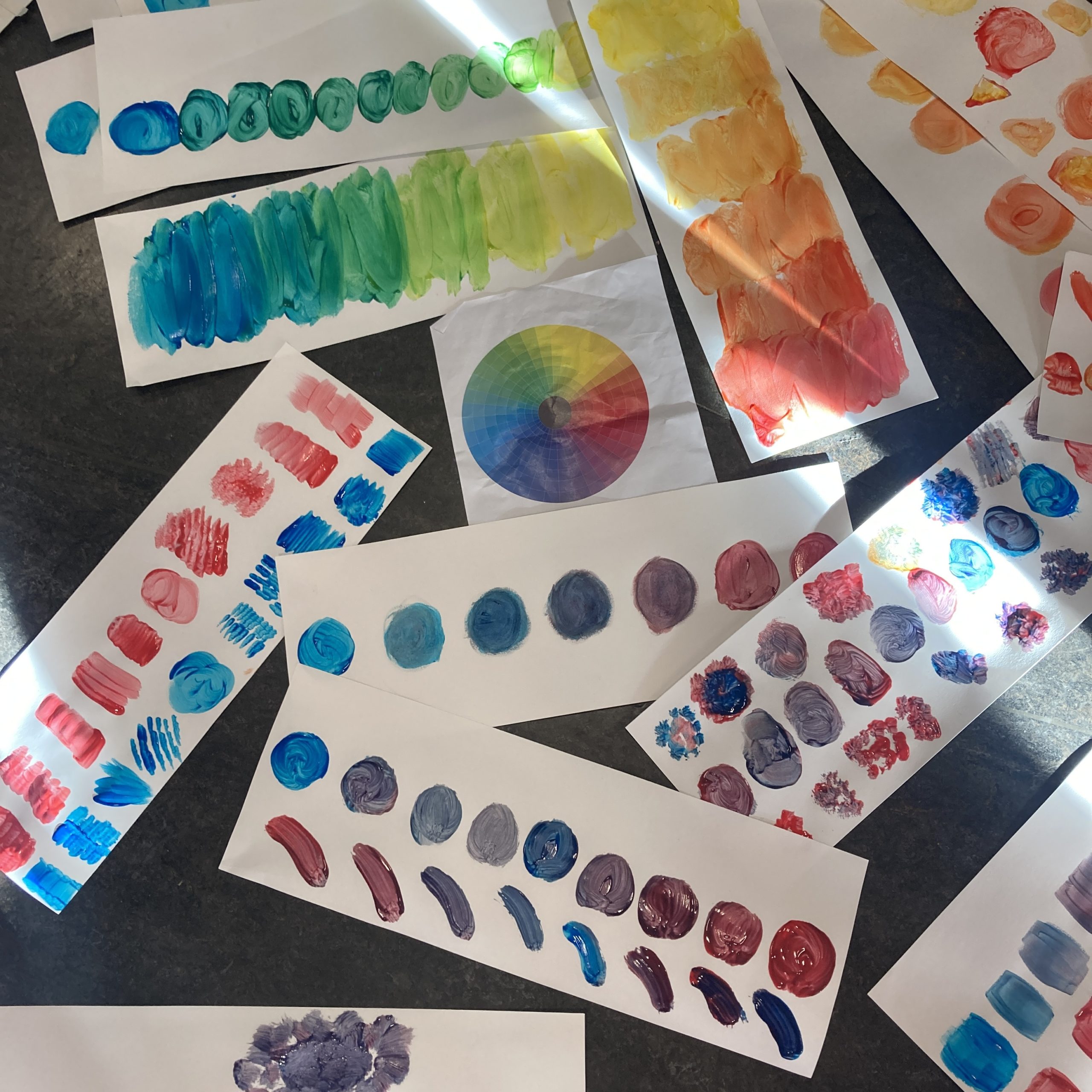
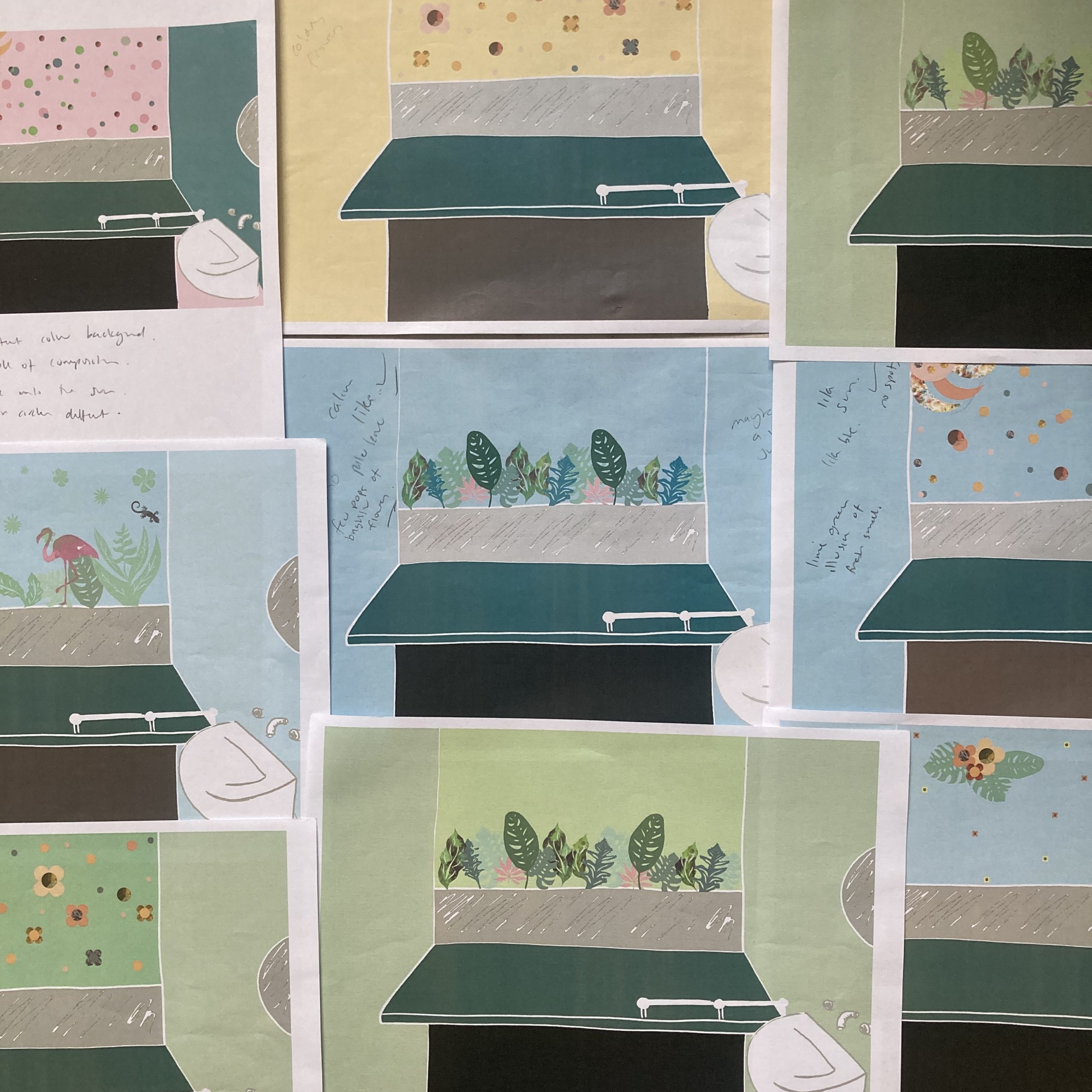
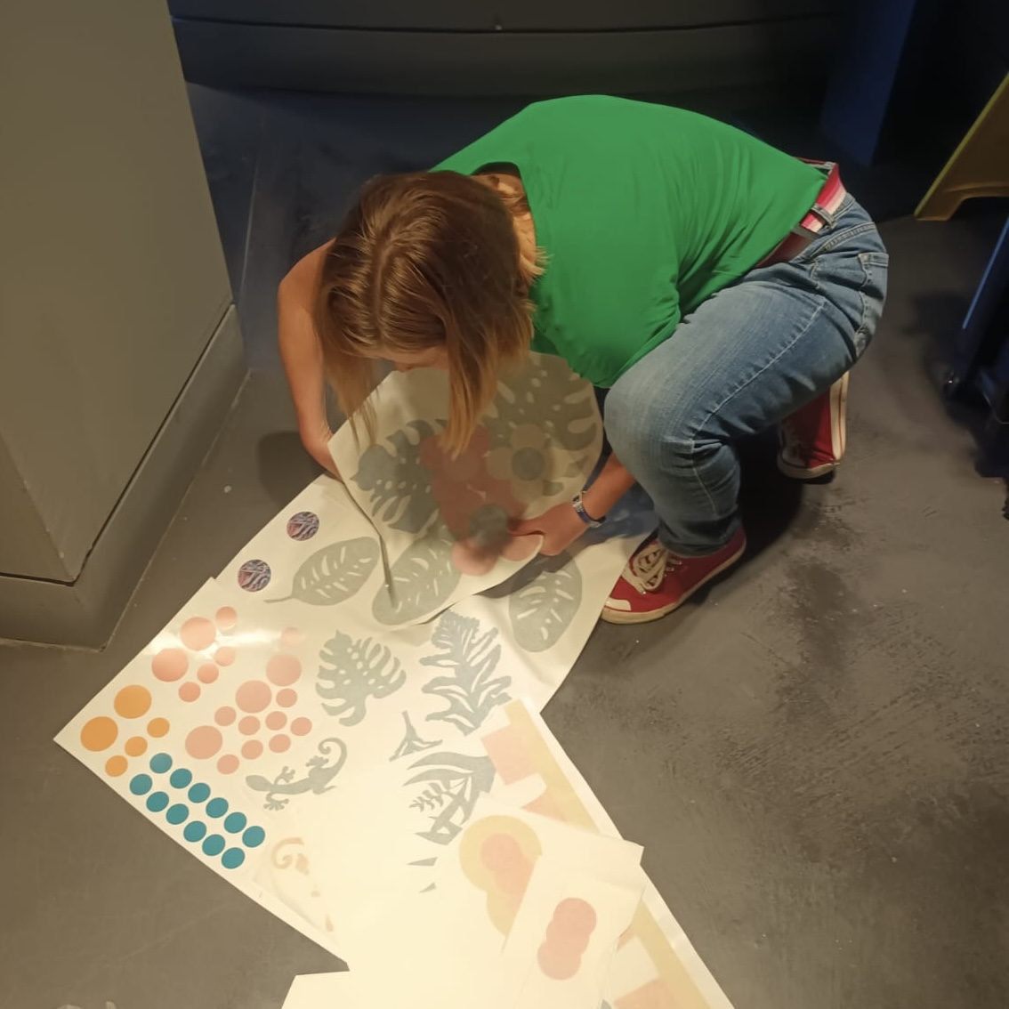
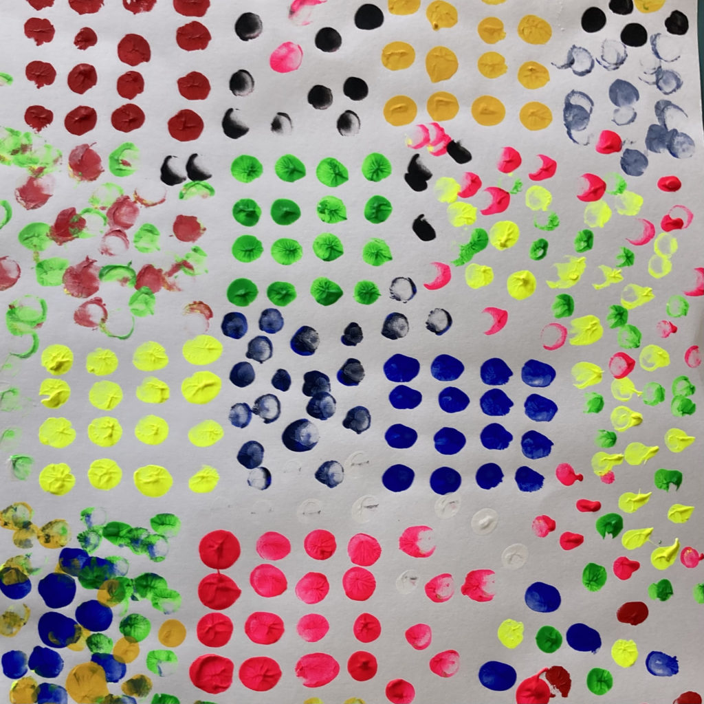
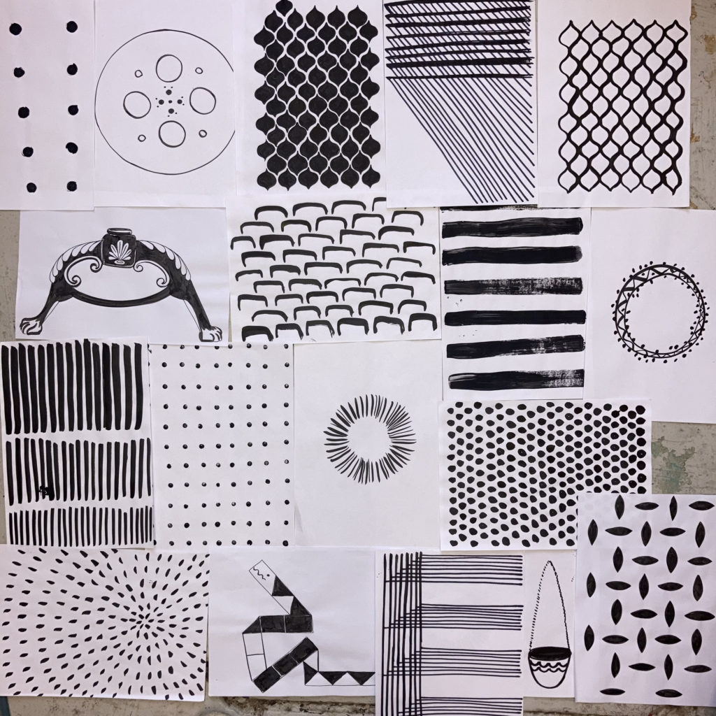
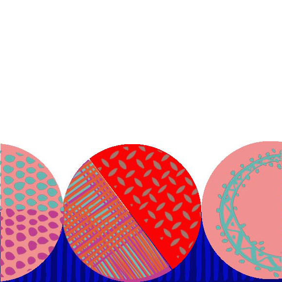
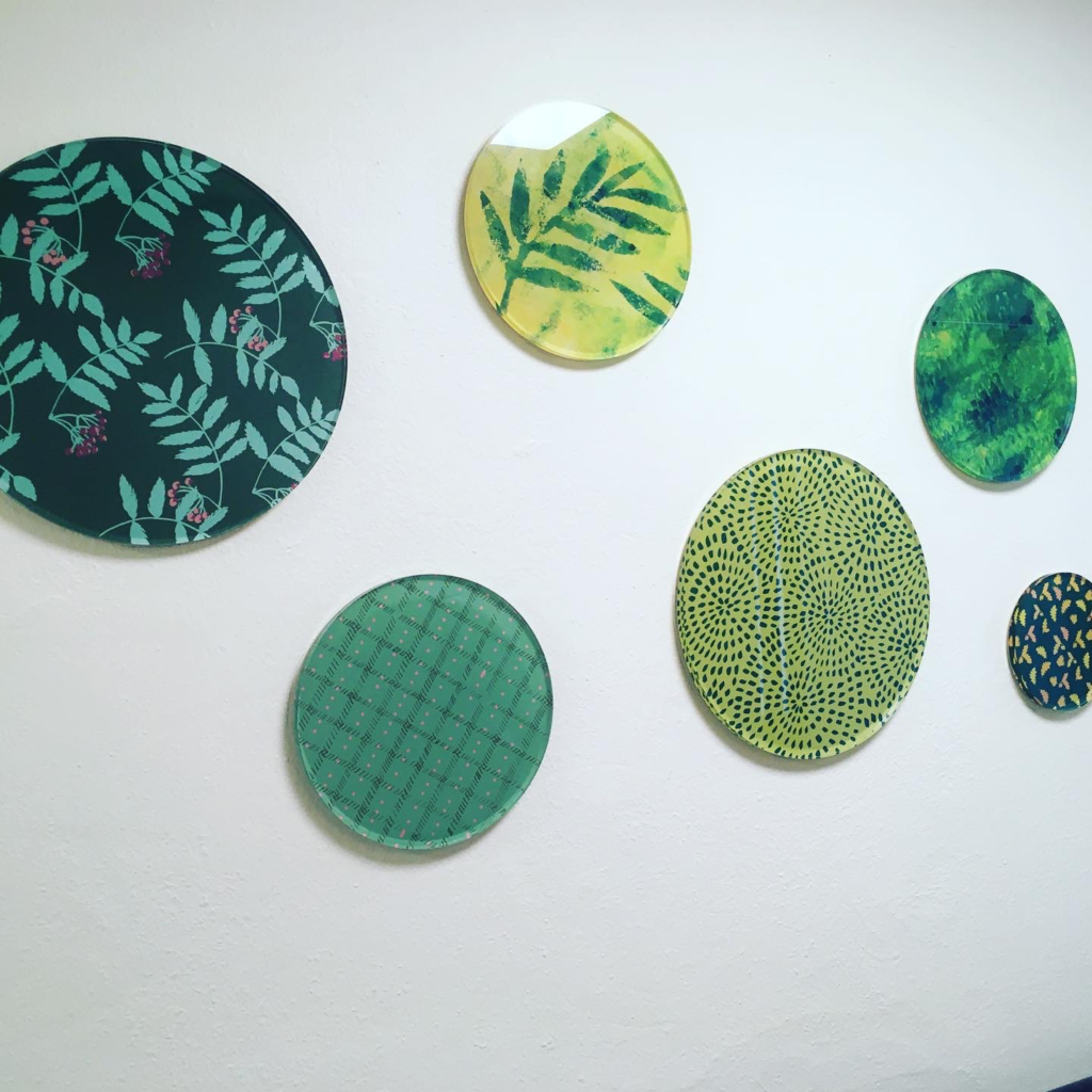
With a project like this I have an abundance of ideas and use traditional methods of sketching to think through the process. Then I select and reject ideas to create clear concepts for feedback. As the project developed it was agreed that panels leading to the gates would be designed to give a coherent look. Designs were mocked up to help visualise and a classic bottle green was chosen. Designs were then developed fully to suit the manufacturing process and safety guidelines.
Accessibility
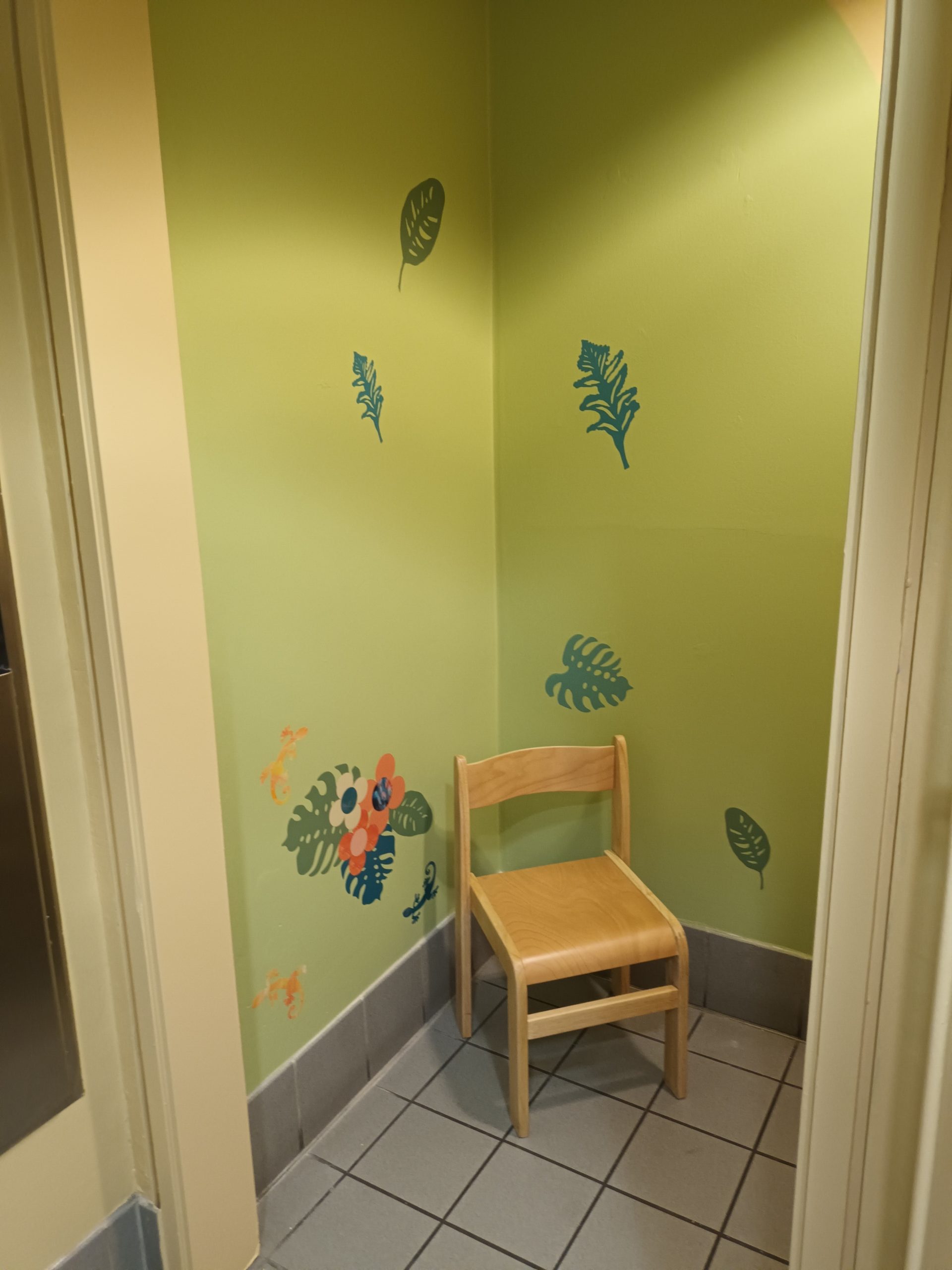
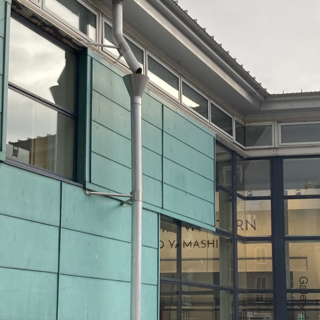
Part of this transformation includes a sloped accessible path into the gardens and decorative gates that open both ways. Broughty Ferry esplanade has been transformation to help improve active travel, part of a much bigger picture you can find out more here. I particularly love working on strategic projects that encourage people to get out and about and improve places.
Local Fabrication
Local fabricator (AS Fabrication) worked on the technical aspect of the gates design and the bottle green colour applied by Tayside Powder Coating Services. I love when ideas become reality and seeing my work applied to different surfaces and situations and working with experts in their field.
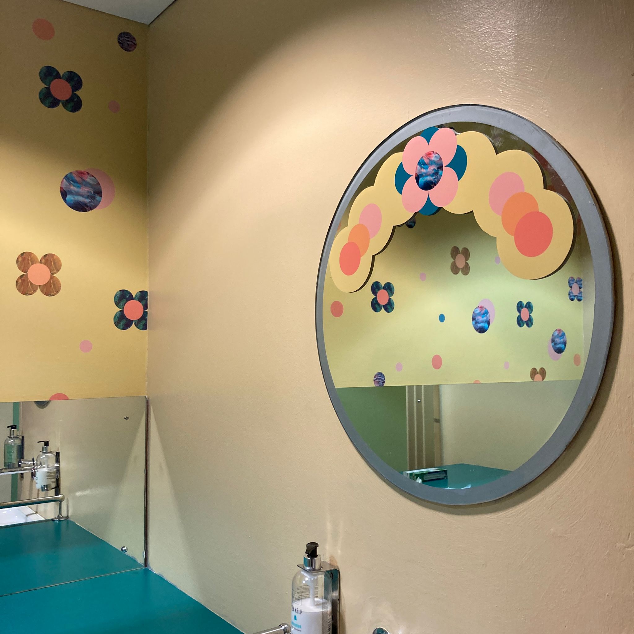
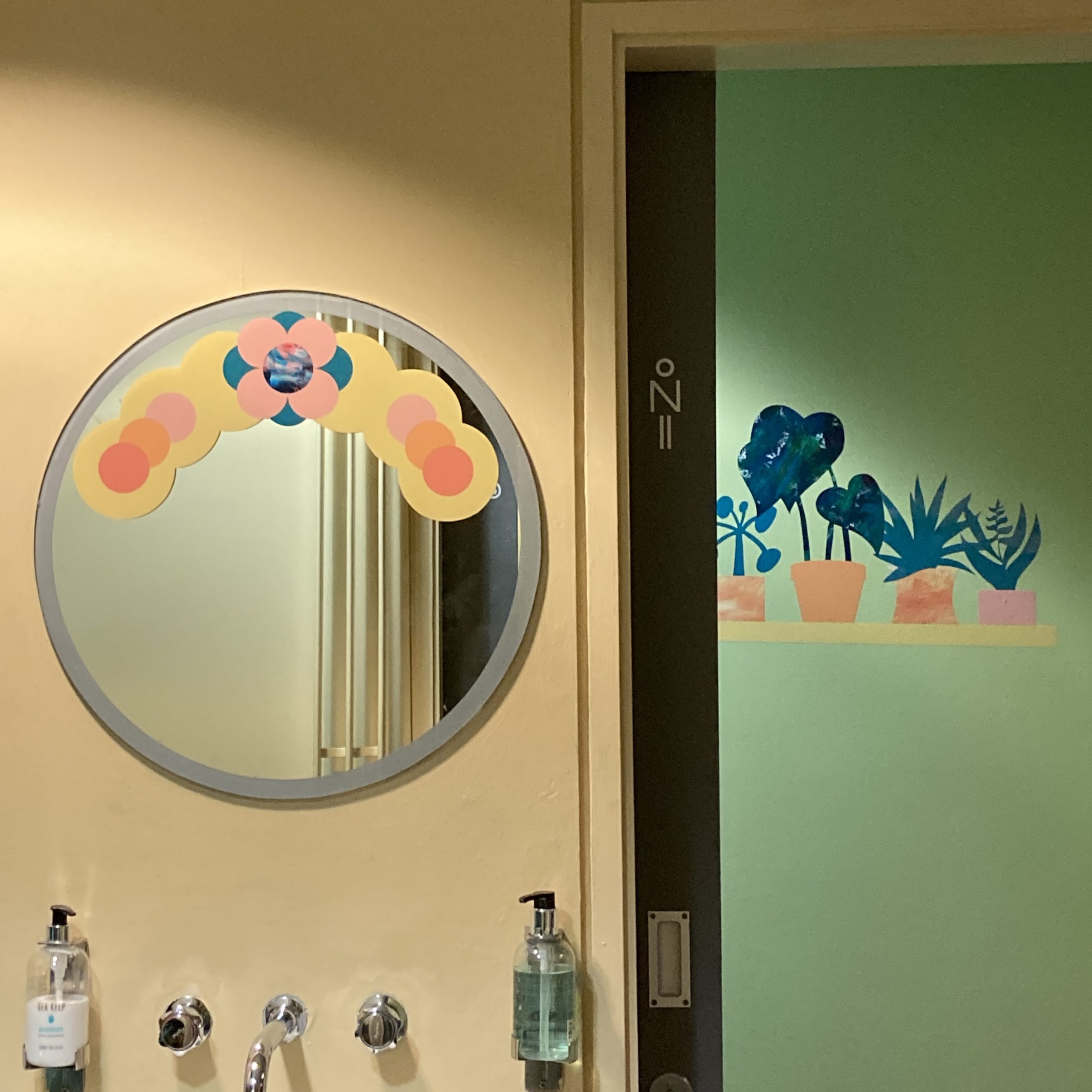
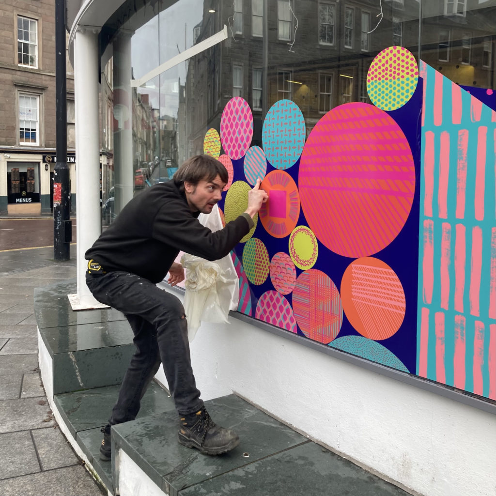
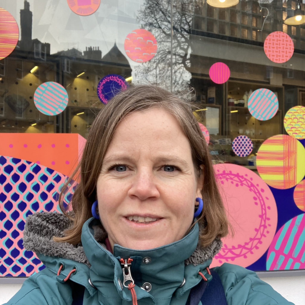
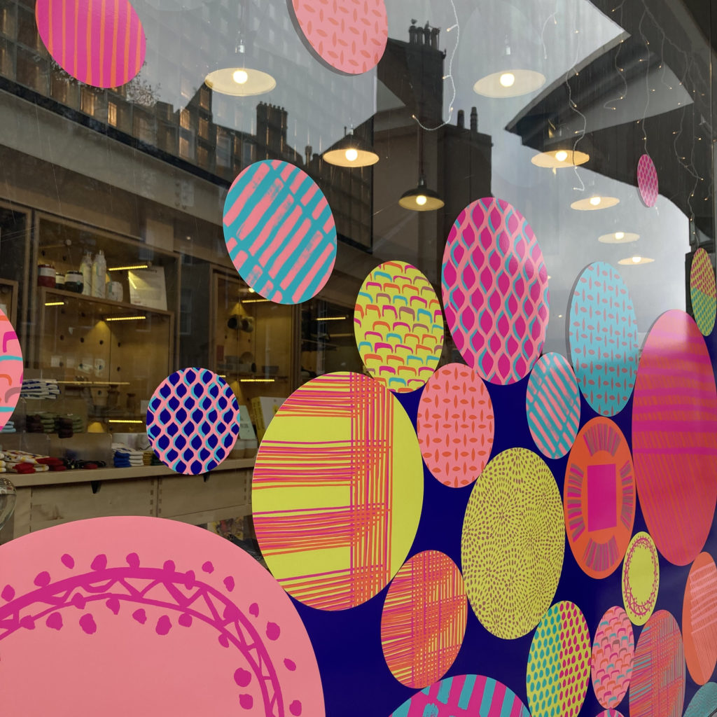
I have a vision of the world full of creative interventions to bring more joy to the spaces we play, live, work and travel through. My aim is to uplift and connect people and highlight the positives by creating artworks that capture a sense of place which creates a sense of belonging. I love to do this by playfully applying colour and pattern to site specific spaces with bespoke designs.
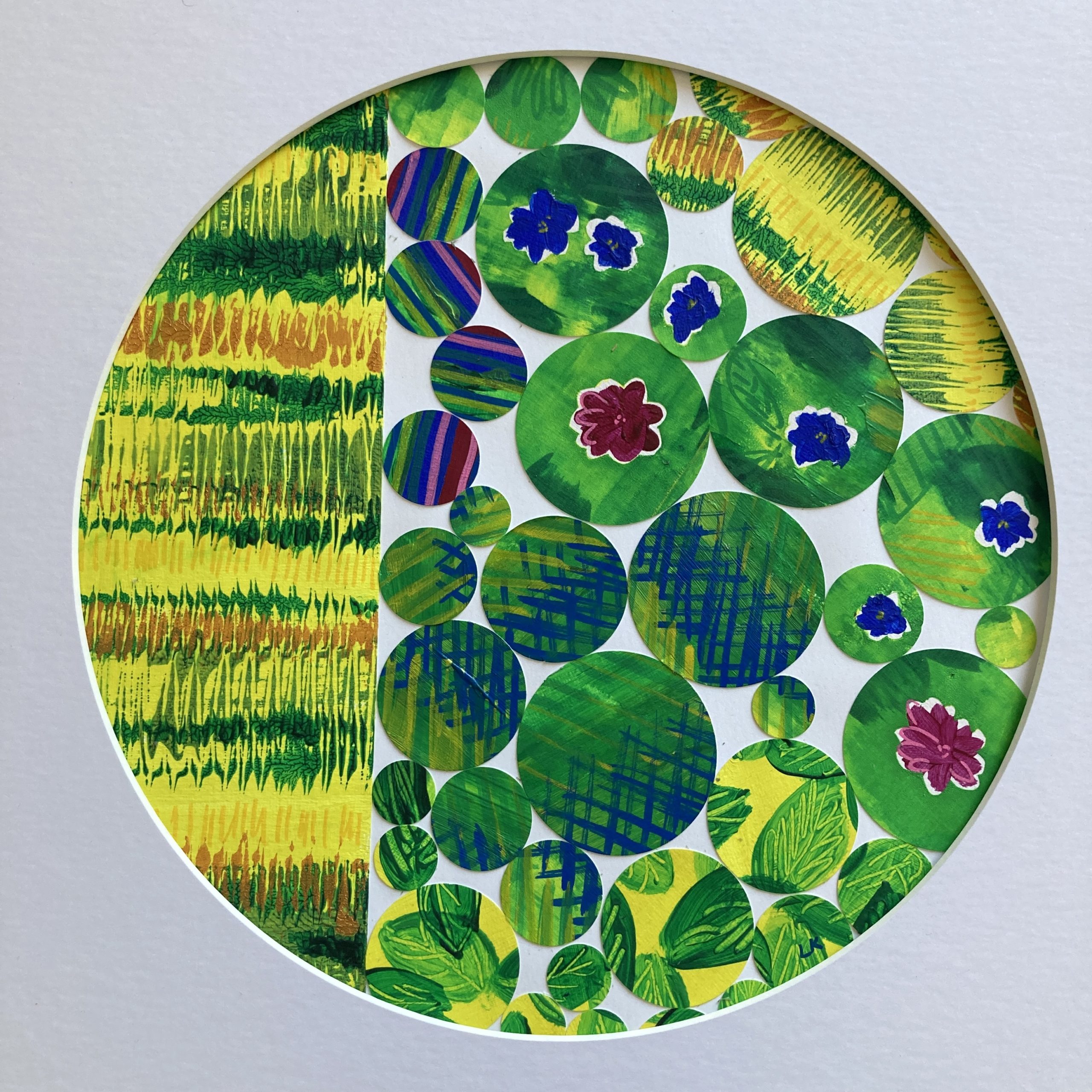
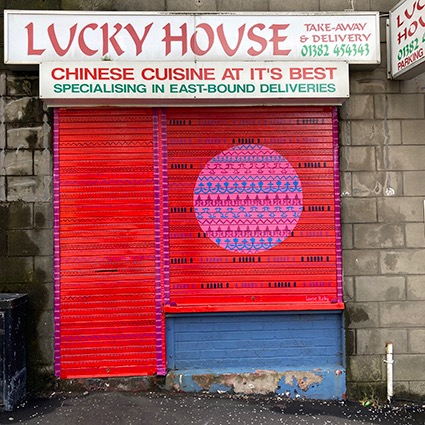
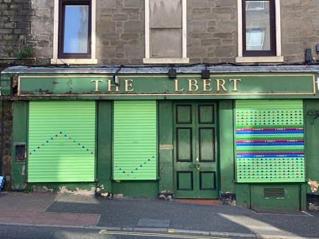
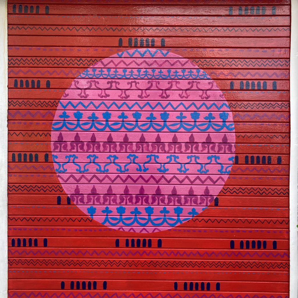
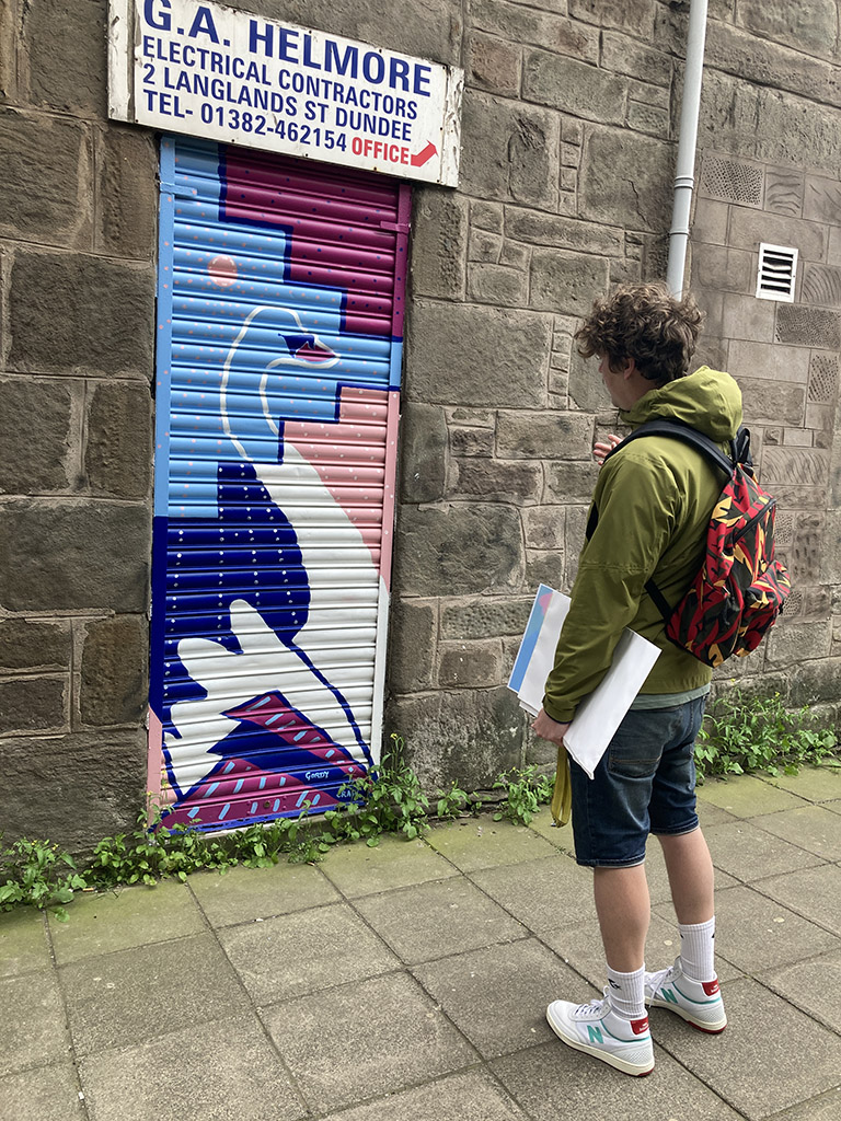
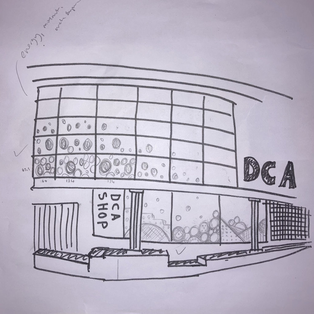
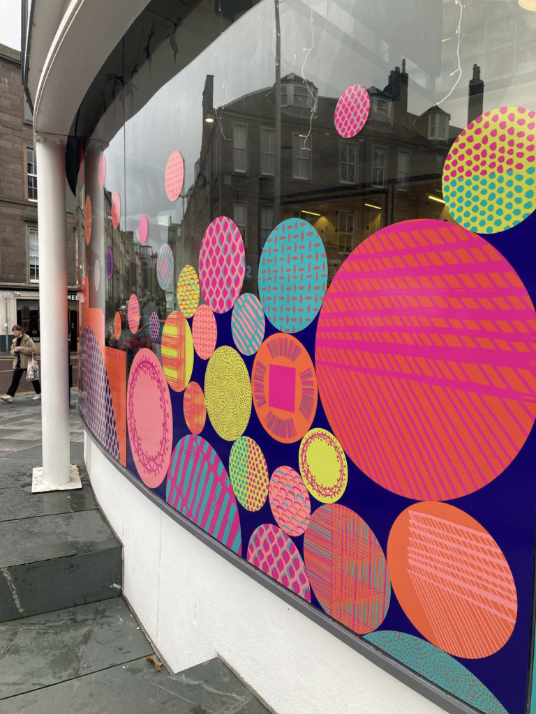
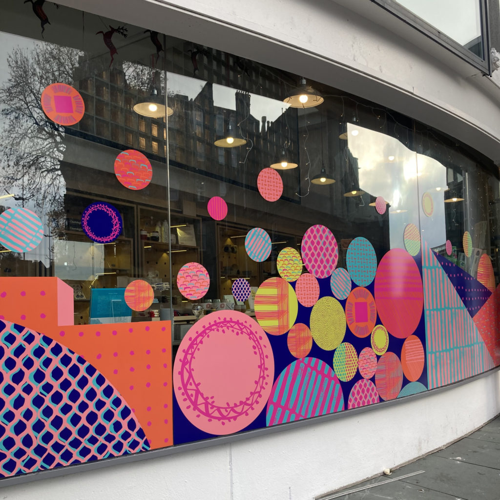
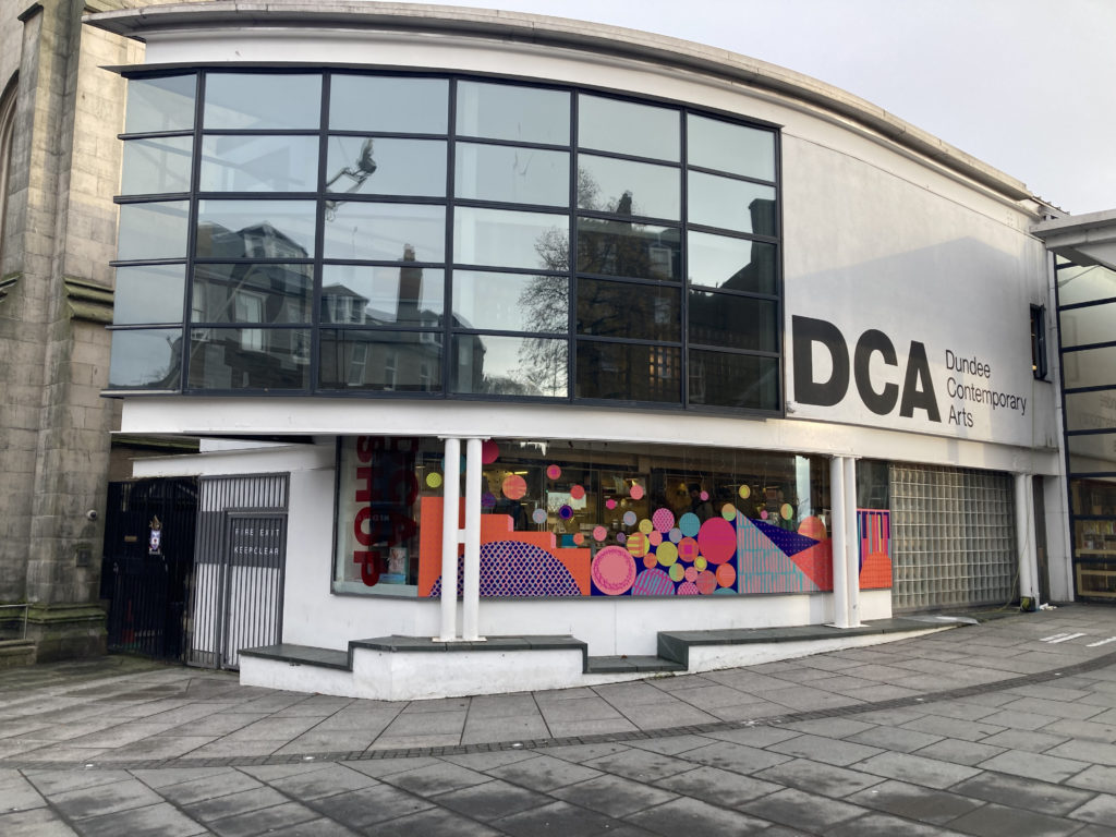
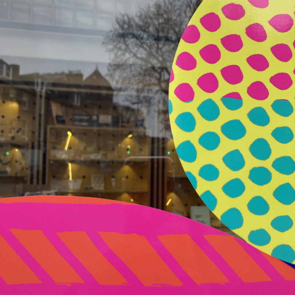
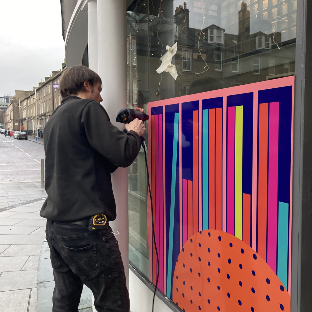
I designed gates for Windmill Gardens just next to Castle Terrace Gardens which have a different look to suit the space, you can see a link with the stripes and circles. You can see them here


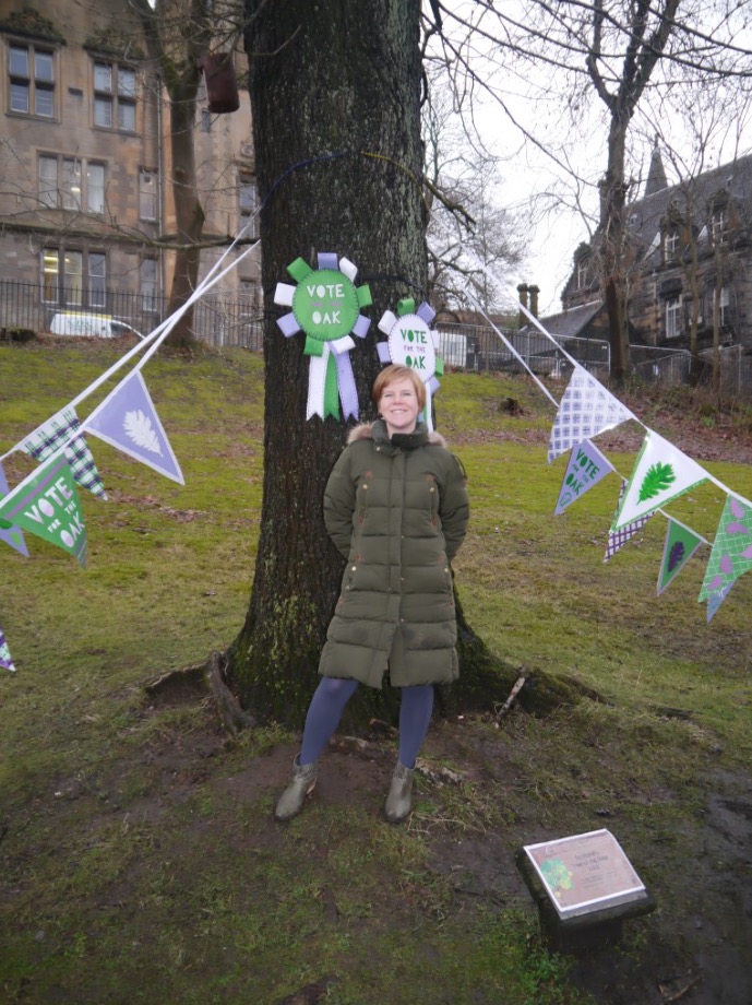 I am delighted to be commissioned by The Woodlands Trust Scotland to help draw attention to an oak tree in Glasgow’s Kelvingrove Park to help it win European Tree of the Year.