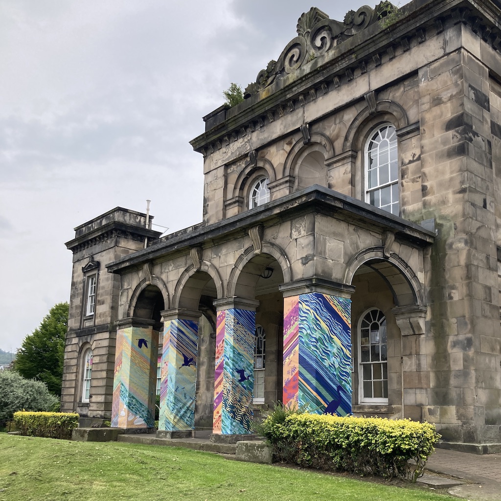
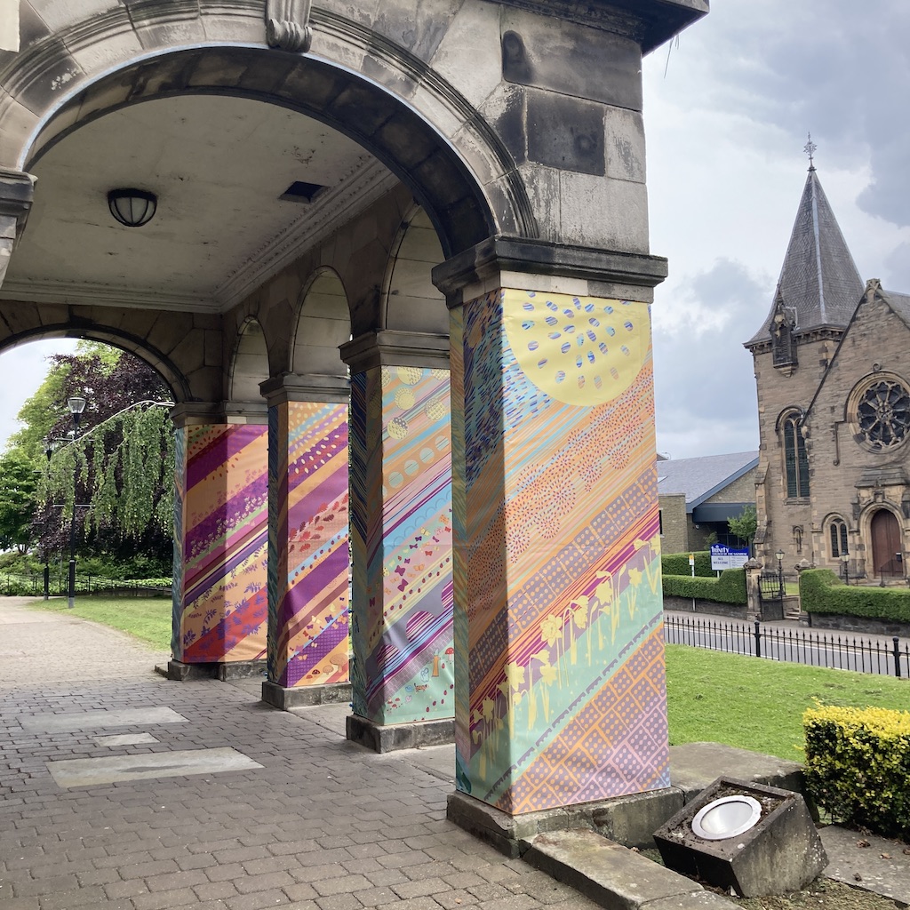
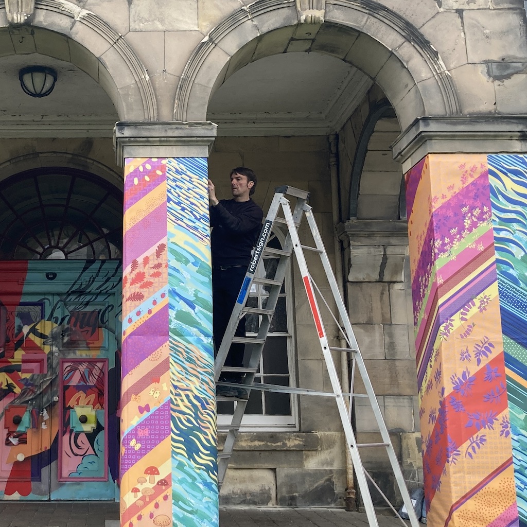
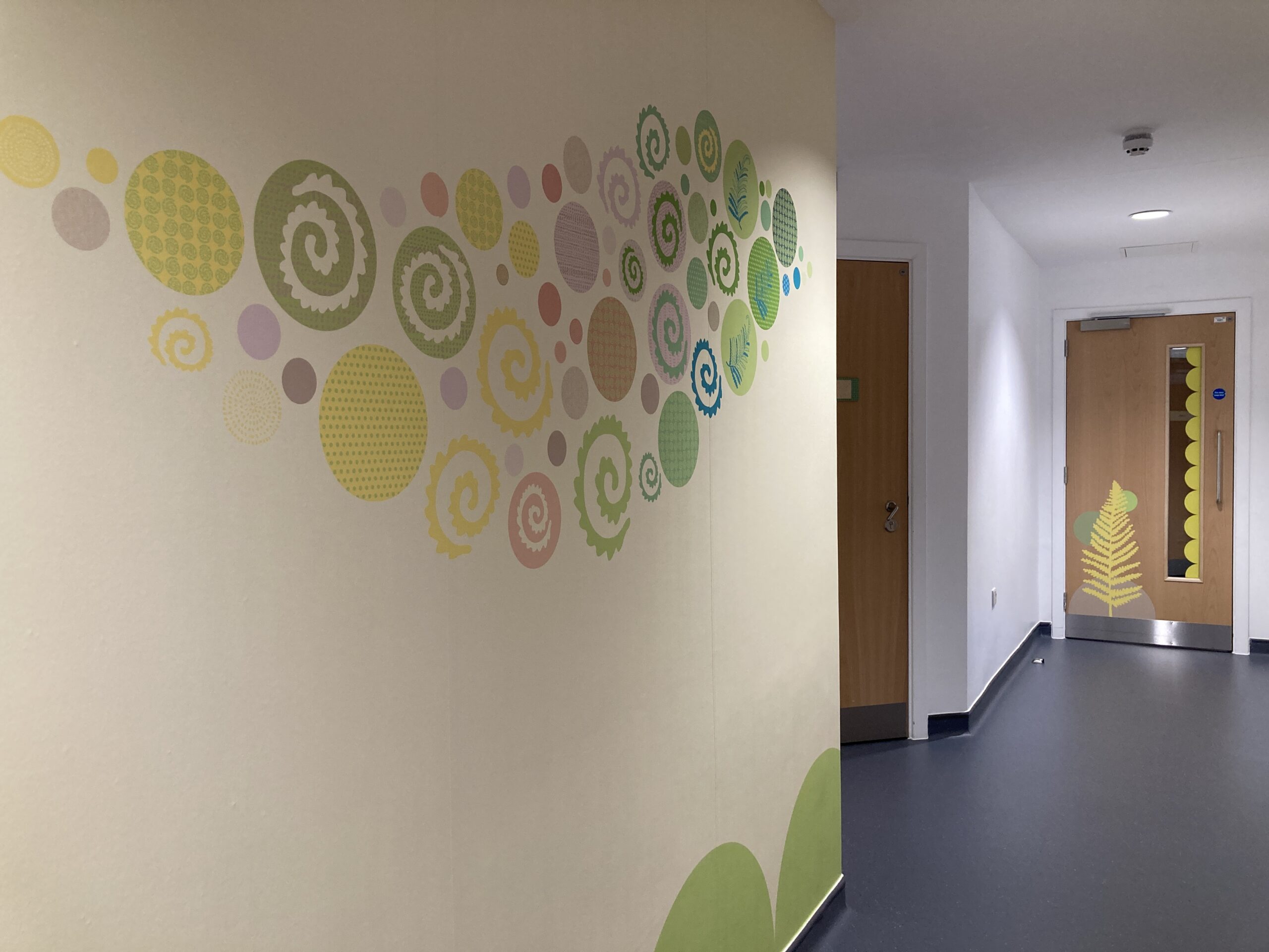
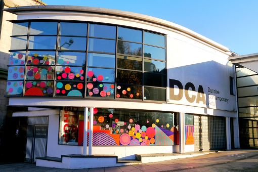
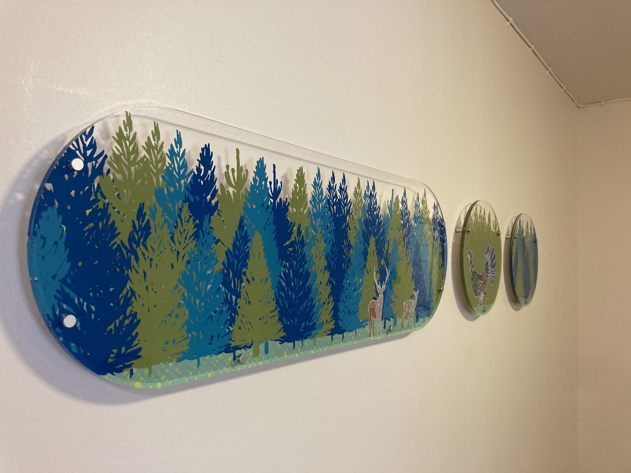
I am delighted to be commissioned by Culture Perth & Kinross to create artwork for the pillar wraps for the entrance of AK Bell Library. The brief was to capture their vision for ‘reinvention and renewal’. I took my inspiration from the River Tay with water being a symbol for renewal, vitality and life, layering meaningful local imagery with colours and surface patterns to capture a sense of place.
Design experience
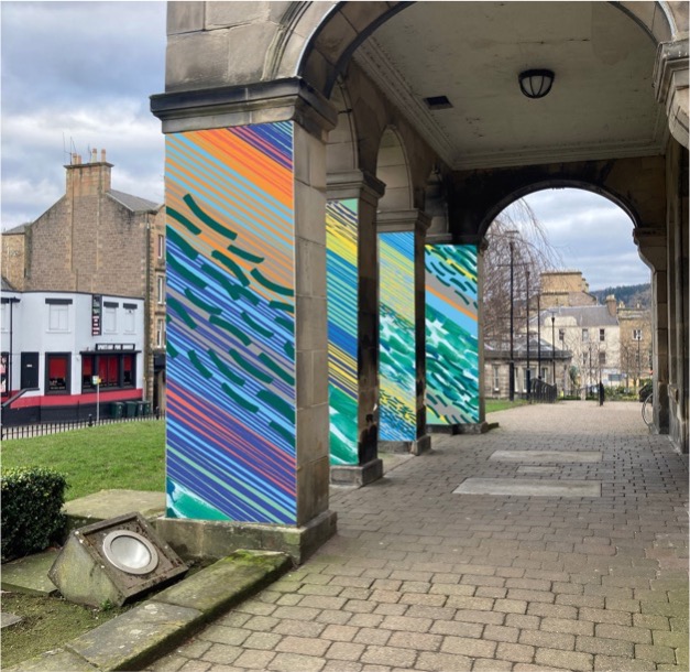
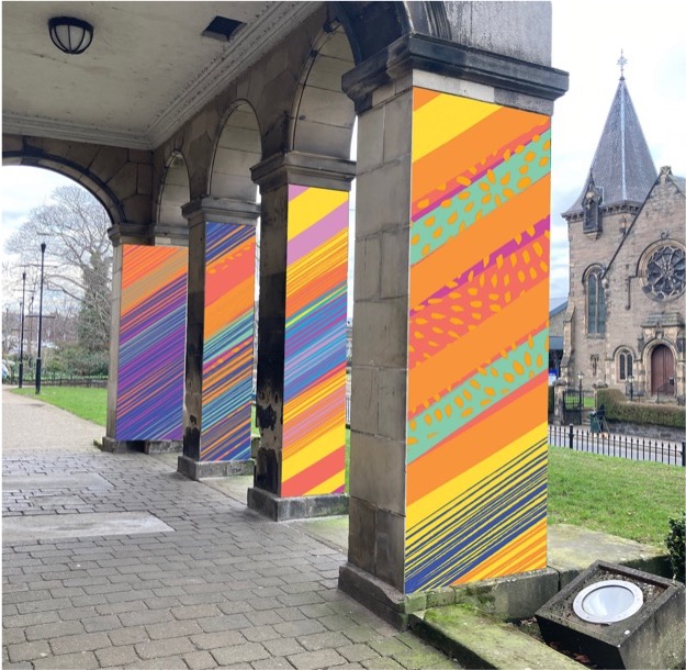
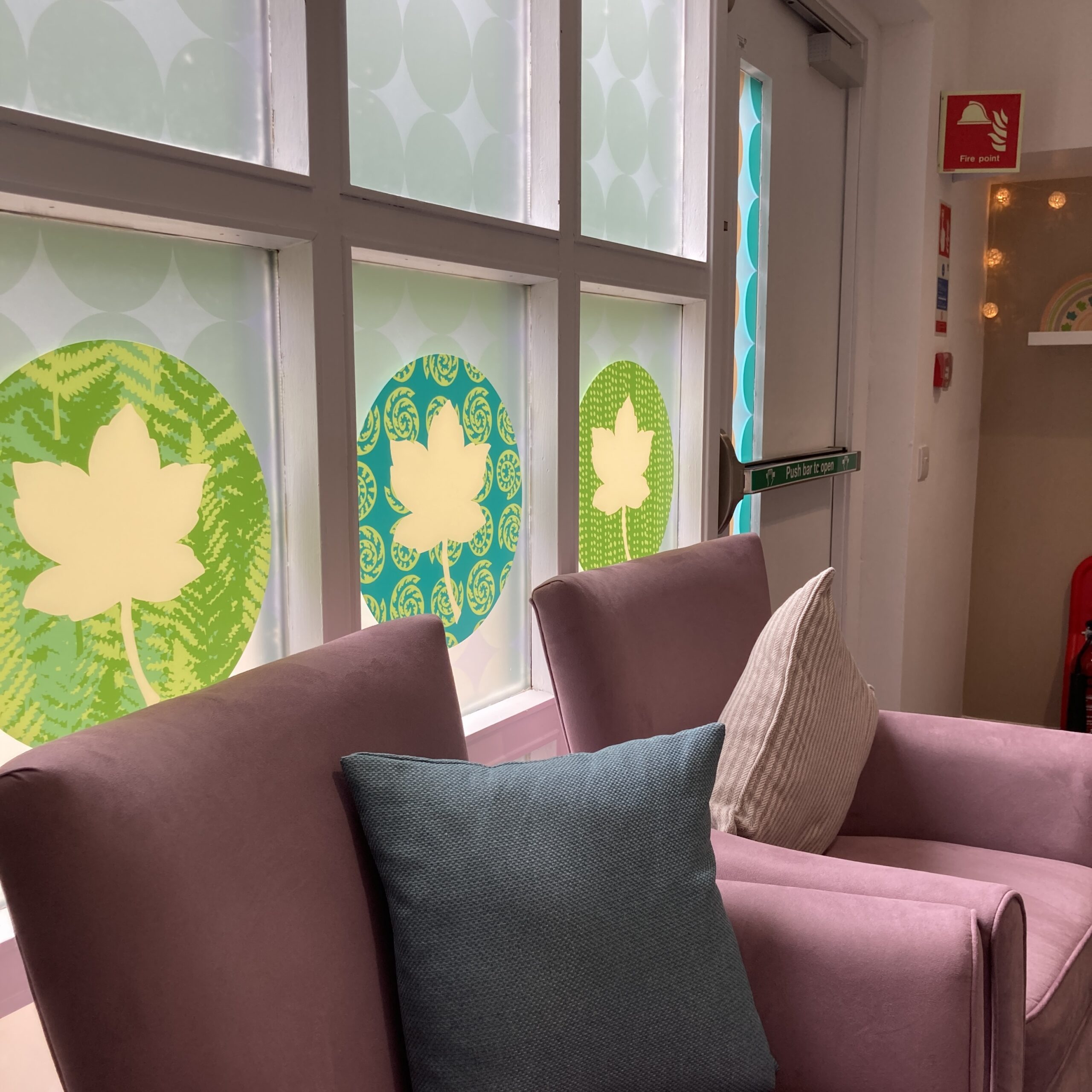
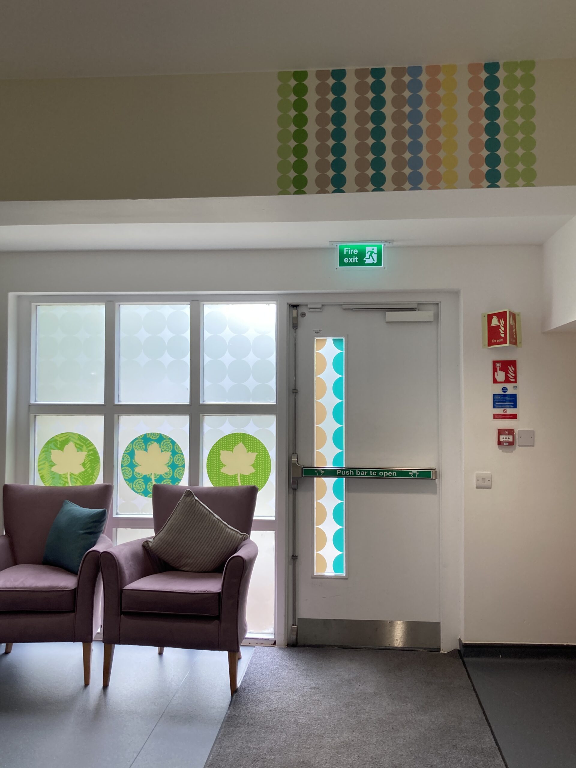
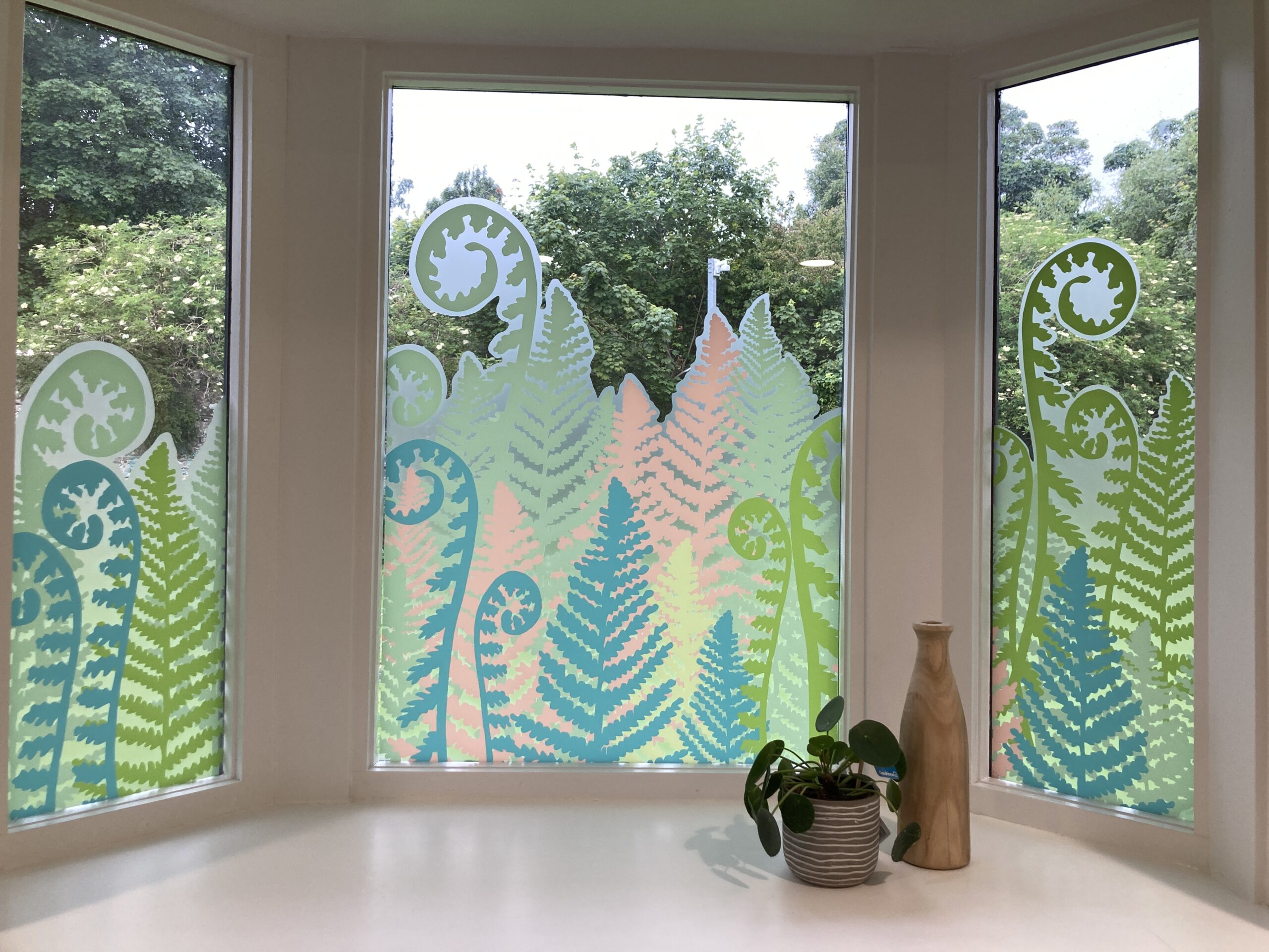
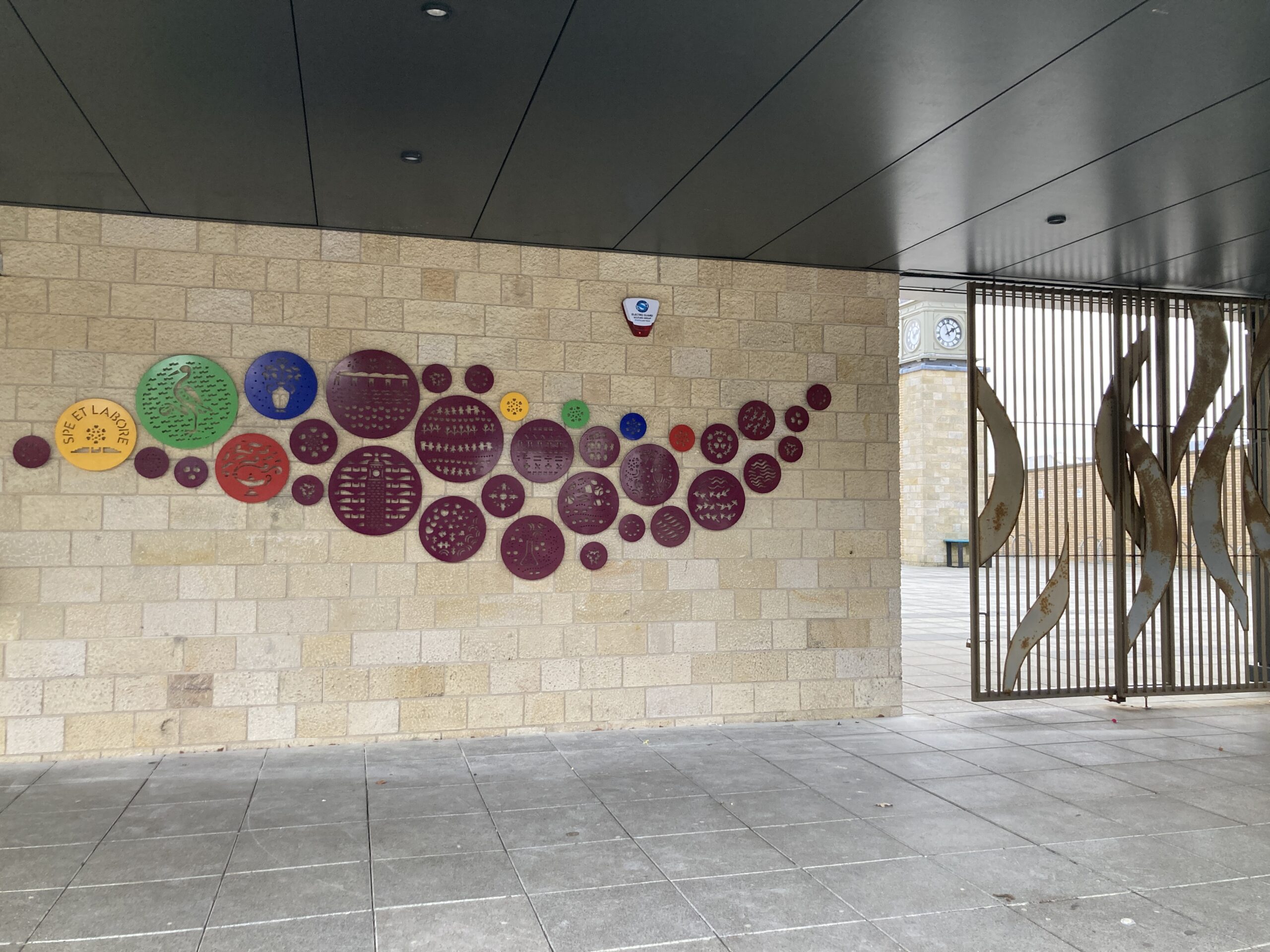
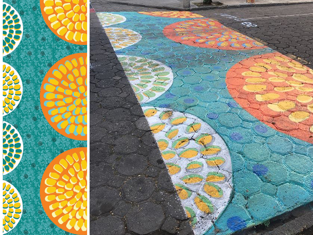
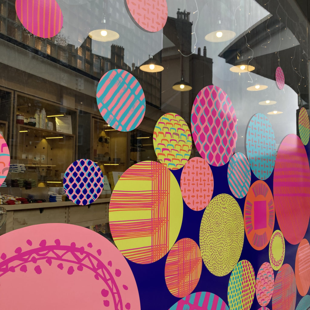
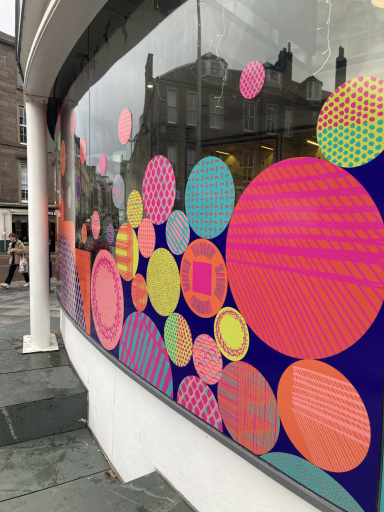
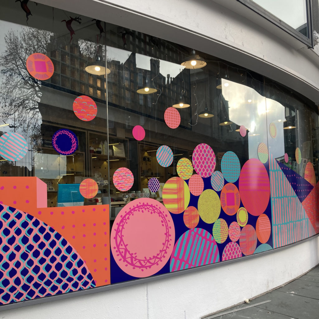
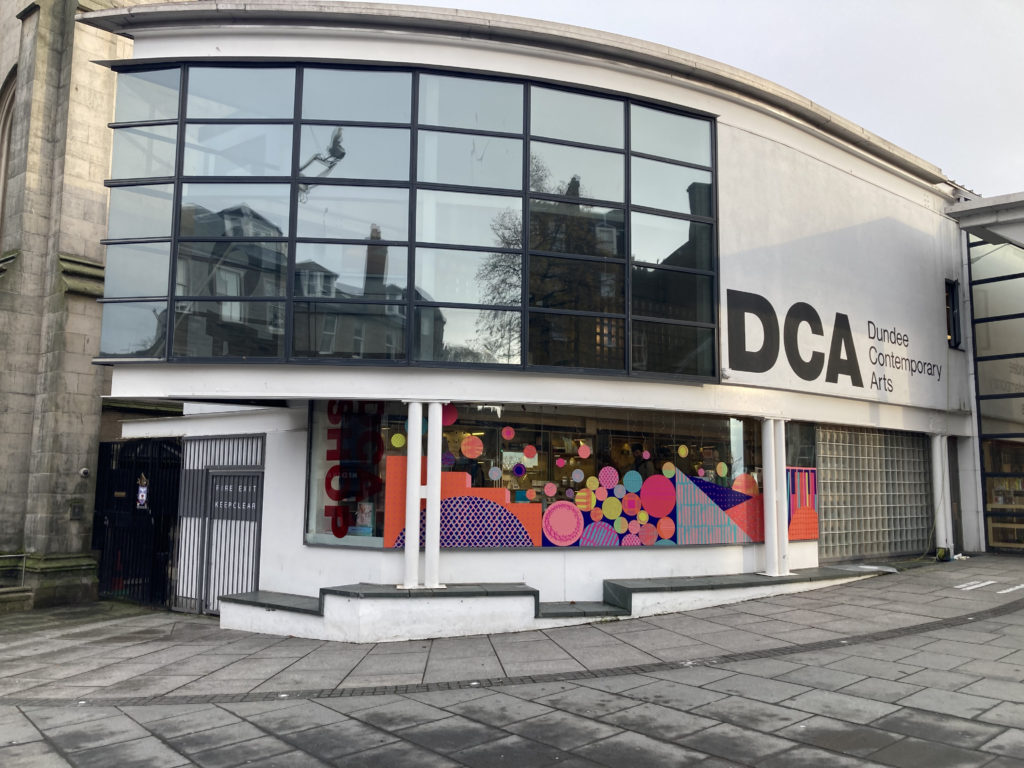
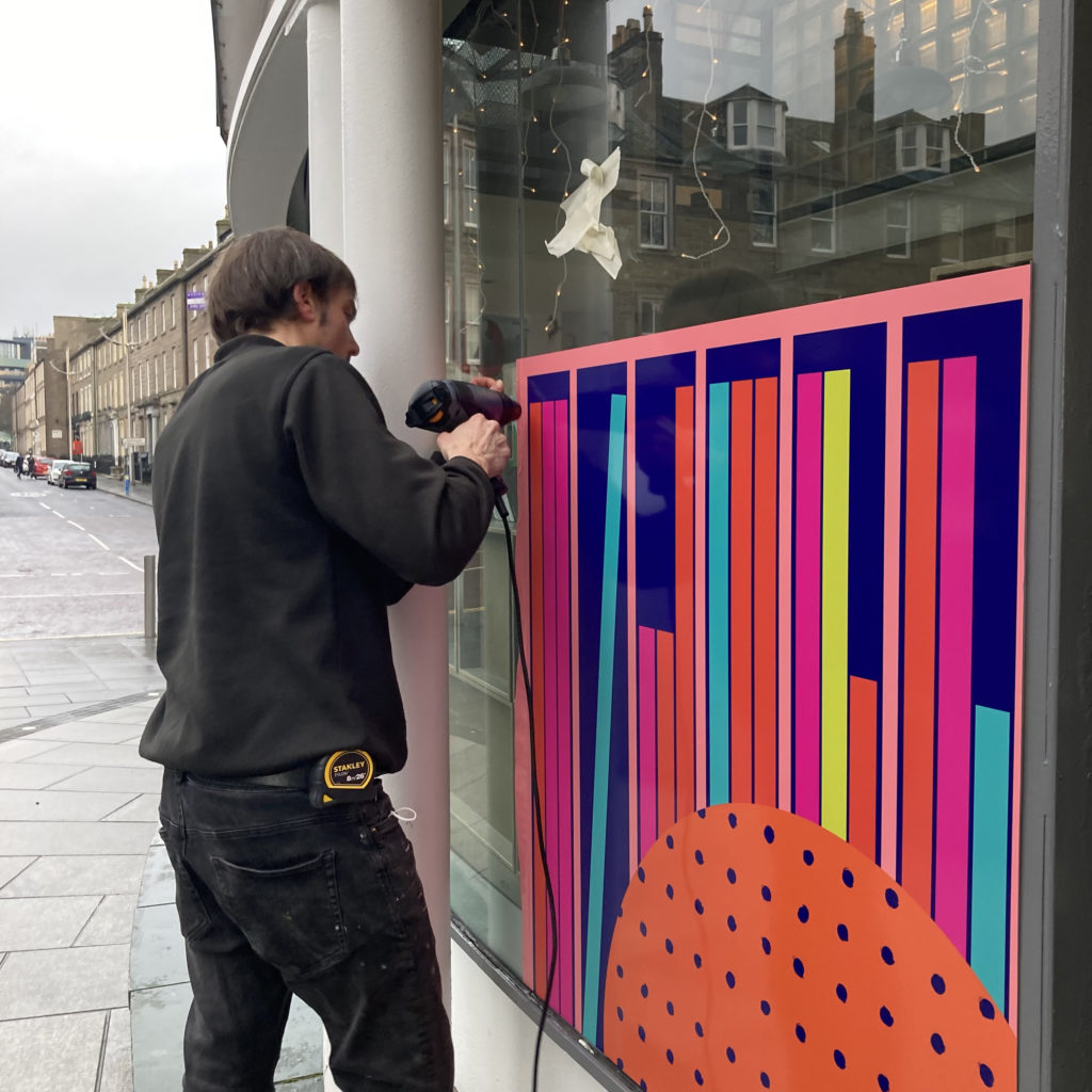
These site specific artworks are designed to be seen from different angles. Entering from either side or walking, wheeling or driving past so that they have an impact from a distance as well as close up.
Viewpoints
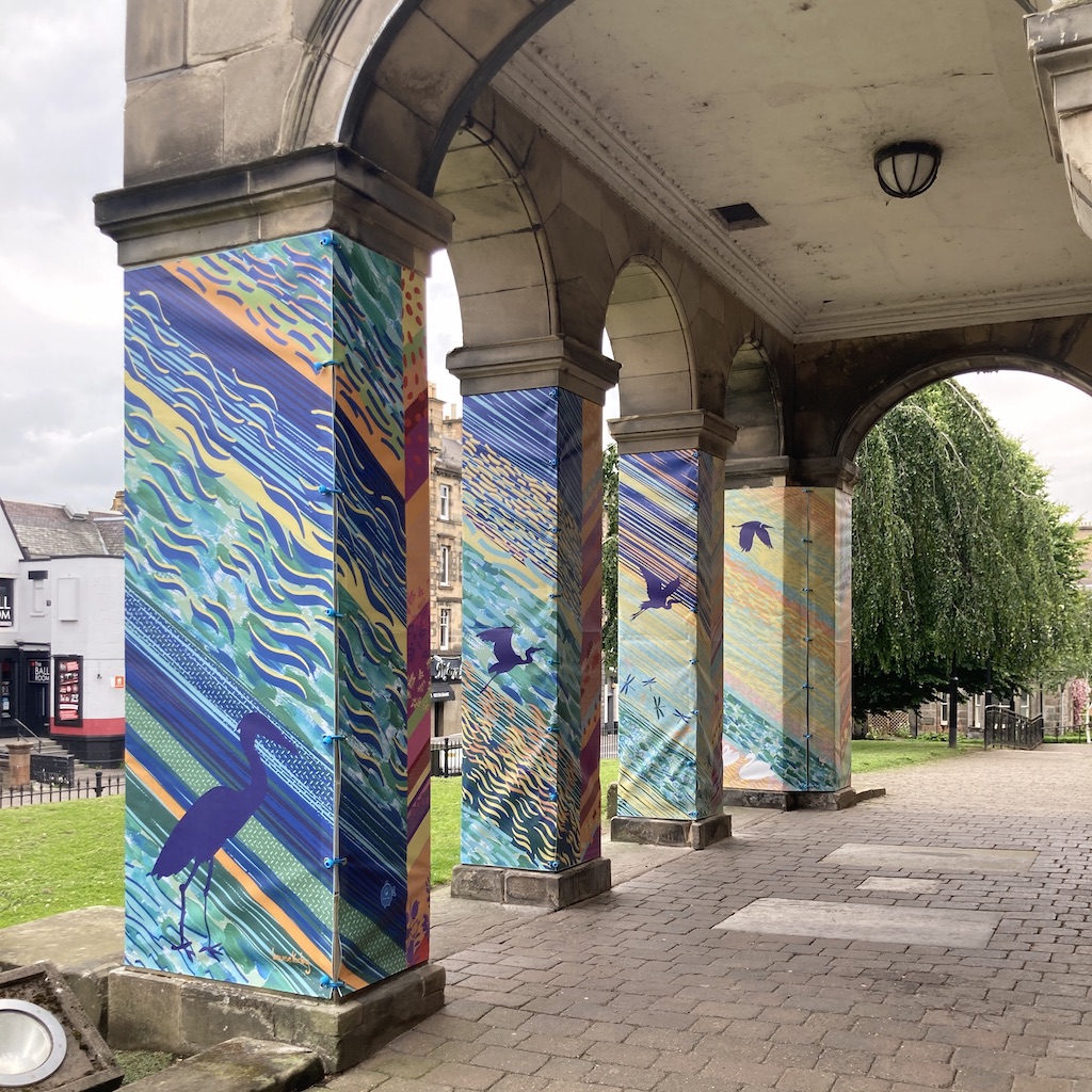
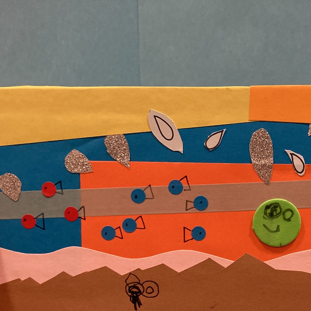
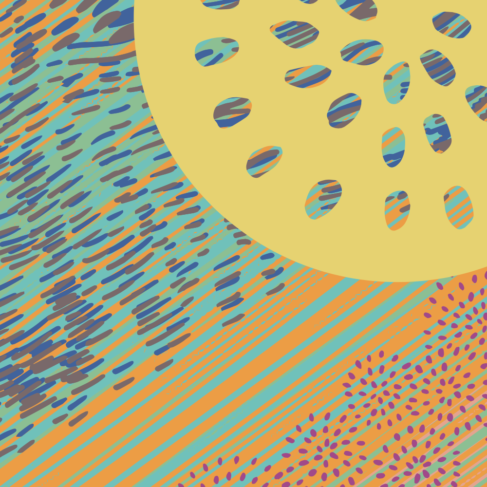
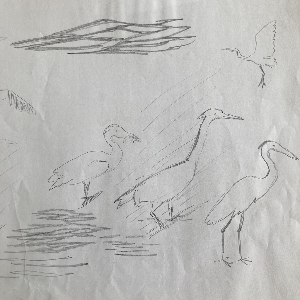
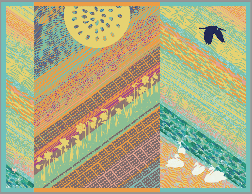
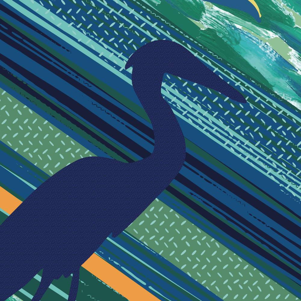
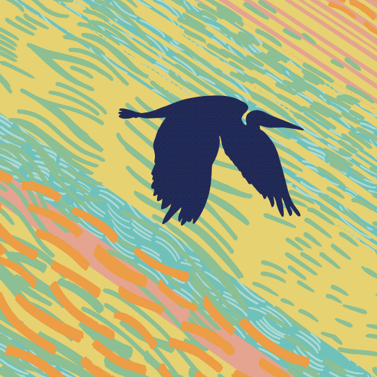
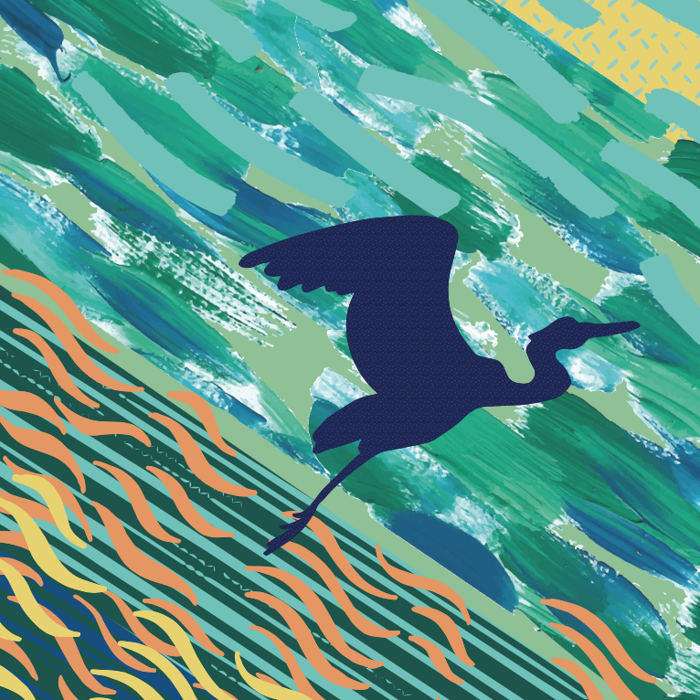
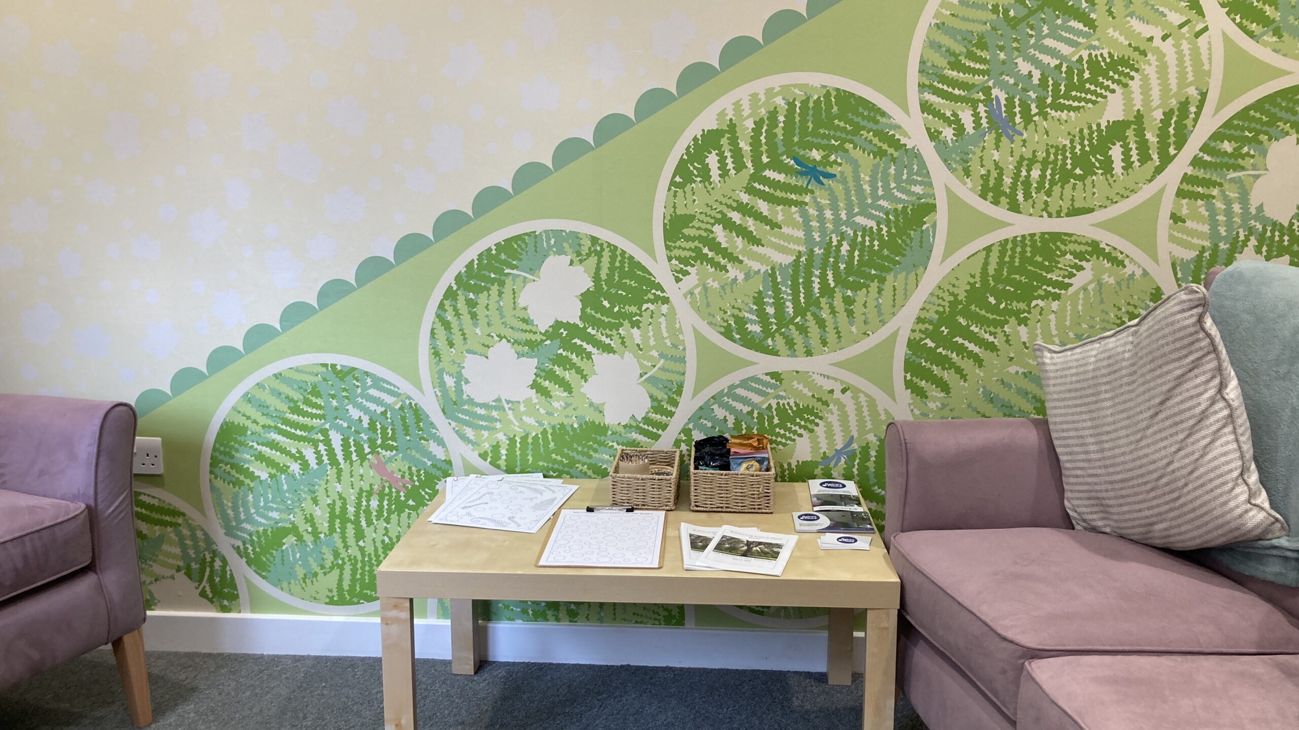
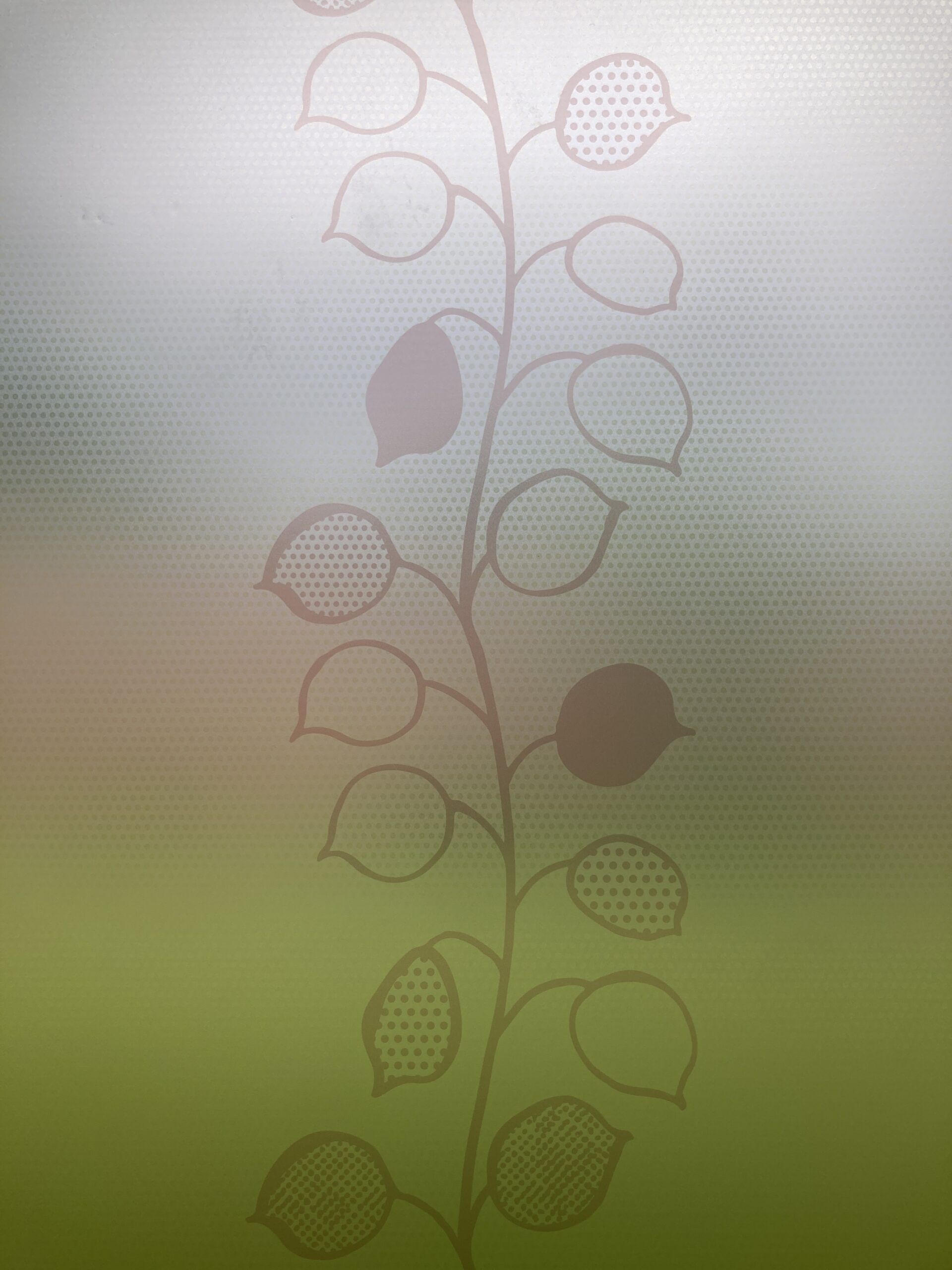
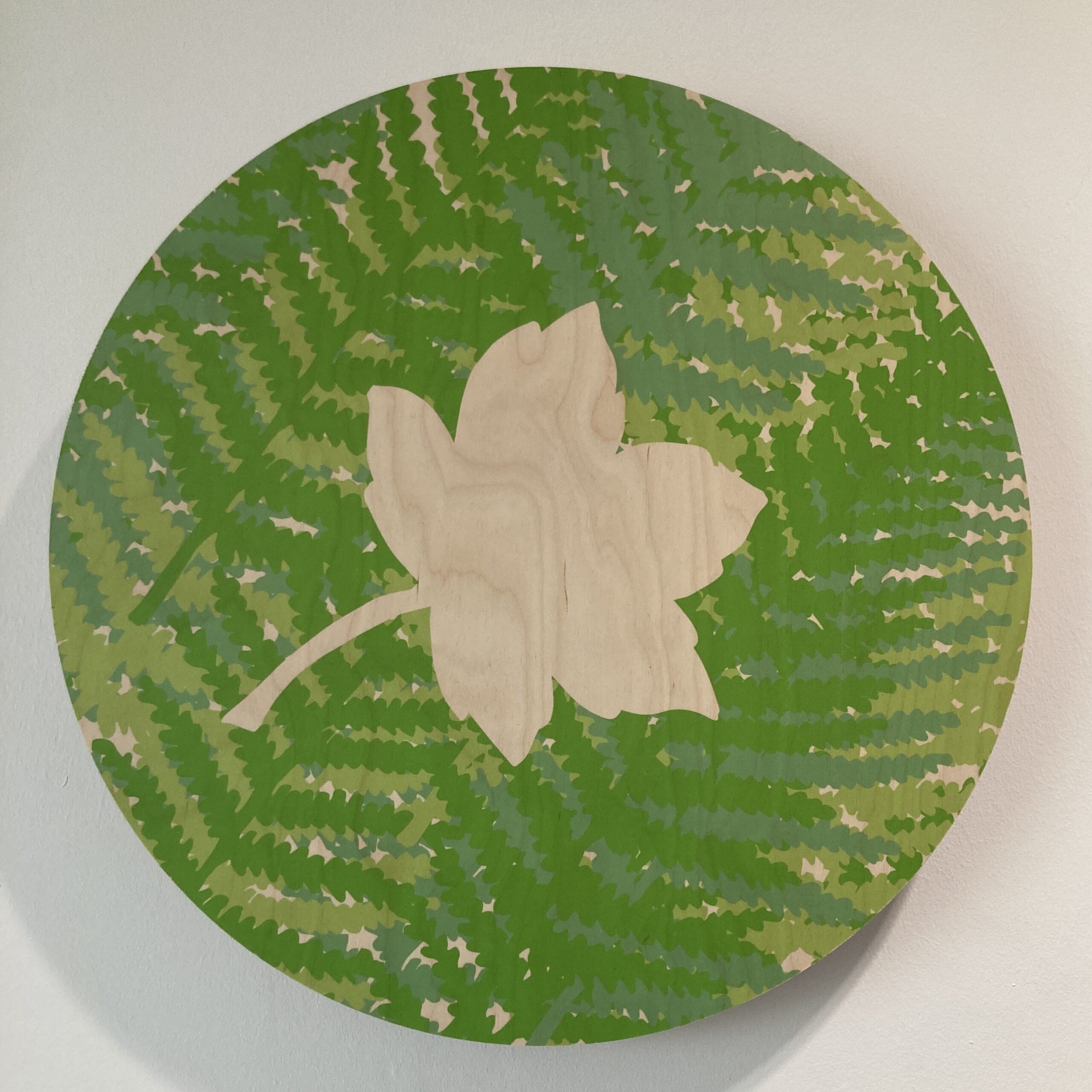
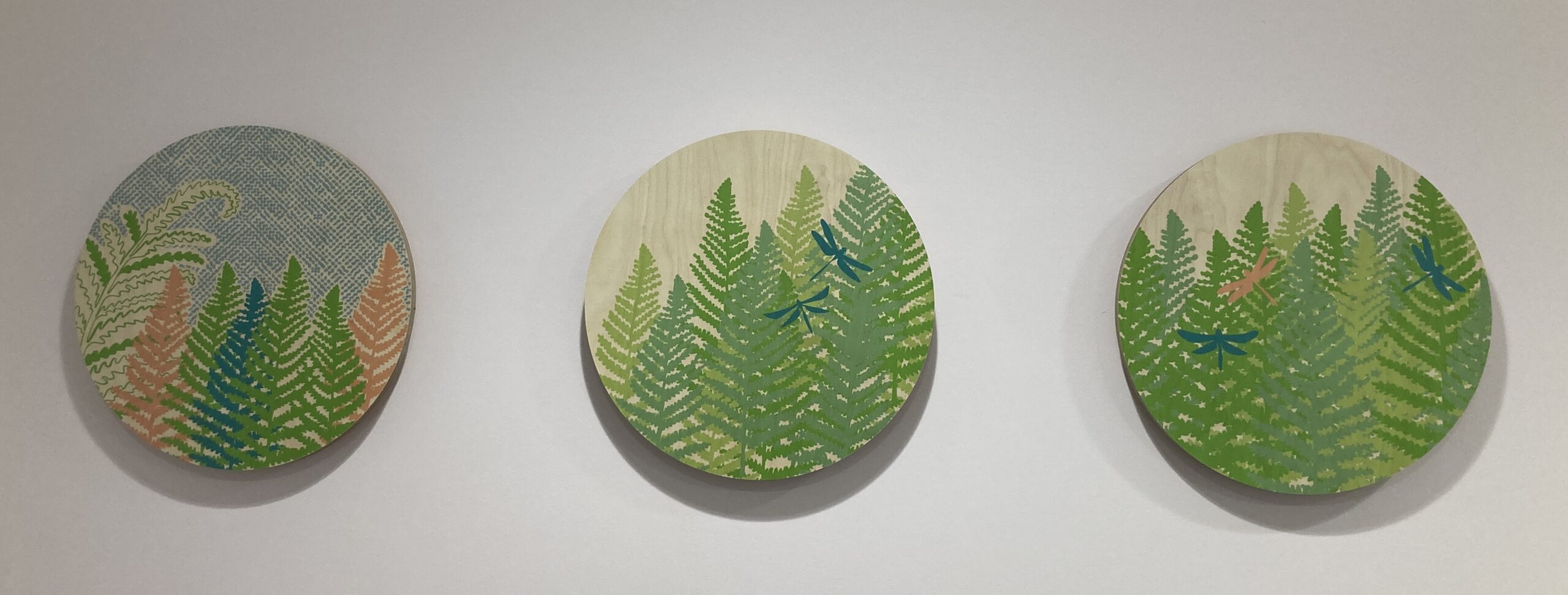
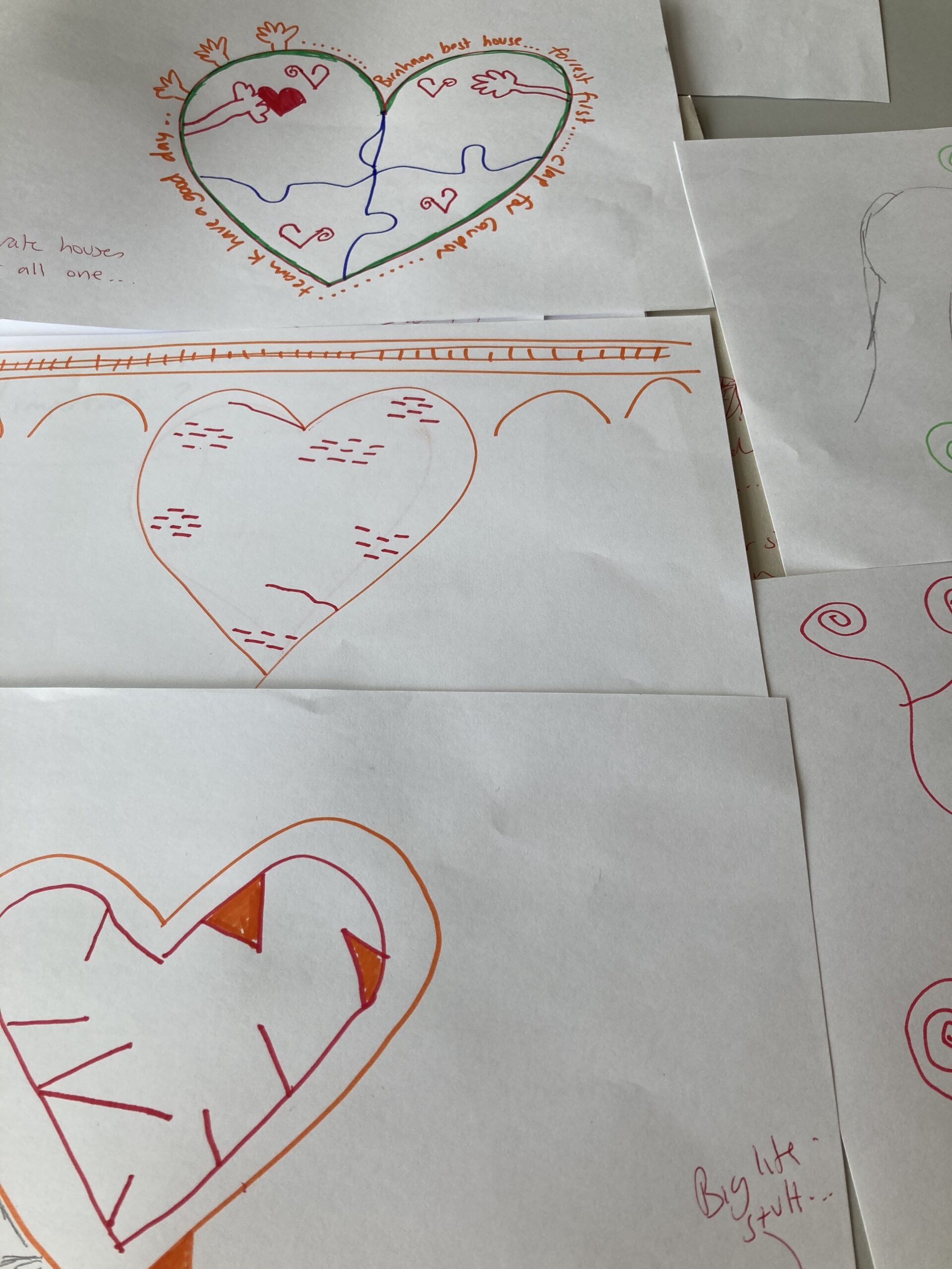
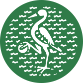
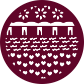
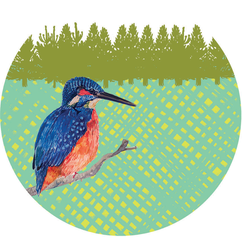
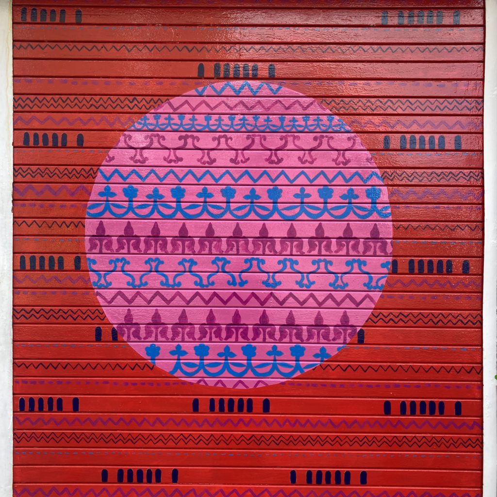
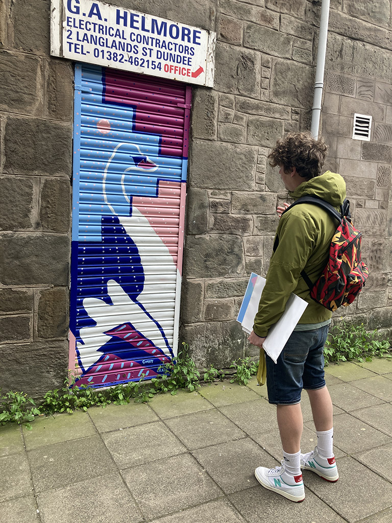
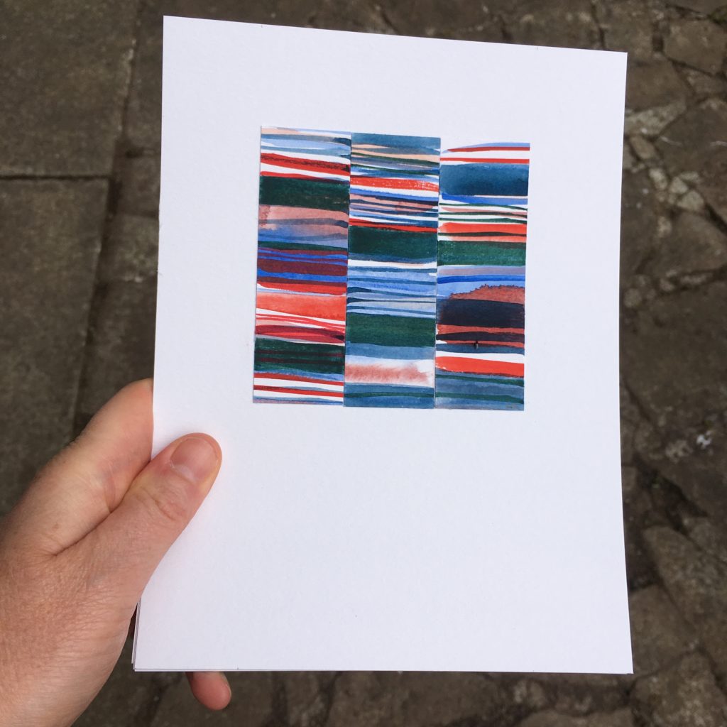
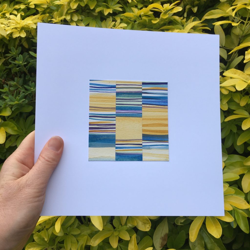
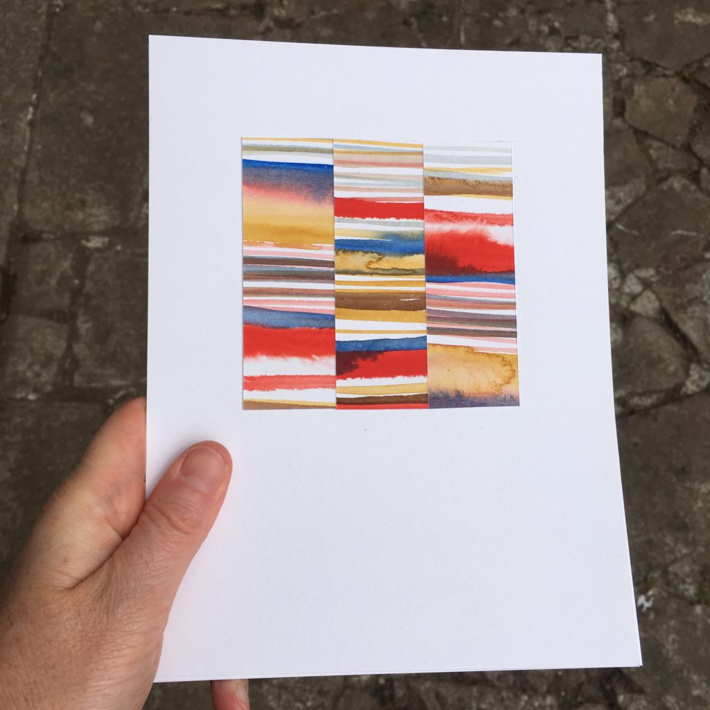
View 1 – Capturing moments in time with the heron standing patiently camouflaged in its surrounding then gradually flying off. Progression of the colour palette and variation of ripple and movement of the water catching the light.
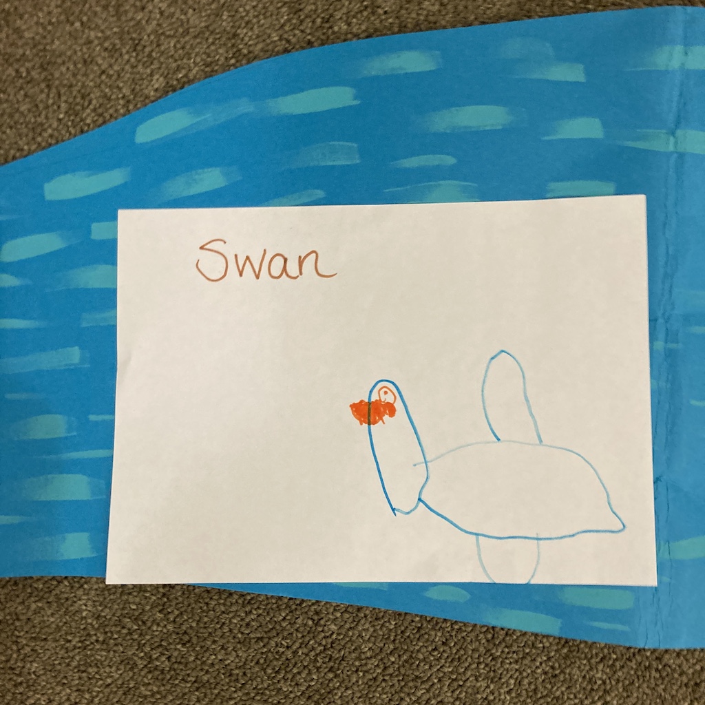
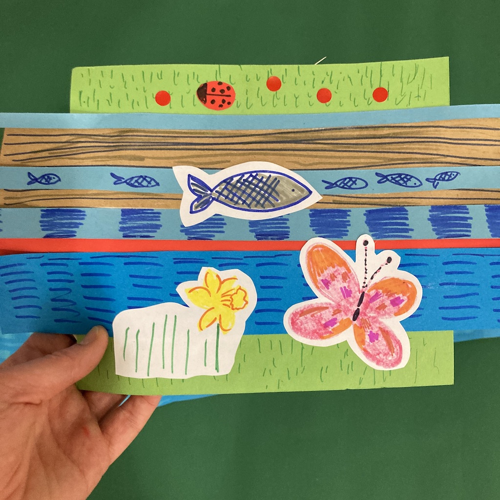
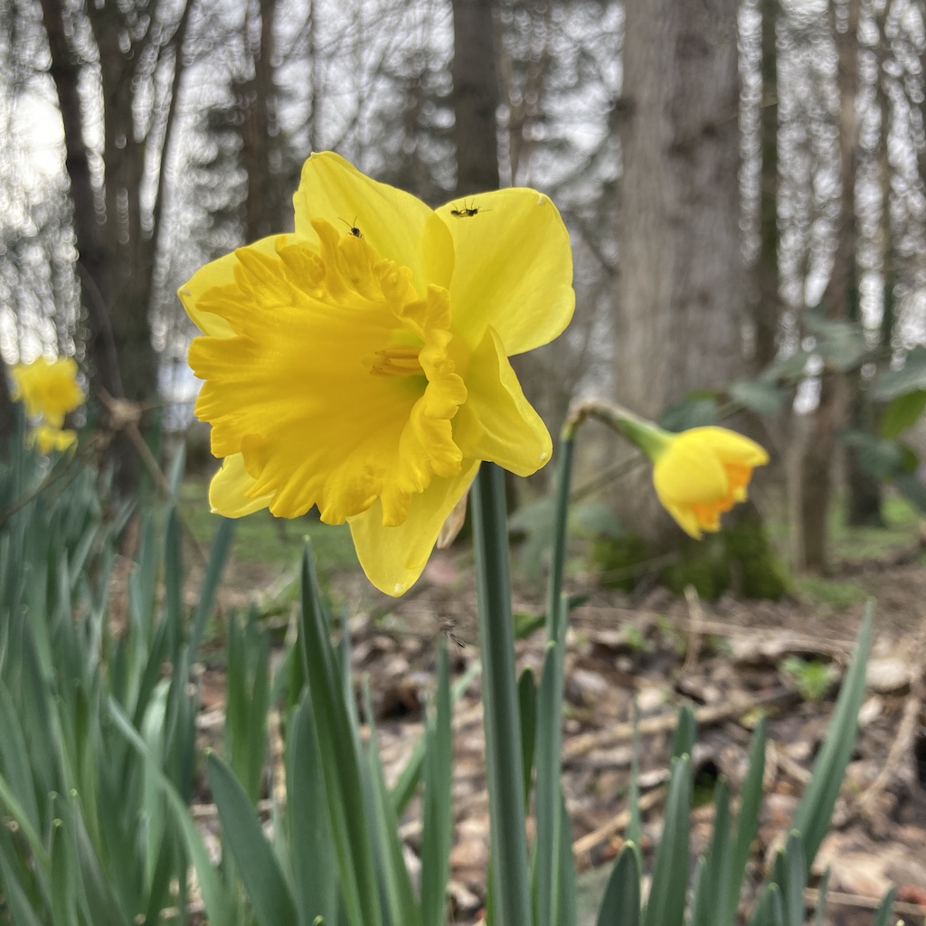
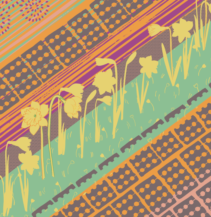
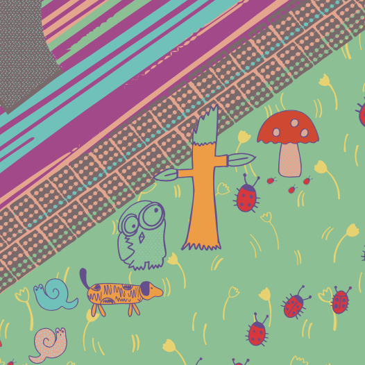
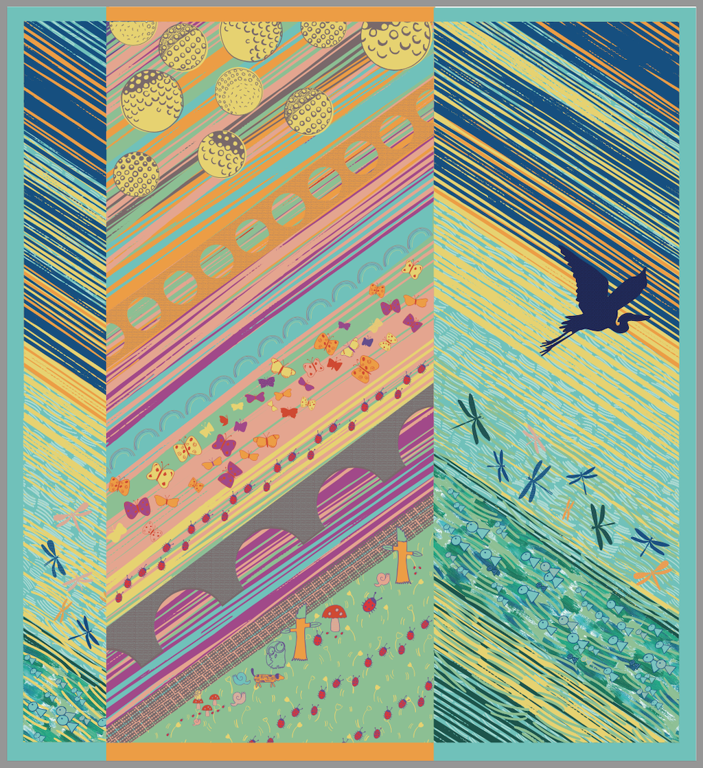
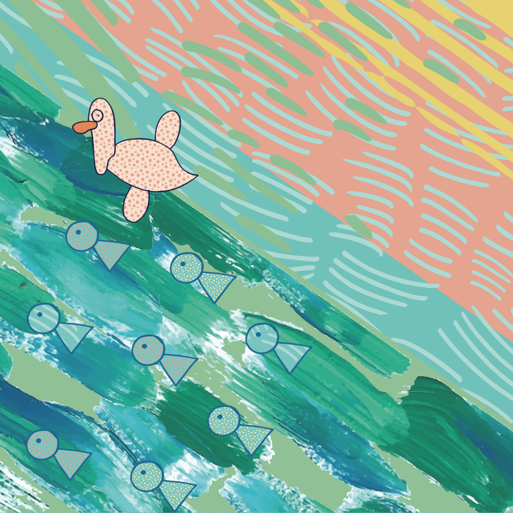
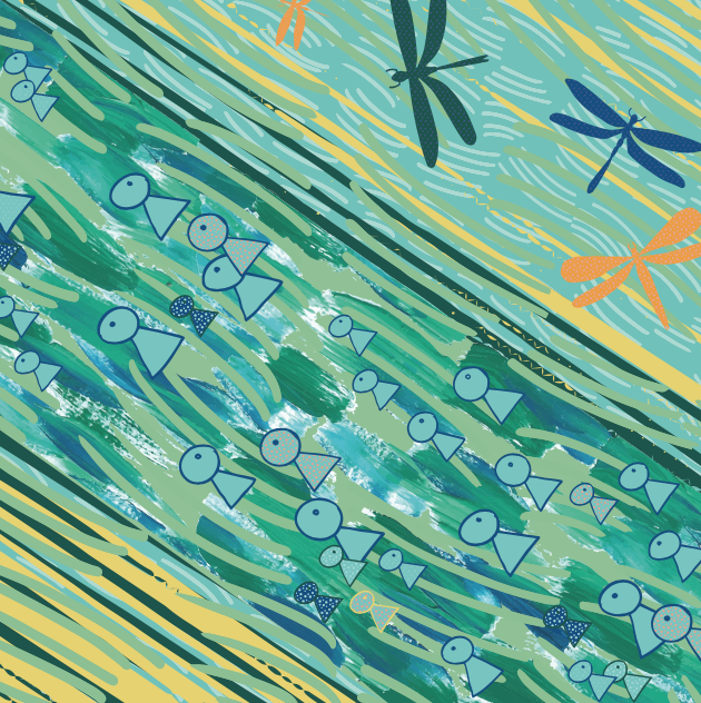
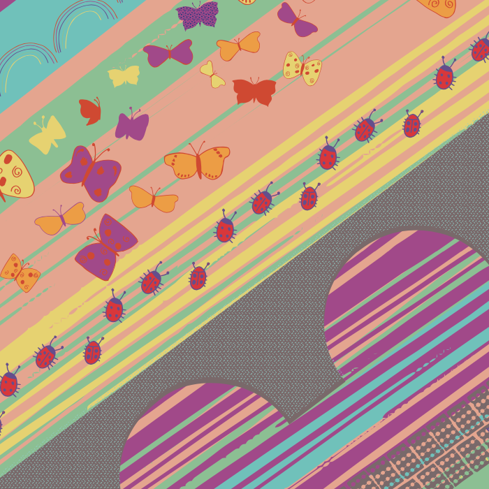
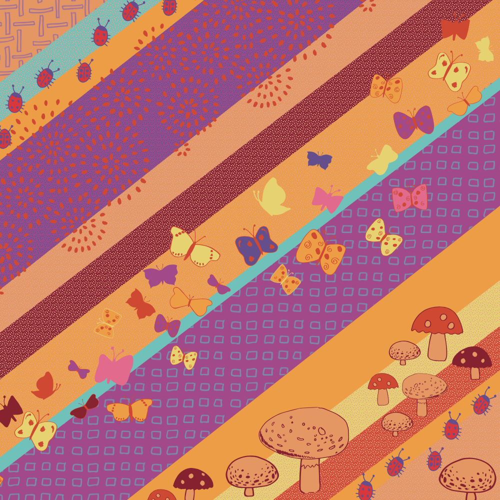
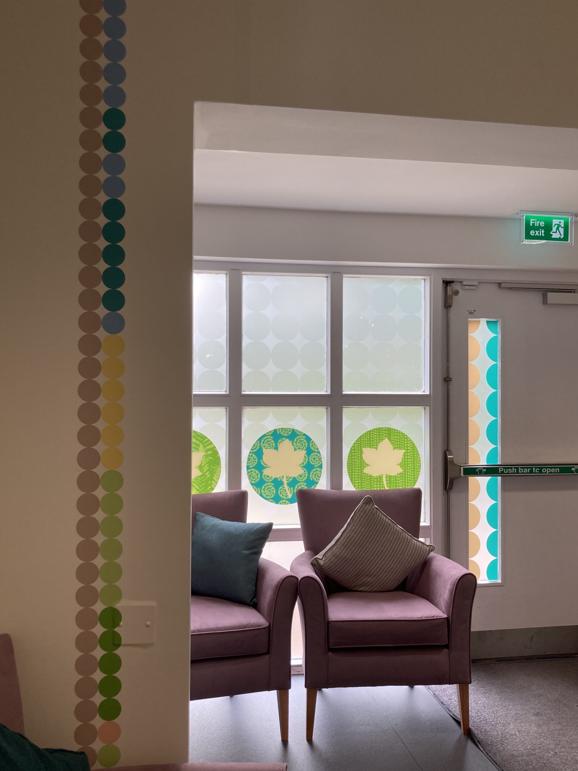
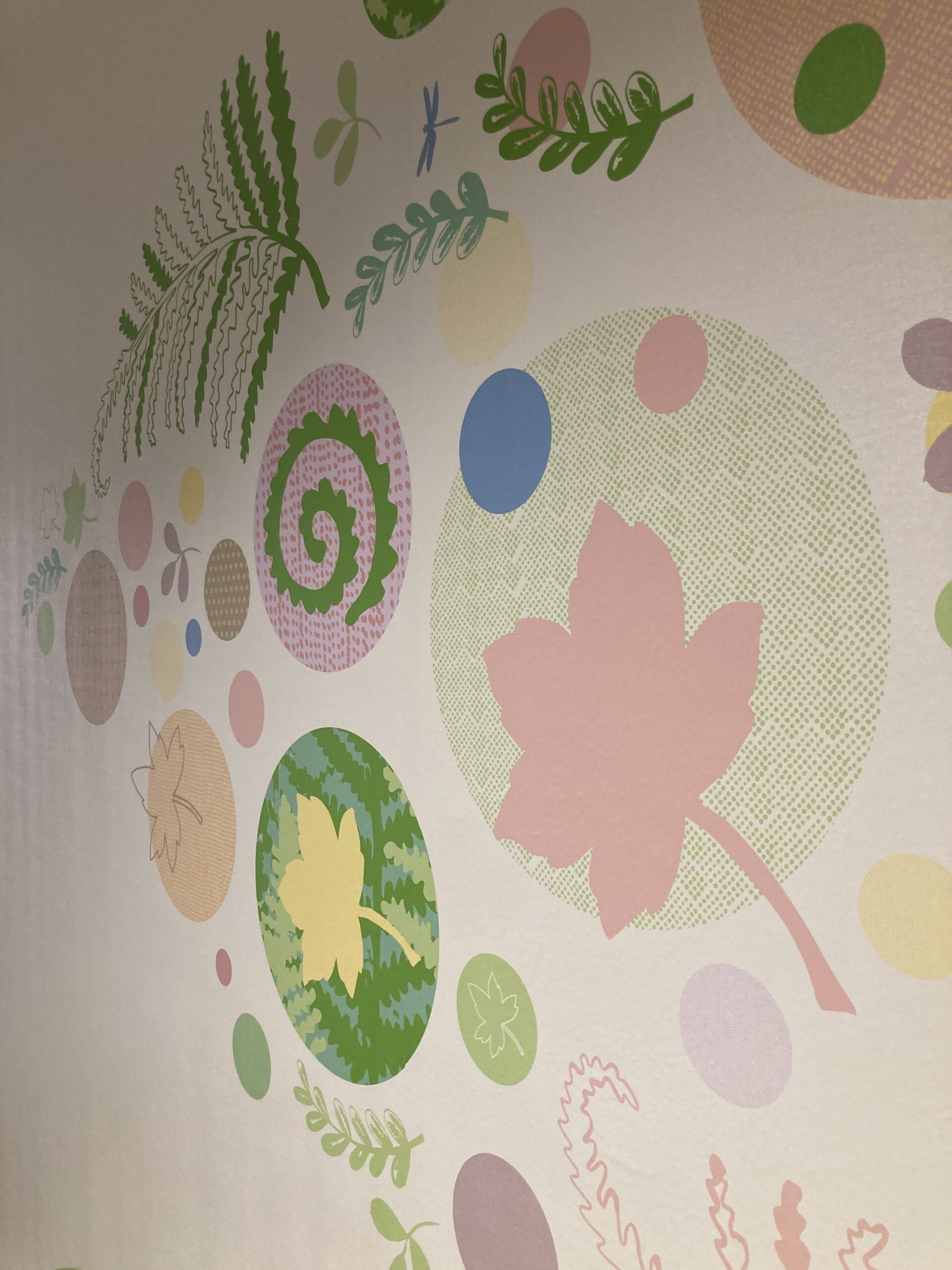
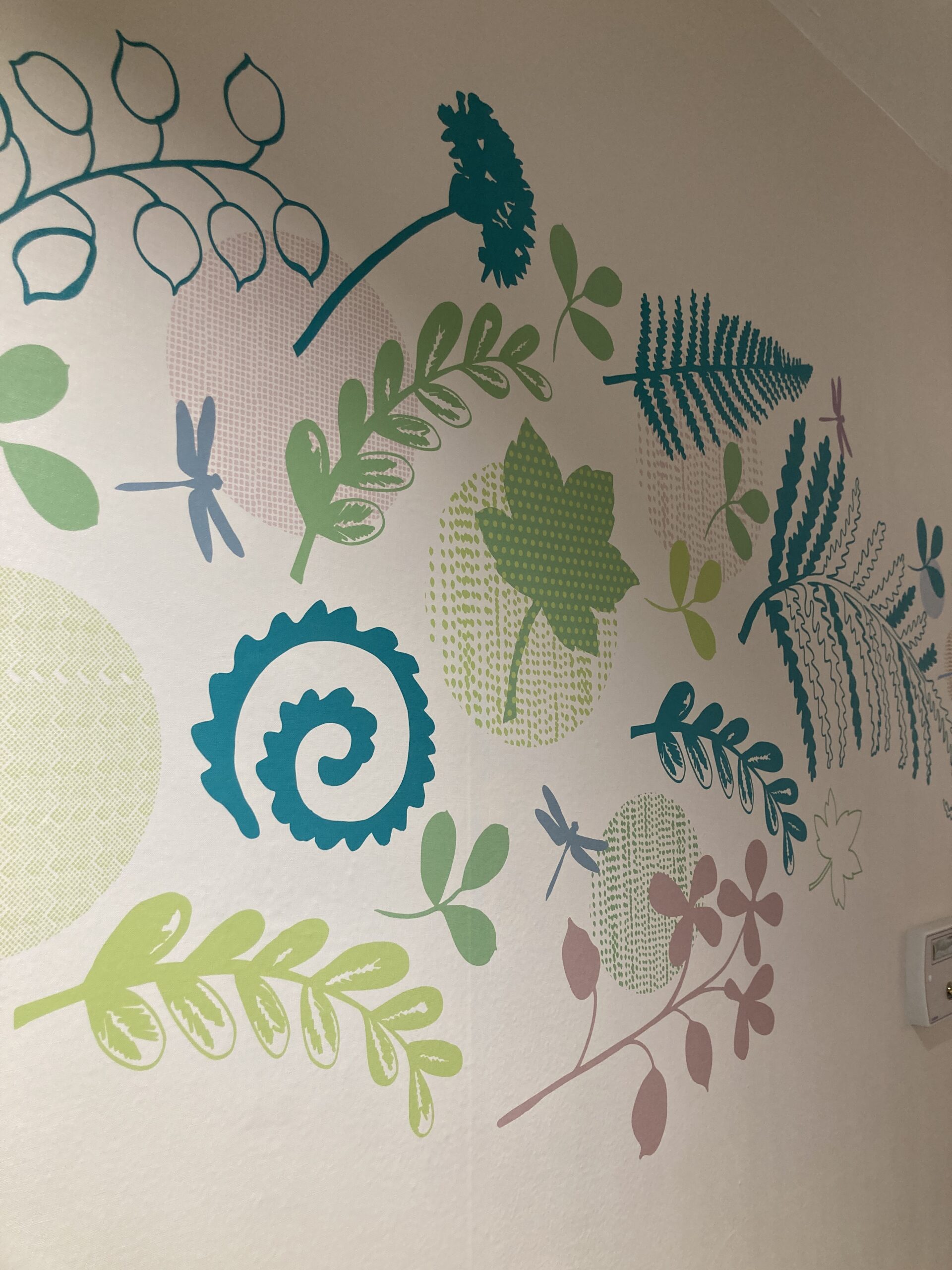
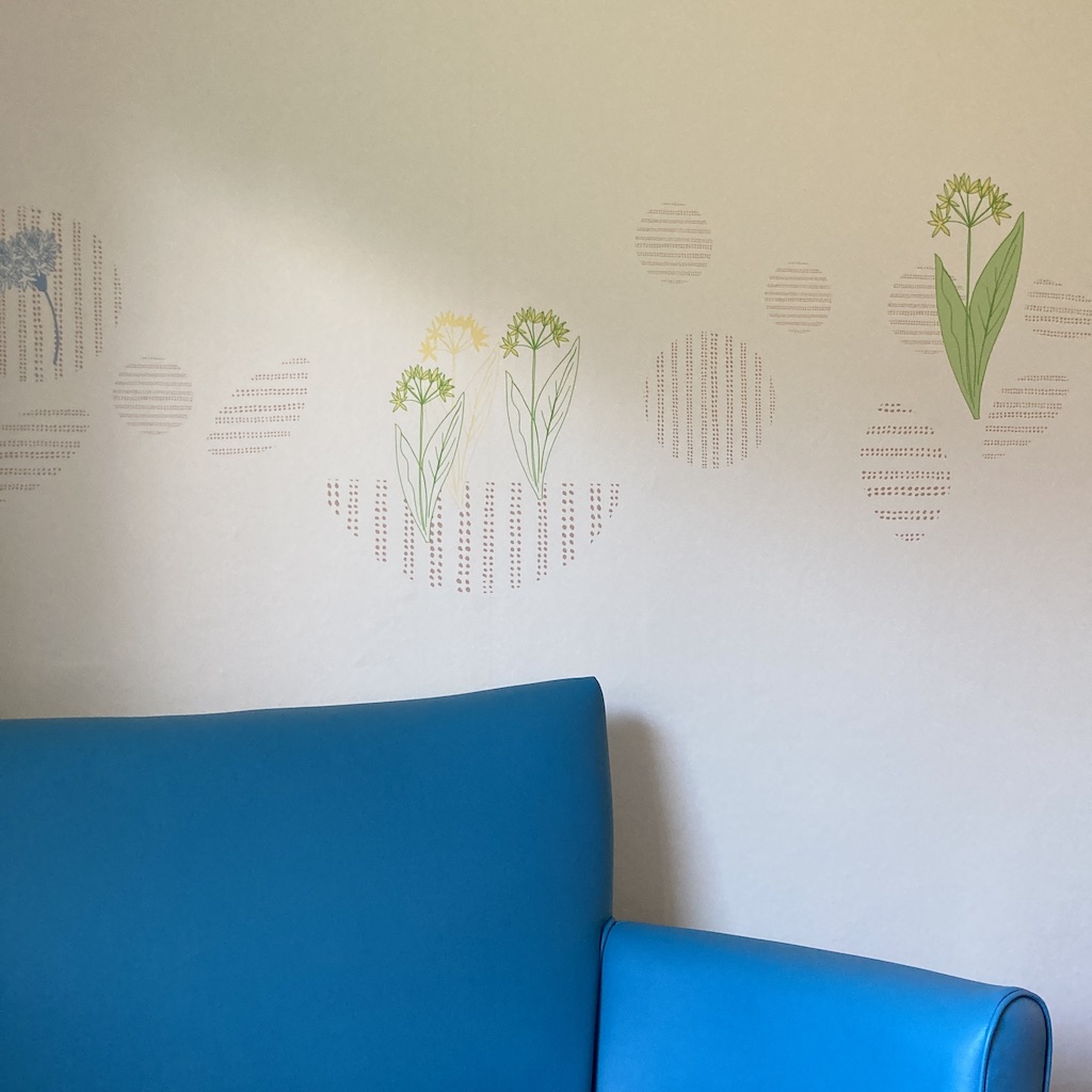
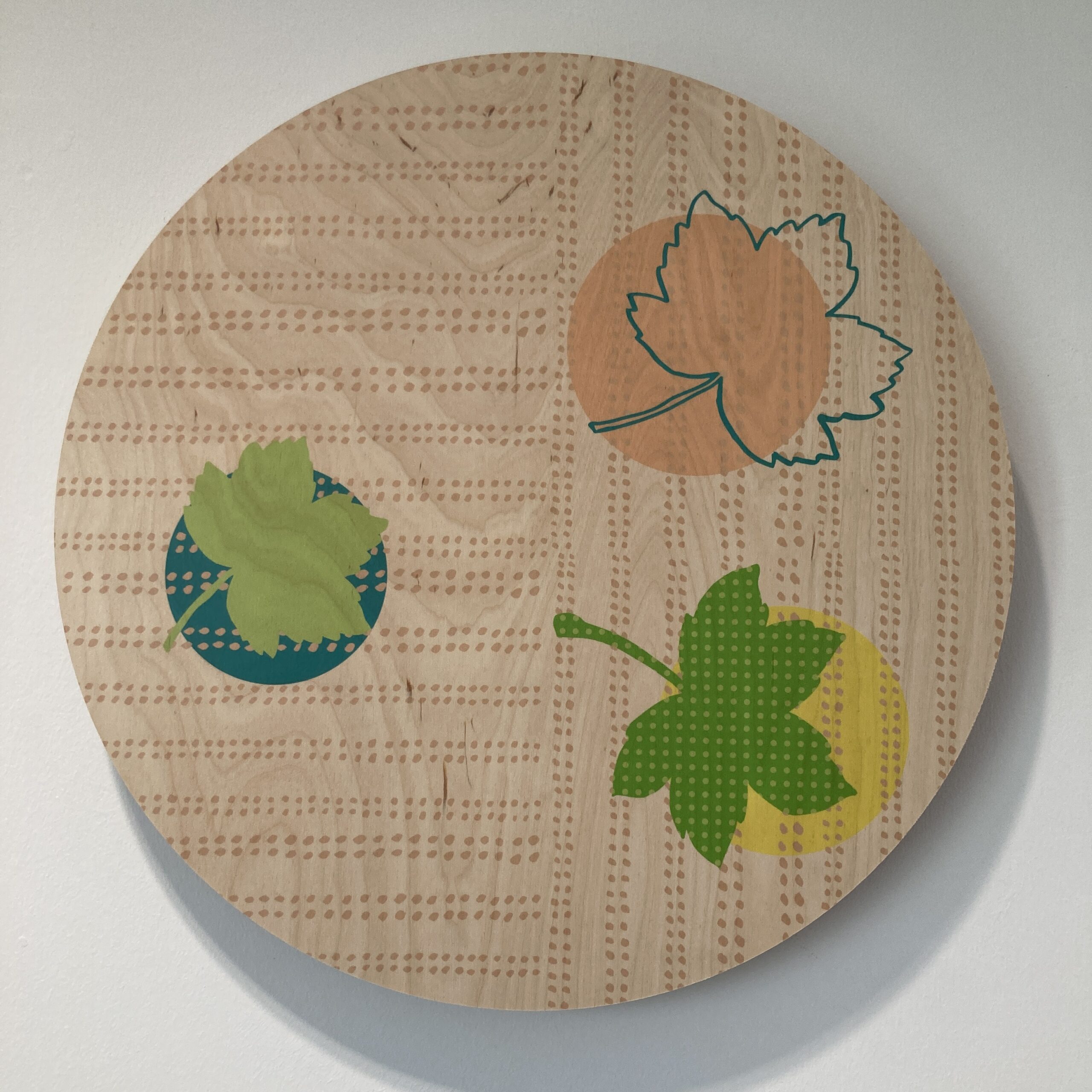
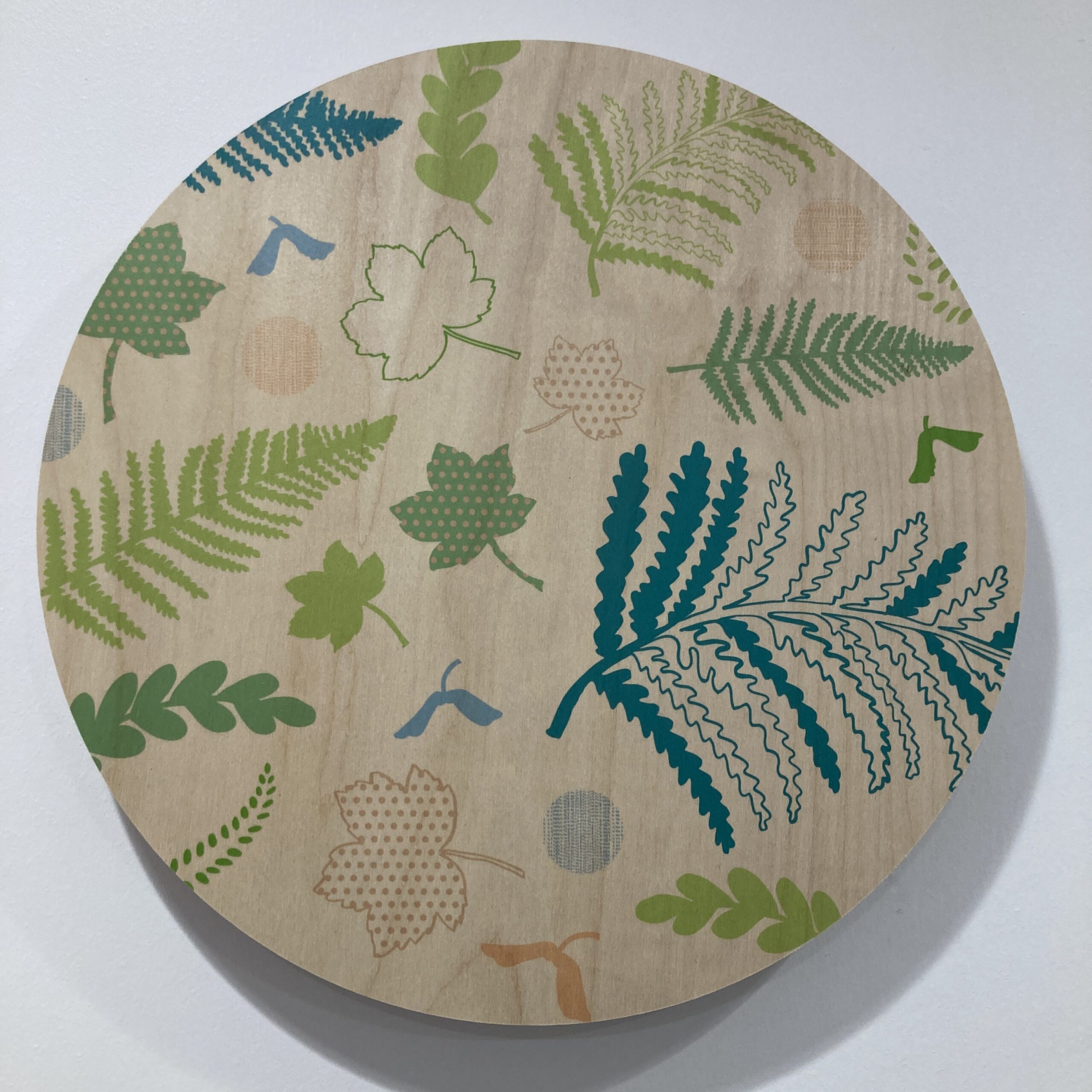
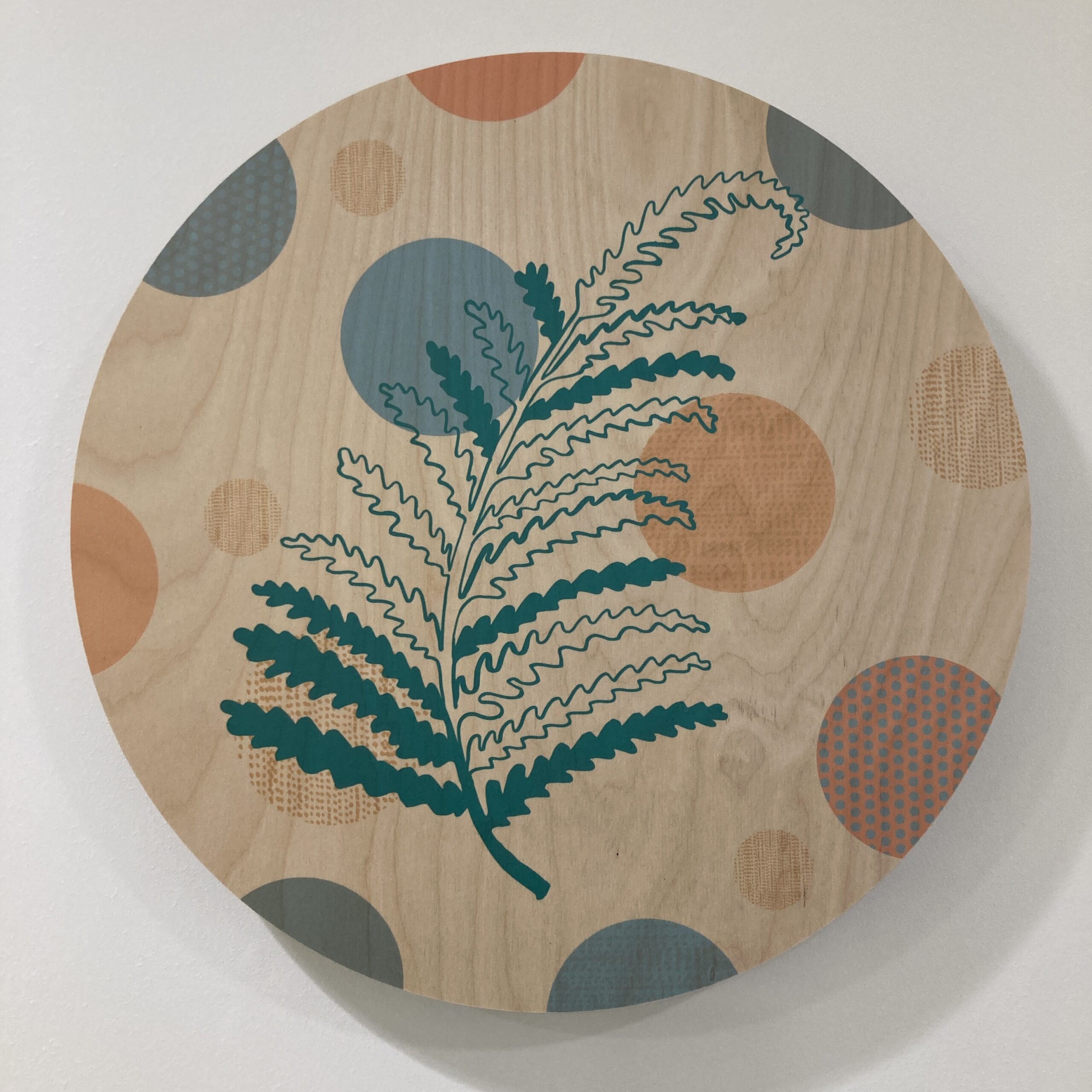
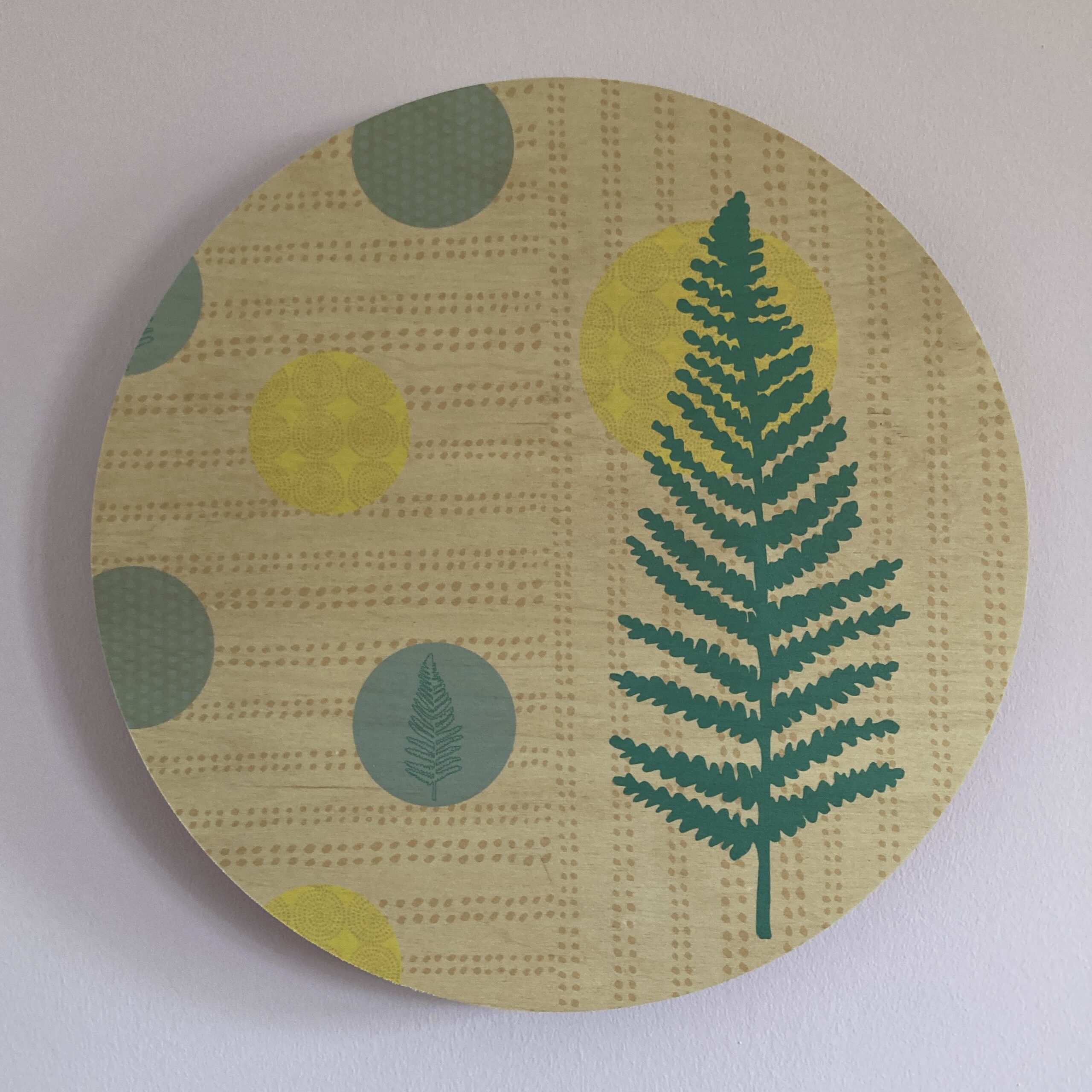
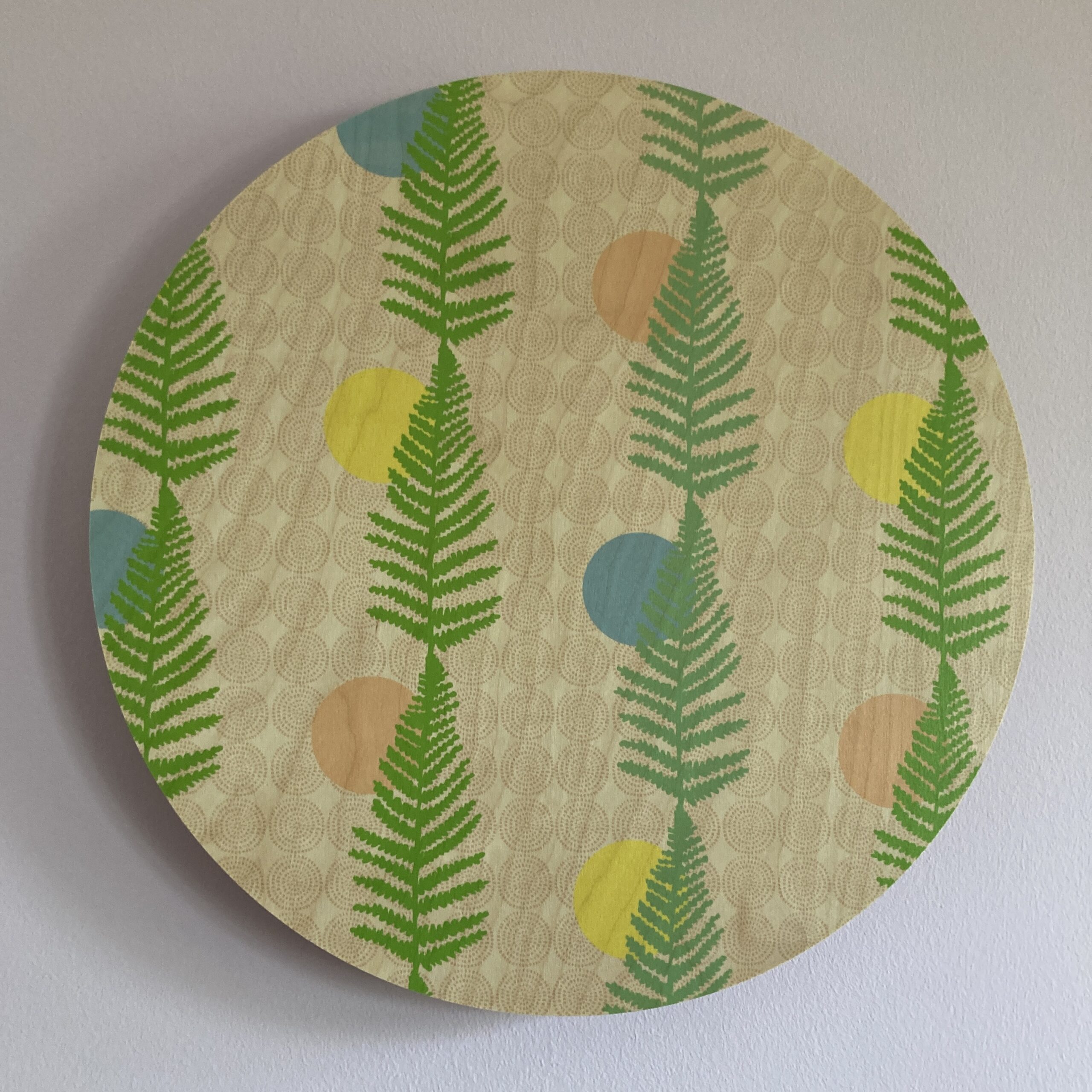
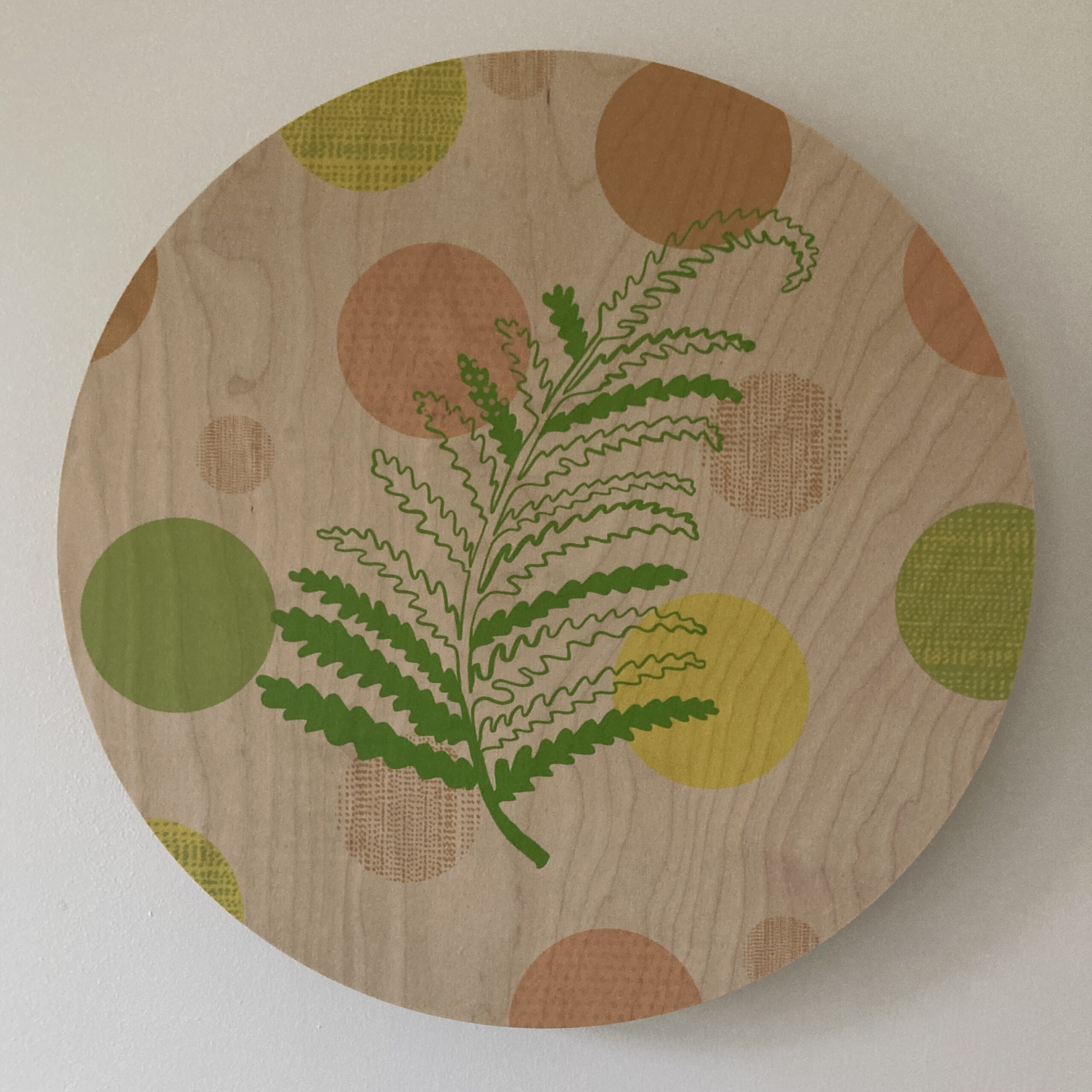
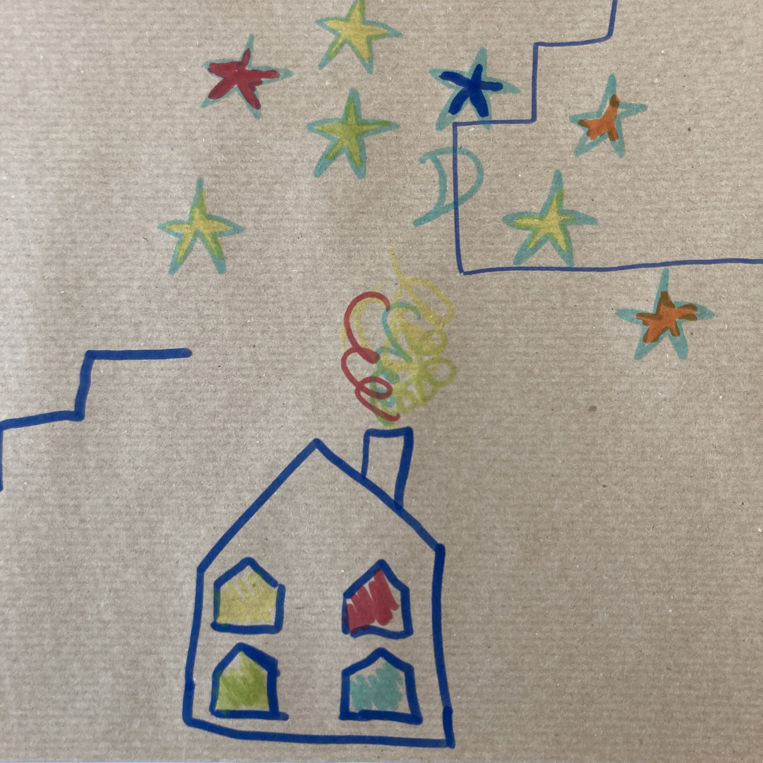
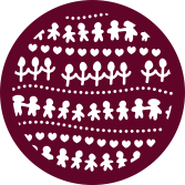
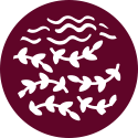
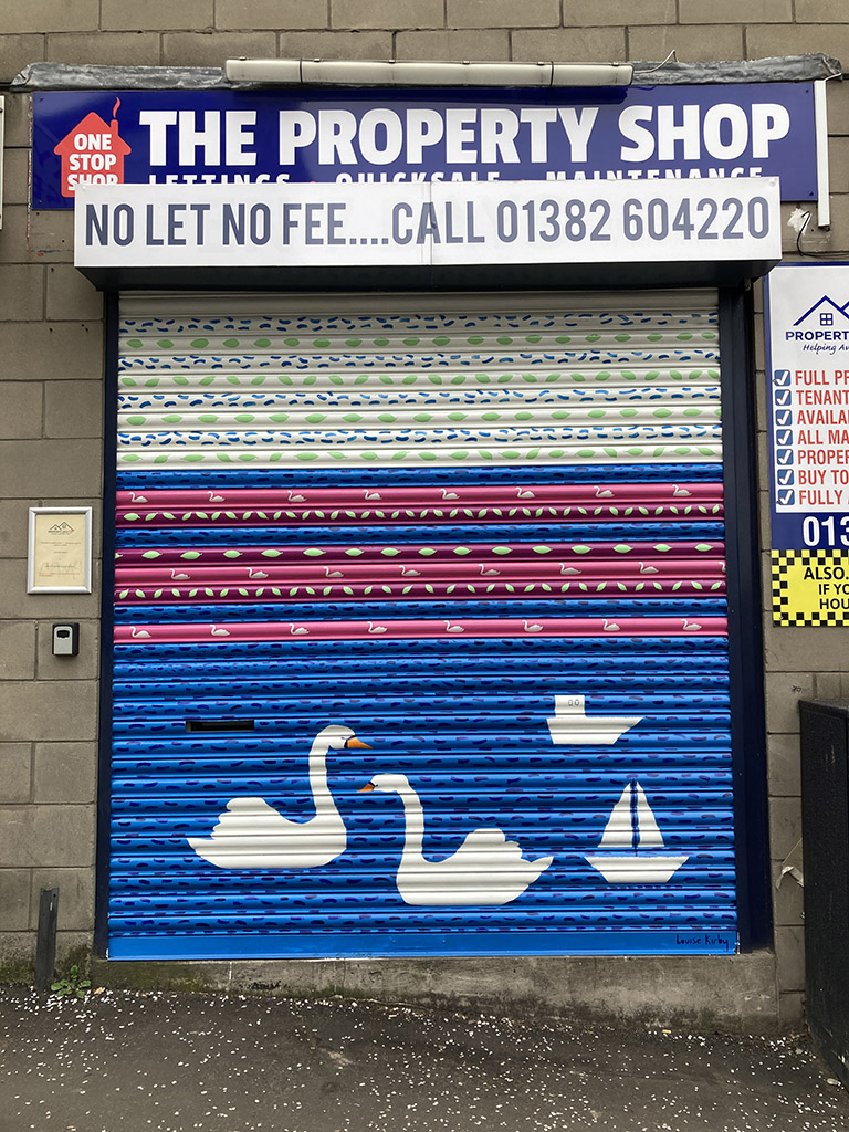
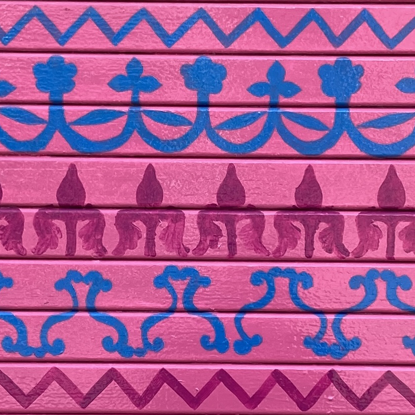
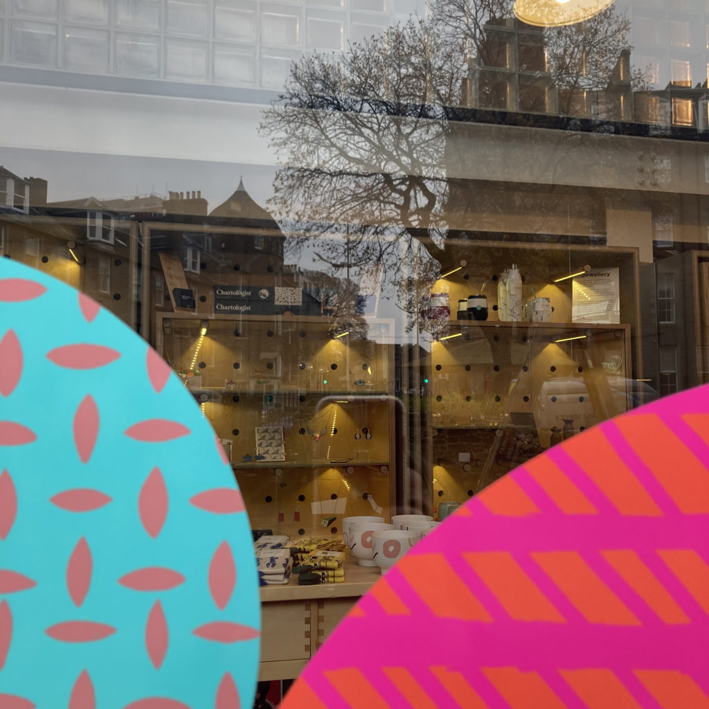
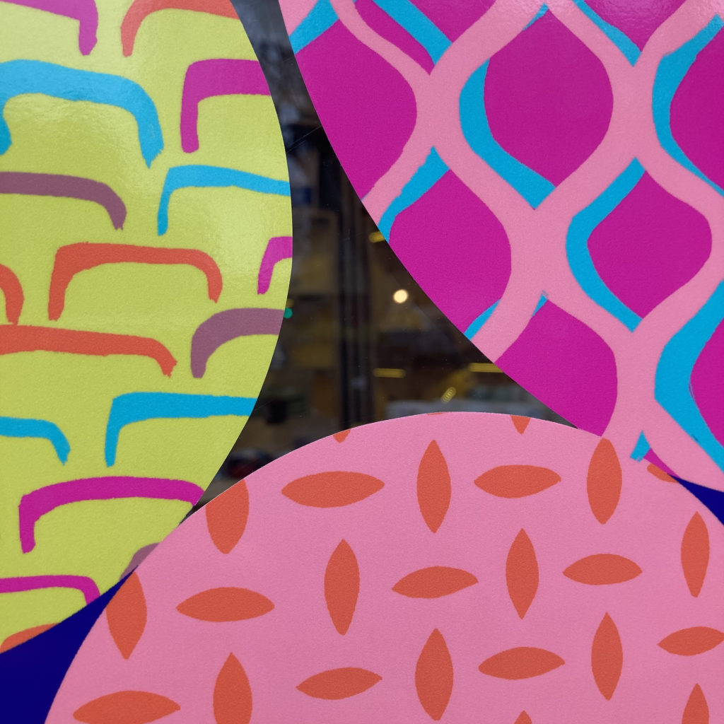
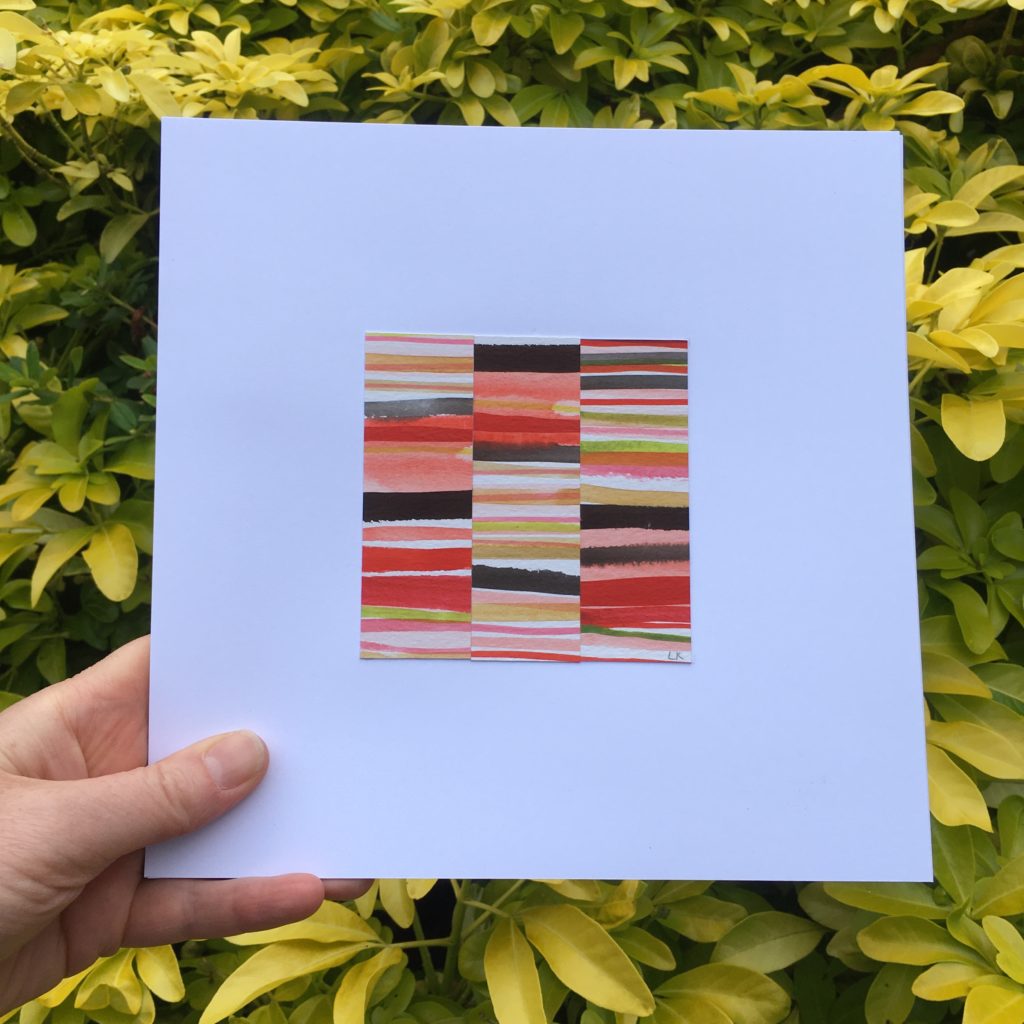
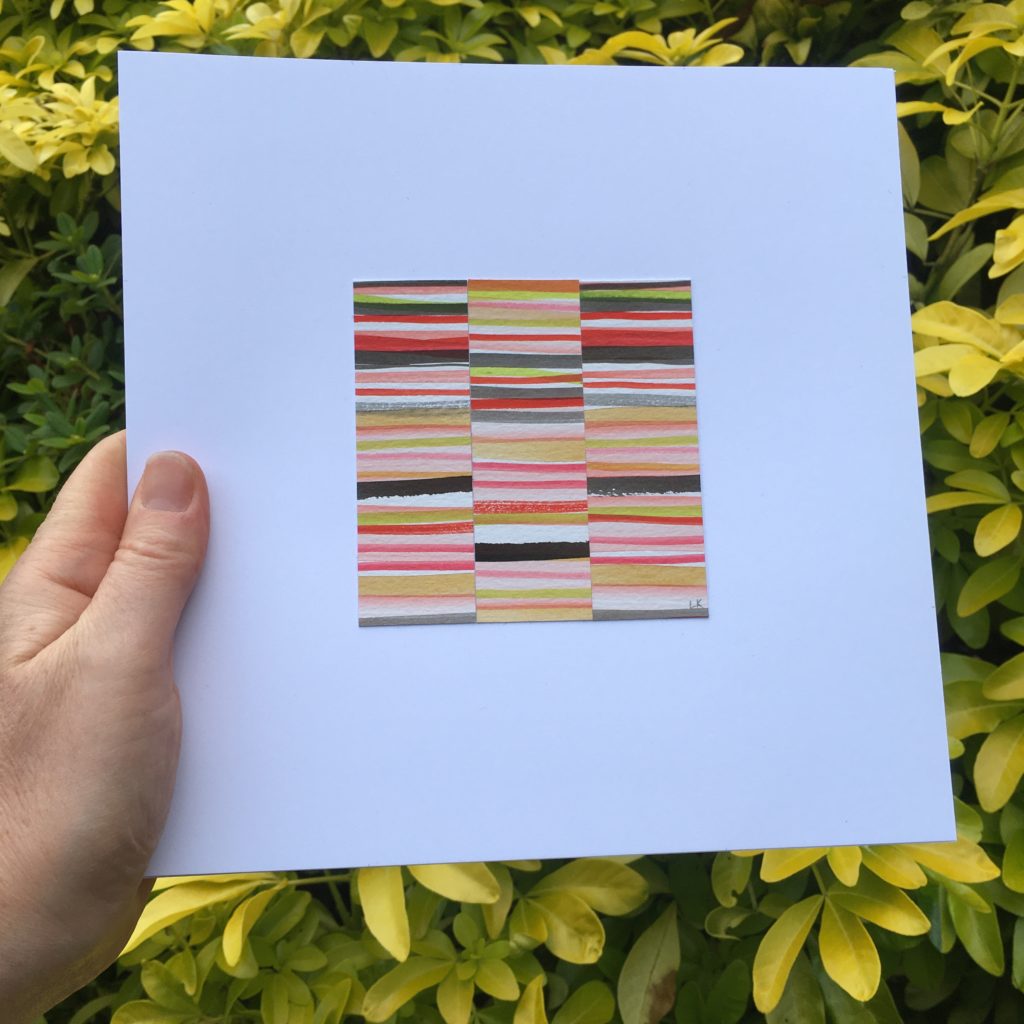
View 2 – Uplifting warm colours with positive imagery playfully combined highlighting local features on The Tay – daffodils along the bank, butterflies flying, mushrooms, ladybirds, golf, heather, bridges, flowers, swans.
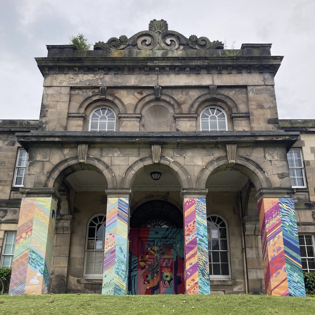
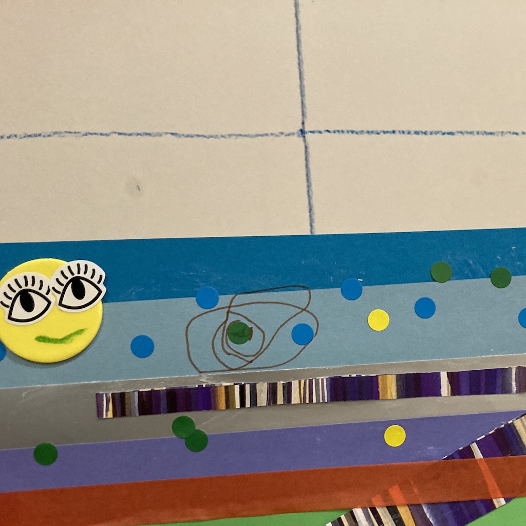
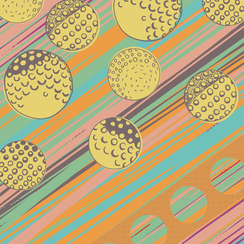
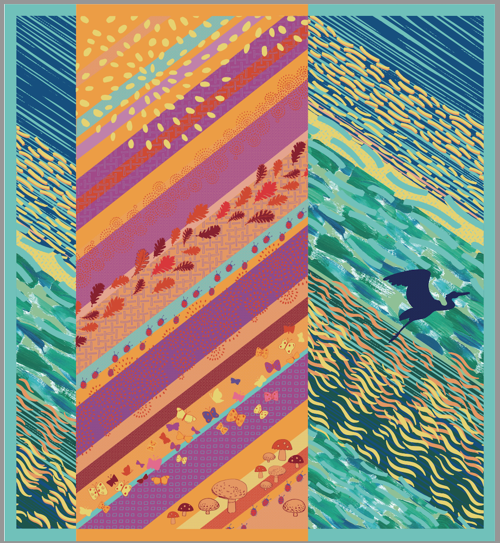
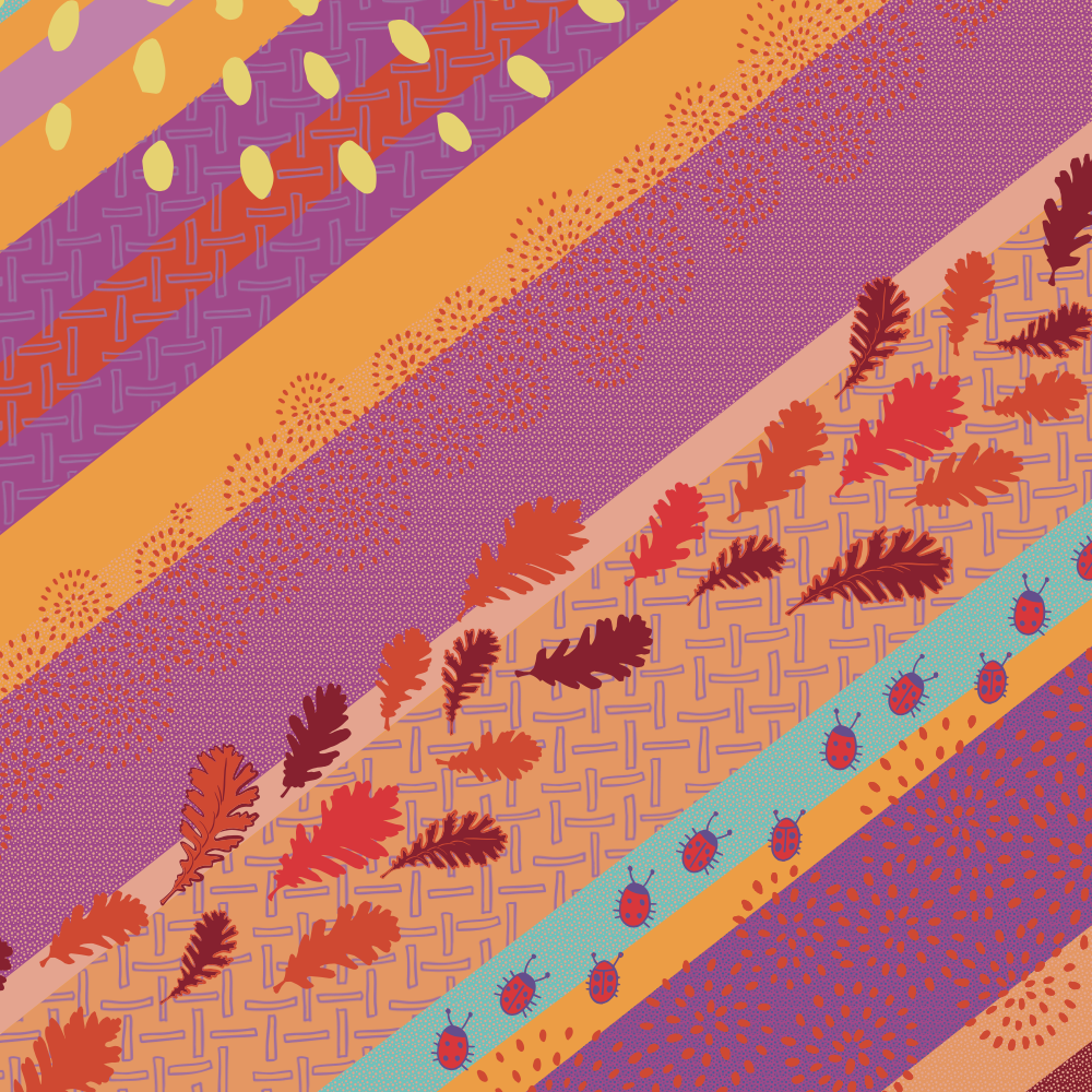
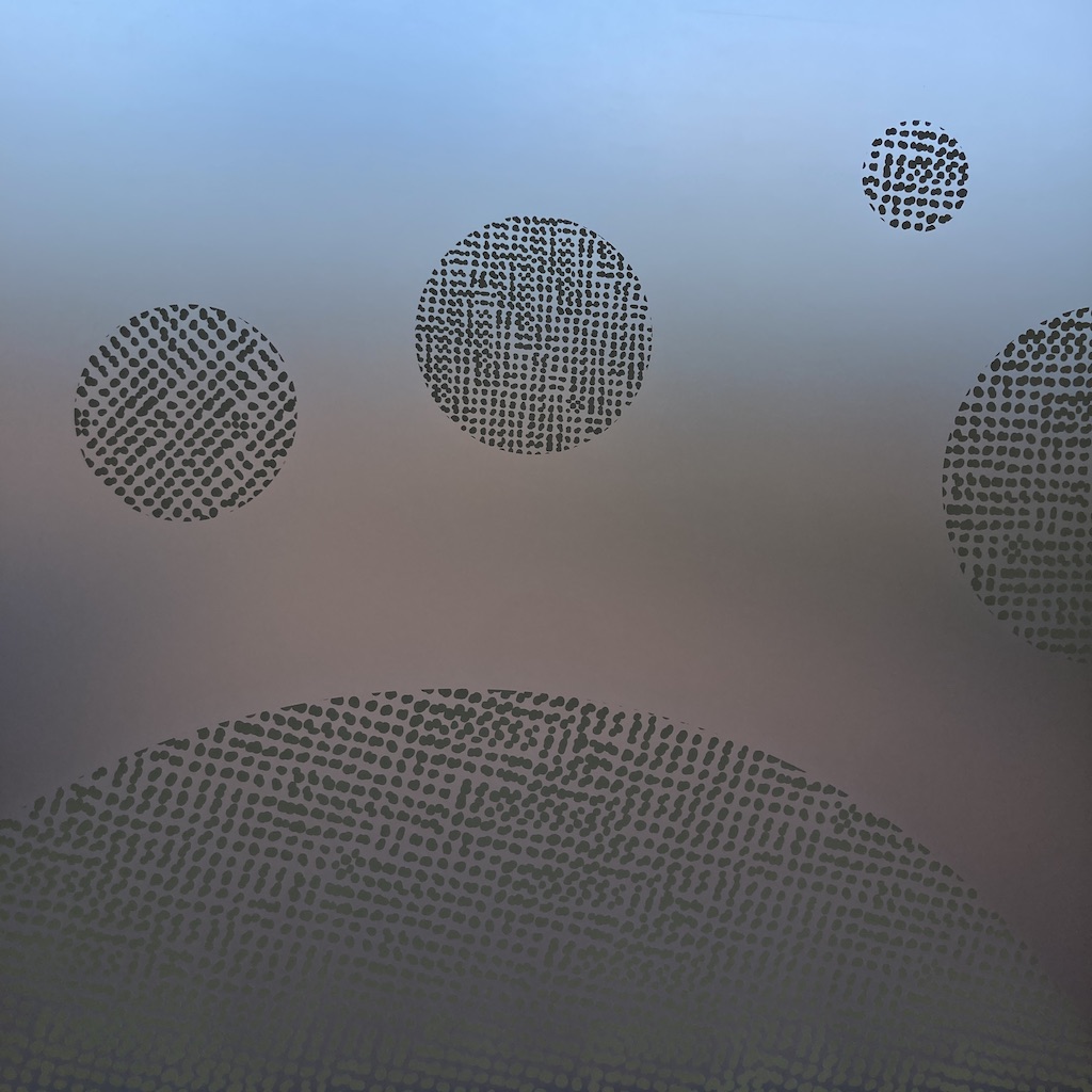
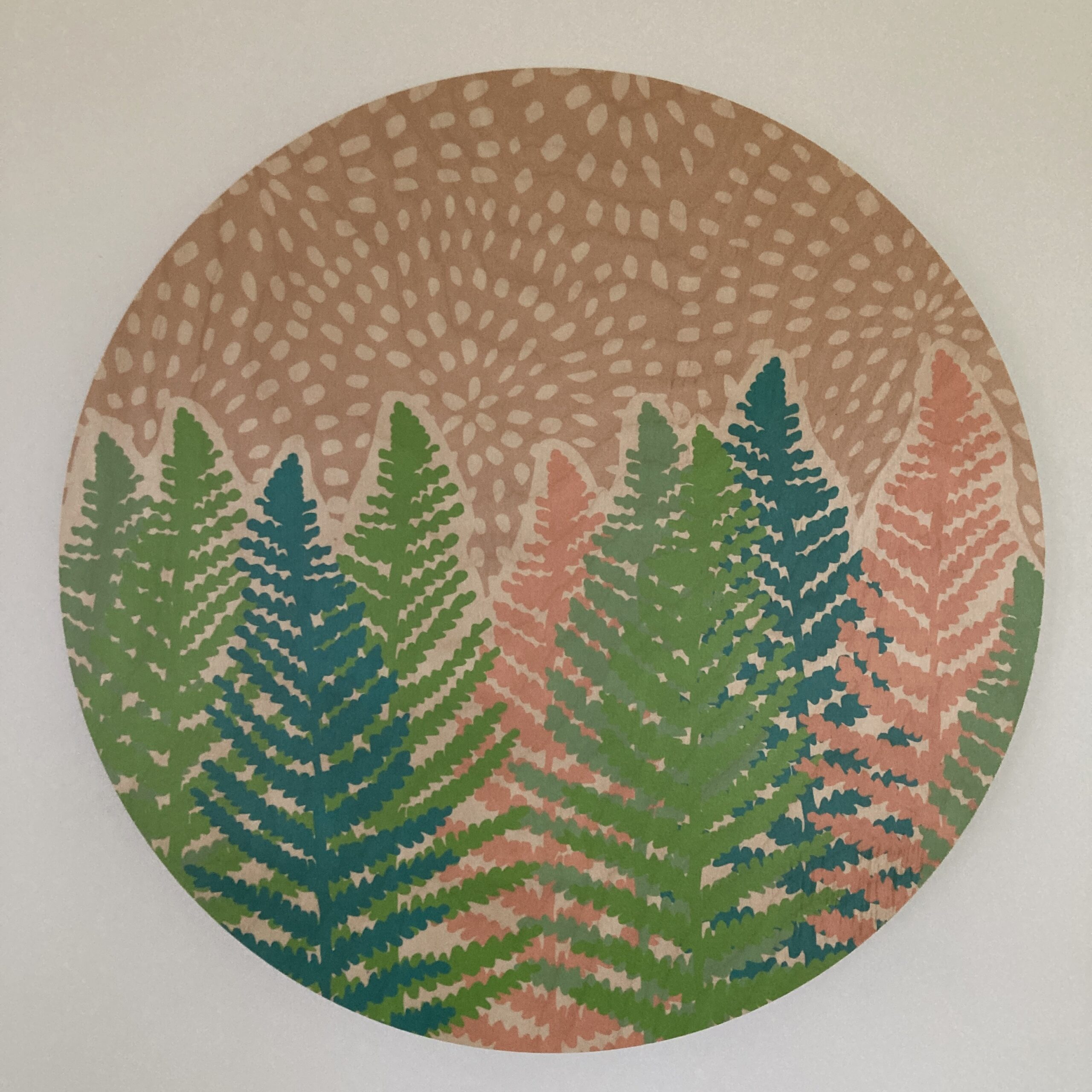
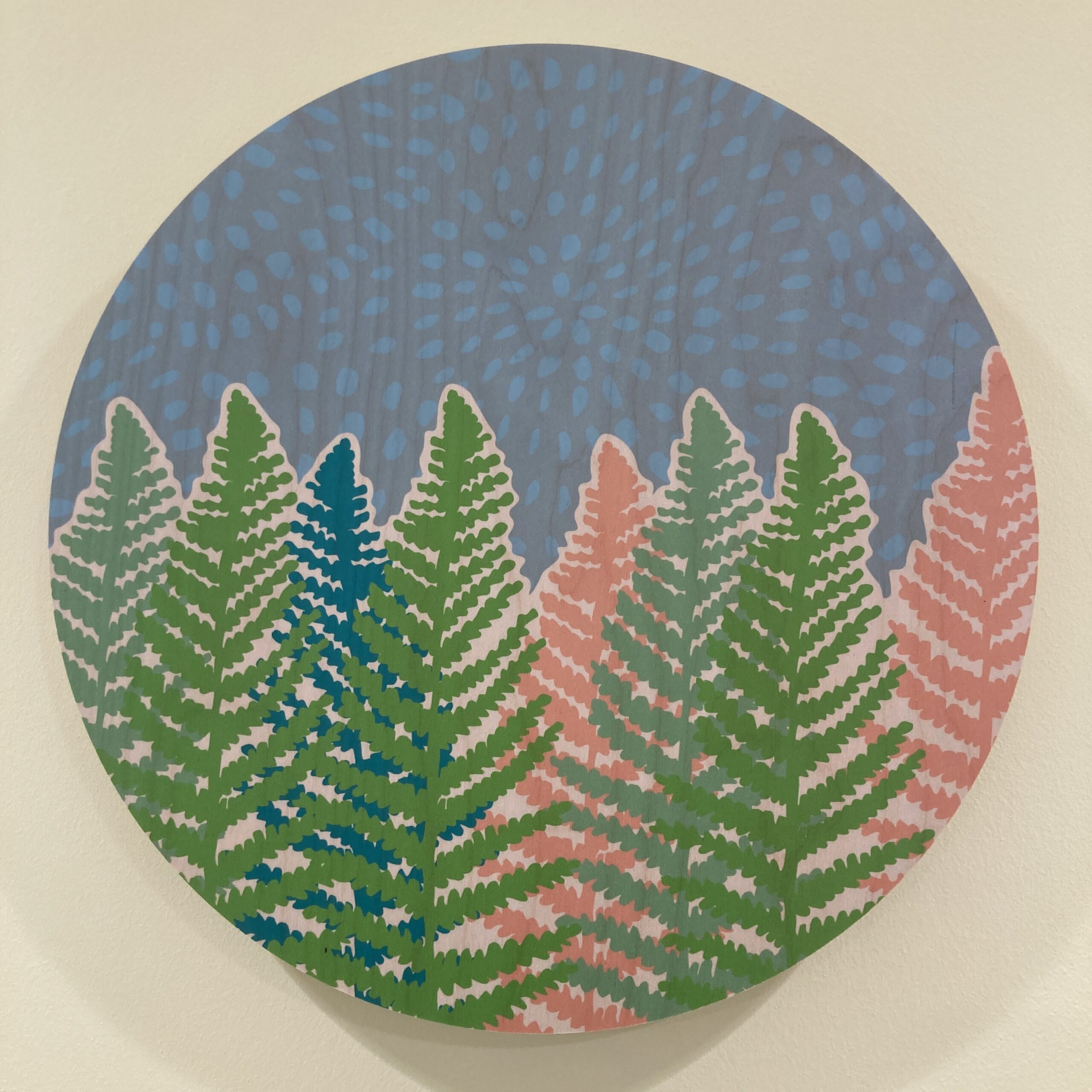
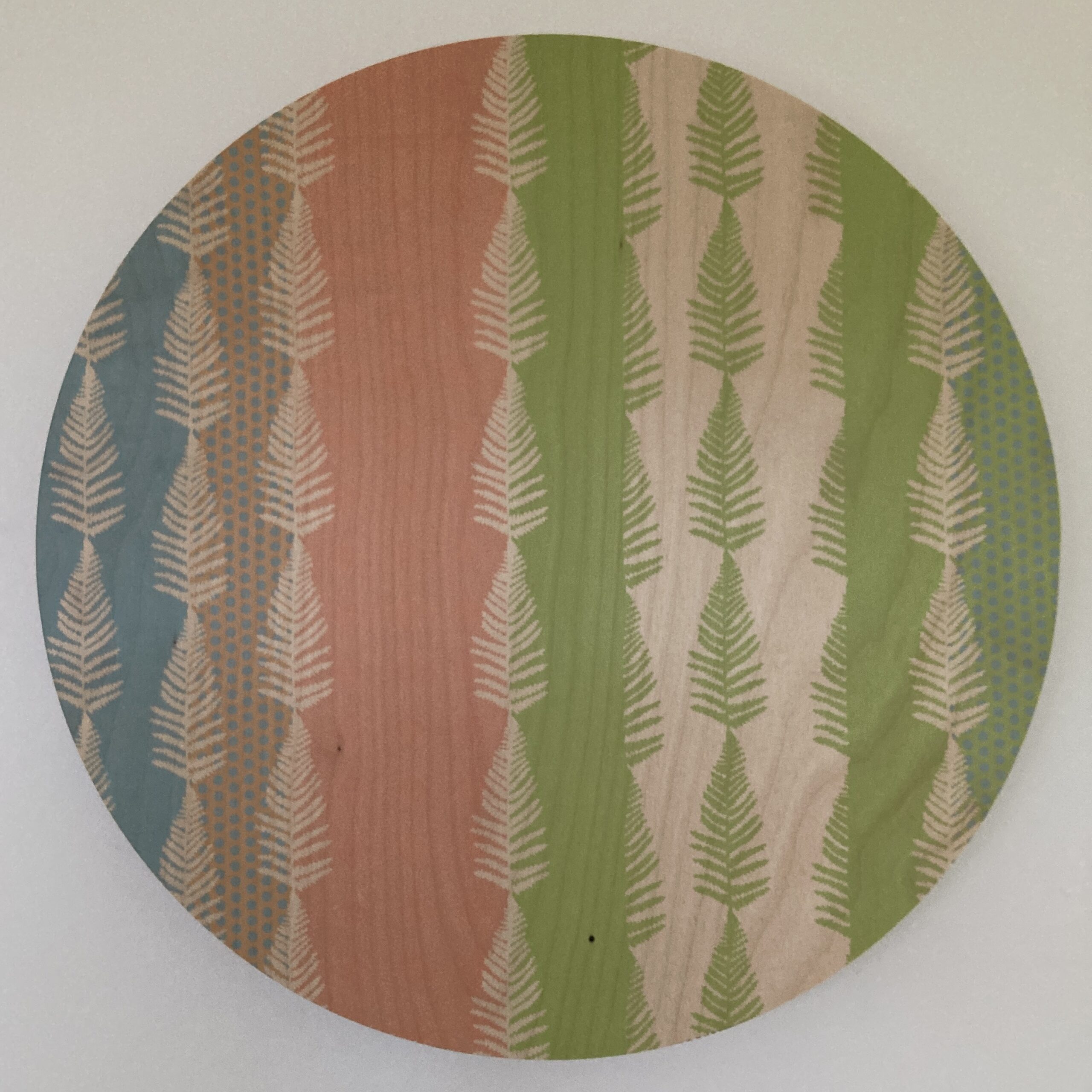
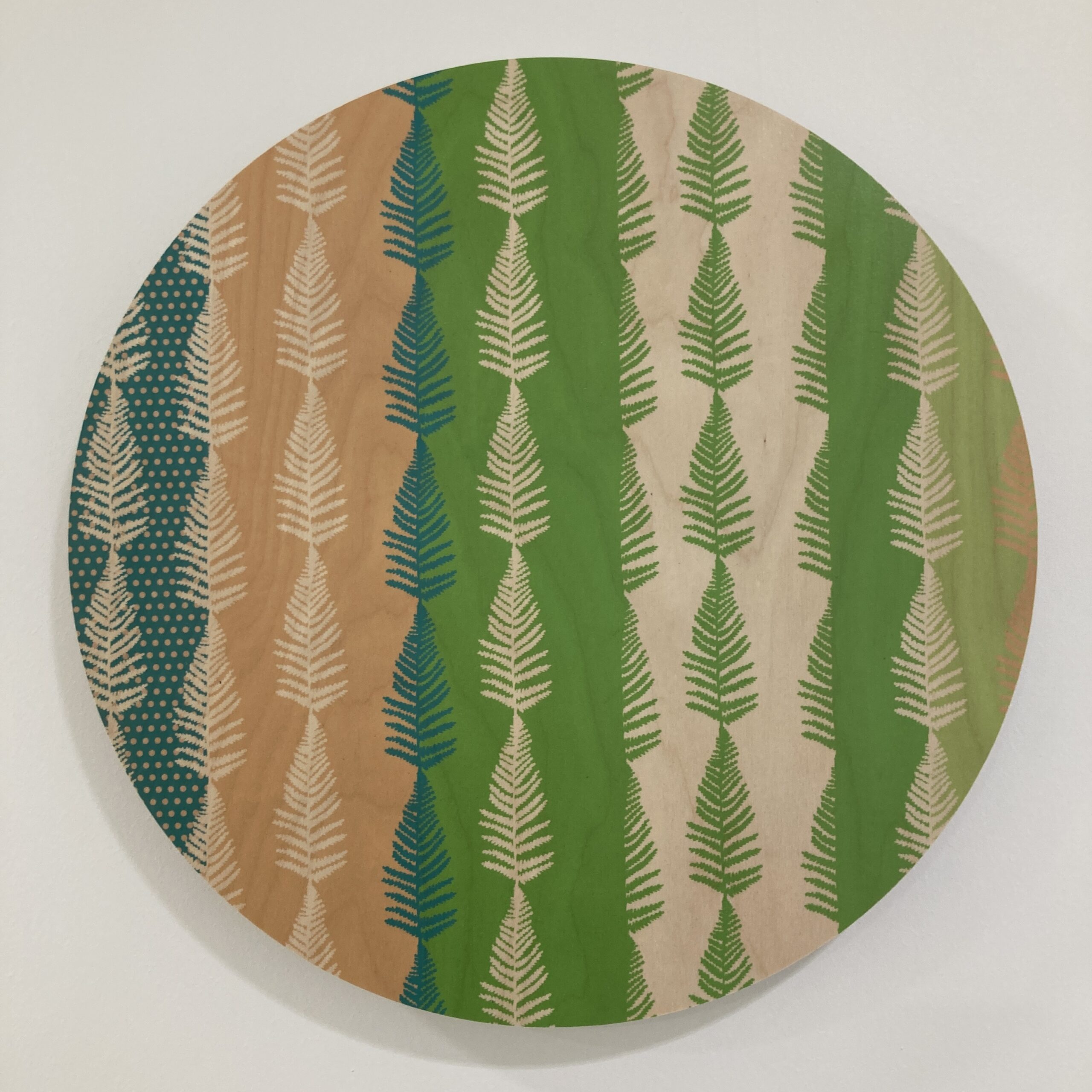
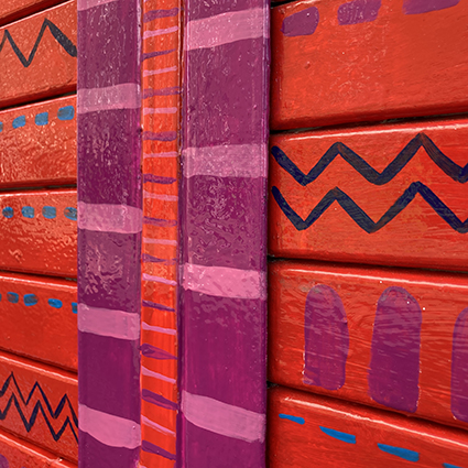
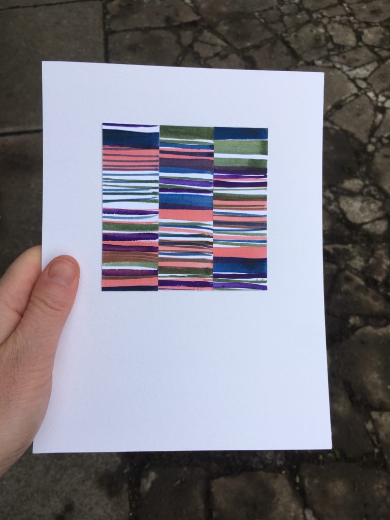
View 3 – The chevron striped artworks are seen from a distance bringing attention to the building. The contrast of colour and patterns flow from one pillar to the next, from a more contrasting combination to a harmonious one, echoing gradual transformation.
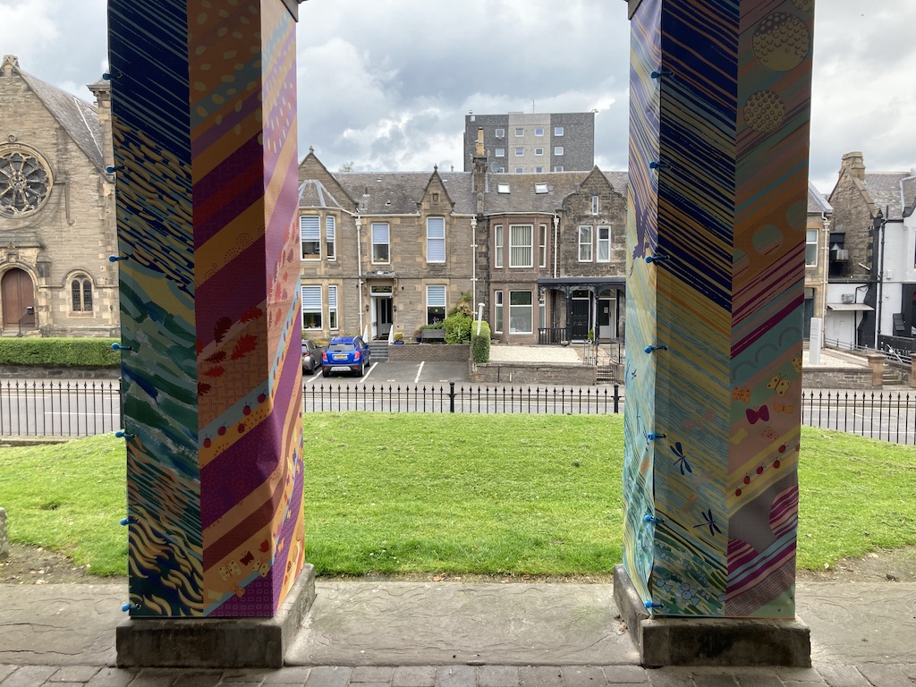
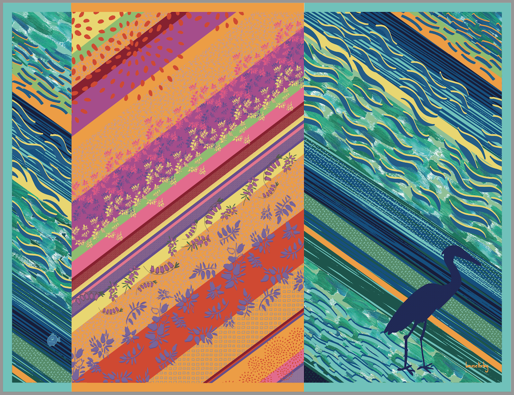
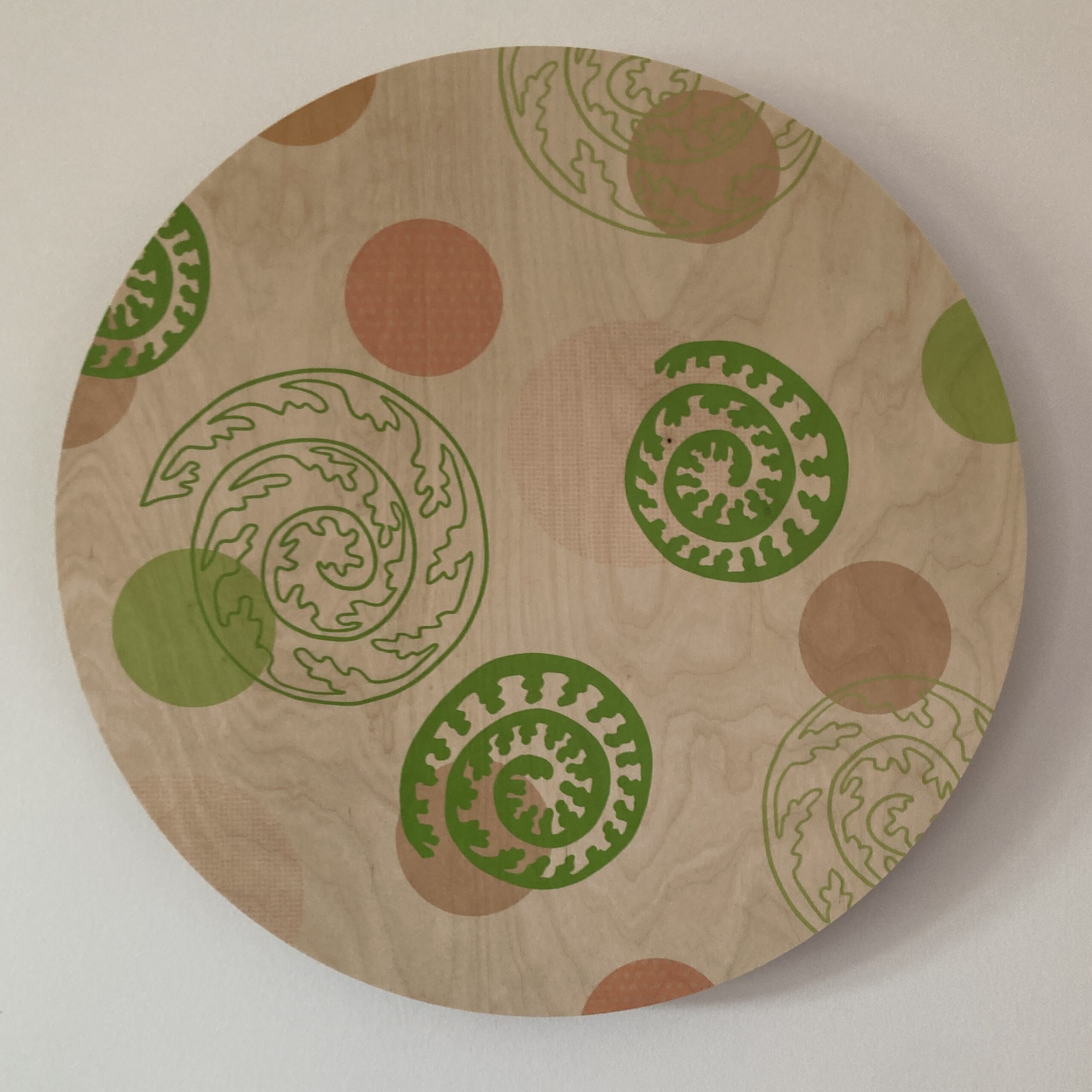
View 4 – As leaving the building or walking past you can see the chevron stripe with details of the pattern, imagery and texture closer up.
Consultation
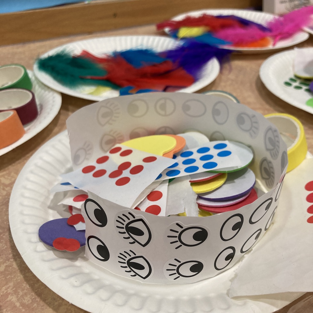
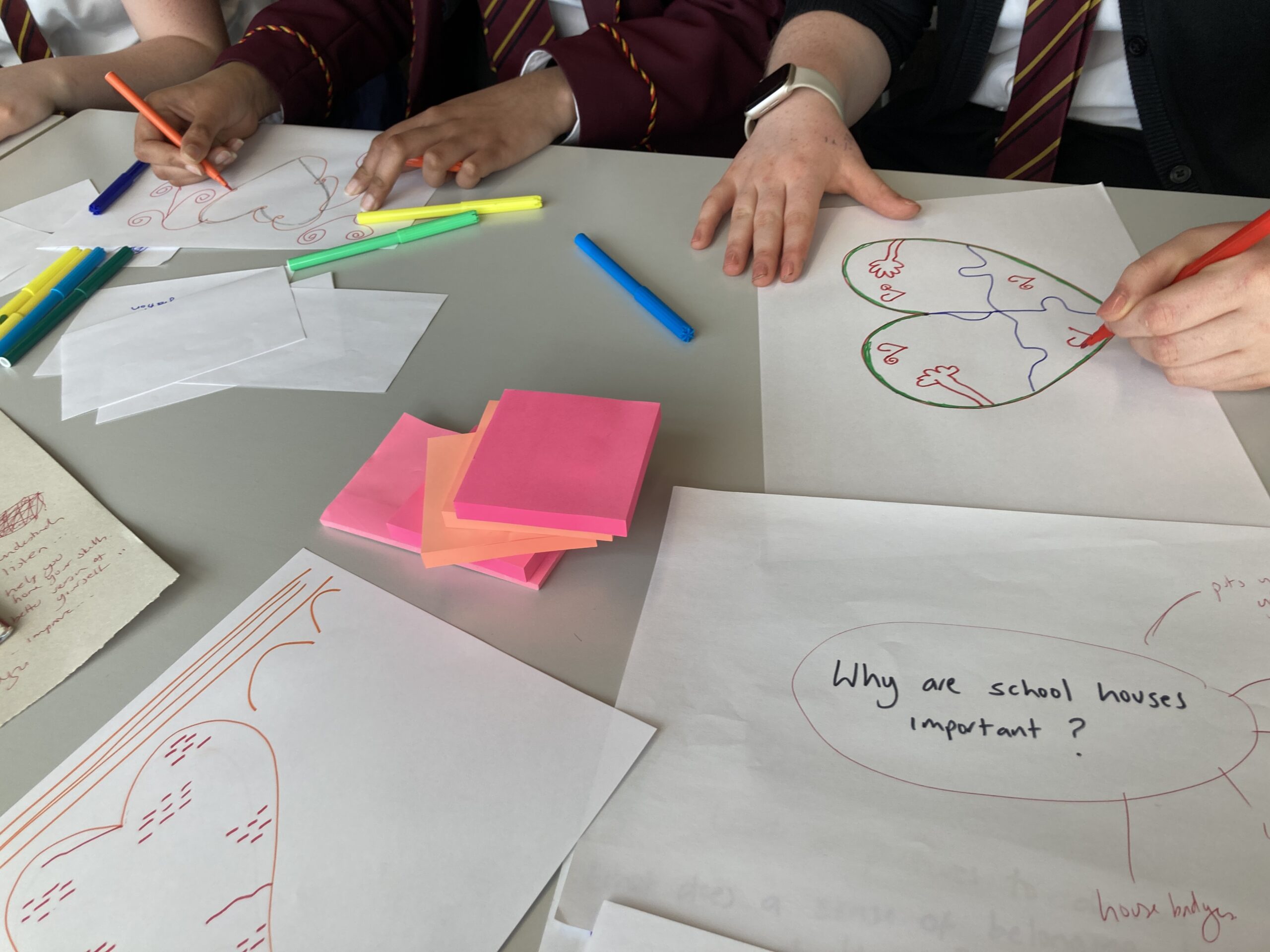
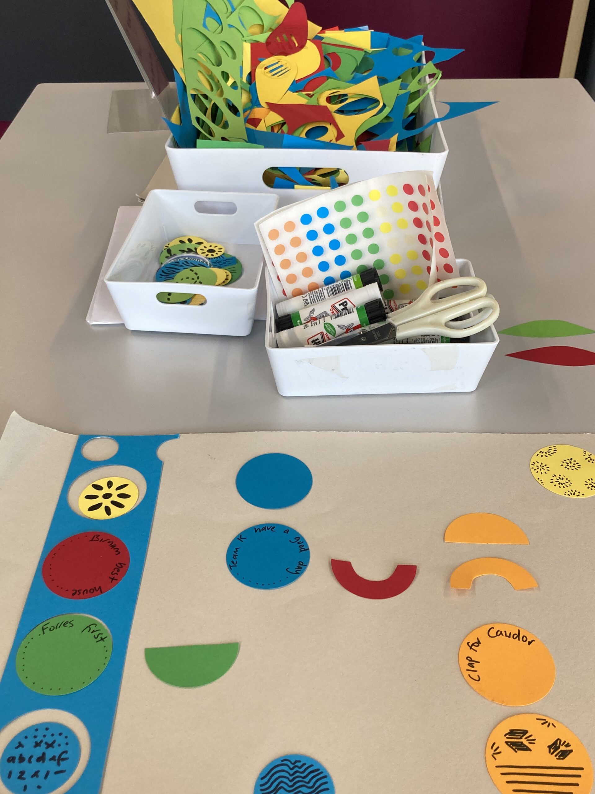
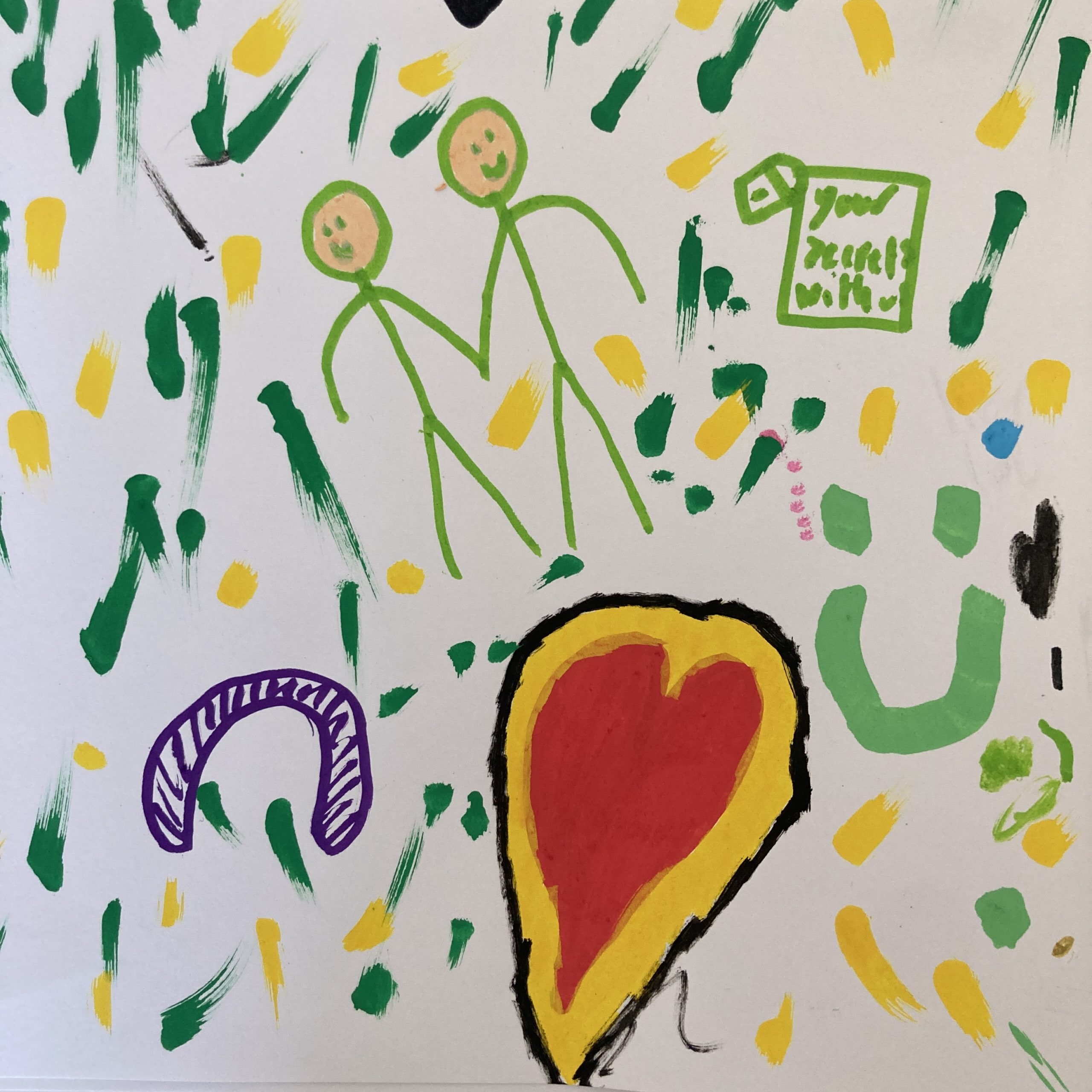
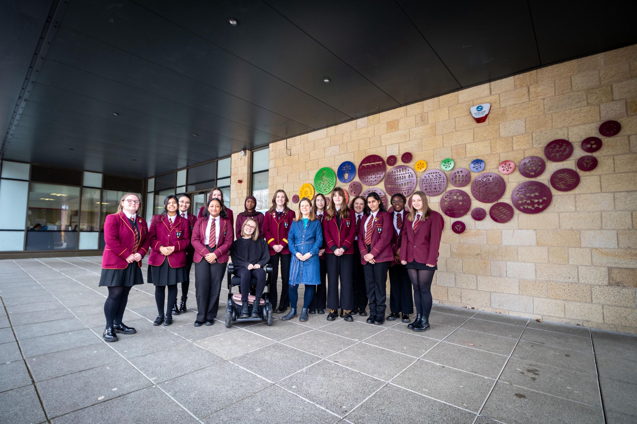
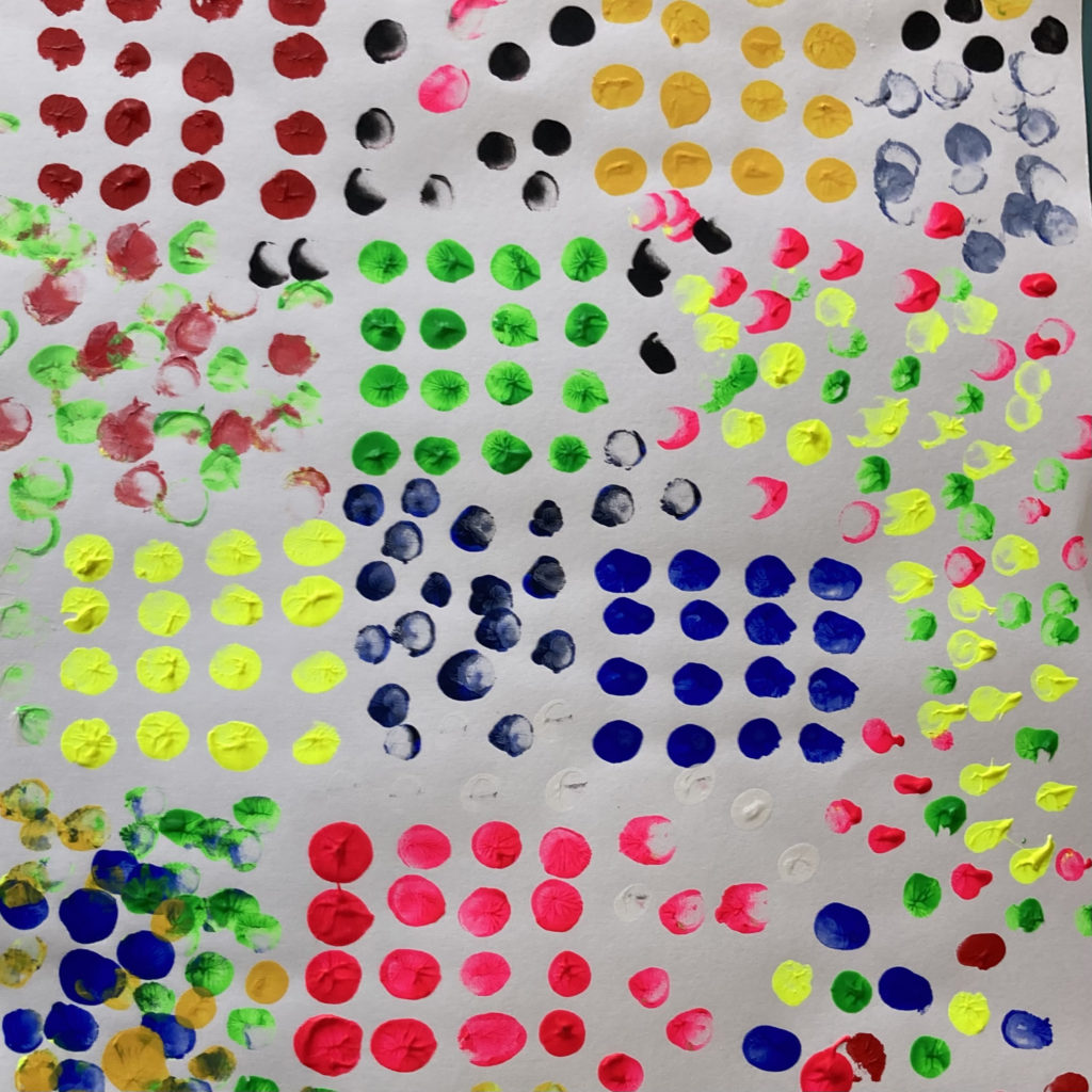
Artwork was informed by the consultation with: staff, a family workshop for 2-5 year olds and their adults, LGBTQ+ group and the knitting group that are held in the library.
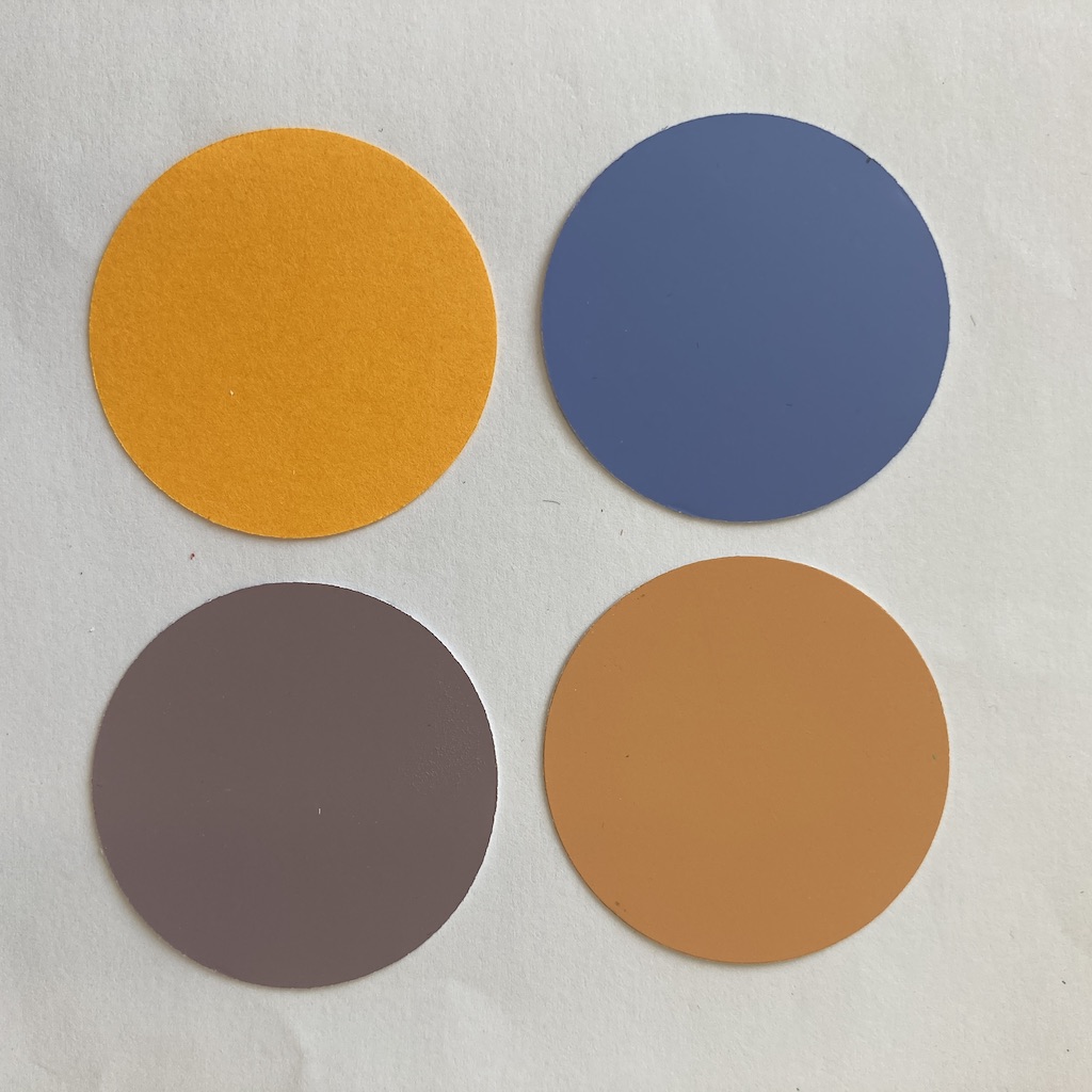
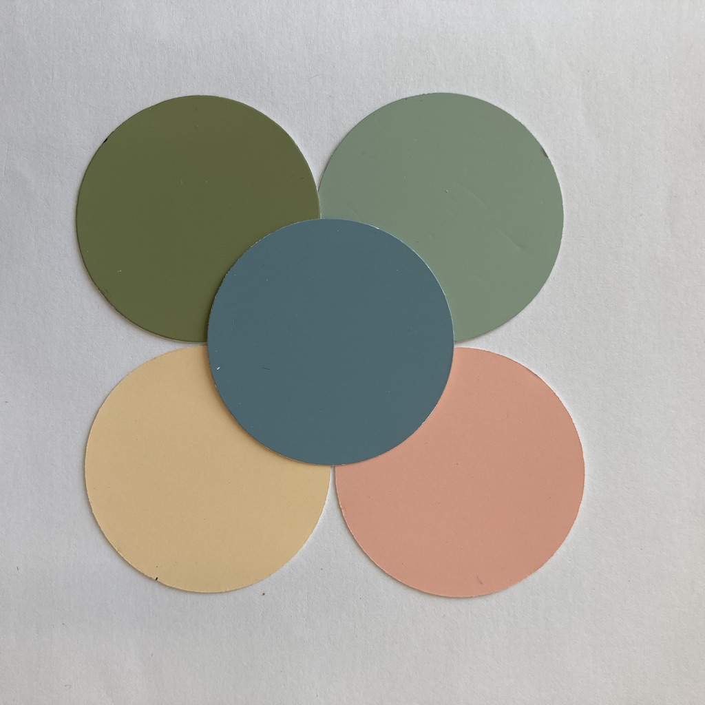
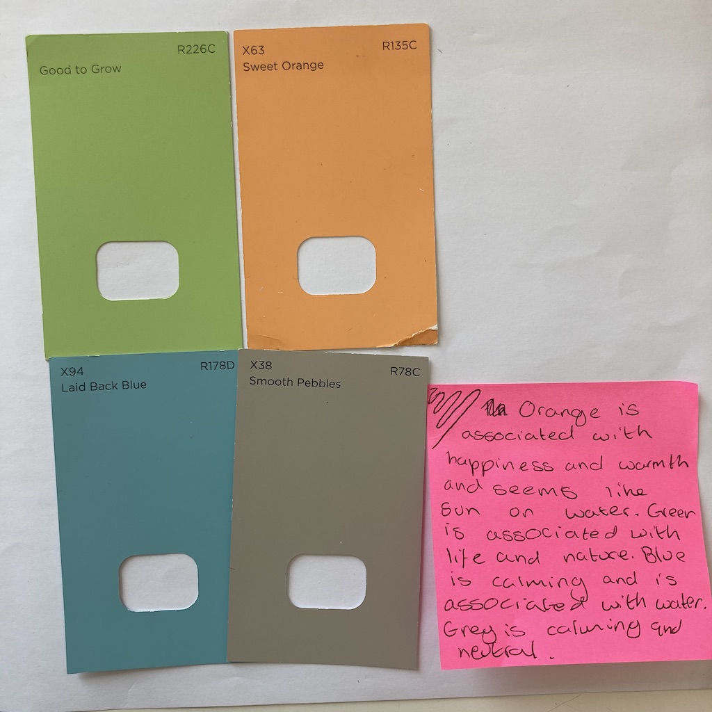
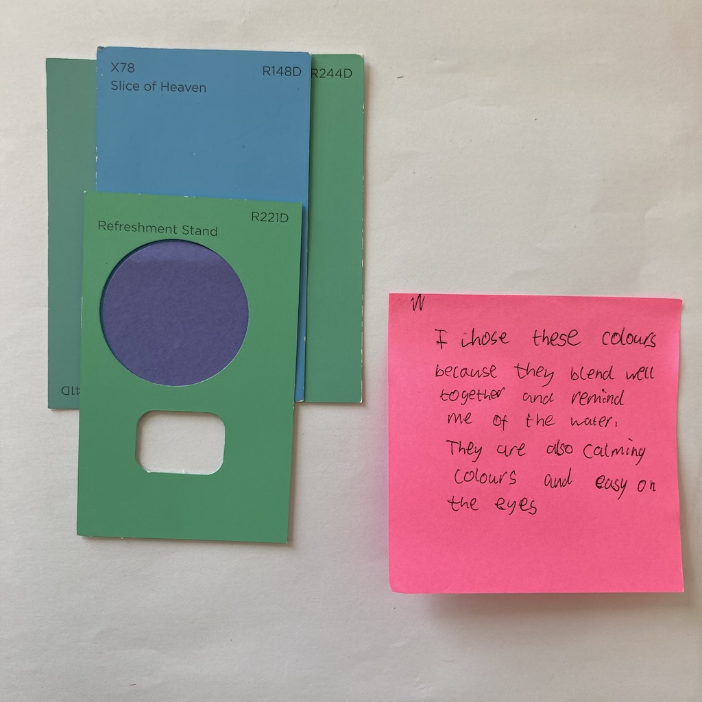
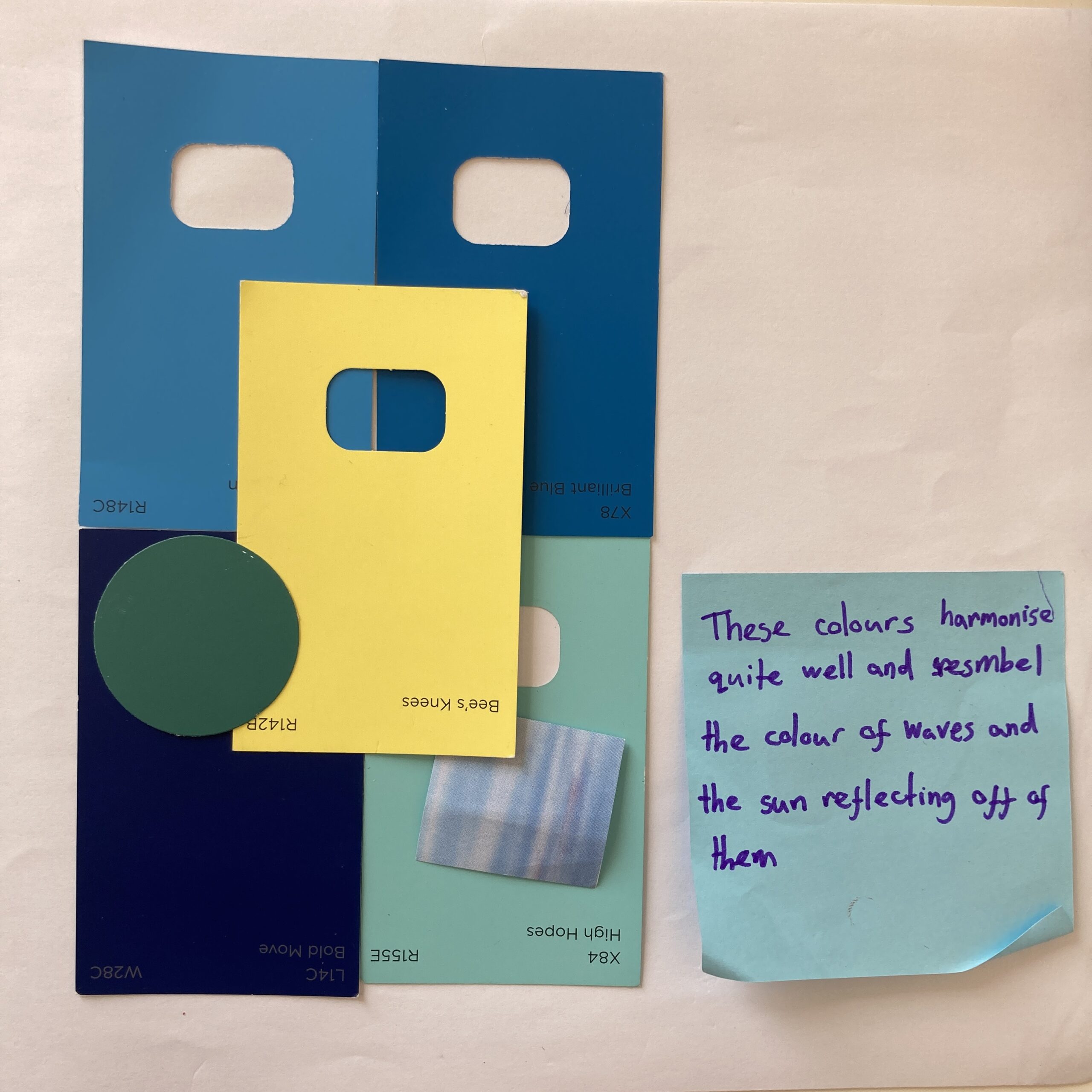
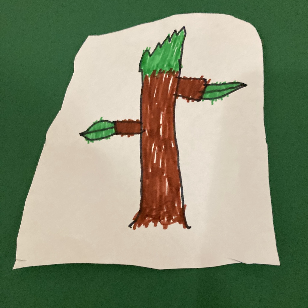
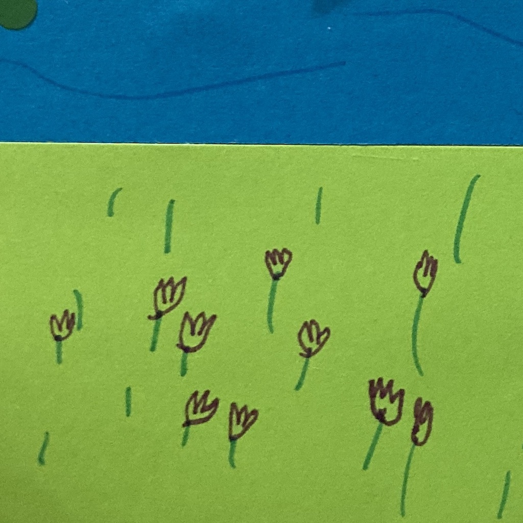
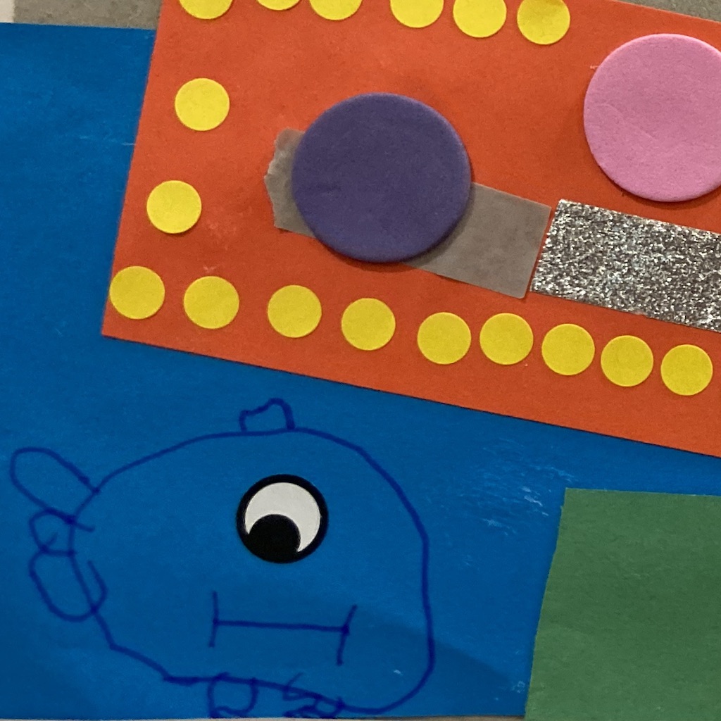
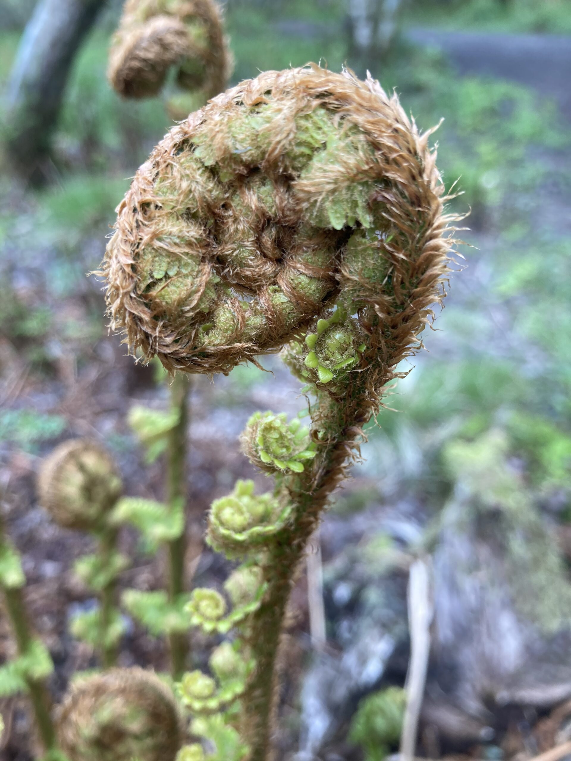
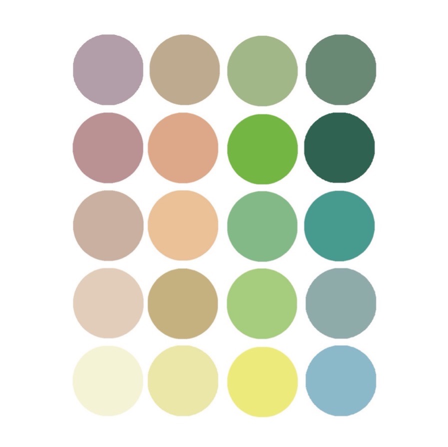
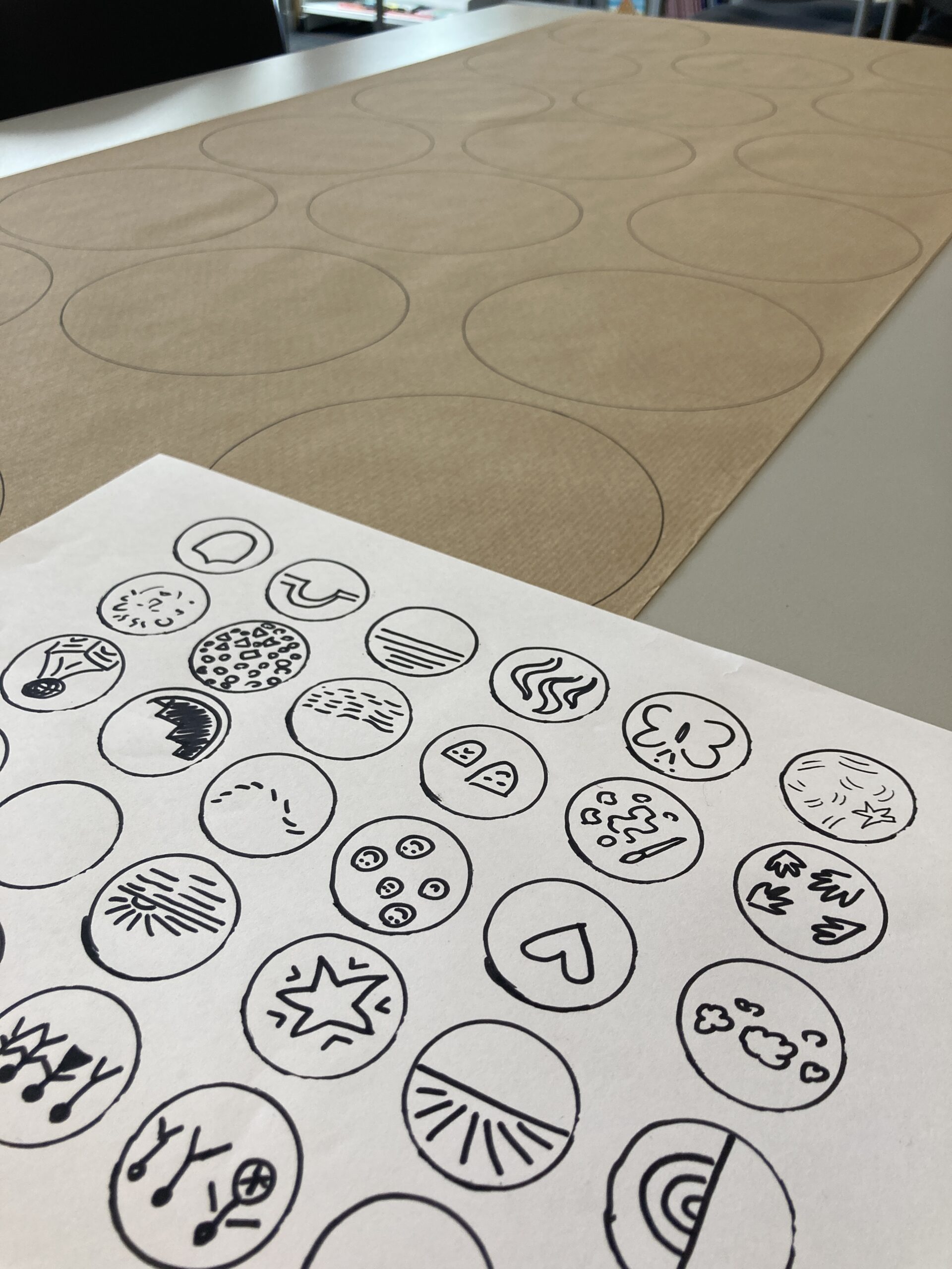
During the consultation I found out what made the area meaningful and unique to the participants, finding out favourite places, things people liked to spot such as herons, golf, ripples, daffodils in the spring, sun on the water, swans, butterflies, dragonflies, heather, leaves, mushrooms, bridges, sunsets, current on the Tay. We explored colour combinations to bring joy. You can see these references in the final designs.
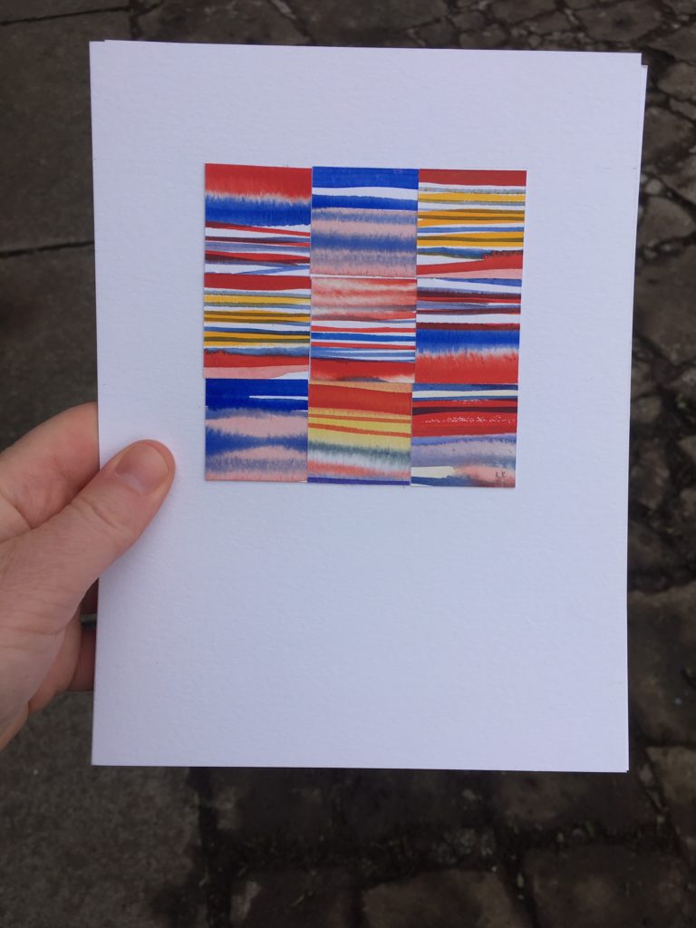
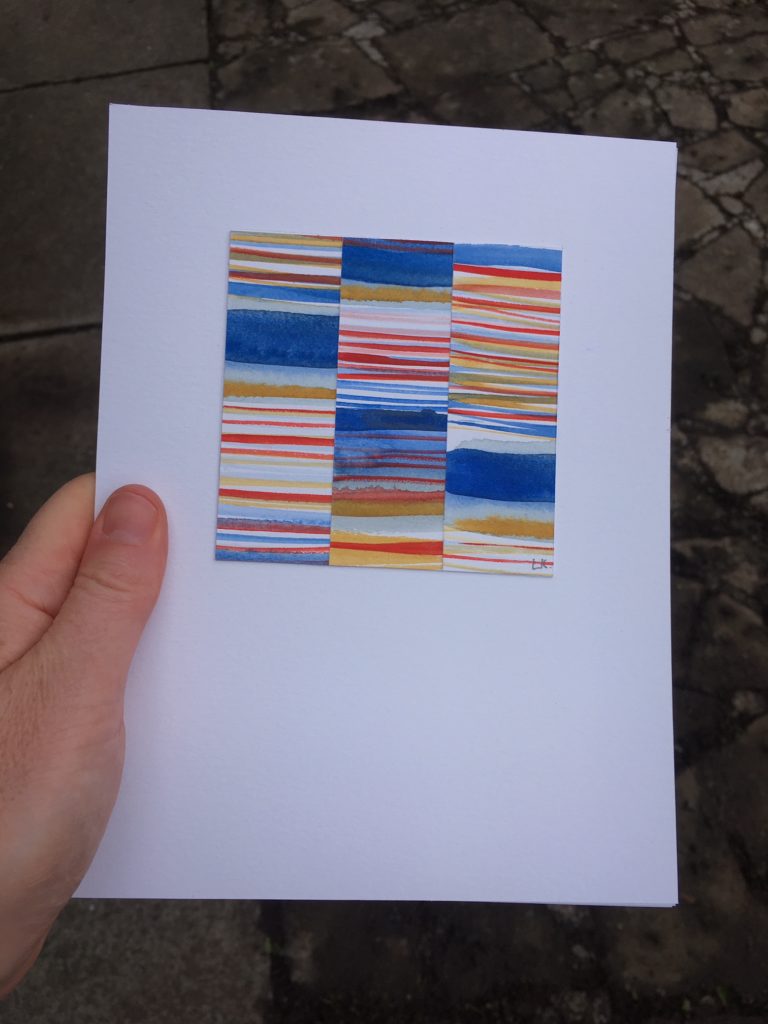
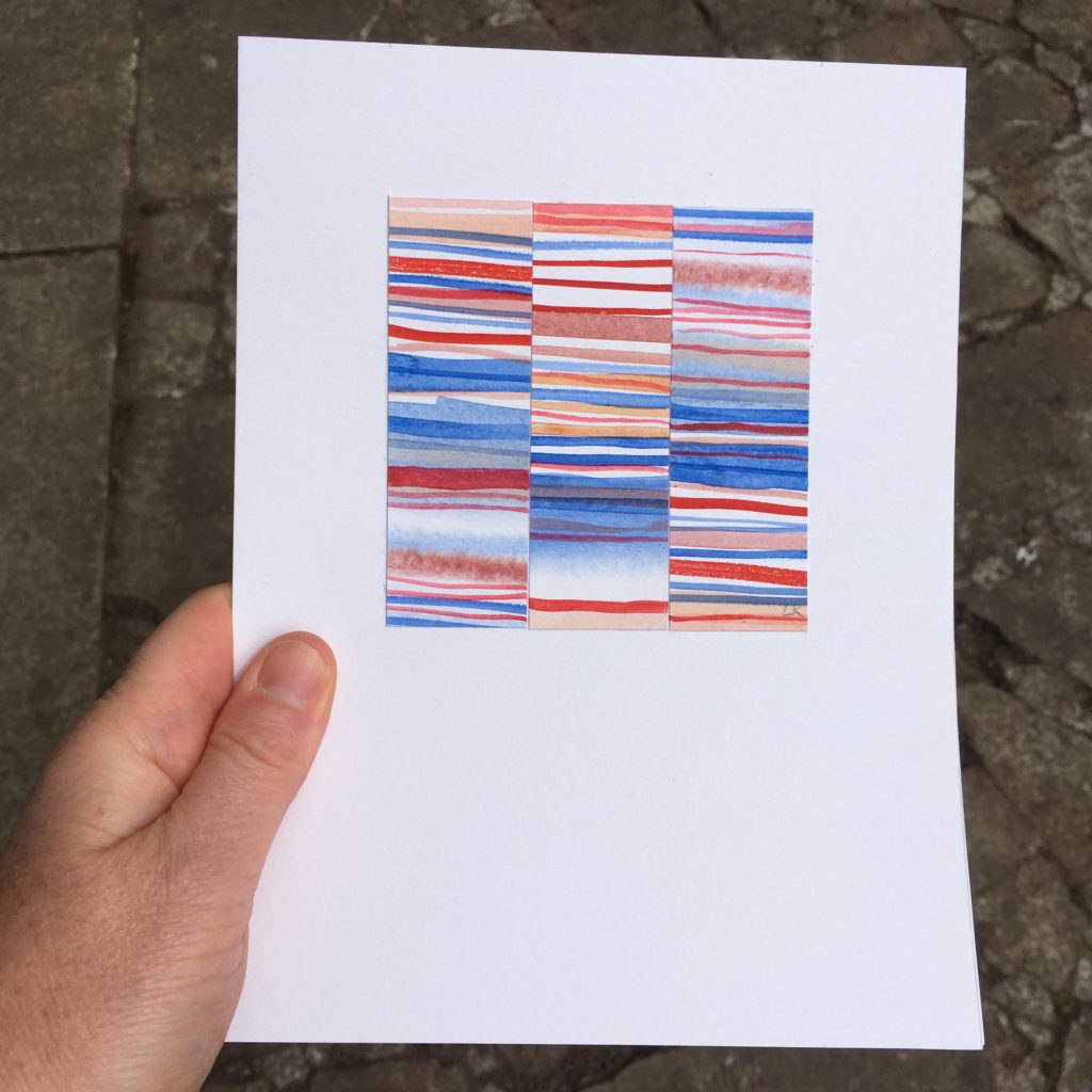
Site Visit Research
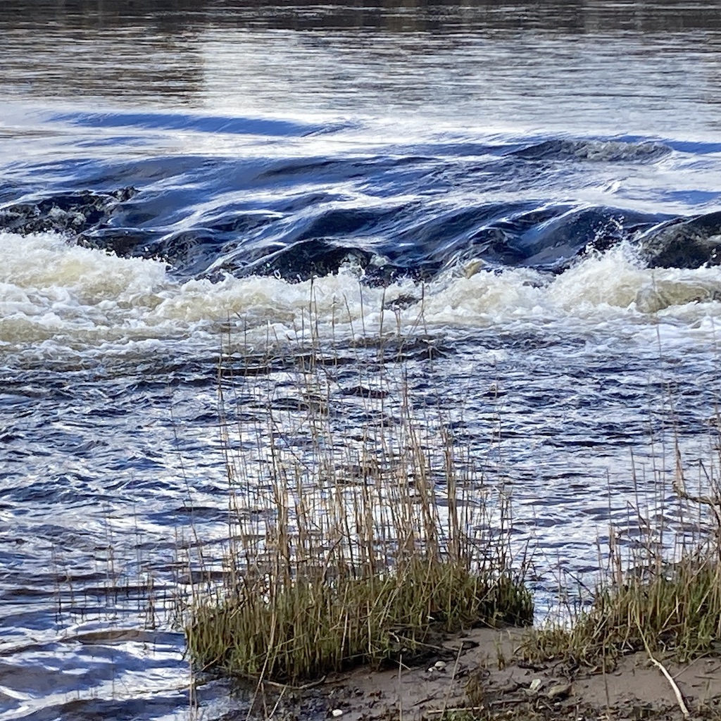
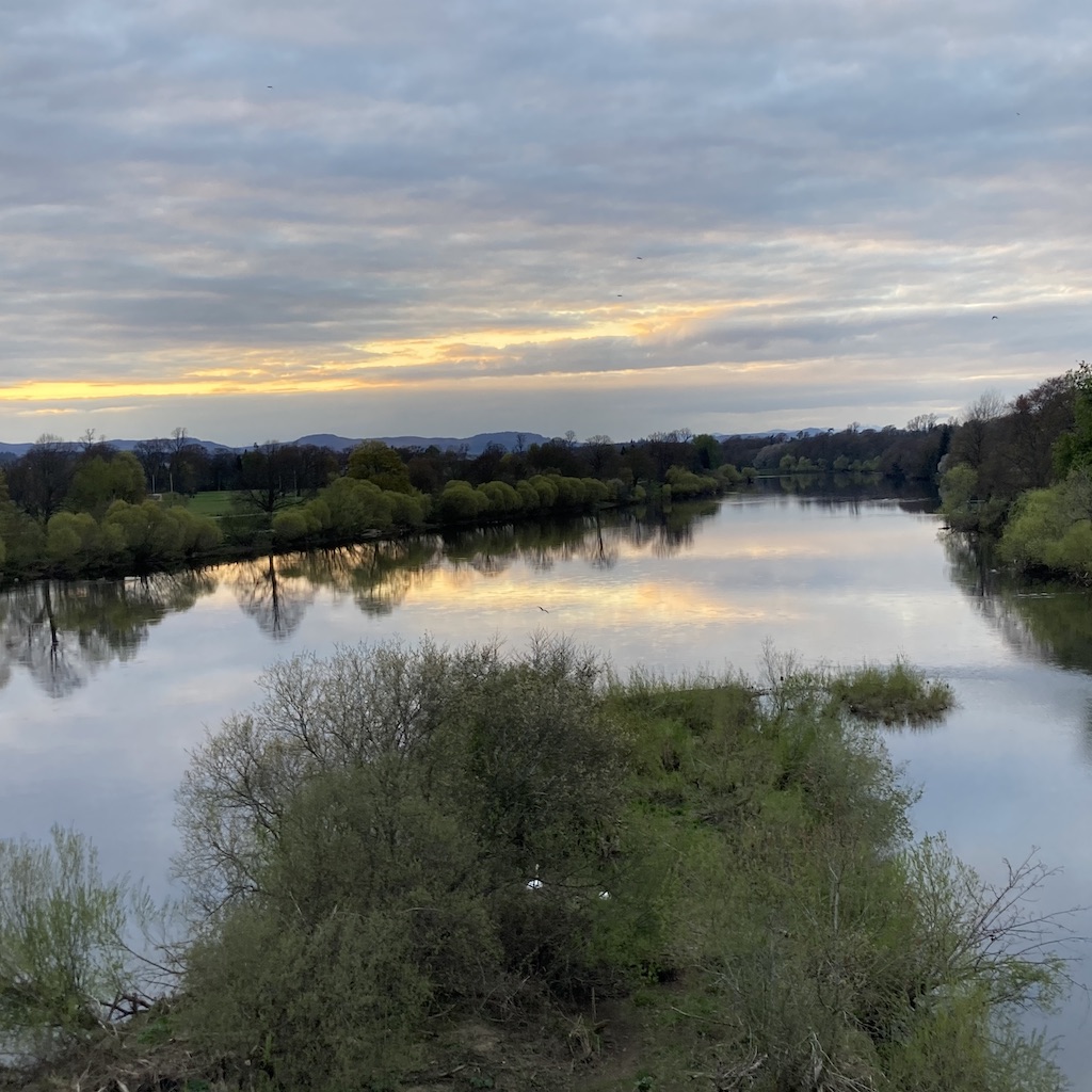
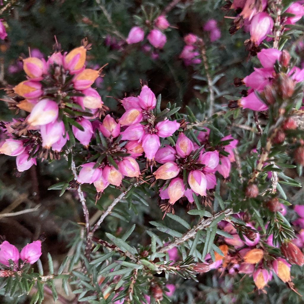
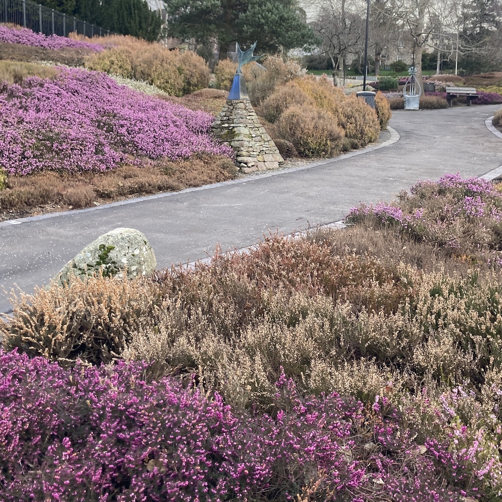
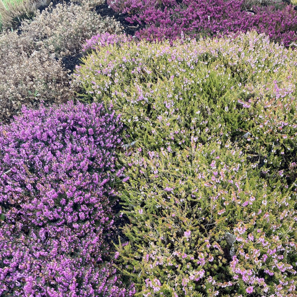
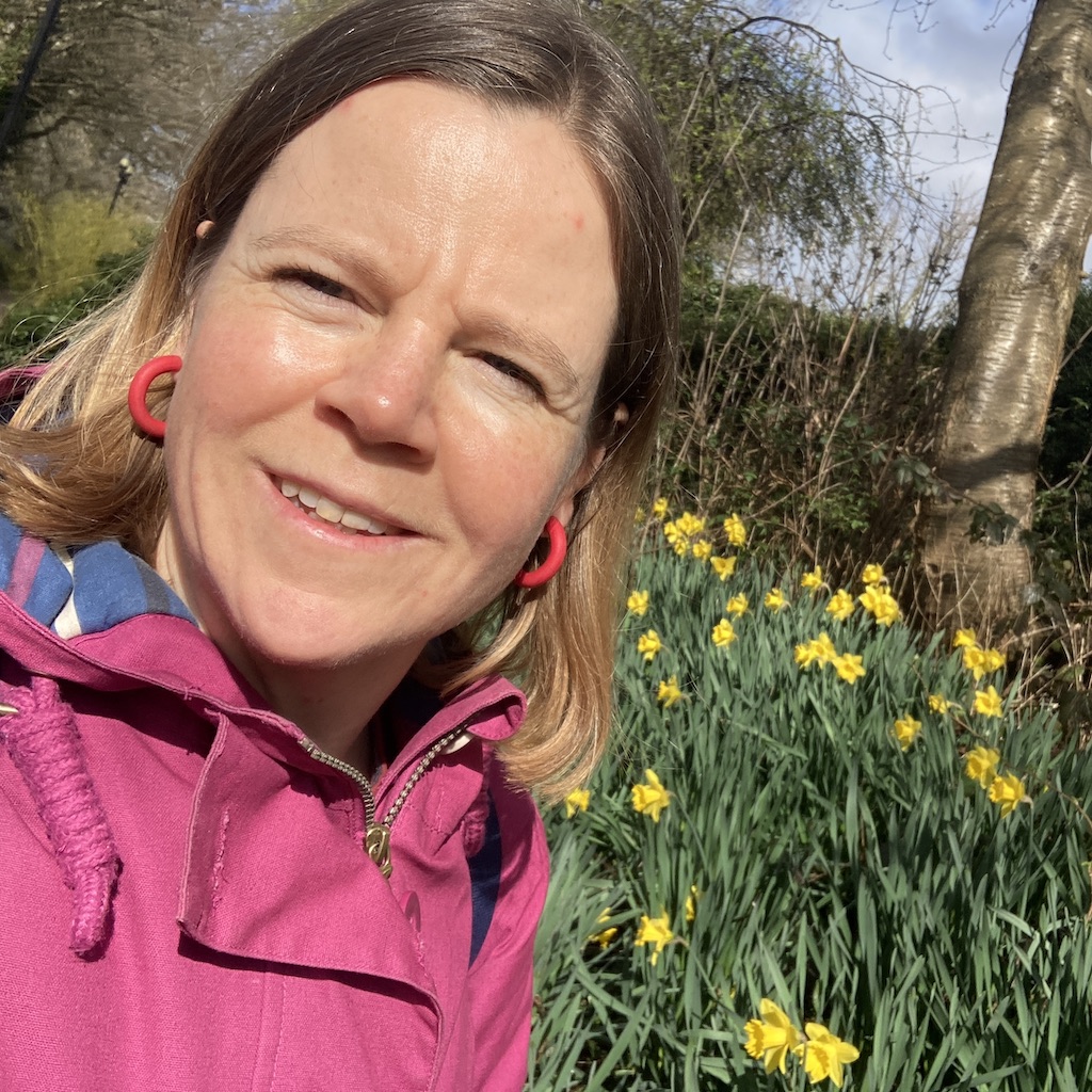
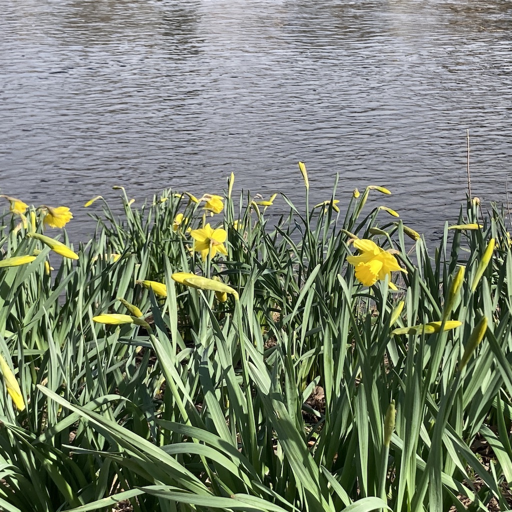
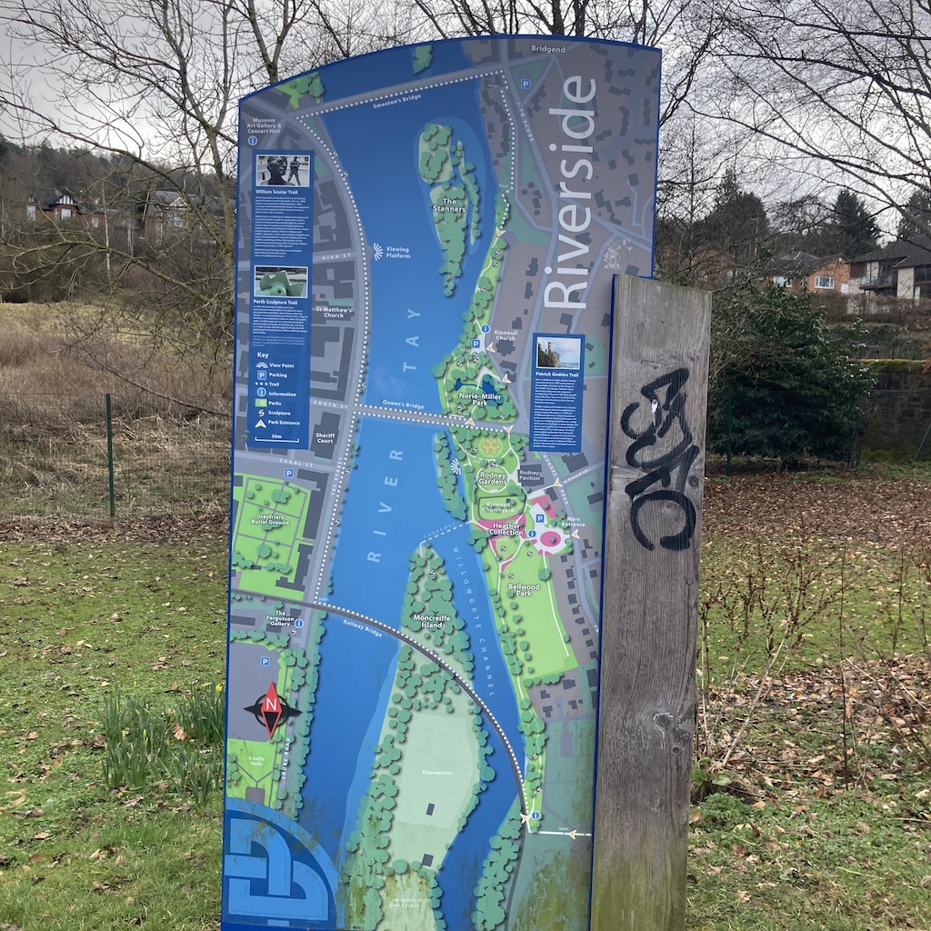
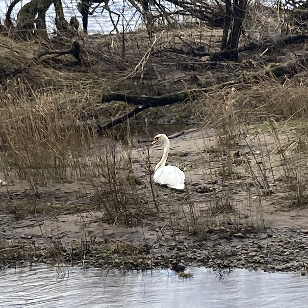
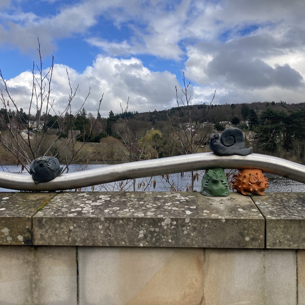
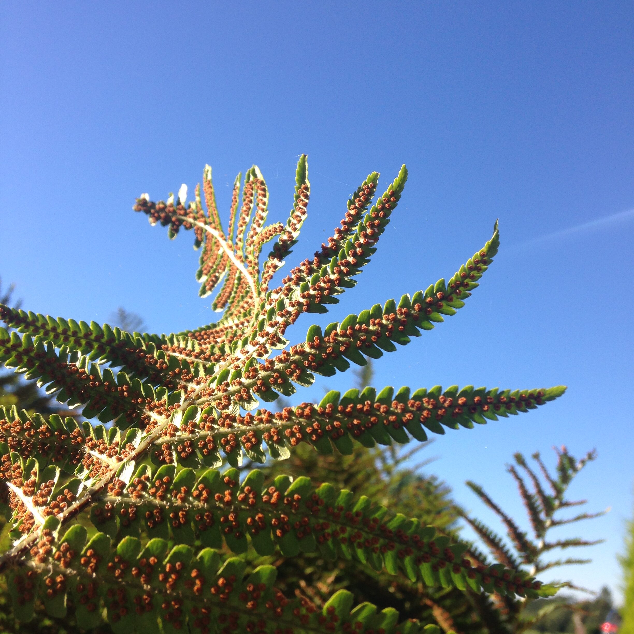
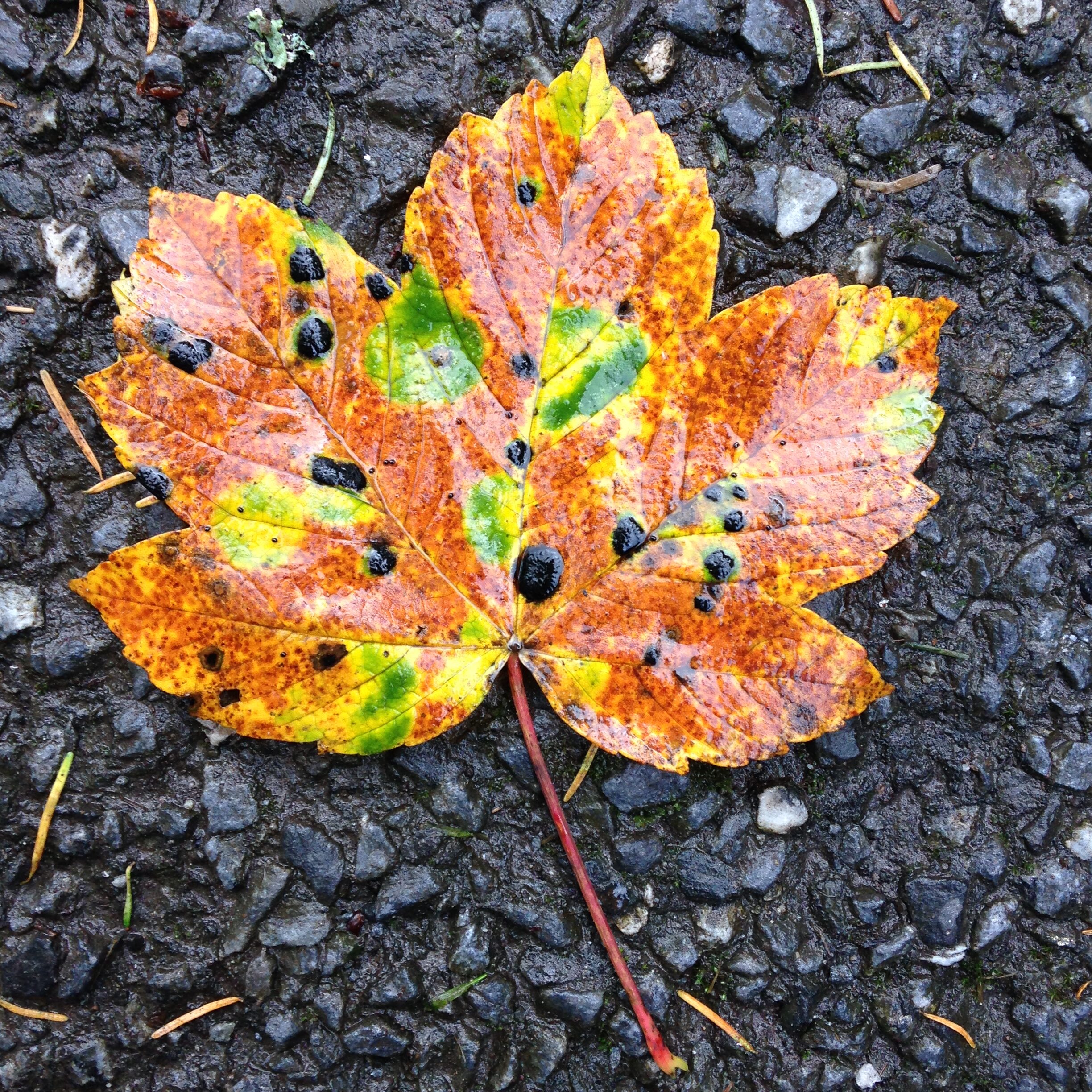
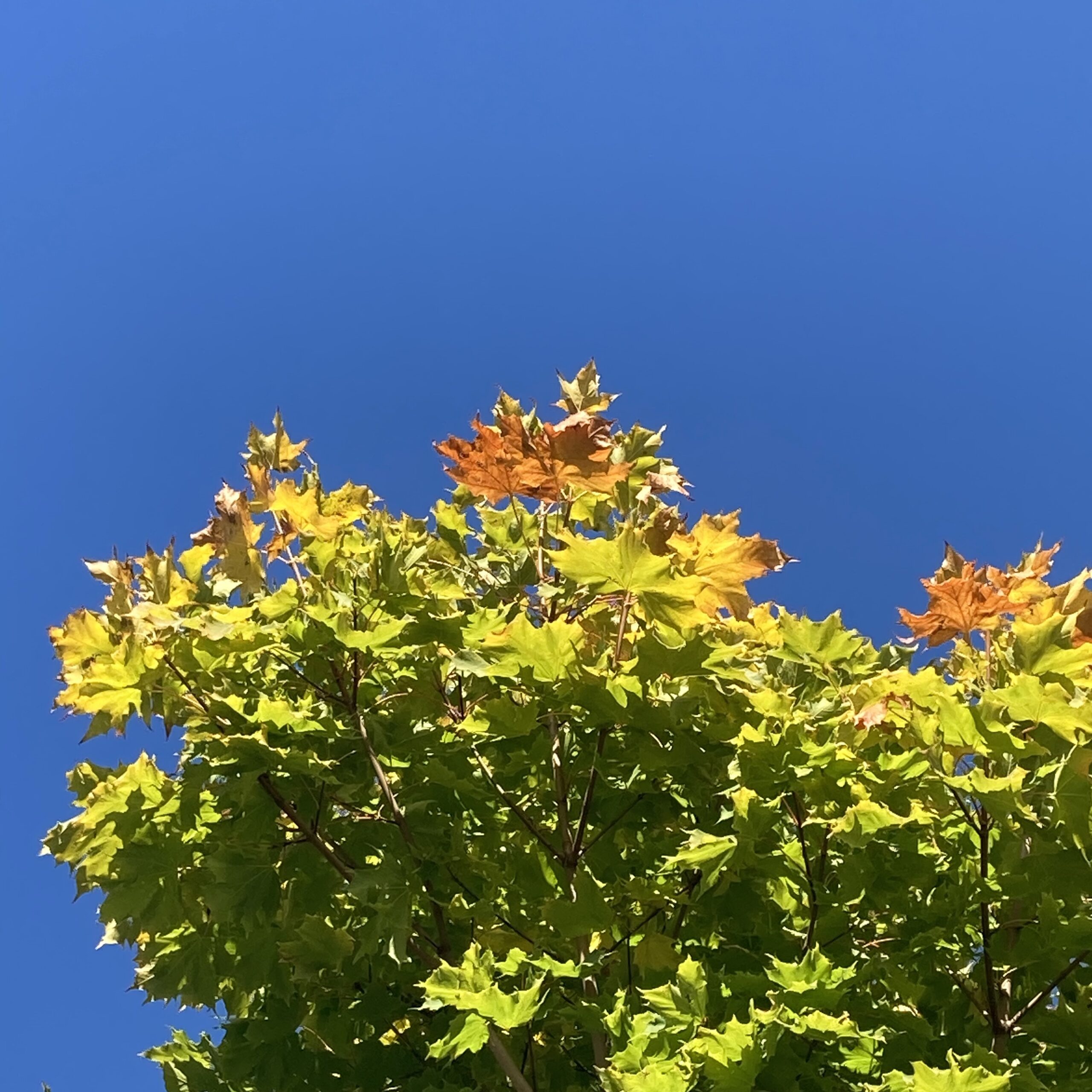
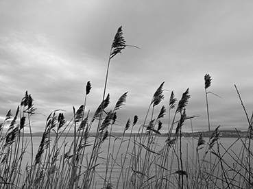
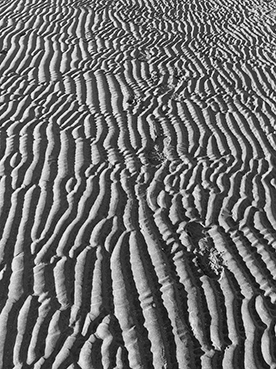
I enjoyed walking along the Tay capturing colour, texture and imagery – lovely rhythm and movement of the water, reflections of the bridges and buildings, the variety of public art sculptures in Rodney Gardens, the colours of the heather, the activity of the ducks and swans.
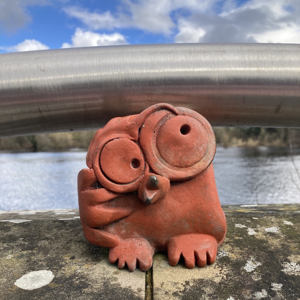
Moncreiffe island is quite unique with having a golf course in the design you can see a sunny pattern of golf balls and blooming daffodils and patterned paving. I loved seeing ‘Soutar’s Menagerie’ by Rhonda Bayley on Tay Street – you’ll find a wee nod to this in the artwork.
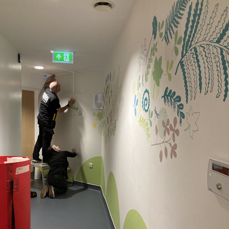
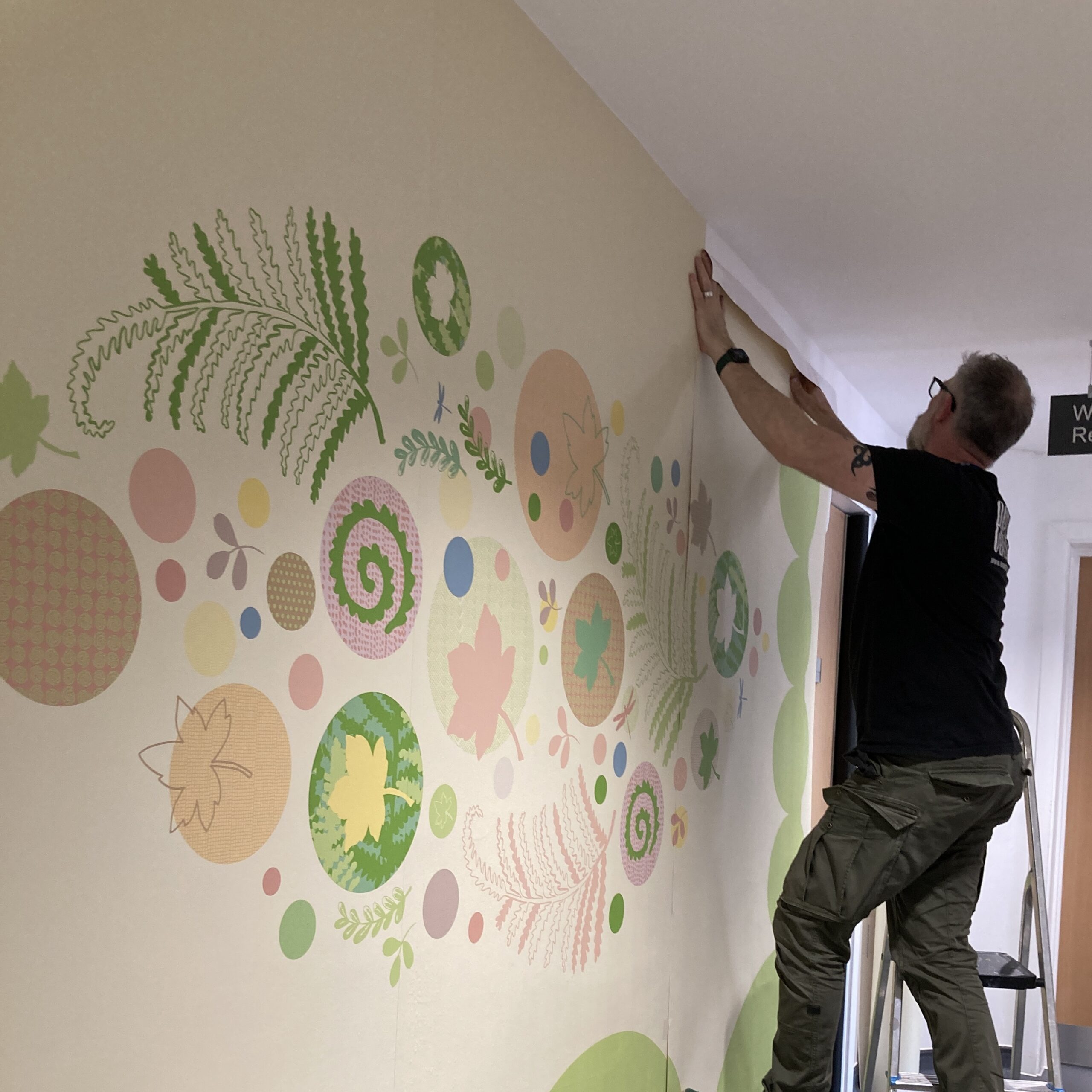
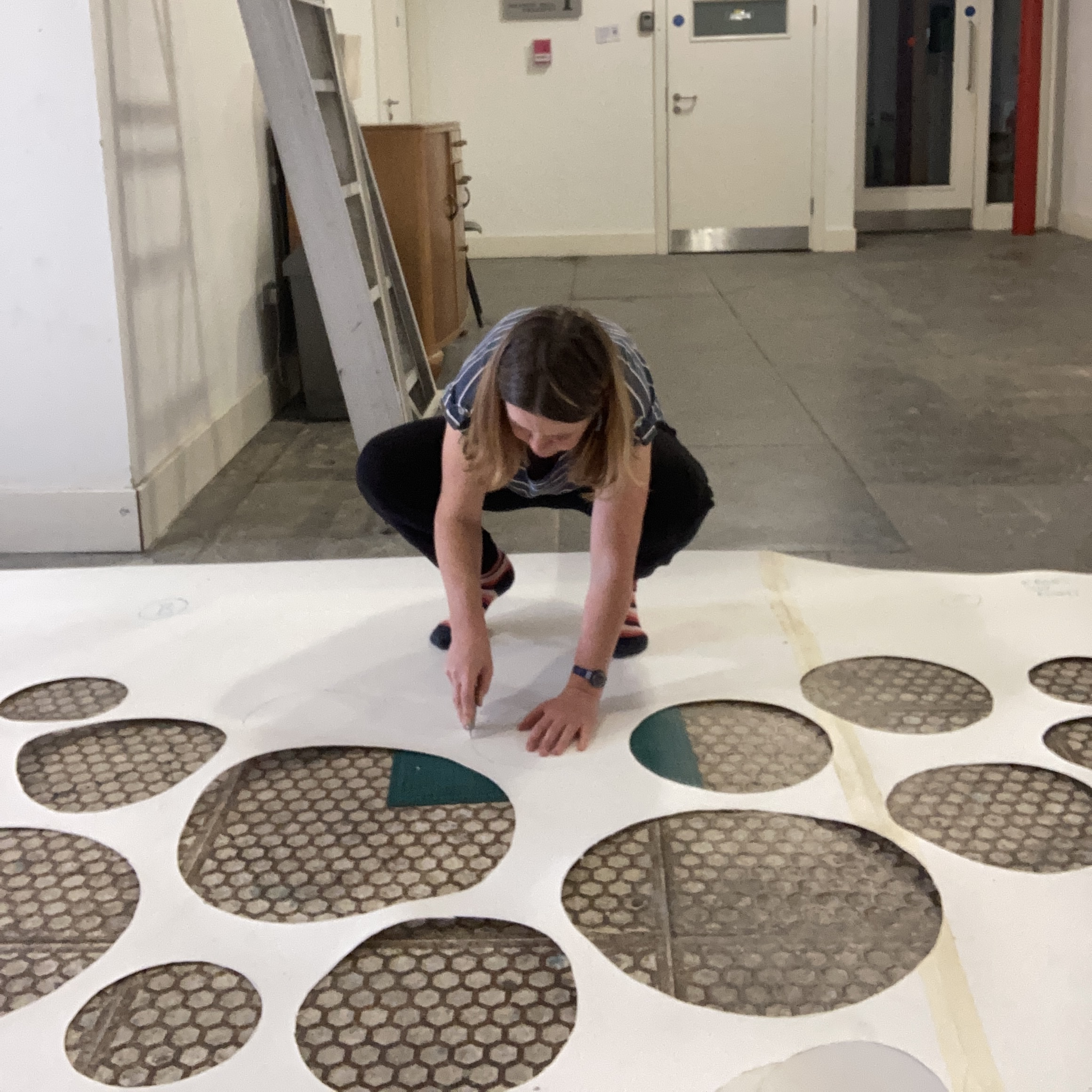
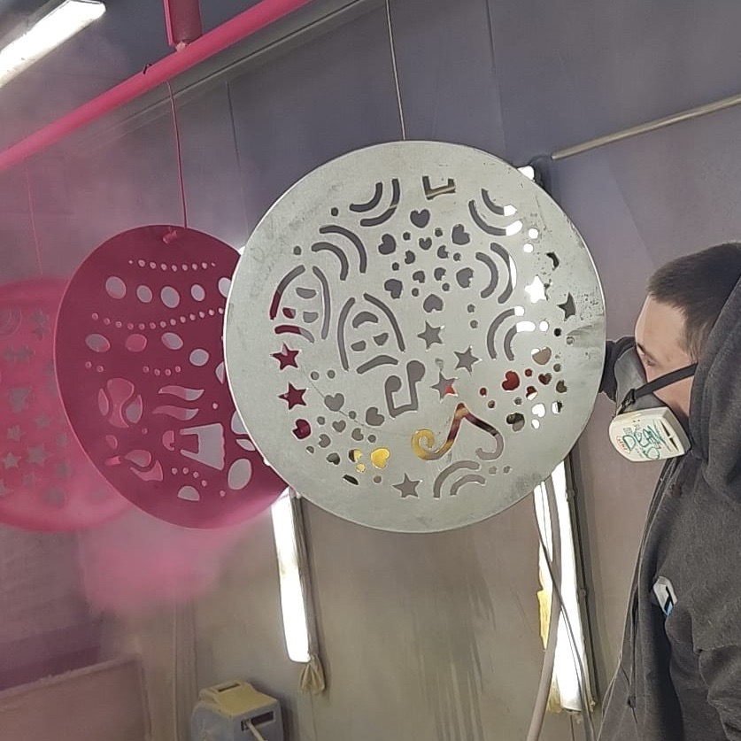
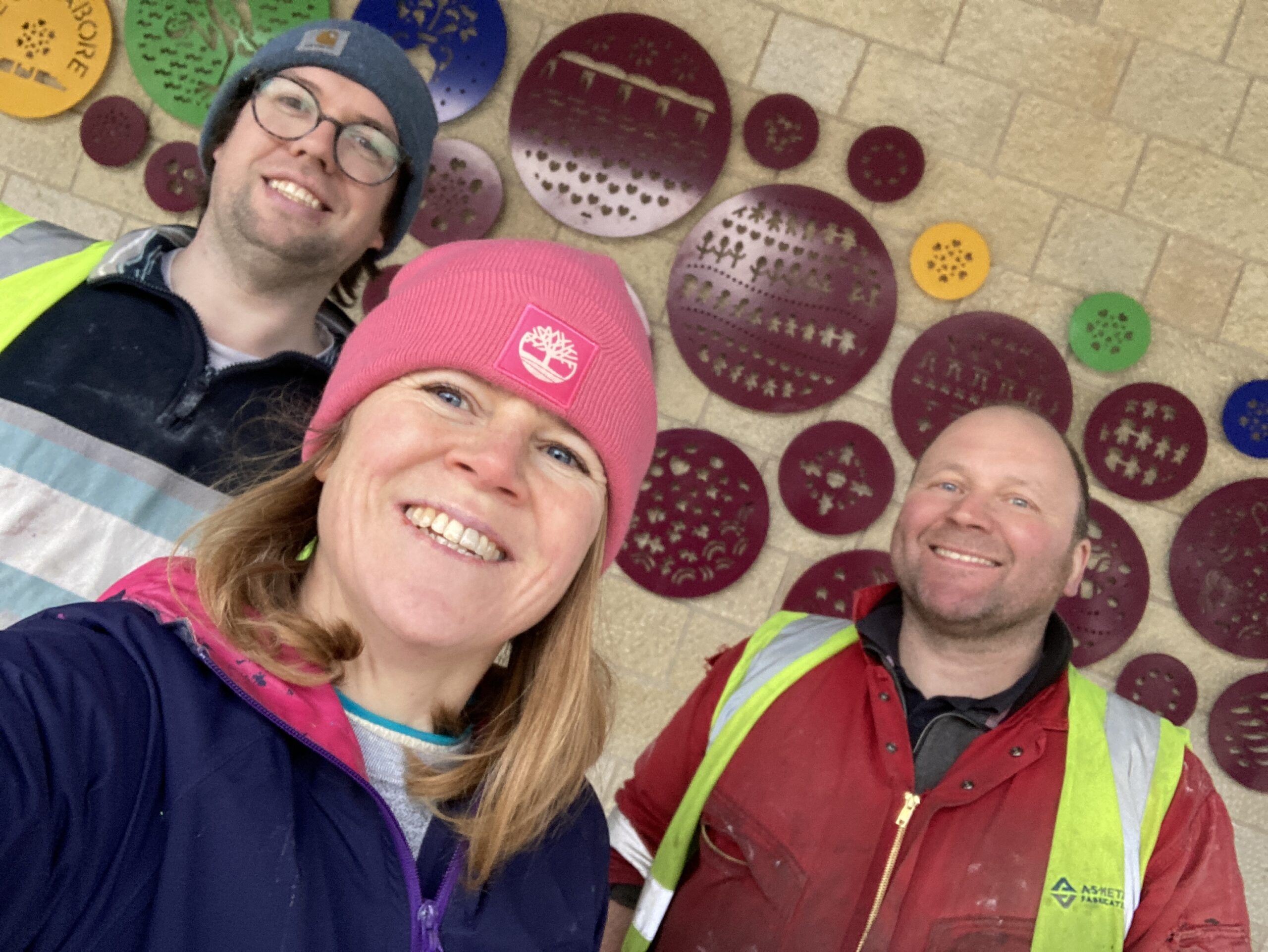
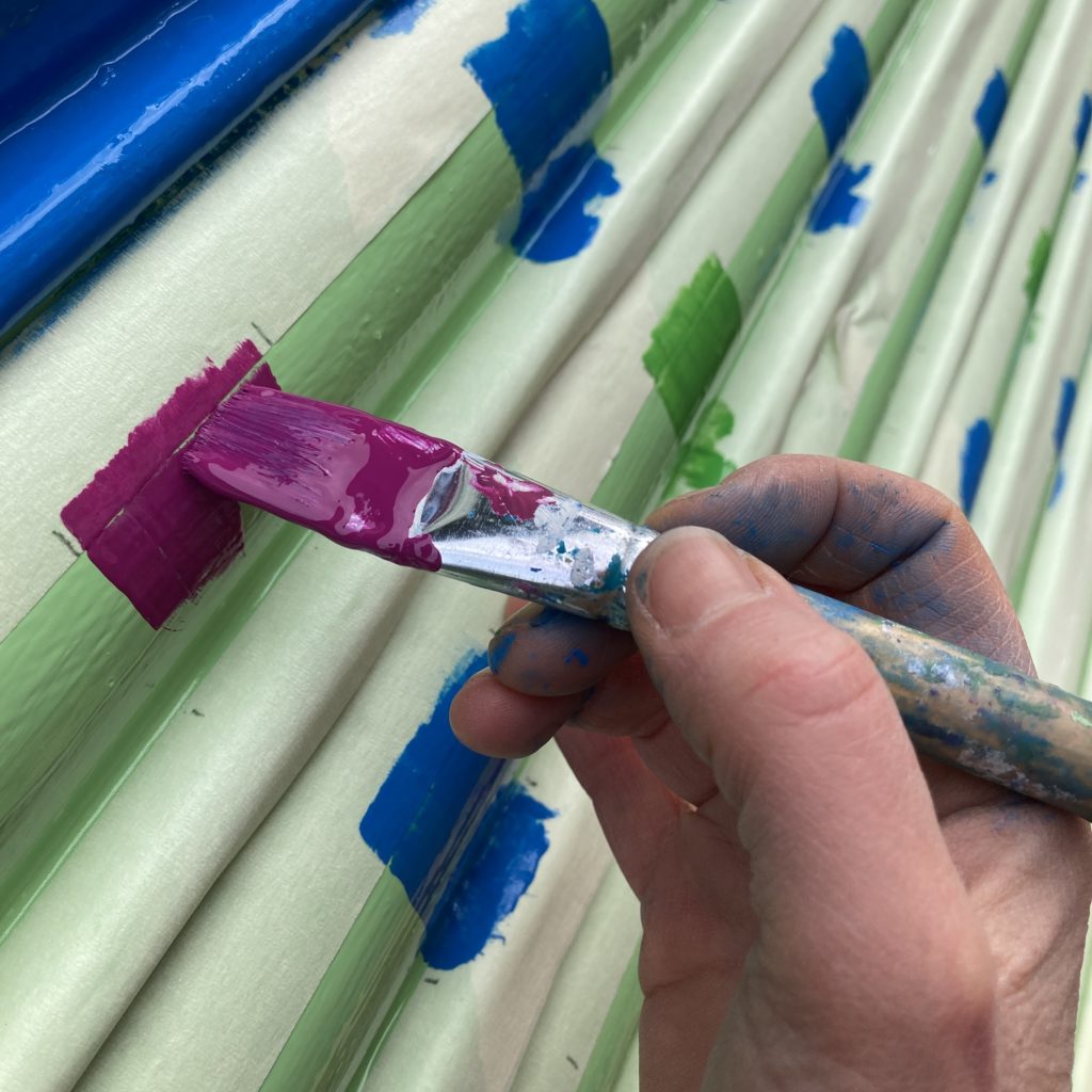
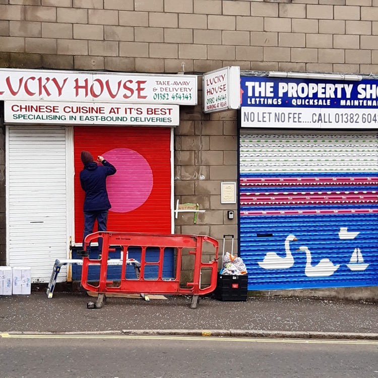
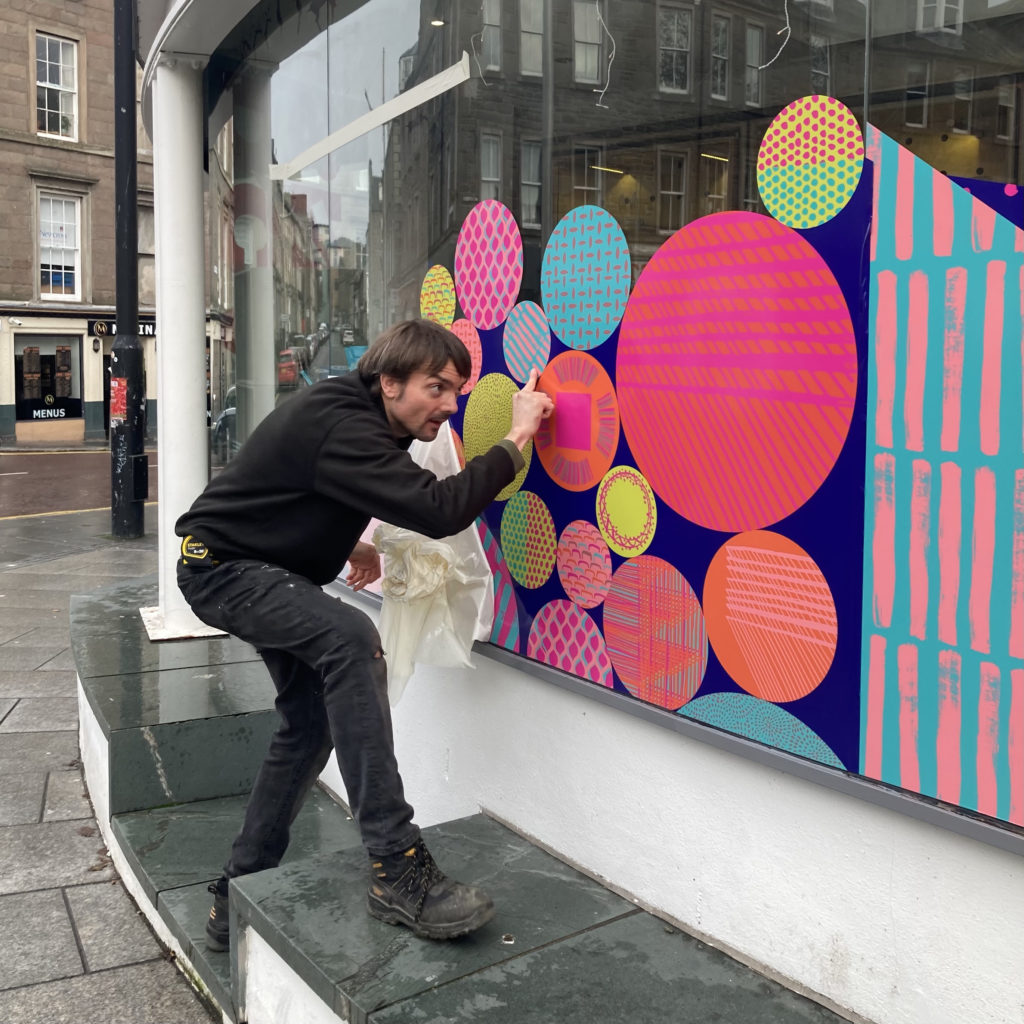
Development and Installation
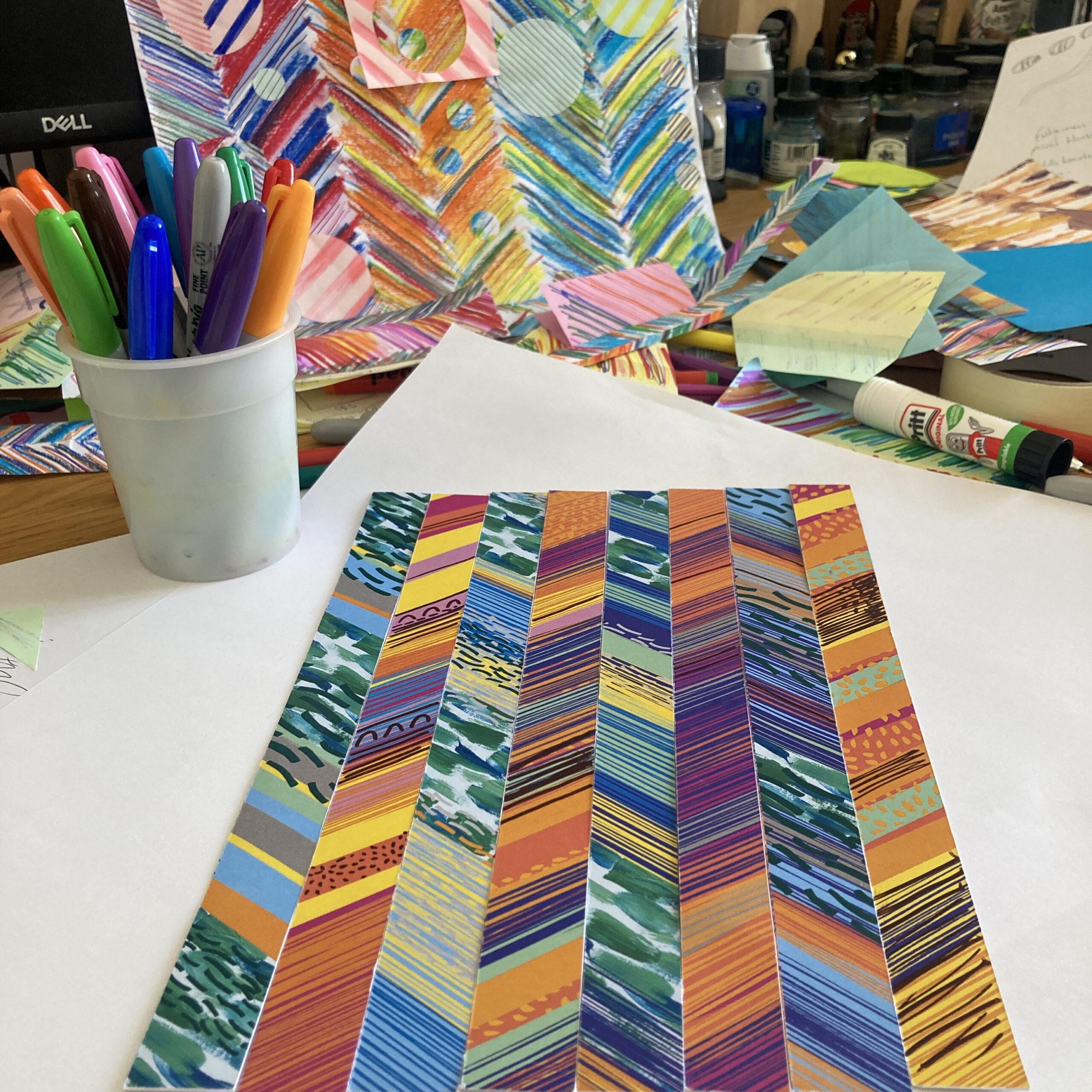
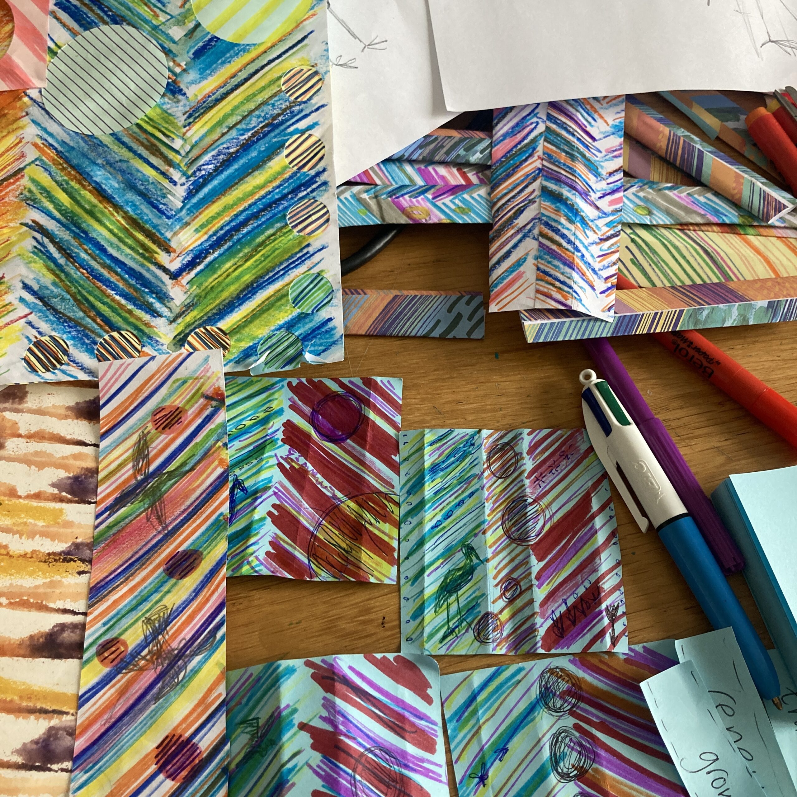
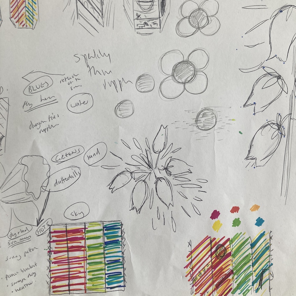
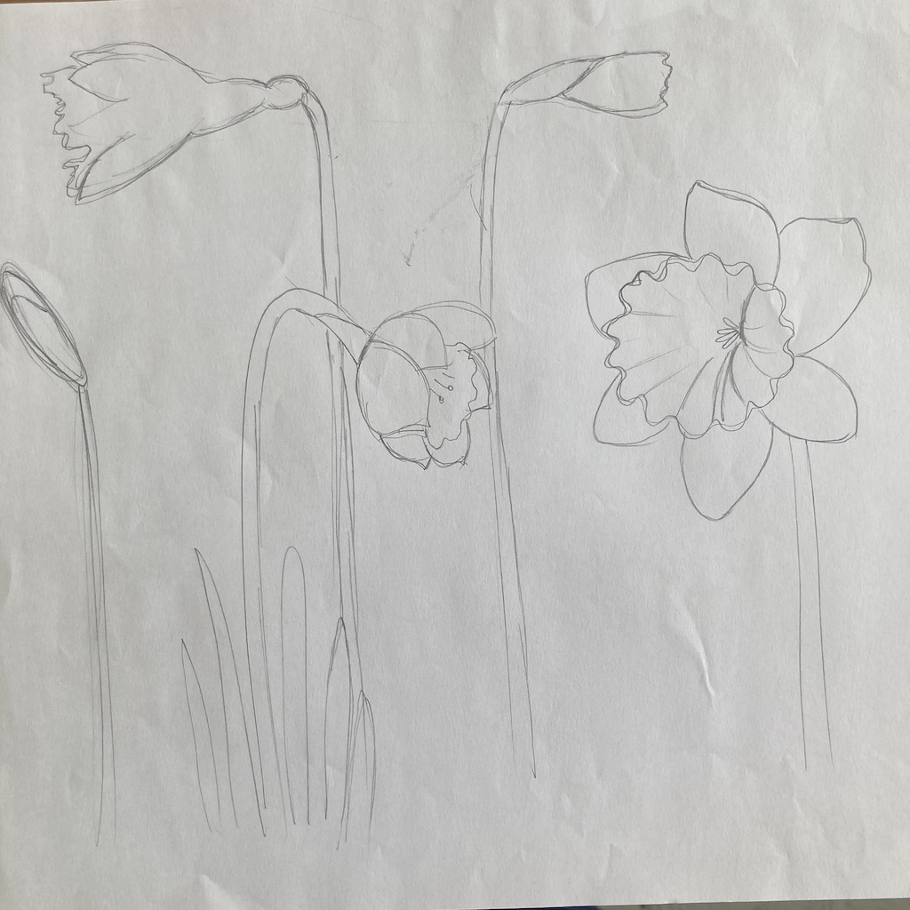
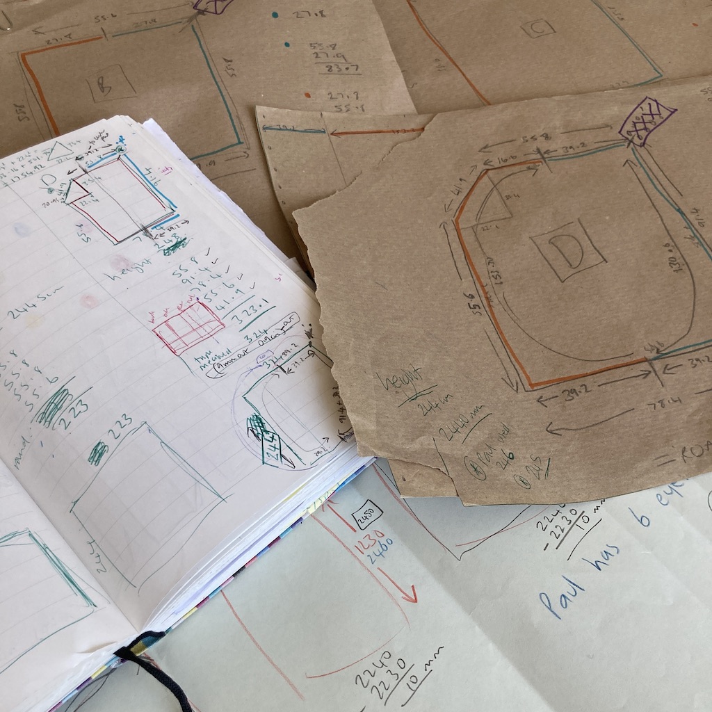
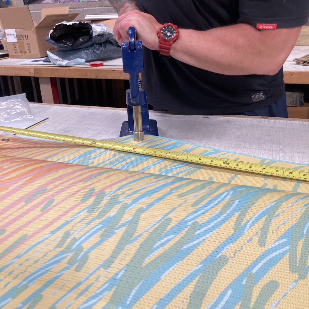
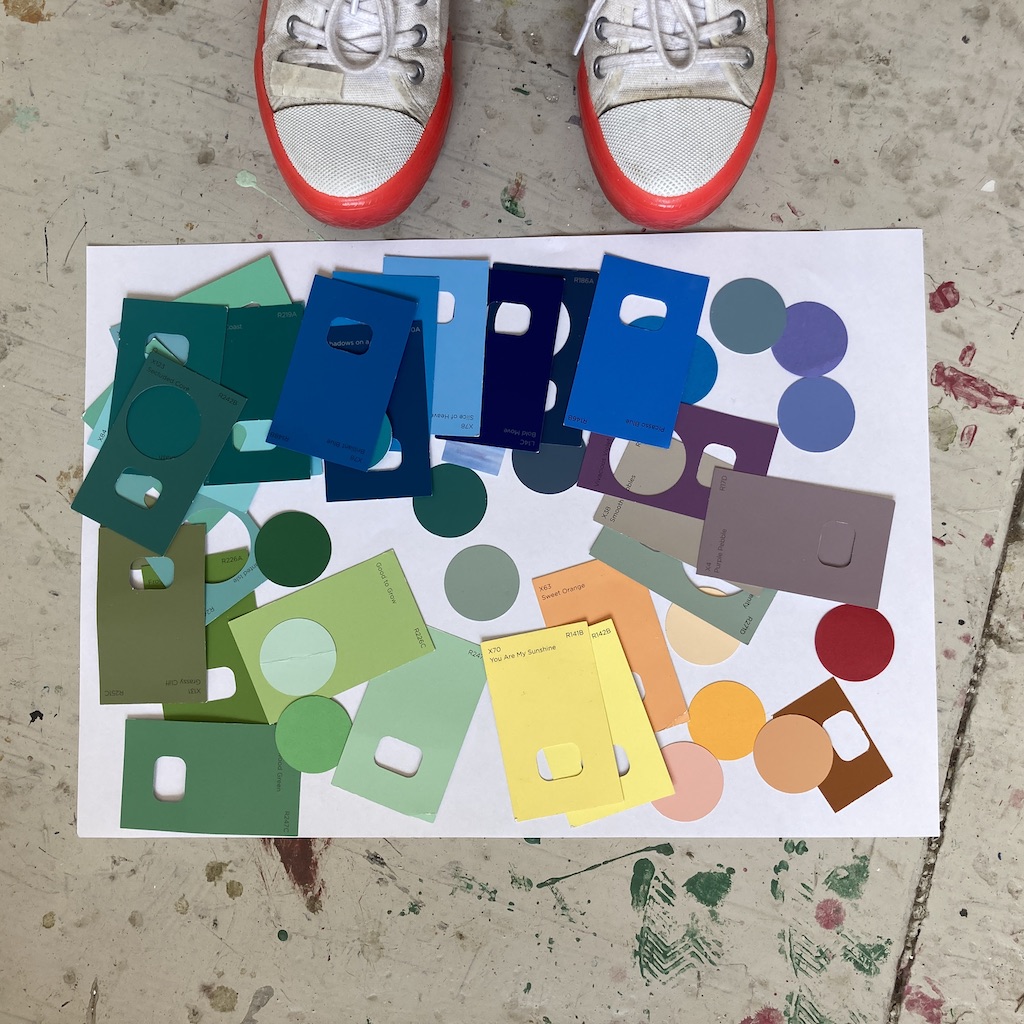
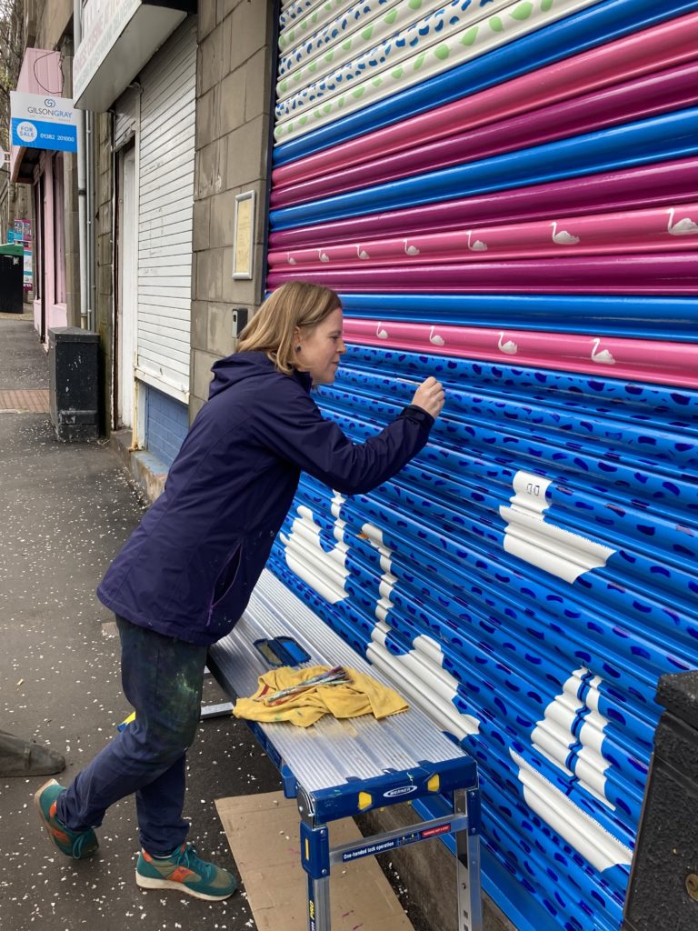
I drew, played with different elements and mocked up concepts, lots of more technical elements linked to measuring, sampling and installation, then created the final artworks ready for production.
Culture Perth & Kinross Vision
The brief was to animate the familiar space in a new way. To contribute to the recognition of Perth as a creative place to live, work and visit and be a new visual marker as a destination.
The aim of my artwork is to capture the positive progress and shifting of perspective in the city of Perth with my striking artworks that uplift and bring joy and a sense of place creating confident, uplifting, joyful designs capturing the shifting perspectives of the city. I hope you enjoy seeing them, they are up for up to 6 months.
Thanks
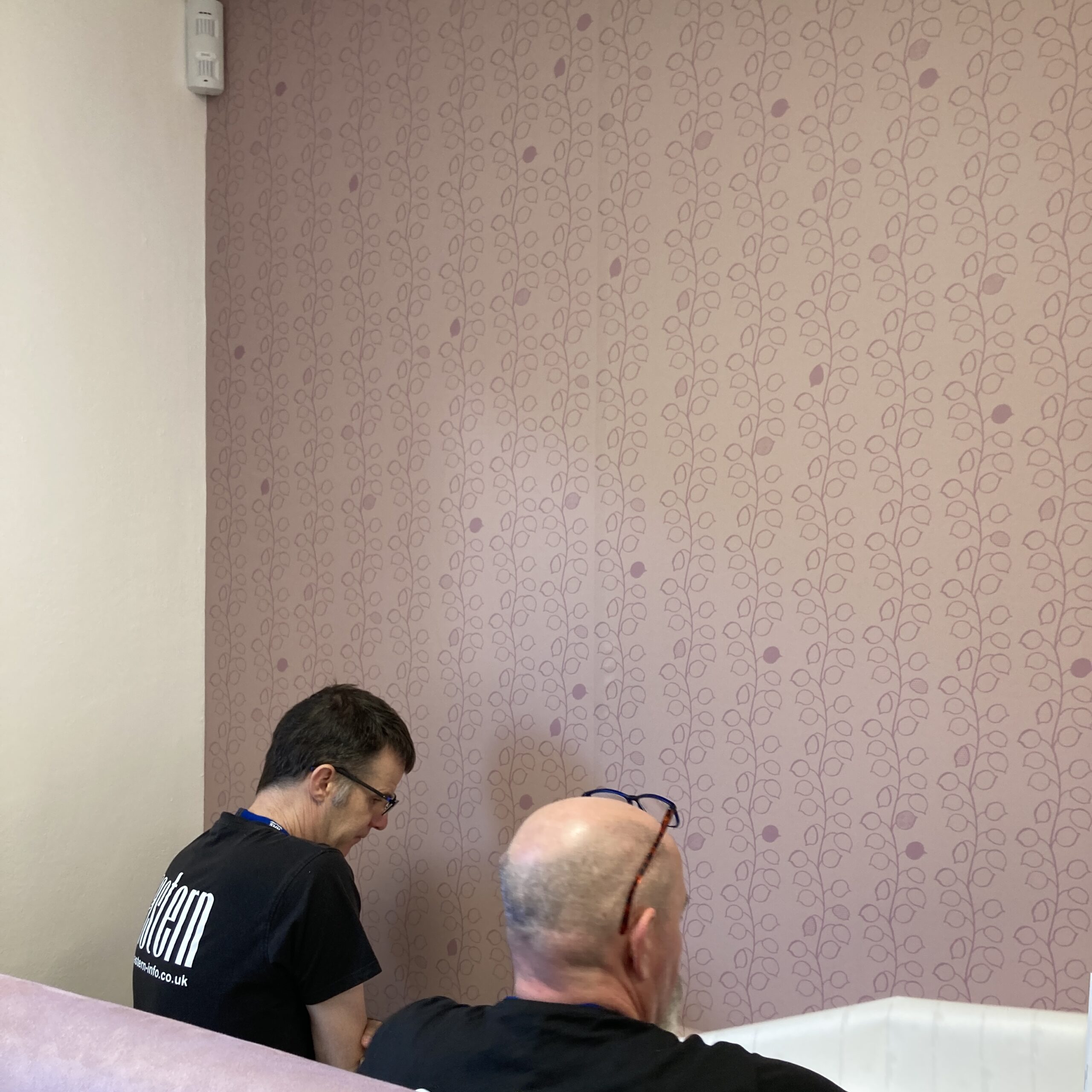
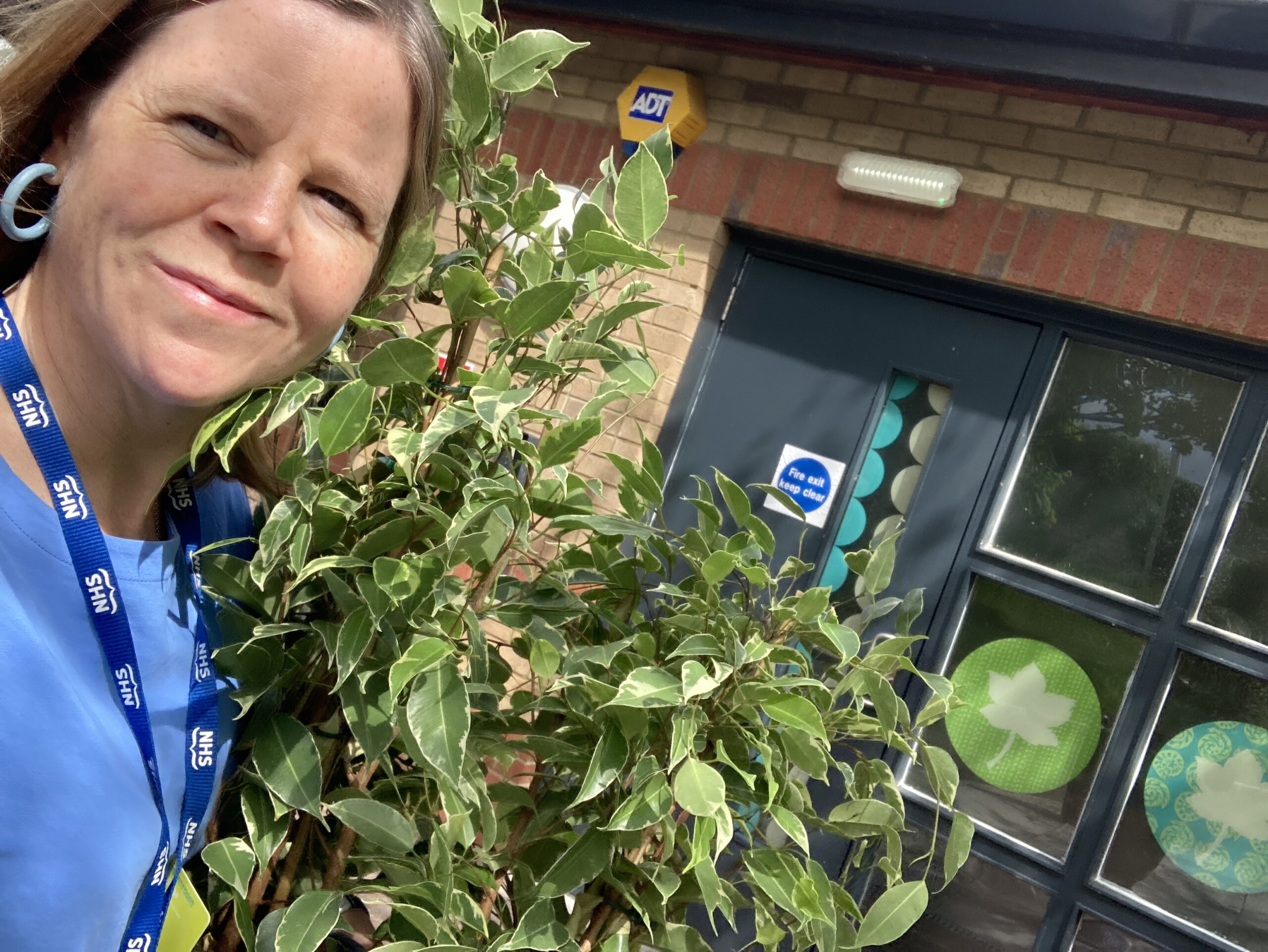
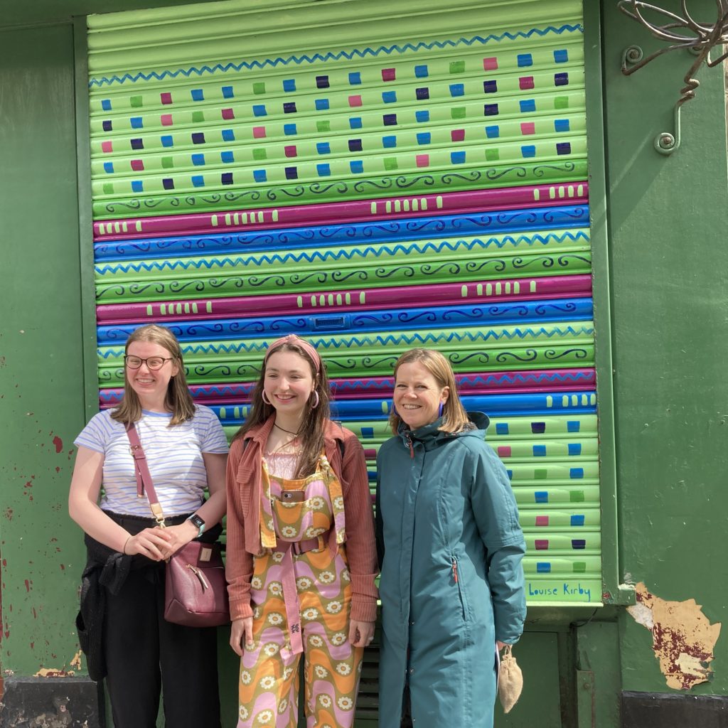
Thanks to librarian Louise for reading ‘love your earth’ by Jane Cabrera and ‘A home on the river’ by Peter Bentley and Charles Fuge as a great start to the crafty consultation workshop with families. Thanks to Kirsty for being my contact at AK Bell, thanks to Paul for initial chats on previous pillar wraps used. Thanks to the families, LGBTQ+ group and knitting group for your help. Thanks to Circle Signs for fabrication and Barry for installation.
My Creative Practice
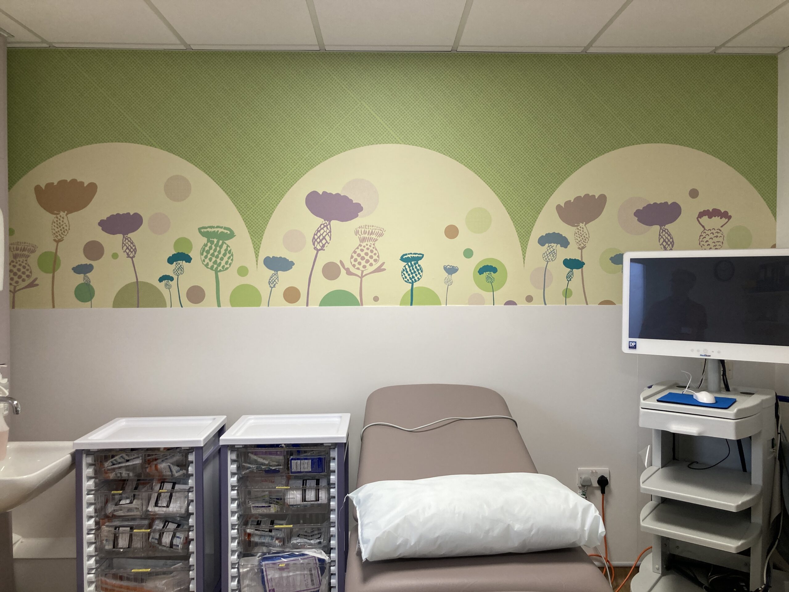
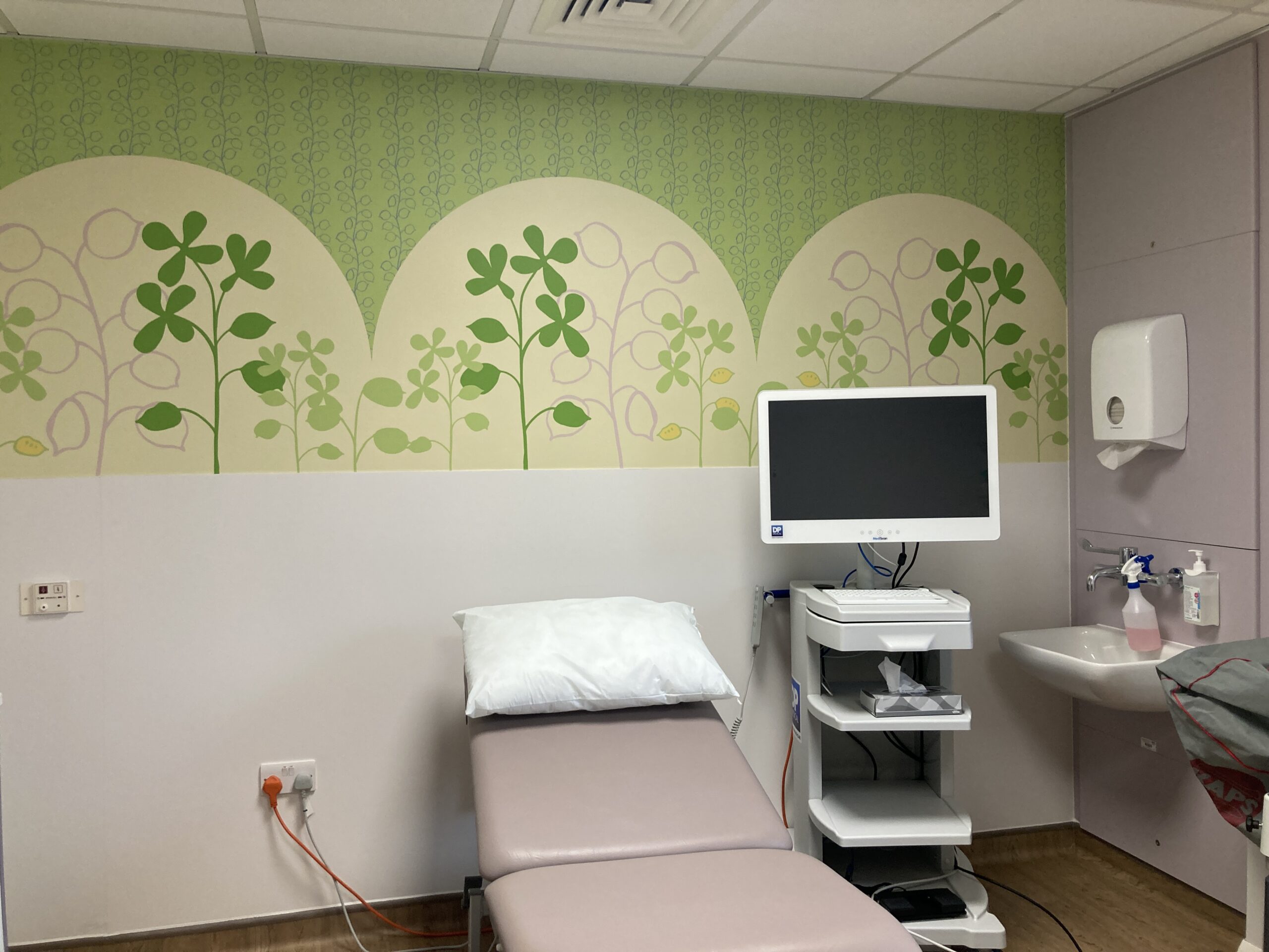
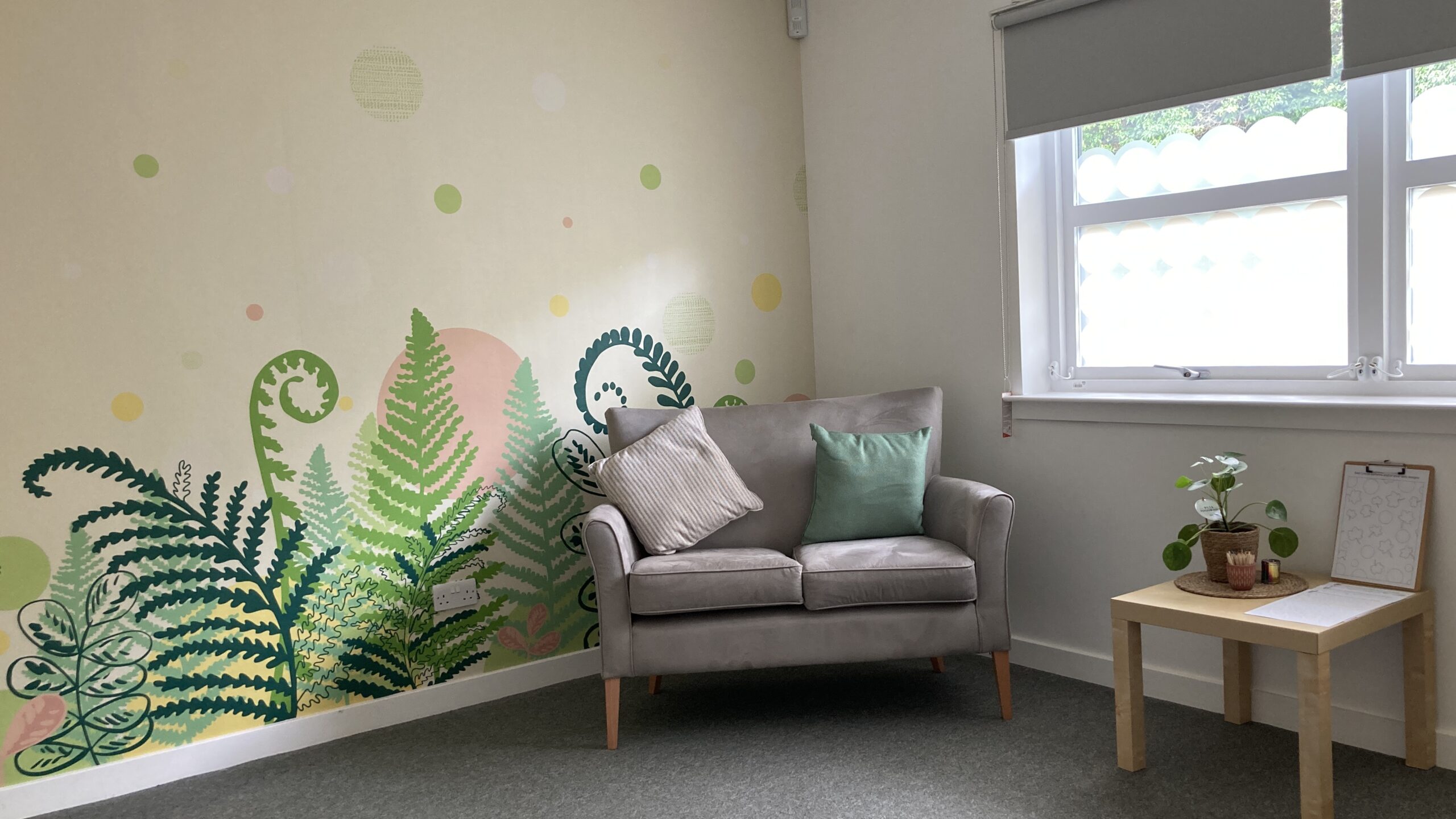
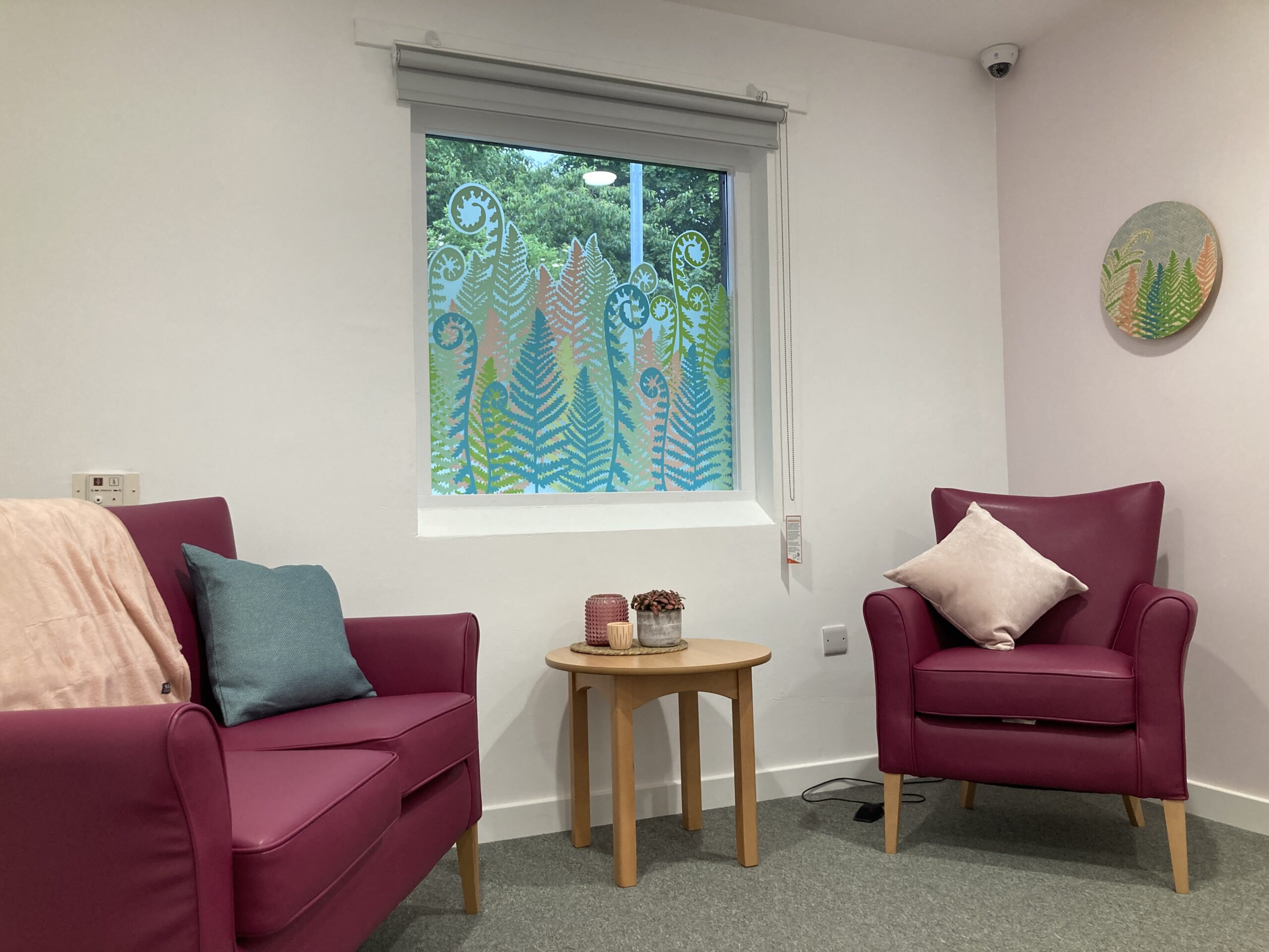
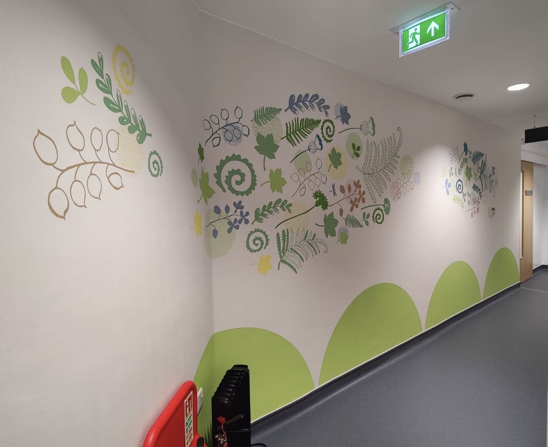
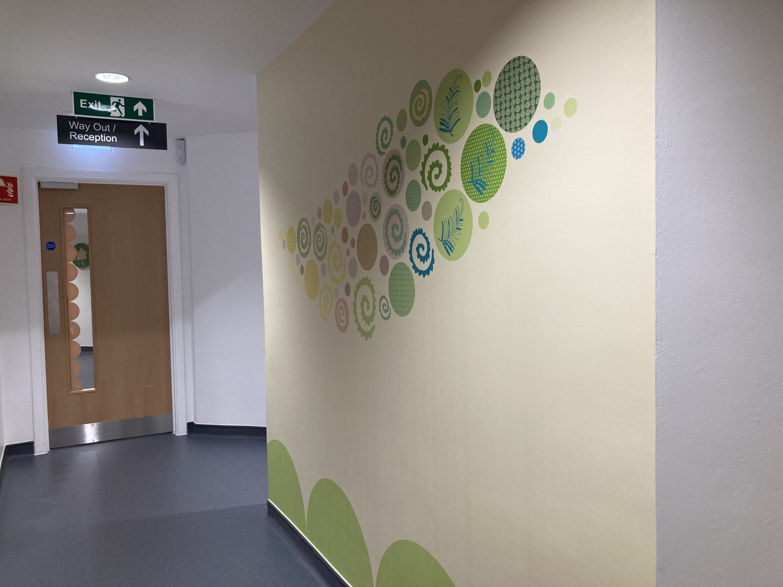
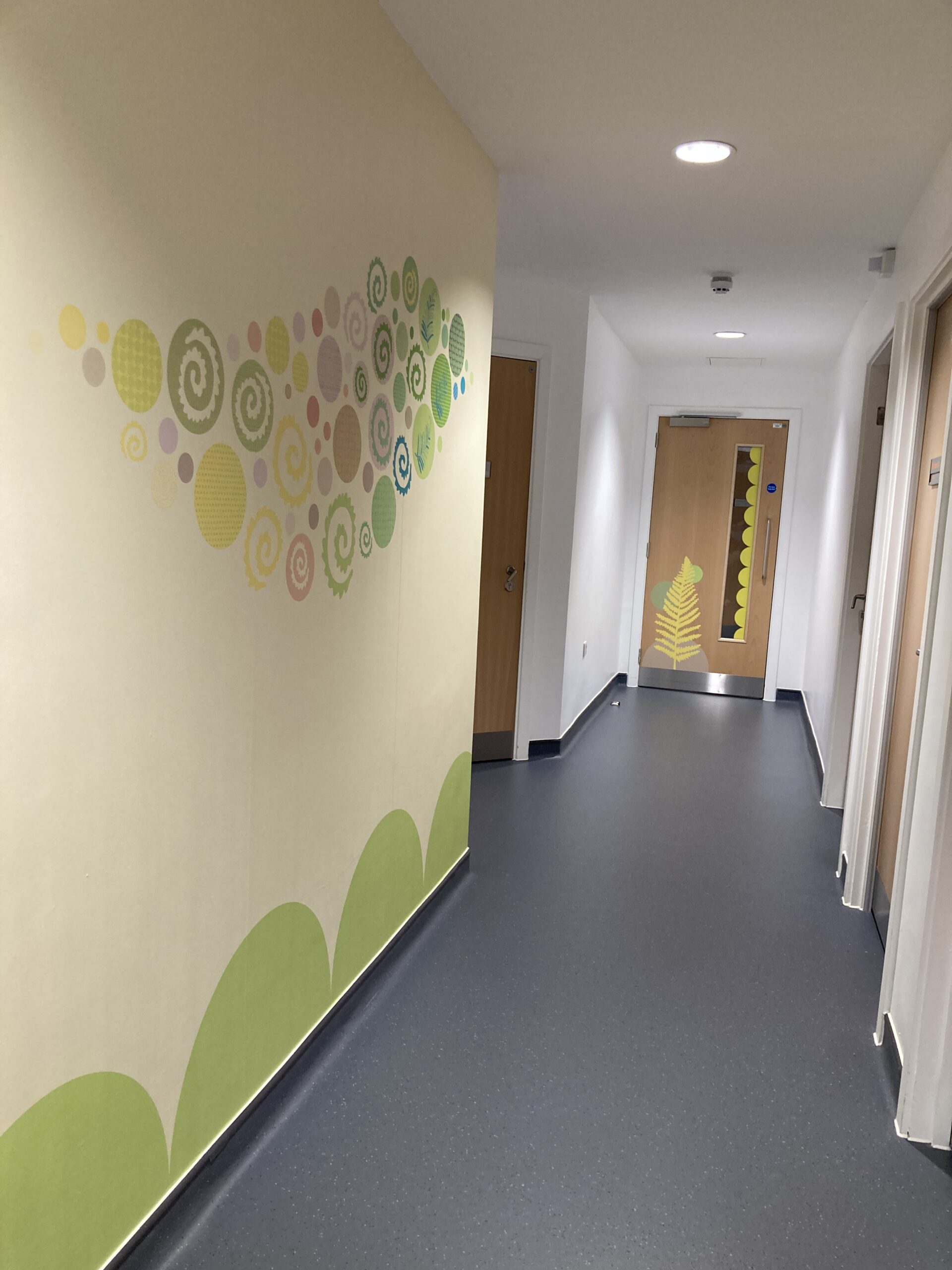
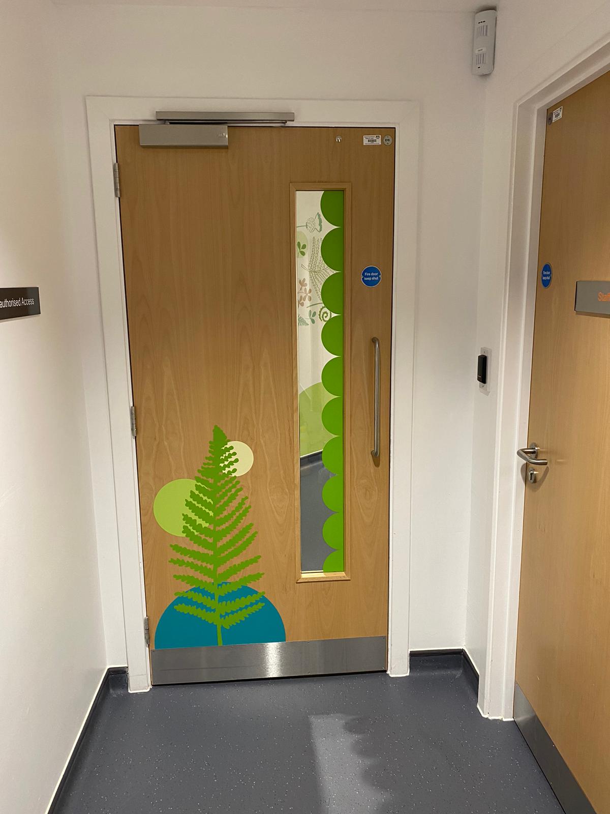
With my artwork I like to create work that captures a sense of place and is meaningful and unique to space and the people who use it. You can find out more about my projects and commissions on my website where there are examples of a range of projects from outdoor active travel public artworks, healthcare corridor artworks, illustrations for books and much more.


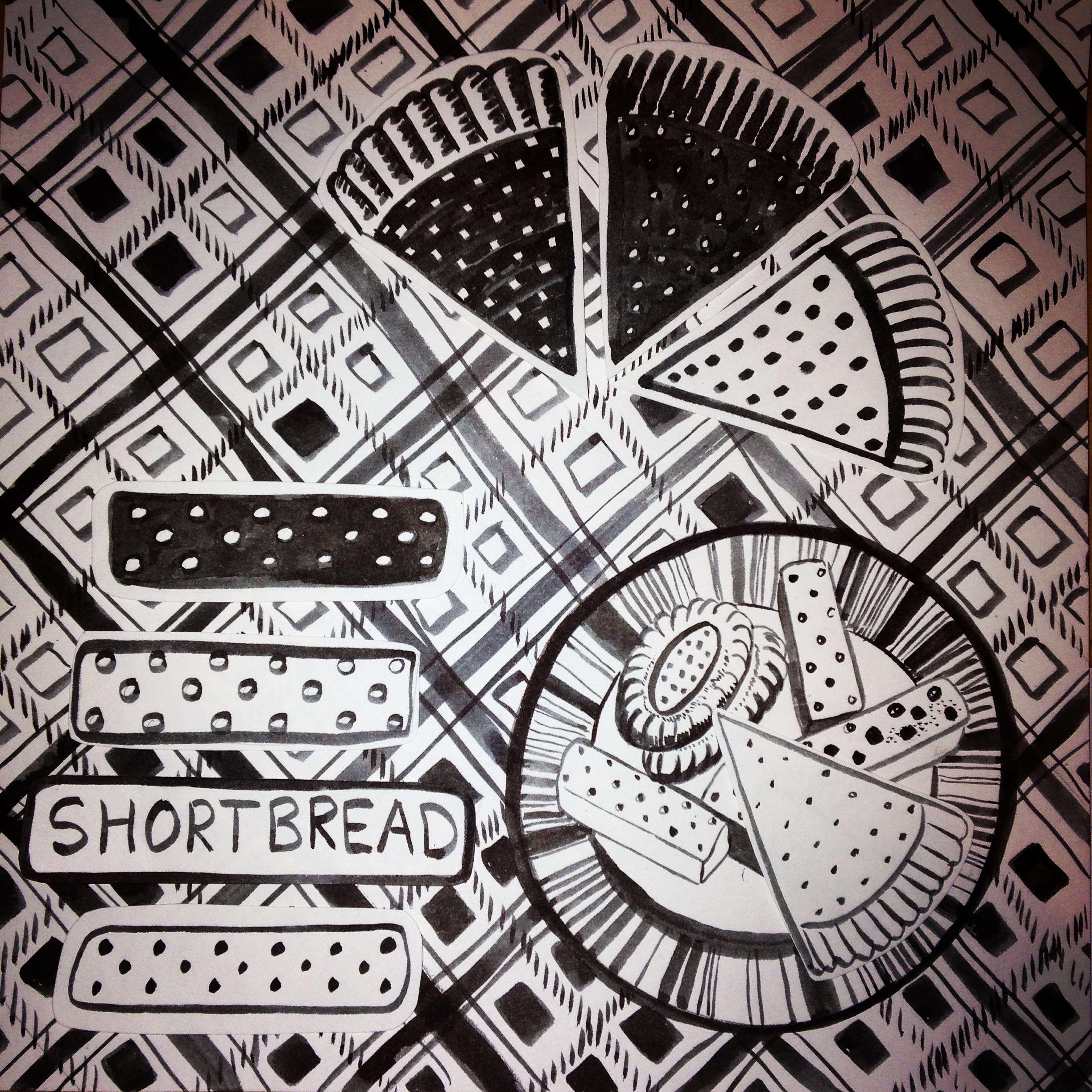
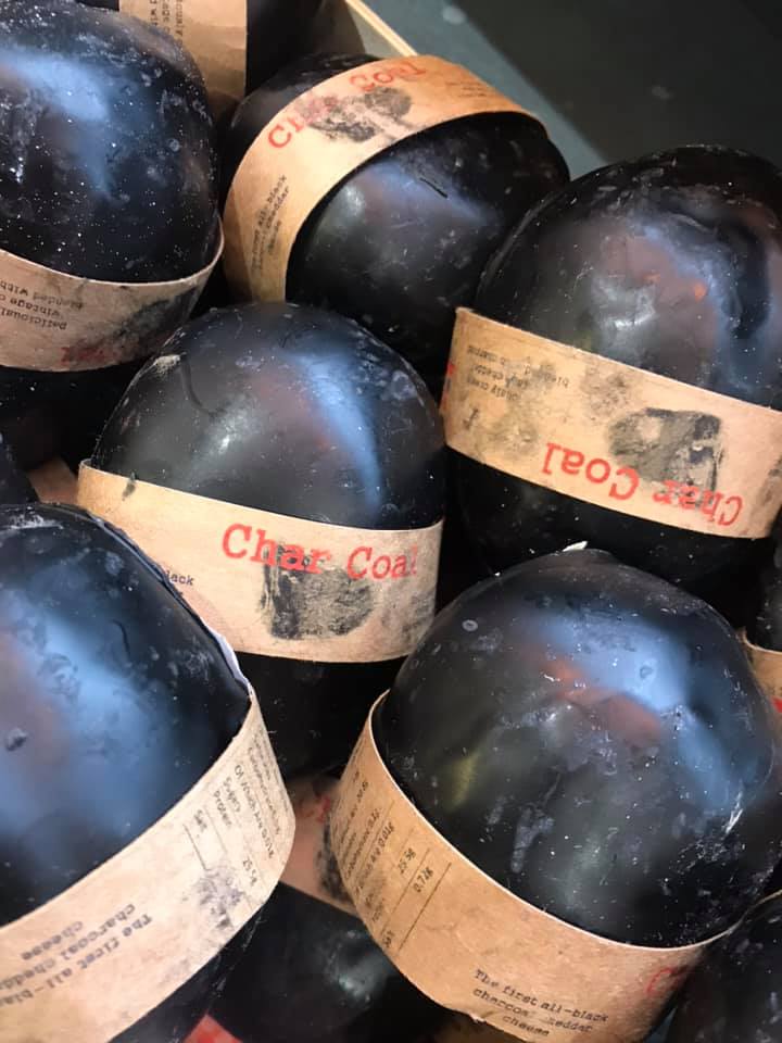
 Here in Scotland its tradition on Hogmanay (New Years Eve) to give a first foot gift after midnight. Traditionally gifts would be whisky to represent financial prosperity and good cheer, a lump of coal to represent warmth and to keep the fire burning, or a black bun or shortbread to symbolise that the receiving family would not go hungry during the forthcoming year.