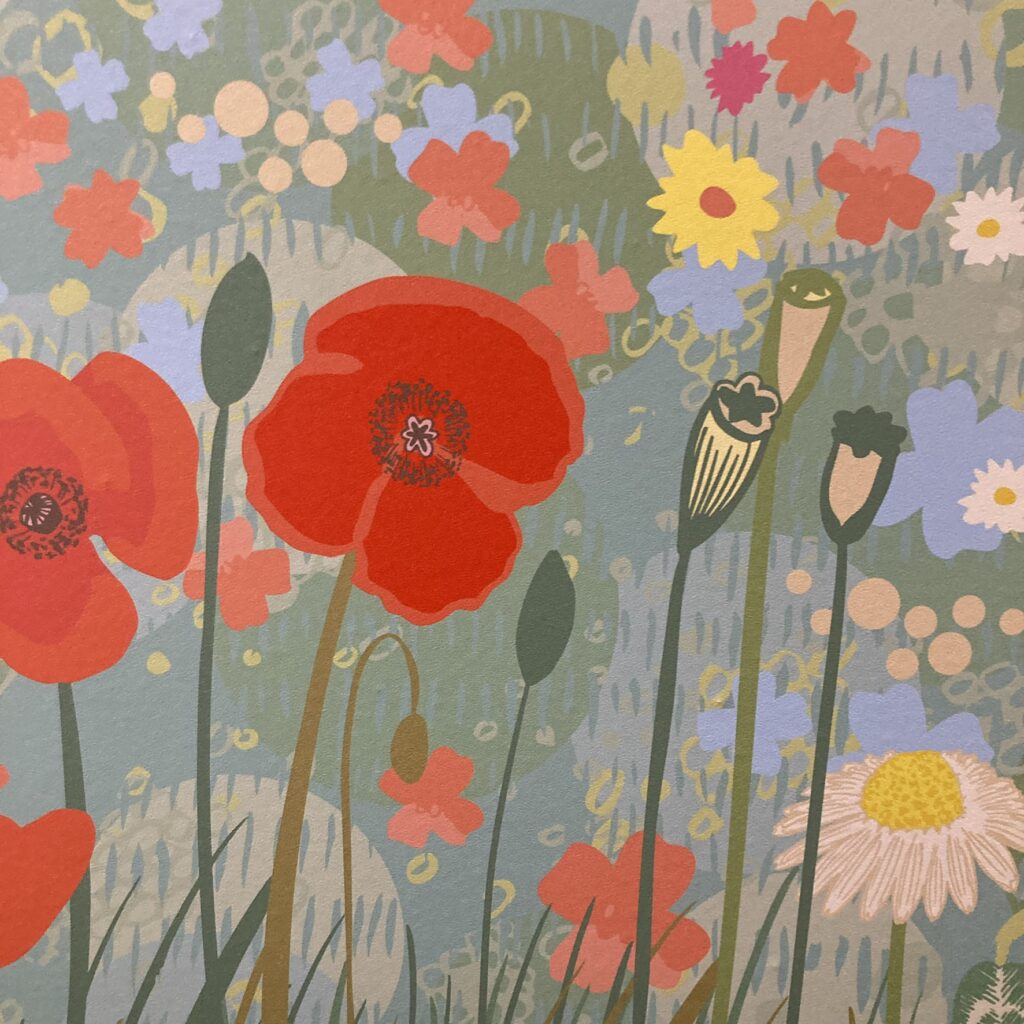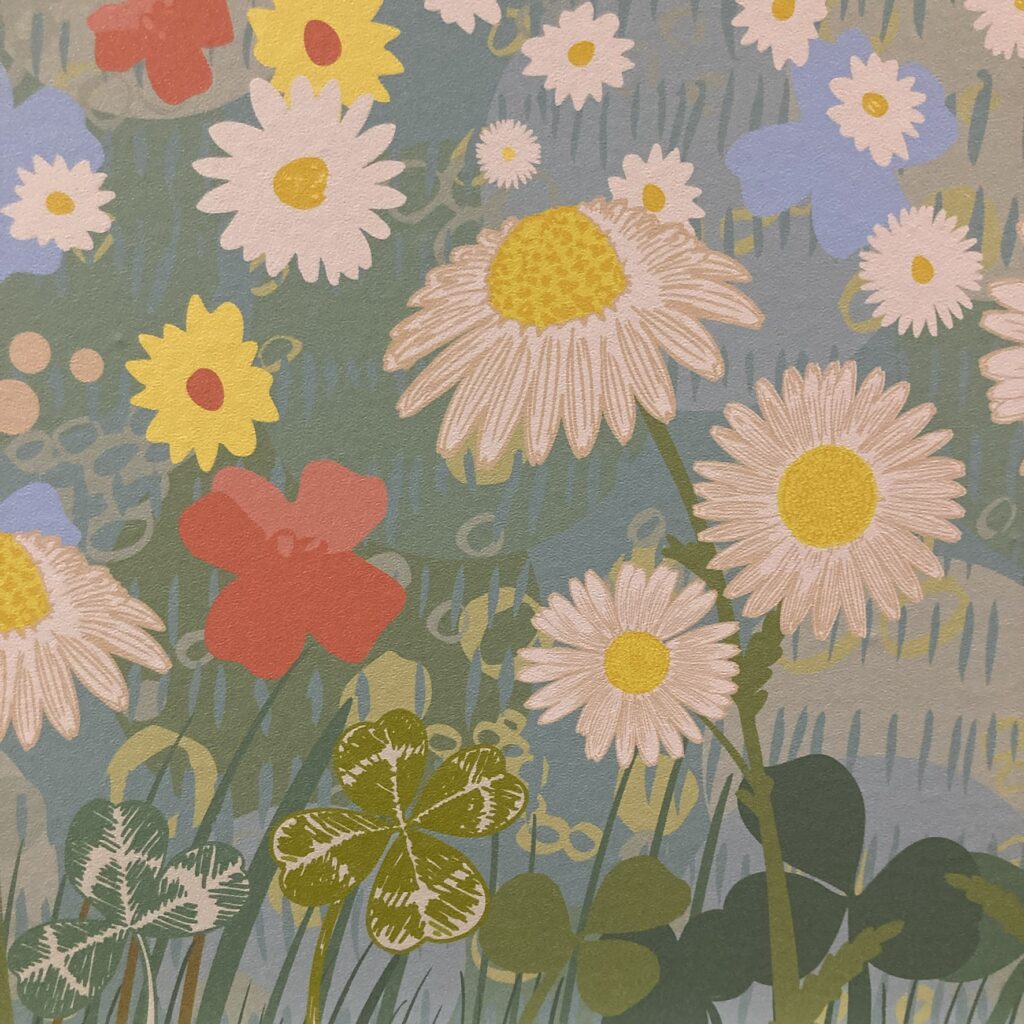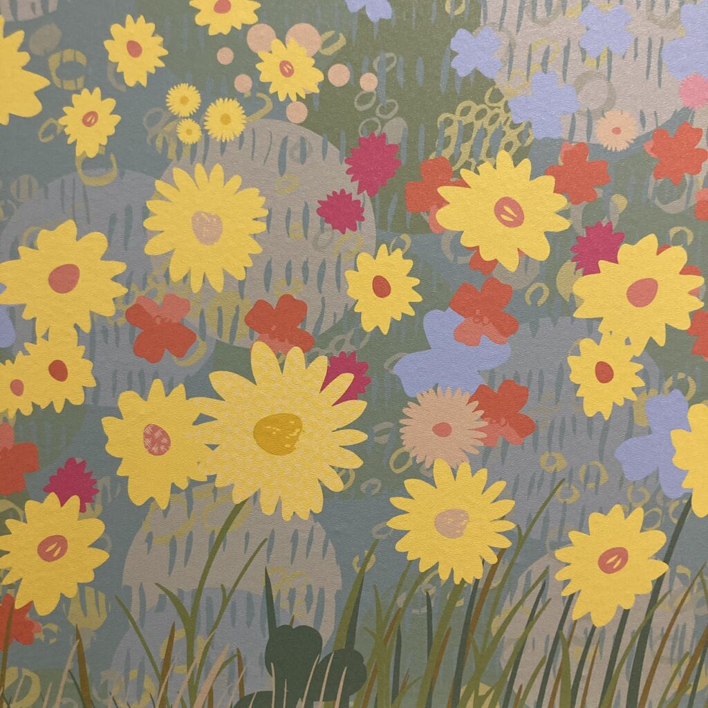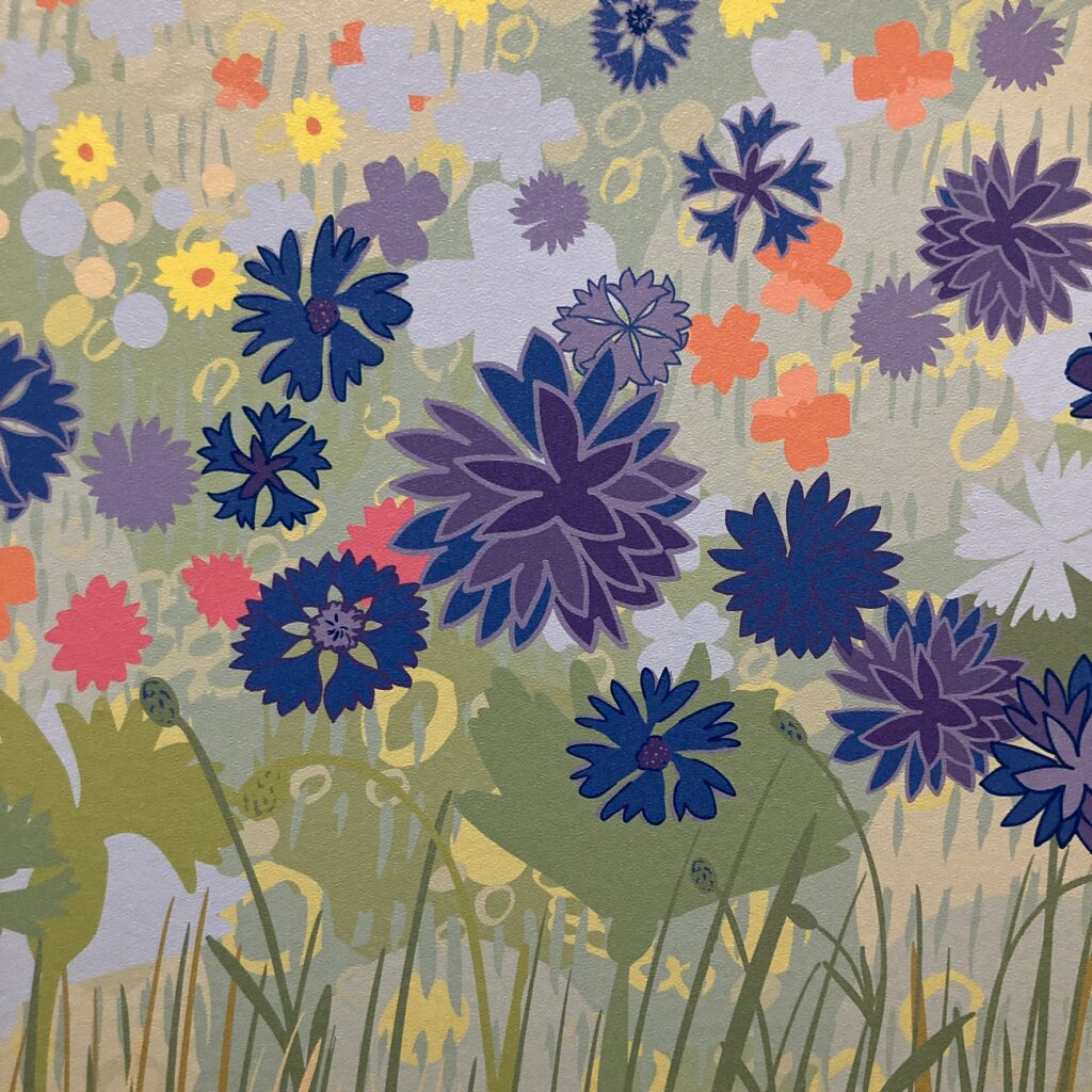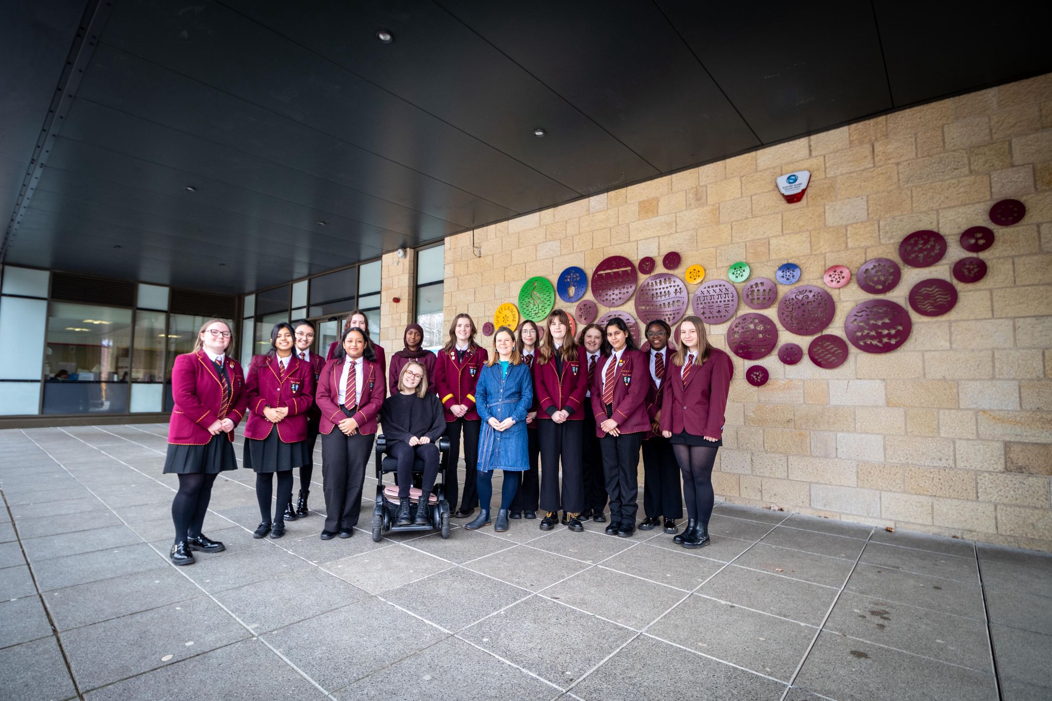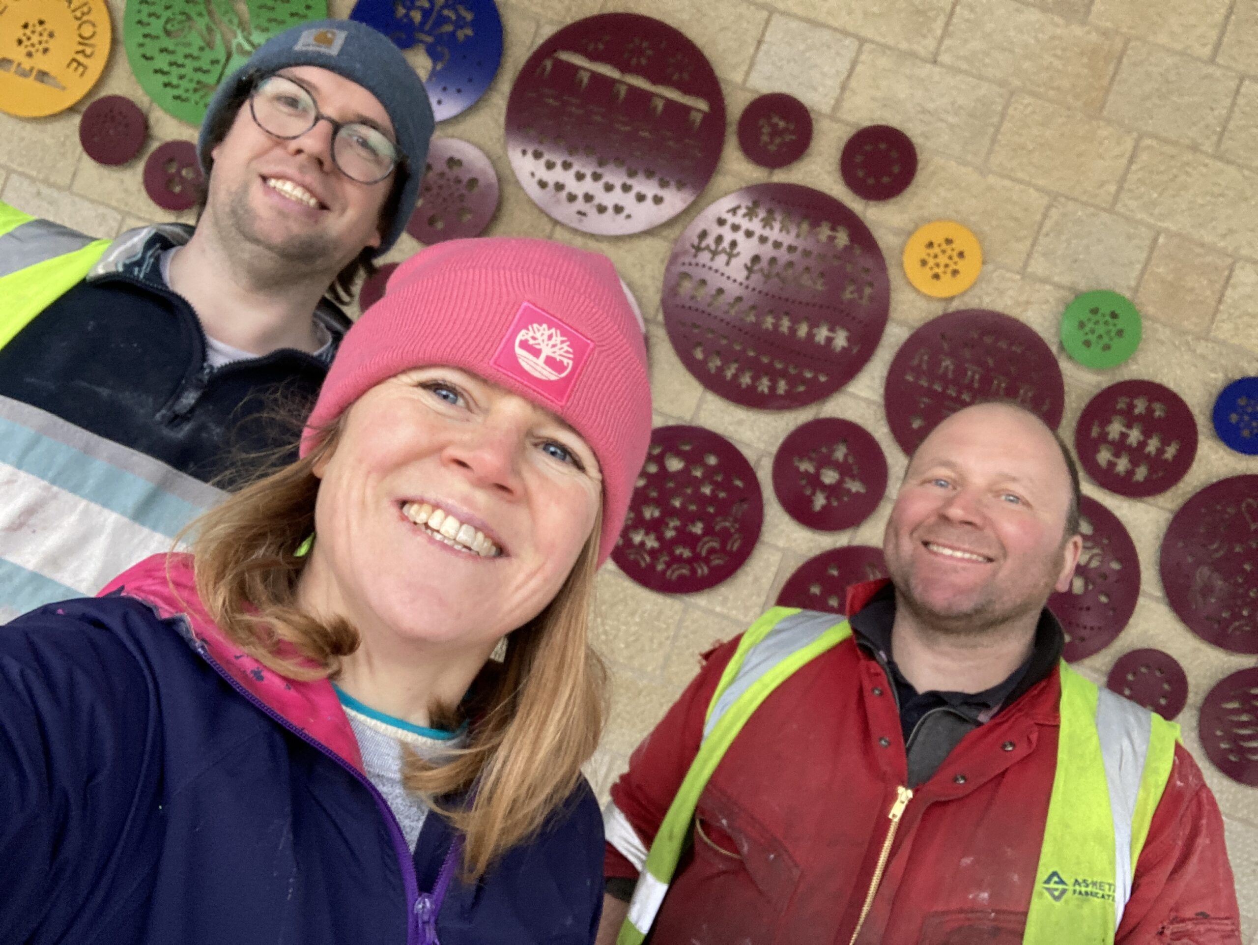
Delighted to share my latest commission for The Sycamore Centre in Edinburgh. I was commissioned to create a welcoming, comfortable and calming environment to reduce the clinical and institutional feel. I did with a mindful approach through my choice of imagery, colour, materials and consideration of the user experience.
The Sycamore centre is the Equally Safe Multi Agency centre (ESMAC) is based in Edinburgh and is a dedicated facility, which provides a wraparound person-centred trauma informed service for adults 16 and over who have encountered gender-based violence, rape, and sexual assault, who live in Edinburgh and the Lothian areas.
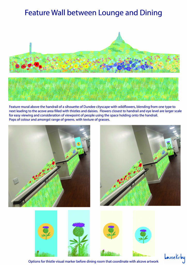
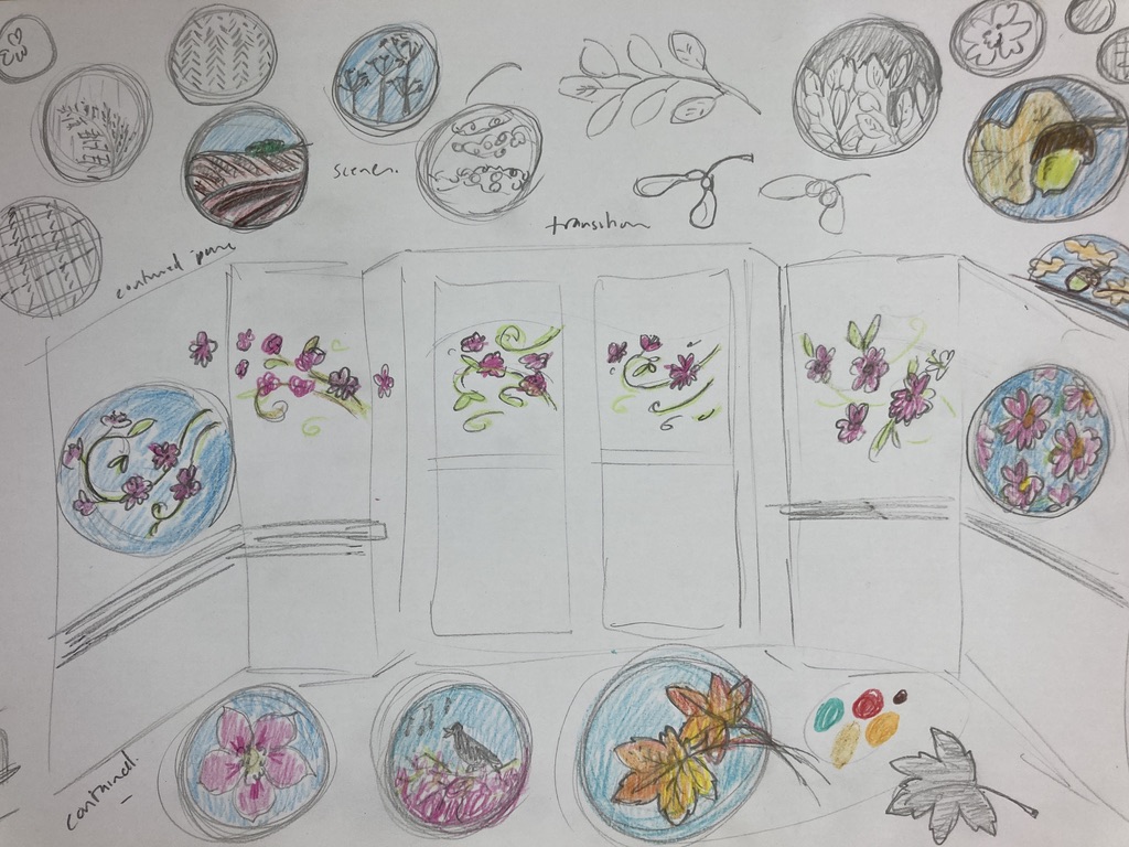
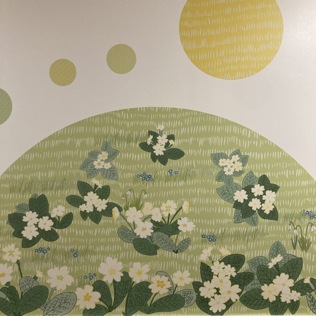
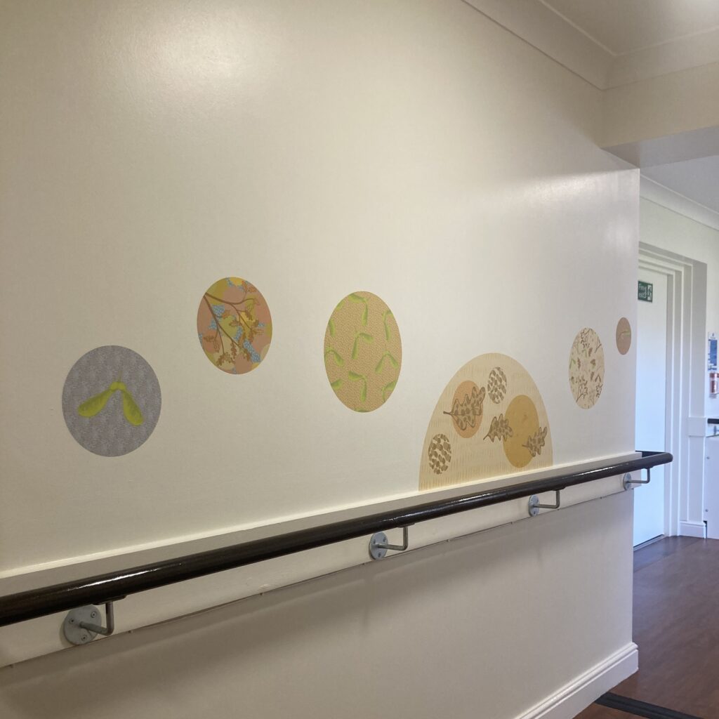
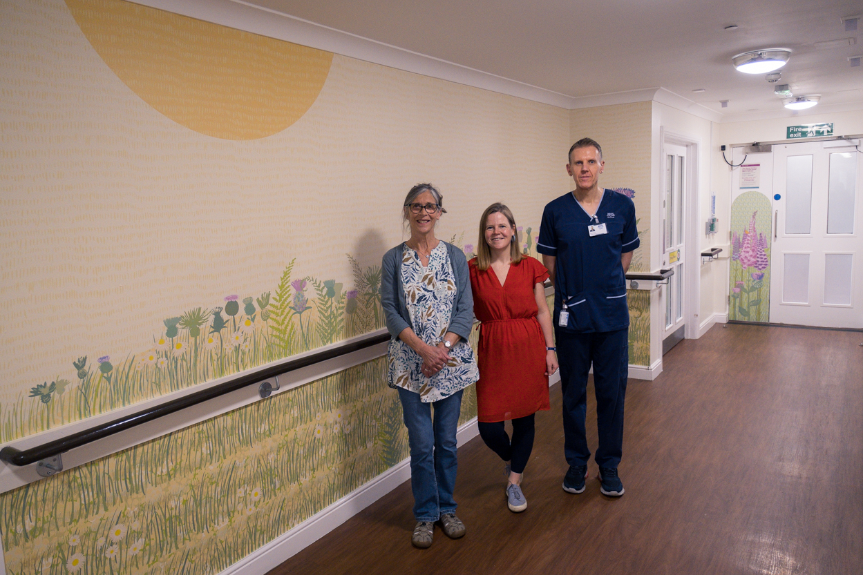
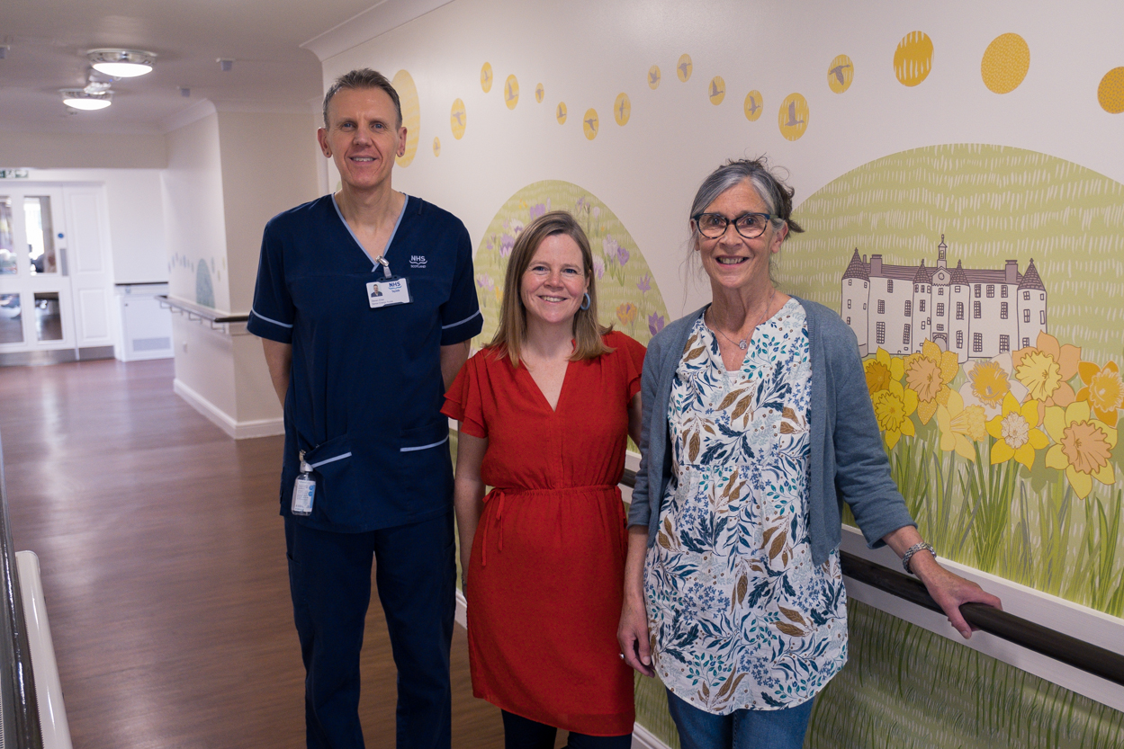
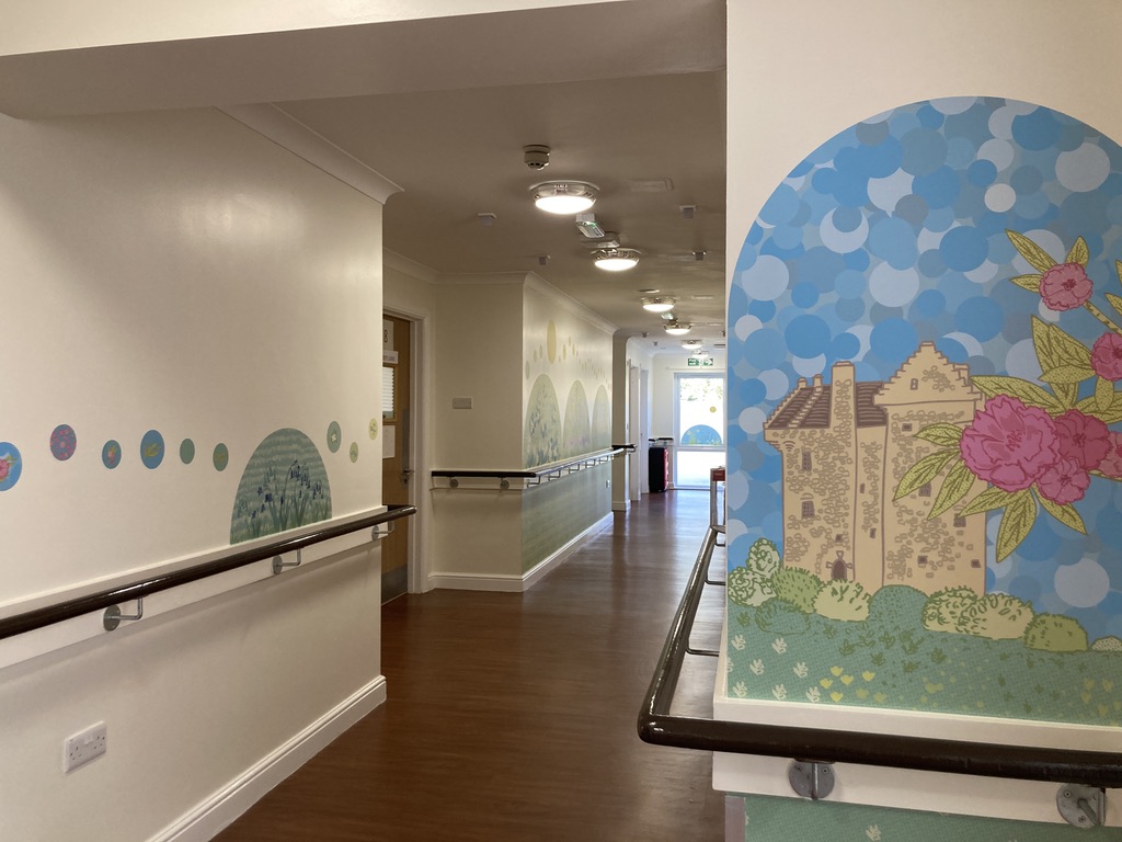
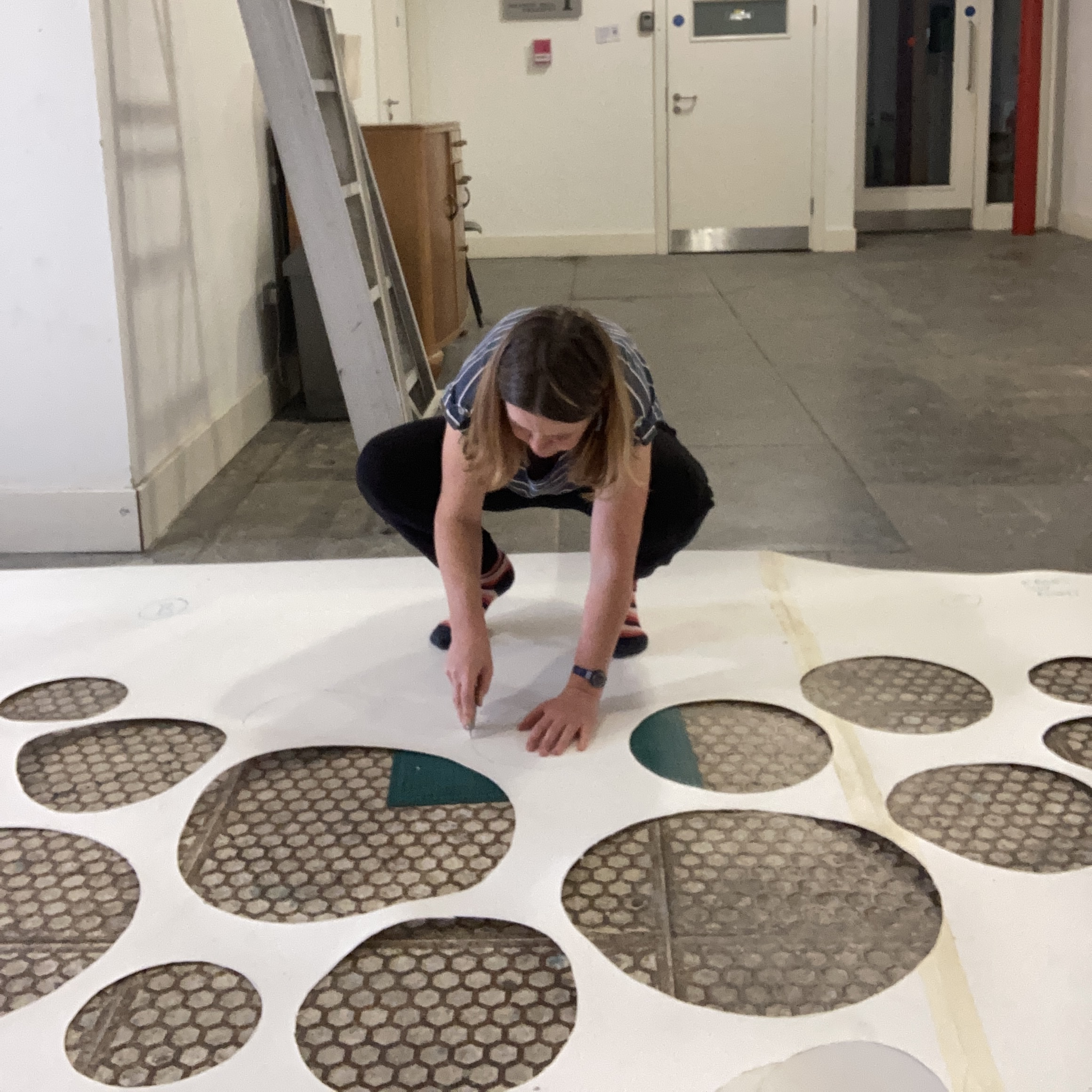
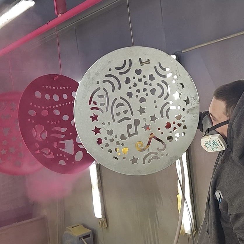
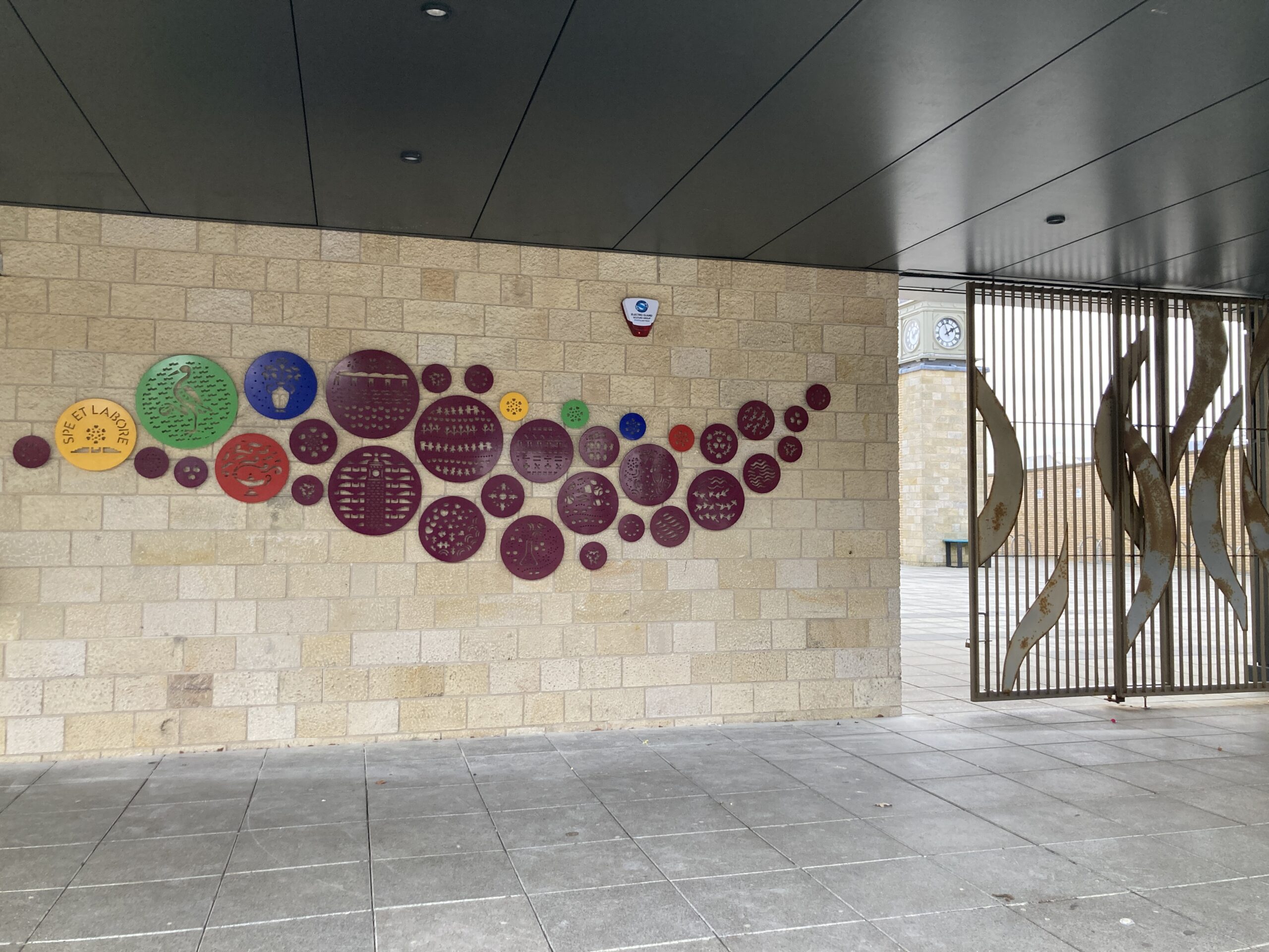
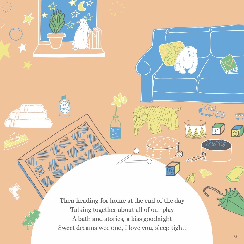
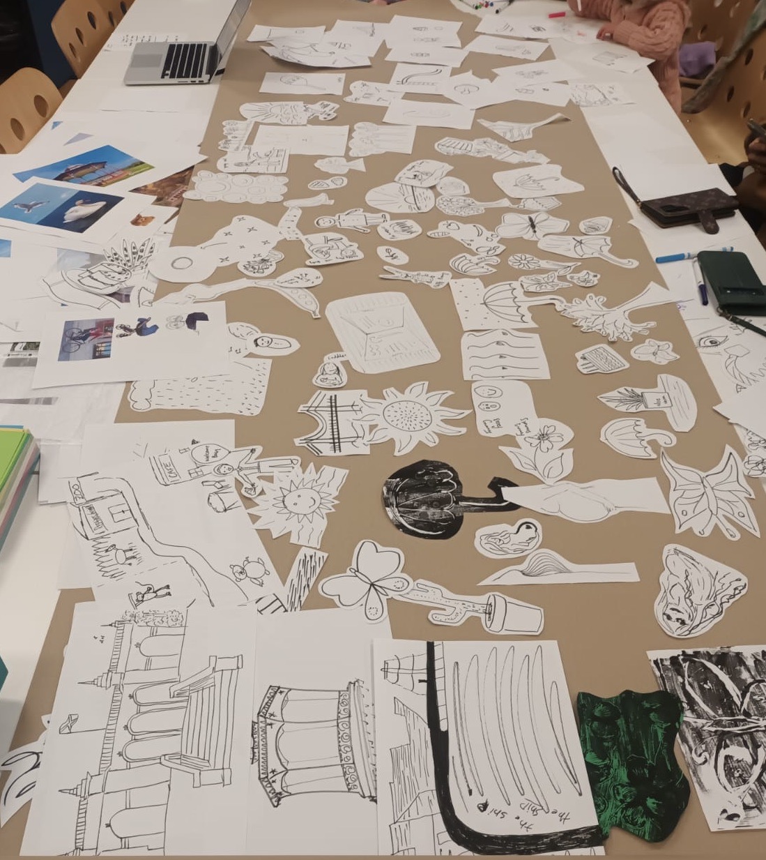
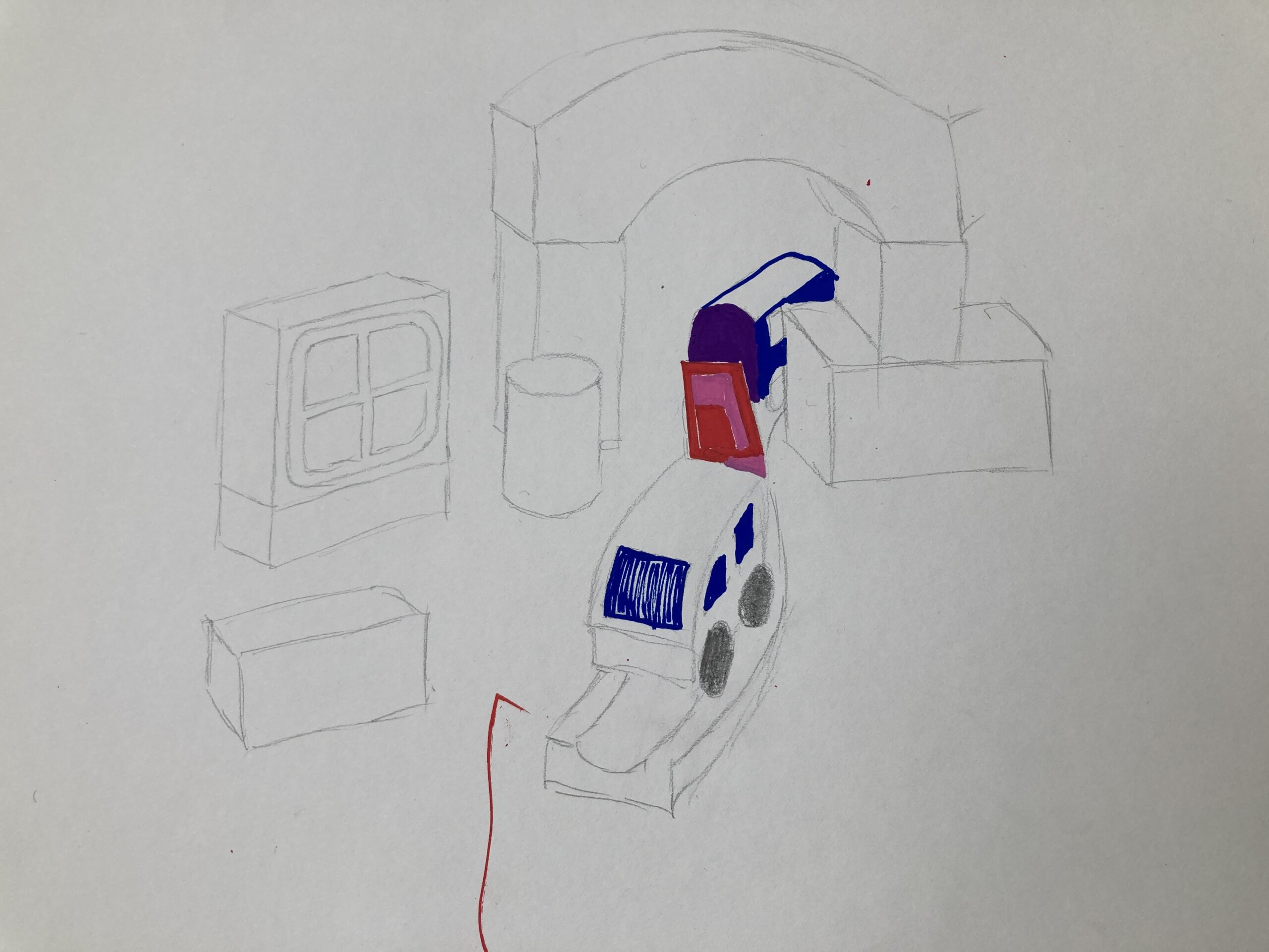
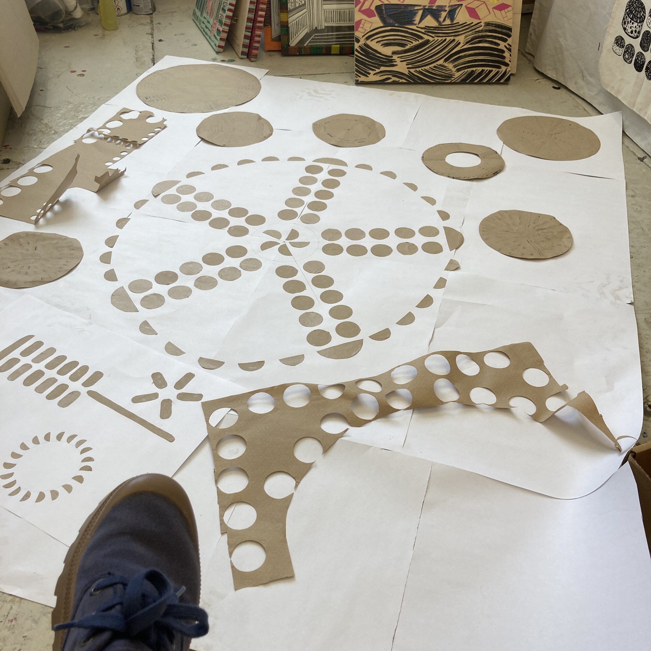
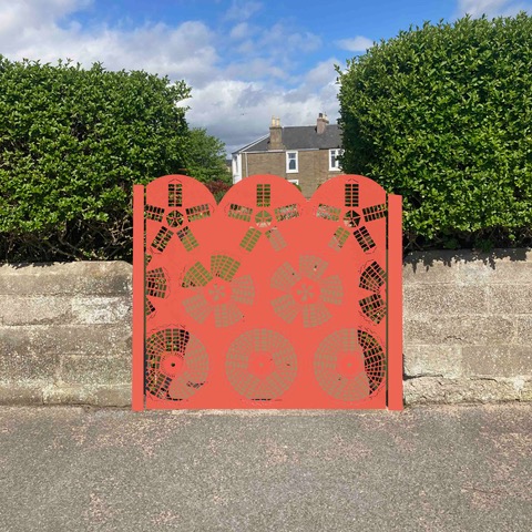
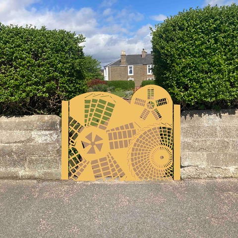
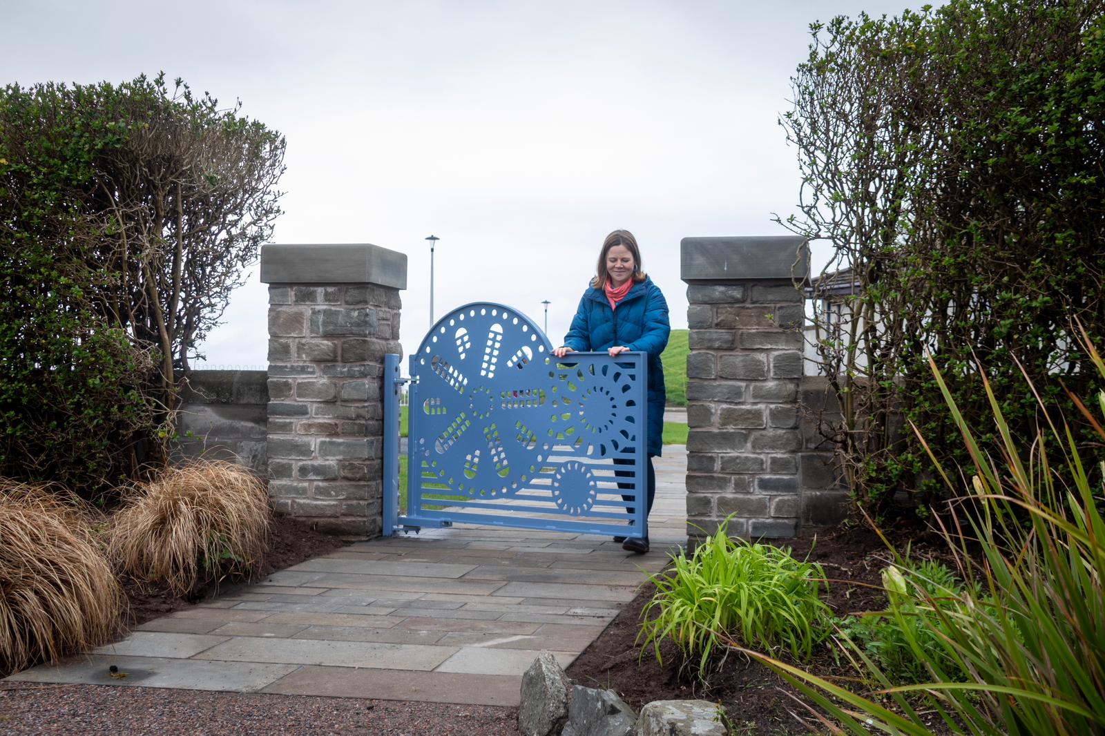
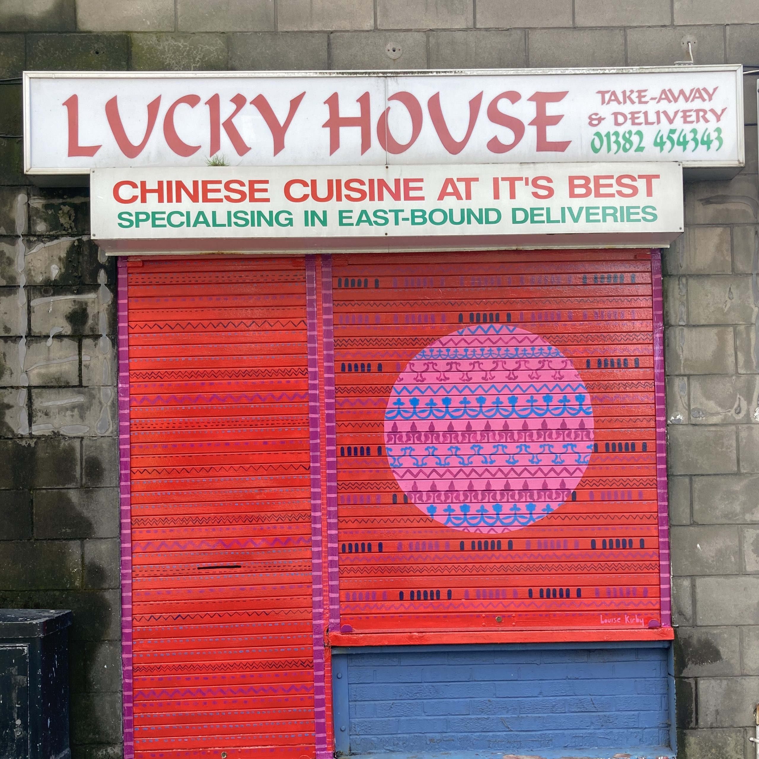
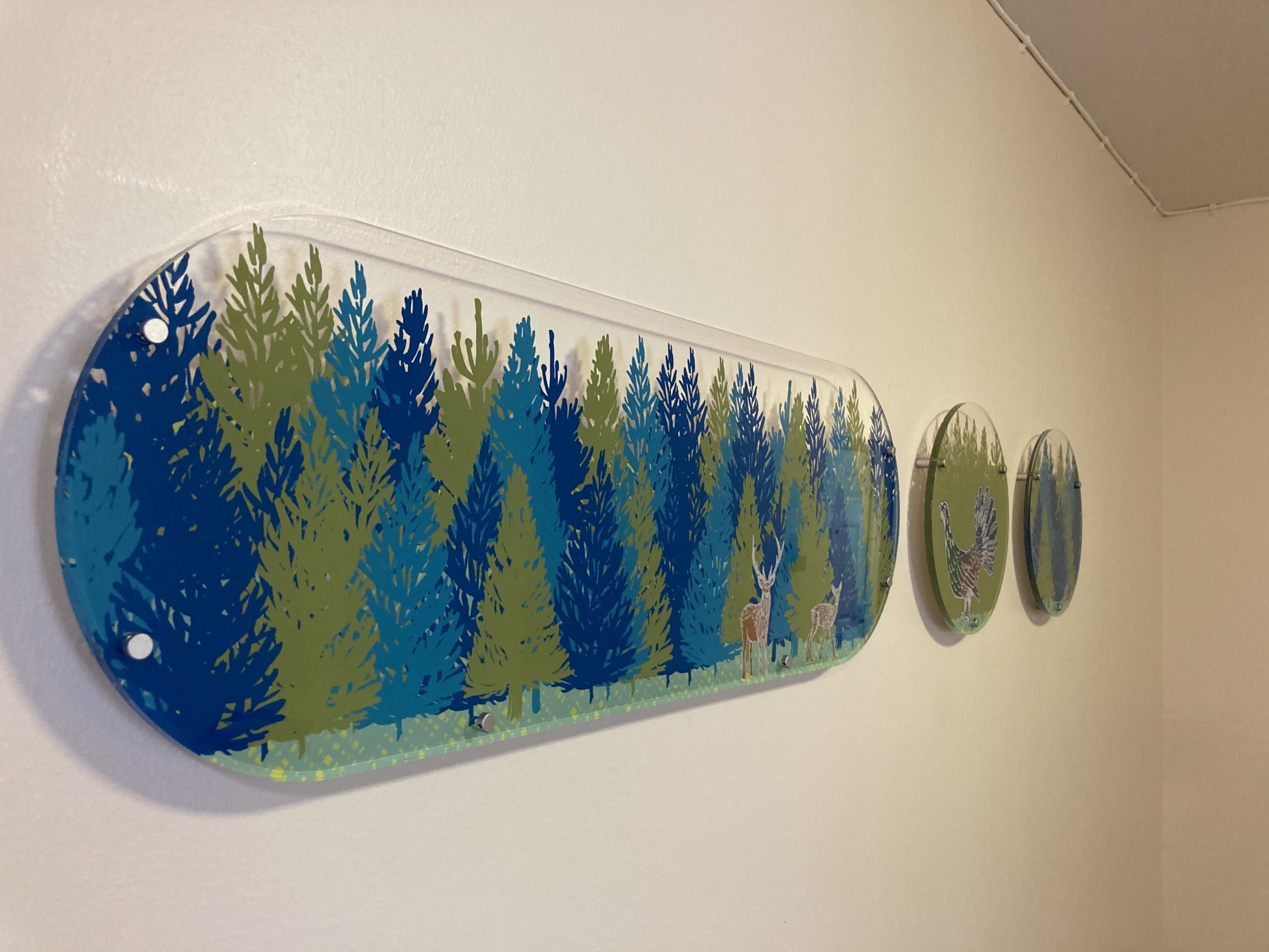
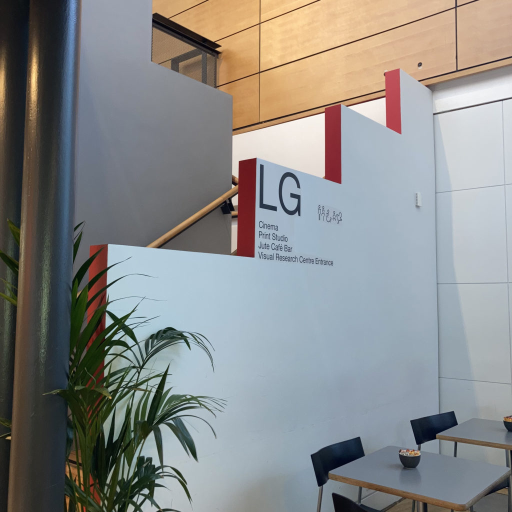
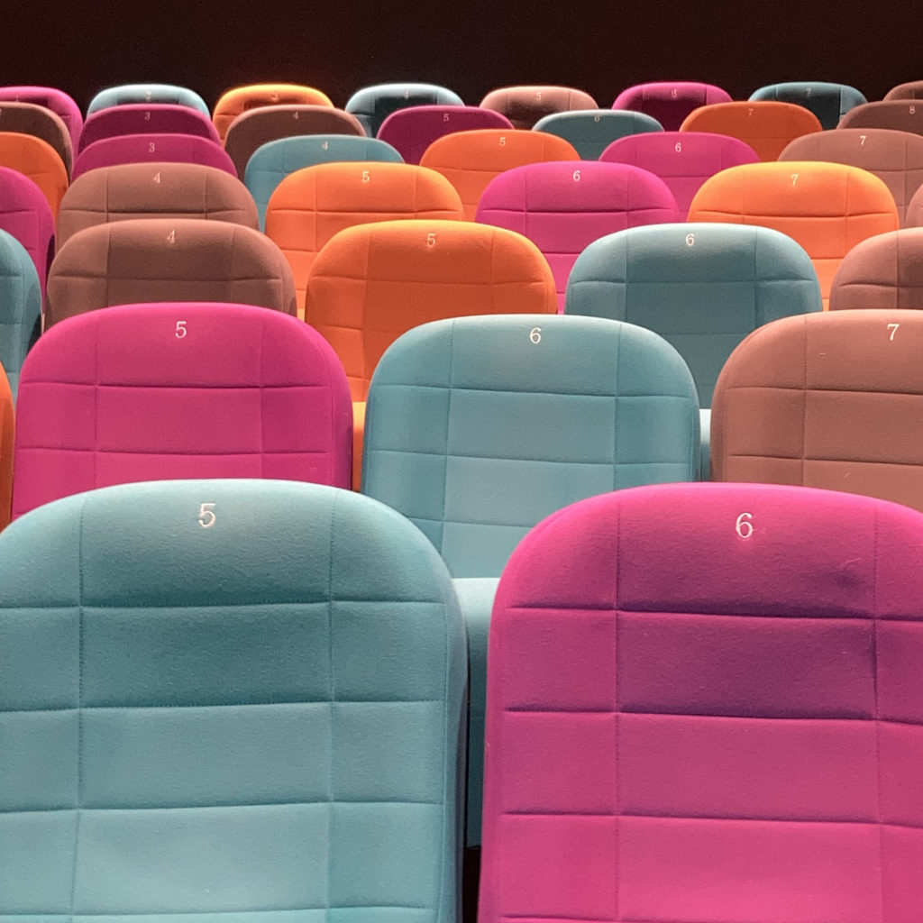
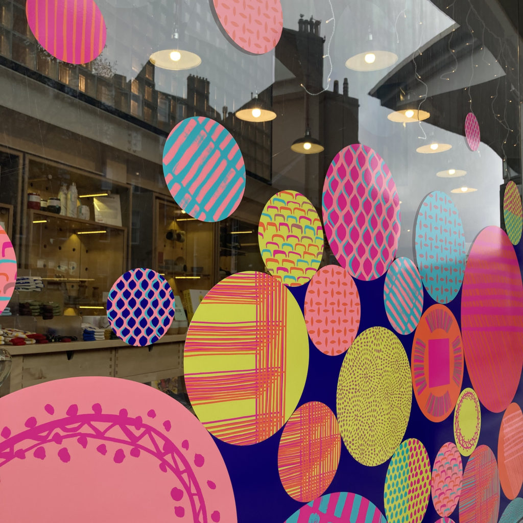
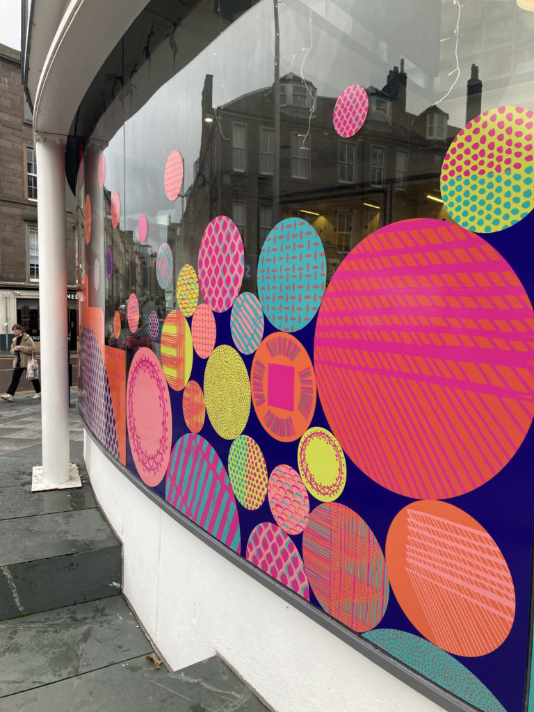
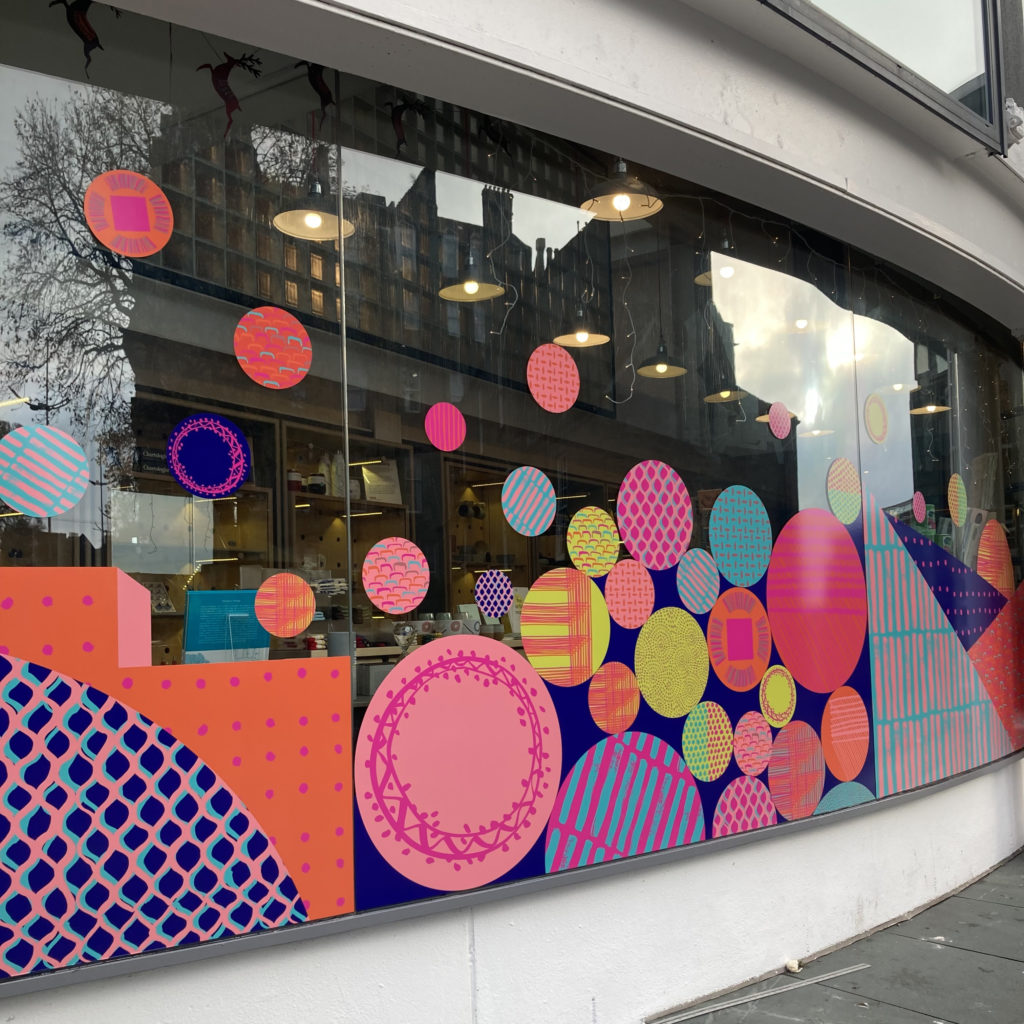
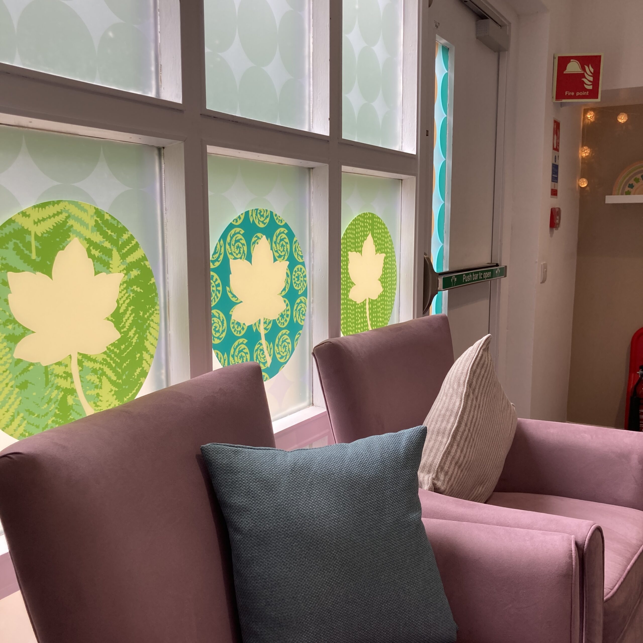
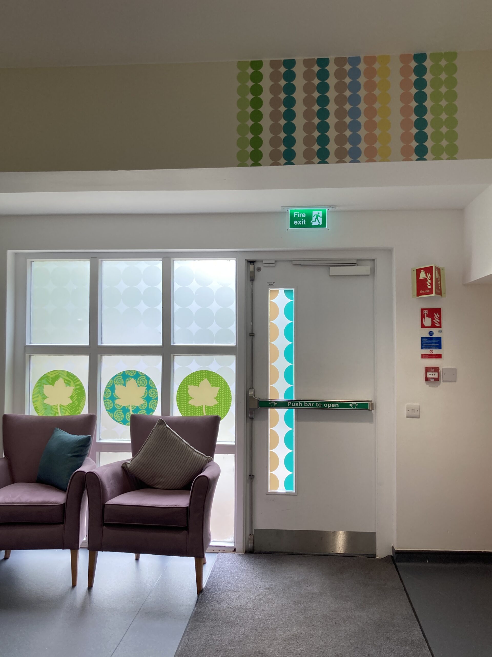
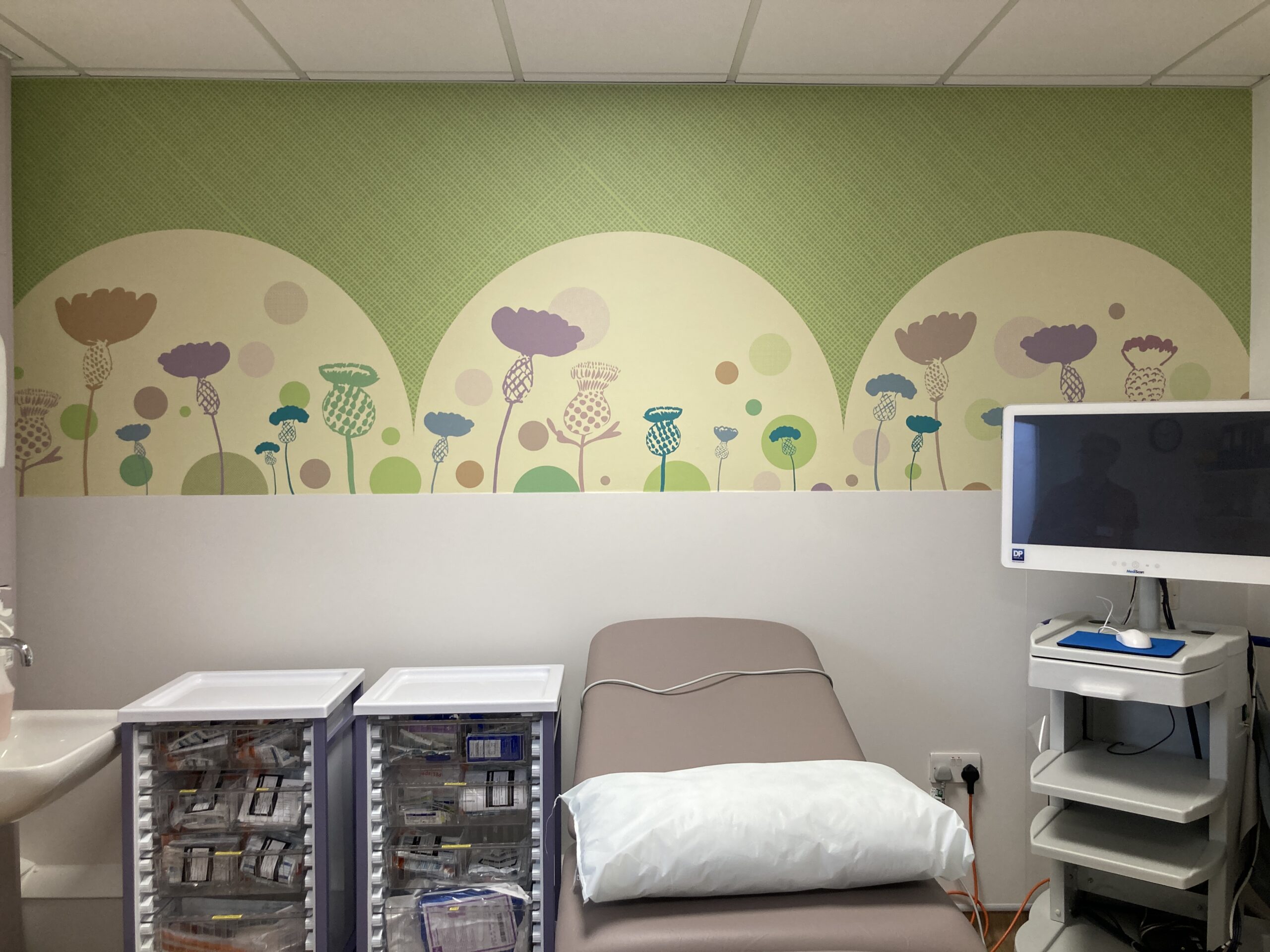
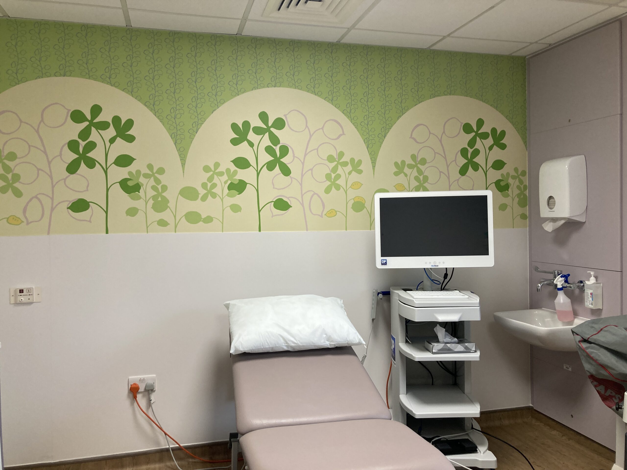
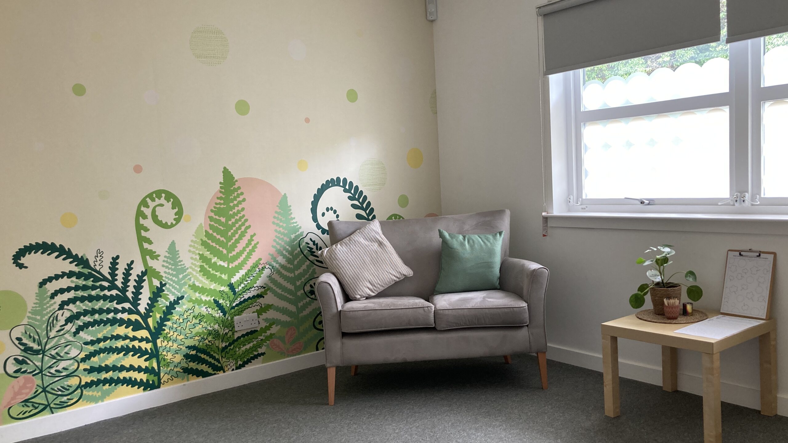
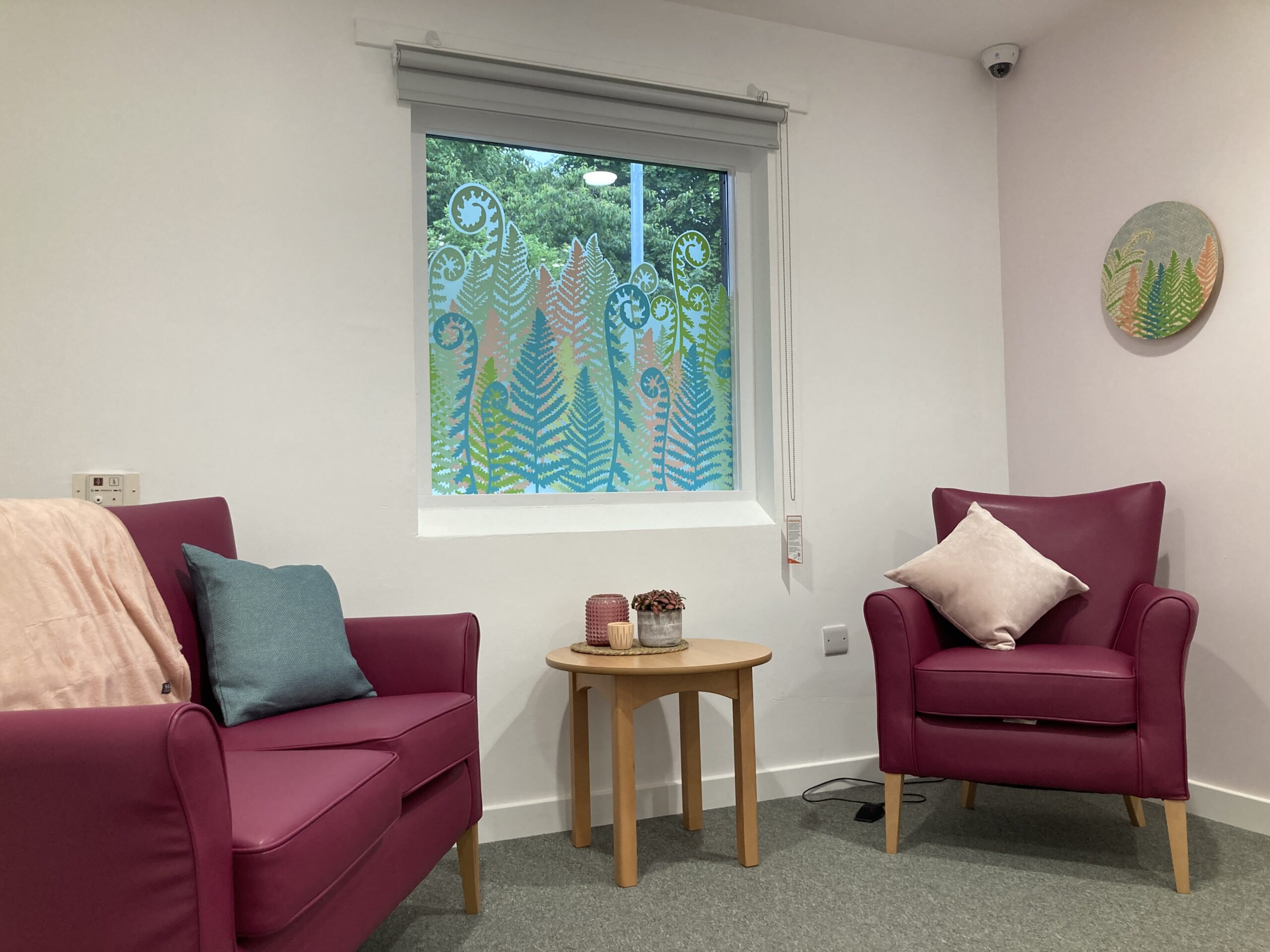
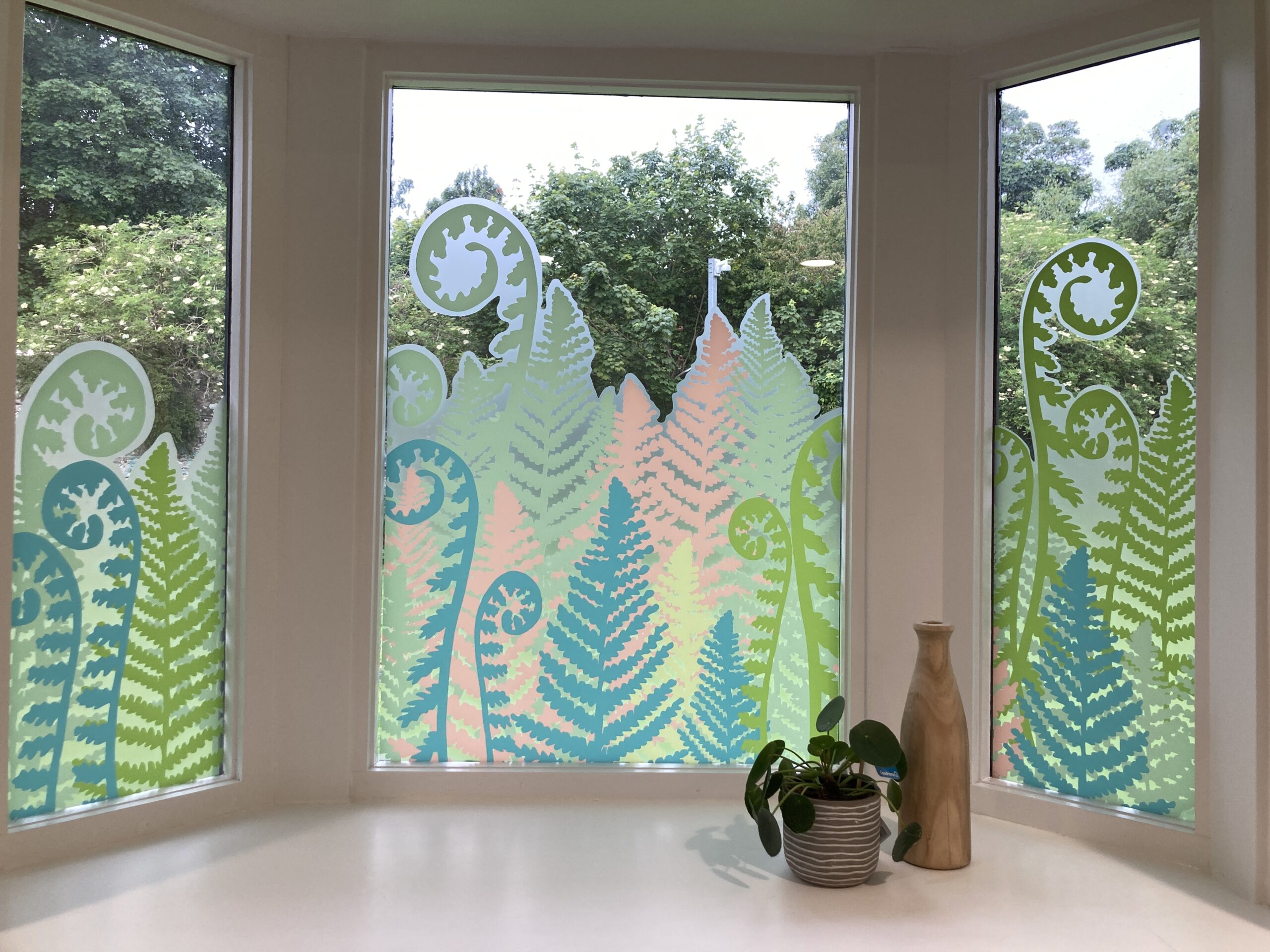
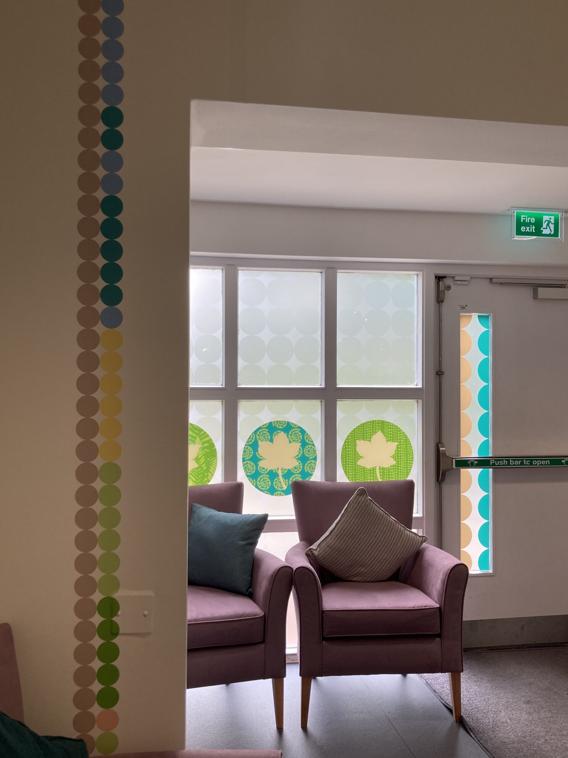
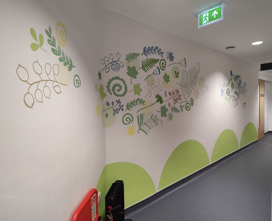
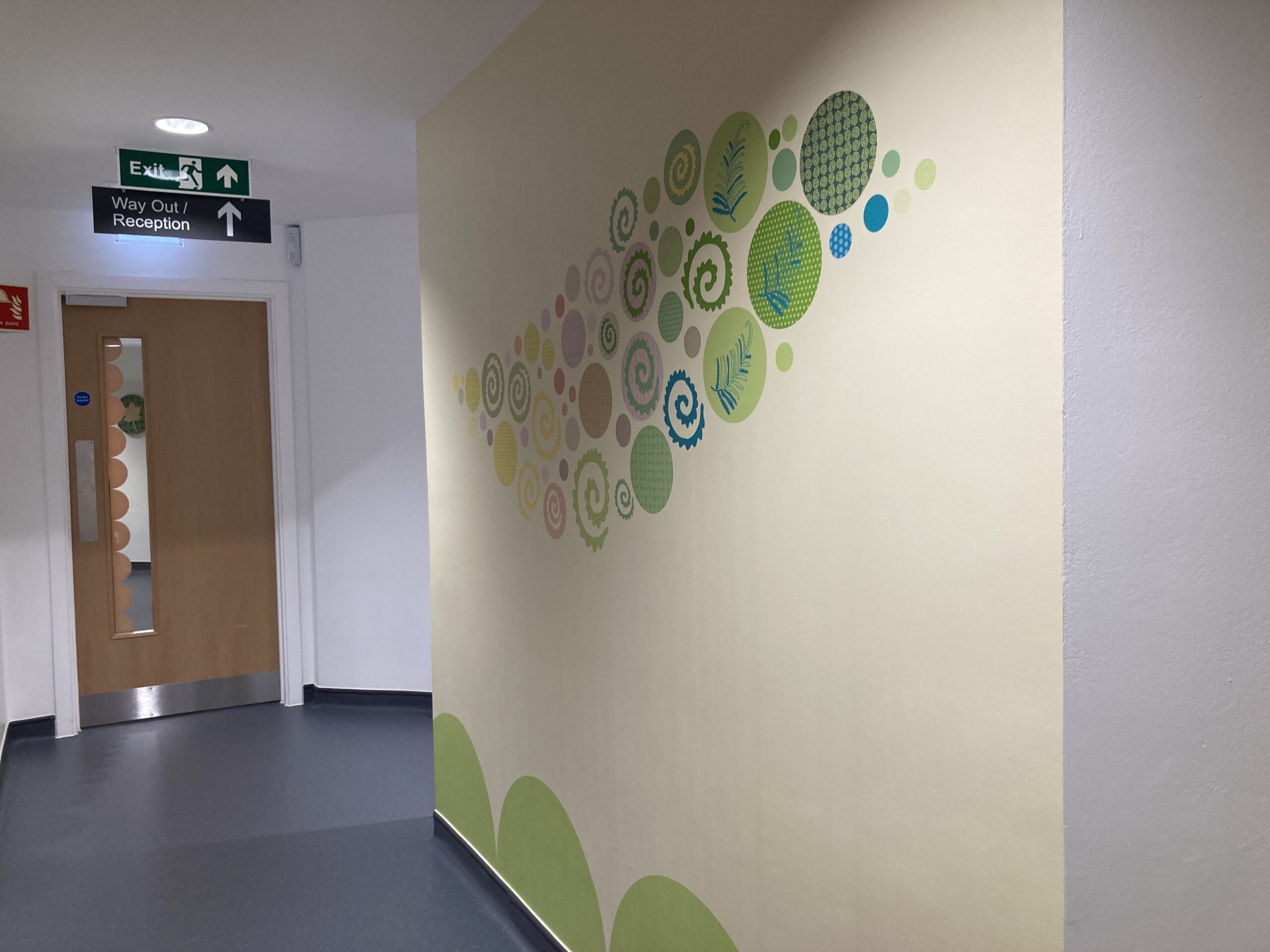
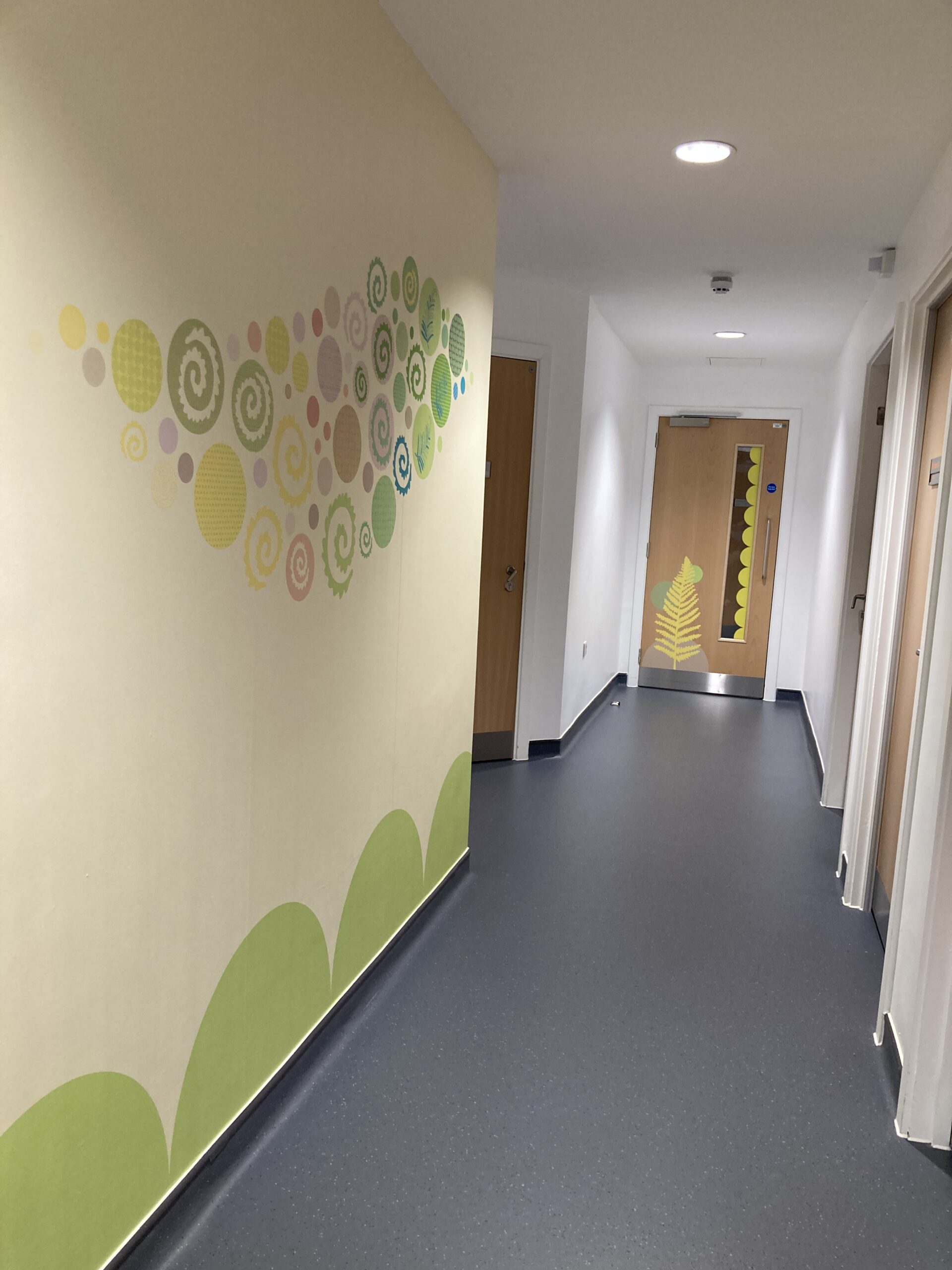
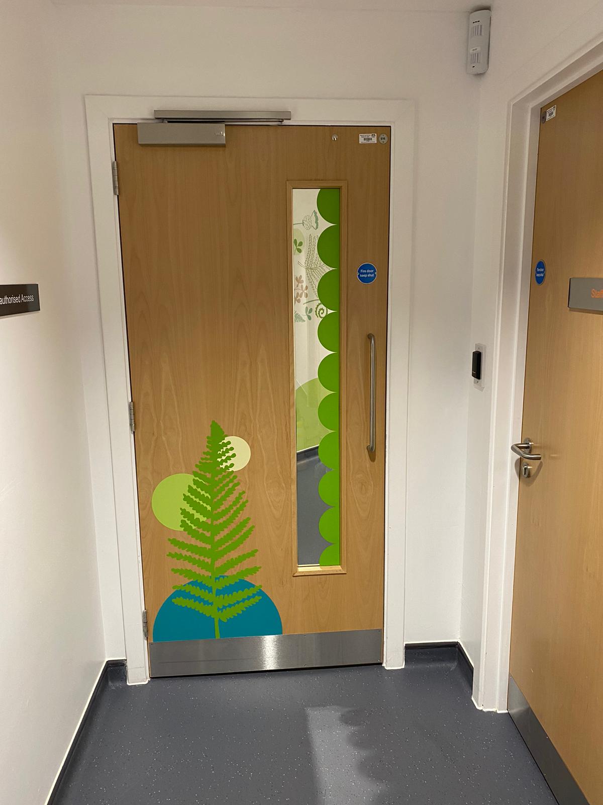
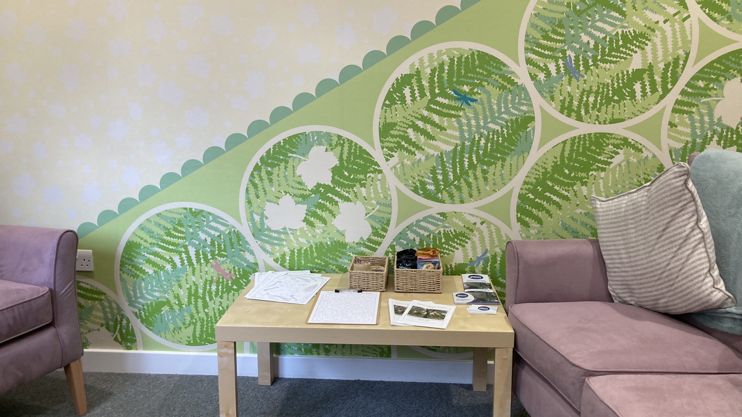
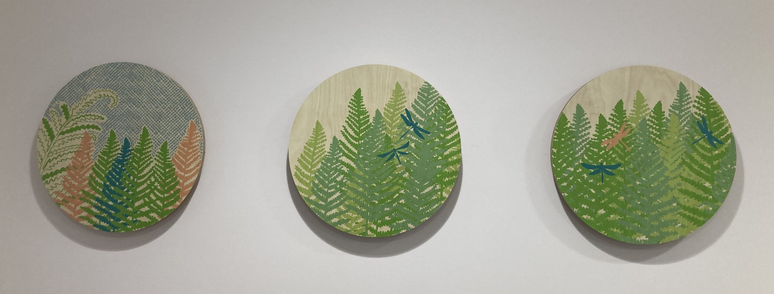
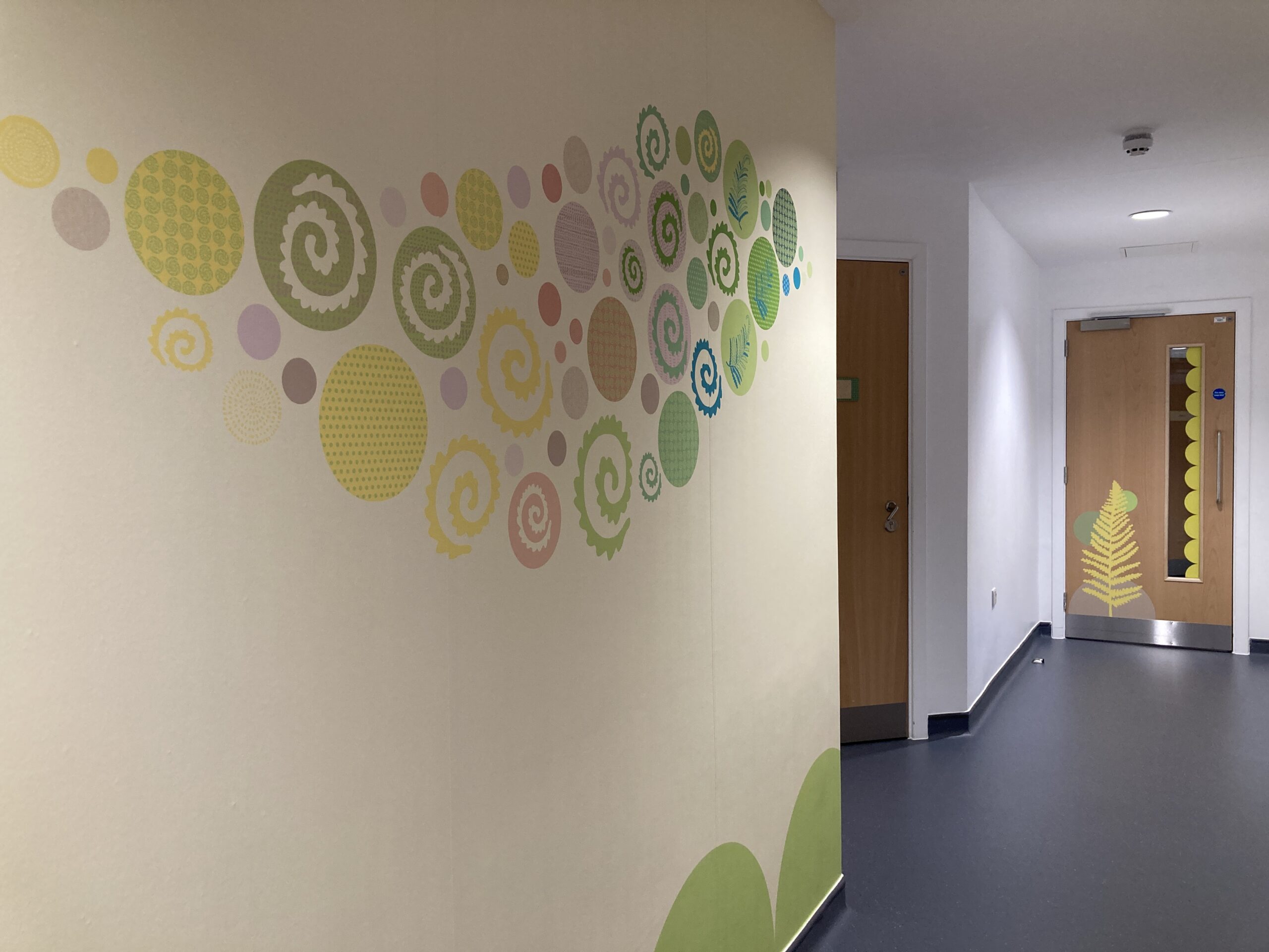
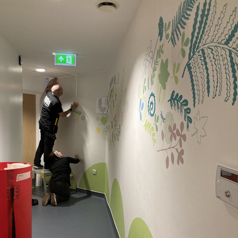
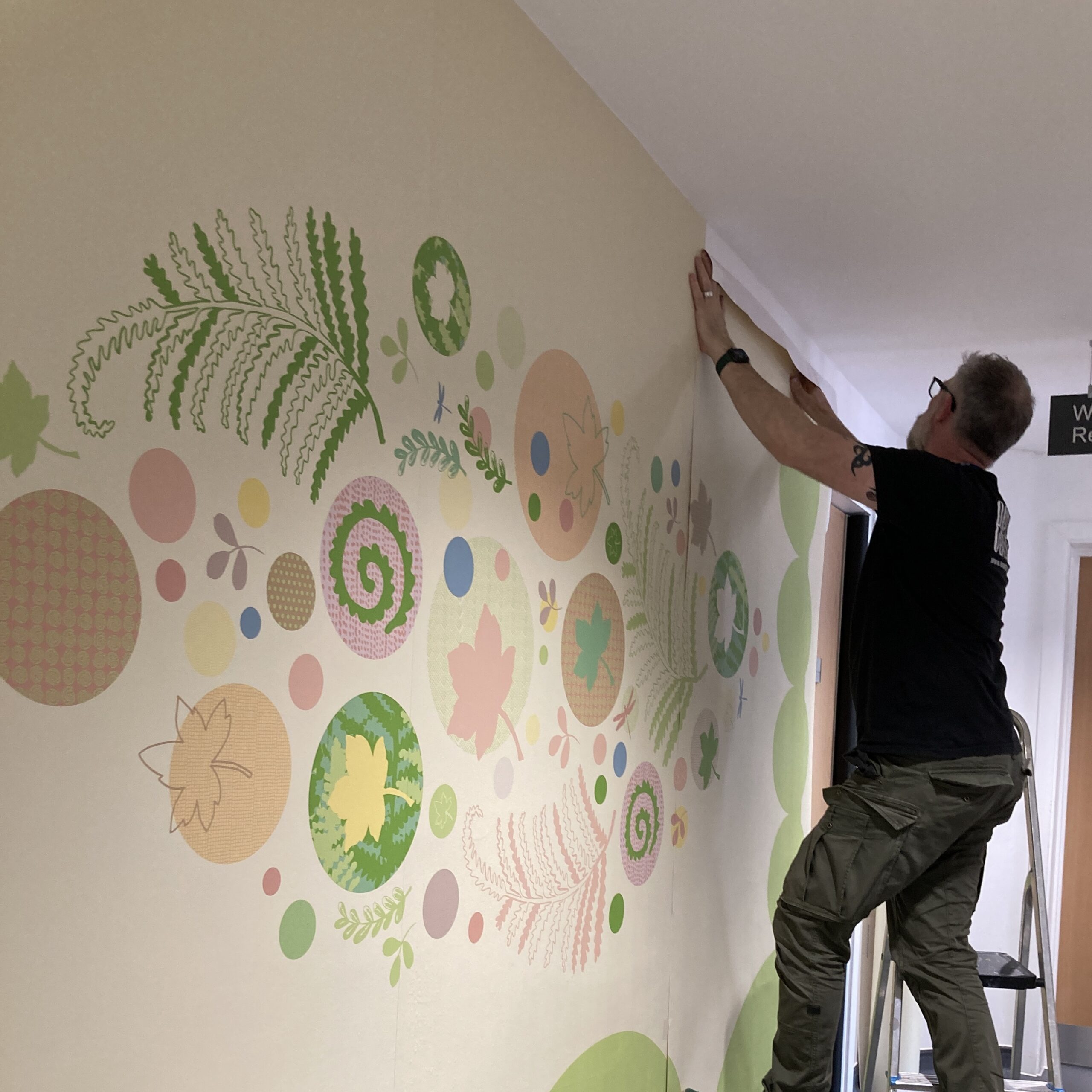
This is my largest project to date where I created artwork for 12 rooms (including forensic suites, police interview rooms, welcome rooms), corridor with 3 feature murals, signage, visual wayfinding, activity sheets, reception area and entrance feature windows and window manifestations.
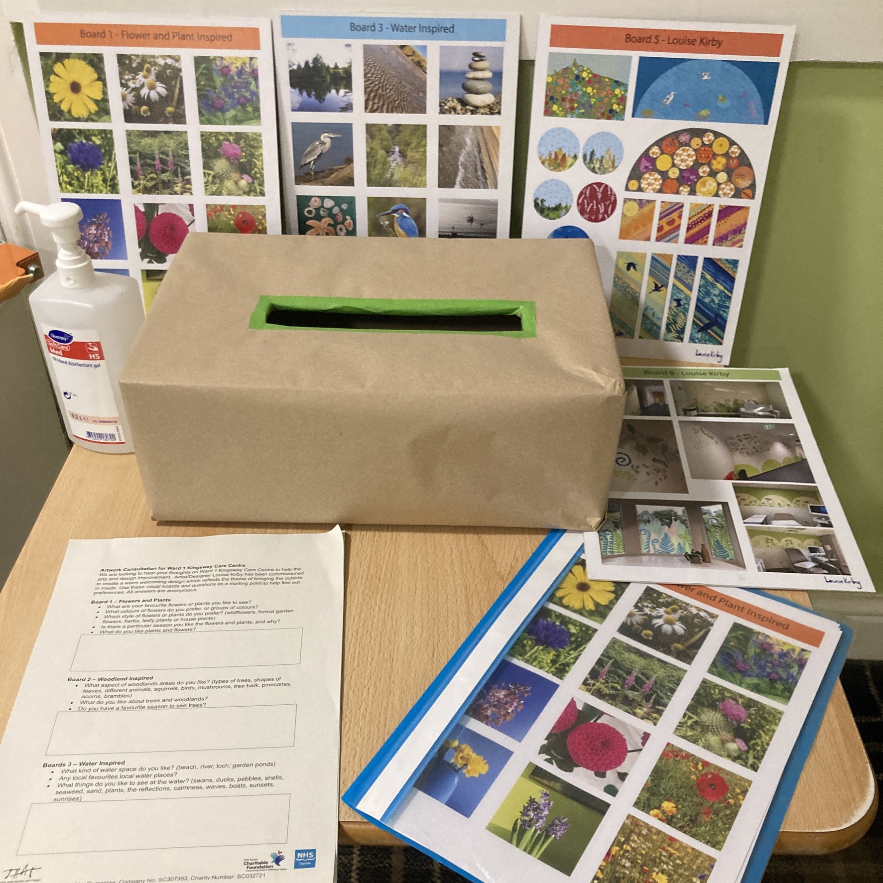
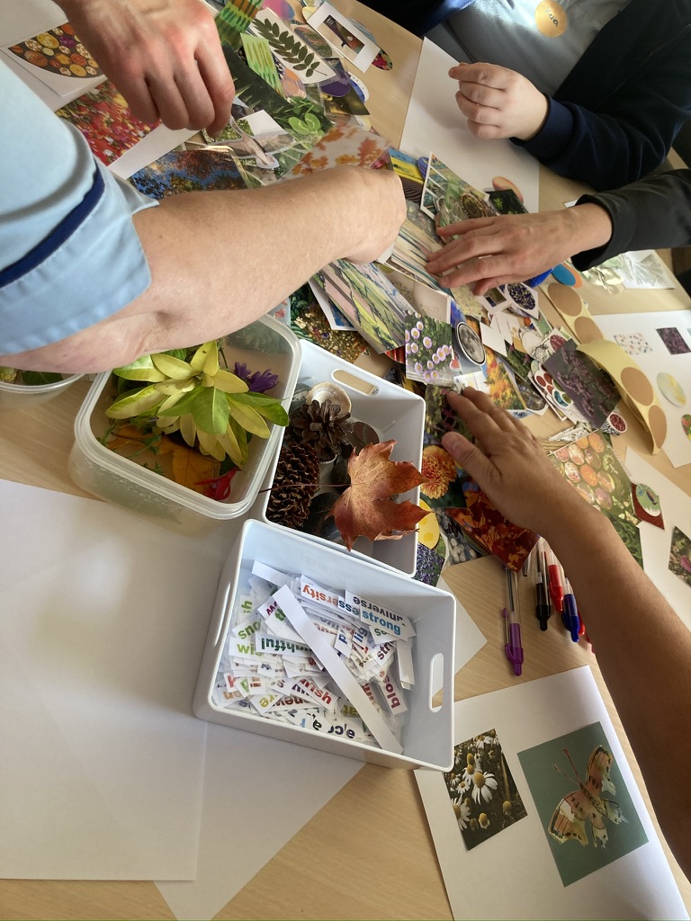
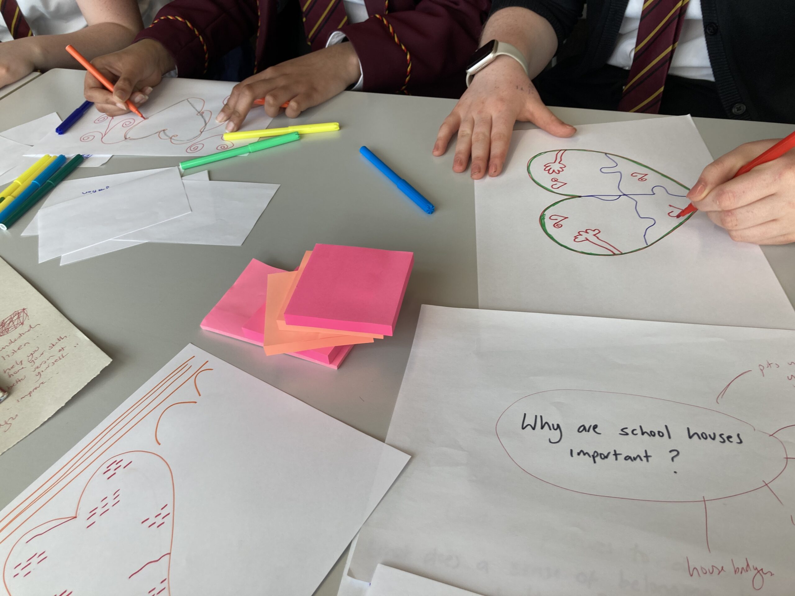
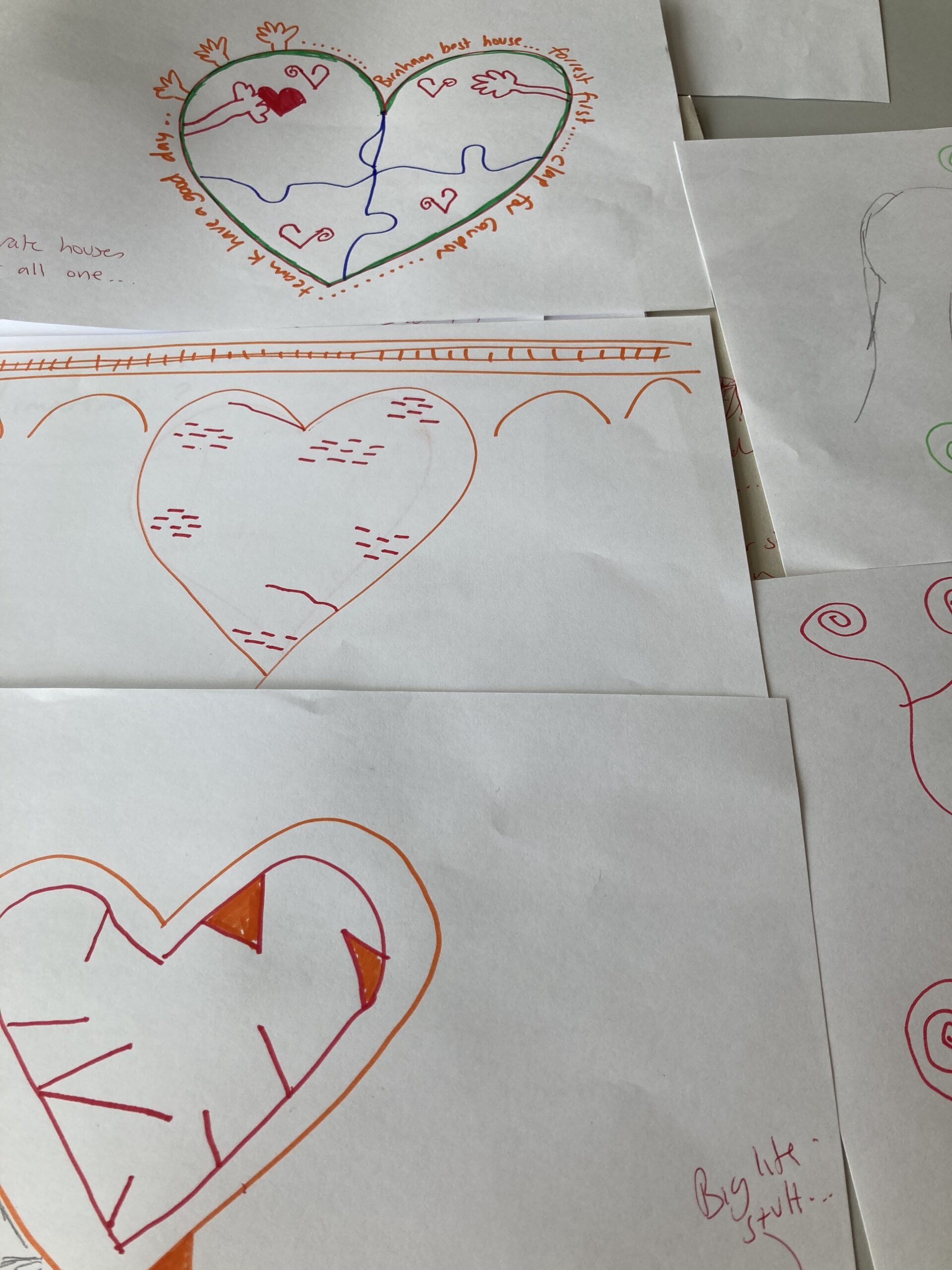
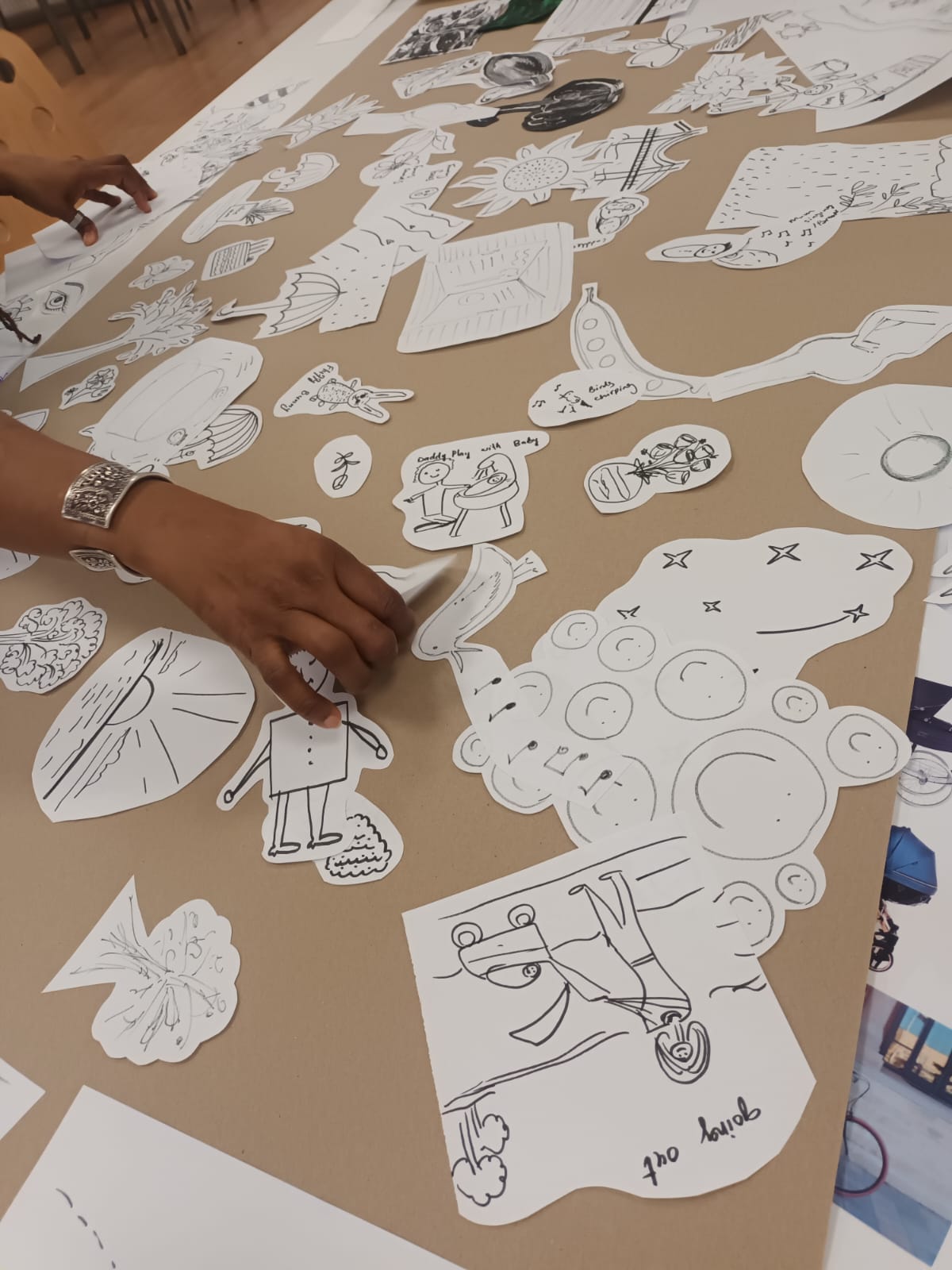
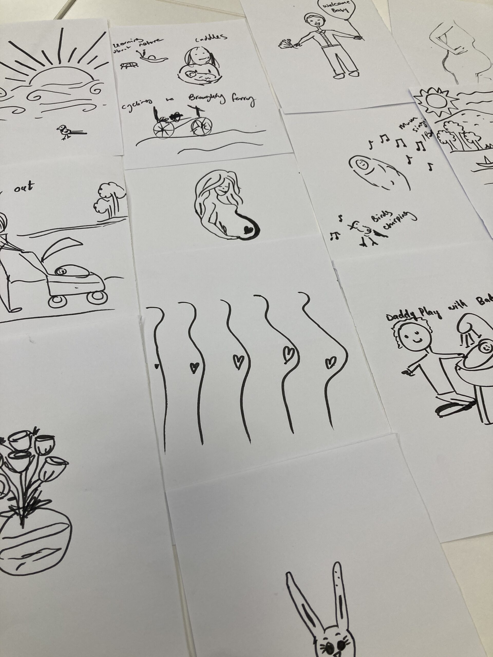
Many site visits, meetings and feedback from stakeholders and lived experience really helped me to create designs suitable for the space and to help support the experience of using the service.
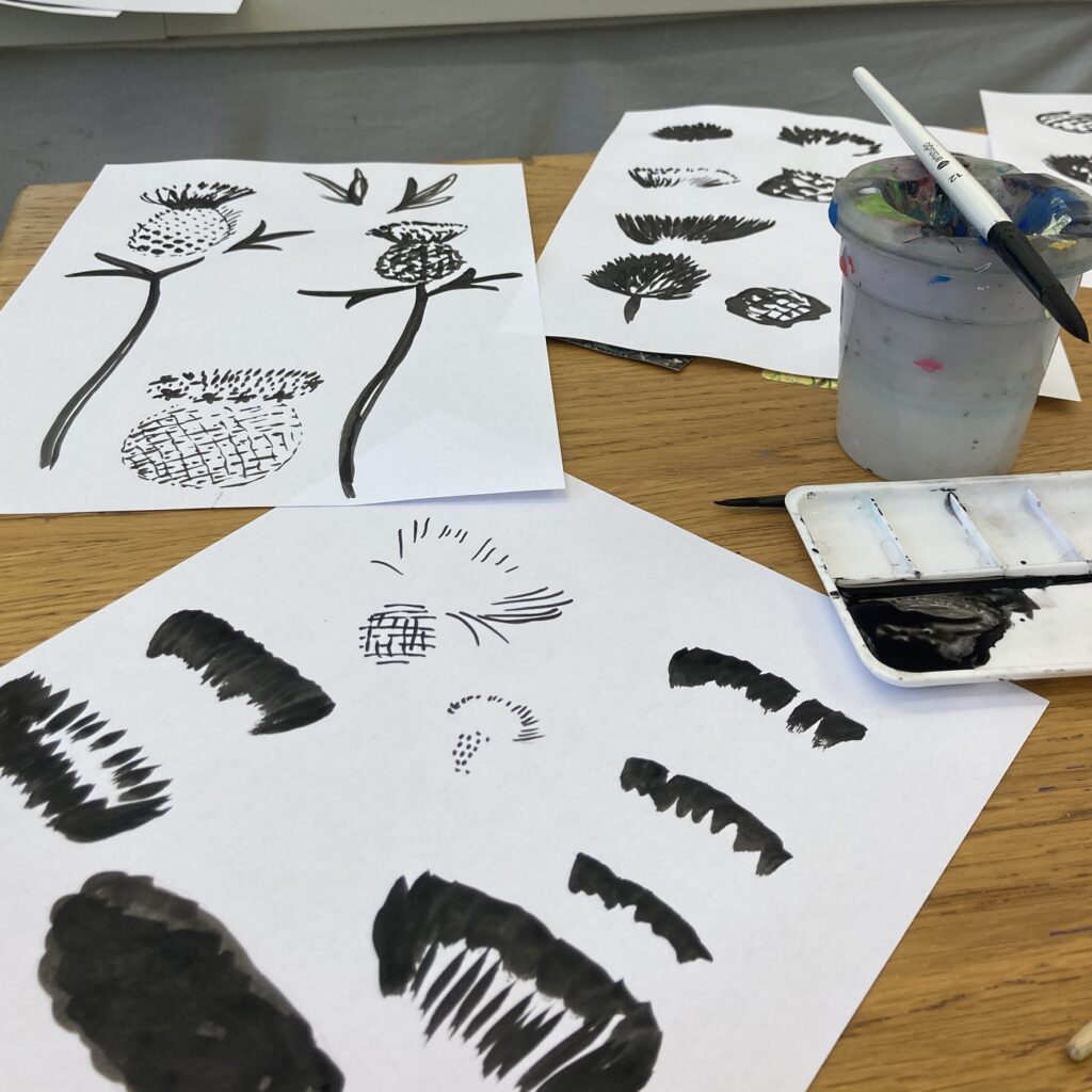
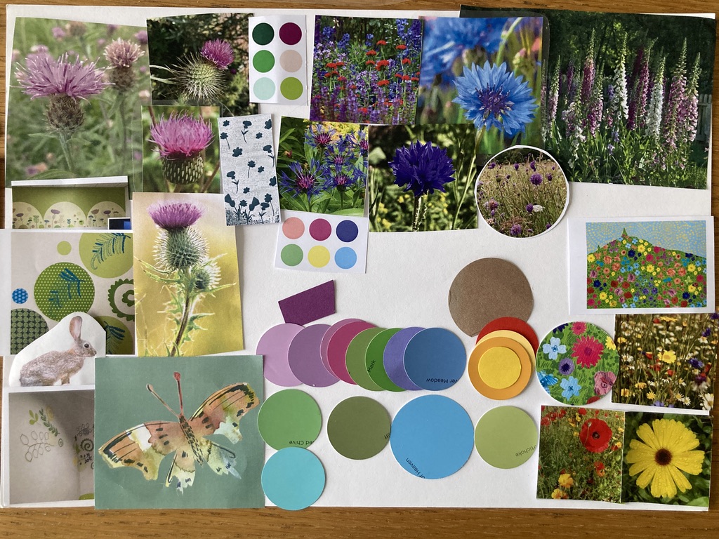
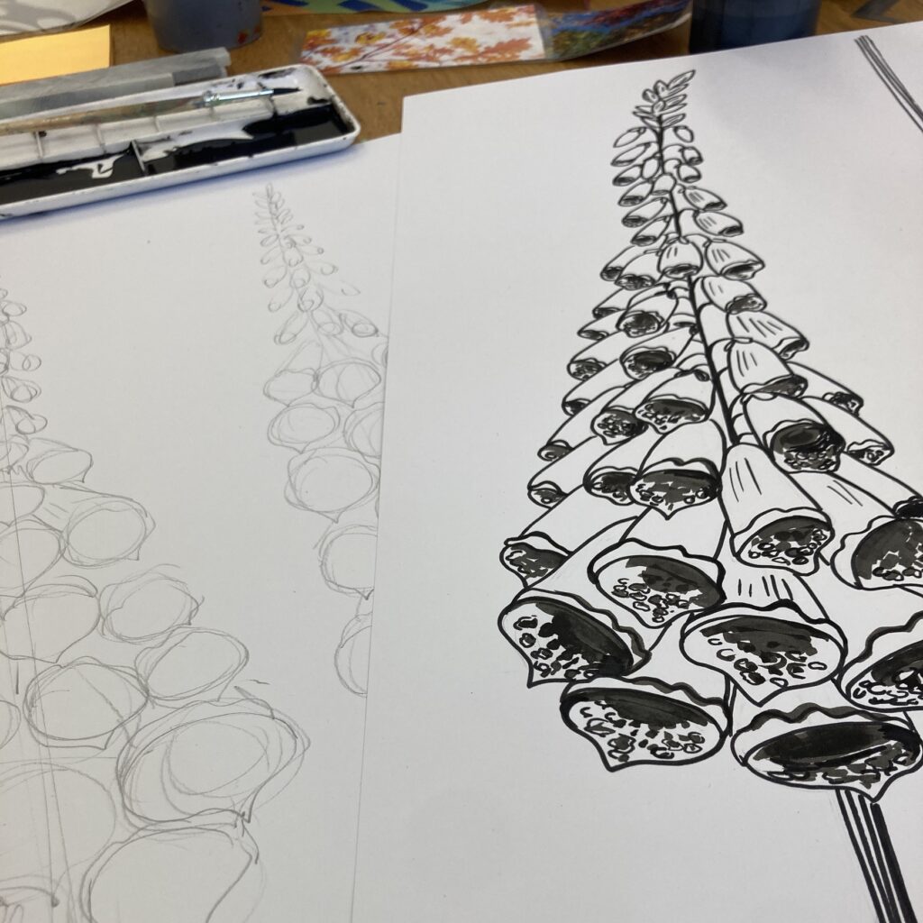
Inspiration
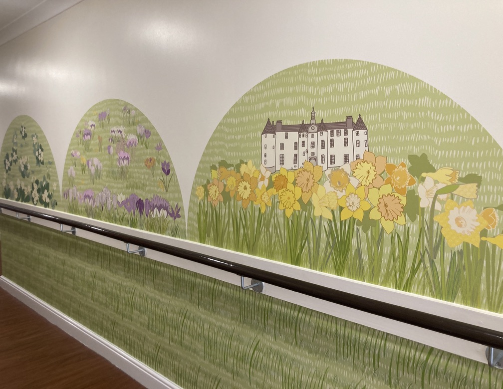
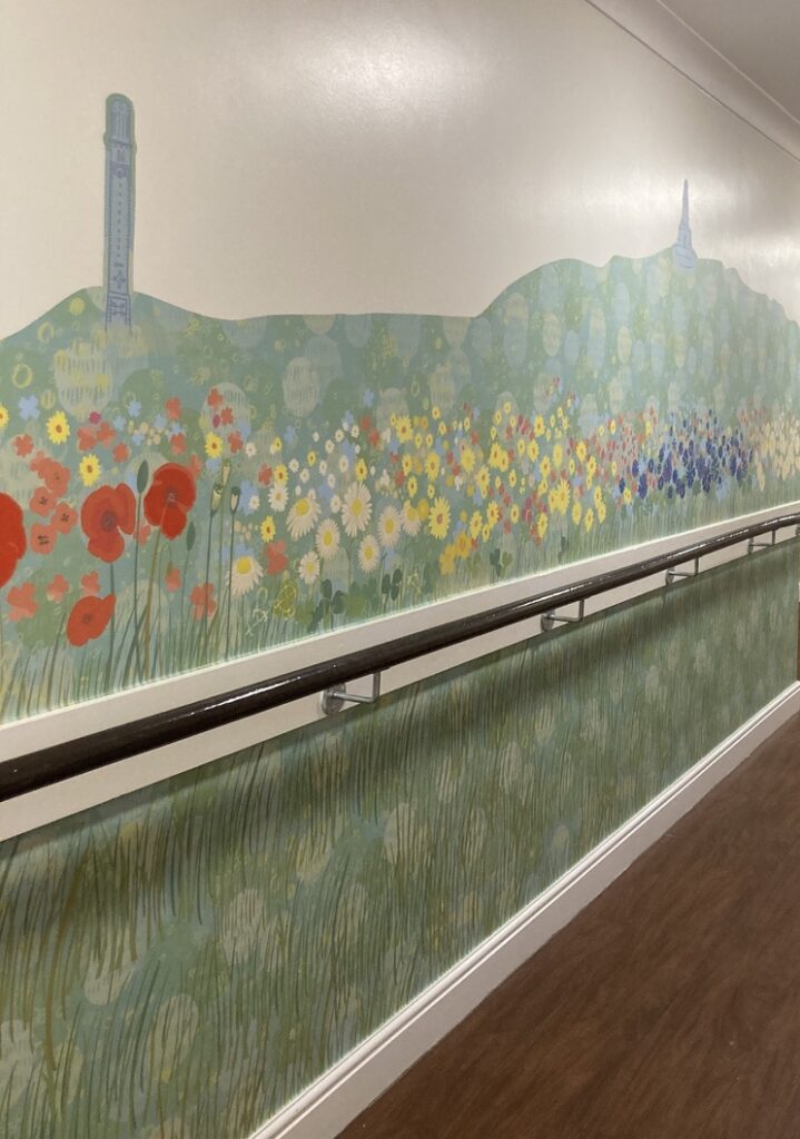
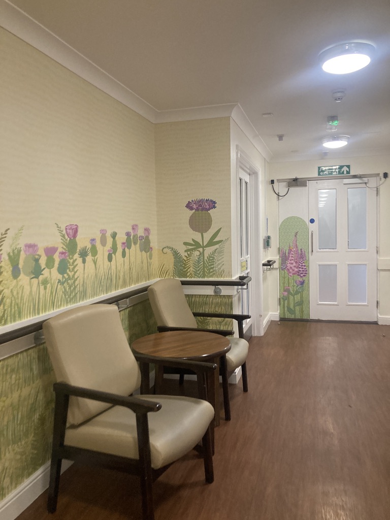
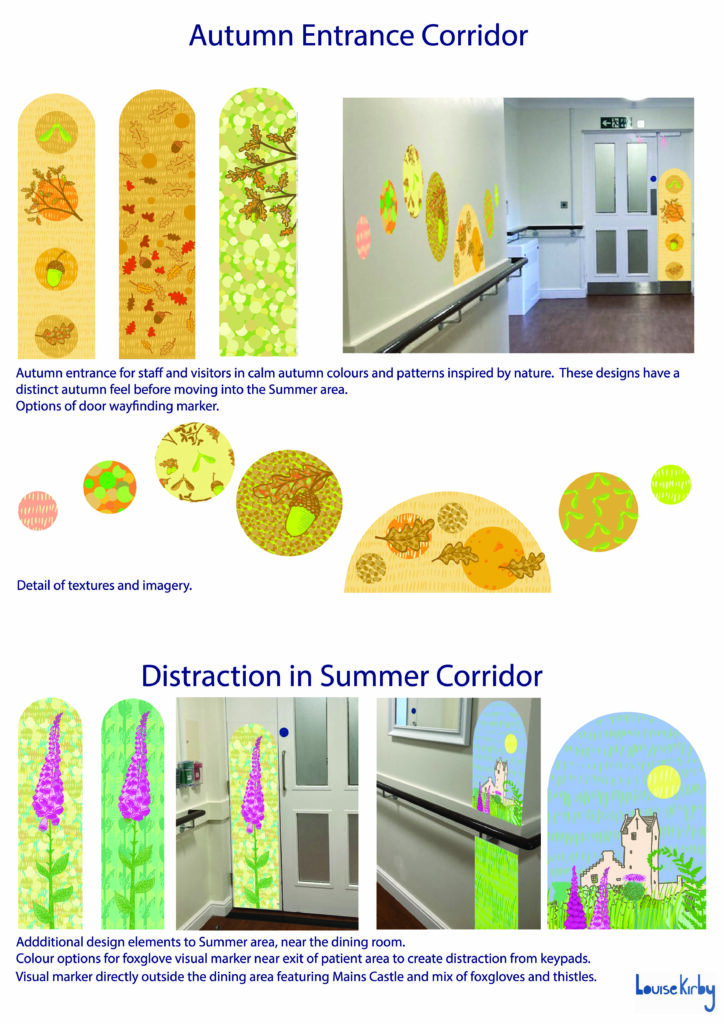
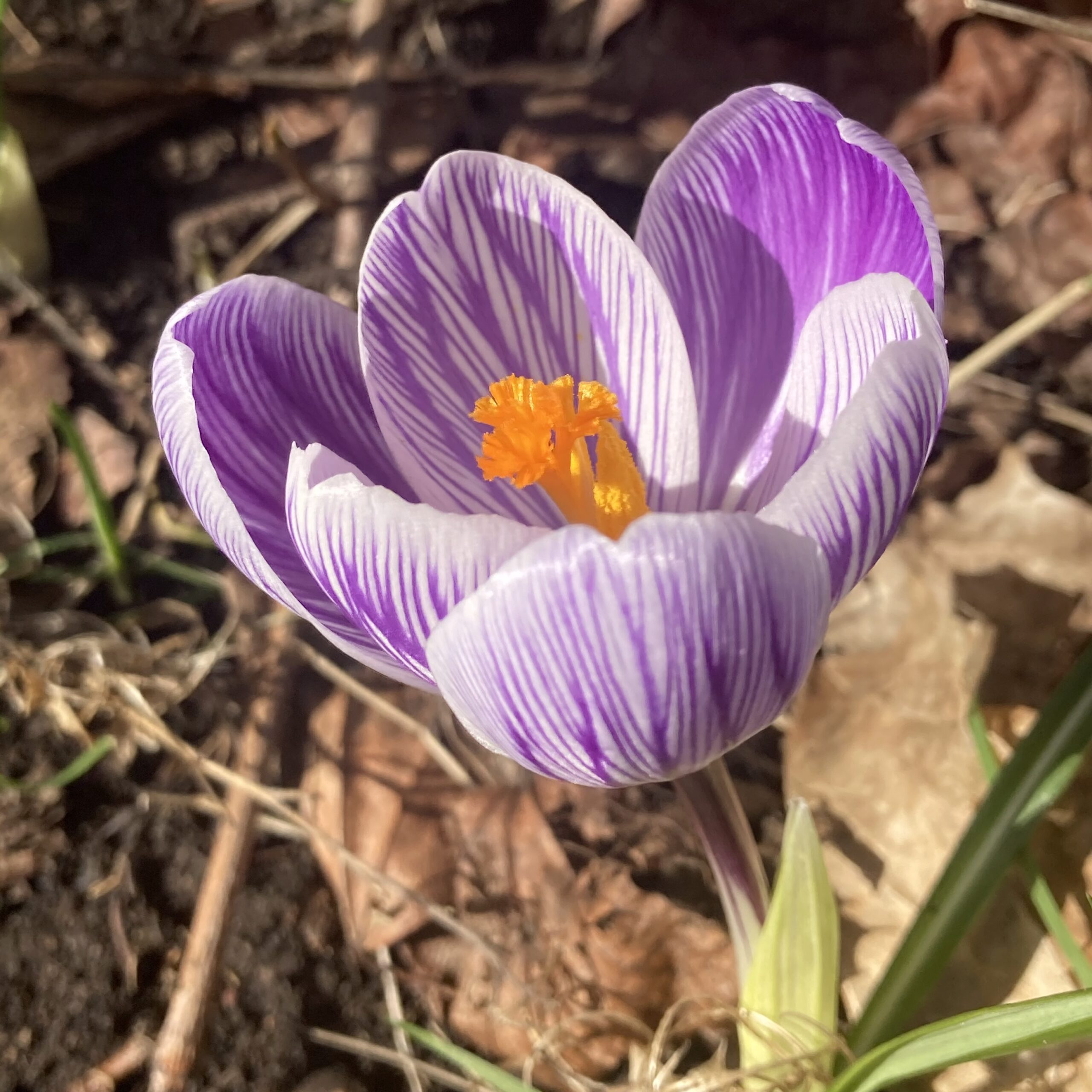
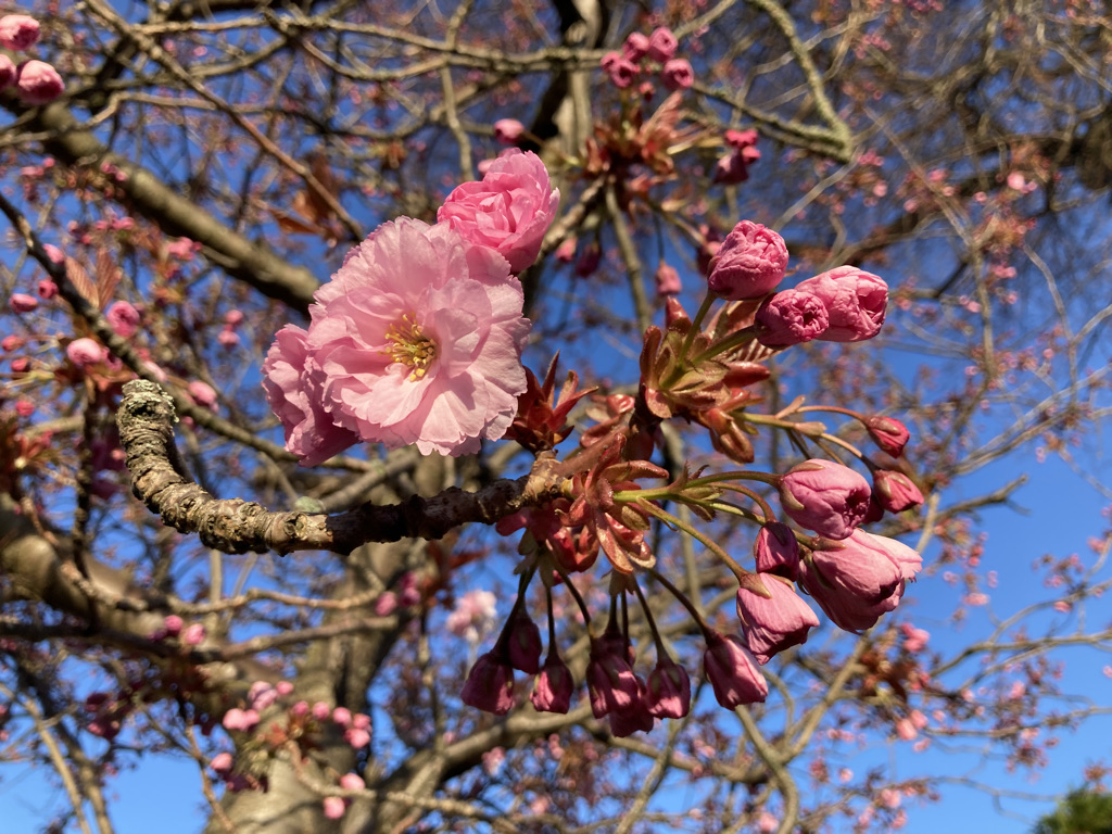
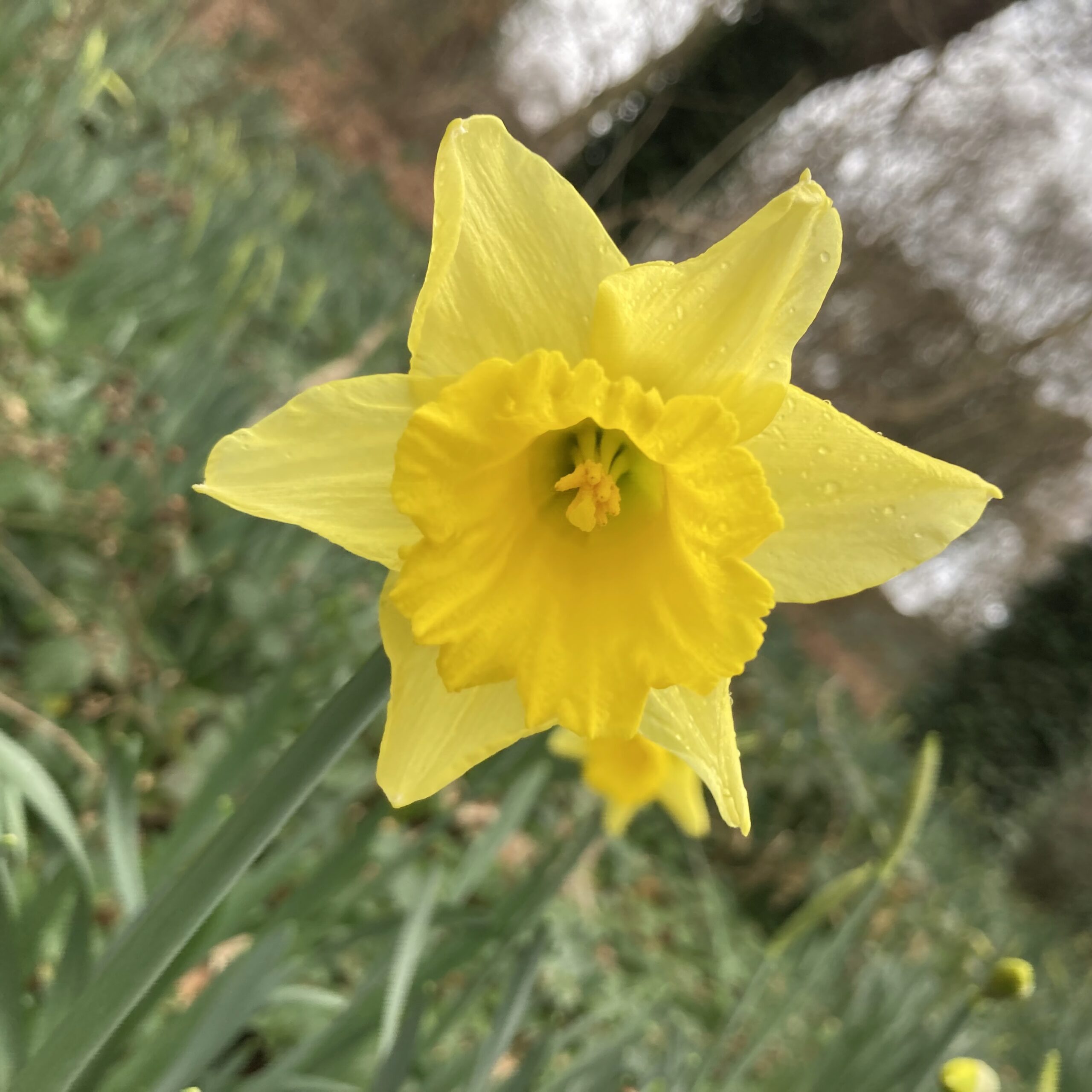
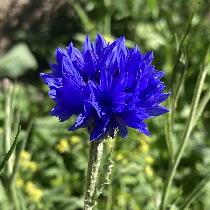
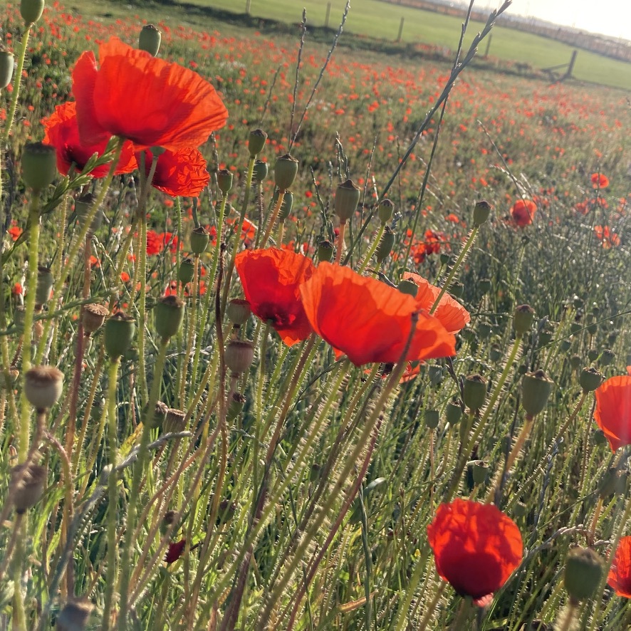
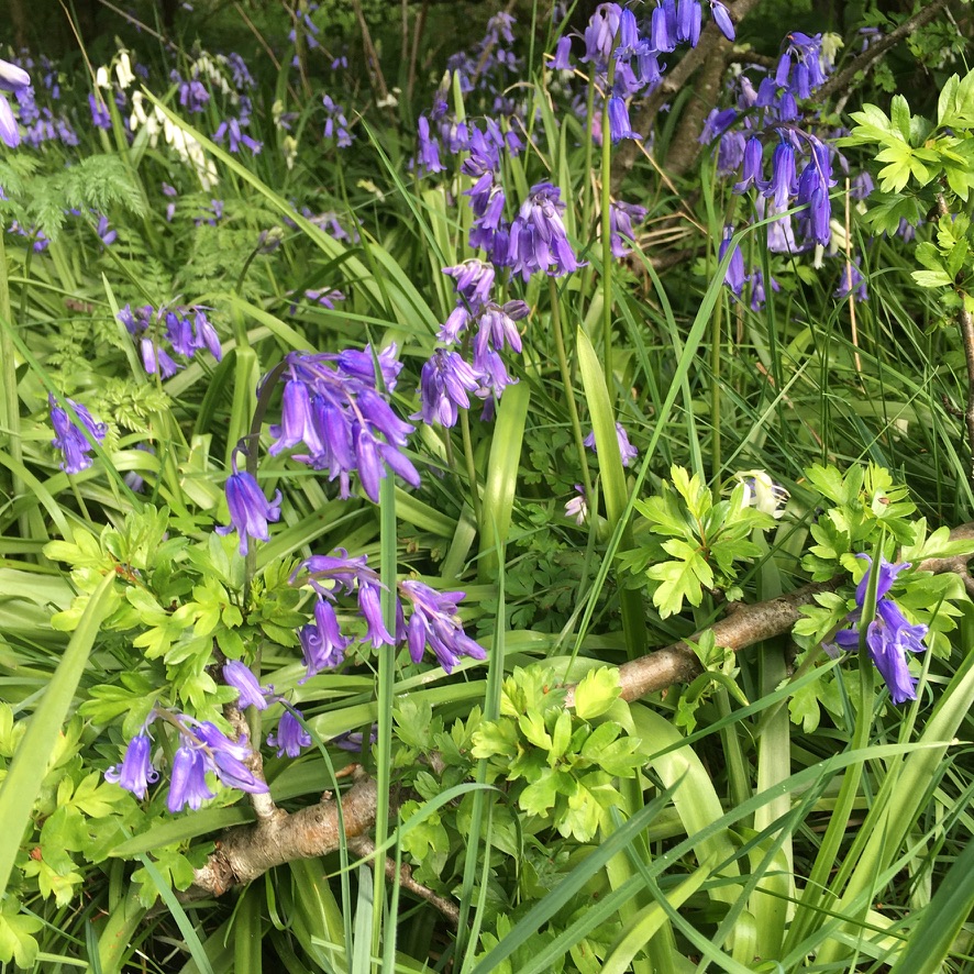
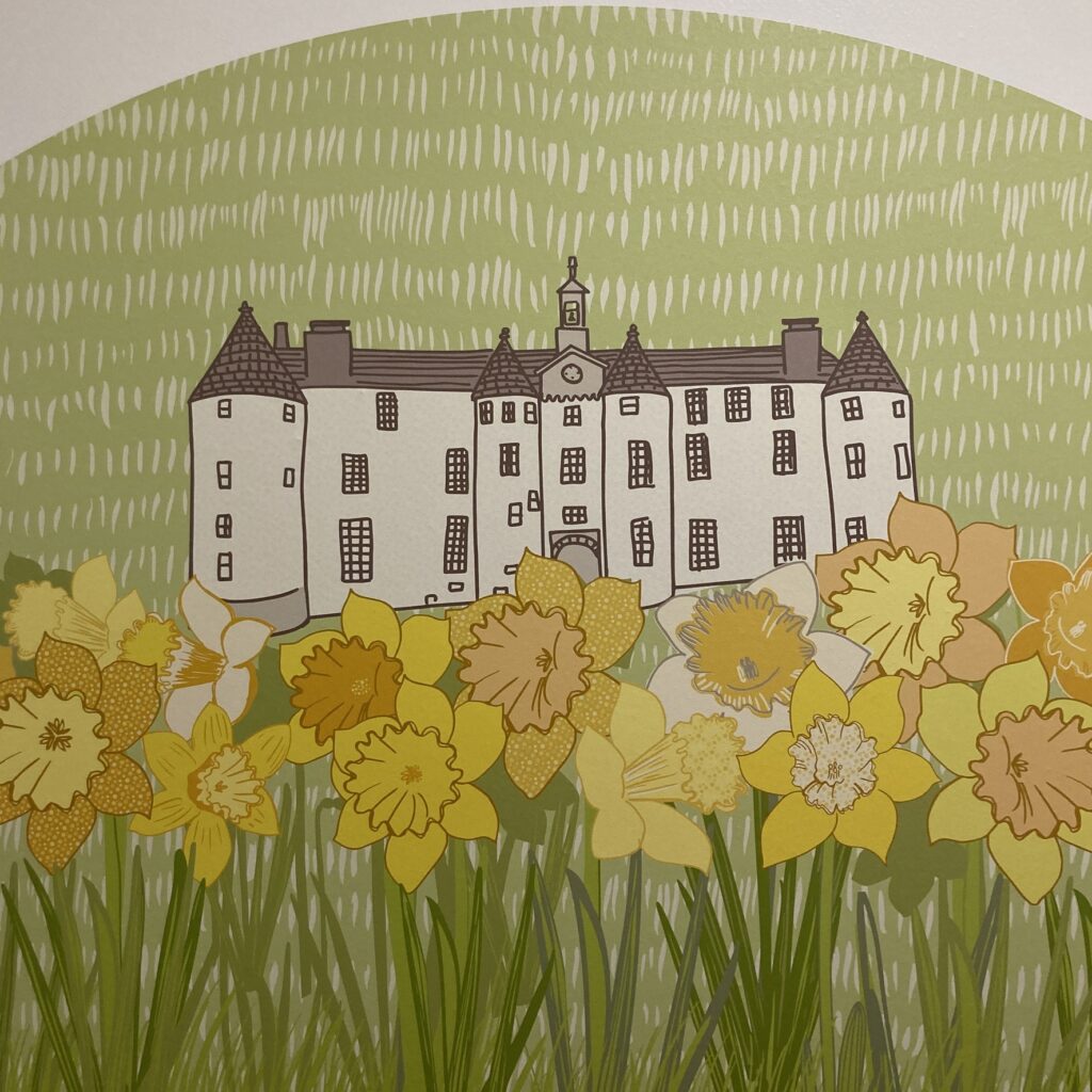
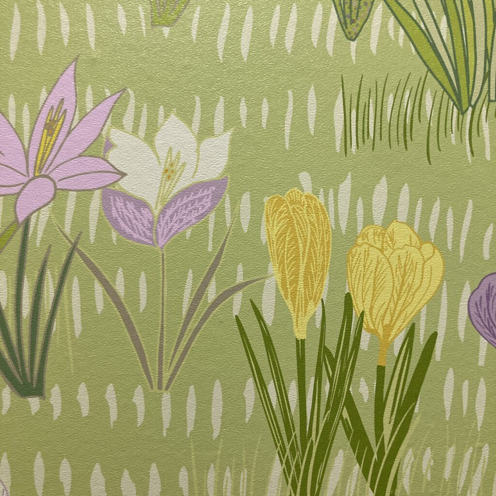
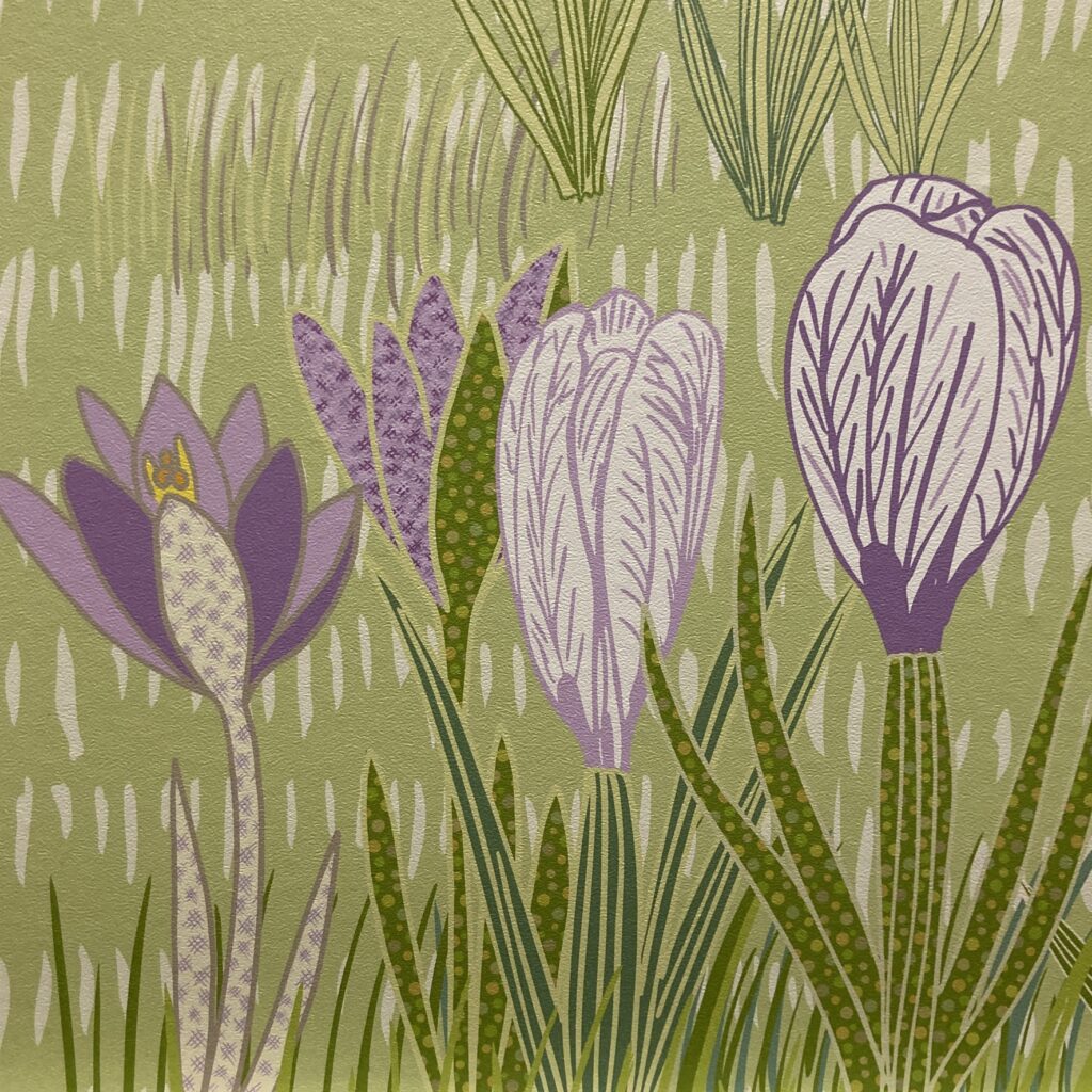
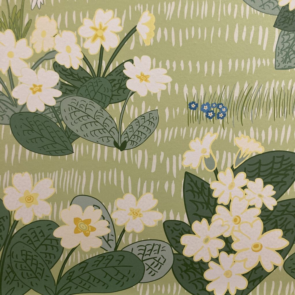
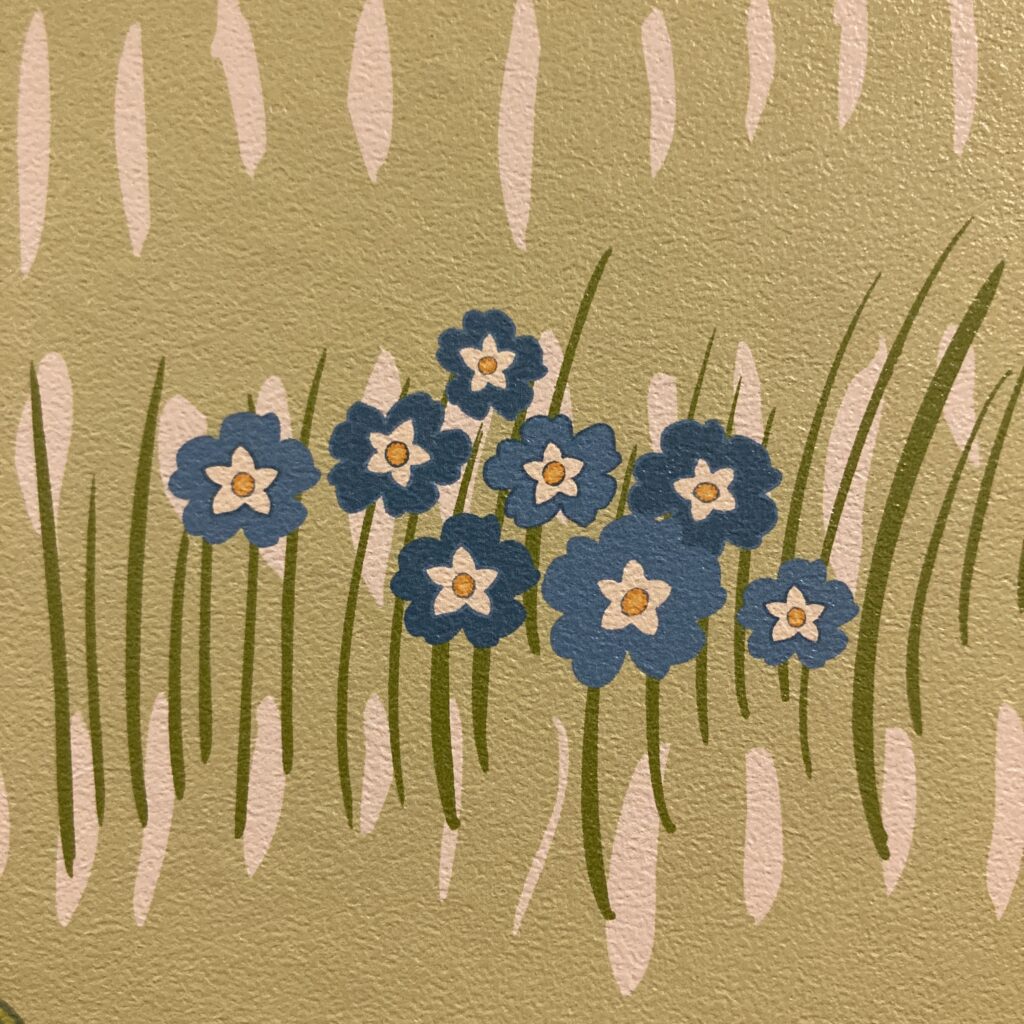
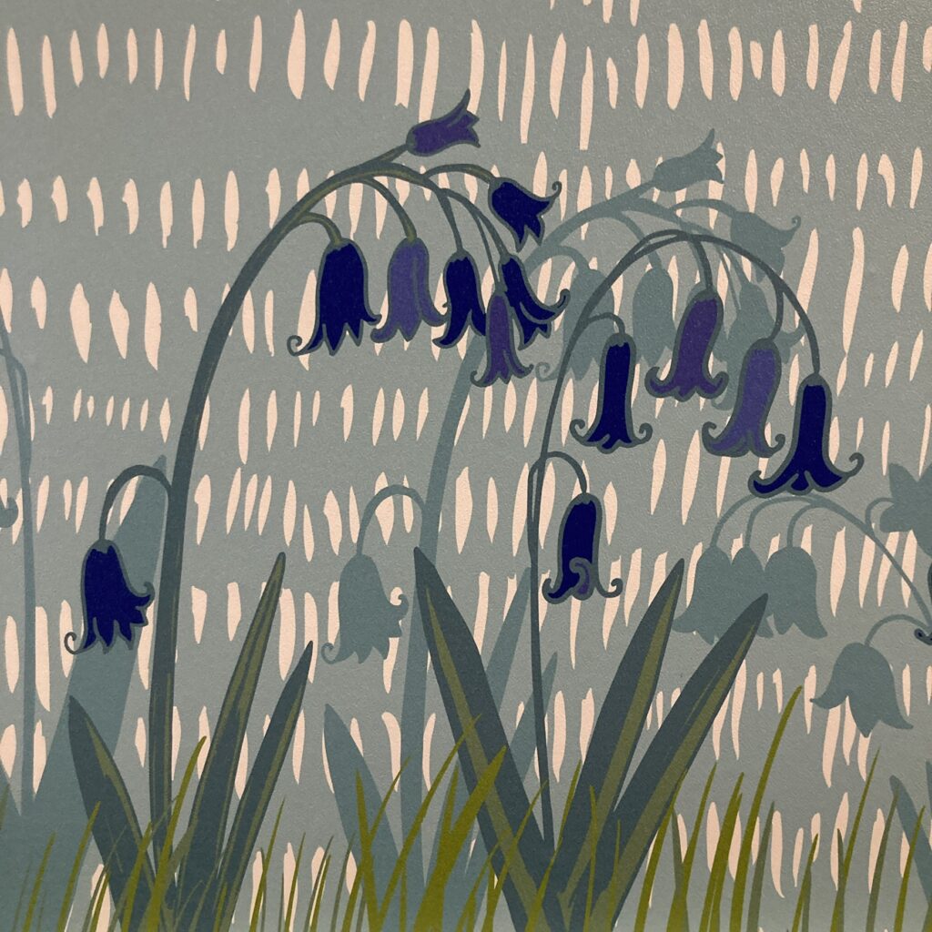
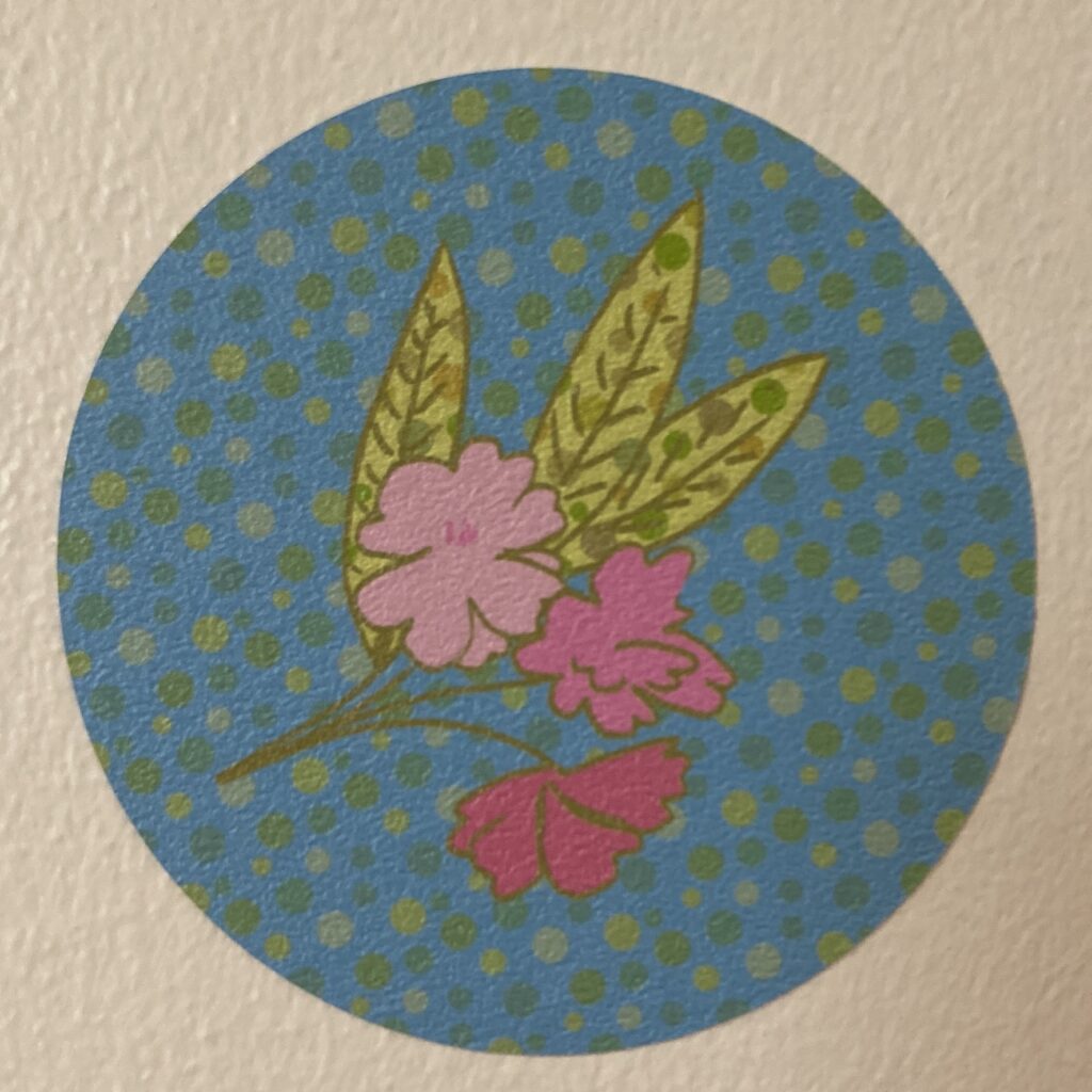
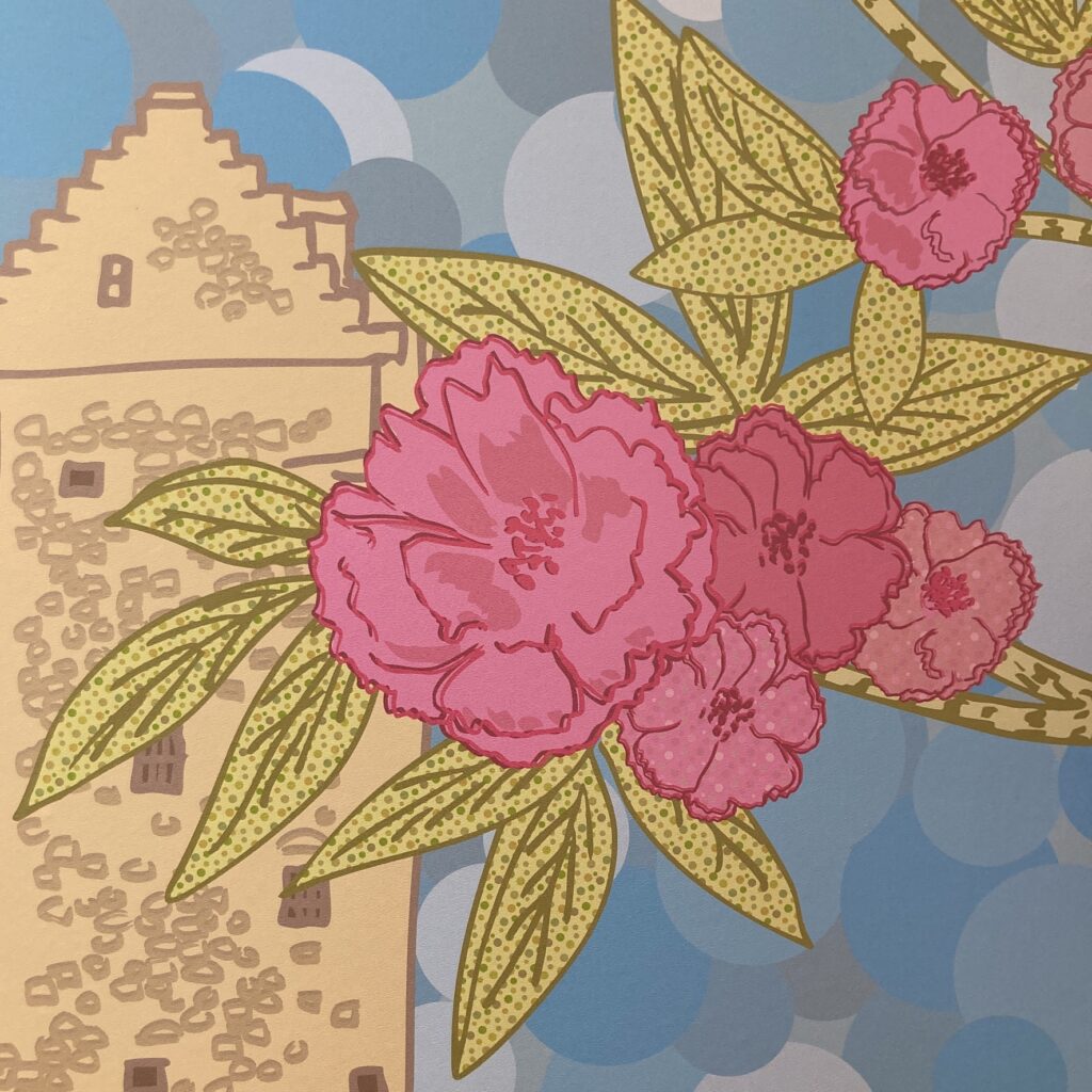
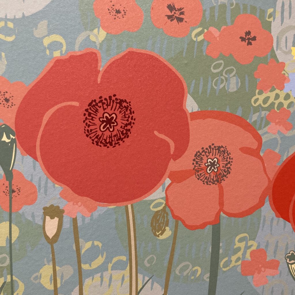
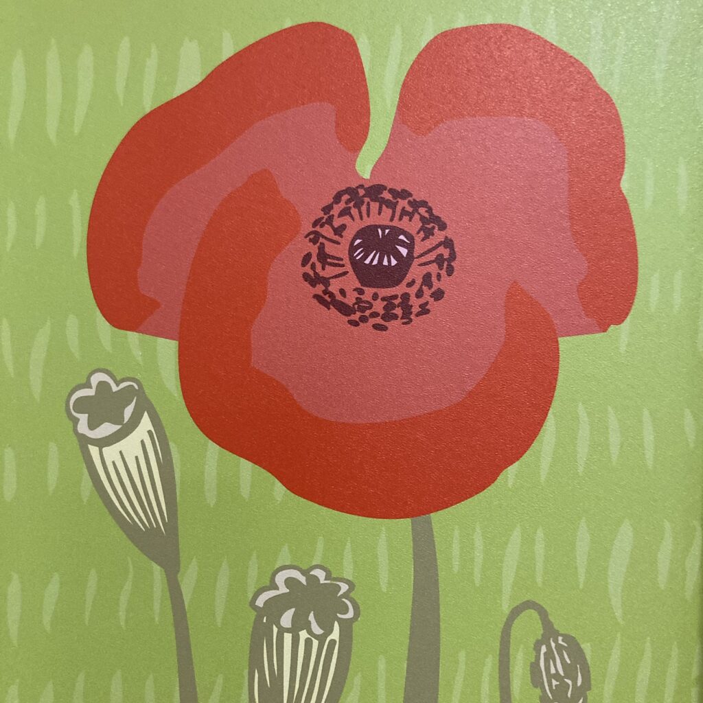
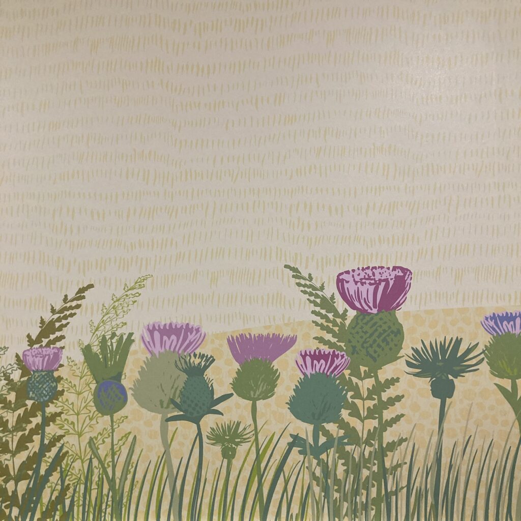
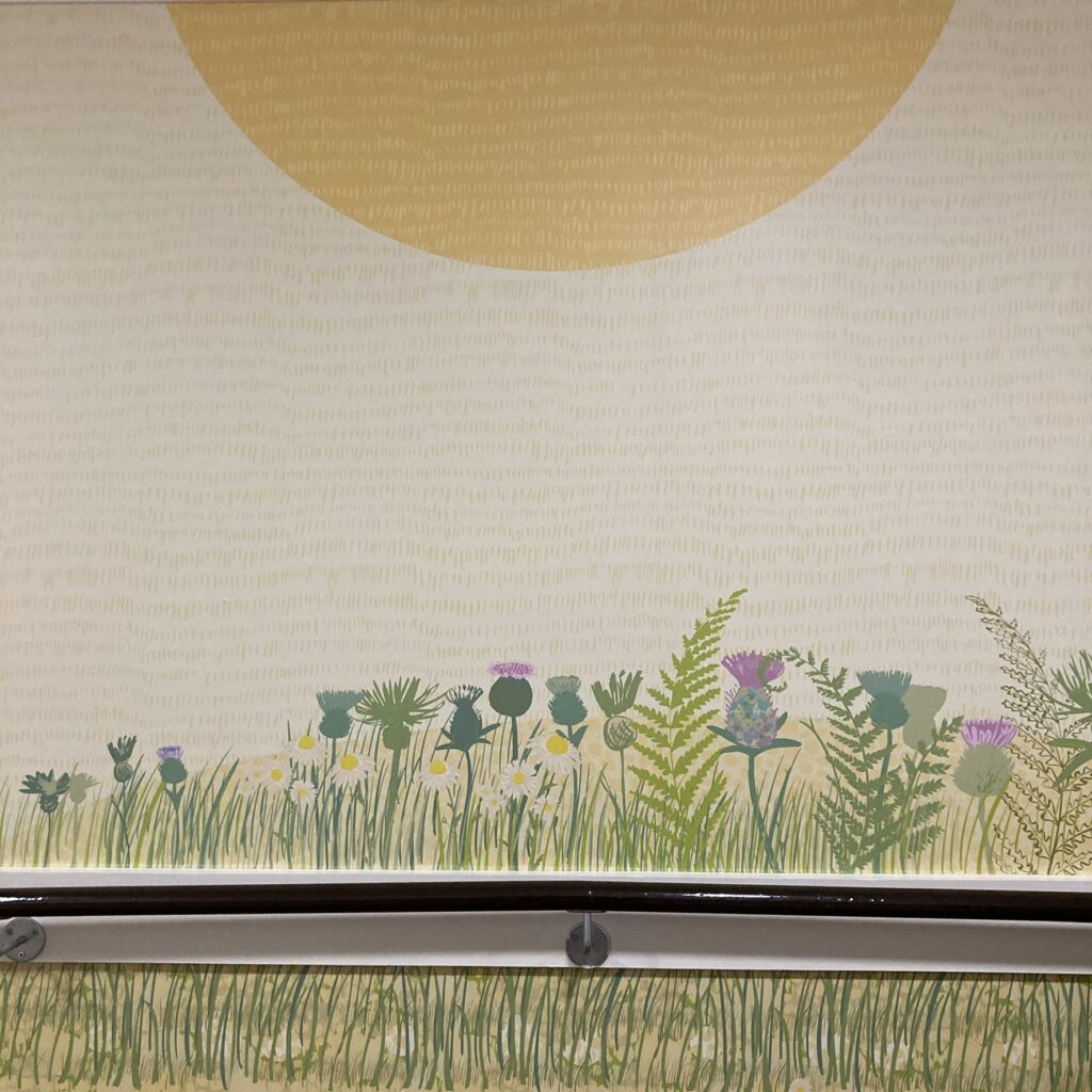
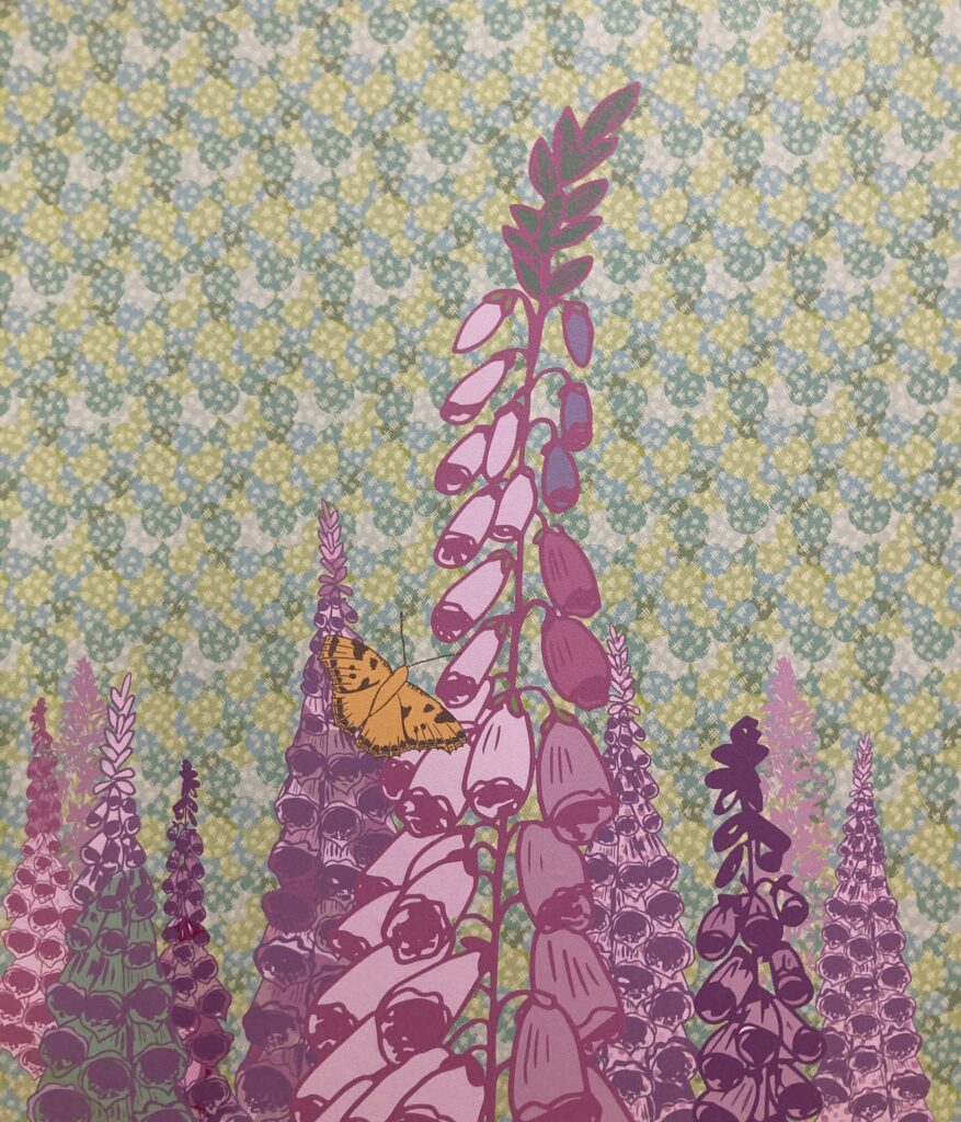
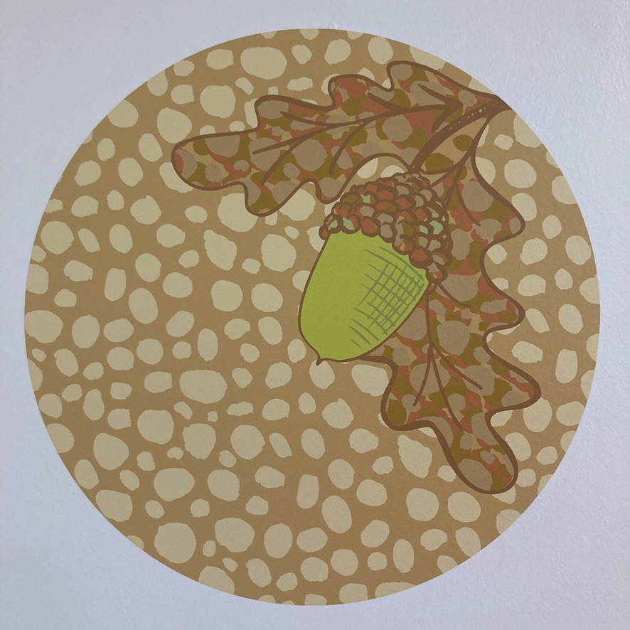
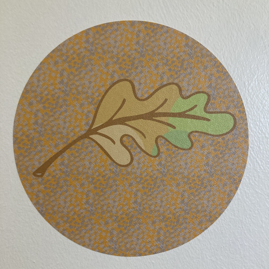
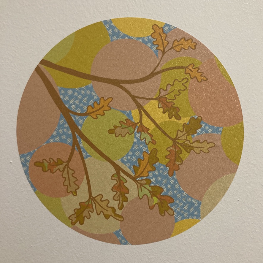
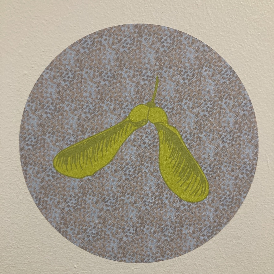
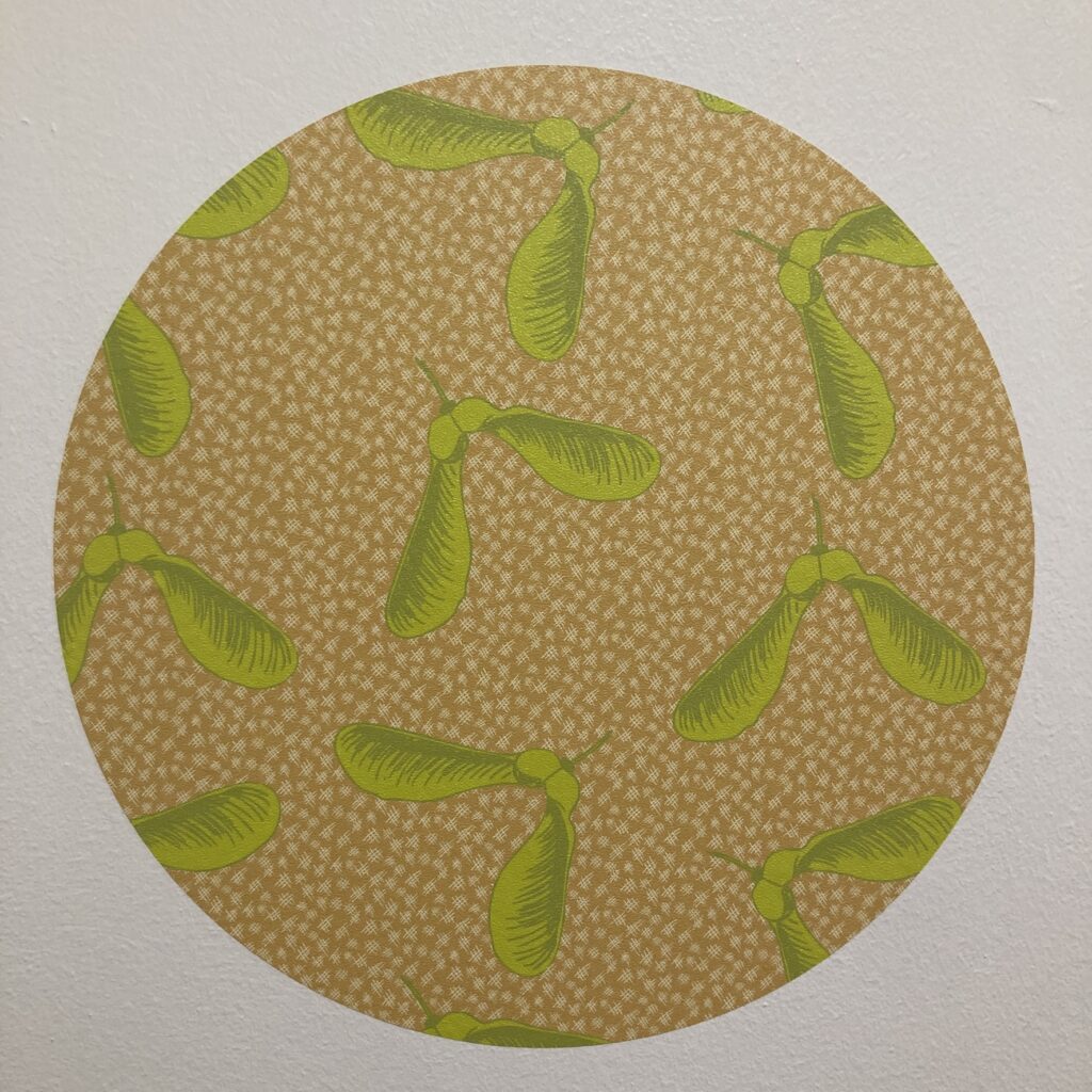
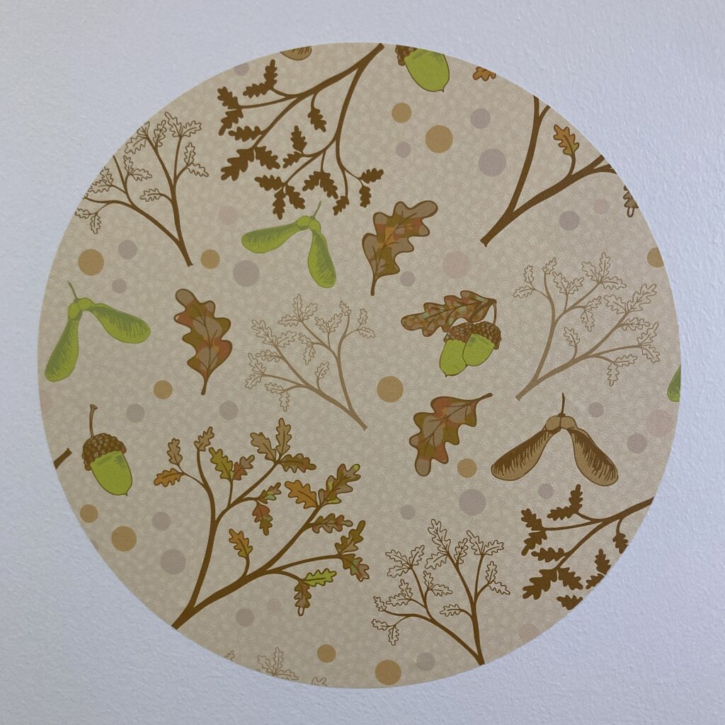
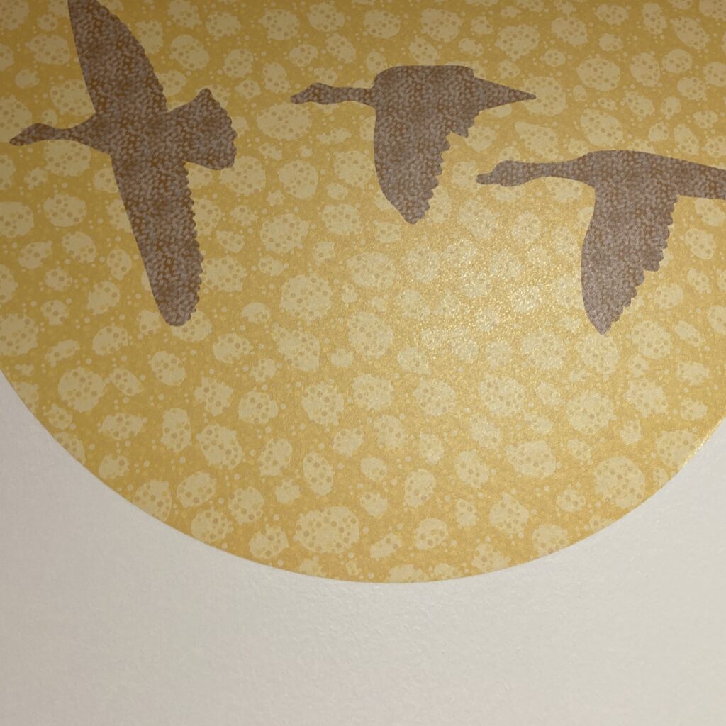
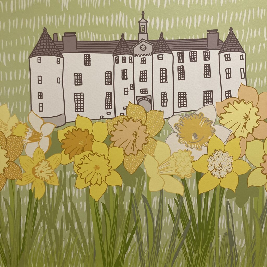
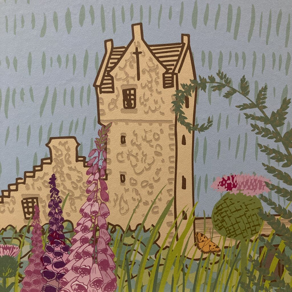
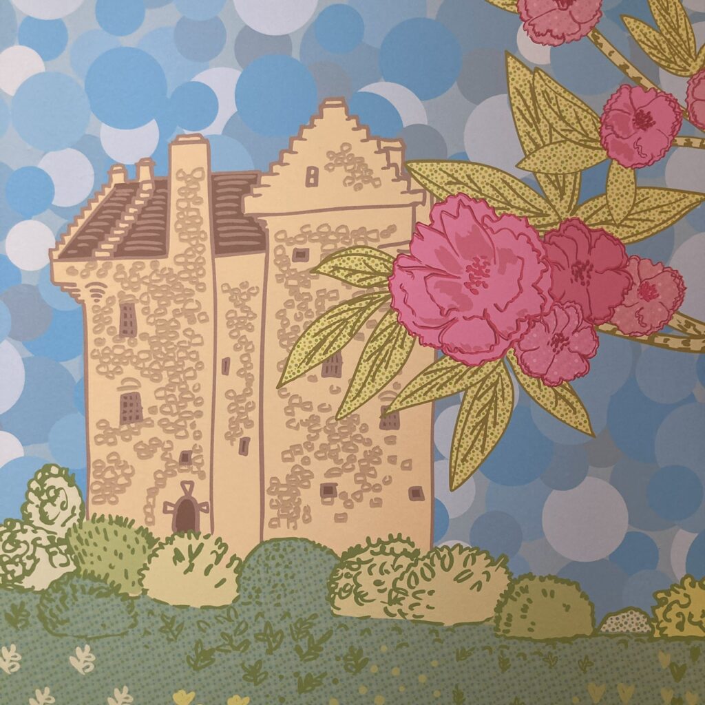
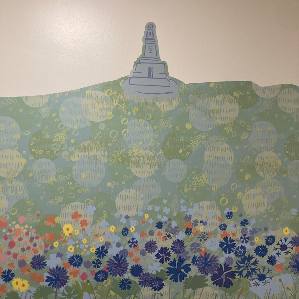
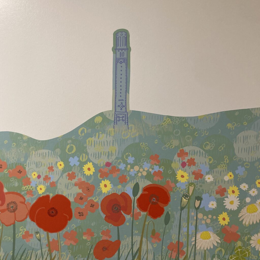
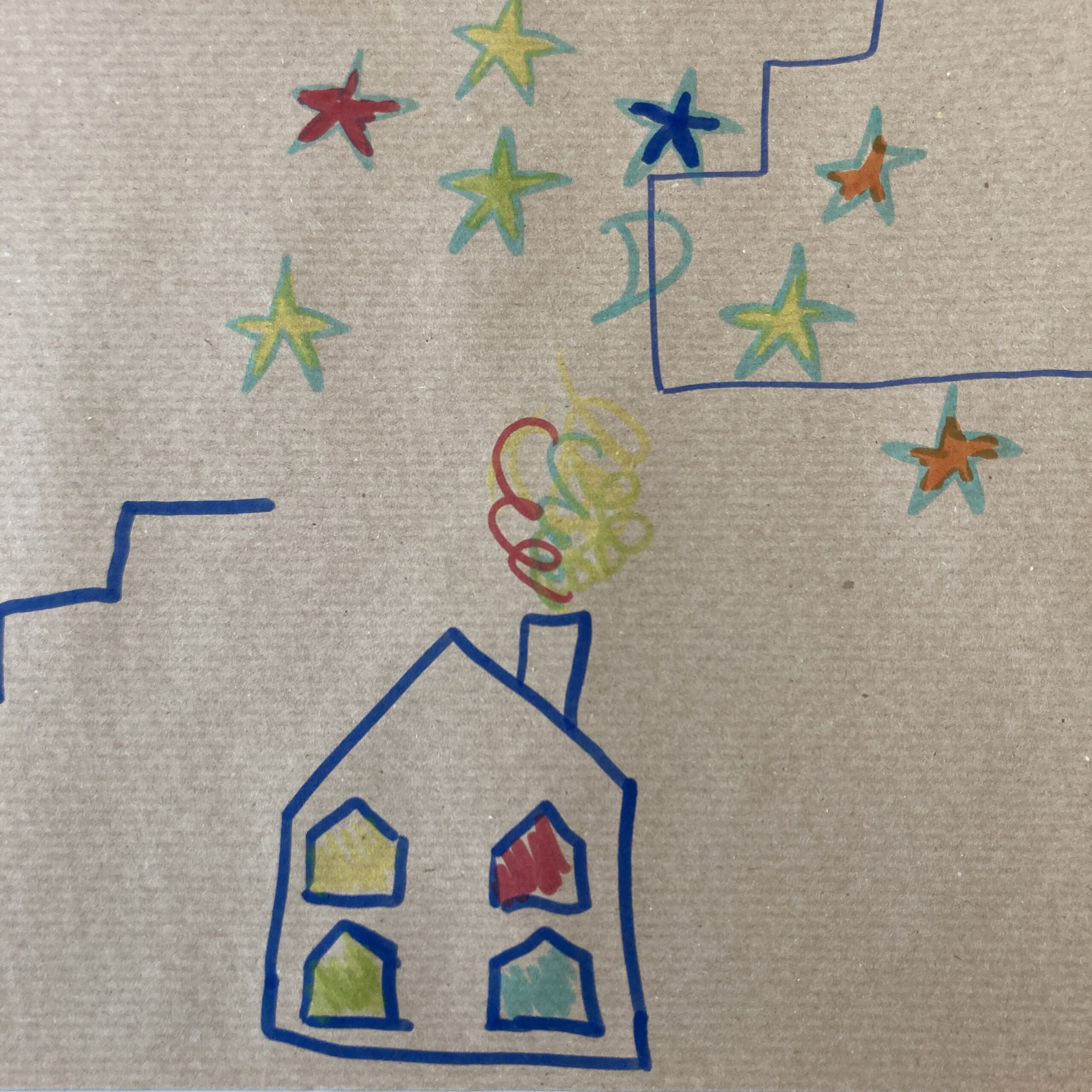
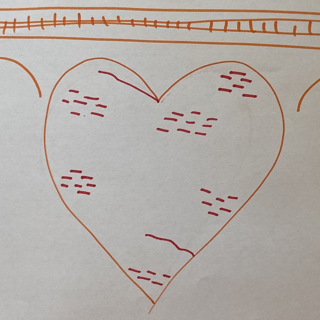
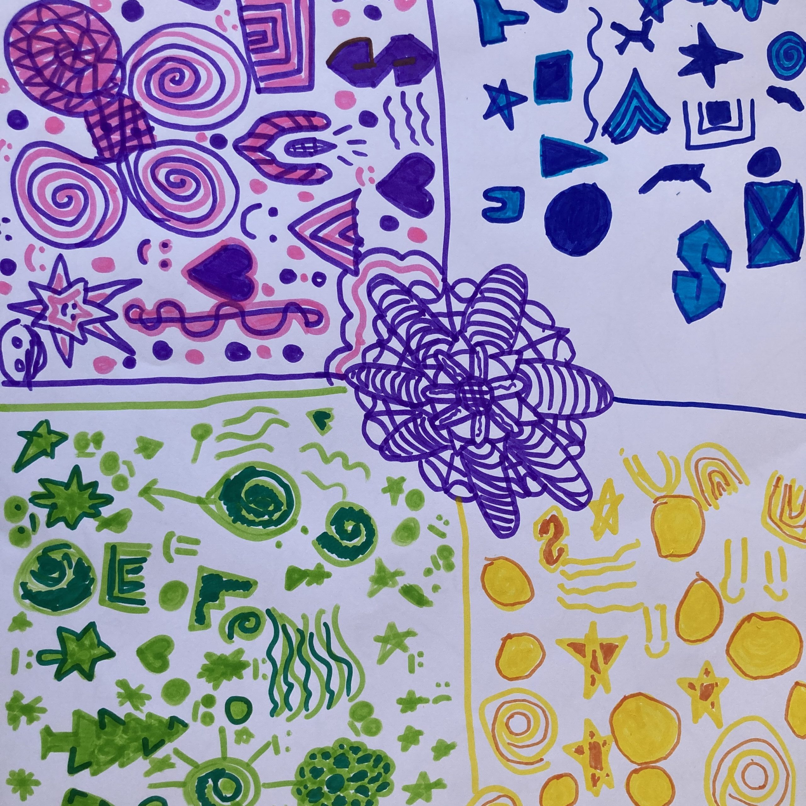
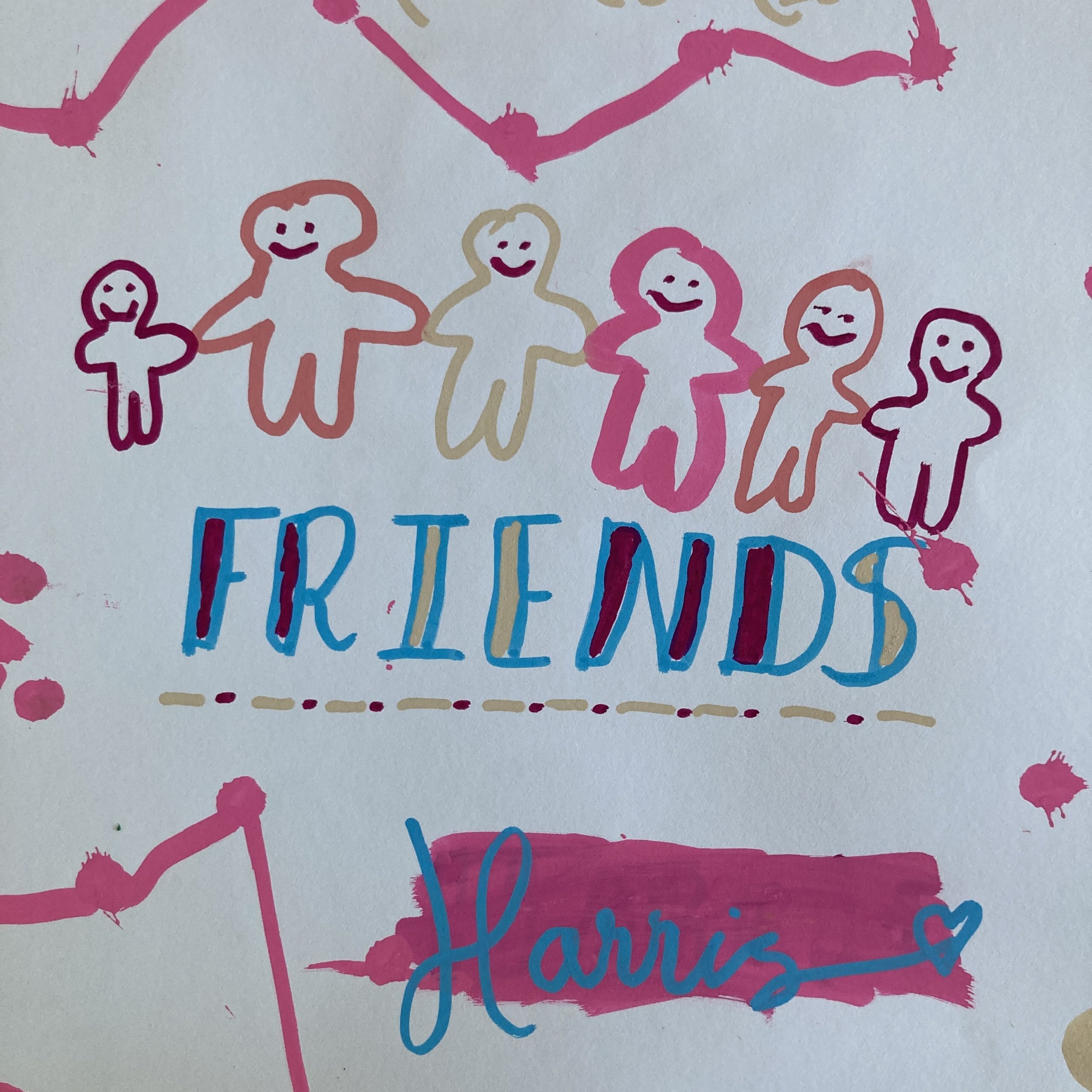
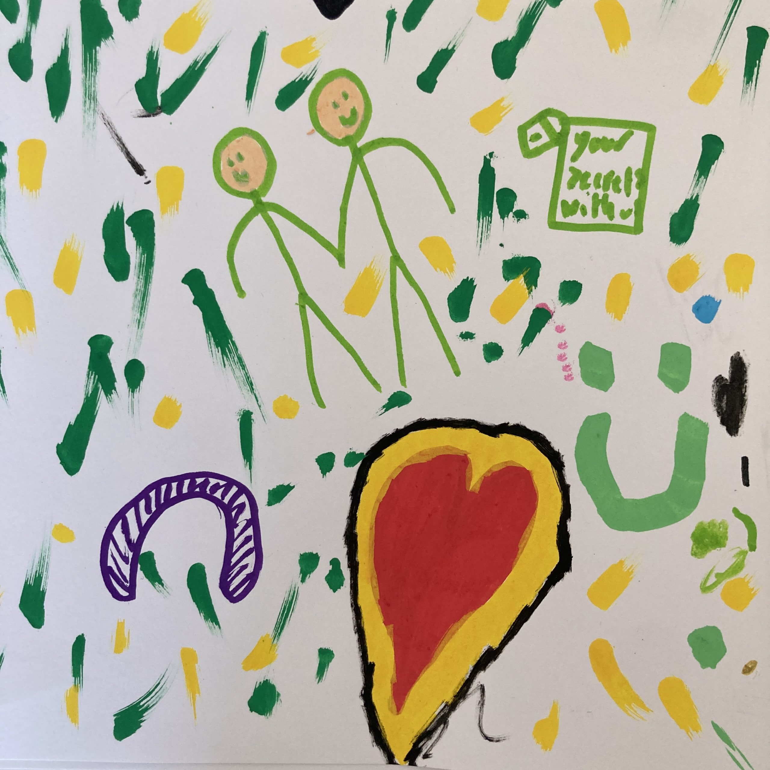
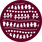
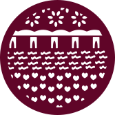
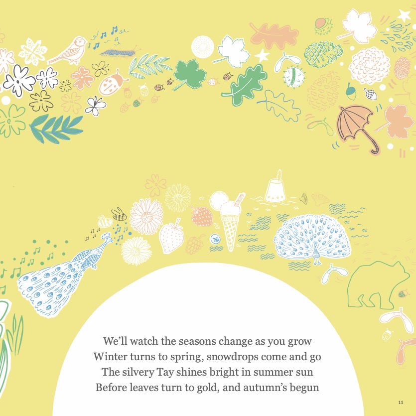
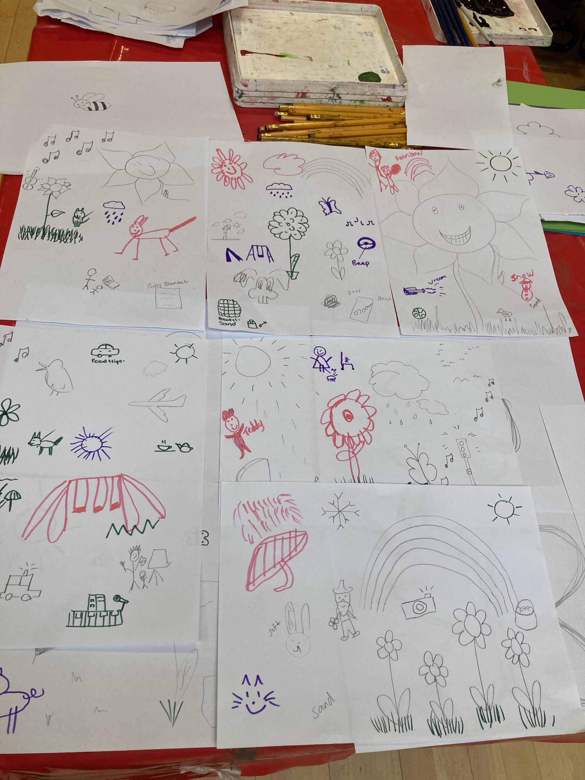
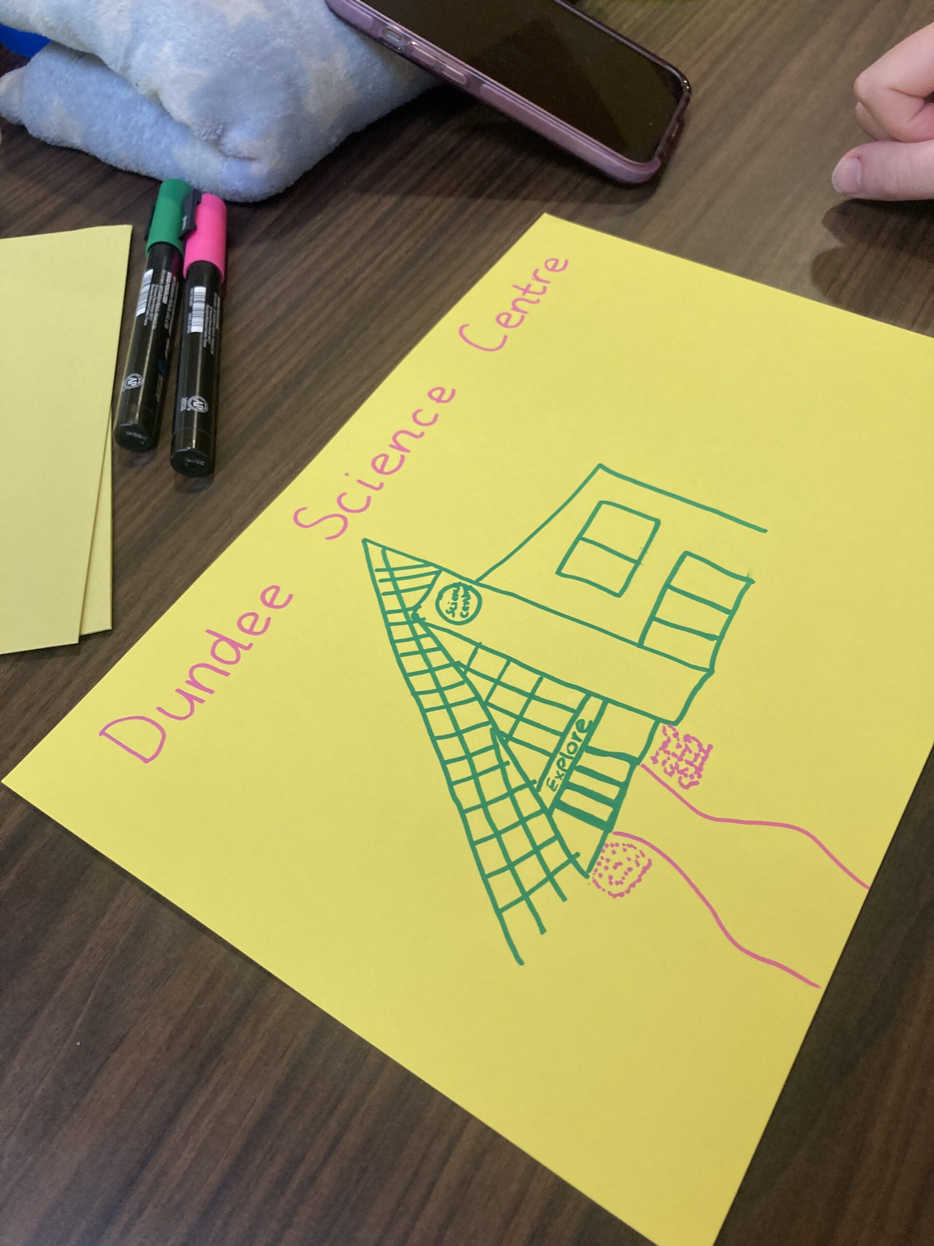
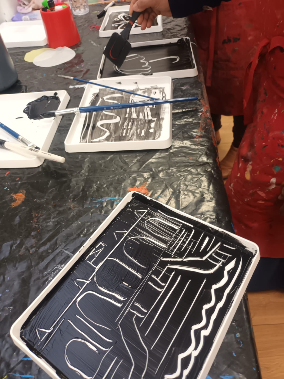
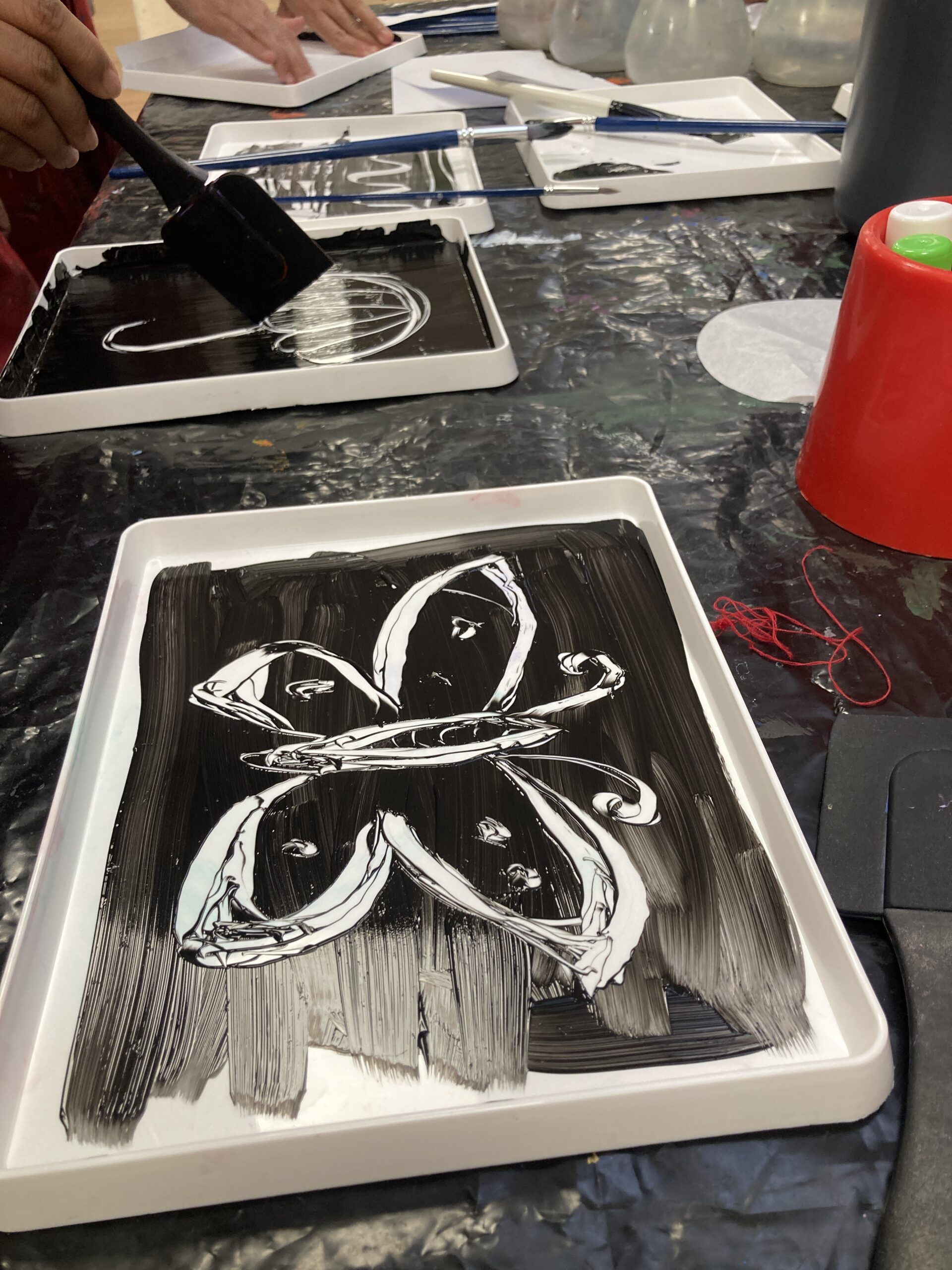
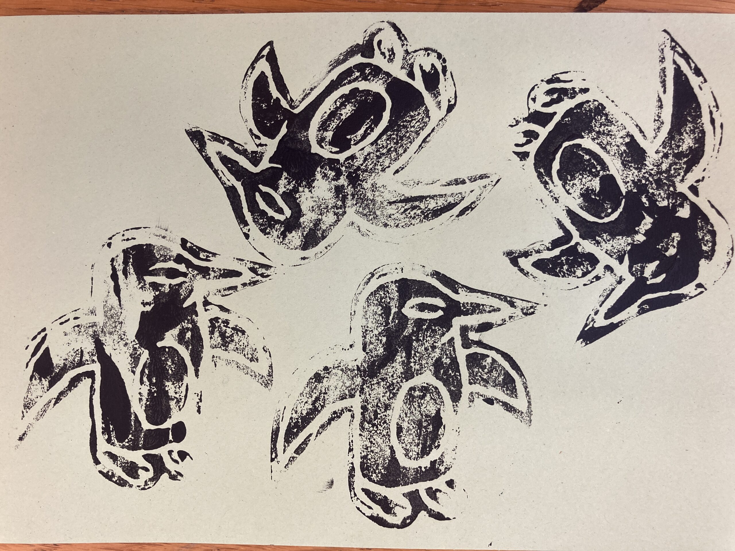
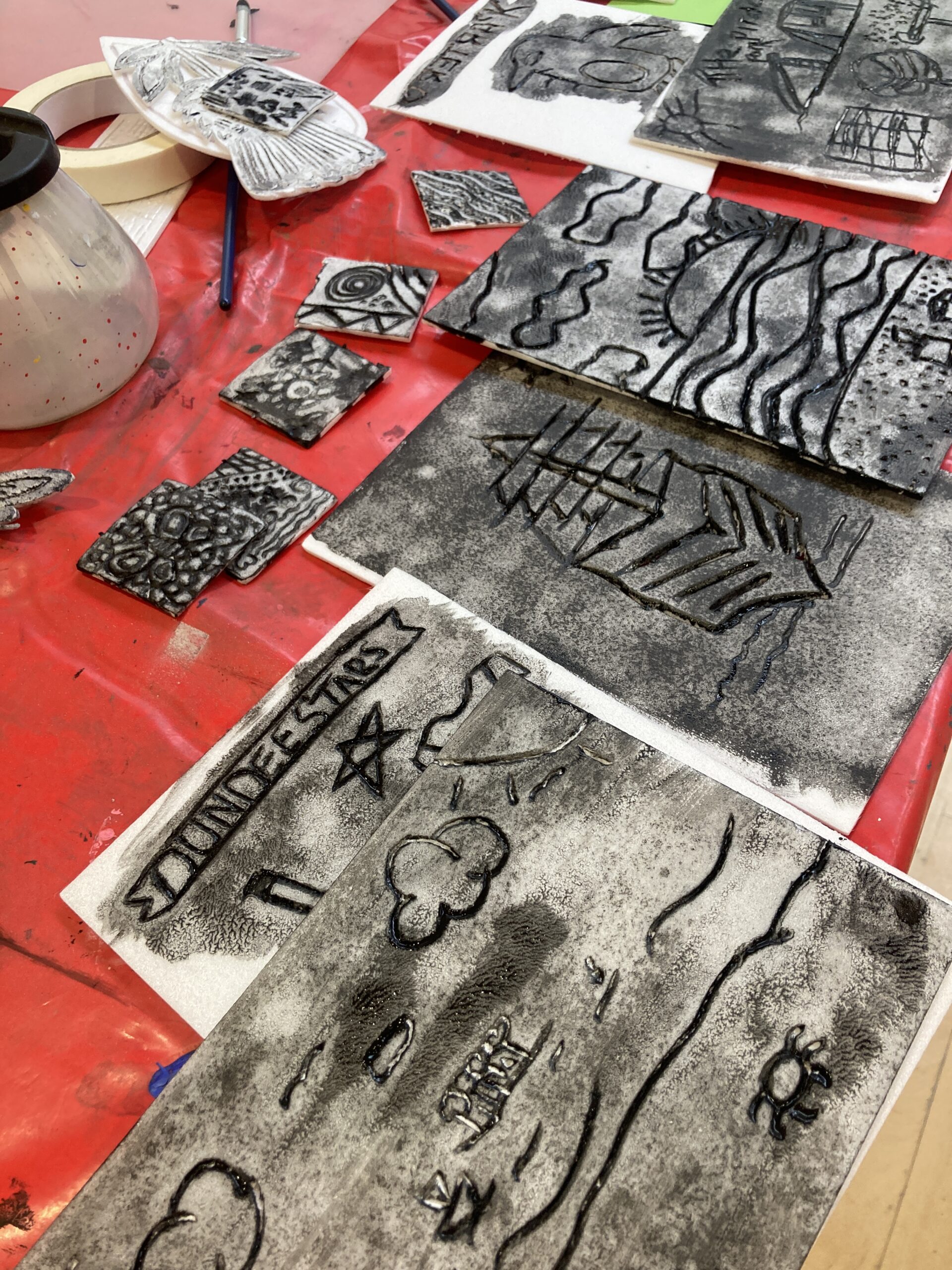
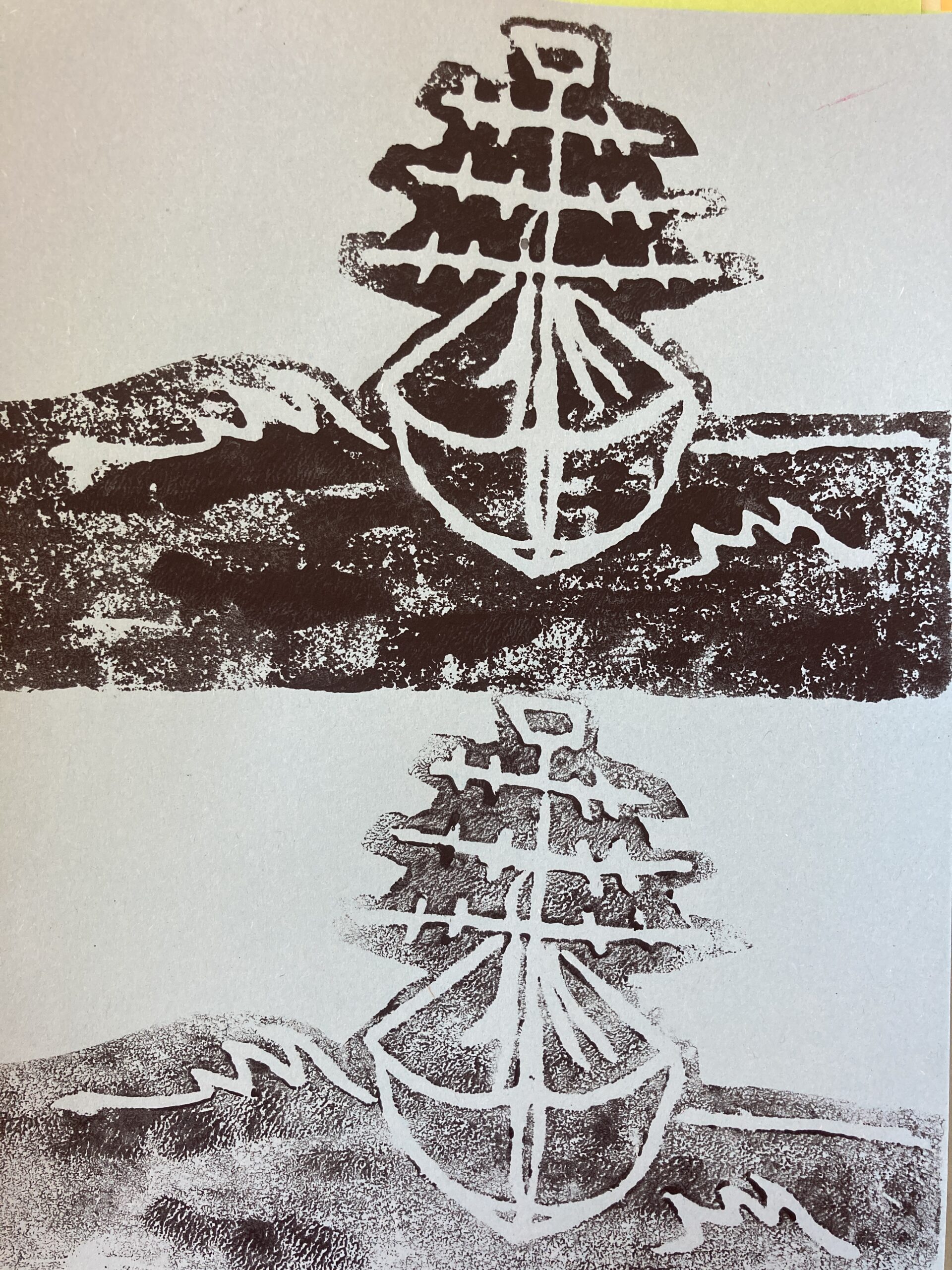
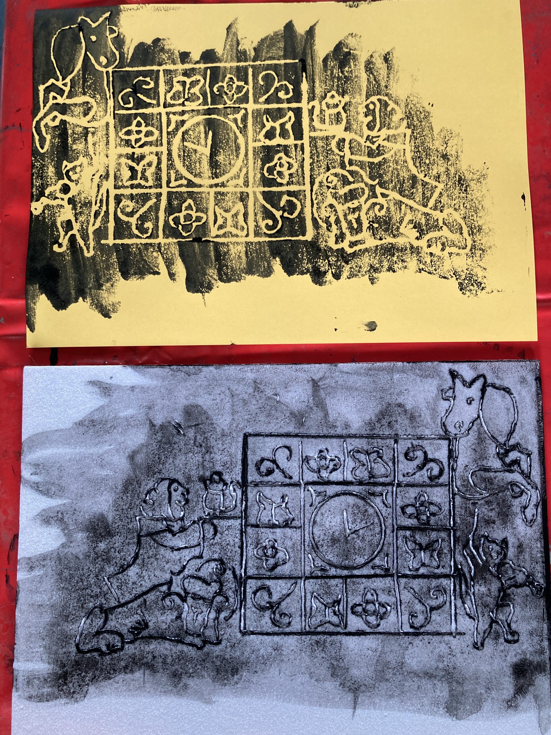
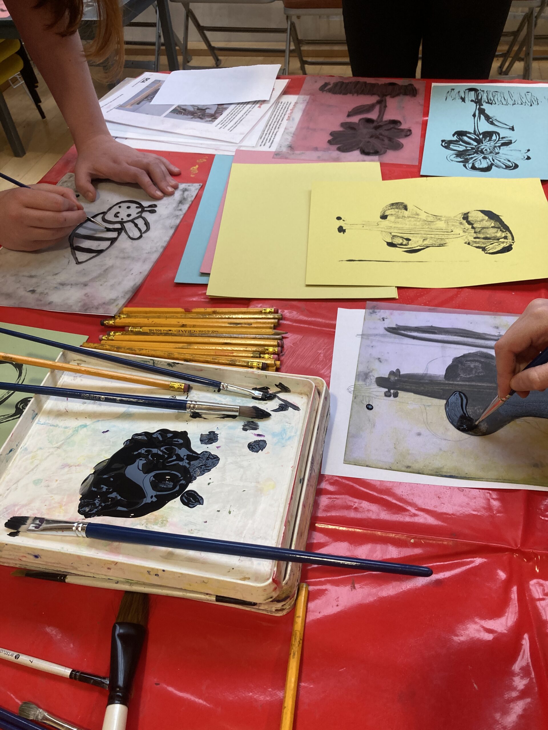
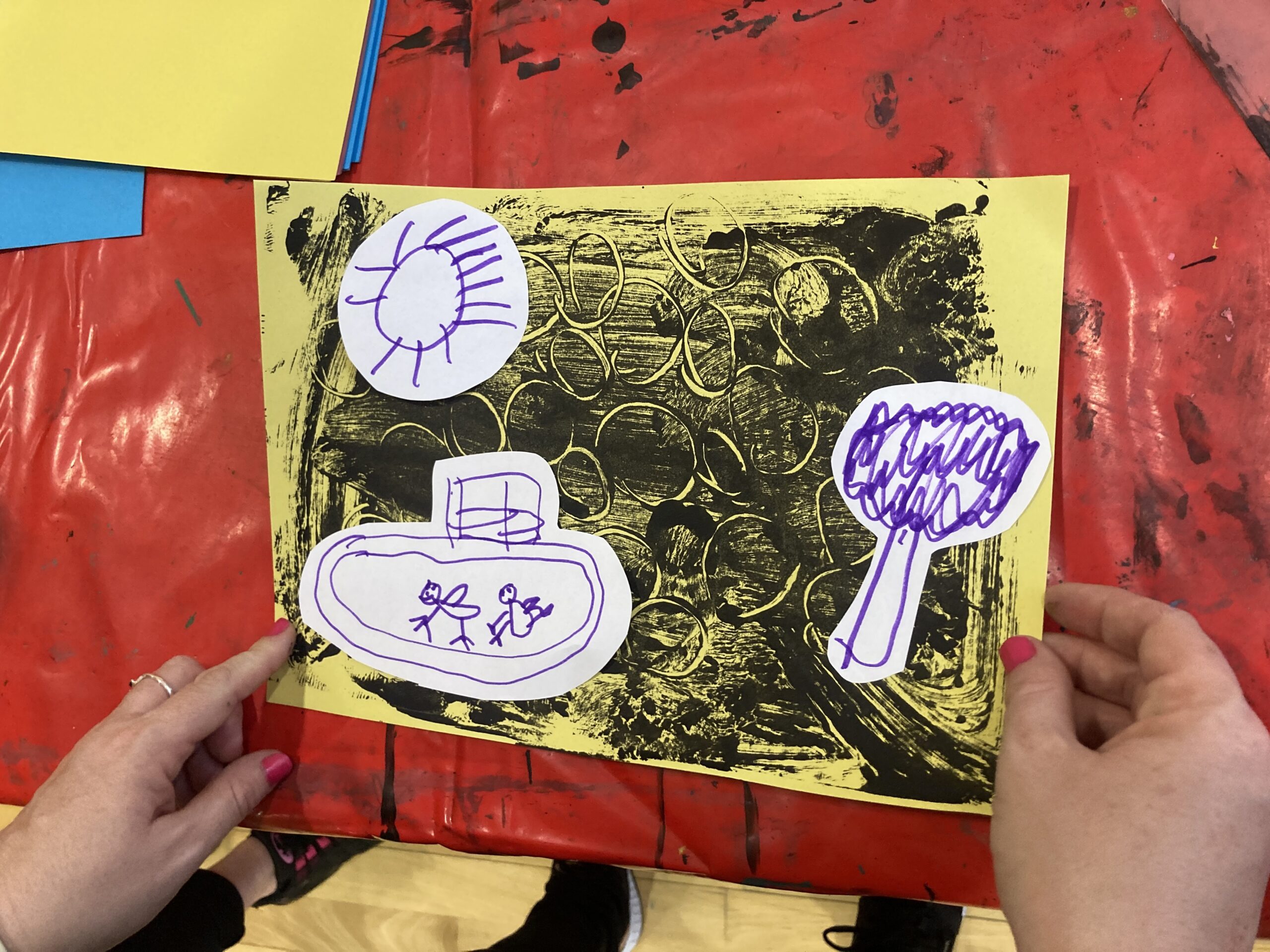
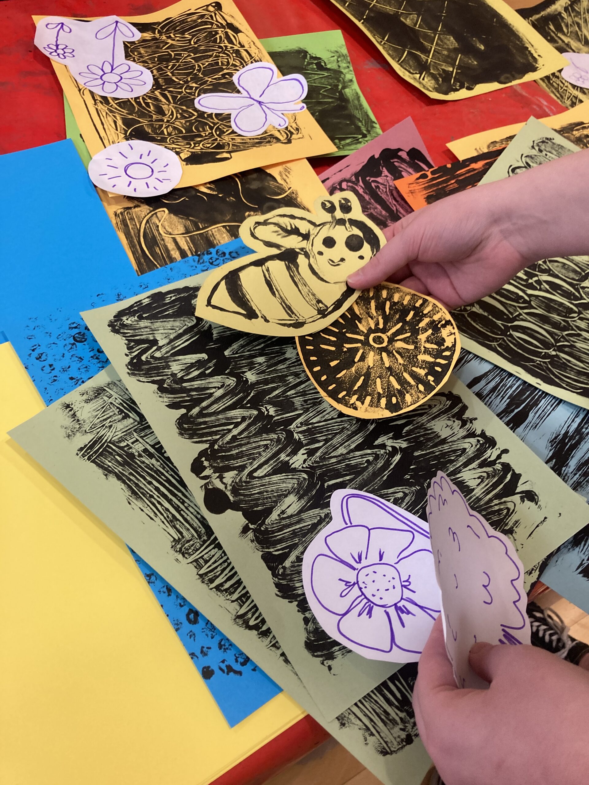
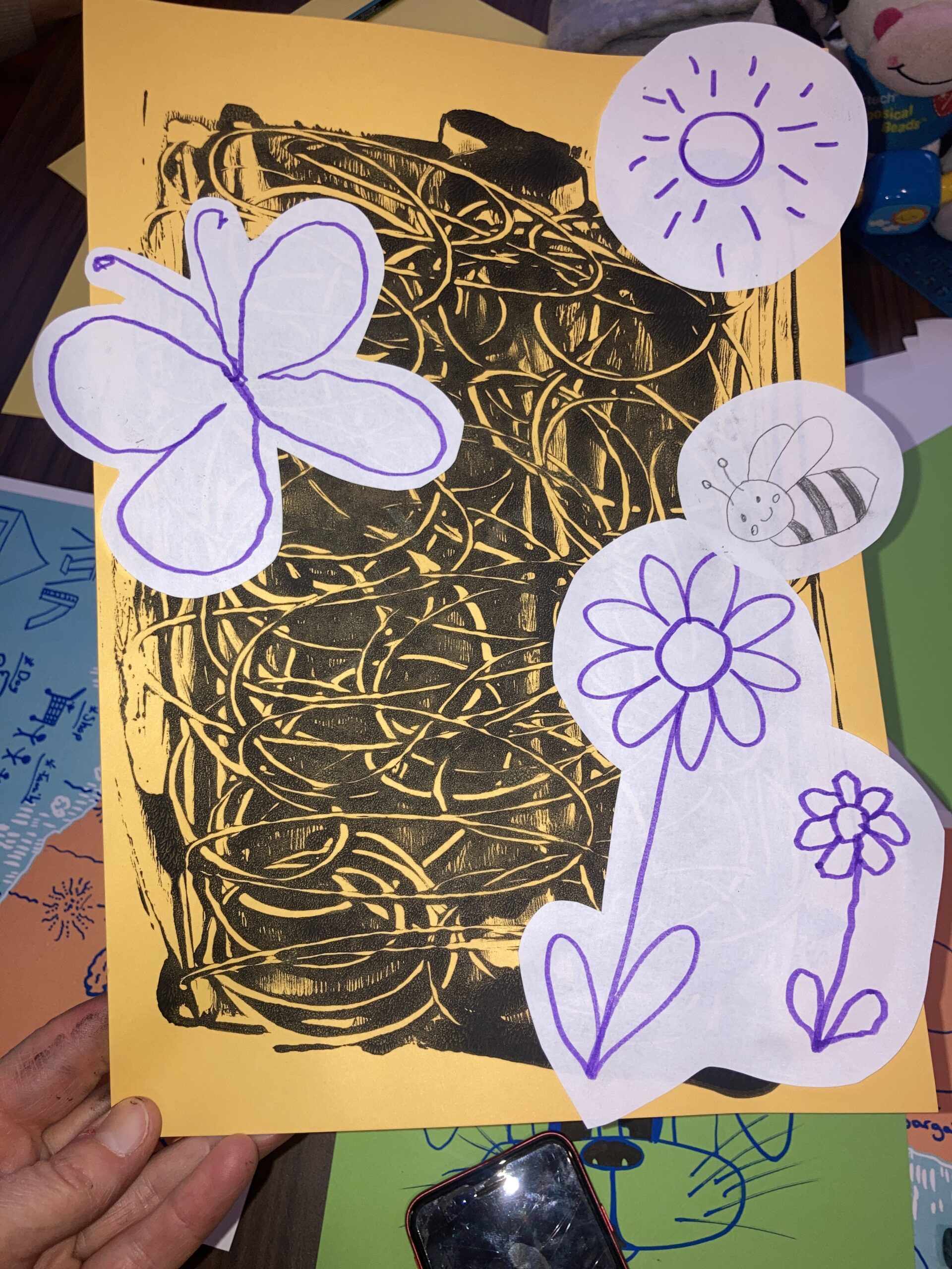
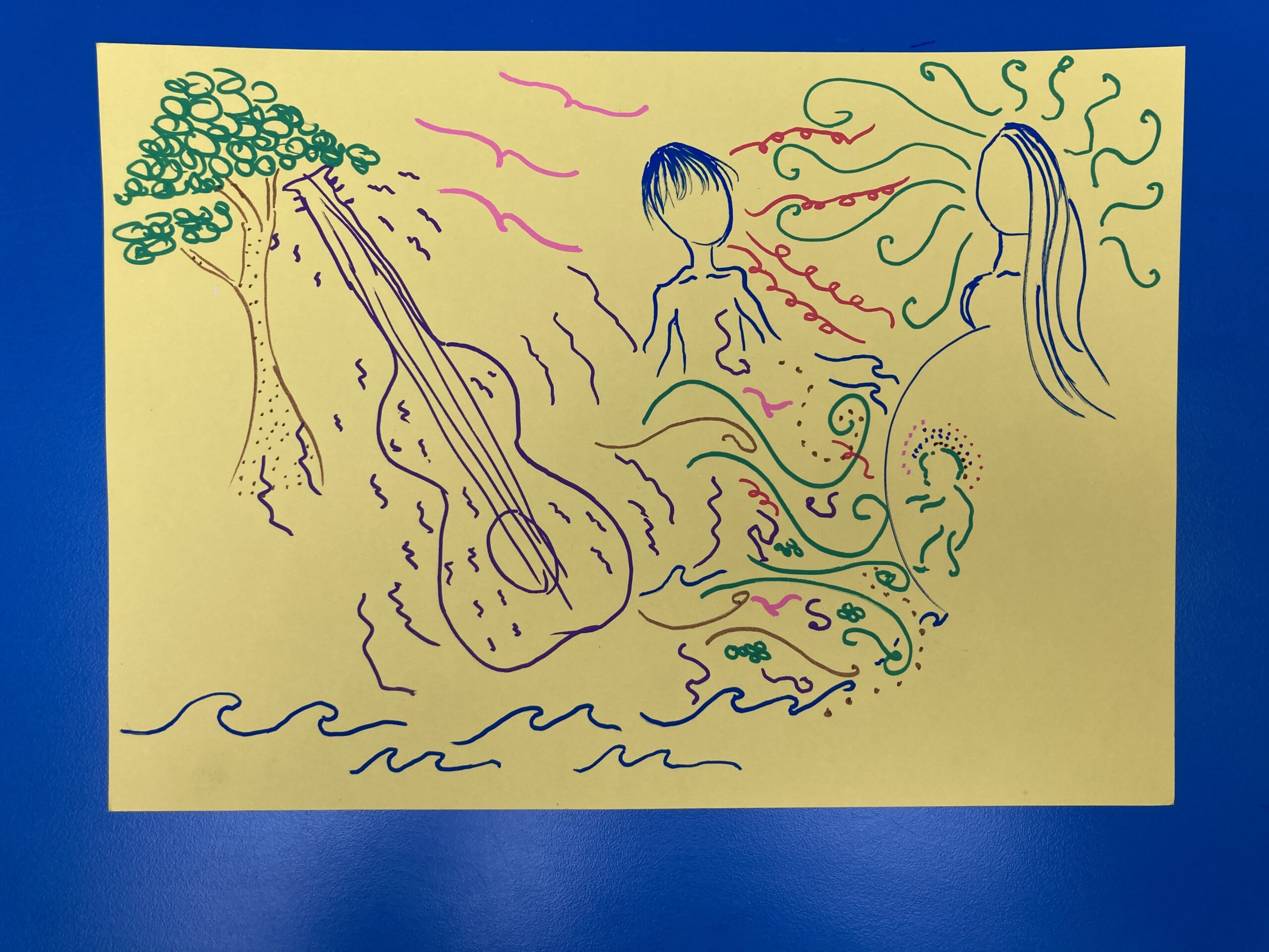
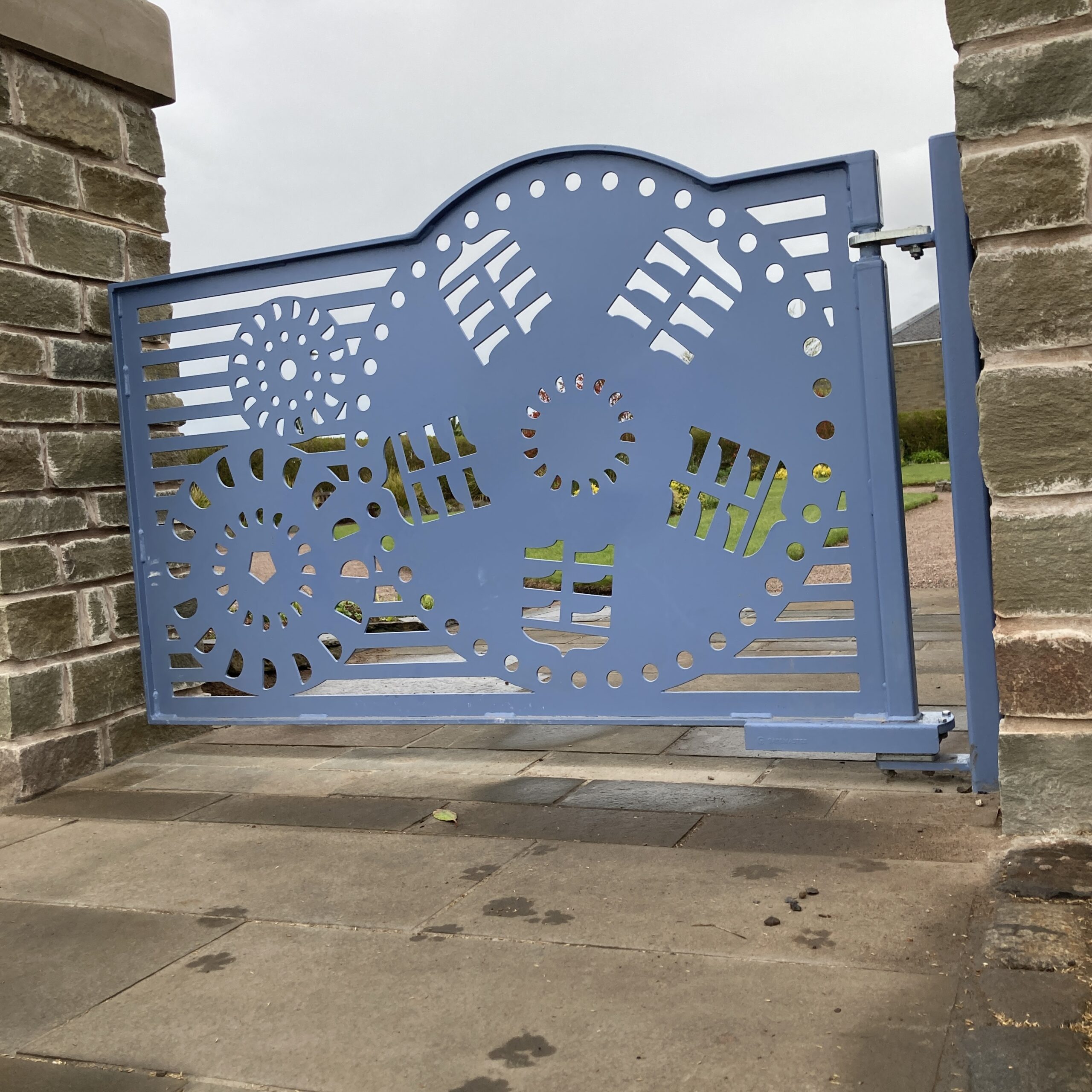
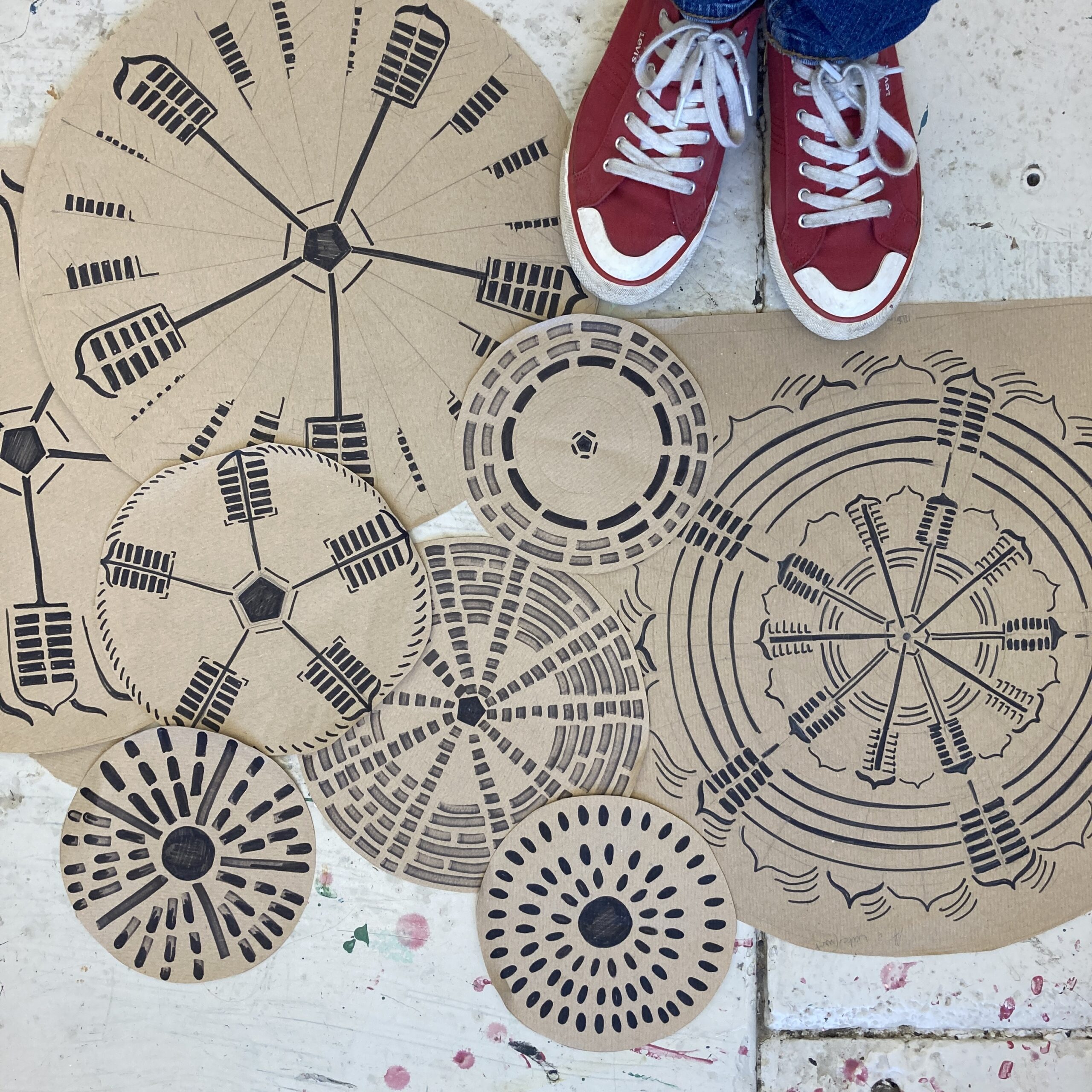
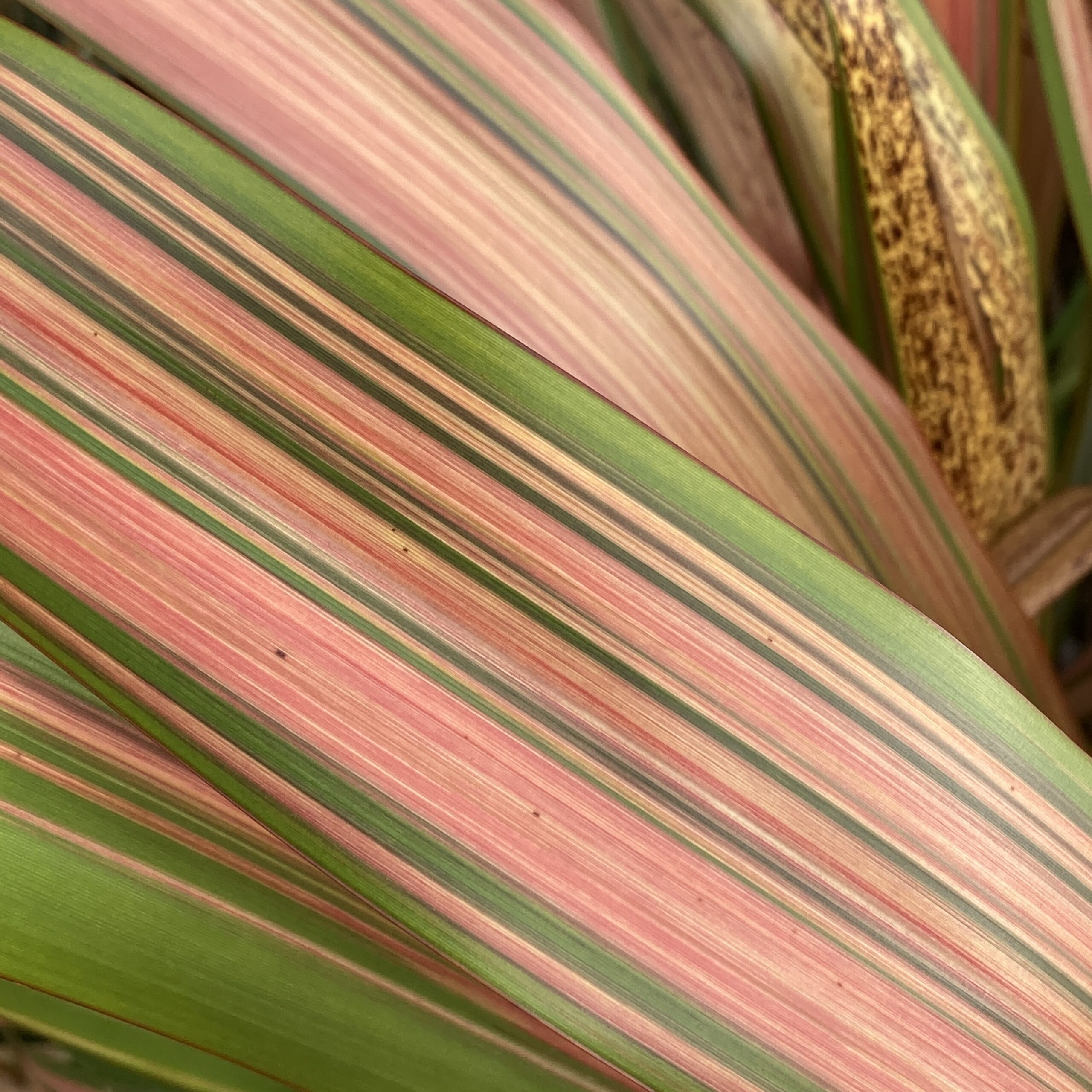
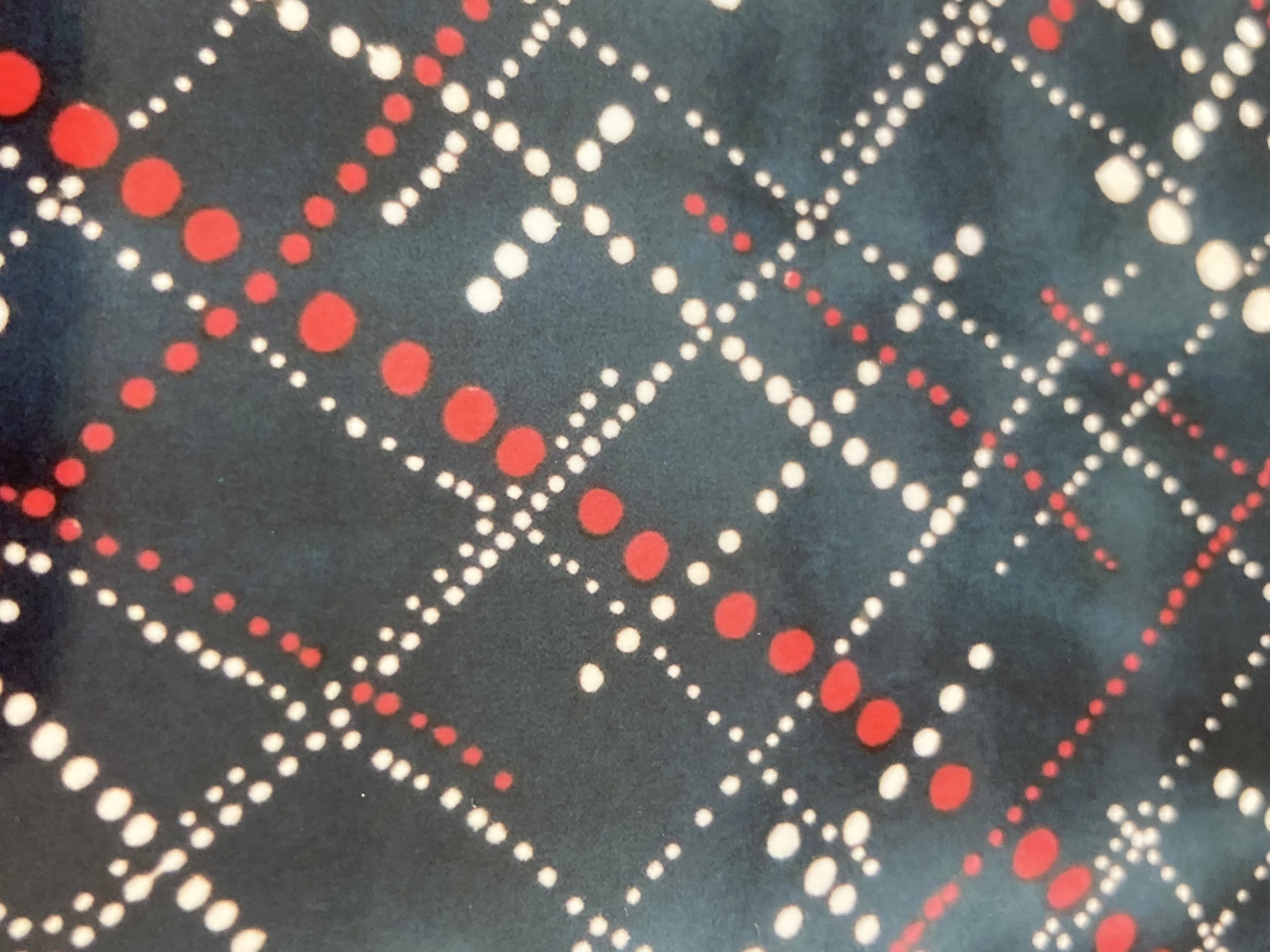
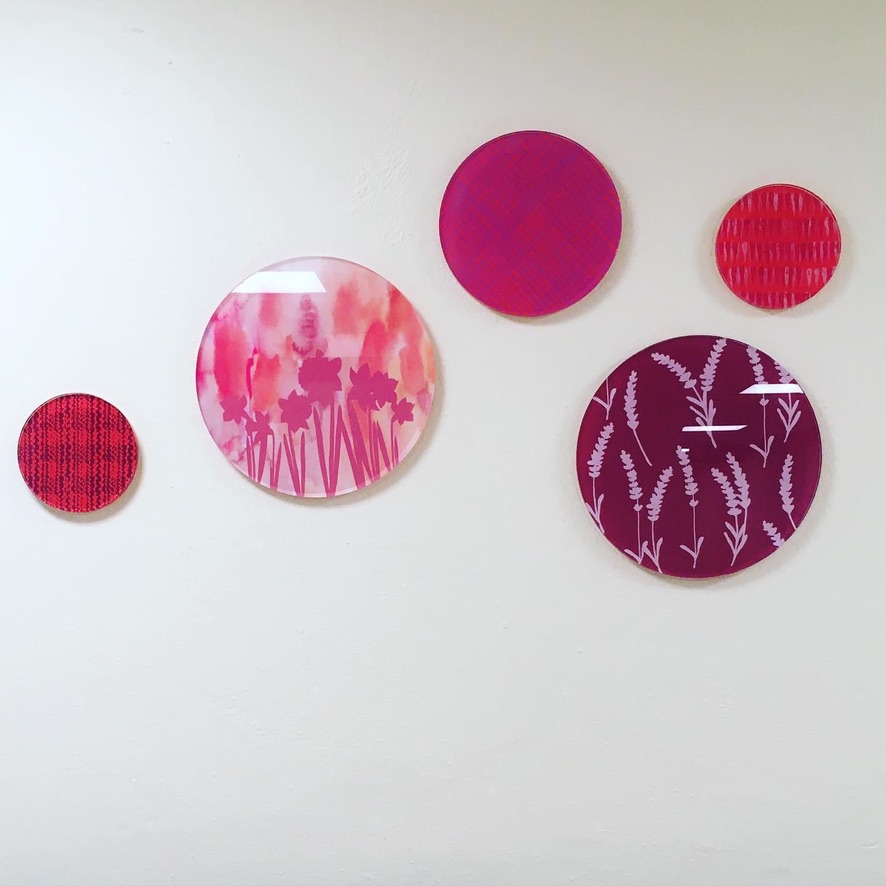
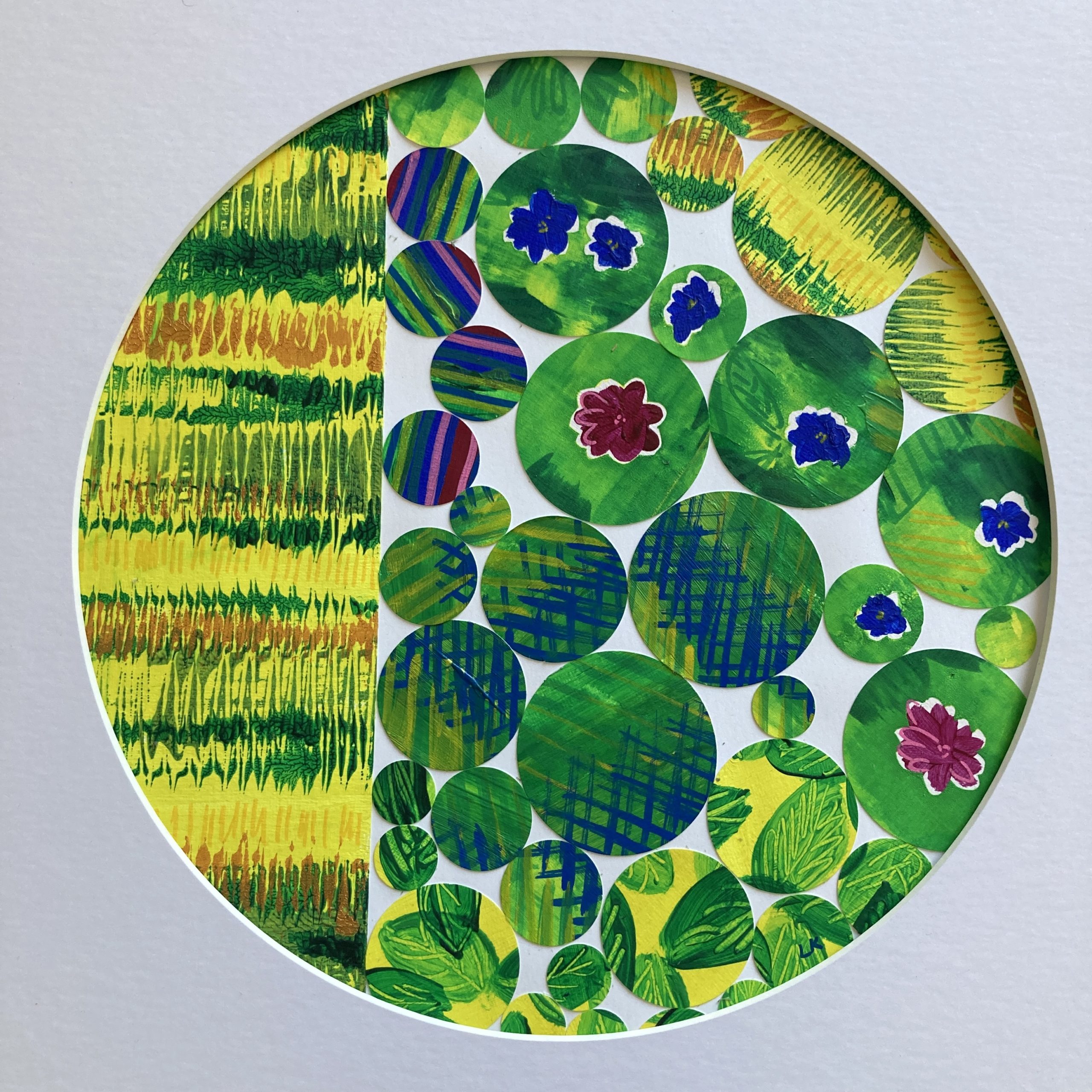
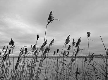
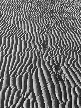
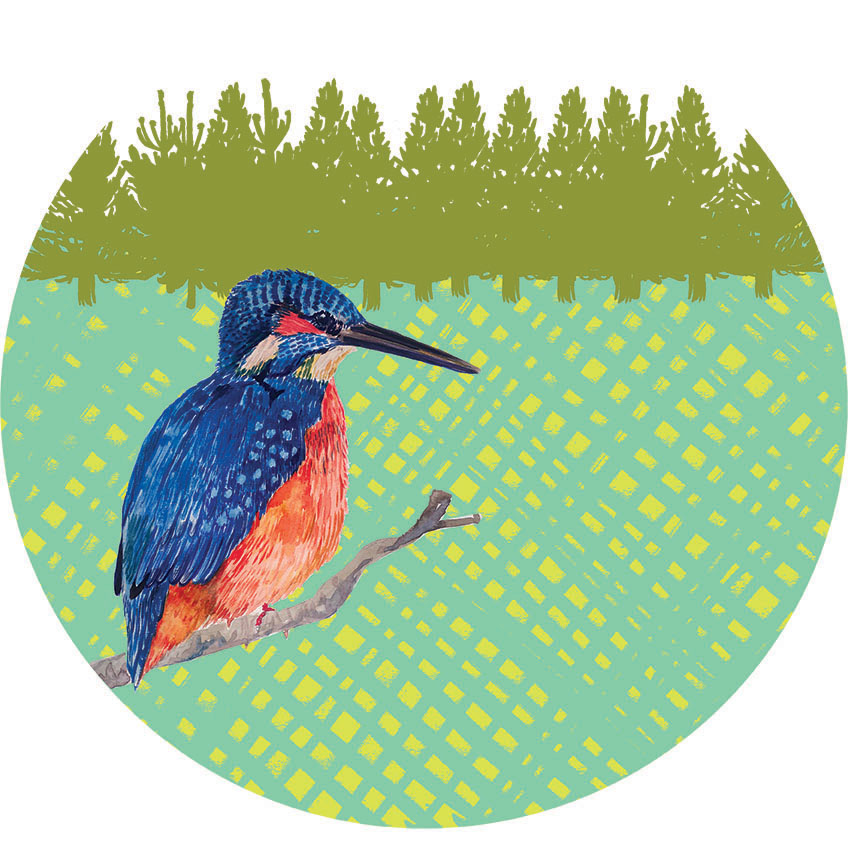
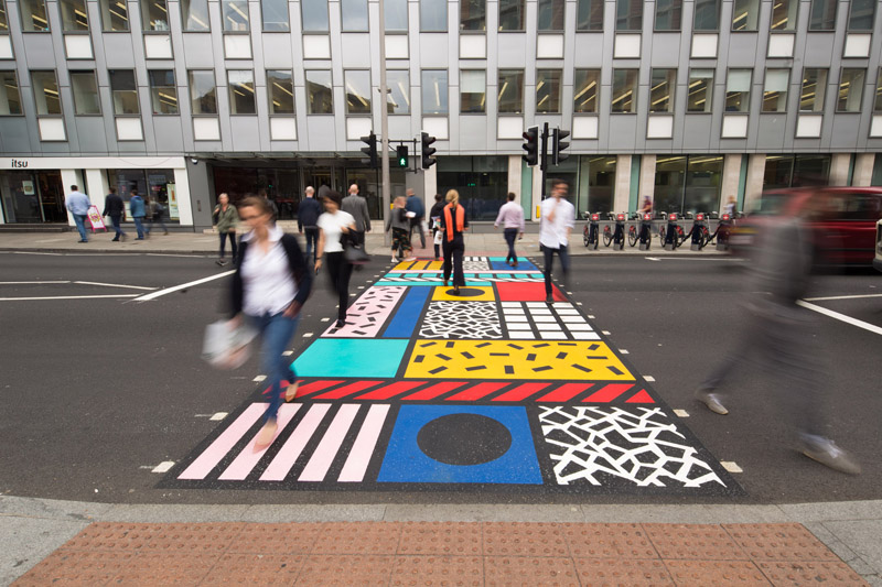
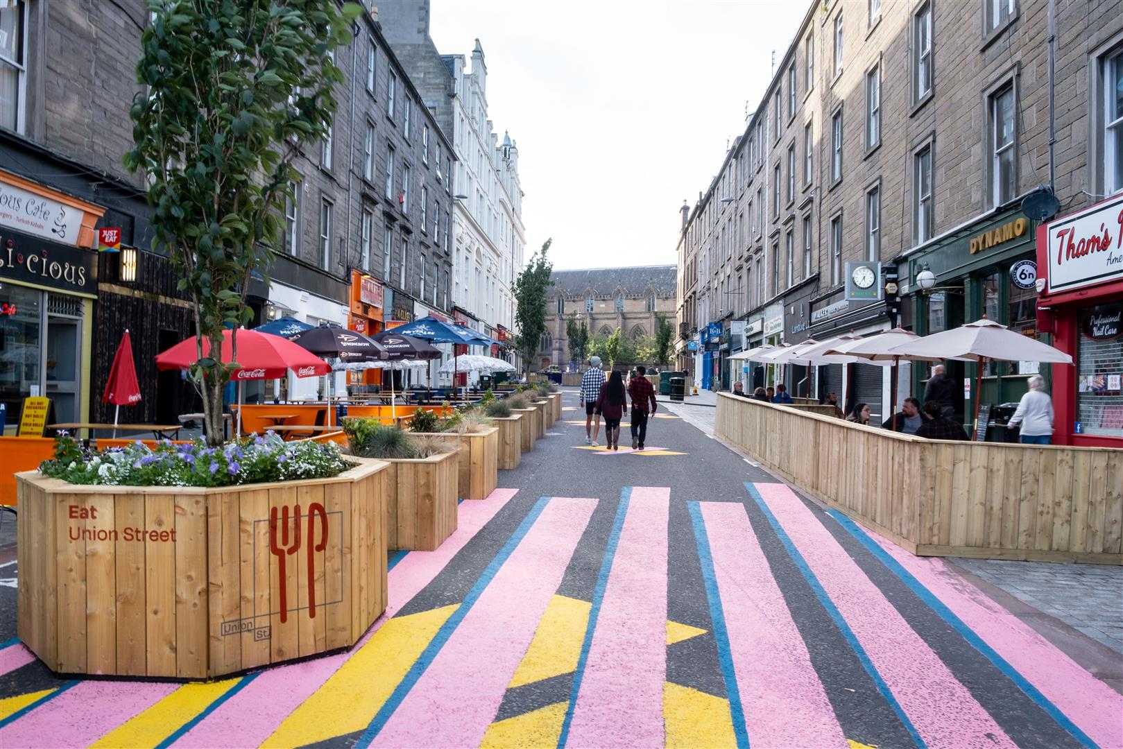
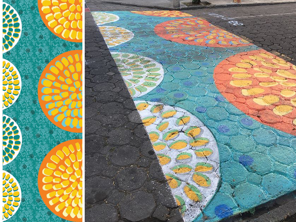
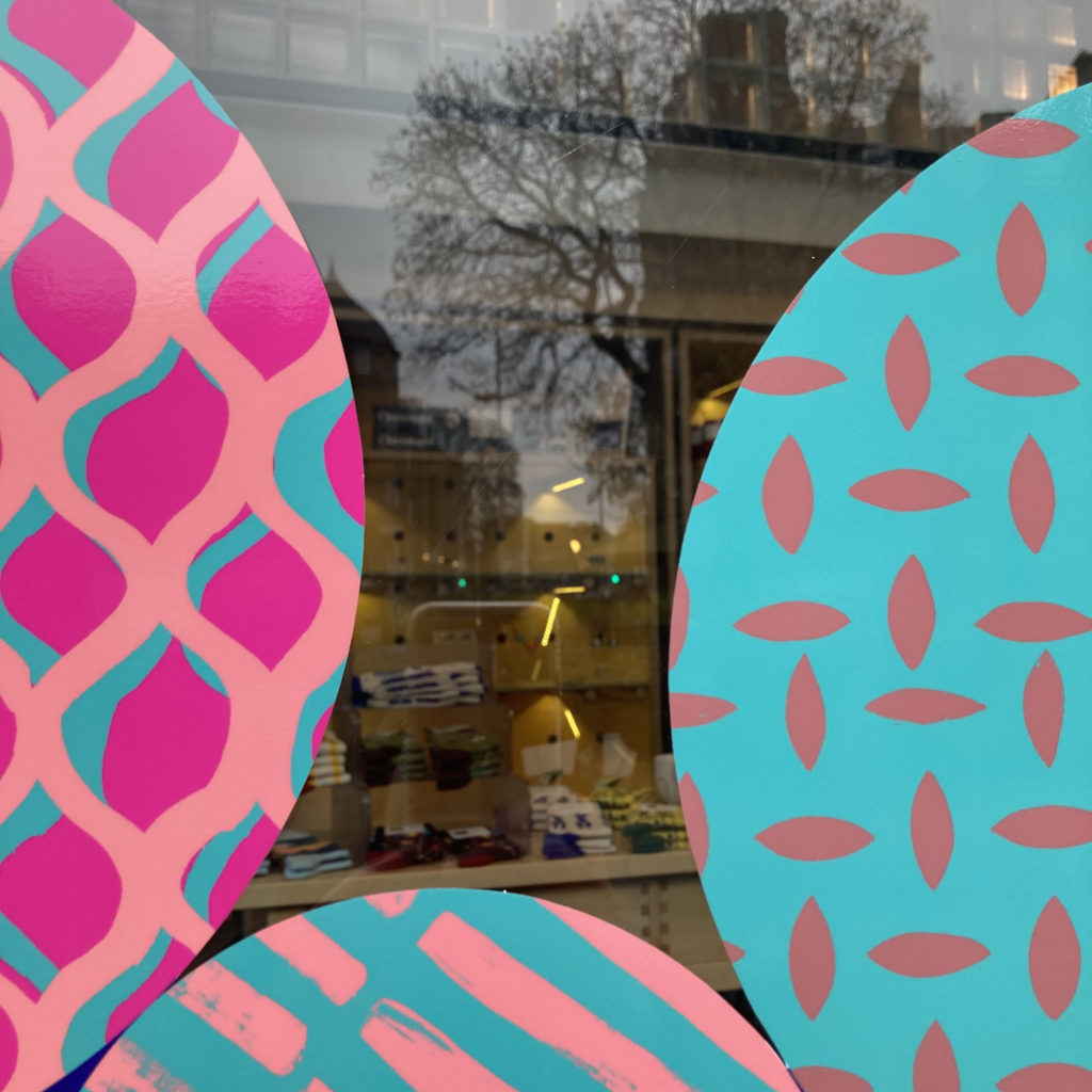
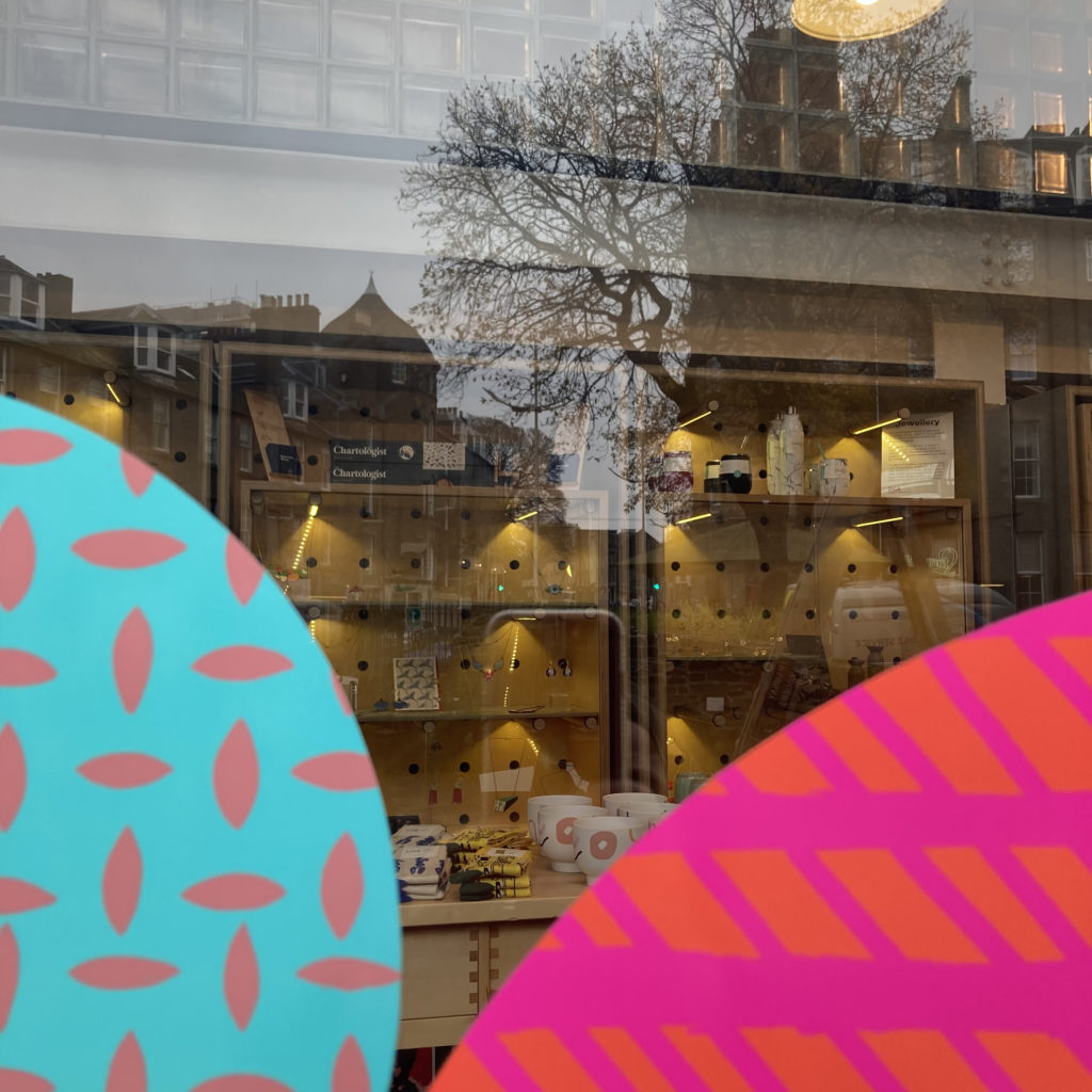
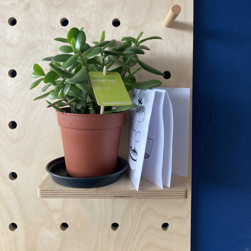
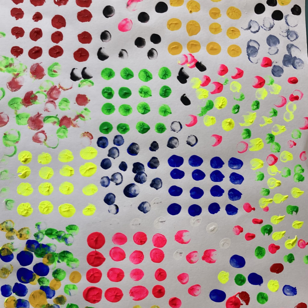
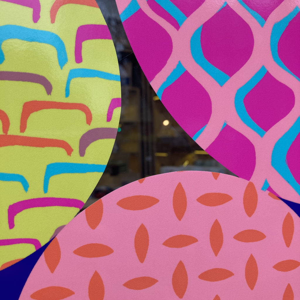
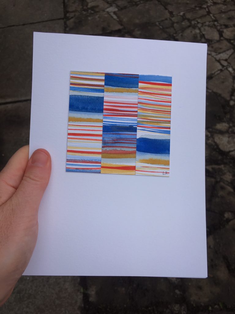
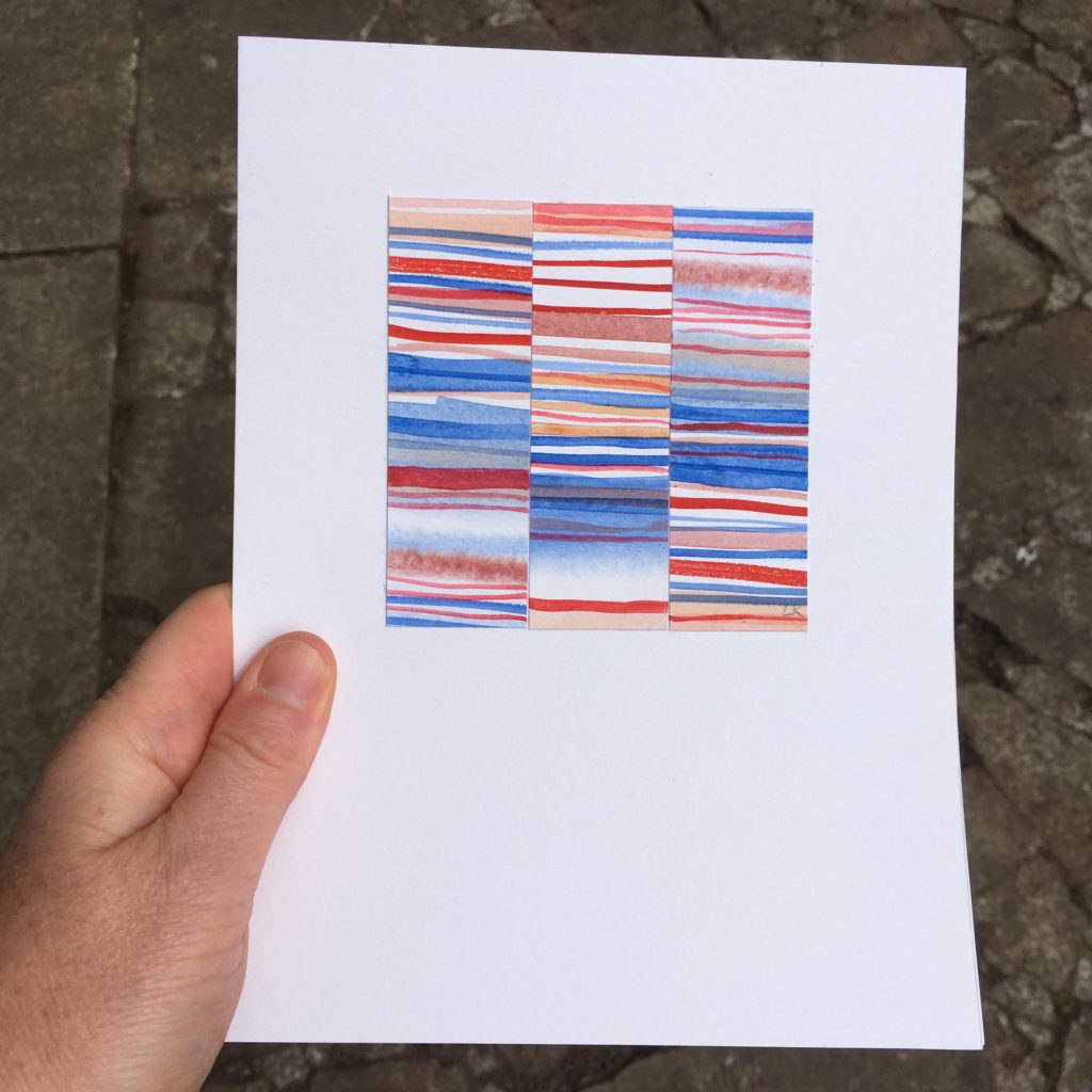
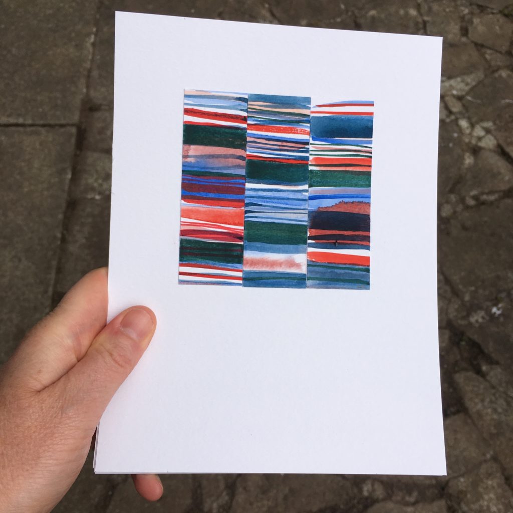
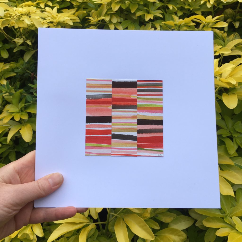
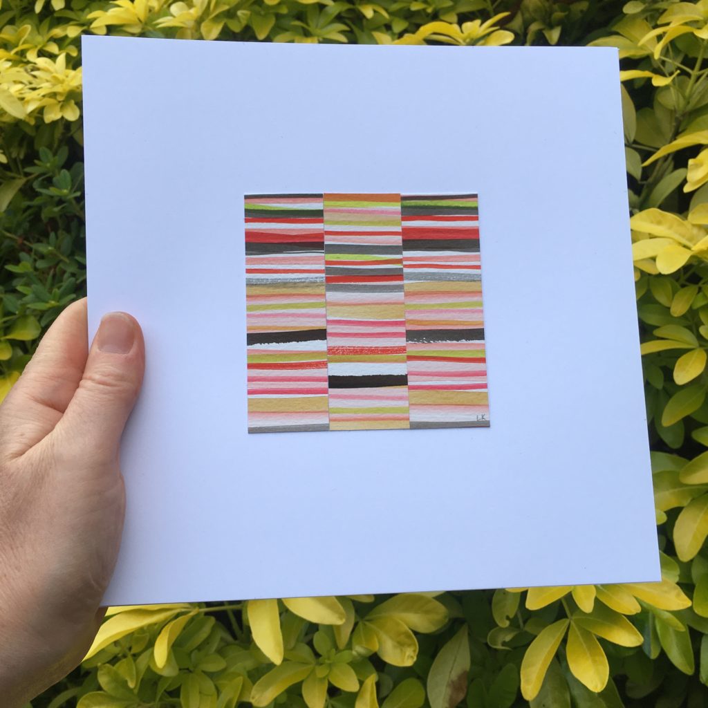
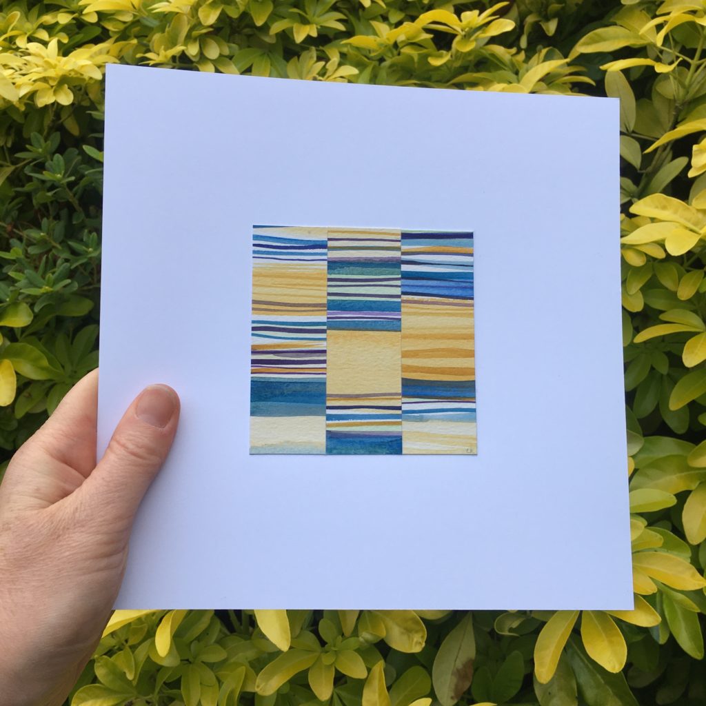
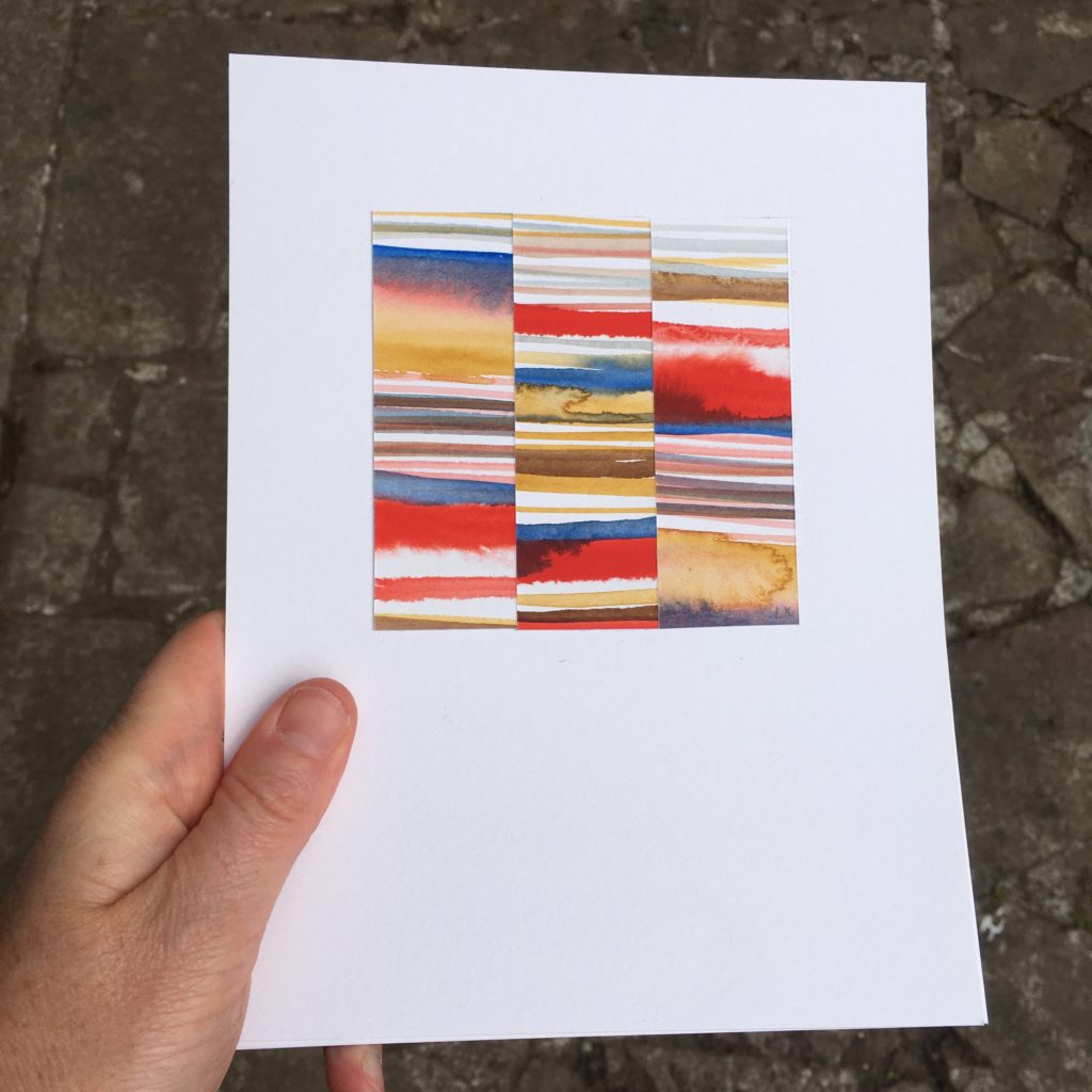
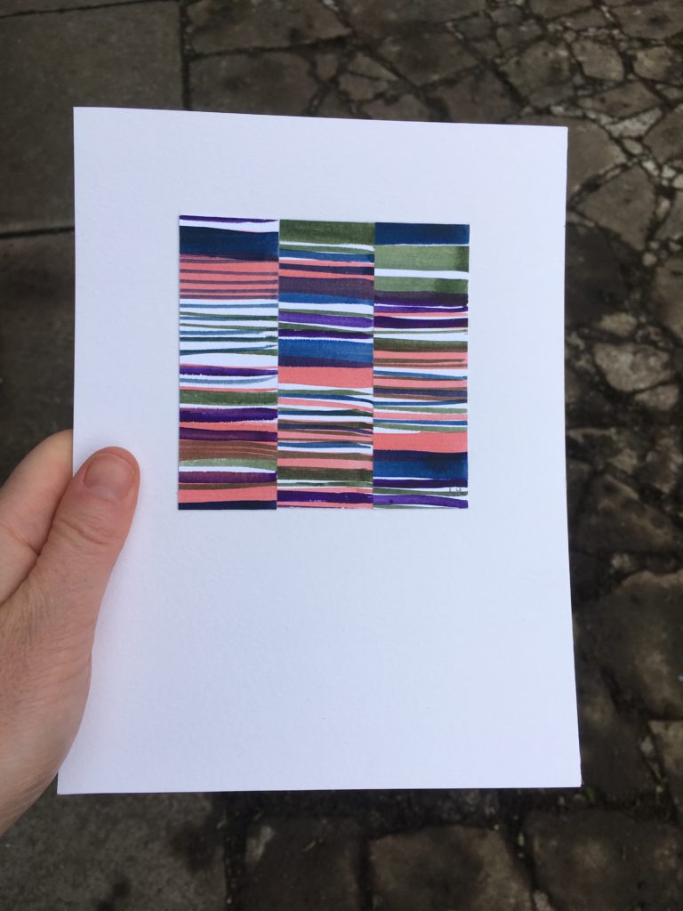
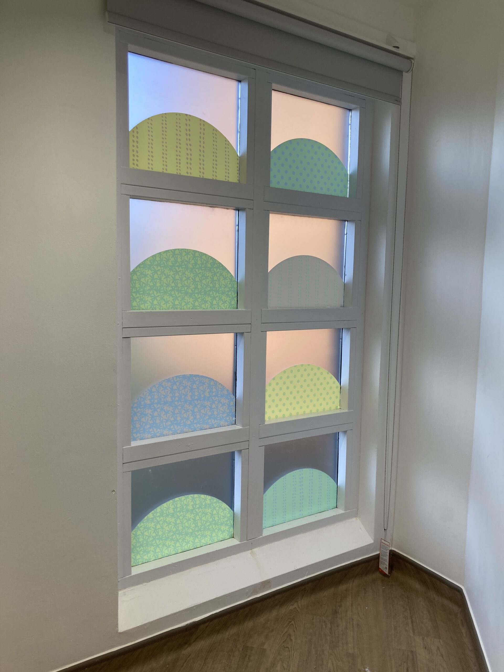
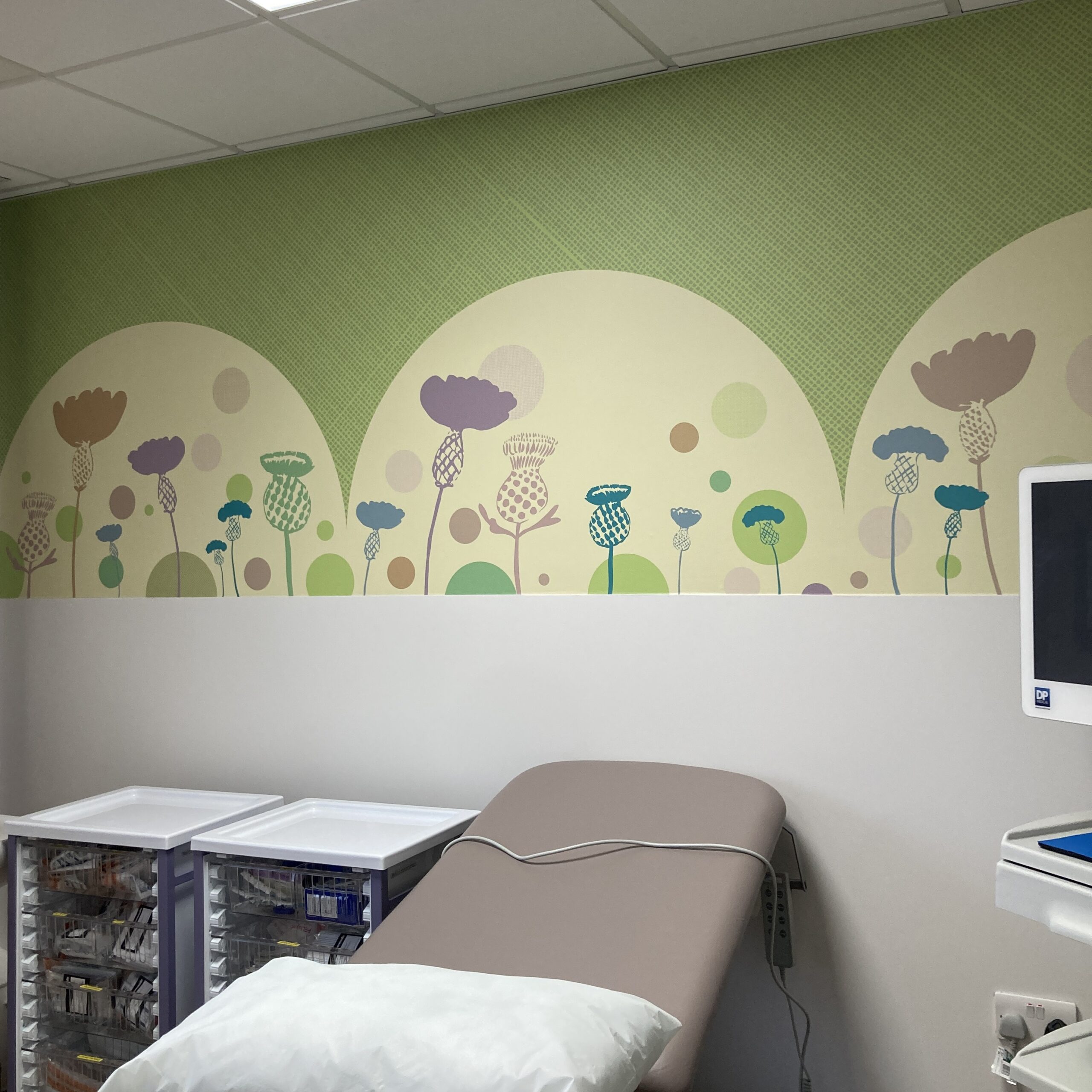
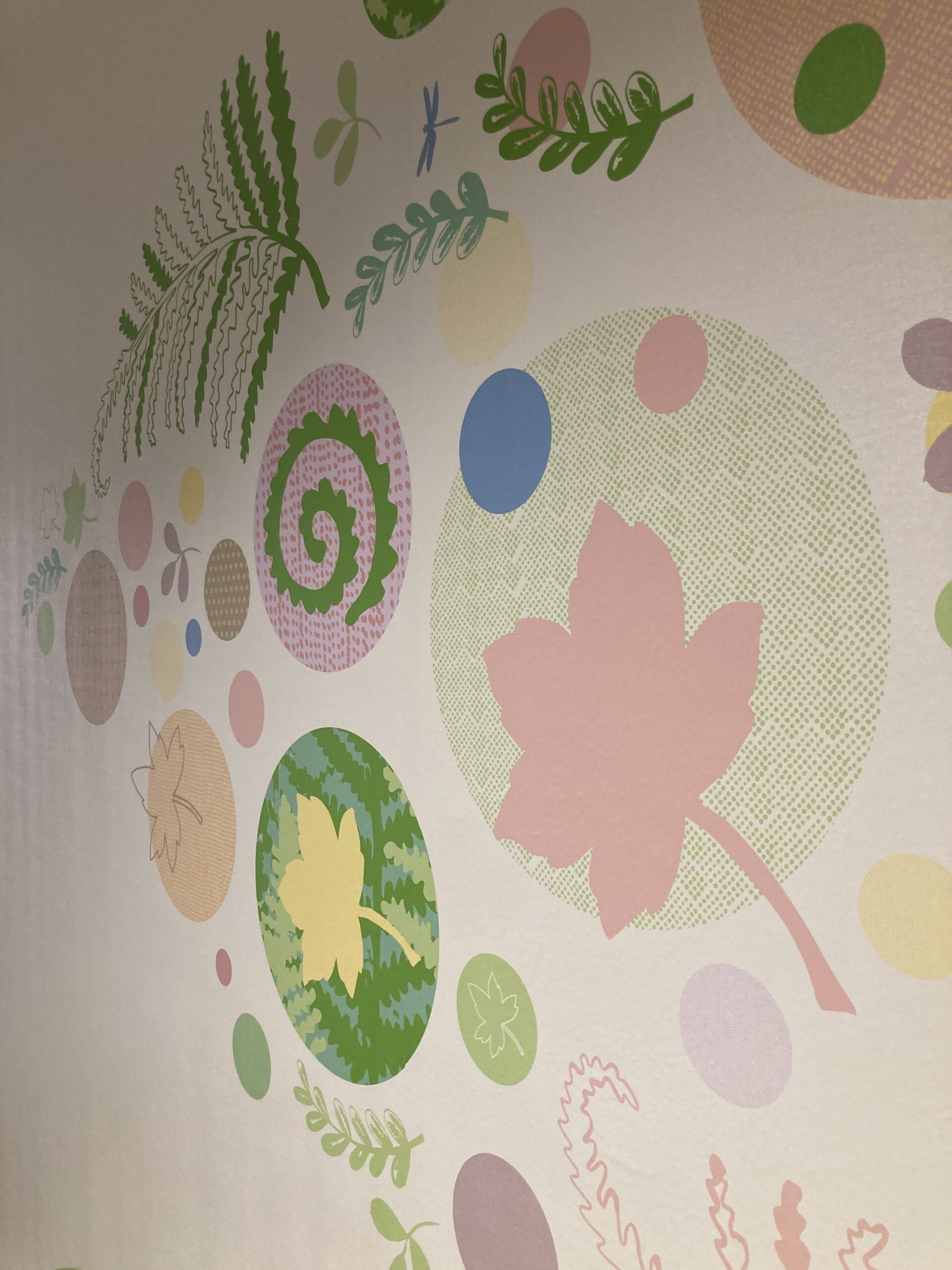
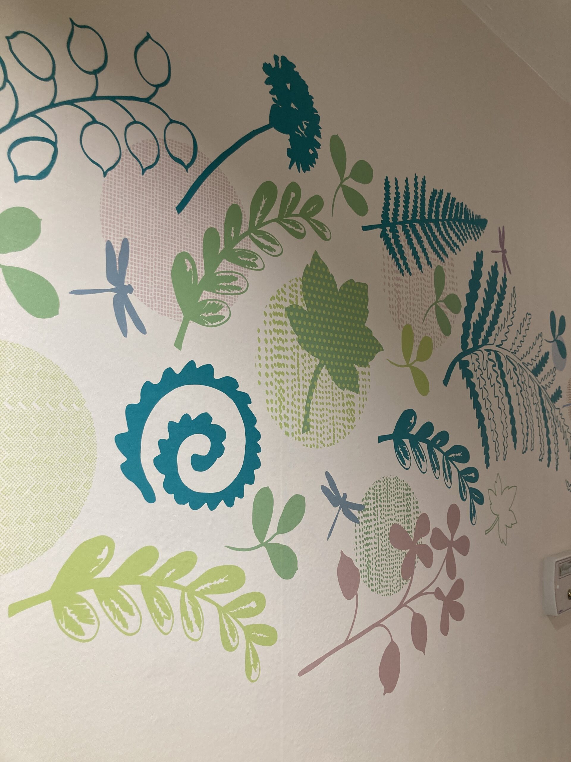
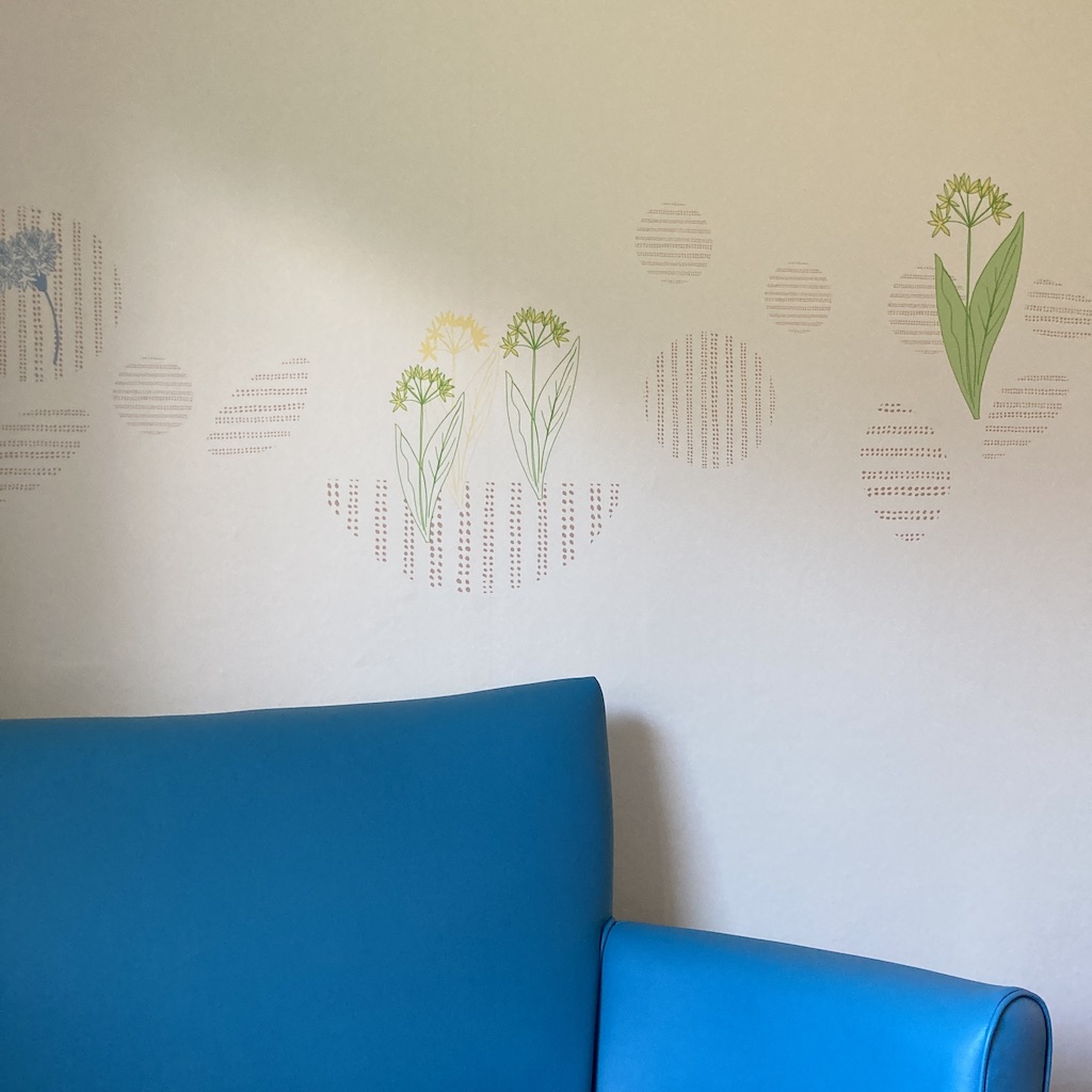
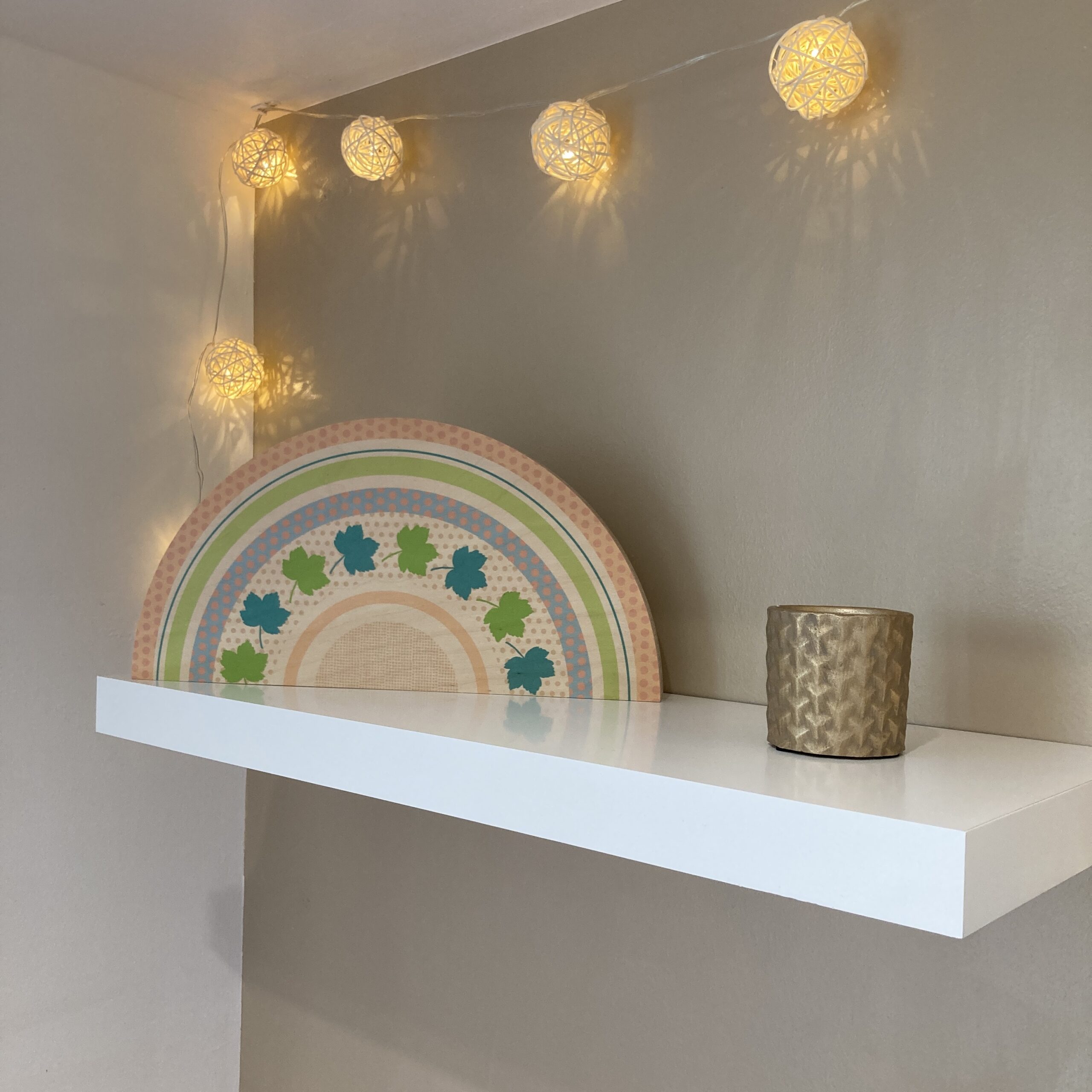
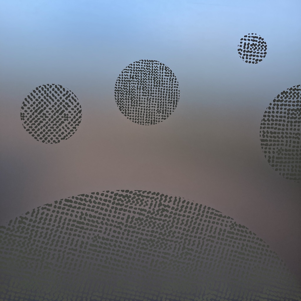
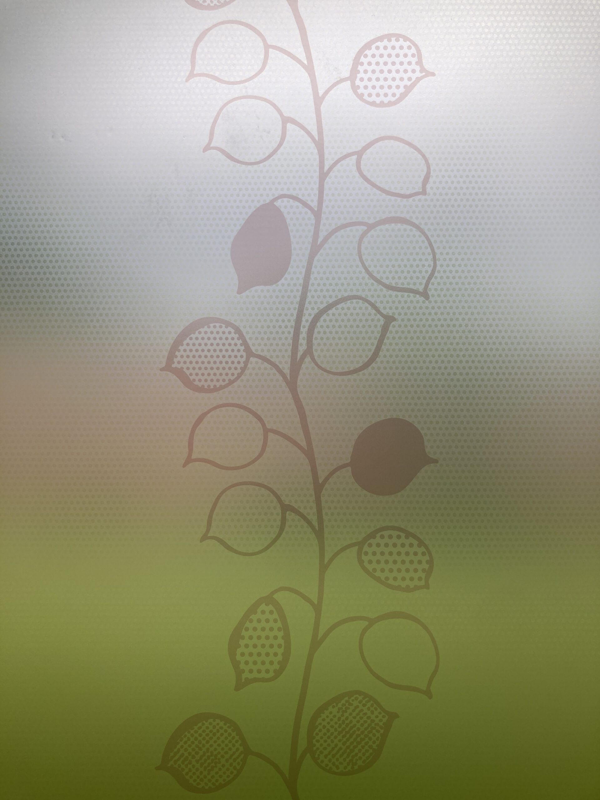
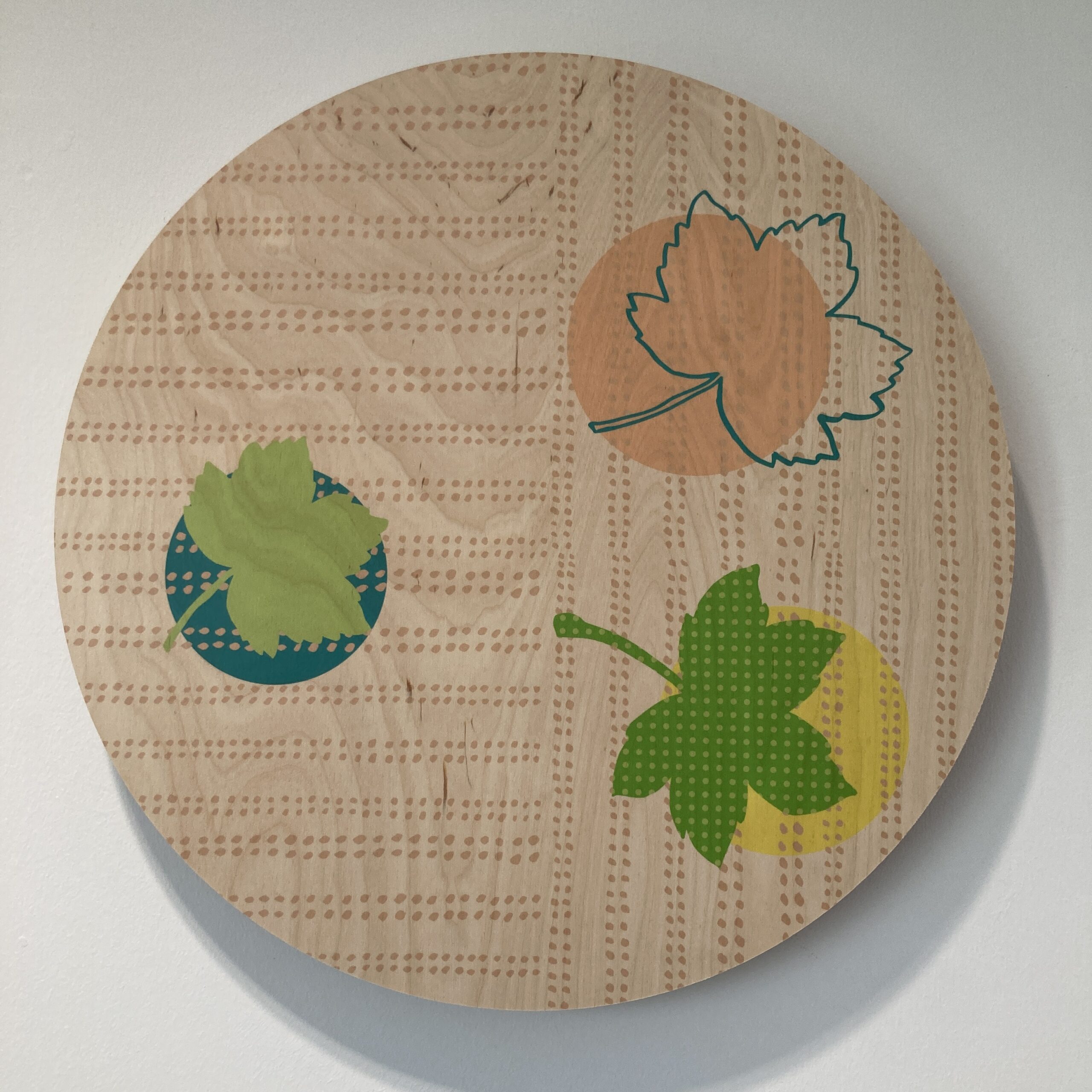
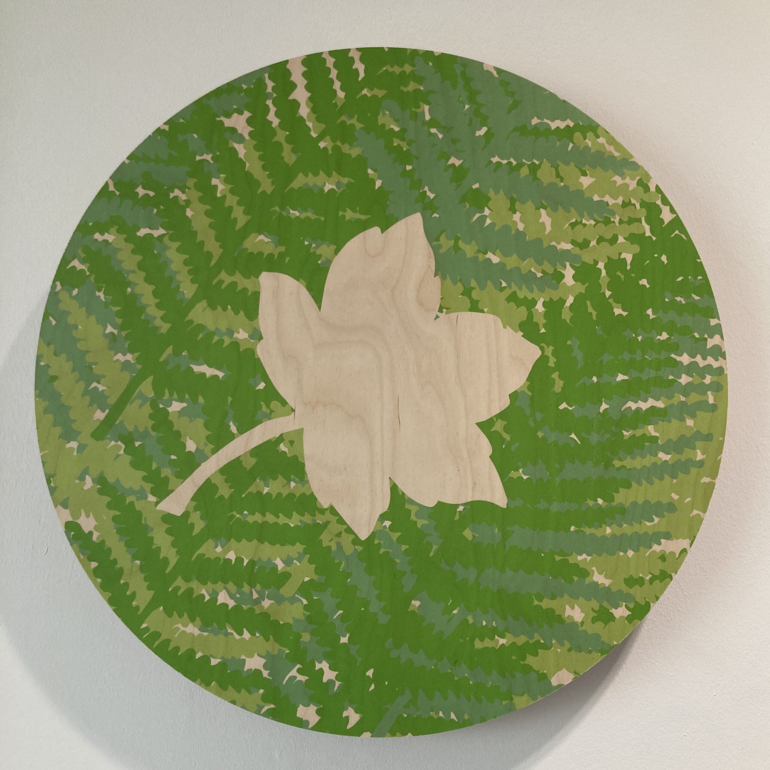
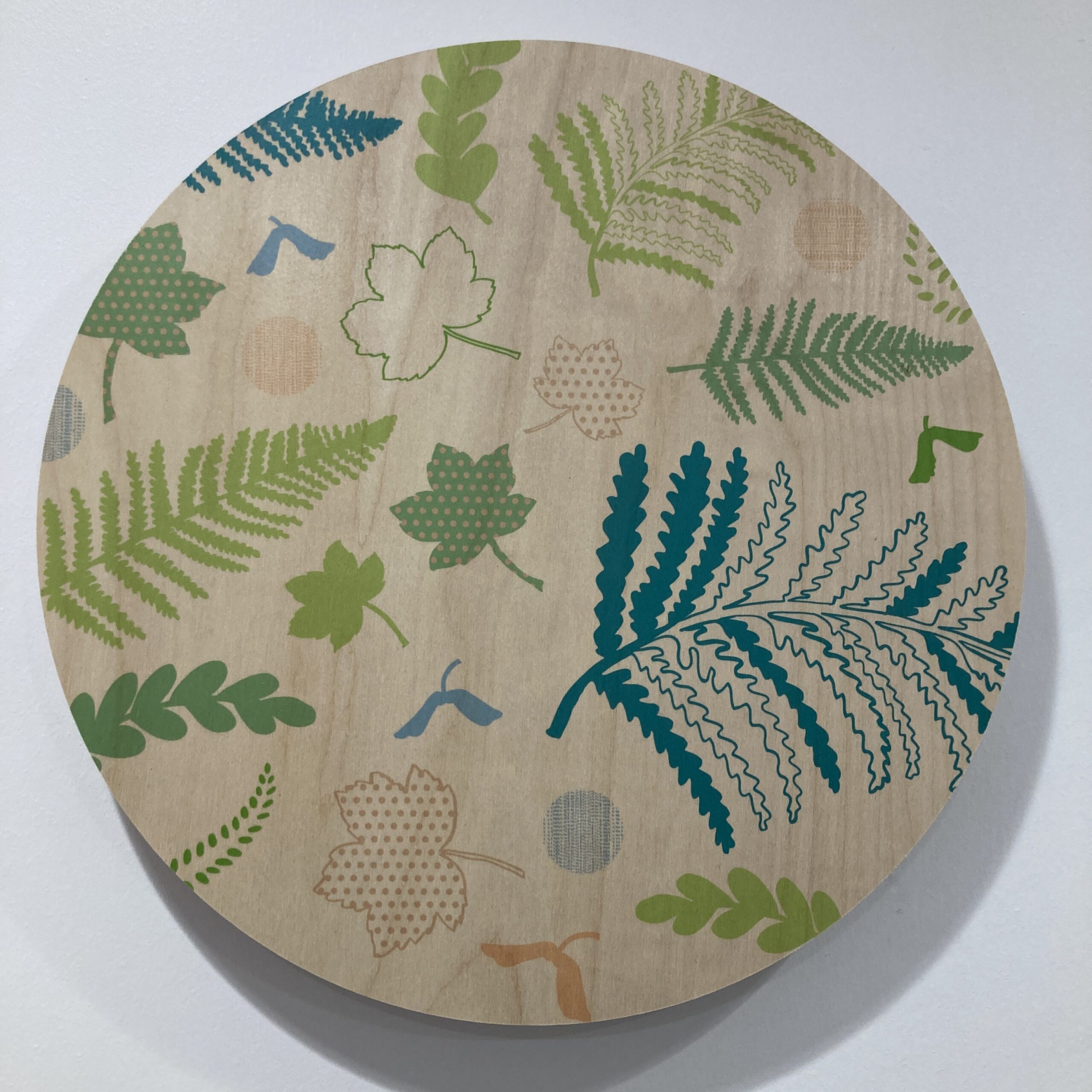
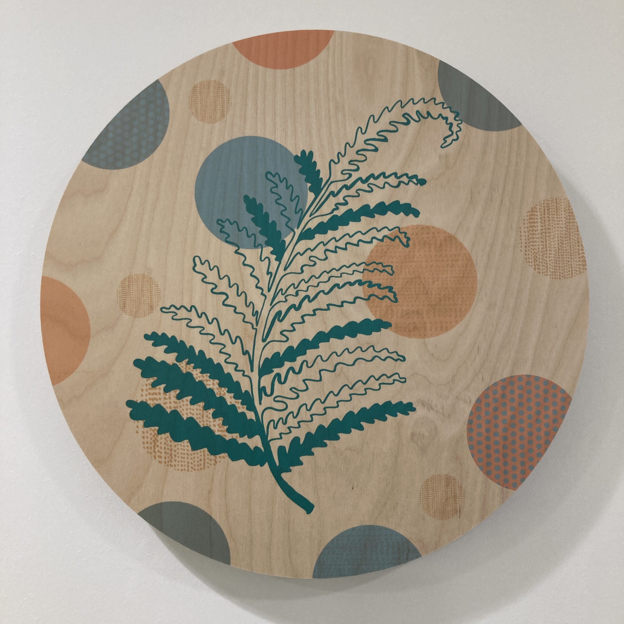
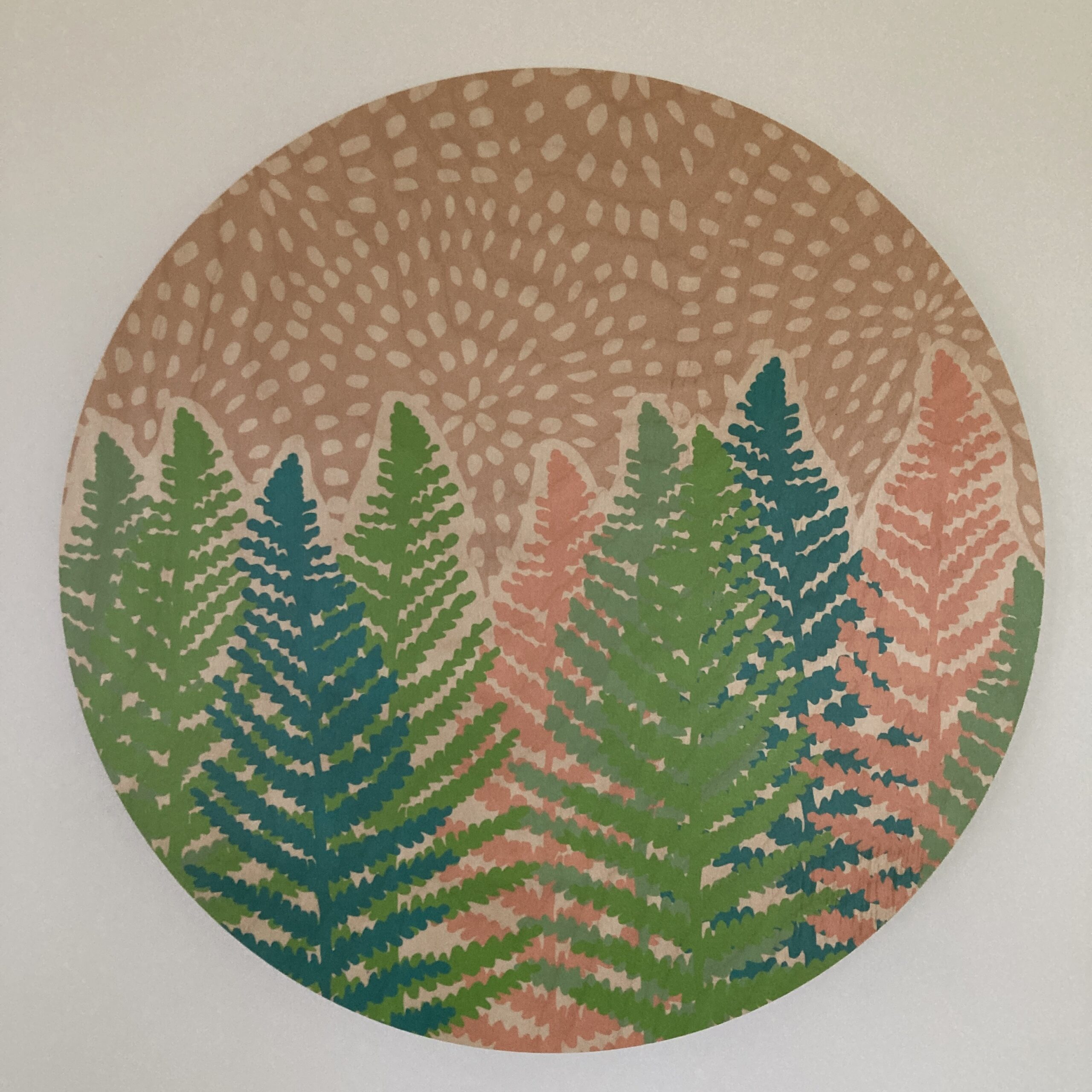
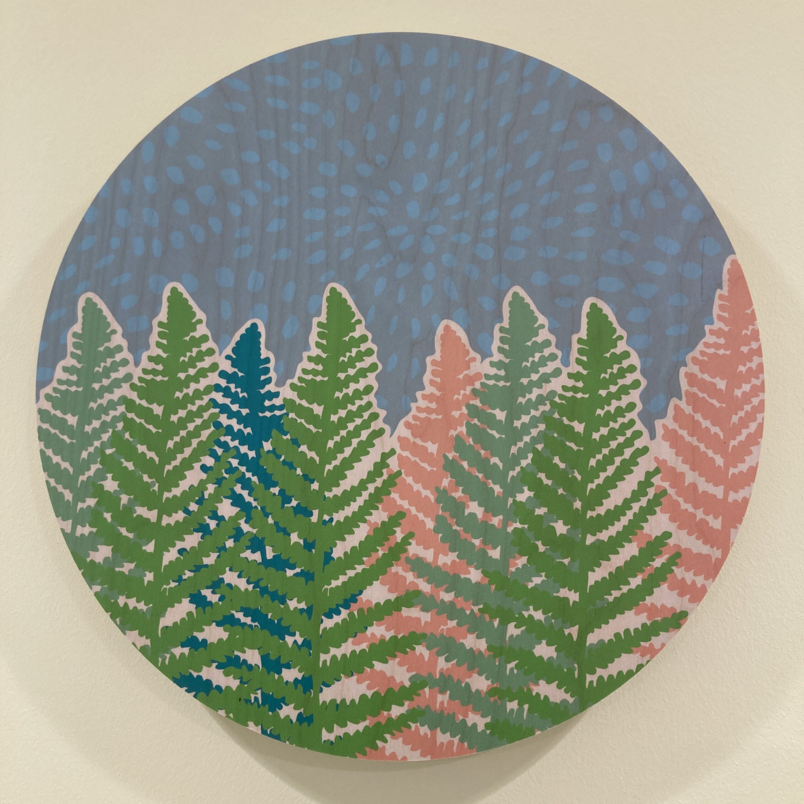
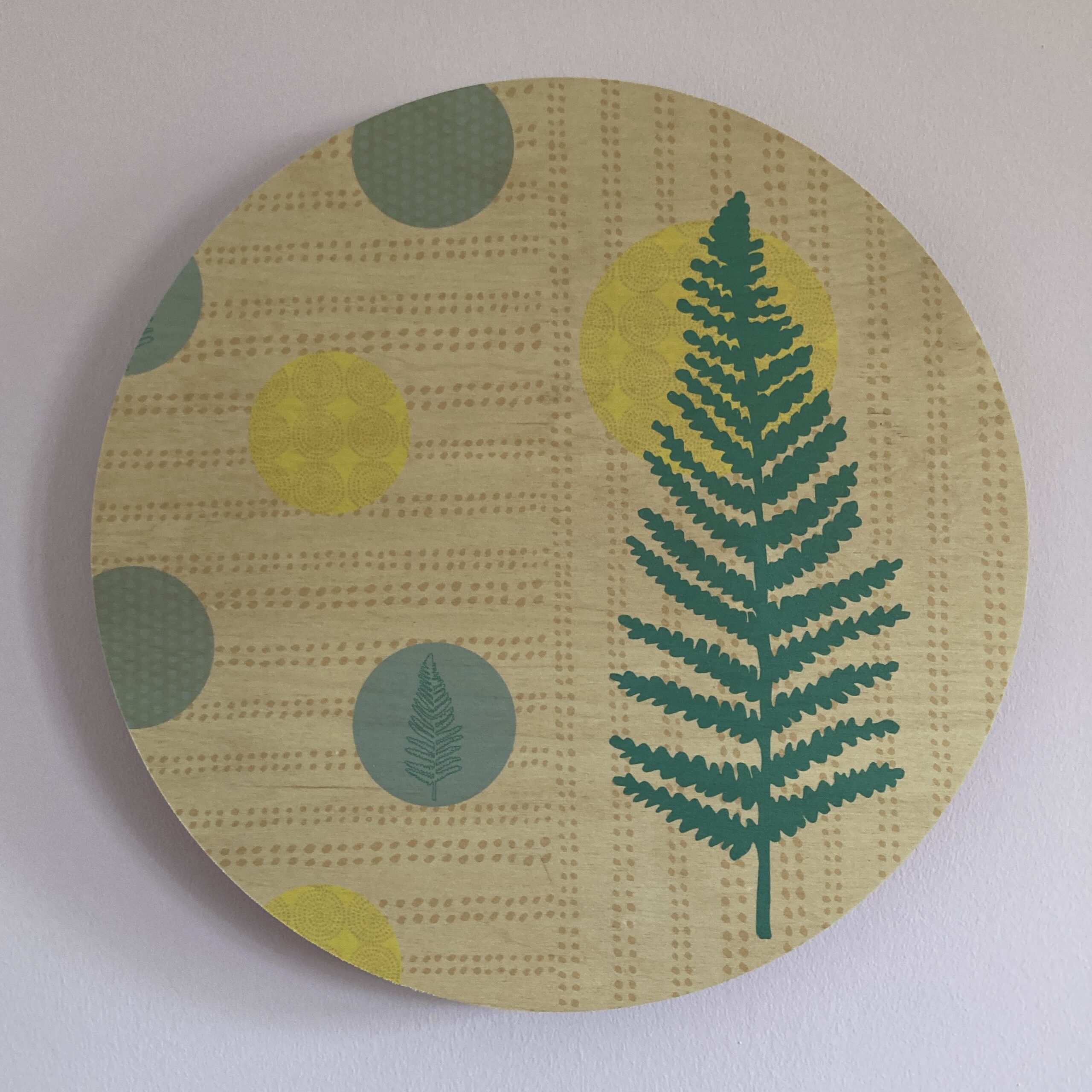
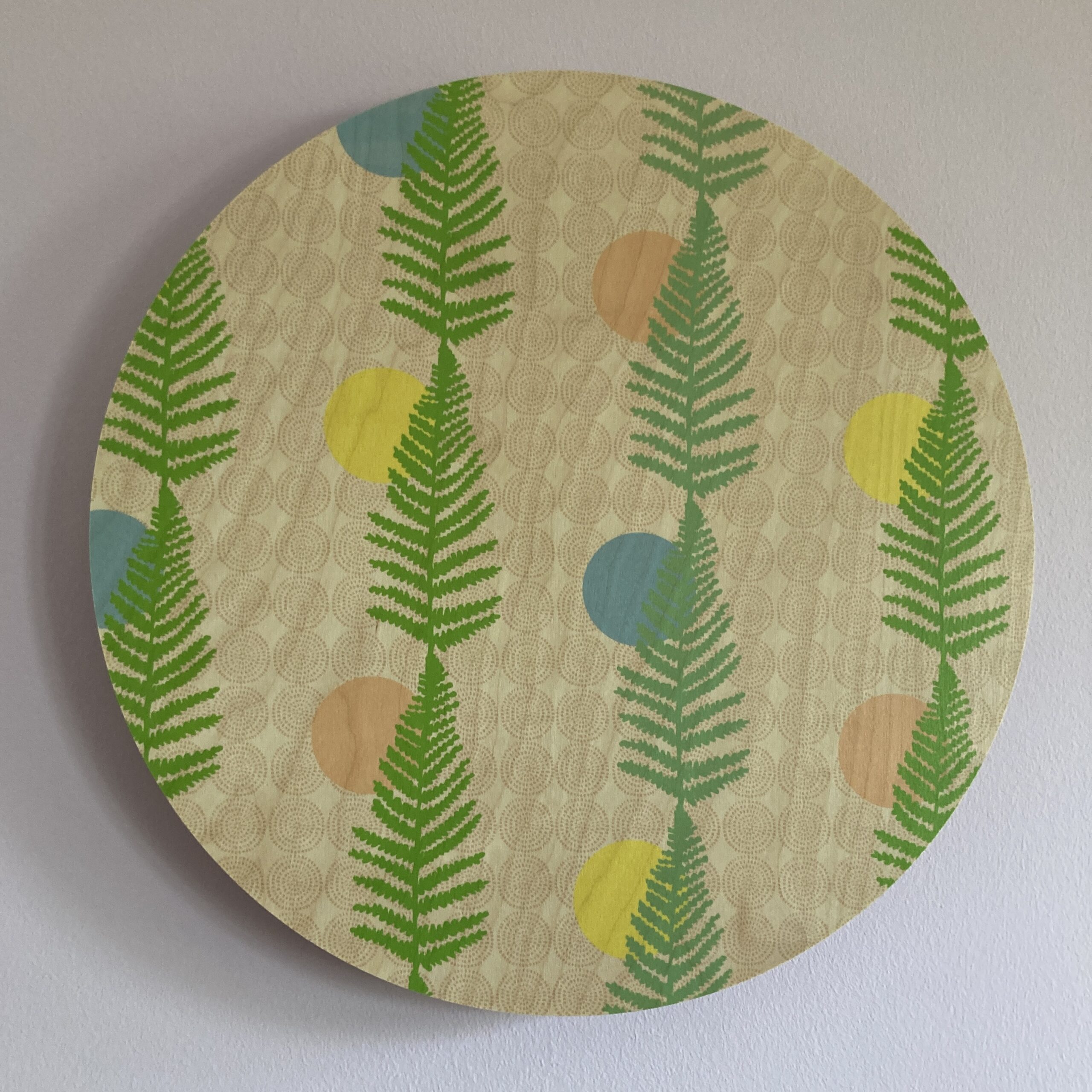
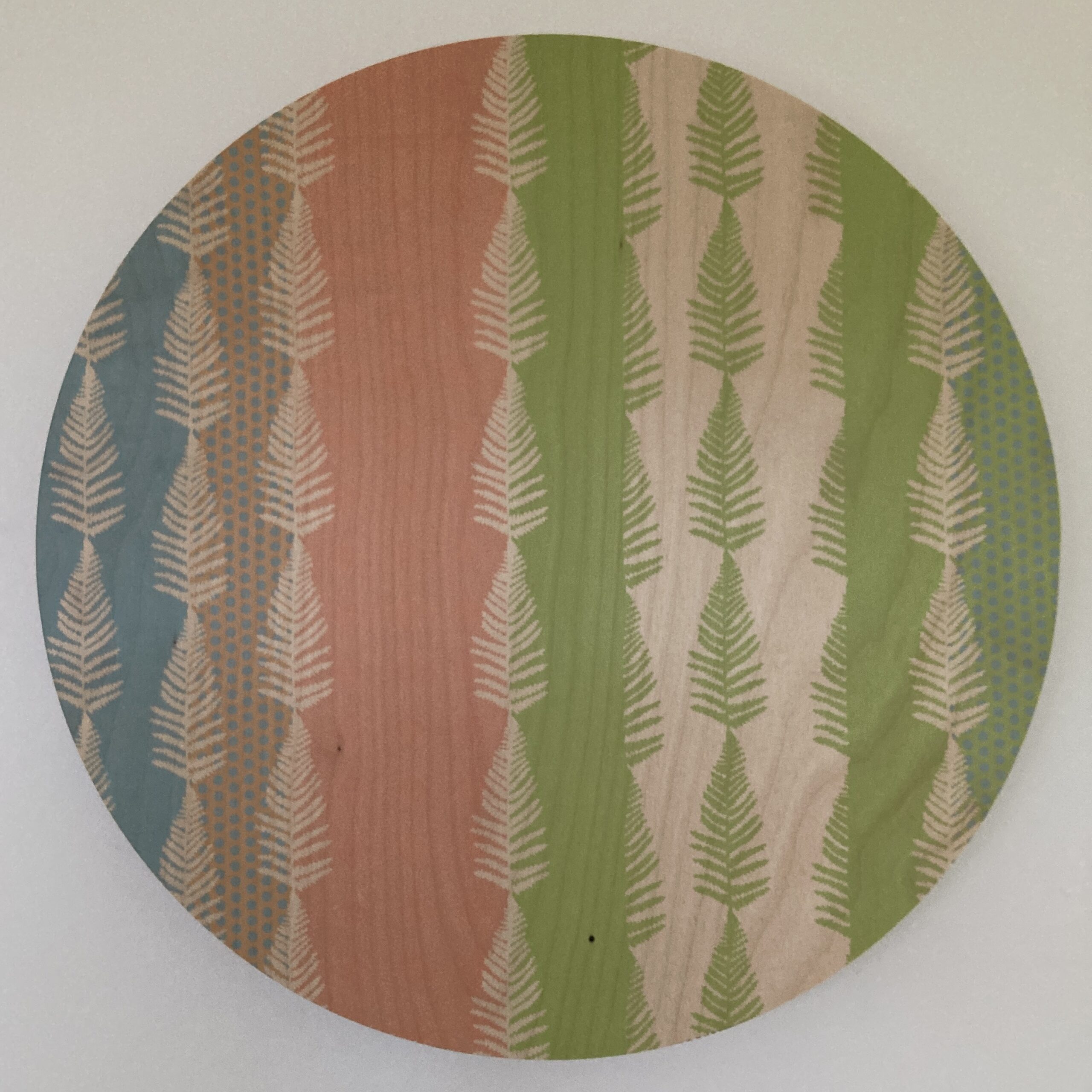
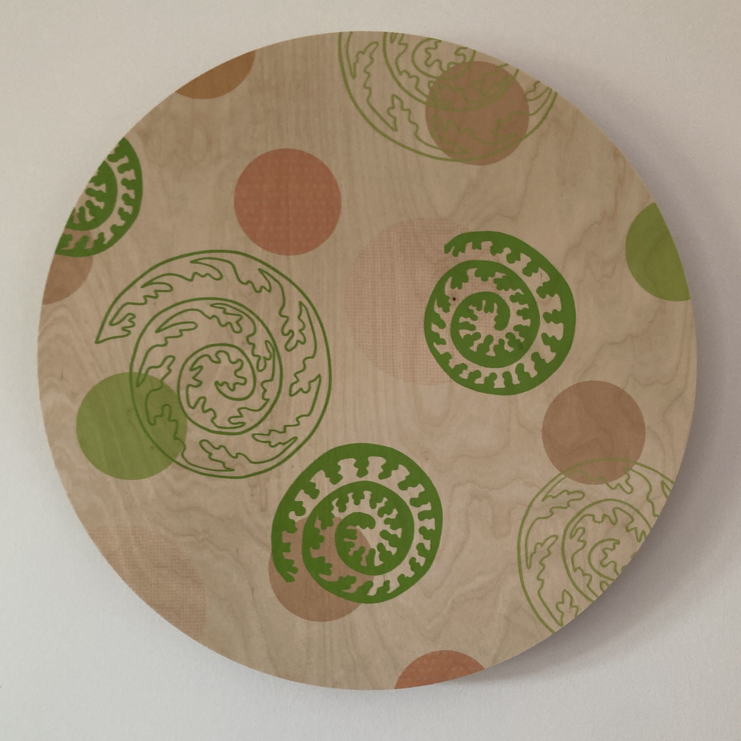
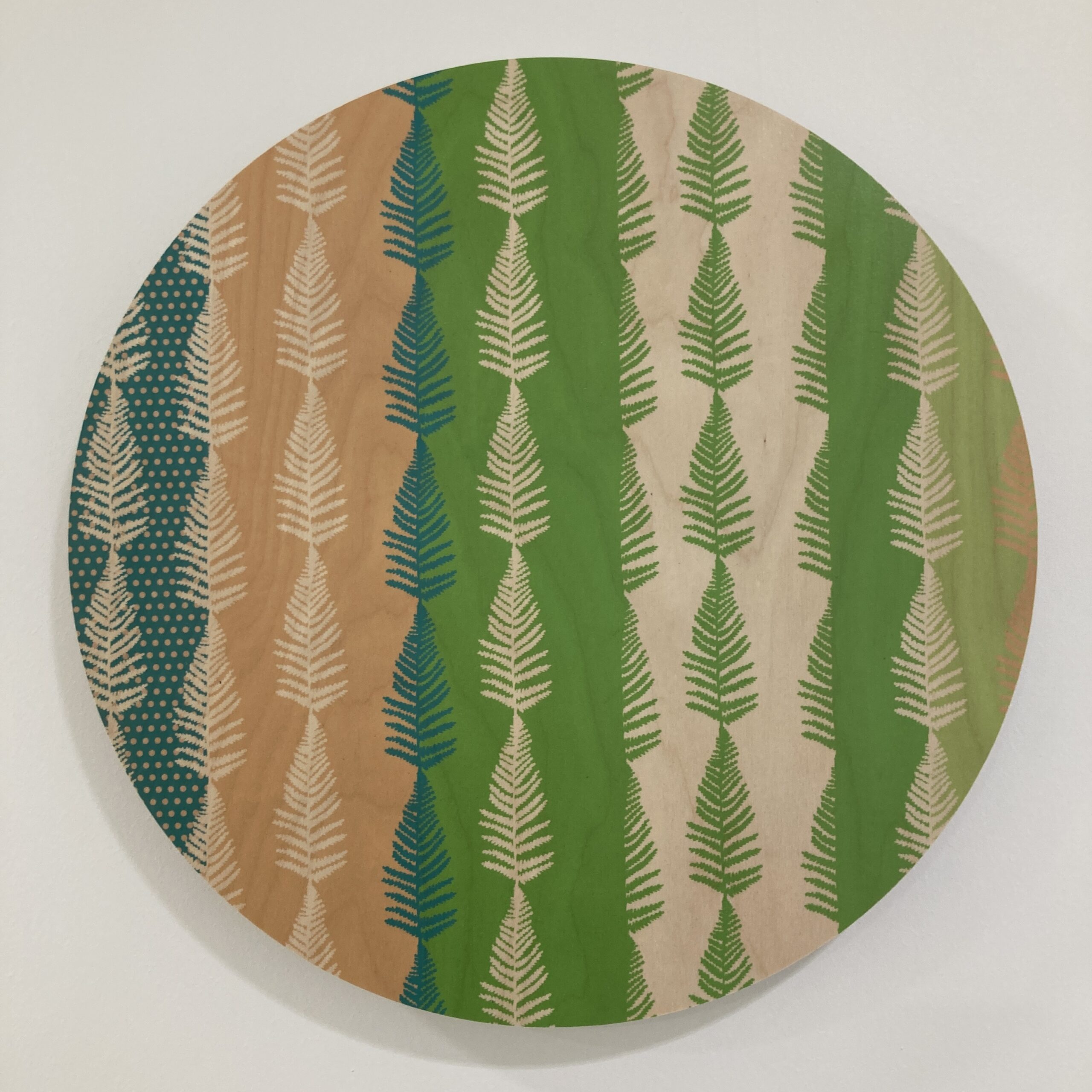
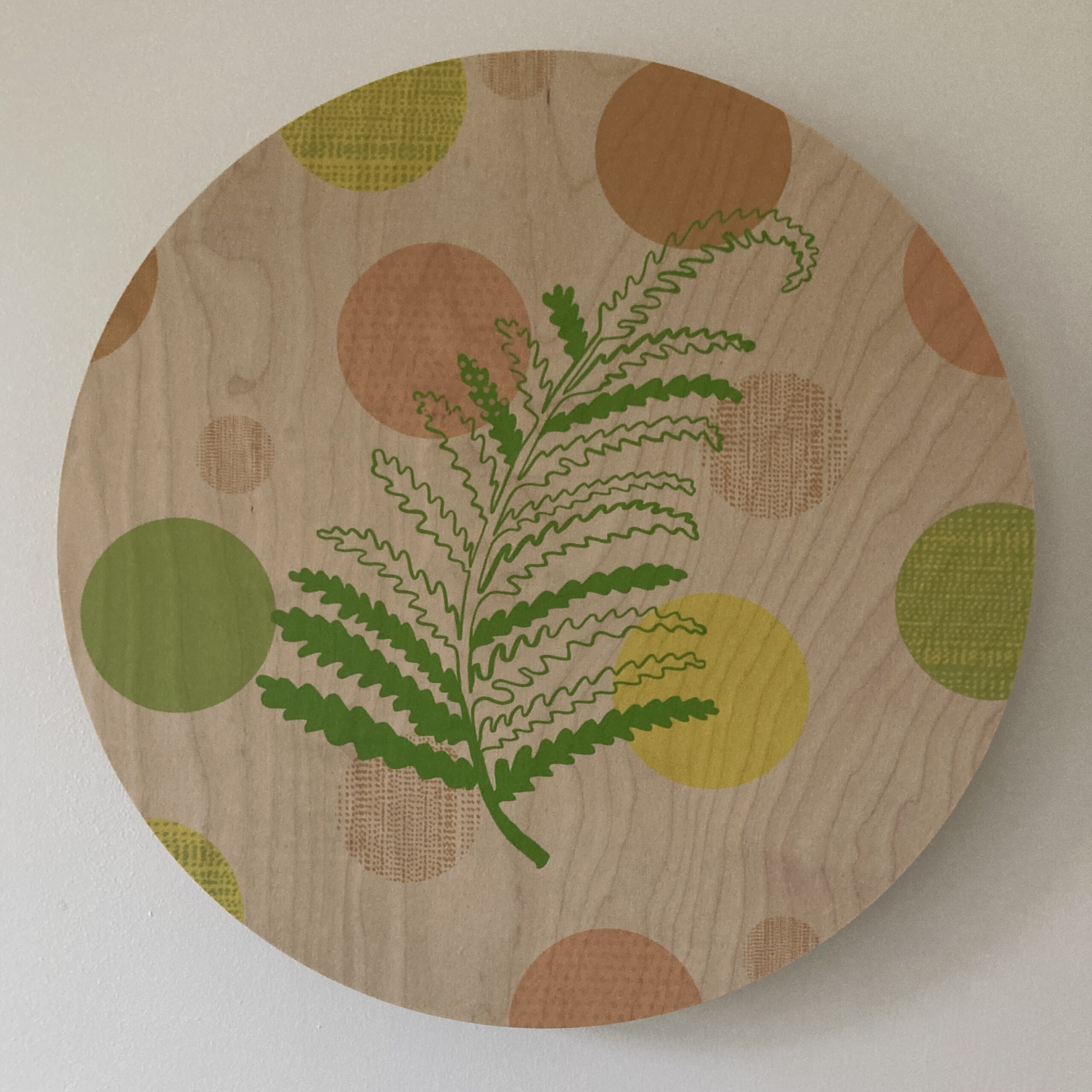
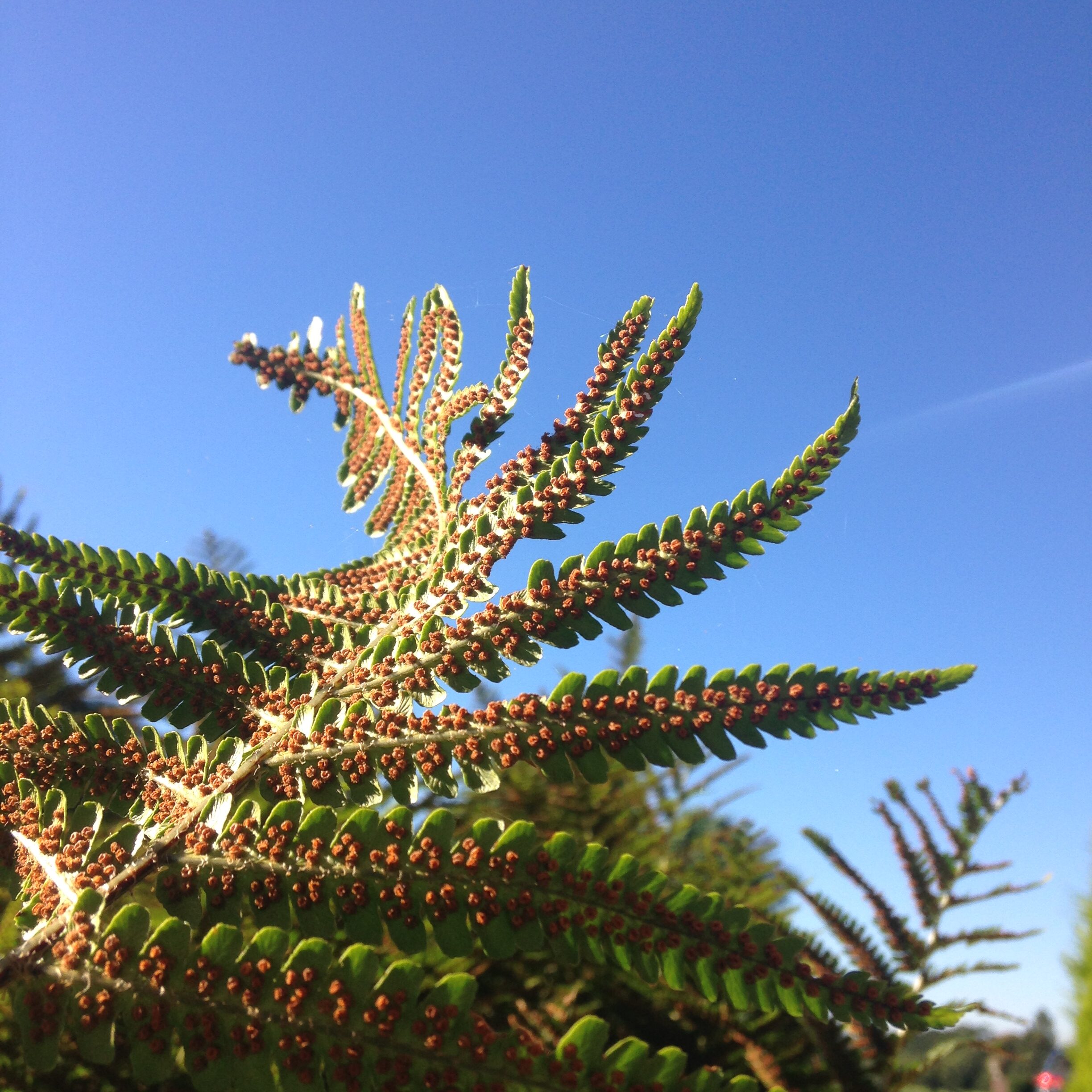
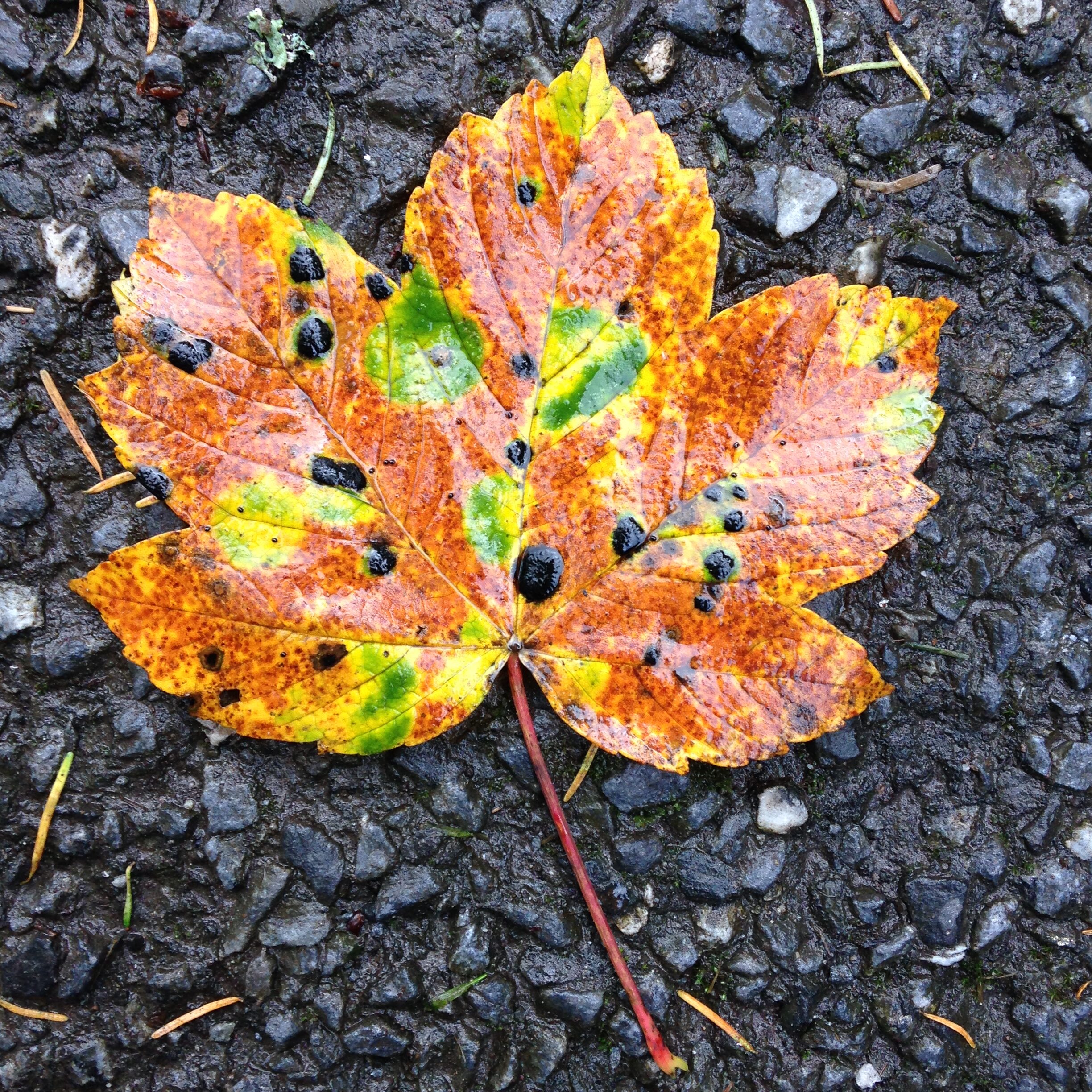
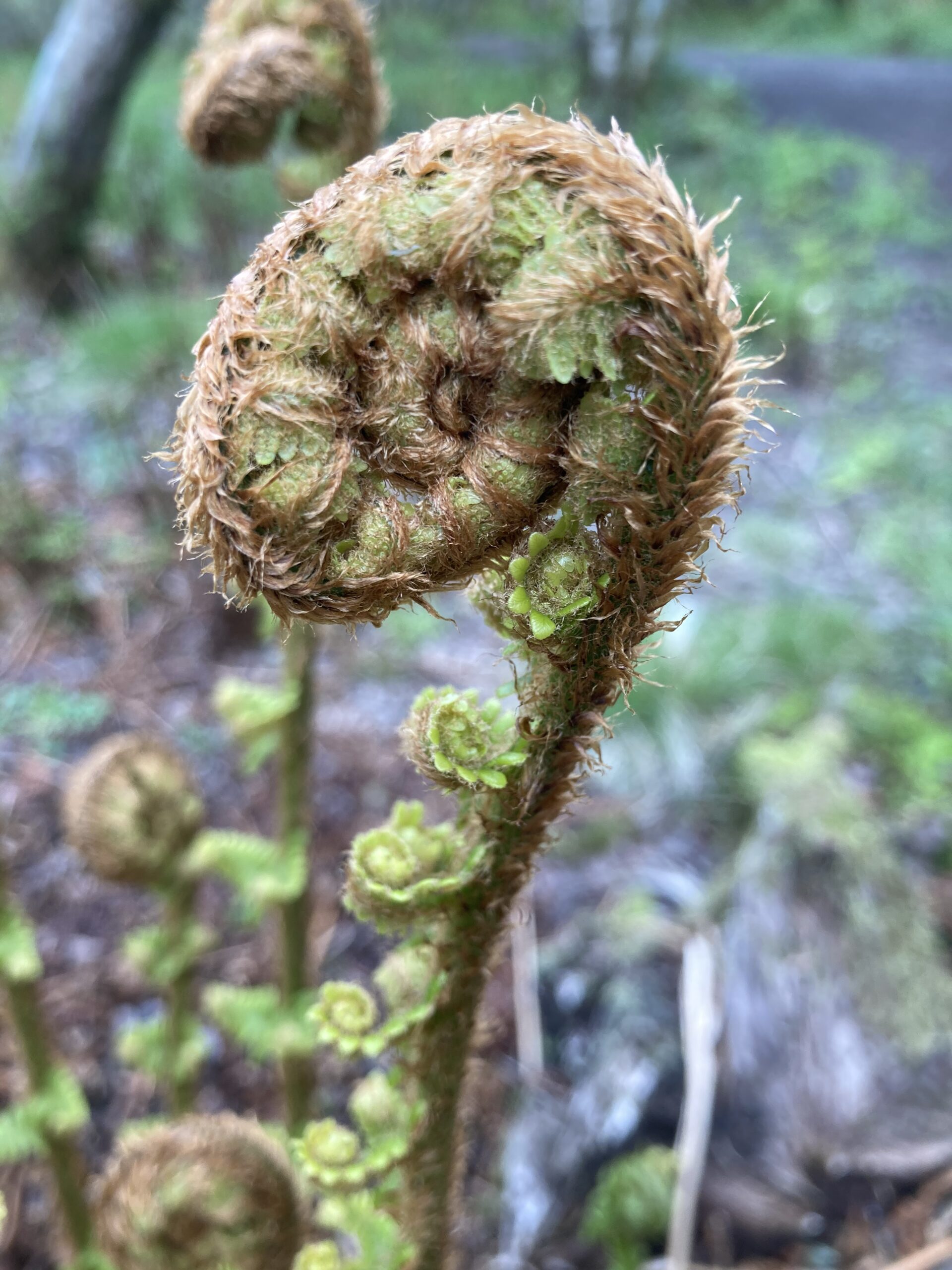
The final designs are inspired by a Scottish woodland walk bringing in nature elements. Adding in nature into the interior environment helps to reducing stress and making it less clinical, linking into biophilic design.

Visual clues
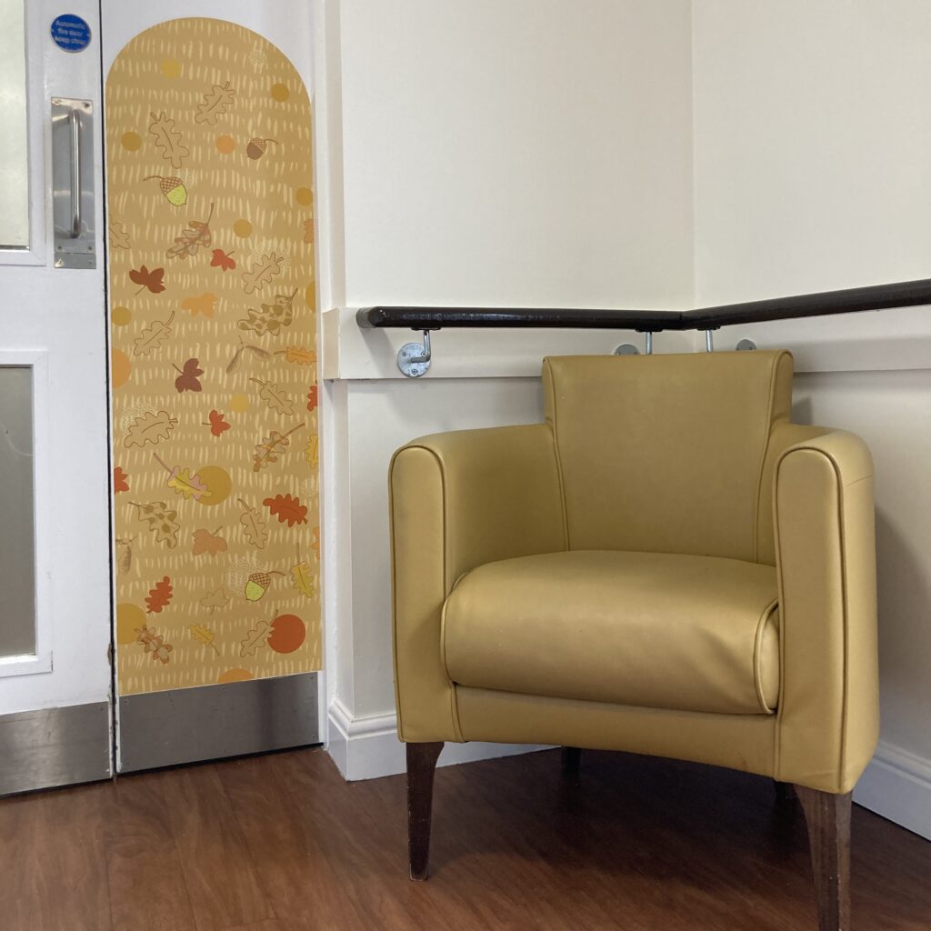
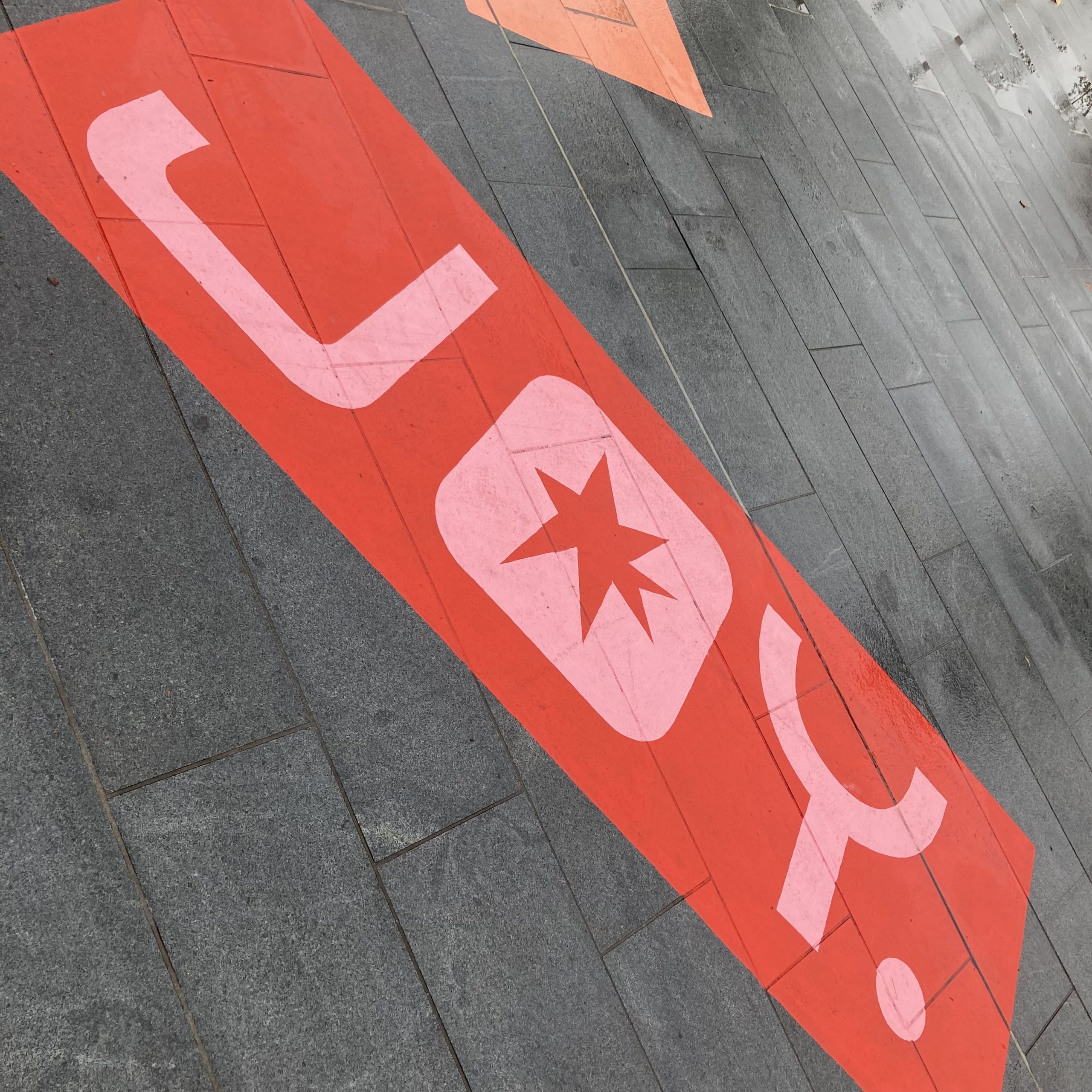
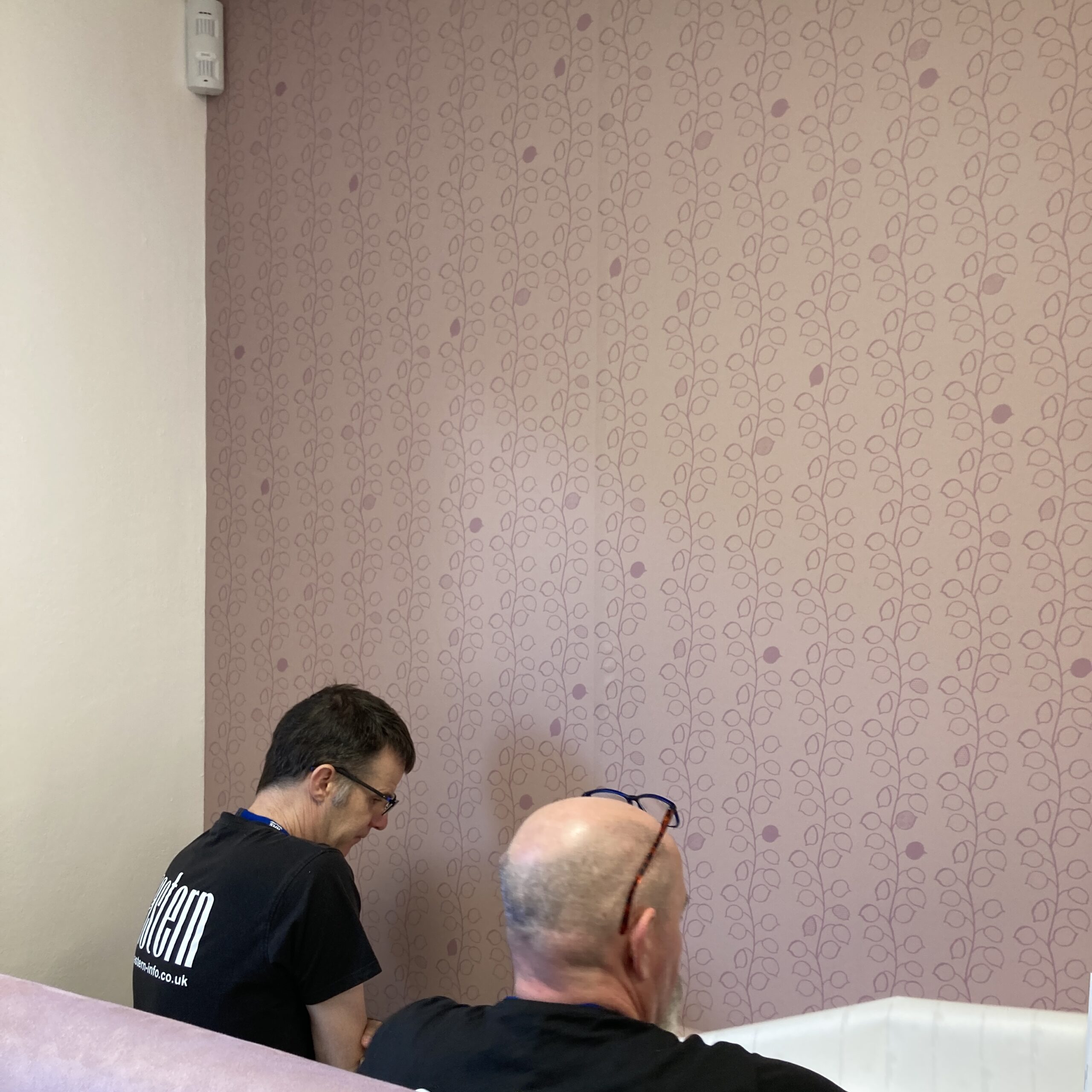
I created a concept for the whole building with visual clues with colour and imagery to help you gently transition through spaces. My colour palette changes as you go through the corridors in both the door artworks and feature murals. Metal clinical signs were removed with warm wooden friendly ones that coordinate with the rooms and whole experience.
Conscientious Colour
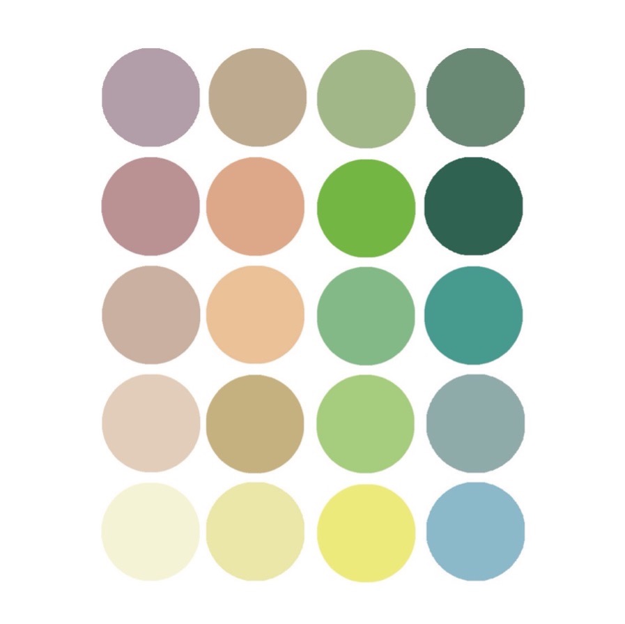
I conscientious used colour to create a warm, safe and welcoming feel that helped to reduce the clinical feel of the while plain walls and the colour worked through the building and helped with wayfinding. Applying colour really helped to get away from the clinical feel.
It’s not all art
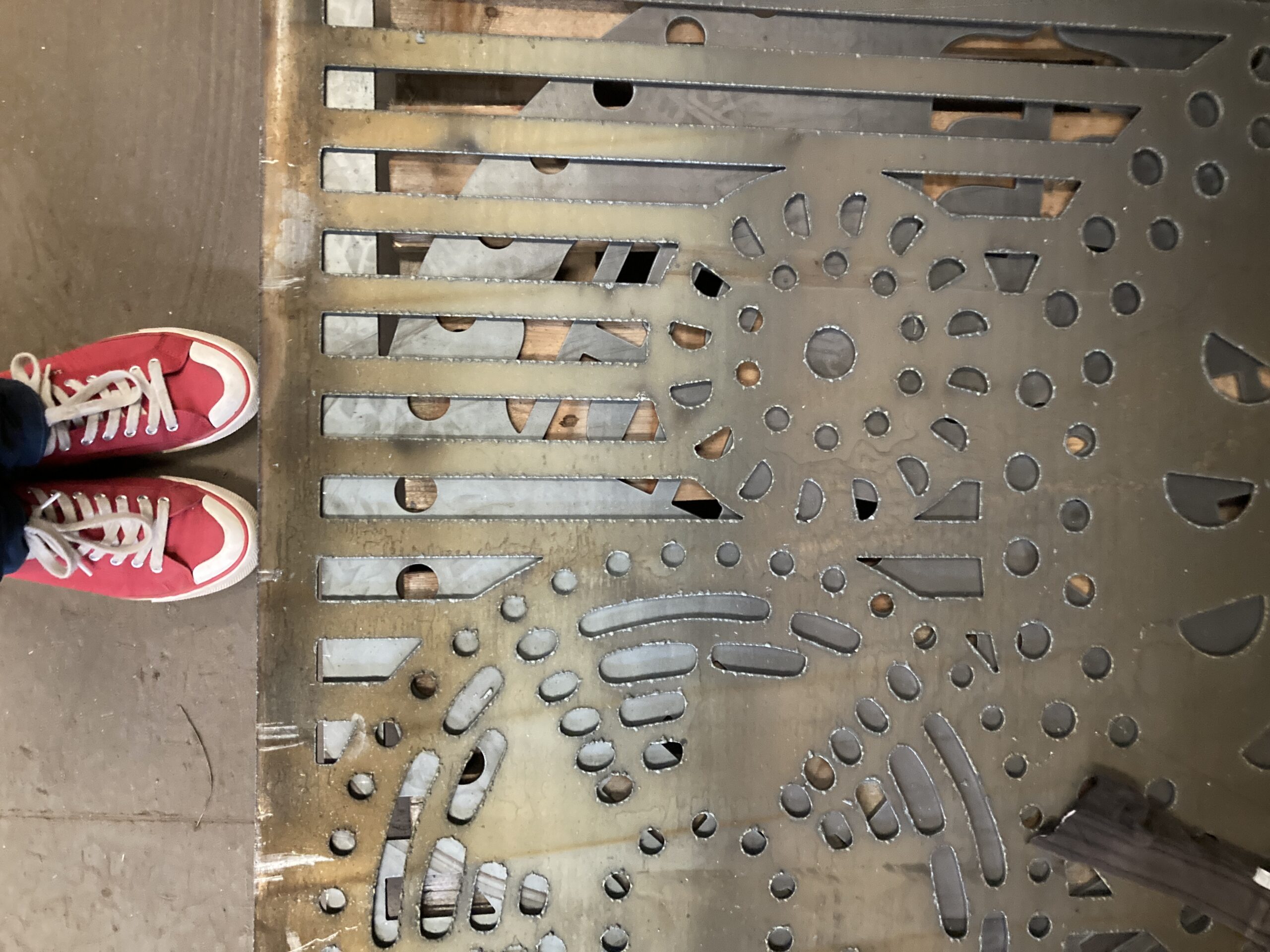
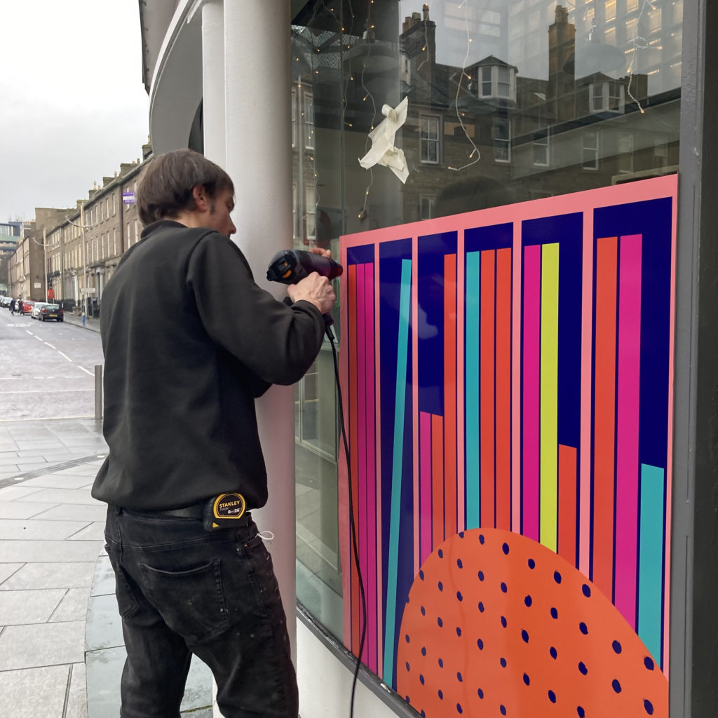
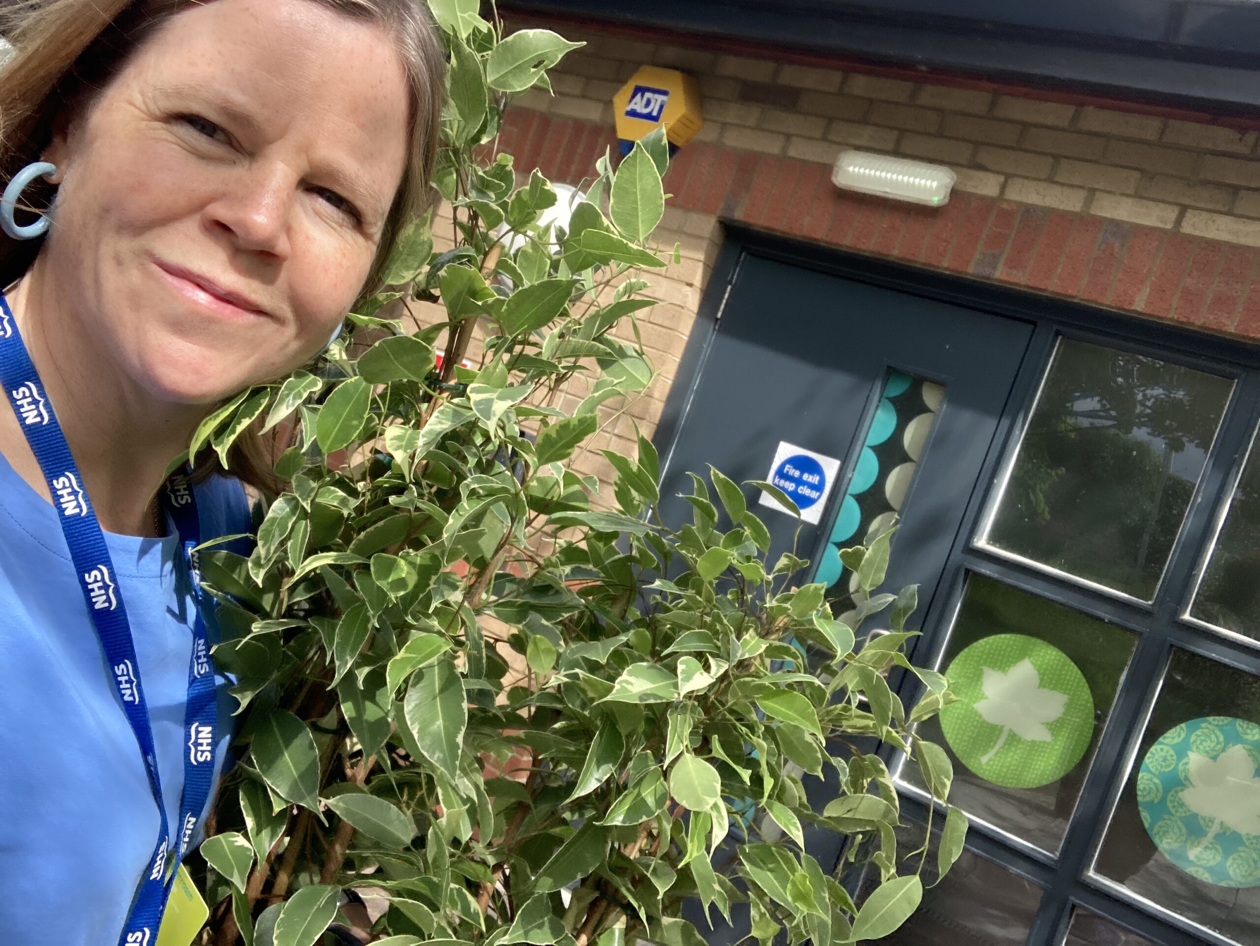
I chose materials suitable for each room that linked to health and safety, produced installation guidelines to ensure smooth running installation, choose suitable plants and soft furnishings for each space and extra details to make the experience better. Thanks to Eastern Display Graphics for laser precision installation!
Impact
” The design and artwork now in place at Sycamore is transformative, it has made the difference between a functional and fit for purpose clinical facility, into a SARC. The colours, images and visual texture are welcoming, warm and peaceful, and at the same time, not memorable, thus not triggering. It gives a vibe, a feeling rather than an impression not to be forgotten. People will always remember, above everything, how you made them feel and I think the trauma informed design reflects and melds with our purpose to provide recovery in a psychologically safe space.”
Louise Kirby Creative Practice
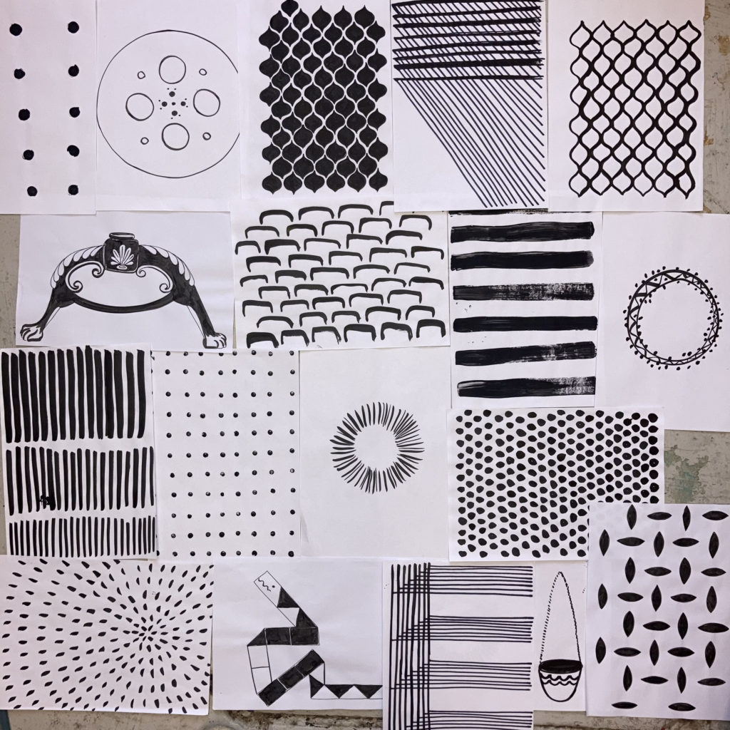
I am a Dundee based visual artist and designer enhancing experiences and placemaking that support positive wellbeing. I creates site specific artworks and designs that transforms the experience. Each project or commision is distinct to the organisation or space with a flavour of my signature style of playful pattern, conscientious colour and meaningful references that captures a sense of place.
You can find out more about my projects and commissions on my website
You can read the NHS Lothian Charity blog about it here