Sense of Belonging at Harris Academy

Louise Kirby smiling with a background of decorative metal circles on a wall
photo credit Mark Thomas, Dundee City Council

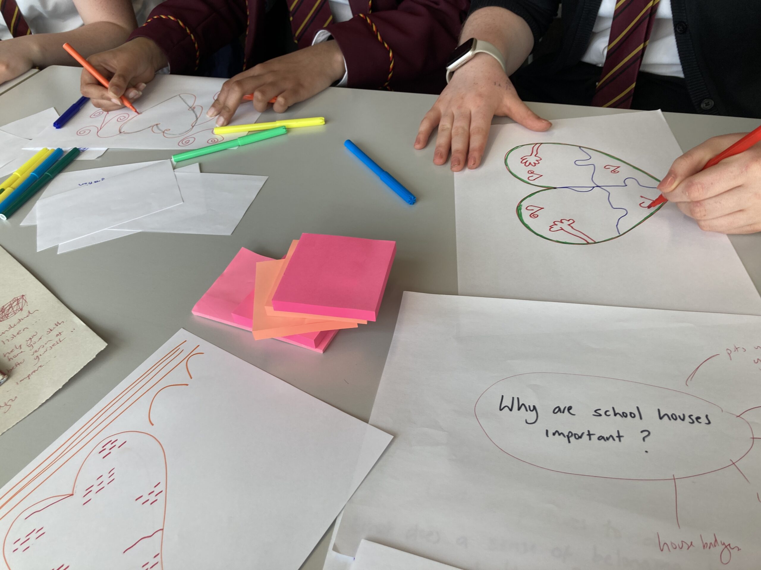
A privilege to work with Harris Academy to create the public art for the front of the school building.  Artwork was inspired by the creative consultation during the summer term of 2024 where pupils and staff were invited to help me capture what’s great about Harris and it’s sense of belonging through drop in sessions, focus groups and the art department working with S2 pupils to hear their views.  It was great to hear their responses, see their artworks and get their feedback which all helped form how the artwork developed.

Research and Development

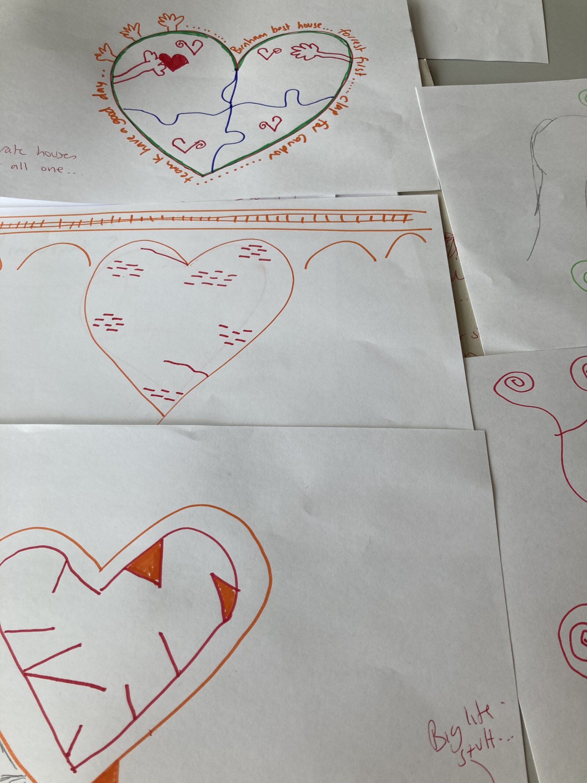
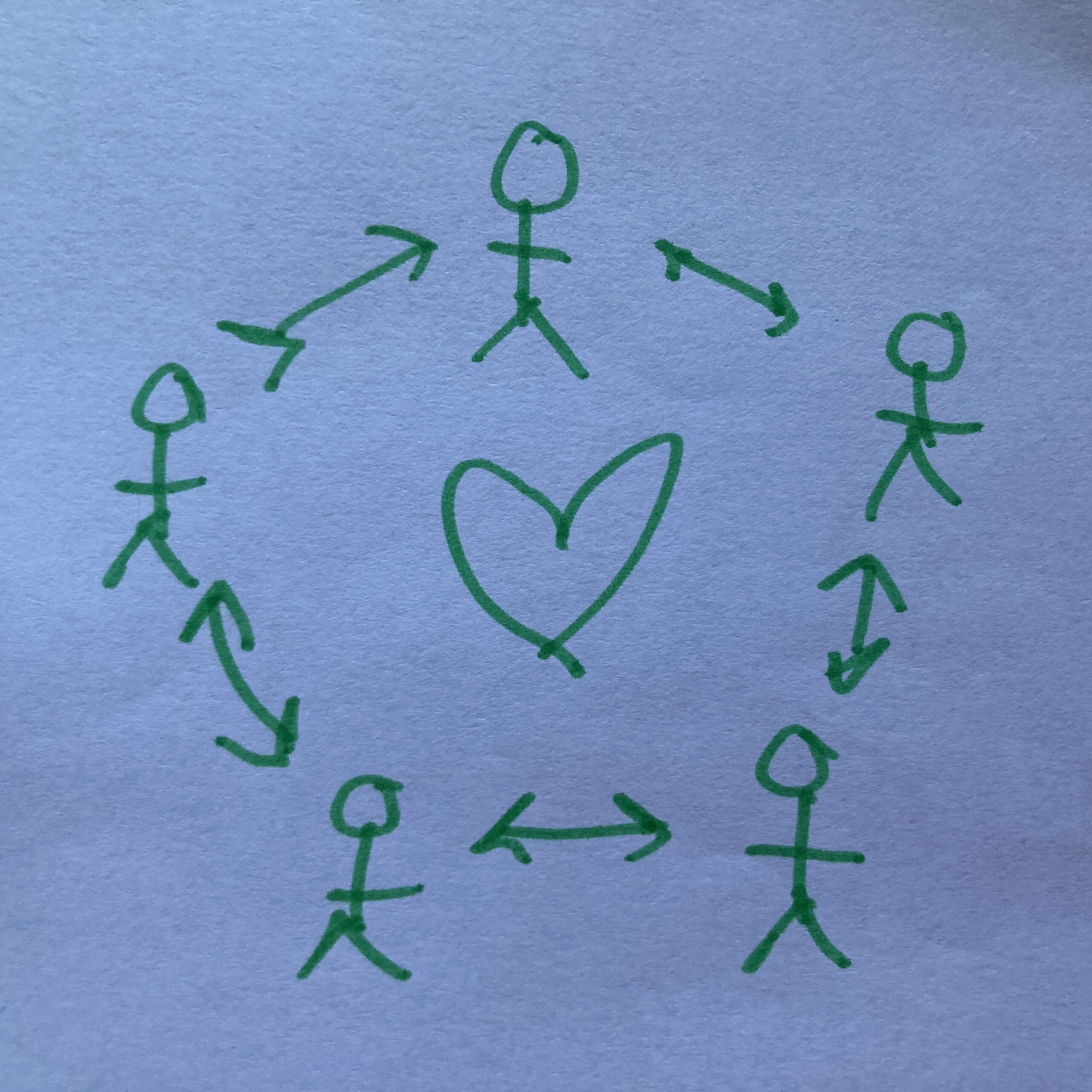
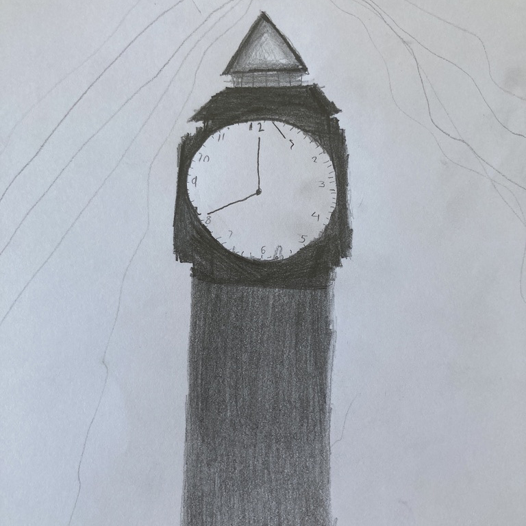
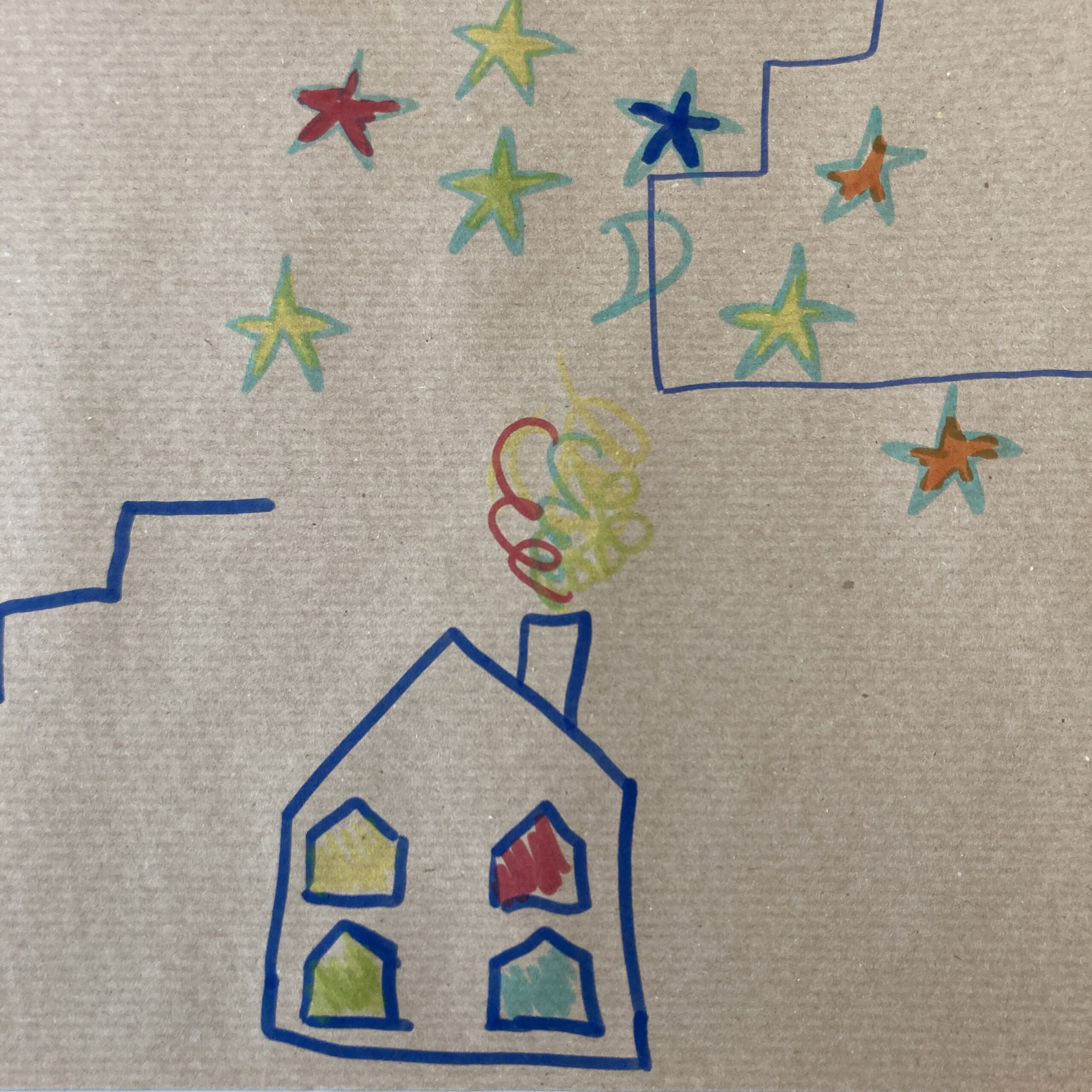
Key themes emerged from the consultation that linked to the welcoming pupils and staff, subjects and extracurricular activity, feeling of belonging and the sense of place with the the tiered building with great views over the trees, ripples on the Tay, seeing the rail bridge and big skies and features from the past including the clocktower in the courtyard.

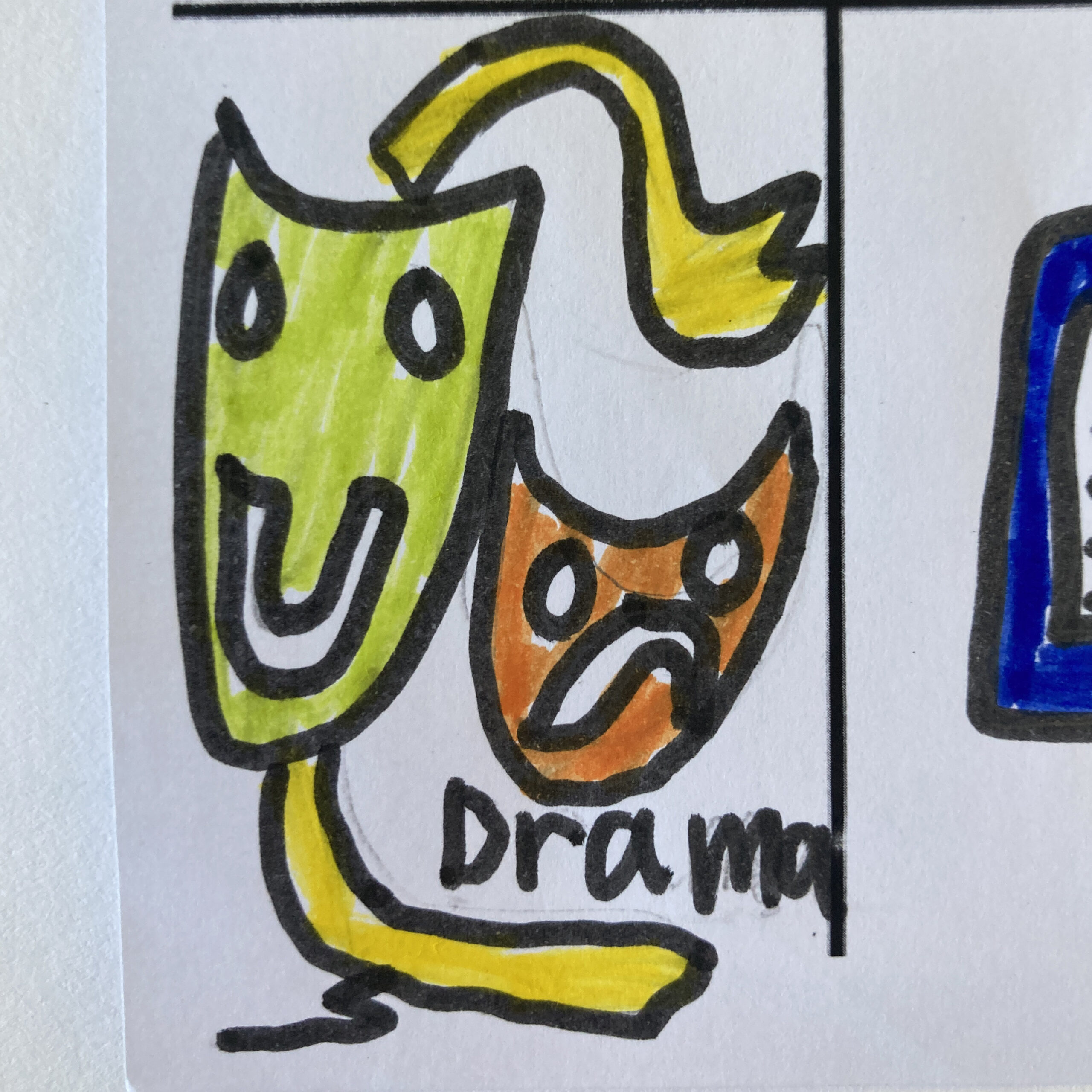
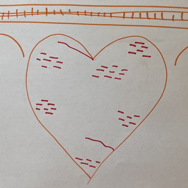
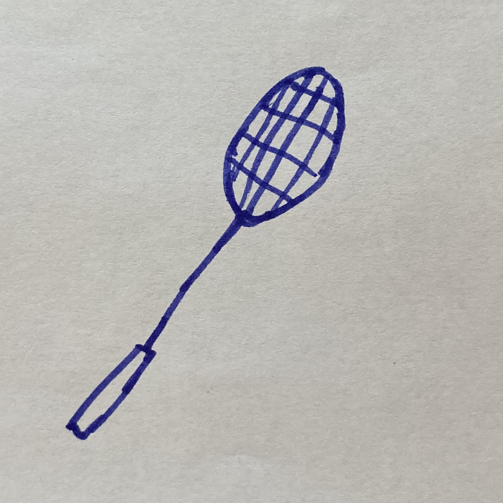
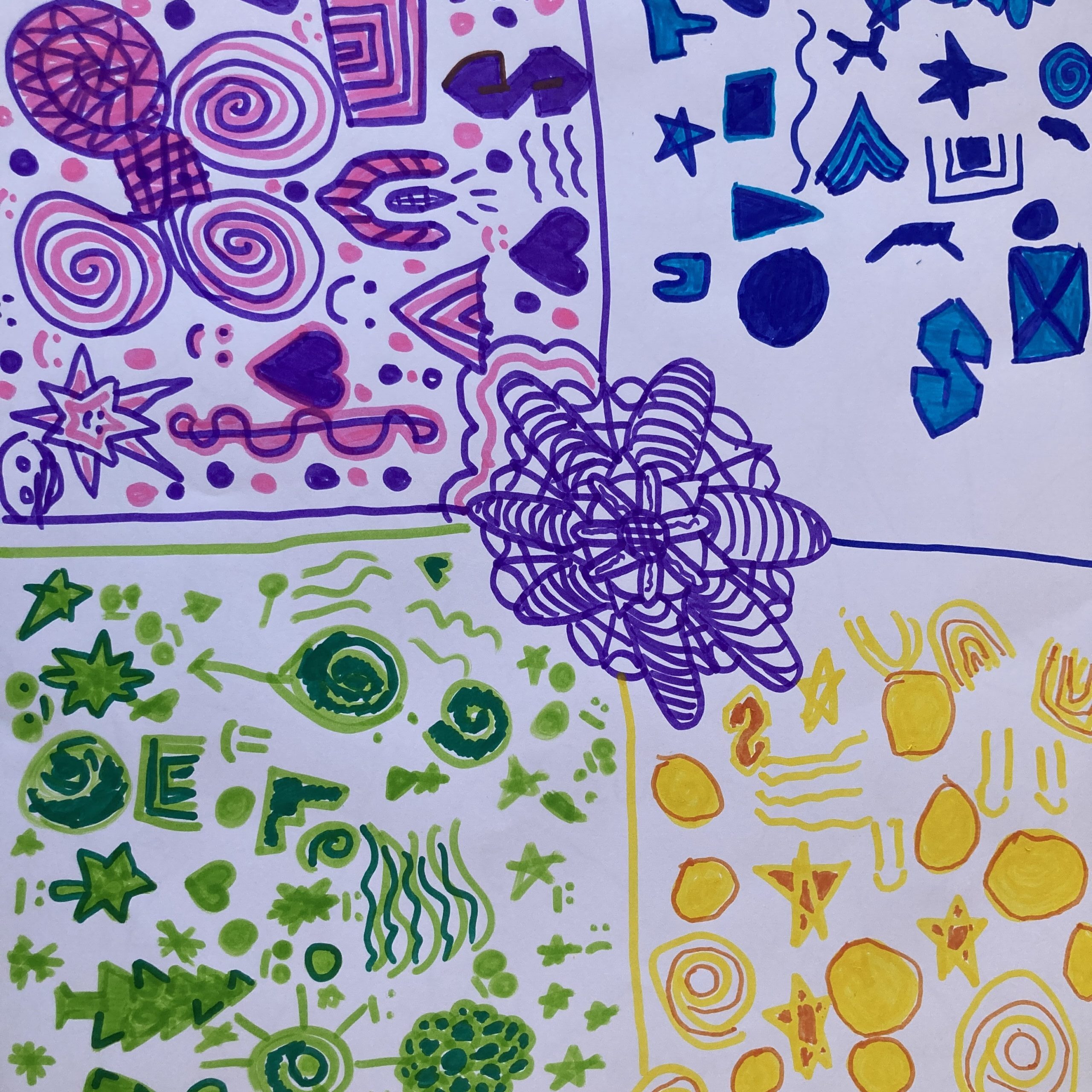
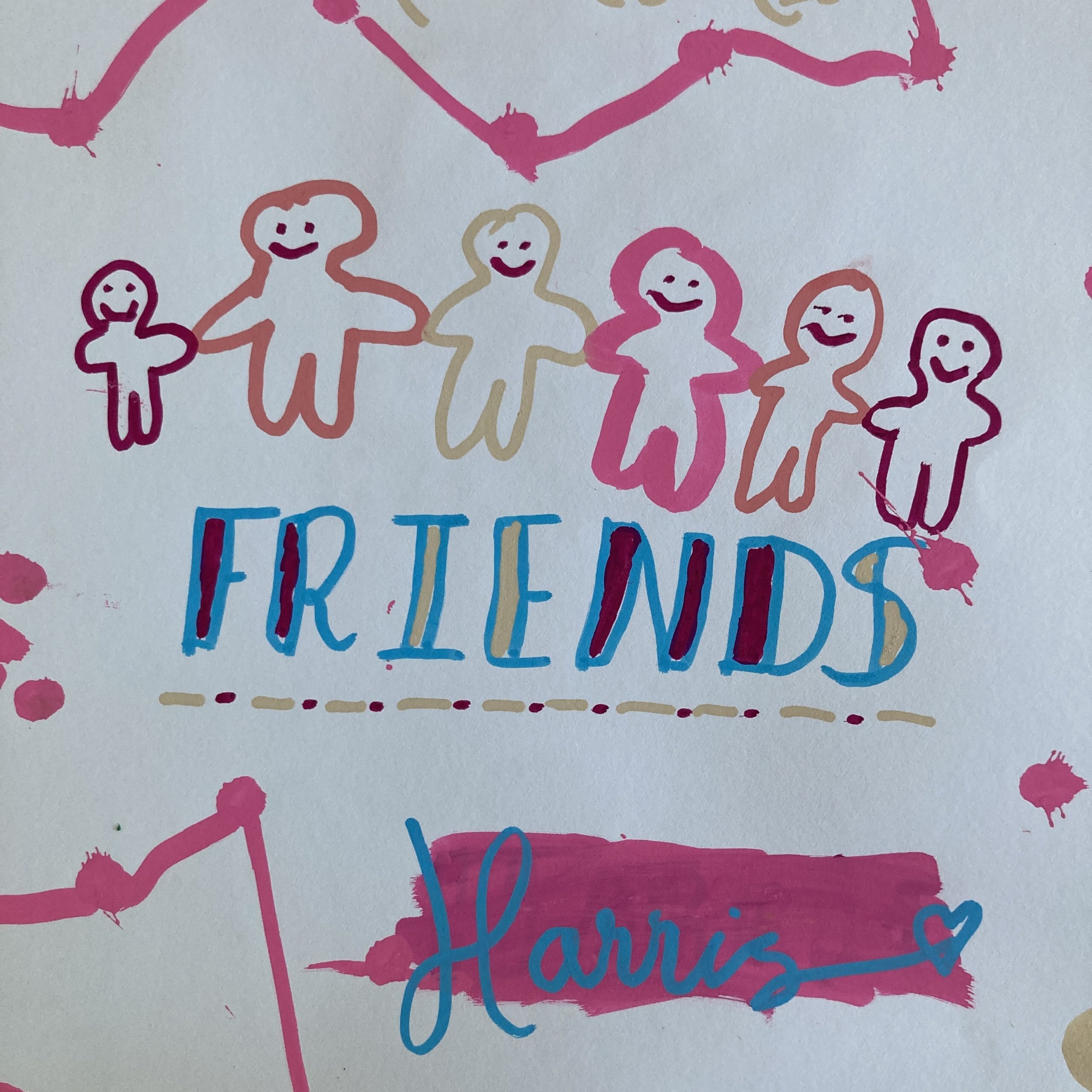
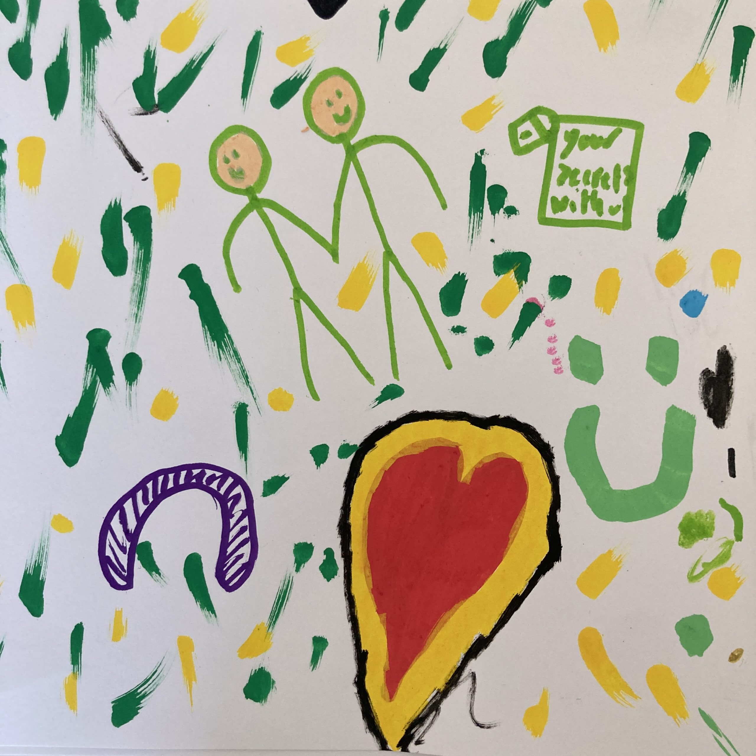
Some of the pics from the research and pupils artwork from the consultation and art department working with S2 classes.

Part of the research and logistics I had site visits and tour of the building, accessed maps and plans and access to old school yearbooks and meetings with senior management.

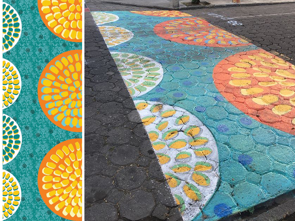
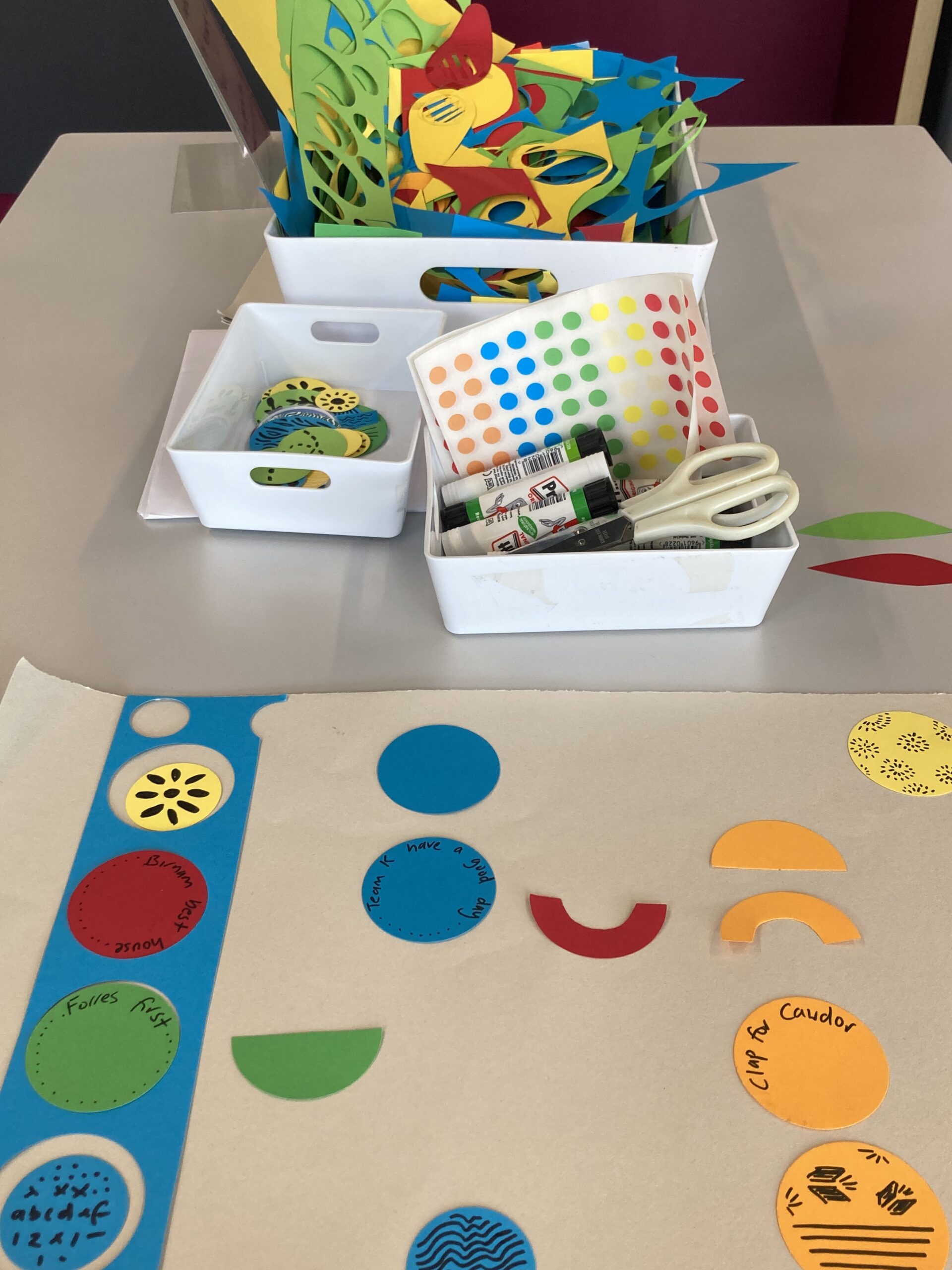
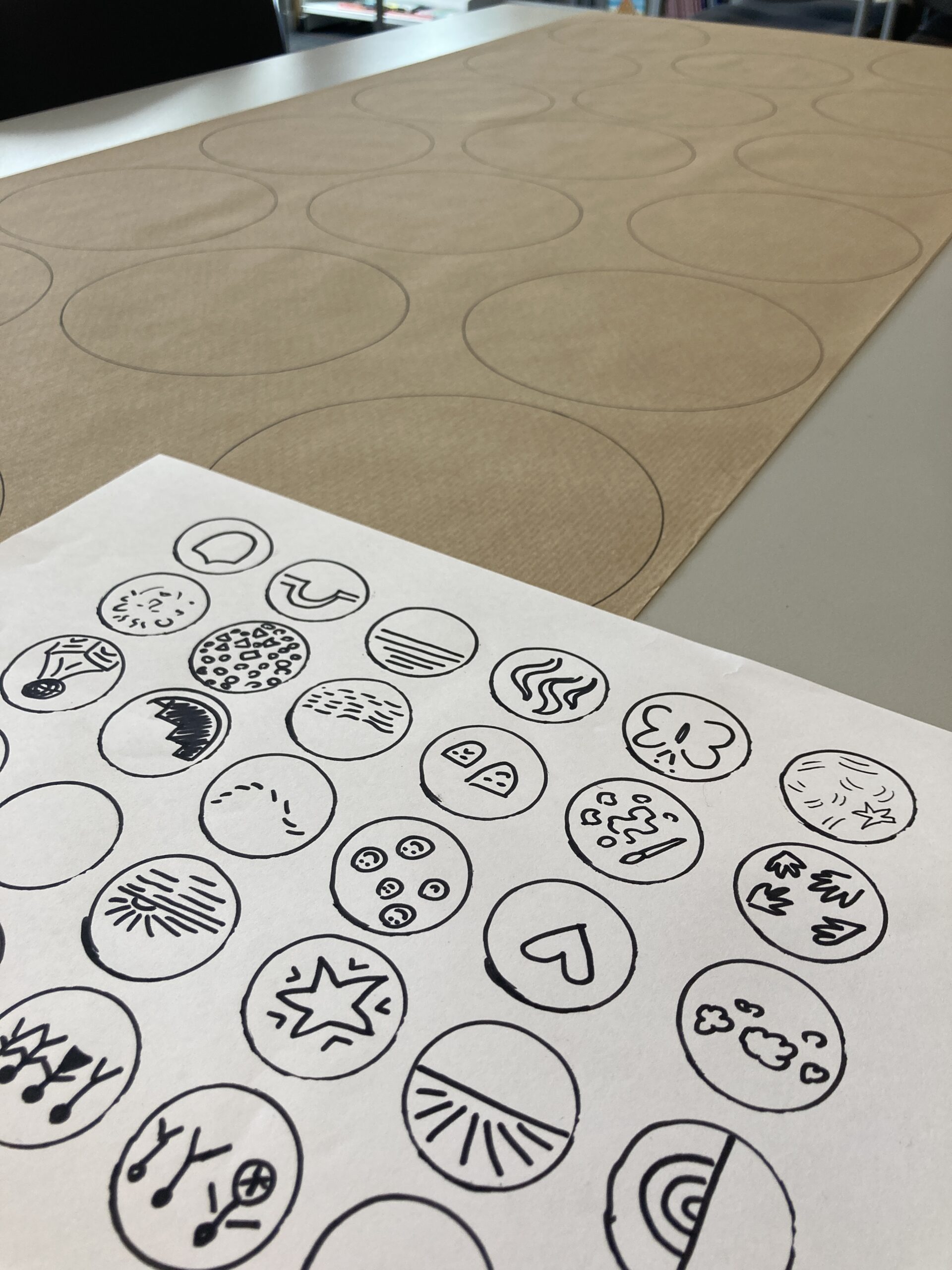
For this site specific design I wanted to captured a real sense of place and sense of belonging that worked from a distance with flowing movement of various sizes of circles working together and as you get closer you see the illustrated details with meaningful references to the school.  Colour of the artwork links into the Harris school blazer colour as a majority plus pops of the brights of the house colours of Birnam (Red), Cawdor (Yellow), Forres (Green), Kinloch (Blue), that would contrast on the surface of the wall.

I developed concepts and created illustrated artwork and worked with fabricators and contractors to have the work fabricated and installed.  As this was an outdoor artwork I chose to fabricate in metal and use a cutting technique to apply the decorative illustrative feel.  This technique has some design challenges to create imagery without losing the essence of the image.

Pupils from Harris Academy standing outside the school with Louise Kirby all smiling next to the circular artworks on the front of the building
Photo Credit Mark Thomson Dundee City Council

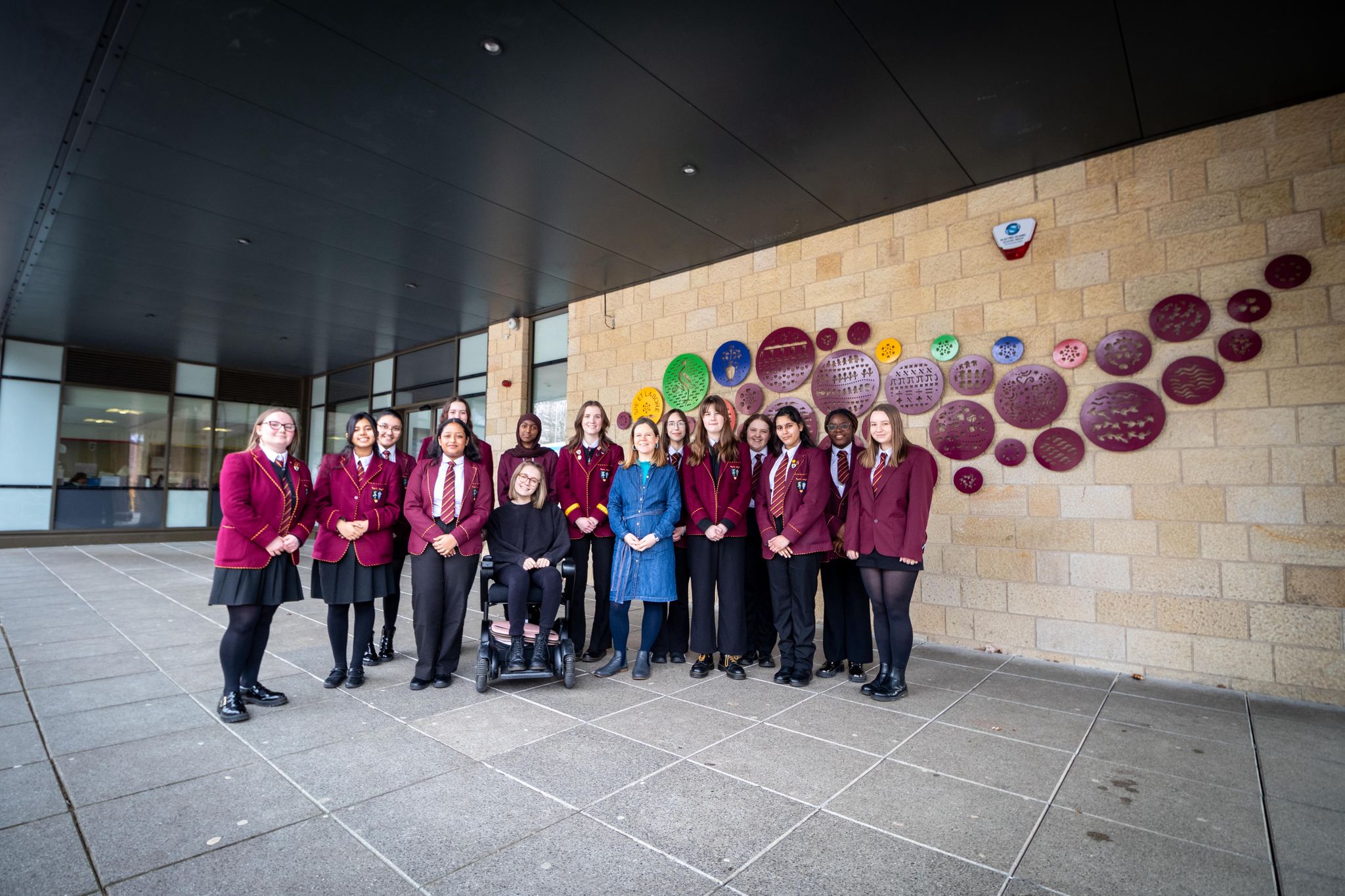
“ What a privilege to work with Harris Academy to create the public artwork for the front of the building , it was a joy to run the sessions and hear so many positives about the school and bring this together to capture the pupils and staff feeling of the sense of belonging and the feeling of abundance and harmony.  Within the circle illustrations I hope that people connect and interpret how it connects to them.” Louise Kirby

Planning and Installing

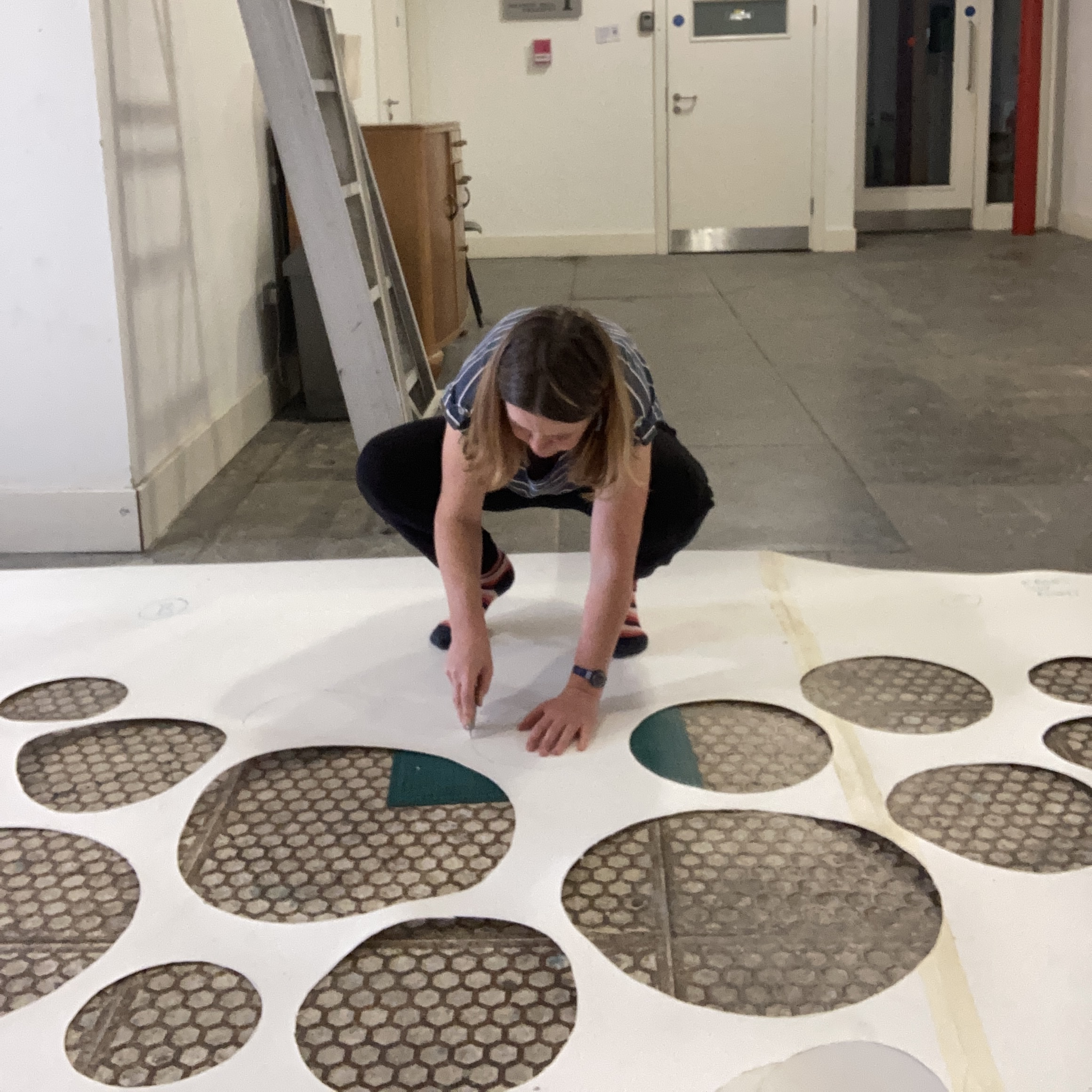
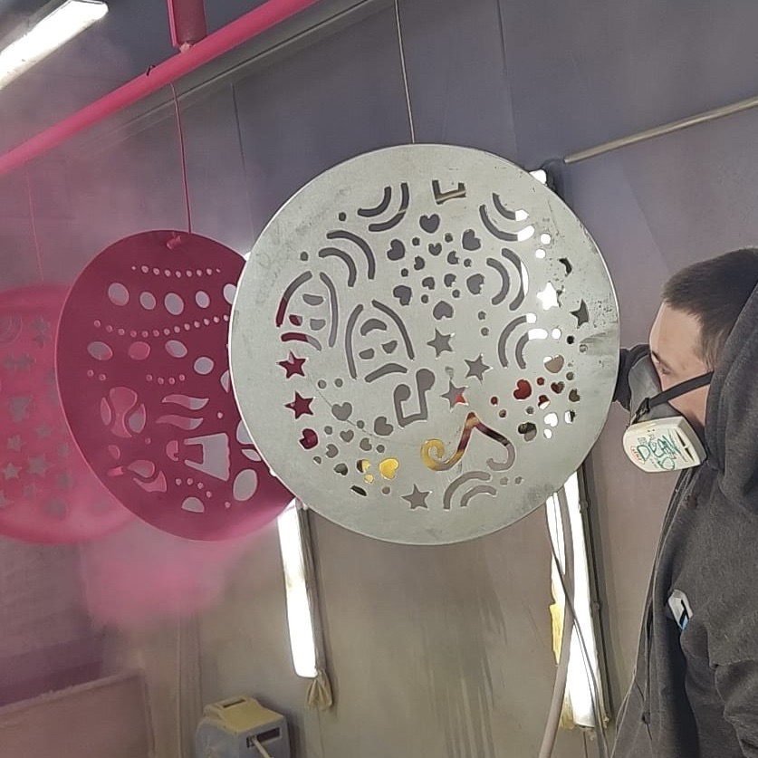
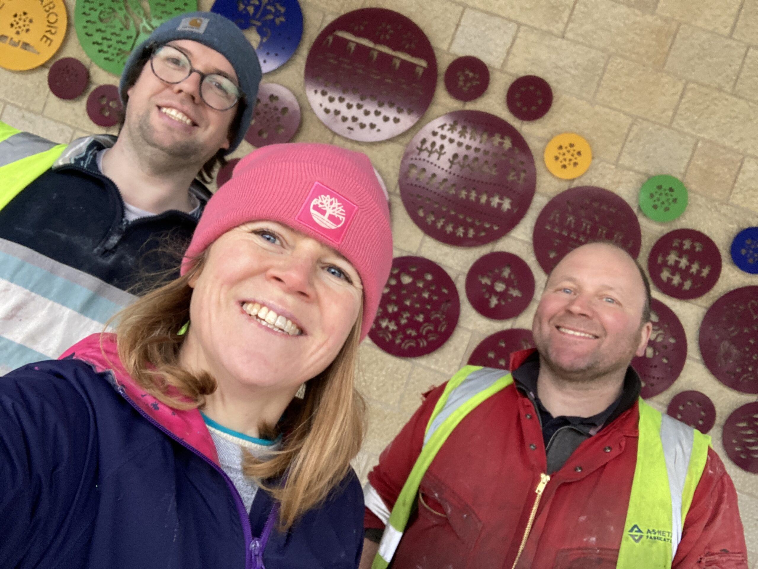
Thanks for Sam for helping in the studio with the files to meet the timeline for production and to local fabricator AS Fabrication for producing the final pieces and installing and local Powder Coating Services for adding the colours.

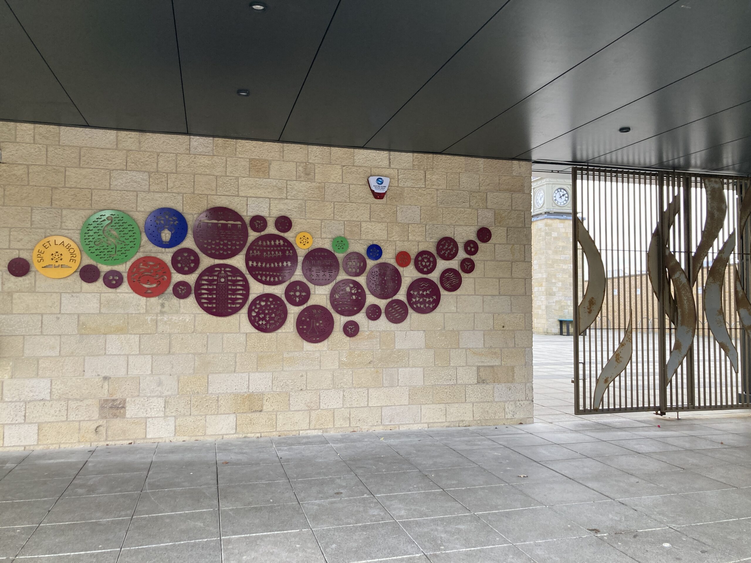
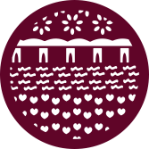
Individual Circle Artworks

With my artwork I like to create work that captures a sense of place and is meaningful and unique to space and people who use it.  You can find out more about my projects and  commissions on my website

How to transform the streets to bring more joy!

I believe colour and pattern can make a positive impact in the world!  The right colour can uplift mood helping people to feel more positive.  Pattern and imagery can help connect people to places and add meaning to placemaking.

Joyous Ground Graphics

Cobalt Collective, commission by V&A Dundee. Photo Credit Louise Kirby

One way to add more colour into the public realm is through adding ground graphics and colourful crossings transforming dreary tarmac streets into colourful ones! Look how joyful these are! Cobalt Collective in collaboration with with some community groups decorated the plaza around the V&A Dundee to create this colourful positive artwork.

Plaza by Cobalt Collective outside V&A Dundee. Photo credit Cobalt Collective

Examples of colourful ground graphics from around the UK

Camille Walala, 2016, London, commissioned by the Transport for London’s Future Streets Incubator Fund.
Photo by Better Bankside

“The aim of the Colourful Crossings commission is to explore how everyday infrastructures in the city, such as pedestrian crossings, are perceived and can be transformed,” said Better Bankside.

Stobswell Colourful Crossing 2021, Dundee by Louise Kirby, UNESCO City of Design Dundee funded by Sustrans Scotland.

I (Louise Kirby) created this design inspired by the local area taking elements from the historic architectural details, green spaces and public art after consultation with locals wanting more colour into the grey streets. You can see more about it and a blog about the whole process here

Eley Kishimoto, 2016, Brixton, London. Photo from Brixton Buzz

I’ve always loved this graphic iconic print design by Eley Kishimoto. It’s got great movement with the use of strong graphics in the positive and negative space. It looks great on the streets of Brixton, also in the variations of colours.

Graphic design by Callum Laird, Union Street, Dundee, UNESCO City of Design Dundee funded by Sustrans Scotland.
Photo credit David P Scott

It brings great joy to walk up and down through the colour of Union Street, Dundee to and from the V&A Dundee. I love the limited colour palette and bold graphics. Nice to see local businesses making use of the street, it reminds me of cafe culture on holiday! I look forward to seeing what happens next in this project to create a more permanent enhancement. I am really inspired by Dundee City Councils vision.

Craigie Compass by Bigg Design and Fun Makes Good, 2022, funded by Sustrans Scotland.
Photo by Bigg Design

Hamish from Bigg Design and Eleanor from Fun Makes Good created these cool ground murals called the ‘Craigie Compas’ to help with wayfinding in Perth, Scotland. Great to see the ground graphics used to help wayfinding, brighten up the area and the addition of fun signage giving it a 3d feel. You can read about it here

Practical Considerations

On ground graphics we have a limited colour palette. By using different colour combinations we can get varied results.  There are options from the material used to apply the designs depending on if it’s a temporary or longer term installation and what the purpose of the area is used for.  When designing a ground graphic in the public realm consideration and consultation needs to be in place for accessibility for all users’ needs.

They are a great way to inject a bit of fun, playfulness and joy!

Dundee cake inspired design in Puebla Mexico for UNESCO City of Design Dundee, designed by Louise Kirby.
Photo credit UNESCO city of Design Dundee

An example of taking a bit of Dundee to the other side of the world in Puebla,Mexico, representing UNESCO City of Design Dundee. You can read more about this project where students from Puebla painted my design and used design to highlight a safety issue on the roads you can read more about it here

I have a vision of the world full of colourful creative interventions to bring more joy to the spaces we play, live, work and travel through.  My aim is to uplift and connect people and highlight the positives by creating artworks that capture a sense of place which creates a sense of belonging.  I love to do this with my use of playfully applying colour and pattern.

I am ready to take on new design challenges and if you have a project, collaboration or commission in mind please get in touch hello@louisekirby.com or you can check some samples on my website to give you a flavour of previous projects.