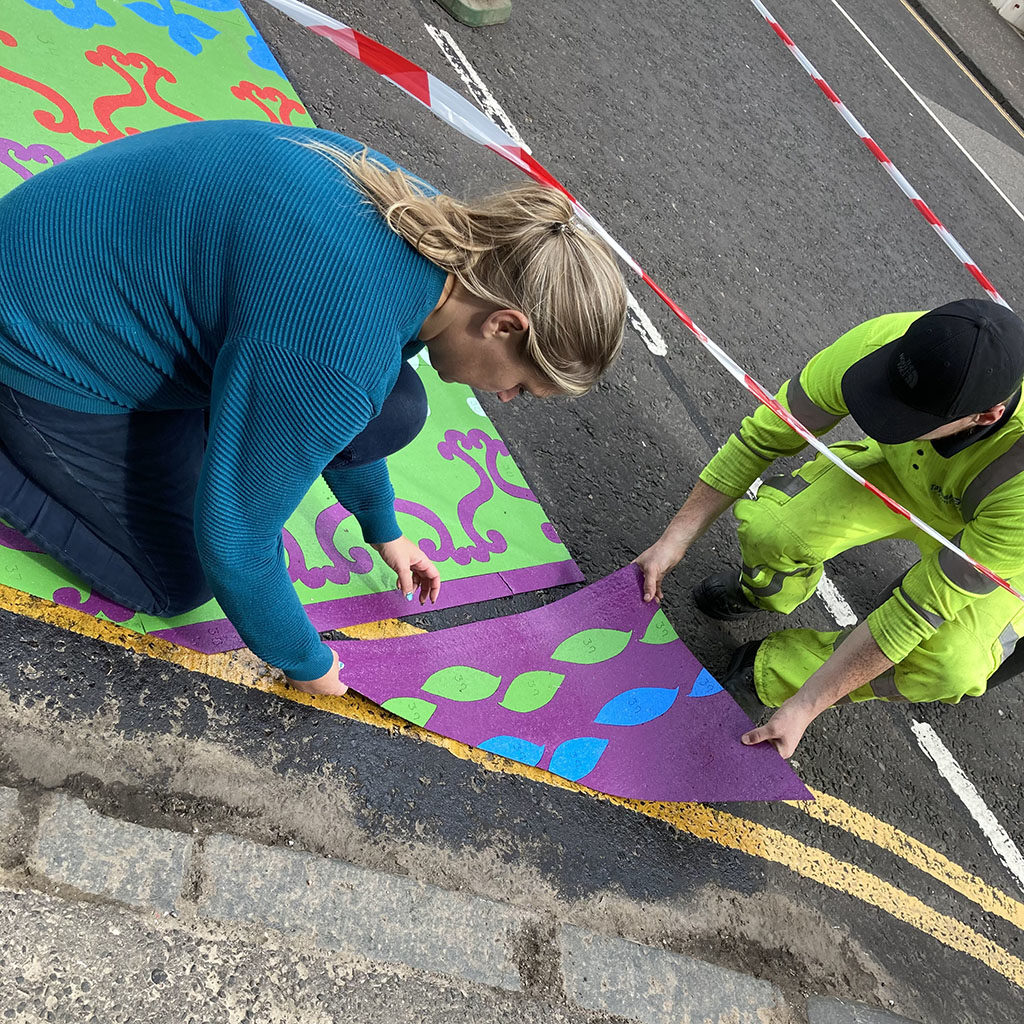
Windmill Gardens Gates

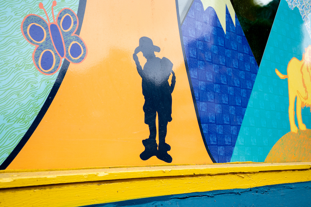
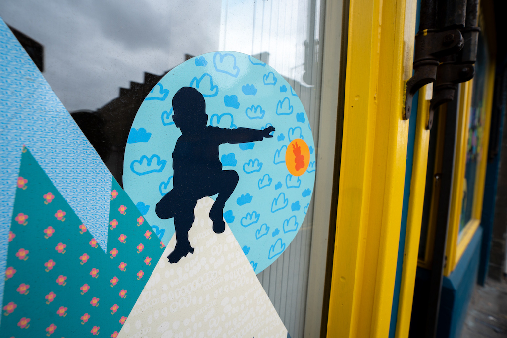
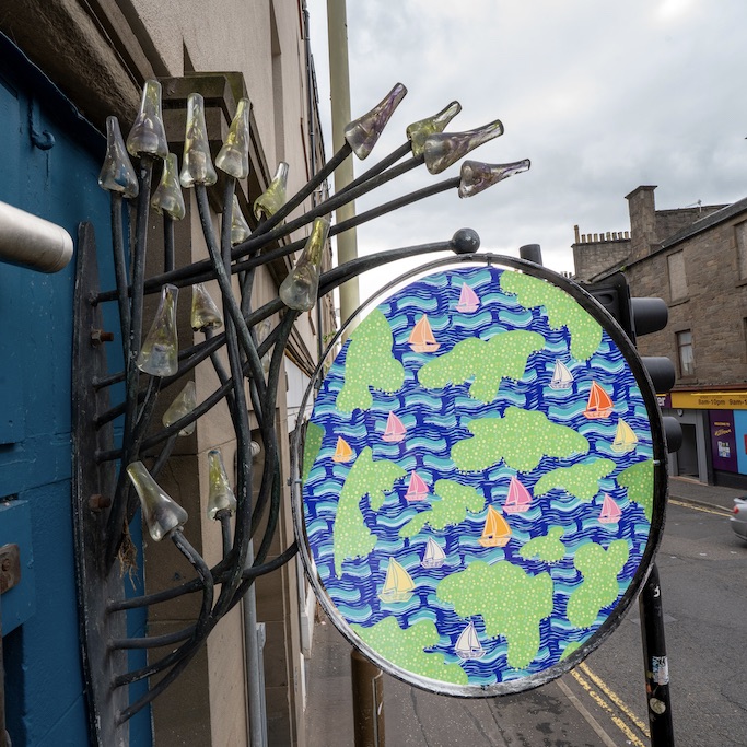
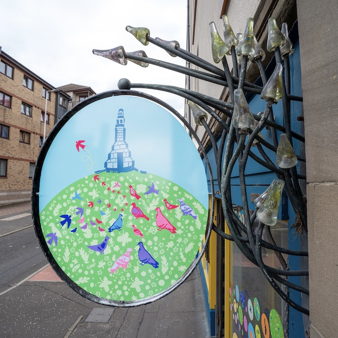
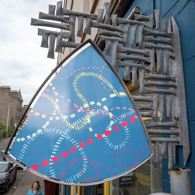
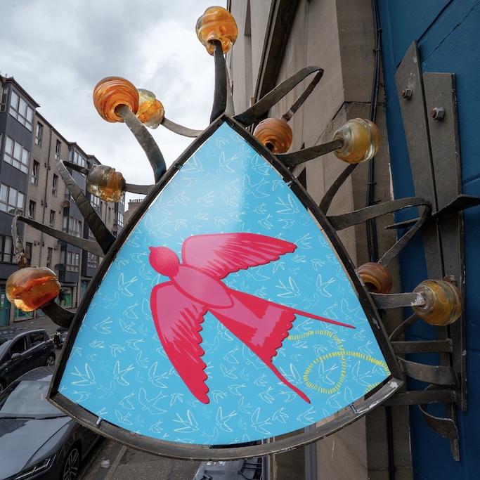
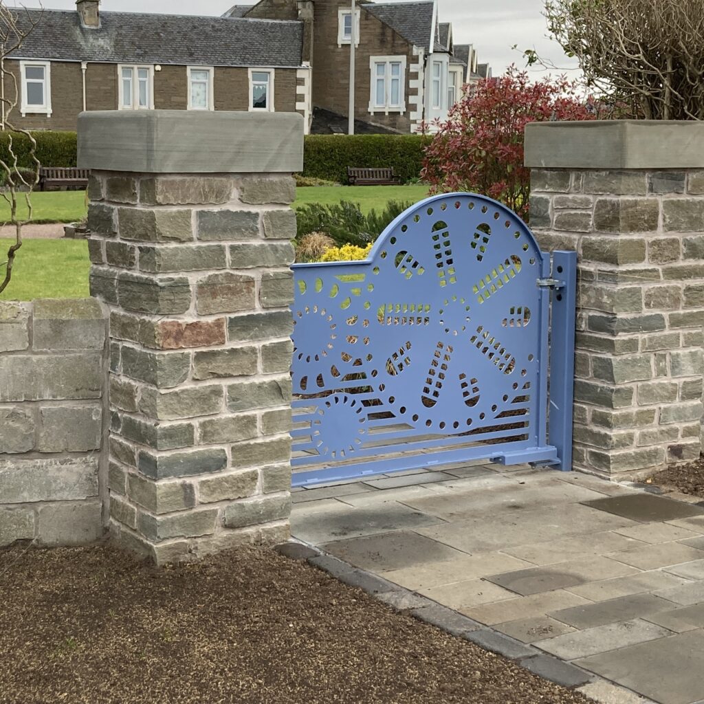
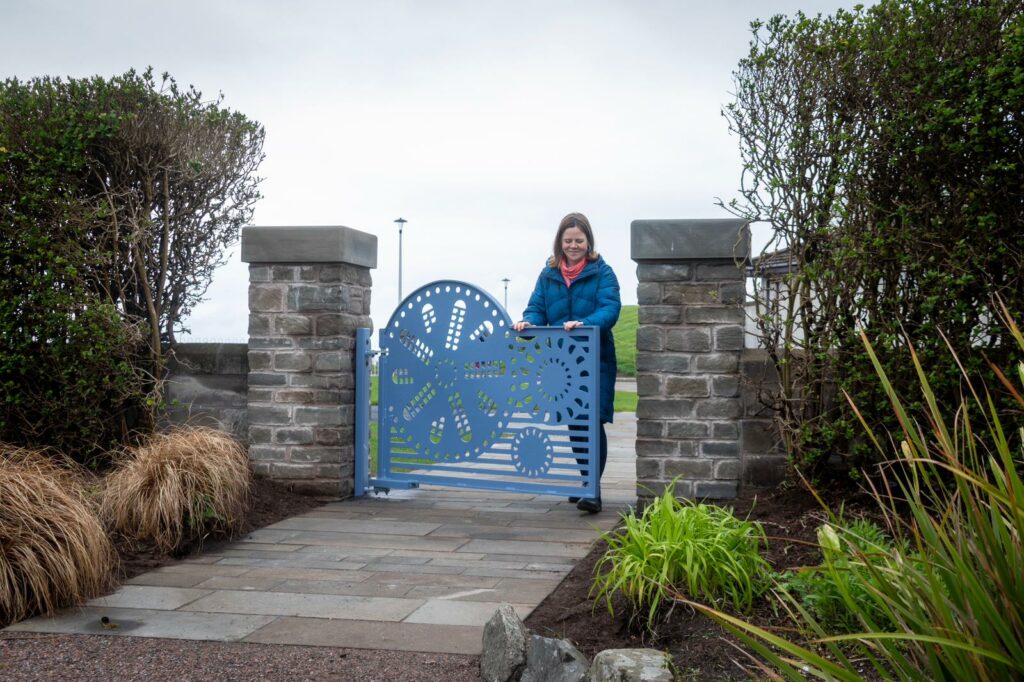
Great to see three new decorative gates I designed for the lovely public gardens in Broughty Ferry called Windmill Gardens. Gates were commissioned to enhance placemaking part of the new re-development of the esplanade.

Site Specific Inspiration

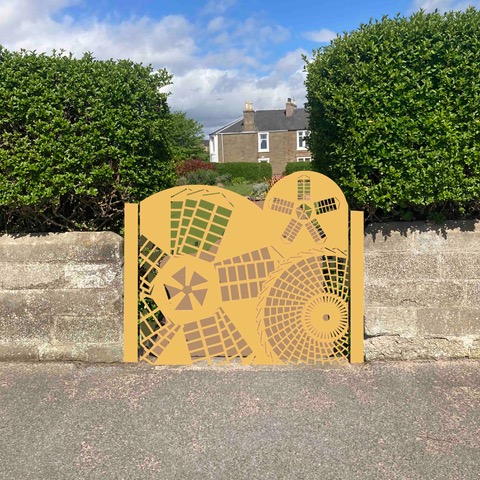
I took inspiration from the history that a wood-turning windmill stood on the site of Windmill Gardens around 1850s. In my design work I like to capture a sense of place and linking the history of the windmill helps to reconnect the name of the park to its past .

Design Process

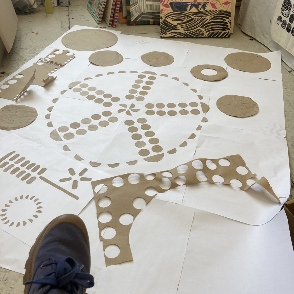
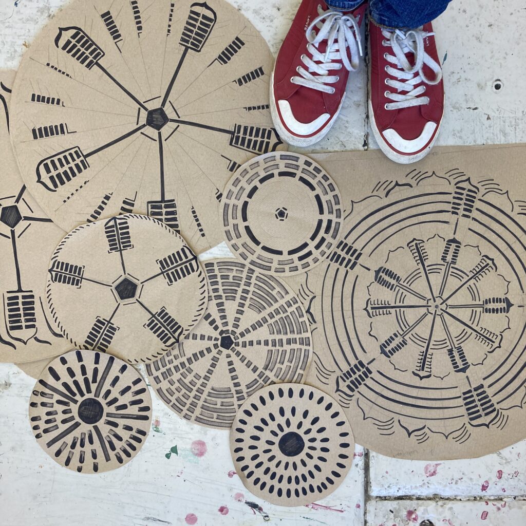
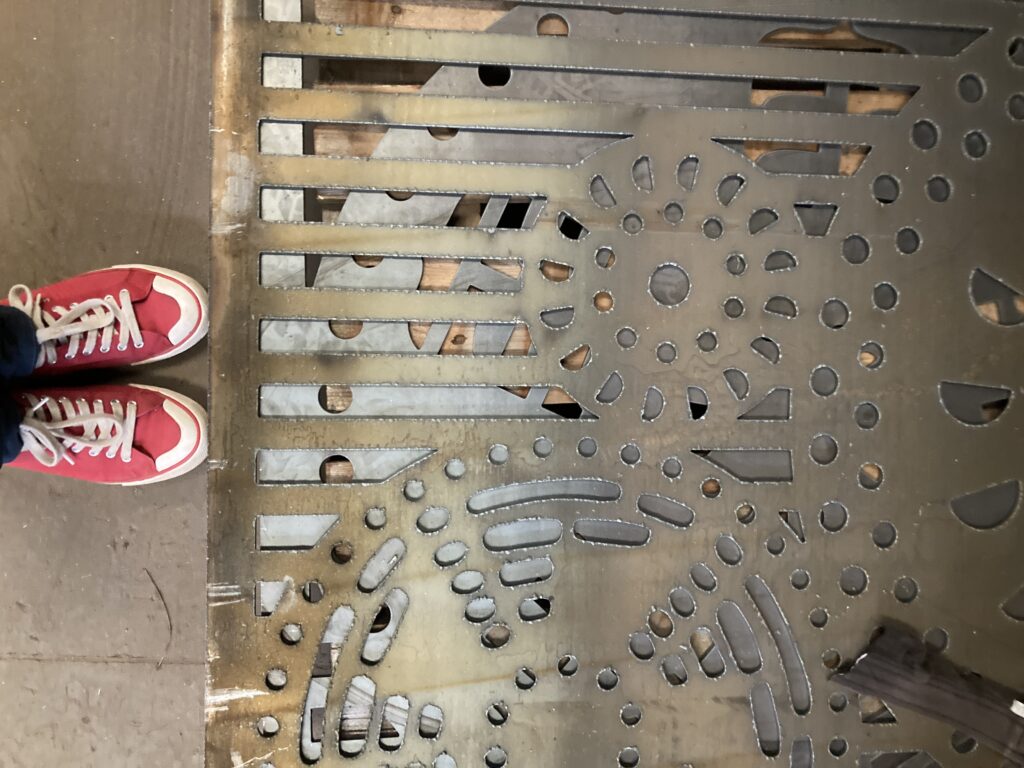
I went through numerous iterations of composition, imagery and colours with consideration to the technical aspect of producing final designs that would be fit for purpose and meet the brief. I wanted to capture the movement of the windmill blades/sails and I playfully tested different compositions and imagery mixing my love of circles and stripes.

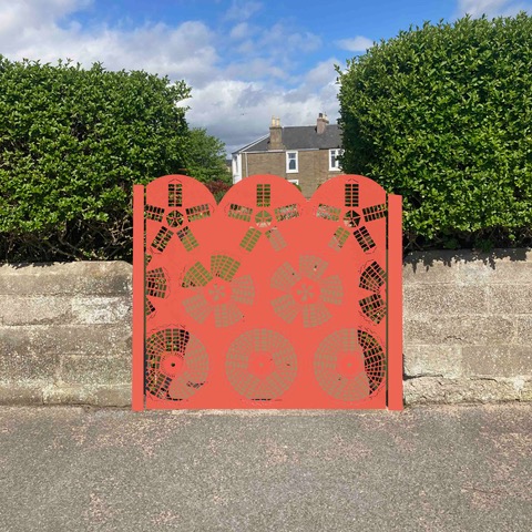
The three gates works as a series but each is individual with linking imagery and work visually inside and outside the gardens. It took many iterations from the bright gates I mocked up (below) to the final designs.

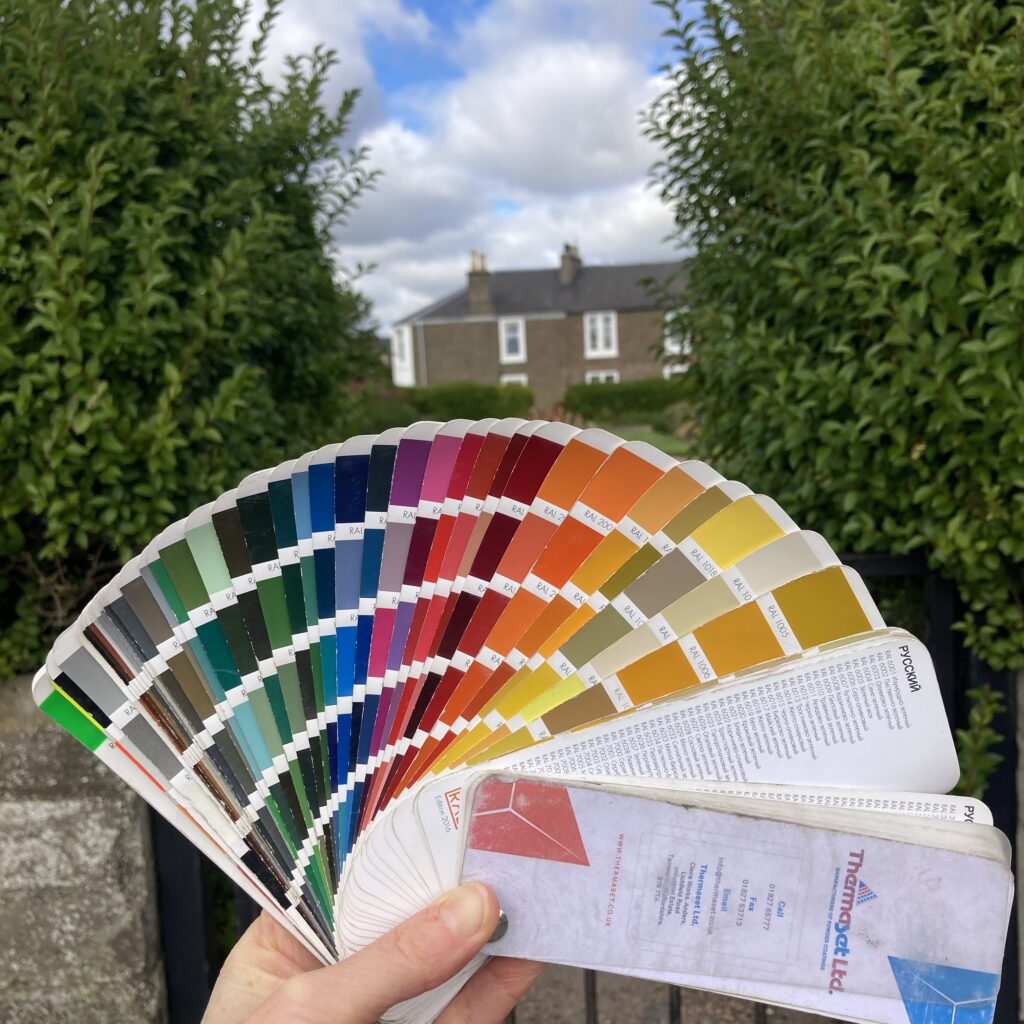
The new decorative gates were to replace 2 old gates that were not fit for purpose and to add a new entrance opposite Castle Green Playpark. I worked with local fabricator AS Fabrication to fabricate and install the gates and used Dundee based Tayside Powder Coated Services to apply the colour and Ieva to work on vectors. Gates were designed to be opened both ways to help with accessibility and consideration was made for the best material and processes for for the site. Colour is important to me and my initial thinking was to have sunset inspired colours but as the designs developed and the choices of colour palette was limited I chose this pigeon blue.

Bigger Picture

For me I want to create a welcoming and uplifting feel for locals and visitors by creating meaningful designs that re-connect people to the place and help highlight the gardens that are for public use.  I highly recommend this little secret garden, always something lovely to spot!

Broughty Ferry esplanade is going through a transformation to help improve active travel, part of a much bigger picture you can find out more here.

I designed gates for Castle Terrace Gardens just next to Windmill Gardens which have a different look to suit the space, you can see a link with the stripes and circles. More info here

Photo above from Dundee City Council

Sense of Place

Places mean a lot to us. 

My bespoke artworks are inspired by a sense of place, creating something that is unique to the people that use the space. A sense of place helps to connect people to their area, to give them a sense of belonging that helps improve wellbeing, making people feel at home and safe in their environment.

During consultation I find out what is meaningful and unique about the area or organisation gathering what makes somewhere unique. 

Calm colours to bold and exciting!

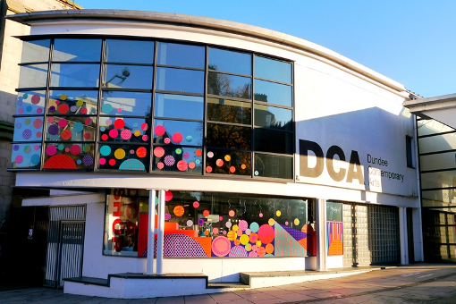
My designs can feel quite different on each project I work on as I respond to the people, place and purpose of a space.  From a calm artwork in a hospital corridor to help reduce stress and anxiety for visitors and patients to a bright vibrant cultural space to inspire people to come and to capture the essence of the building activity.

you can read more about the Dundee Contemporary Art Project https://louisekirby.com/window-designs

Locals to an area or service users of an organisation need to feel welcomed and connected to a space so they feel comfortable.  Buildings, streets and spaces can be daunting, uninspiring and scary. With the use of imagery, colour and good design in consultation with people that use the space designs can have a positive impact.

“Sustrans commissioned Louise to spruce up Albert Street with her beautiful artwork as part of the Stobswell Pocket Places project and it’s been a pleasure working with her. Her designs were carefully considered and every detail was inspired by the local area, helping to create a sense of place and an identity for Albert Street. Louise eagerly engaged with business owners to get them involved in the project and ensure they were happy with the designs before she painted them. Her warmth, authenticity and personal approach put the business owners at ease and encouraged them to participate in the project. She was in regular communication with the project team, remained flexible under changing circumstances, and even helped to raise the profile of the project through her social media and other channels. I would not hesitate to work with Louise again – 10/10 would recommend!” – Tremaine Bilham, Project Lead, Sustrans Scotland

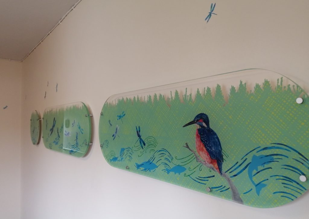
Artwork for the enhancement of the corridor James Court sheltered housing unit in Pitlochry

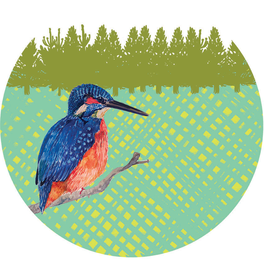
For Pitlochry Sheltered Housing Unit corridor enhancements inspiration came from the local trees and wildlife to bring in a bit of the outdoors inside as talked about during the staff and tenants consultations. 

I have a vision of the world full of colourful creative interventions to bring more joy to the spaces we play, live, work and travel through.  My aim is to uplift and connect people and highlight the positives by creating artworks that capture a sense of place which creates a sense of belonging.  I love to do this with my use of playfully applying colour and pattern.

I am ready to take on new design challenges and if you have a project, collaboration or commission in mind please get in touch hello@louisekirby.com or you can check some samples on my website to give you a flavour of previous projects.
How to transform the streets to bring more joy!

I believe colour and pattern can make a positive impact in the world!  The right colour can uplift mood helping people to feel more positive.  Pattern and imagery can help connect people to places and add meaning to placemaking.

Joyous Ground Graphics

Cobalt Collective, commission by V&A Dundee. Photo Credit Louise Kirby

One way to add more colour into the public realm is through adding ground graphics and colourful crossings transforming dreary tarmac streets into colourful ones! Look how joyful these are! Cobalt Collective in collaboration with with some community groups decorated the plaza around the V&A Dundee to create this colourful positive artwork.

Plaza by Cobalt Collective outside V&A Dundee. Photo credit Cobalt Collective

Examples of colourful ground graphics from around the UK

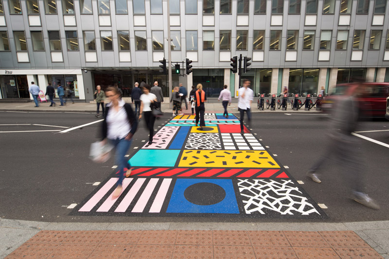
Camille Walala, 2016, London, commissioned by the Transport for London’s Future Streets Incubator Fund.
Photo by Better Bankside

“The aim of the Colourful Crossings commission is to explore how everyday infrastructures in the city, such as pedestrian crossings, are perceived and can be transformed,” said Better Bankside.

Stobswell Colourful Crossing 2021, Dundee by Louise Kirby, UNESCO City of Design Dundee funded by Sustrans Scotland.

I (Louise Kirby) created this design inspired by the local area taking elements from the historic architectural details, green spaces and public art after consultation with locals wanting more colour into the grey streets. You can see more about it and a blog about the whole process here

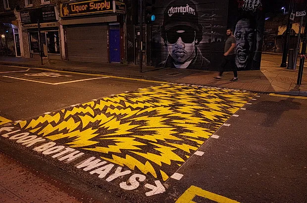
Eley Kishimoto, 2016, Brixton, London. Photo from Brixton Buzz

I’ve always loved this graphic iconic print design by Eley Kishimoto. It’s got great movement with the use of strong graphics in the positive and negative space. It looks great on the streets of Brixton, also in the variations of colours.

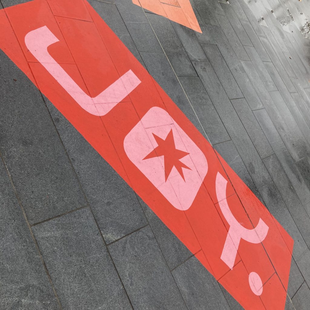
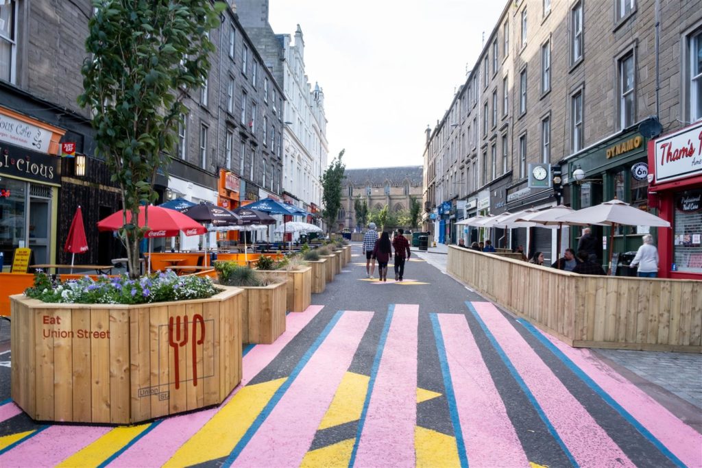
Graphic design by Callum Laird, Union Street, Dundee, UNESCO City of Design Dundee funded by Sustrans Scotland.
Photo credit David P Scott

It brings great joy to walk up and down through the colour of Union Street, Dundee to and from the V&A Dundee. I love the limited colour palette and bold graphics. Nice to see local businesses making use of the street, it reminds me of cafe culture on holiday! I look forward to seeing what happens next in this project to create a more permanent enhancement. I am really inspired by Dundee City Councils vision.

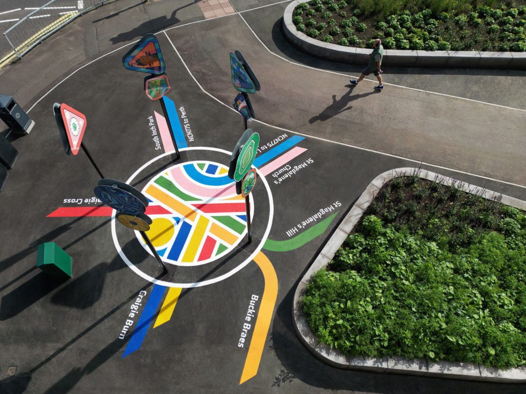
Craigie Compass by Bigg Design and Fun Makes Good, 2022, funded by Sustrans Scotland.
Photo by Bigg Design

Hamish from Bigg Design and Eleanor from Fun Makes Good created these cool ground murals called the ‘Craigie Compas’ to help with wayfinding in Perth, Scotland. Great to see the ground graphics used to help wayfinding, brighten up the area and the addition of fun signage giving it a 3d feel. You can read about it here

Practical Considerations

On ground graphics we have a limited colour palette. By using different colour combinations we can get varied results.  There are options from the material used to apply the designs depending on if it’s a temporary or longer term installation and what the purpose of the area is used for.  When designing a ground graphic in the public realm consideration and consultation needs to be in place for accessibility for all users’ needs.

They are a great way to inject a bit of fun, playfulness and joy!

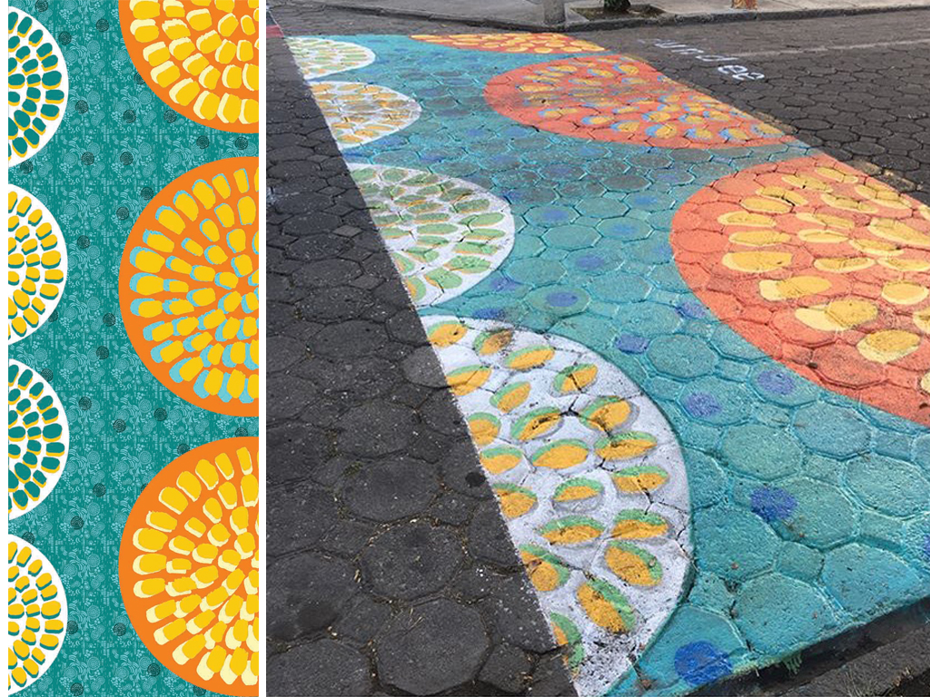
Dundee cake inspired design in Puebla Mexico for UNESCO City of Design Dundee, designed by Louise Kirby.
Photo credit UNESCO city of Design Dundee

An example of taking a bit of Dundee to the other side of the world in Puebla,Mexico, representing UNESCO City of Design Dundee. You can read more about this project where students from Puebla painted my design and used design to highlight a safety issue on the roads you can read more about it here

I have a vision of the world full of colourful creative interventions to bring more joy to the spaces we play, live, work and travel through.  My aim is to uplift and connect people and highlight the positives by creating artworks that capture a sense of place which creates a sense of belonging.  I love to do this with my use of playfully applying colour and pattern.

I am ready to take on new design challenges and if you have a project, collaboration or commission in mind please get in touch hello@louisekirby.com or you can check some samples on my website to give you a flavour of previous projects.
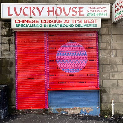
Stobswell Shutter Arts

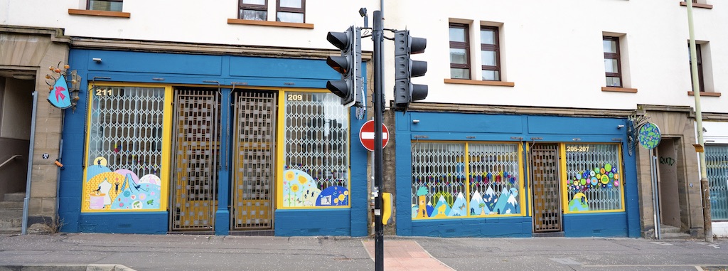
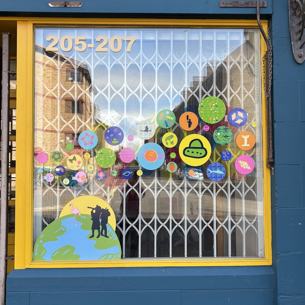
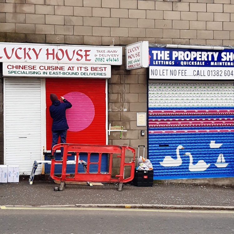
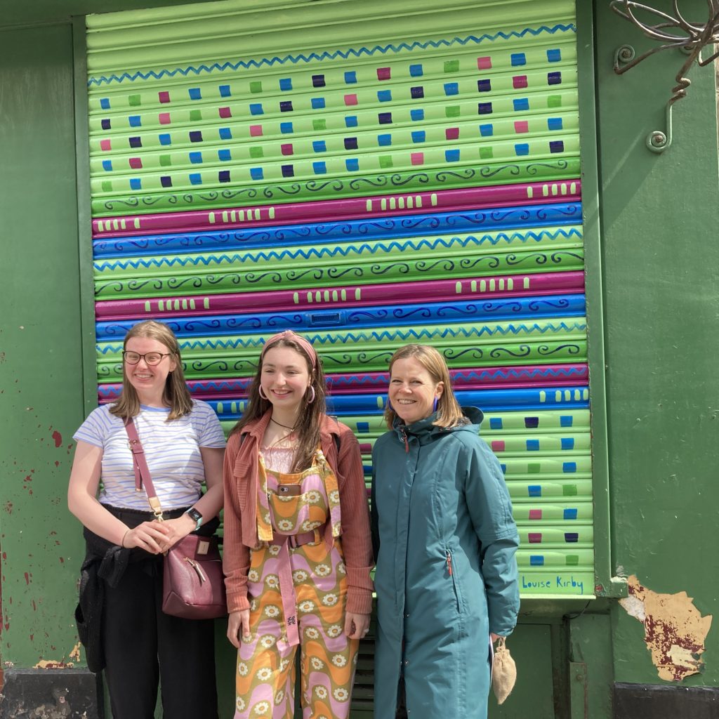
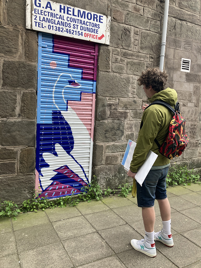
I’ve loved painting the shutter art designs on 3 businesses on Albert Street in Stobswell Dundee. All designs are inspired by highlighting the positives in the area.

It’s been a joyful experience with lots of banter from locals giving me positive encouragement ‘what you up to?’ and me replying I’m bringing a bit of colour and pattern to the area to brighten it up!

Here’s a flavour of what folk have said over the weeks I was painting: “You’re doing a braw job of this, it’s keeping you busy, it’s so cheerful “, “Amazing what a difference it makes”, “That’s smart”, “You must have good patience, it’s lovely!”, “Radical Colours”, “He’s fascinated with your swans”, “Are you painting the whole street?”, “I hope you’re getting paid for this, it’s lovely and making a real difference”, And to top it off ‘Eh Ken you’

Colour is really important to me and I believe it can change how a place feels, which in turn can change how people feel. I want the people of Stobswell to feel positive and uplifted. For these designs I used the same vibrant colour palette from the Pocket Parks I designed in 2021 on Craigie St and Eliza Street.

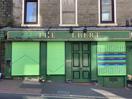
The Albert Bar

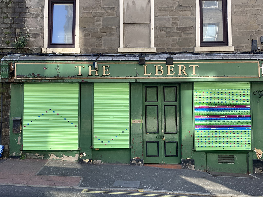
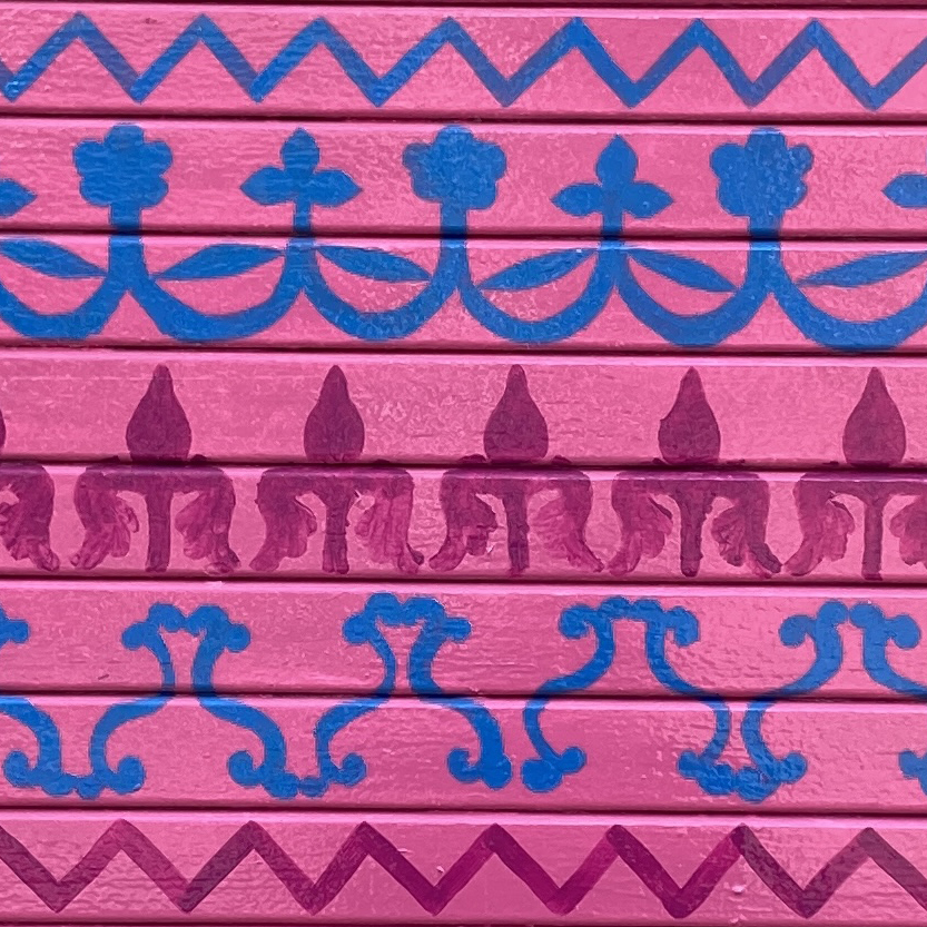
The Albert Bar design is filled with colourful patterns, shapes and colours taken from the local area, such as the row of 7 arches inspired by the arches of the windows of the Baxter Park Pavilion, zig zags from the public art sculpture on Princess Street and geometrics from the brickwork gable end on Craigie Street.

Initially I was only to be painting one shutter but I extended the design onto 2 other shutters to look like the squares were falling off like an old school video game and bouncing in the shape of a zig zag to echo the detail. I think having all 3 together gives a stronger impact and the zig zag directs your eye to the main shutter.  Great to hear The Albert Bar or should I say L’lbert is planning on upgrading their frontage and fixing their sign now that they have shutter art!

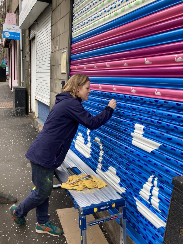
The Property Shop

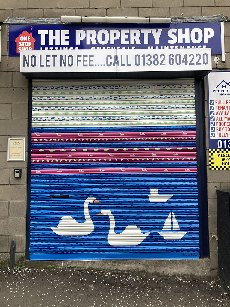
The Property Shop design is inspired by the Swannie Ponds featuring rows of swans, leaves and rippling water to create stripes of colourful patterns. This design idea developed further as I was painting as I wanted it to be more engaging to the children that walked and wheeled past as the bottom section is at a good eye level for them. I added 2 larger scale swans and some boats to give a nod to the Dundee Model Boat Club. It was nice to hear “He’s fascinated with your swans” as a lady and wee boy passed daily.

Lucky House

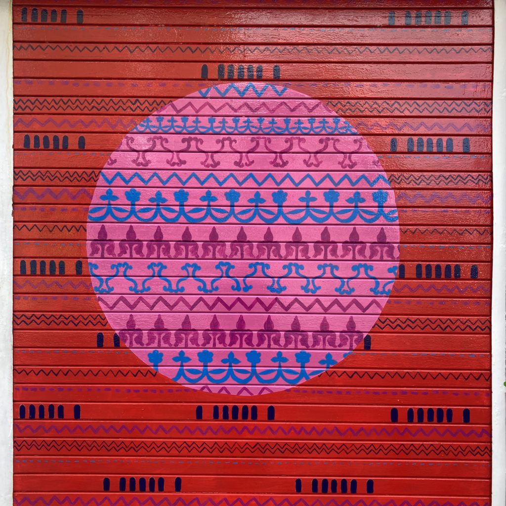
The Lucky House bold circular design is full of decorative details on the inside and outside and I think the clashing red and pink just sing together.  I was keen to include red as it represents happiness, beauty, success, and good fortune in China.

Can you spot where the patterns come from?

Ornamental details from the Baxter Park railings and the ironwork on the rooftop of Morgan Academy, zig zags from the public art sculpture. Some of these elements are also seen in my colourful crossing on Eliza Street. (you can read more about it here)

While painting the Lucky House shutter a local said ‘That’s not an oriental design’ and I explained the meaning of the patterns which started the conversation and hearing the history about how the Morgan Academy railings were removed in the 2nd world war to be used for bullets. You learn something new everyday!

I wanted each design to look unique but also to work as a series. I think they make a stronger impact being positioned quite close together, just imagine if they went all the way up Albert Street!
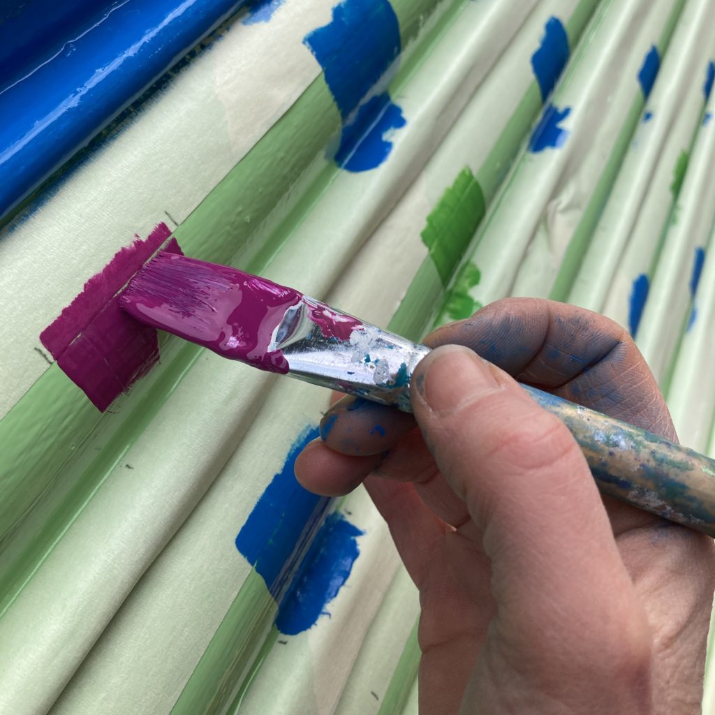
This commission was part of an open call from Sustran Scotland who are encouraging walking and wheeling in the area. We approached business owners with possible designs to find out if they were interested. I created sketches and shared for feedback, then agreed suitable times I could paint that didn’t interfere with their opening hours. I got all layered up in my painting clothes. The designs were painted by hand and I used some stencils and I created the circle shape using the lofi method of a bit of string and chalk. Thanks to all the help from Stobswell Forum and Dundee City Council Community Officer to encourage businesses to take part.

We had a Celebration Day to showcase the shutter art where myself and artist Gordy Crawford did tours talking about our inspiration and process. This event was in partnership with the Stobswell Form, Sustrans Scotland, Dundee City Council, where fun chalk activities were happening on Craigie Street and info about the future regeneration plans.

I really hope that the shutters bring joy to the people of the area who use it. Let me know what you think or how they make you feel!

`You can find out more about my projects here

This project was funded by Sustrans Scotland, Pocket Places programme where local communities shape their neighbourhood and take a lead in making their local area a better place to walk, wheel, cycle – and live.

Spaces for People in Stobswell, Dundee.

Bringing joy to the streets of Stobswell in Dundee!

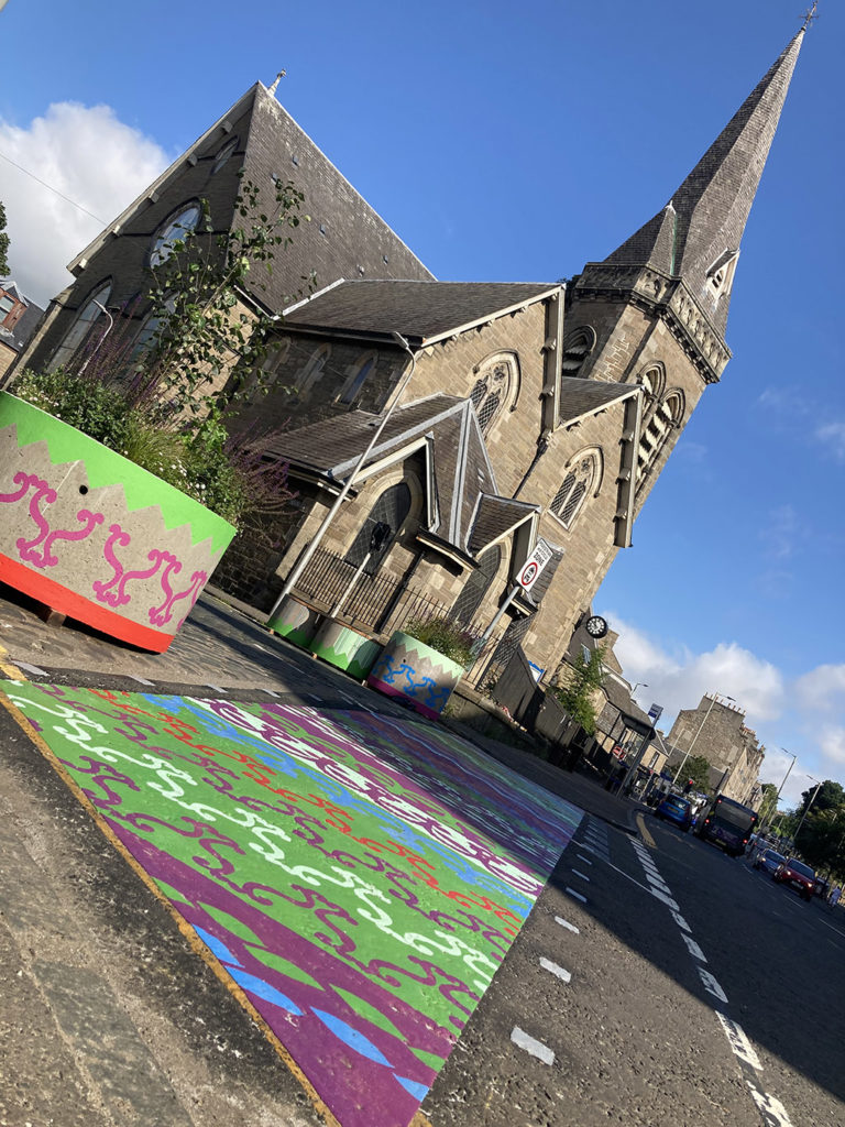
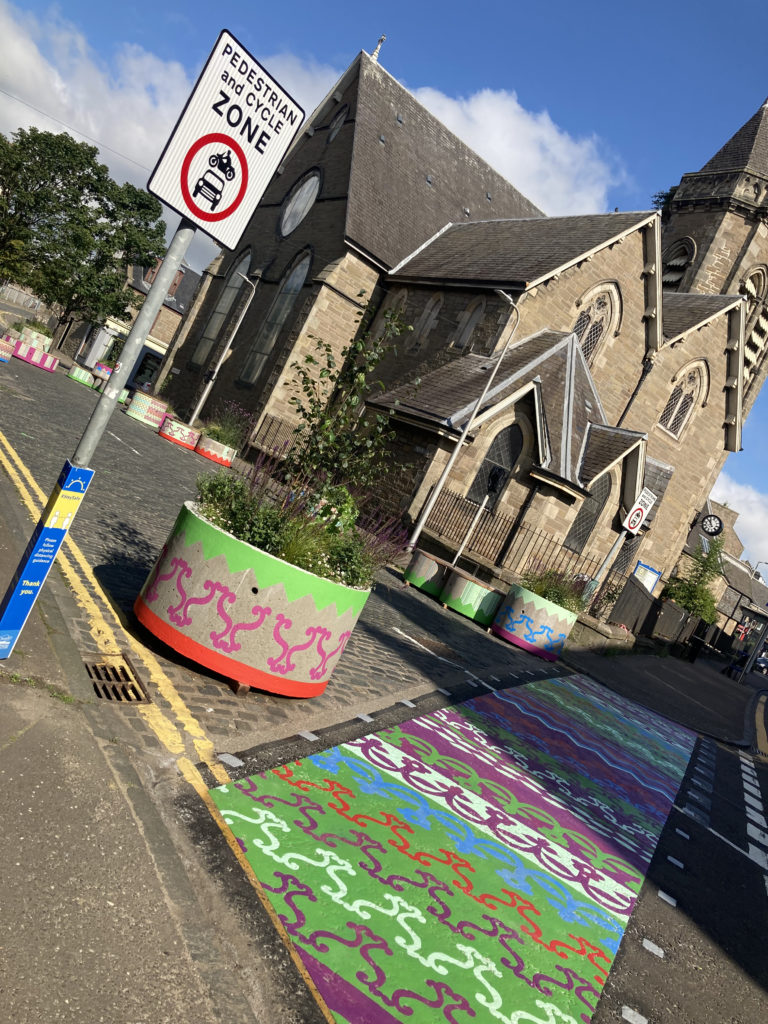
I worked with the UNESCO City of Design Dundee on the Spaces For People project to help realise the community’s idea of reclaiming two small sections of road at Eliza Street and Craigie Street to create people focused, friendly spaces full of colour and greenery as a temporary intervention funded by Sustrans Scotland.
Co-Design Process

I loved being part of the process from start to completion. Beginning with workshops run by the Service Design Academy using a co-design process, which gave a real insight into what the people who use and live in the area want and need, plus their issues and aspirations. The co-design process gave everyone a level playing field and participants were encouraged to gather user research to bring back a wider voice, they be imaginative on developing ideas. These ideas formed the design brief I worked on.

Research + Development

My role was to create a visual identity inspired by the feedback from the Service Design workshops to combat the greyness of the area, by brightening it up with more colour.
Stobswell is an area I know well from living there and attending Morgan Academy. I wanted to take a fresh look and went on a research mission with my camera to find shapes, colours and imagery linking into the initial conversations in the workshops about the jewels of Stobswell. I had interesting conversation with Friends of Baxter Park finding out about the plants and wildflowers and was shown the Cotoneaster tree which is the largest of its kind. Stobswell has many interesting pieces of public art so I watched Matthew Jarron’s video tours which gave me a good insight.

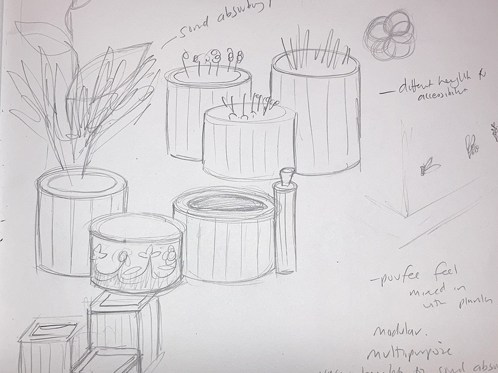
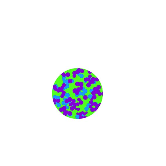
I found lots of circles and this later features in the seating and planter design.

From there I created print and pattern ideas in sketches, collage and digital art. I looked at many ways of applying colour to the area from trails, signage, gable ends, shop windows, shelters, awnings, seating/planters and through ground art. Not all ideas could go forward. (some pictures of things that didn’t go forward)

Concepts were shared for feedback. Ideas were refined and adapted to suit users. I defined colour palettes and did lots of maths to work out scale and repeat patterns.

I created 3D prototypes to help plan how the artwork would look in situ and placed designs in street plans to help visualise how the ground graphics would look.

Jewels of Stobswell

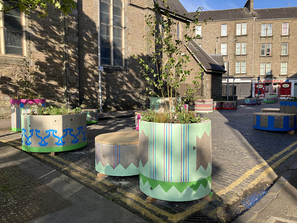
I think it’s important to capture a sense of place to find out what’s meaningful and unique about the area. It was identified Stobswell has a real mix of jewels – from historic details, green spaces, public art and tree lined streets. (I have a big long list of specific places that people love). I wanted to have a strong visual identity that worked in the Stobswell area using the same colour palette but felt there needed to be distinction between the 2 pocket parks of each individual site.

Eliza Street – Grand and Ornamental

The Eliza Street is an eclectic mix of imagery inspired by the jewels of Stobswell: details of the decorative ironwork on Morgan Academy rooftop, Baxter park railings, zig zags from the public art down on Princess Street, some leaves from Baxter Park and I managed to slip in a stripe or two!

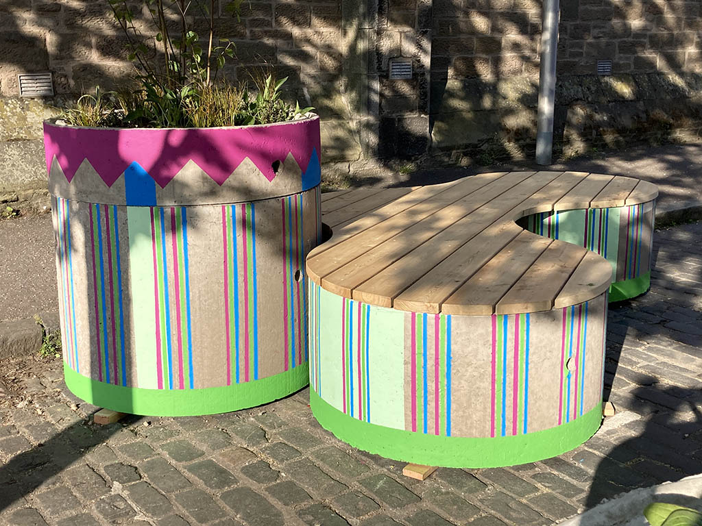
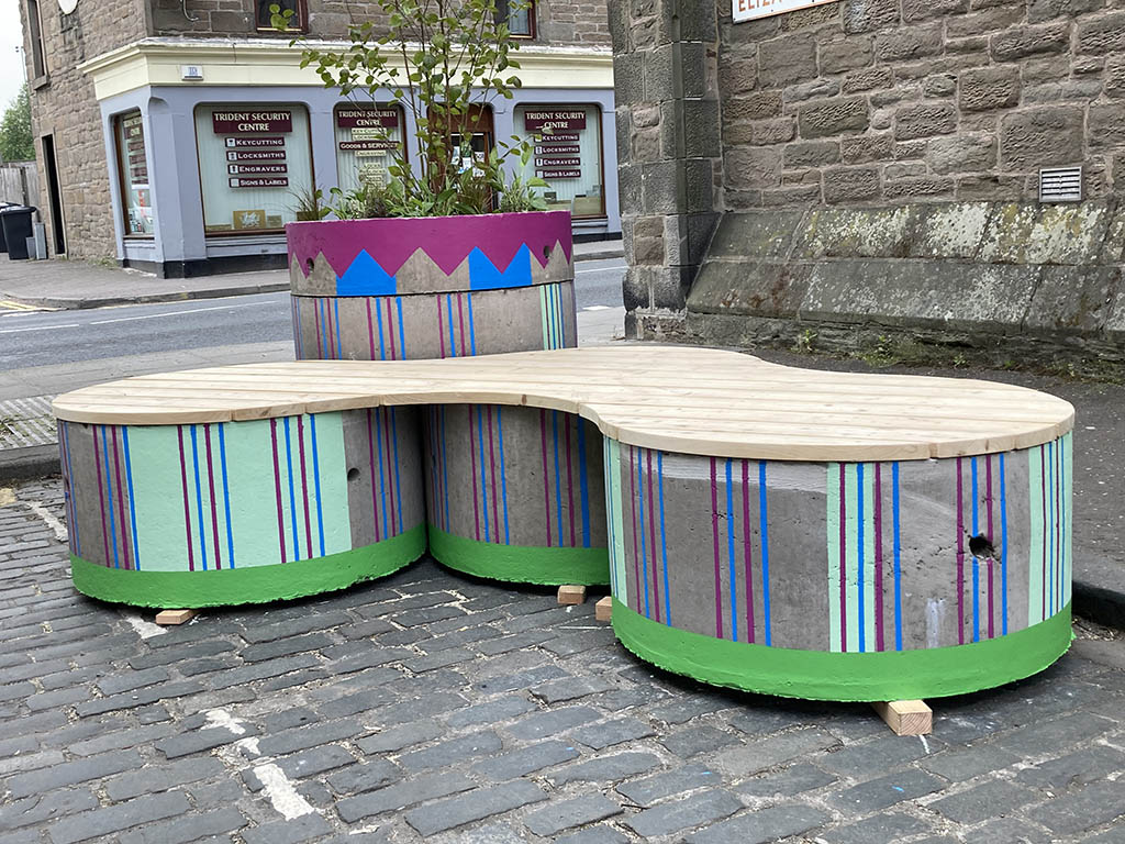
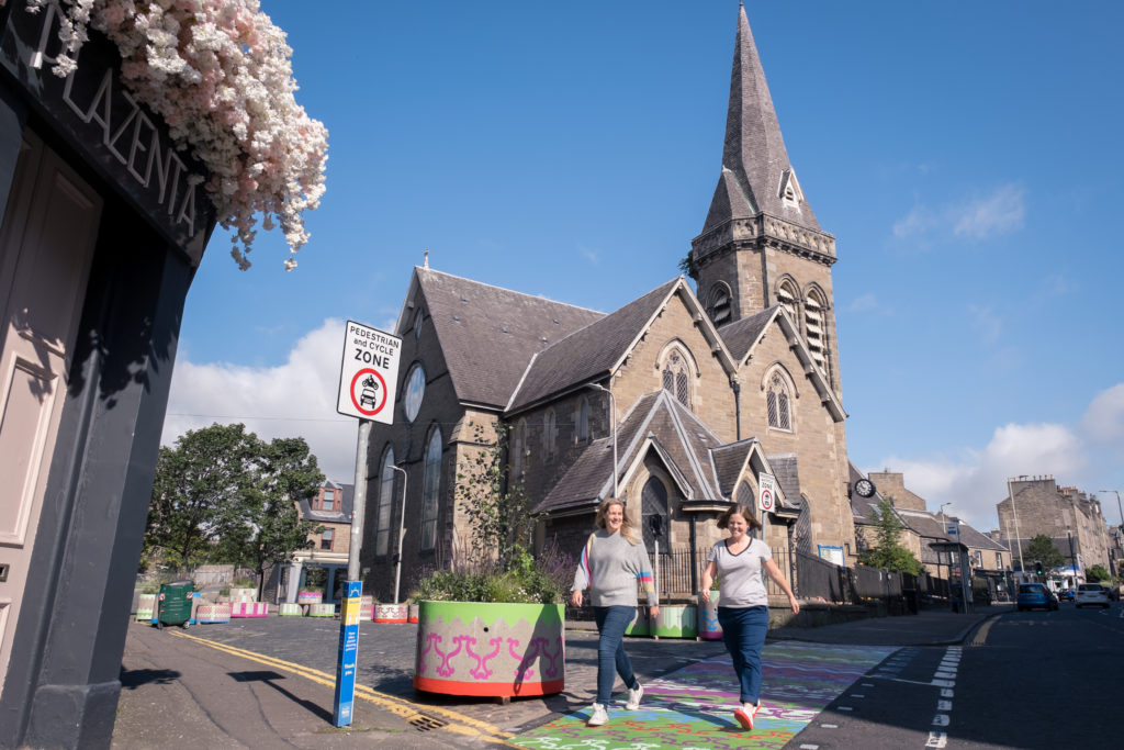
The entrance from Albert Street was marked with a colourful crossing. To give it a homely feel I coordinated and clashed patterns on the seating and planters which complimented the range of surfaces of the birch, concrete and planting.

Craigie Street – Geometric and Playful

Craigie Street’s visual references came from the decorative brickwork gable end on the street, mixed with circular berries inspired from the Cotoneaster tree in Baxter Park. Colour and pattern were added to the seating and planters plus the circular ground graphics. Designs were initially developed to give a visual clue to physical distancing due to the Covid-19 pandemic.

By adding the ground graphics it gave an opportunity to have more colour and pattern into the space, plus is gave it a more playful feel.

Teamwork is dreamwork

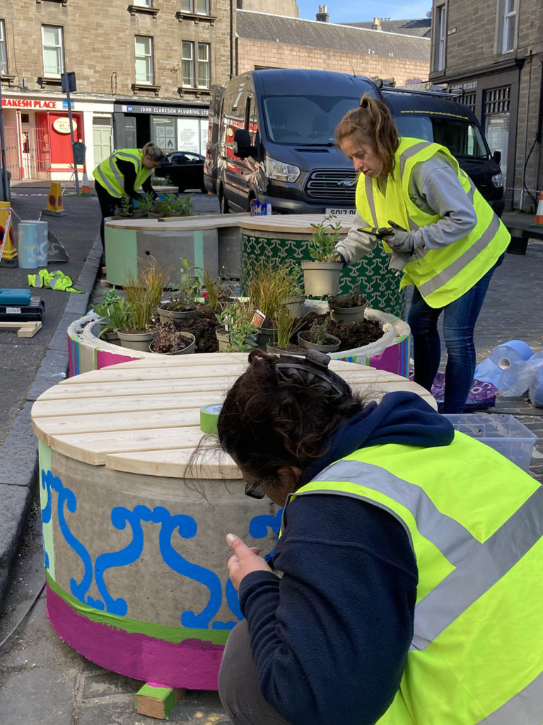
I was only one part of this project. I loved being part of a core team with architectural designer Fíona Canavan who was a whizz on the technical side of maps, plans and research. UNESCO City of Design Dundee team, Annie Marrs and Poppy Jarrett who lead on the project and trusted my ability. Old School Fabrications who created the modular seating and planters and did all the logistics and practical element of the install.

So many people helped make this happen, from Angie who used her magic to convert files to be print ready, plus the team of local painters who brought the vision of colour and pattern to life.

Working with Tayside Contracts to add the colourful crossing and circle graphics along with Jamie from Geveko Marking. So many conversations were had to make this work from accessibility groups, Stobswell Form, Dundee City Council Transport and Planning team, Boomerang Project, Fire Brigade to name a few.

I met with local artist Gordy Craw who was working on painting shopfronts in Stobswell. We decided to use the same colour palette to give a stronger identity to the area. I added window decals with zig zags on The Stobbie Chipper and cotoneaster leaves and berries to the Boomerang Cafe. I love how Gordy’s artwork and my designs clash and bring a richer Stobswell pattern.

Future

There were lots of ideas and not everything could be taken forward in this project as it is temporary. There is still work to be done in the area and Sustrans are working with the community to create permanent interventions. You can find out more about what they are doing here.

What’s it all about for me

For me this project encompases what I love doing: bringing joy through colour and pattern, creating meaningful artwork that captures a sense of place, connecting people to places and improving the world we live in.

It’s been great to see people using the space from stopping for a chat, sitting stroking the friendly cats, enjoying sunshine and eating lunch from the local takeaways.

Photographed by David P Scott. All rights reserved. www.davidpscott.com

Thanks for reading, you can find out more about projects I’ve worked on here.